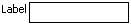
A panelLabelAndMessage component running on Windows Mobile.
Tag name: <amc:panelLabelAndMessage>
This component lays out a label and children.
Typically, the only child of this component will be an
input element of some sort, but as many children as necessary can
be added. When using panelLabelAndMessage with
input components, you should always
set simple="true" on the input
components. Non-simple input components already
effectively have all the functionality of
panelLabelAndMessage.
To lay out multiple panelLabelAndMessage components - or multiple non-simple input components - you can use the panelFormLayout component. When panelLabelAndMessage components are placed inside a panelFormLayout the labels will line up.
A panelLabelAndMessage component running on Windows Mobile.

<amc:panelLabelAndMessage label="Birthdate:" id="plm1">
  <amc:inputDate id="selectDate" simple="true" id="id1"/>
</amc:panelLabelAndMessage>
| Name | Type | Supports EL? | Description |
|---|---|---|---|
| backgroundColor | String | Yes | Sets the color of a background to an RGB value (rgb(255,0,0)) or a hexadecimal number (#ff0000 or #f00). The default value is device-dependent. |
| disabled | boolean | Yes | Specifies whether or not the component is disabled. Unlike a read-only component, a disabled component cannot receive focus. |
| height | int | Yes | Specifies the height of the component. Can be entered in pixels or as a percentage of its parent's height. A percentage value should be entered as a number followed by the "%" symbol. A number will be interpreted as a pixel value (as will a number followed by the text "px"). |
| id | String | No |
Specifies the identifier for the component. The identifier must follow the following rules:
|
| label | String | Yes | Defines the label of the component. In order for the label to appear above the component, a Panel Form Layout should be used. |
| rendered | boolean | Yes | Specifies whether or not the component is rendered. When set to false, no output will be delivered for this component (the component will not in any way be rendered, and cannot be made visible). |
| showRequired | boolean | Yes | Defines whether or not the associated component displays a visual indication of the required user input. Both the "required" attribute and the "showRequired" attribute must be false for the visual indication not to be displayed. For example, this attribute could be used when there is a field that is initially empty and is required only if some other field on the page is modified. |
| truncateAt | int | Yes | Specifies the length at which the text should automatically begin truncating. When set to zero (the default), the string will never truncate. Values from one to fifteen will display the first 12 characters followed by an ellipsis (...). The component will not truncate strings shorter than fifteen characters. For example, for the value of 1234567890123456, setting truncateAt to 0 or 16 will not truncate. Setting truncateAt to any value between 1 and 15 will truncate to 123456789012... |
| width | int | Yes | Specifies the width of this component. Can be entered in pixels or as a percentage of its parent's width. A percentage value should be entered as a number followed by the "%" symbol. A number will be interpreted as a pixel value (as will a number followed by the text "px"). |