A User Interface
Site Studio Designer includes numerous dialogs and administrative pages that you use to create and administer your site:
-
Section A.24, "Native Document Conversion Settings Dialog (Legacy)"
-
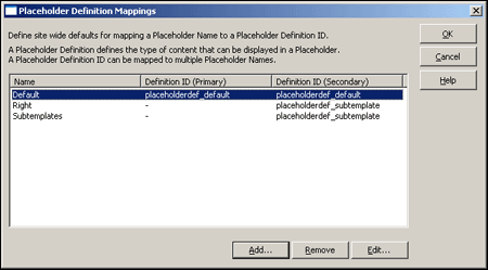
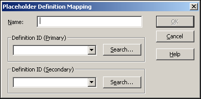
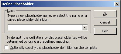
Section A.74, "Define Placeholder Definition Mapping Dialog"
A.1 Customize Dialog
The Customize Dialog is used to modify the designer interface to match the needs of the designer.
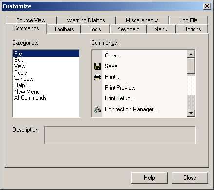
A.1.1 Customize Dialog: Commands Tab
The Designer application includes numerous menus and commands. You can change the way these menus and commands appear and even create menus and then populate them with commands. In conjunction with the Toolbars tab (see Section A.1.2, "Customize Dialog: Toolbars Tab"), you can create a toolbar to display frequently used commands.
| Element | Description |
|---|---|
| Categories | Displays existing menus. Use New Menu to create a menu in Designer. |
| Commands | Displays available commands. Use New Menu to create a command for a menu in Designer. |
| Description | Displays a description of the selected menu. |
| Help | Opens the online help for this specific dialog. |
| Close | Closes the Customize dialog. |
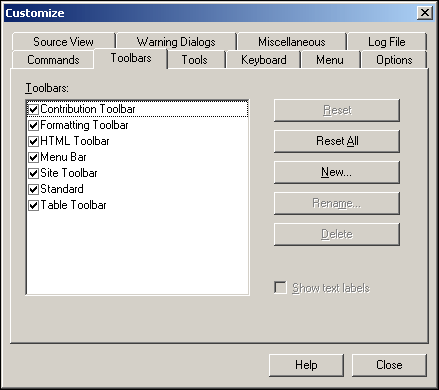
A.1.2 Customize Dialog: Toolbars Tab
The Designer application includes numerous toolbars. You can show and hide these toolbars, create a toolbar and then populate it with commands (see Section A.1.1, "Customize Dialog: Commands Tab"); delete toolbars; and restore icons that were removed from the original toolbars.
| Element | Description |
|---|---|
| Toolbars | Displays a checkbox for each toolbar item in Designer. Select the checkbox to show that item in the toolbar or clear the checkbox to hide that item in the toolbar. For more information about the toolbars, see Section 5.10, "Toolbars."
Contributor Toolbar: Includes Insert Region, Insert Element, and so on Formatting Toolbar: Includes typeface, bold, align left, and so on. HTML Toolbar: Includes HTML styles, insert image, insert rule, and so on. Menu Bar: Includes File, Edit, View, and so on. Site Toolbar: Includes Choose Site, Assign Content, and so on. Standard: Includes Copy, Paste, Save, and so on. Table Toolbar: Includes Insert Table, Insert Row, Insert Column, and so on. |
| Reset | Resets the existing toolbar. Select the toolbar you want to restore and then click this button.
This command applies only to the default set of toolbars provided with Designer. If you created a toolbar and then removed an icon from it but wanted to restore that icon, then you must go to the Commands tab, drag the icon from the Commands box, and drop it onto the toolbar. |
| Reset All | Resets all of the toolbars in Designer.
This command applies only to the default set of toolbars provided with Designer. If you created a toolbar and then removed an icon from it but wanted to restore that icon, then you must go to the Commands tab, drag the icon from the Commands box, and drop it onto the toolbar. |
| New | Opens the Toolbar Name dialog where you can create a toolbar.
When the toolbar displays in the Toolbars column, drag its icon from the Toolbars tab to the desired position in relation to the other toolbars in Designer. To populate the toolbar, open the Commands tab and drag each icon (representing a command) from the Commands box to the toolbar. You can further customize the toolbar by right-clicking the icon or text and clicking Button Appearance in the popup menu. |
| Rename | Renames a toolbar. You can only rename toolbars that you create. You cannot rename the toolbars that come with Designer. |
| Delete | Deletes a toolbar. You can only delete toolbars that you create. You cannot delete the toolbars that come with Designer. |
| Show text labels | Displays explanatory text with the toolbar icon. |
| Help | Opens the online help for this specific dialog. |
| Close | Closes the Customize dialog. |
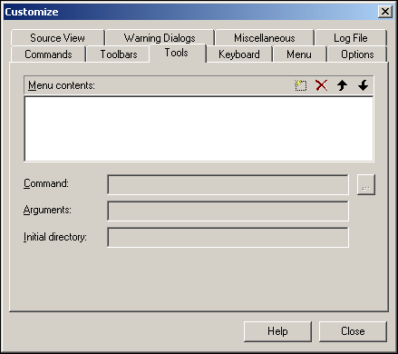
A.1.3 Customize Dialog: Tools Tab
The Designer application includes numerous toolbars and menus. In addition to these, you can add a shortcut to an outside application in the Tools menu to provide immediate access to that application.
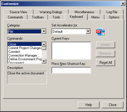
A.1.4 Customize Dialog: Keyboard Tab
The Designer application includes numerous commands that have one or more keyboard shortcuts assigned to them. You can create, change, and delete keyboard shortcuts.
| Element | Description |
|---|---|
| Category | Displays the menus. Select the menu that contains the command you want to assign a shortcut to. |
| Commands | Displays the available commands for the menus. Select the command to assign the shortcut to. |
| Description | Displays a description of the command. |
| Set Accelerator for | Specifies when the keyboard shortcut is available. Select Default if you want the keyboard shortcut to be available in general when working in Designer. |
| Current Keys | Displays keyboard shortcuts already assigned to the command. |
| Press New Shortcut Key | Place your cursor in this text box then, using your keyboard, press the actual key combination to assign to the shortcut. |
| Assign | Assigns the shortcut key to the command. |
| Remove | Deletes the keyboard shortcut. |
| Reset All | Restores all of the keyboard shortcuts available when you first started Designer. |
| Help | Opens the online help for this specific dialog. |
| Close | Closes the Customize dialog. |
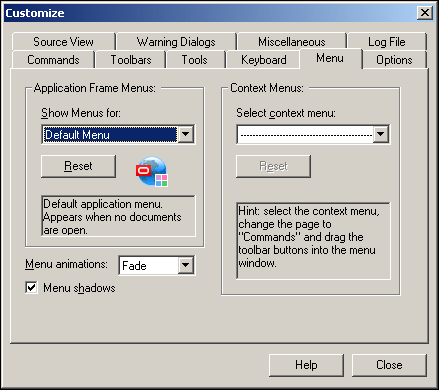
A.1.5 Customize Dialog: Menu Tab
The Designer application includes numerous popup menus. You can customize the behavior of these popup menus by adding, deleting, and changing the way the popup menus work.
| Element | Description |
|---|---|
| Show Menus for | Selects the menu to modify. Designer uses the Default Menu. |
| Reset | Resets the menu for Designer. |
| Menu animations | Controls how the menu commands appear in Designer (includes menus on the Menu bar and popup menus). There are four options:
None: The list of menu commands appears in the usual way. Unfold: The list of menu commands opens from top-left to bottom-right. Slide: The list of menu commands opens from top to bottom. Fade: The list of menu commands slowly appears on-screen. |
| Menu shadows | Displays a shadow effect around the menu. |
| Select context menu | Modifies the menu command.
When you choose this, a popup menu appears in the upper-left corner of the Customize dialog. Click the Commands tab and under Categories, select the appropriate menu. Under Commands, select the command to add to the popup menu. Drag the command onto the popup menu and position it where you would like it to appear on the menu. |
| Reset | Resets the commands from the Select Context Menu drop-down list. |
| Help | Opens the online help for this specific dialog. |
| Close | Closes the Customize dialog. |
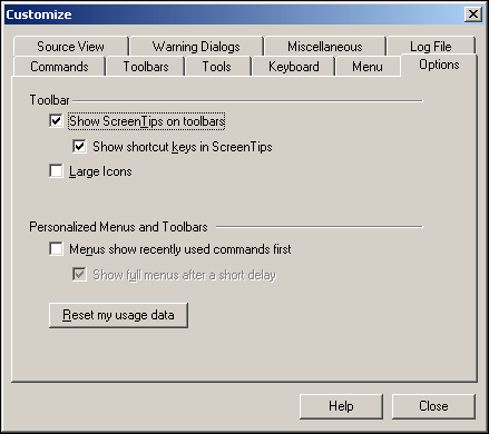
A.1.6 Customize Dialog: Options Tab
The Designer application includes numerous menus, icons, and screen tips. You can control the way these work on this tab.
| Element | Description |
|---|---|
| Show ScreenTips on toolbars | Opens popup text (a screentip) when the cursor passes over an icon. |
| Show shortcut keys in ScreenTips | The screentip that opens when the cursor passes over an icon also displays the shortcut key assigned to that command. |
| Large Icons | Displays large icons in the user interface. |
| Menus show recently used commands first | Commands are listed based on their frequency of use. |
| Show full menus after a short delay | Opens the full menu after a short delay. |
| Reset my usage data | Returns the Designer to its original state. |
| Help | Opens the online help for this specific dialog. |
| Close | Closes the Customize dialog. |
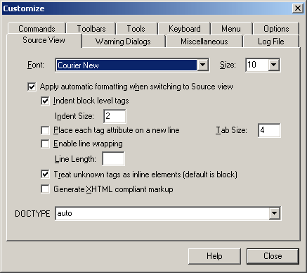
A.1.7 Customize Dialog: Source View Tab
The Designer application opens multiple views of site assets. These can include Source view, Design view, and Preview. You can customize the way the code opens in source view by changing the font face, font size, and certain automatic formatting.
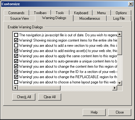
A.1.8 Customize Dialog: Warning Dialogs Tab
The Designer application opens numerous warning and confirmation messages. You can control which warning messages open and which ones remain hidden.
| Element | Description |
|---|---|
| Enable Warning Dialogs | Provides checkboxes beside each warning message.
Select the checkbox to display the warning message, or clear the checkbox to hide the warning message. By default, certain warning messages open when you first open Designer. |
| Check All | Checks all of the warning messages so that all of them open. |
| Clear All | Clears all of the warning messages so that none of them open. |
| Help | Opens the online help for this specific dialog. |
| Close | Closes the Customize dialog. |
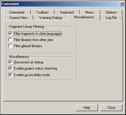
A.1.9 Customize Dialog: Miscellaneous Tab
When Designer opens, it automatically connects to the last site you worked on and it downloads certain fragments for display in the Toolbox. You can change these options, if you like.
| Element | Description |
|---|---|
| Filter fragments in other languages | When checked, only the fragments written in the same language as your site (HCSP/JSP or ASP) appear in the Toolbox. |
| Filter fragments from other sites | Only the fragments that belong to your site (and not other sites in the content server) appear in the Toolbox.
Fragments in fragment libraries not identified as part of your site no longer appear in the Toolbox. To make a fragment part of your site, add it as a site asset to the "Fragment Libraries" category. |
| Filter default libraries | Only the fragments that you have created for your site (and not the default ones that ship with Site Studio) appear in the Toolbox. |
| Reconnect at startup | When opening Designer, you are automatically connected to the last site you worked on. |
| Enable project status checking | While working in Designer, a project status icon displays in the lower right telling you if the site hierarchy matches the latest project file in the content server. |
| Enable accessibility mode | While working in Designer, the menus are changed to work better with a screen reader. |
| Help | Opens the online help for this specific dialog. |
| Close | Closes the Customize dialog. |
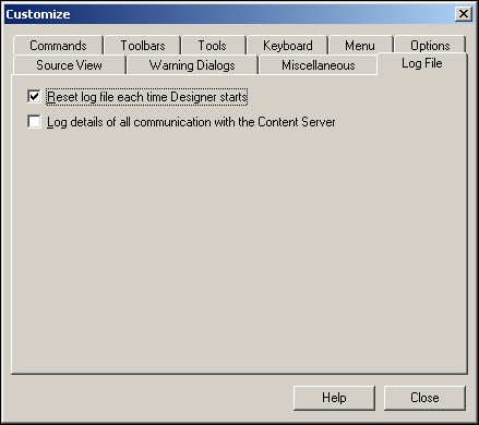
A.1.10 Customize Dialog: Log File Tab
Site Studio creates a detailed log file for your site. You can control what is logged and the details of the log on this tab.
| Element | Description |
|---|---|
| Reset log file each time Designer starts | Creates a log file each time Designer starts. |
| Log details of all communication with the Content Server | Creates a detailed log of all communication with the content server. |
| Help | Opens the online help for this specific dialog. |
| Close | Closes the Customize dialog. |
A.2 Site Connection Manager Dialog
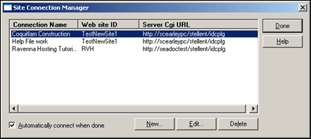
Designer uses a site connection to connect to and update a web site in the content server. You can create, edit, and delete site connections using this dialog.
| Element | Description |
|---|---|
| Connection Name | web site ID | Server Cgi URL
(Status area) |
Displays each connection name, the corresponding web site, and content server Cgi URL. |
| Automatically connect when done | Automatically connects to the site (using the site connection you just created) when you close the Site Connection Manager dialog. |
| New | Opens the Site Connection Details dialog (see Section A.3, "Site Connection Details Dialog"), where you can create a site connection. |
| Edit | Opens the Site Connection Details dialog (see Section A.3, "Site Connection Details Dialog"), where you can edit an existing site connection. |
| Delete | Deletes an existing site connection. |
| Done | Closes the Site Connection Manager dialog and connects to the web site using the highlighted site connection (if you checked "Automatically connect when done"). |
| Help | Opens the online help for this specific dialog. |
You must first disconnect from a web site before you can edit or delete that site in the Site Connection Manager.
A.3 Site Connection Details Dialog
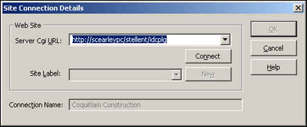
Designer uses a site connection to connect to and update a web site in the content server. You can create and edit site connections using this dialog. When creating a site connection, you identify the content server where the site resides, the name of the actual web site, and a name for the connection.
| Element | Description |
|---|---|
| Server Cgi URL | The address of the content server that hosts the web site.
You can type the complete Cgi URL address of the content server, or you can choose a placeholder address in the menu, replacing <server> with the name of your server. |
| Connect | Connects to the content server using the Cgi URL address you provided above.
You are prompted to enter your login credentials to connect to the server. |
| Site Label | Displays existing web sites on the server. Choose an existing site or click New to create a new one. |
| New | Opens the Create New Site dialog (see Section A.4, "Create New Site Dialog"), where you can create a web site. |
| Connection Name | The name that displays in Designer to identify this site connection.
You can use the default name provided or enter a new one. |
| OK | Saves your settings and closes the Site Connection Details dialog. |
| Cancel | Cancels your settings and closes the Site Connection Details dialog. |
| Help | Opens the online help for this specific dialog. |
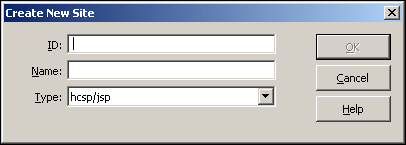
A.4 Create New Site Dialog
Designer uses a site connection to connect to and update a web site in the content server. You can create a web site using this dialog (accessible from the Site Connection Details dialog (see Section A.3, "Site Connection Details Dialog"). When creating a site, you specify a site ID, name, and type.
| Element | Description |
|---|---|
| ID | The identification of the web site. This ID is used to uniquely identify this site and its associated files in the content server (not to be confused with a Content ID).
You should use only valid characters (no spaces, no symbols, and so on), which this dialog forces you to do when you enter a value. You may also want to keep the value relatively short. You see the ID again when working with the "siteid" fragment parameter or CSP. |
| Name | The name of the web site.
The name that you use becomes the title of the project file in the content server, and it appears as the title of your site in the "Web Sites" menu in the content server. (This value does not affect the TITLE tag in your page templates.) |
| Type | The type, or scripting choice, for your web site:
hcsp/jsp: Creates an Idoc Script or JavaServer Pages-enabled web site, which governs other choices in Site Studio. asp: Creates an Active Server Pages-enabled web site, which governs other choices in Site Studio. You can create a web site in HCSP, JSP, or ASP. But only those sites built in HCSP have the full functionality, architecture and features introduced in Site Studio 10gR4. |
| OK | Saves your settings and closes the Create New Site dialog. |
| Cancel | Cancels your settings and closes the Create New Site dialog. |
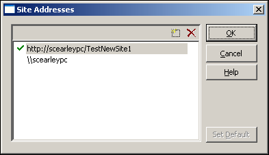
A.5 Site Addresses Dialog
You can open your site using a domain-based address or a folder-based address. Using this dialog, you can add one or more domain names that point to your web site.
| Element | Description |
|---|---|
| Click this to add a domain name that resolves to your web site.
(When you click this, a text box opens where you can enter your address and then click Enter.) |
|
| Deletes the selected site address. | |
| Set Default | Sets the selected address as the default address.
The default address is used in several places in Site Studio, such as by Designer to connect to and preview your site and when you assign content to a contribution region. |
| OK | Saves your settings and closes the Site Address dialog. |
| Cancel | Cancels your settings and closes the Site Address dialog. |
| Help | Opens the online help for this specific dialog. |
Before a domain name address works, you must properly configure the domain name (DNS record) on a name server.
The default folder address you see when you first open this dialog is the one used by Site Studio when the site was first created.
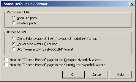
A.6 Choose Default Link Format Dialog
When you create a hyperlink in Designer and in Contributor, you have numerous choices regarding the format of the link. Using this dialog, you can choose a default link format for designers and contributors, and you can hide this option so that it does not appear in the Link Wizard (see Section A.18, "Link Wizard").
| Element | Description |
|---|---|
| Path-based URL | Absolute Path: Generates a full path. For example: <!--$ssServerRelativeSiteRoot-->products/index.htm (where "<!--$ssServerRelativeSiteRoot-->" gets replaced with the path to the root of the web site).
Relative path: Uses a relative path instead of a full path. For example: ../products/index.htm |
| ID-based URL | Contains the hard-coded ID of the target location without referencing a section name or label. Choose an option:
Client Side javascript:link() / javascript:nodelink() format: Uses client-side JavaScript and the ID of the target location. Server Side wcmUrl() format: Uses server-side Idoc Script and the ID of the target location. URL Token ssLINK / ssNODELINK format: Uses a Site Studio token and the ID of the target location. |
| Hide the "Choose Format" page in the Designer Hyperlink Wizard | Prevents the Create Hyperlink Wizard - Choose Format screen (see Section A.18.3, "Link Wizard - Choose URL Format") from displaying in the Create Hyperlink Wizard for designers. |
| Hide the "Choose Format" page in the Contributor Hyperlink Wizard | Prevents the Create Hyperlink Wizard - Choose Format screen (see Section A.18.3, "Link Wizard - Choose URL Format") from displaying in the Create Hyperlink Wizard for contributors. |
| OK | Saves your settings and closes the Choose Default Link Format dialog. |
| Cancel | Cancels your settings and closes the Choose Default Link Format dialog. |
| Help | Opens the online Help. |
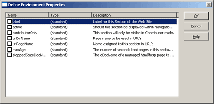
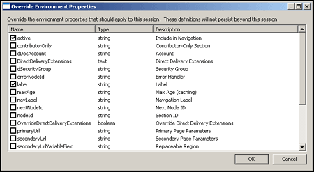
A.7 Define Environment Properties Dialog
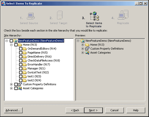
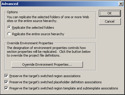
When replicating a web site, the properties of the site are replicated as well from one server to the next. In this dialog, you can specify properties that are not replicated and instead remain on the source server. The settings are called environment properties.
| Element | Description |
|---|---|
| Name | The name of the property.
Check the box beside the name to turn it into an environment property. |
| Type | The type of property. |
| Description | A description of the property. |
| OK | Saves your settings and closes the Environment Properties dialog. |
| Cancel | Cancels your settings and closes the Environment Properties dialog. |
| Help | Opens the online help for this specific dialog. |
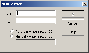
A.8 New Section Dialog
Each section in the site hierarchy contains a label, a URL directory name, and a section ID. These values are used repeatedly throughout your site. You can choose these values when you first create a section, and you can edit them after you create the section (using the Site Hierarchy pane and the Properties pane).
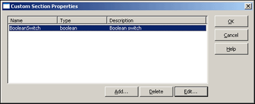
A.9 Custom Section Properties Dialog
Each section in the site hierarchy contains properties (ID, label, default placeholder definition, and so on). In addition to these, you can create a custom property and then modify the web site to read that value and consequently, perform a certain function. The custom section properties that you add to your site are listed here. You can edit or delete them at any time using this dialog.
| Element | Description |
|---|---|
| Name | Type | Description
(Viewing area) |
Displays existing custom section properties. |
| Add | Opens the Define Custom Section Property dialog (see Section A.10, "Define Custom Section Property Dialog"), where you can add a custom section property. |
| Delete | Deletes a custom section property. |
| Edit | Opens the Define Custom Section Property dialog (see Section A.10, "Define Custom Section Property Dialog"), where you can edit a custom section property. |
| OK | Saves your settings and closes the Define Custom Section Properties dialog. |
| Cancel | Cancels your settings and closes the Define Custom Section Properties dialog. |
| Help | Opens the online help for this specific dialog. |
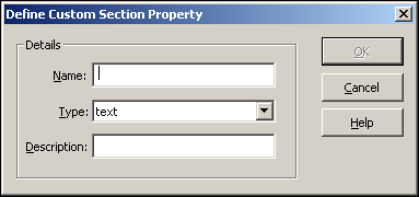
A.10 Define Custom Section Property Dialog
Each section in the site hierarchy contains properties (ID, label, default placeholder definition, and so on). In addition to these, you can create a custom property and then modify the web site to read that value and consequently, perform certain function. You can add and edit a custom section property using this dialog.
| Element | Description |
|---|---|
| Name | The name of the custom section property. The name displays in the Properties pane when you select a section in the Site Hierarchy pane. |
| Type | The type of action to take for this property (similar to the way a fragment parameter works).
text: Provides a simple text box that you can use to add text. bigtext: Provides a much larger text box (in a popup window) where you can add and edit text. boolean: Provides a True or False value that you can choose from. integer: Provides an integer value. The integer value may not contain decimal points. float: Provides a value, including decimal points. size: Provides a sizing value, in pixels or percentage. color: Provides an RGB hexadecimal value (for example, 0xFF0000) and a color picker. url: Provides a dialog (see Section A.18.1, "Link Wizard - Choose Type of Link") that you use to browse to a URL and then select it as a value. manageddoc: Opens a content server window that you can use to browse to a document in the content server and then select it as a value (dDocName). managedurl: Opens a content server window that you can use to browse to the URL of a document in the content server and then select it as a value. managedquery: Opens the Edit Query Text dialog (see Section A.22, "Edit Query Text Dialog"), where you can build a query. cssstyle: Provides a text box where you can specify a CSS style value. siteid: Provides a dialog (see Section A.16, "Select Site Dialog") that you use to select a web site in the content server. nodeid: Opens a dialog (see Section A.17, "Select Section Dialog") that you use to select a section in your site hierarchy. |
| Description | Optional setting used to display a description of the property at the bottom of the Properties pane. |
| OK | Adds the custom section property and closes the Define Custom Section Property dialog. |
| Cancel | Cancels your settings and closes the Define Custom Section Property dialog. |
| Help | Opens the online help for this specific dialog. |
After you add the custom section property, you must go through your site hierarchy and enter a value for each section. Then, you must modify your site assets to read that custom property and perform a certain function.
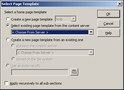
A.11 Select (Home) Page Template Dialog
A home page is like a primary page, except that it is associated with the root of the web site rather than one of its sections. It is the default, or landing, page for visitors when they enter the site. You can add a home page using this dialog.
| Element | Description |
|---|---|
| Create a new page template | Creates the home page with the file extension that you specify below:
hcsp: Use for Idoc Script web sites. jsp: Use for JSP web sites. asp: Use for ASP web sites. The available file extensions depend on the type of site you created using the Site Connection Details dialog (see Section A.3, "Site Connection Details Dialog"). You can create a web site in HCSP, JSP, or ASP. But only those sites built in HCSP have the functionality that is in 10gR4 and later releases. You should not create a web site in ASP or JSP unless you have determined that you have very specific needs that require a site built in ASP or JSP. |
| Select existing page template from the content server | Adds an existing page template (from the content server) to your web site, making it the home page. You can select it from the menu if the page template is one you created recently; if not, select <Choose From Server> to browse to it in the content server when this dialog closes. |
| Create a new page template from an existing one | Creates a copy of an existing page template and adds it to your web site, making it the home page. This action saves you time by letting you reuse another page template rather than re-create the design from scratch.
The page template that you are creating this from can come from one of two sources: stored in the content server: Selects a page template stored on the content server. You can select it from the menu if the page template is one you created recently; if not, select <Choose From Server> to browse to it in the content server when this dialog closes. stored on the file system: Selects a page template stored on the file system. This option can be especially useful if you created a page template on your file system and want to reuse it. The file, however, must have the appropriate file extension (.hcsp, .jsp, or .asp). |
| Use an external URL | This option applies only to primary pages (see Section A.12, "Select (Primary) Page Template Dialog"). |
| Apply recursively to all subsections | Applies the same page template to every section below this one in the site hierarchy.
This action is the same as opening each section in the site hierarchy, adding a page template, and choosing "Select existing page template from the content server." |
| OK | Closes the Select Page Template dialog and associates the page template with the root of your site hierarchy. |
| Cancel | Closes the Select Page Template dialog without associating a page template with the root of your site hierarchy. |
| Help | Opens the online help for this specific dialog. |
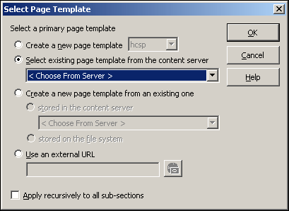
A.12 Select (Primary) Page Template Dialog
In most cases, each section in the site hierarchy contains a primary page, which acts as the default, or landing, page for that section. You can create a primary page for each section in the site hierarchy or reuse the same primary page throughout the site hierarchy. You can add a primary page using this dialog.
| Element | Description |
|---|---|
| Create a new page template | Creates a primary page for this section of the site, using the file extension that you specify below:
hcsp: Use for Idoc Script web sites. jsp: Use for JSP web sites. asp: Use for ASP web sites. The available file extensions depend on the type of site you created (see Section A.3, "Site Connection Details Dialog"). You can create a web site in HCSP, JSP, or ASP. But only those sites built in HCSP have the functionality that is in 10gR4 and later releases. You should not create a web site in ASP or JSP unless you have determined that you have very specific needs that require a site built in ASP or JSP. |
| Select existing page template from the content server | Adds an existing page template from the content server to your web site, making it the primary page for this section. You can select it from the menu if the page template is one you created recently; if not, select <Choose From Server> to browse to it in the content server when this dialog closes. |
| Create a new page template from an existing one | Creates a copy of an existing page template and adds it to your web site, making it the primary page for this section. This action saves you time by letting you reuse another page template rather than re-create the design from scratch.
The page template used to create the new one may come from one of two sources: stored in the content server: A page template stored on the content server is used. You can select it from the menu if the page template is one you created recently; if not, select <Choose From Server> to browse to it in the content server when this dialog closes. stored on the file system: A page template stored on the file system is used. This option is especially useful if you created a page template on your file system and want to reuse it. This file must have the appropriate file extension (.hcsp, .jsp, or .asp). |
| Use an external URL | Uses the web page of another web site (possibly a partner site or department-level site) instead of a page template. When visitors go to this section, they are taken to the URL that you specify here. |
| Apply recursively to all subsections | Applies this same page template to every section below this one. This is the same as opening each section below this one in the site hierarchy, adding a page template, and choosing "Select existing page template from the content server." |
| OK | Closes the Select Page Template dialog and associates the primary page with this section in the site hierarchy. |
| Cancel | Closes the Select Page Template dialog without associating the primary page with this section in the site hierarchy. |
| Help | Opens the online help for this specific dialog. |
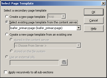
A.13 Select (Secondary) Page Template Dialog
In most instances, the secondary page is used for a list of items, or items found in a search. A secondary page can also serve as a backdrop for files (data files or native documents) added to the site by a contributor. As such, they are only required when you allow contributors to add files to the web site. You can add a secondary page to the root of your site and to a section of your site. Furthermore, you can create a secondary page or reuse a secondary page from another section. You add secondary pages using this dialog.
| Element | Description |
|---|---|
| Create a new page template | Creates a secondary page for this section of the site, using the file extension that you specify below:
hcsp: Use for Idoc Script web sites. jsp: Use for JSP web sites. asp: Use for ASP web sites. The available file extensions depend on the type of site you created (see Section A.3, "Site Connection Details Dialog"). You can create a web site in HCSP, JSP, or ASP. But only those sites built in HCSP have the functionality that is in 10gR4 and later releases. You should not create a web site in ASP or JSP unless you have determined that you have very specific needs that require a site built in ASP or JSP. |
| Select existing page template from the content server | Adds an existing page template from the content server to your web site, making it the secondary page for this section. You can select it from the menu if the page template is one you created recently; if not, select <Choose From Server> to browse to it in the content server when this dialog closes. |
| Create a new page template from an existing one | Creates a copy of an existing page template and adds it to your web site, making it the secondary page for this section. This action saves you time by letting you reuse another page template rather than re-create the design from scratch.
The page template used to create the new one may come from one of two sources: stored in the content server: A page template stored on the content server is used. You can select it from the menu if the page template is one you created recently; if not, select <Choose From Server> to browse to it in the content server when this dialog closes. stored on the file system: A page template stored on the file system is used. This option is especially useful if you created a page template on your file system and want to reuse it. This file must have the appropriate file extension (.hcsp, .jsp, or .asp). |
| Use an external URL | This option applies only to primary pages (see Section A.12, "Select (Primary) Page Template Dialog"). |
| Apply recursively to all subsections | Applies this same page template to every section below this one. This is the same as opening each section below this one in the site hierarchy, adding a page template, and choosing "Select existing page template from the content server." |
| OK | Closes the Select Page Template dialog and associates the secondary page with this section in the site hierarchy. |
| Cancel | Closes the Select Page Template dialog without associating the secondary page with this section in the site hierarchy. |
| Help | Opens the online help for this specific dialog. |
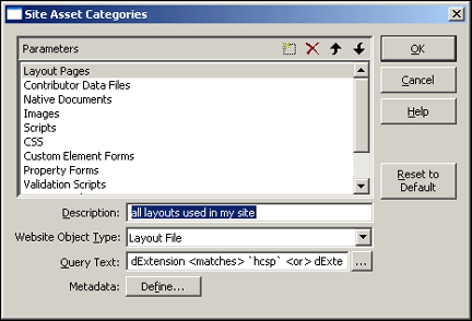
A.14 Site Asset Categories Dialog
You use the Site Asset Categories dialog to customize and even add categories to the Site Assets pane in Designer.
| Element | Description |
|---|---|
| Creates a category. (A text box opens where you can enter your category and then click Enter.) | |
| Deletes an existing category. (Existing files in that category are not deleted from the content server.) | |
| Moves the selected category up in the list. | |
| Moves the selected category down in the list. | |
| Description | Describes the asset category. |
| Website Object Type | Indicates the Website Object Type for the asset. |
| Query Text | The query that is performed in the content server to display the assets that belong to this category.
Normally, the query picks up everything that contains the correct Type (from above), but you can use this value to further customize the assets that should appear in this category. The Additional Information button opens the Edit Query Text dialog (see Section A.22, "Edit Query Text Dialog"), where you specify, test, and capture a custom query. |
| Metadata | Click to open the Enable Metadata Modification dialog (see Section A.15, "Enable Metadata Modification Dialog"), where you can make particular metadata available when you add an asset using the Site Assets pane. |
| OK | Saves your settings and closes the Site Asset Categories dialog. |
| Cancel | Cancels your settings and closes the Site Asset Categories dialog. |
| Help | Opens the online help for this specific dialog. |
| Reset to Default | Resets the default Site Asset categories (removing any categories that you may have created). |
In order for a site asset to appear in the Site Assets pane, it must have the appropriate Websites and Website Object Type metadata assigned to it in the content server.
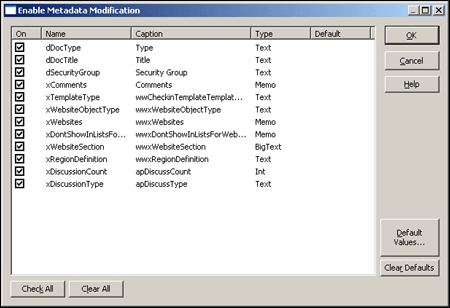
A.15 Enable Metadata Modification Dialog
You can specify the metadata that is available when you add an asset using the Site Assets pane. You can also specify the default metadata that is assigned to each new asset.
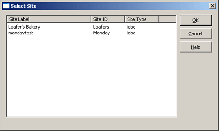
A.16 Select Site Dialog
You use this dialog when you must specify a web site in the content server where a piece of content should appear (also referred to as the target location). One such place is in a fragment parameter or custom section property of type "siteid."
| Element | Description |
|---|---|
| Site Label | Site ID | Site Type | Displays the available web sites in the content server.
Select the web site to use. |
| OK | Saves your settings and closes the Select Site dialog. |
| Cancel | Cancels your settings and closes the Select Site dialog. |
| Help | Opens the online help for this specific dialog. |
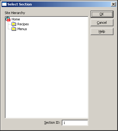
A.17 Select Section Dialog
When identifying where a piece of content should appear (such as specifying the value for a fragment parameter of type "nodeid"), It may be necessary to select the section on your web site as the target location. You can do so using this dialog.
| Element | Description |
|---|---|
| Site Hierarchy | Displays the available sections in the site hierarchy.
Click the section to use it as a value. |
| Section ID | The node ID for a section. A value is inserted automatically if you select a section using the site hierarchy window.
You can also manually enter a value. |
| OK | Saves your settings and closes the Select Section dialog. |
| Cancel | Cancels your settings and closes the Select Section dialog. |
| Help | Opens the online help for this specific dialog. |
A.18 Link Wizard
The Link wizard can be used to create different types of links to different locations on your site or other sites.
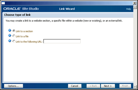
A.18.1 Link Wizard - Choose Type of Link
The first screen in the Link wizard asks you to choose the link type. Depending on your choice here, you see different options in the wizard.
| Element | Description |
|---|---|
| Link to a section | Creates a link to another section on your site or a section on another site in the content server. |
| Link to a file | Creates a link to a contributor data file or native document on your site or another site in the content server.
You have the option later on to create a link to a new or existing file. |
| Link to following URL | Creates a link to the URL that you specify in this text box. |
| Cancel | Cancels your settings and closes the Link wizard. |
| Back | Disabled on this screen. |
| Next | Takes you to the next screen in the wizard. |
| Help | Opens the online help for this specific dialog. |
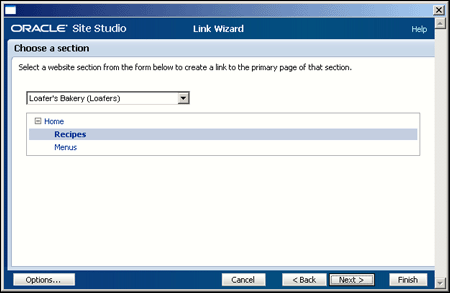
A.18.2 Link Wizard - Choose a Section
On this screen in the Link wizard, you identify the section to link to.
| Element | Description |
|---|---|
| Menu | Lists the available sites in the content server that you can create a link to. |
| Site hierarchy window | Lists the sections on the selected site (from above) that you can create a link to. |
| Cancel | Cancels your settings and closes the Link wizard. |
| Back | Takes you to the previous screen in the wizard. |
| Next | Takes you to the next screen in the wizard. |
| Finish | Completes the wizard and inserts the link. |
| Help | Opens the online help for this specific dialog. |
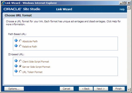
A.18.3 Link Wizard - Choose URL Format
In the Link wizard, you can use several different linking formats for the hyperlink. There are advantages and disadvantages to each format.
| Element | Description |
|---|---|
| Path Based URL | The link contains a path to the target location. You have two choices for this type of link:
Absolute Path: Generates a full path. For example: <!--$ssServerRelativeSiteRoot-->products/index.htm (where "<!--$ssServerRelativeSiteRoot-->" gets replaced with the path to the root of the web site). Relative Path: Generates a relative path instead of a full path. For example: ../products/index.htm. |
| ID Based URL | The link contains the coded identity of the target location rather than the path-based name. You have three choices for this type of link.
Client Side Script Format: Uses client-side JavaScript to construct a link to the target location. For example: javascript:nodelink('123');, javascript:link('myfile');, or javascript:link('myfile','123');. Server Side Script Format: Uses server-side Idoc Script to construct a link to the target location. For example: <!--$ssNodeLink("123")-->, <!--$ssLink("myfile")-->, or <!--$ssLink("myfile","123")-->. URL Token Format: Uses a redirect on the server to construct a link to the target location. For example: ssNODELINK/123, ssLINK/myfile, or ssLINK/123/myfile. |
| Cancel | Cancels your settings and closes the Link wizard. |
| Back | Takes you to the previous screen in the wizard. |
| Next | Takes you to the next screen in the wizard. |
| Finish | Completes the wizard and inserts the link. |
| Help | Opens the online help for this specific dialog. |
If you know that you always want to choose the same format, you can hide this screen so that it does not display again, for both designers and contributors, using the Choose Default Link Format dialog (see Section A.6, "Choose Default Link Format Dialog").
The "Path-based URL" option may be disabled, depending on what you chose on the previous screen (for example, if you're creating a link to a file and you choose its Web Site Section metadata as the target section).
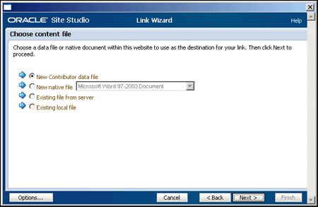
A.18.4 Link Wizard - Choose Content File
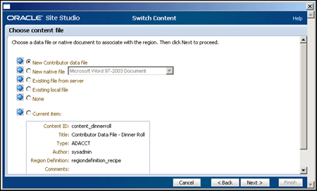
In the Link wizard, you can create a link to a new or existing contributor data file or native document. If you create a link to a new file, you can choose the type of file from a list and Site Studio checks it in for you. If you choose an existing file, you can select one from the content server or browse for one locally.
| Element | Description |
|---|---|
| New Contributor data file | Choose to check in a new contributor data file that is the target of the link. |
| New native file | Choose to check in a new native document to target in the link.
Select the native document type in the menu. |
| Existing file from server | Choose to view the files associated with the current web site on the server.
The file selected is the target for the link. |
| Existing local file | Choose to check in a local file to target in the link. |
| Current item | Choose to select the current file as the link target. |
| Cancel | Cancels your settings and closes the Link wizard. |
| Back | Takes you to the previous screen in the wizard. |
| Next | Takes you to the next screen in the wizard. |
| Help | Opens the online help for this specific dialog. |
When you use the Link wizard to select a file or add a file to your site, Site Studio automatically assigns the appropriate metadata to the file so that it is recognized as part of your site.
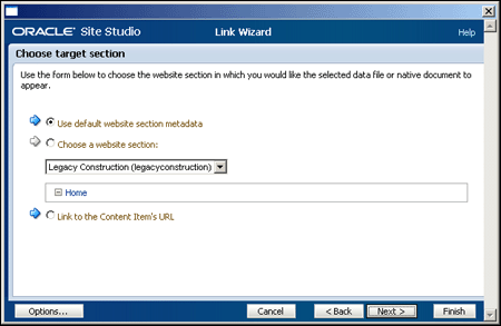
A.18.5 Link Wizard - Choose Target Section
In the Link wizard, you can create a link to a contributor data file or native document, and you can control where that file appears on the web site when the link is clicked. This has no relation to where the file is actually stored on the web site or the content server. You can specify any location on your site or another site.
Alternatively, you can let Site Studio identify the section where the file is currently used in the web site.
| Element | Description |
|---|---|
| Use default website section metadata | The file opens in the section where it is stored (using the metadata defined in xWebsiteSection).
If you choose this value, you must use an ID-based link format on the next screen. |
| Choose a website section | The file opens in the section that you specify in the menu. |
| Menu | Lists the available sites in the content server.
Select one of these sites as the target location for your file. |
| Site hierarchy window | Lists the available sections on the selected site (from above).
Select one of these sections as the target location for your file. |
| Link to the Content Item's URL | The link created links directly to the item's web layout URL. |
| Options | Opens a link options dialog (see Section A.18.8, "Link Wizard - Link Target Options"). |
| Cancel | Cancels your settings and closes the Link wizard. |
| Back | Takes you to the previous screen in the wizard. |
| Next | Takes you to the next screen in the wizard. |
| Finish | Completes the wizard and inserts the link. |
| Help | Opens the online help for this specific dialog. |
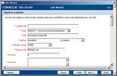
A.18.6 Link Wizard - Check-In Content
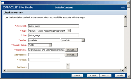
When you create a link to a new file, or are linking to one hosted locally, then the item is checked into the content server. This section of the wizard is used to collect all of the necessary content server data. All fields marked in red are required; that is, the item cannot be checked in without providing values for these fields.
A.18.7 Link Wizard - Confirmation
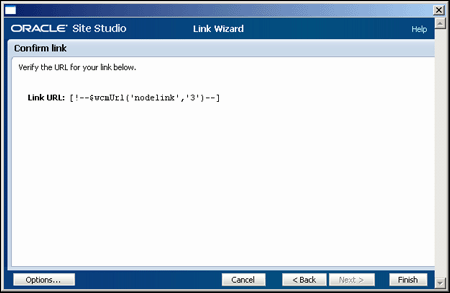
On the last screen in the Link wizard, you see what your hyperlink looks like.
| Element | Description |
|---|---|
| Link URL | Shows what the generated link looks like.
You can view this link as is or copy and paste it into another file. |
| Options | Opens a link options dialog (see Section A.18.8, "Link Wizard - Link Target Options"). |
| Cancel | Cancels your settings and closes the Link wizard. |
| Back | Takes you to the previous screen in the wizard. |
| Finish | Completes the wizard and inserts the link. |
| Help | Opens the online help for this specific dialog. |
A.18.8 Link Wizard - Link Target Options
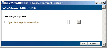
The options of the link are available in this smaller dialog from any point in the wizard. Here you can control whether the link opens in a new window or not.
| Element | Description |
|---|---|
| Open link target in new window | When checked, the link opens in a new browser window.
_blank: The value specified when the link is opened. |
| Ok | Accepts the entered options and returns you to the screen the dialog was launched from. |
| Cancel | Cancels your settings and closes the Link Target Options dialog. |
Choosing the "Open link target in new window" is useful when you want to prevent visitors from inadvertently leaving the web page when they click the link.
A.19 Contribution Region Dialog
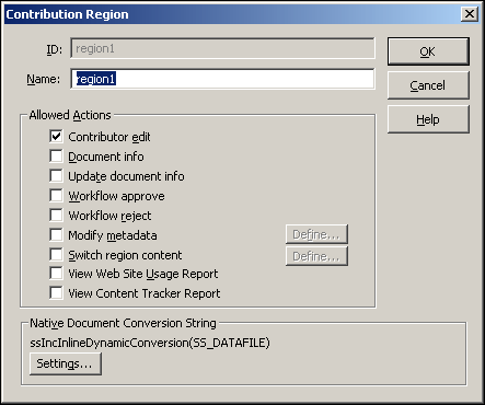
A contribution region allows contributors to edit a portion of the web page using the Contributor application or a third-party application (when native documents are used). You can add a contribution region to a page template, specify the options that are available to contributors, and customize document conversion settings (for native documents) in this dialog.
| Element | Description |
|---|---|
| ID | An identification automatically generated by Site Studio. |
| Name | The name that you give to the contribution region. The name displays in Design view to represent the region. (The name of the region is used for coding purposes and may not contain spaces, or non-ASCII or special characters.)
If you reuse the same data file on multiple page templates, then the name of the region and its elements on each page must be the same. |
| Contributor edit | Makes the contribution region editable. Consequently, contributors can edit the content assigned to the region by left-clicking the contribution icon or right-clicking the icon and choosing Edit (to launch Contributor for data files) or Check Out and Open (to launch a third party application for native documents). |
| Document info | Adds a "Document Info" link to the right-click menu of the contribution icon. Contributors can use this to go to the Content Information page for the data file or native document assigned to the region. |
| Workflow approve | Adds an "Approve Document" link to the right-click menu of the contribution icon. Contributors (contributors designated as reviewers or contributors in the workflow) use this to approve the data file or native document assigned to the region. |
| Workflow reject | Adds a "Reject Document" link to the right-click menu of the contribution icon. Reviewers (contributors designated as reviewers or contributors in the workflow) use this to reject the data file or native document assigned to the region. |
| Modify metadata | Takes contributors to the Assign Info Form page before saving the data file assigned to the region so that they can update the metadata for the data file.
Define: Opens the Enable Metadata Modification dialog (see Section A.15, "Enable Metadata Modification Dialog"), where you can specify the metadata that is available to contributors when they save the file assigned to the region. |
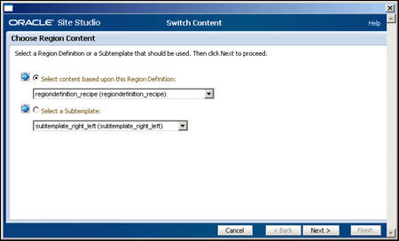
| Switch region content | Adds a "Switch Region Content" link to the right-click menu of the contribution icon. Contributors use this to create a file (contributor data file or native document) or browse to an existing file and assign it to the region.
Define: Opens the Region Content Options dialog (see Section A.20, "Region Content Options Dialog"), where you specify the options that are available to a contributor when switching or assigning content to the region. |
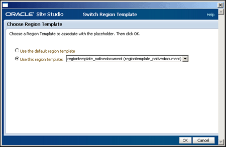
| Switch region template | Adds a "Switch Region Template" link to the right-click menu of the contribution icon. Contributors use this to select a different region template to use in the contribution region. |
| View Web Site Usage Report | Adds a "View Web Site Usage Report" link to the right-click menu of the contribution icon. Contributors use this to view a site report showing where the file (the contributor data file or native document assigned to the region) is used throughout the site. |
| View Content Tracker Report | Adds a "View Content Tracker Report" link to the right-click menu of the contribution icon. Contributors use this to view a site report showing how many times a file (the contributor data file or native document assigned to the region) was viewed and who viewed it. |
| Settings | Opens the Native Document Conversion Settings dialog (see Section A.24, "Native Document Conversion Settings Dialog (Legacy)"), where you specify a Dynamic Converter template or rule that is used to convert native documents assigned to the region. |
| OK | Saves your settings and closes the Contribution Region dialog. |
| Cancel | Cancels your settings and closes the Contribution Region dialog. |
| Help | Opens the online help for this specific dialog. |
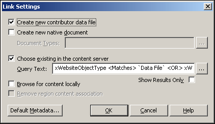
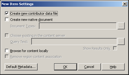
A.20 Region Content Options Dialog
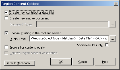
The types of files that a contributor can assign are defined using this dialog.
| Element | Description |
|---|---|
| Create new contributor data file | Allows a contributor to create a contributor data file and assign it. |
| Create new native document | Allows a contributor to create a native document and assign it.
Document Types: Specifies which native documents a contributor can create. The Additional Information button opens the Choose Document Types dialog (see Section A.21, "Choose Document Types Dialog"), which you can use to select native document types from a list. |
| Choose existing in the content server | Allows a contributor to search the content server for an existing contributor data file or native document and assign it.
Query Text: Specifies the actual query that is performed in the content server to display existing files. The Additional Information button opens the Edit Query Text dialog (see Section A.22, "Edit Query Text Dialog"), which you can use to create, capture, and test the query used to display existing files. Show Results Only: Shows only the search results and not the content server environment. (This is useful when you want to prevent contributors from browsing to other content in the content server.) |
| Browse for content locally | Allows a contributor to browse for a file on the local file system and check that file in. |
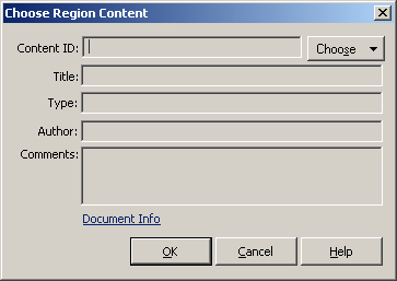
| Remove region content association | Allows the contributor to remove an existing contributor data file or native document already assigned. (This adds a "None" option to the Choose Region Content dialog.) |
| Default Metadata | Opens the Enable Metadata Modification dialog (see Section A.15, "Enable Metadata Modification Dialog"), where you specify the metadata that is available to the contributor and the default metadata that is assigned when a contributor creates a file. |
| OK | Saves your settings and closes the Region Content Options dialog. |
| Cancel | Cancels your settings and closes the Region Content Options dialog. |
| Help | Opens the online help for this specific dialog. |
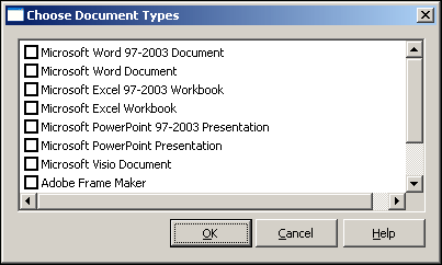
A.21 Choose Document Types Dialog
When you allow a contributor to create a native document and add it to the site, you must specify the type of native document that they can create (for example, Microsoft Word, Excel, and PowerPoint).
| Element | Description |
|---|---|
| List of file types | Displays the native documents that are available on your system. Check the box beside the type of document to allow contributors to create.
Not all document types in this dialog are supported for contribution (for example, image authoring software). |
| OK | Saves your settings and closes the Choose Document Types dialog. |
| Cancel | Cancels your settings and closes the Choose Document Types dialog. |
| Help | Opens the online help for this specific dialog. |
A.22 Edit Query Text Dialog
There are numerous occasions when you want to specify a custom query to perform in the content server. This query searches for files matching one or more metadata values and then opens those results in Designer, Contributor, or the web site (depending on the element you're using).
You can specify, test, and capture your query using this dialog.
| Element | Description |
|---|---|
| [Text field] | Use this text box to specify your query. |
| Capture Query | Opens the Content Query Capture screen in the content server that you use to perform a query and then save (capture) that query. |
| Test Query | Use to test your query in the content server. |
| OK | Saves your settings and closes the Edit Query Text dialog. |
| Cancel | Cancels your settings and closes the Edit Query Text dialog. |
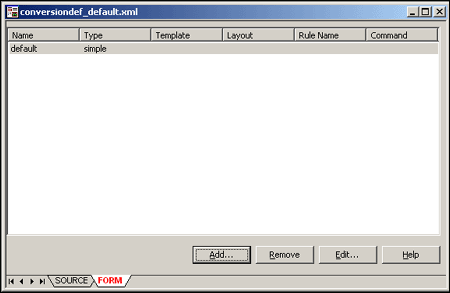
A.23 Conversion Definition Dialog
The conversion definition dialog is used to organize and assign the conversion template or rule as a site asset. After a conversion definition is created and named, then it can be used as a site asset.
| Element | Description |
|---|---|
| Conversion Definition | Each named conversion definition is listed. |
| Add | Opens the Native Document Conversion Settings dialog (see Section A.25, "Native Document Conversion Settings Dialog") to add a dynamic conversion template or rule to a conversion definition. |
| Remove | Removes the selected conversion definition. |
| Edit | Opens the data for the selected definition in the Native Document Conversion Settings dialog (see Section A.25, "Native Document Conversion Settings Dialog") to edit the selected conversion definition. |
| Help | Opens the online help for this specific dialog. |
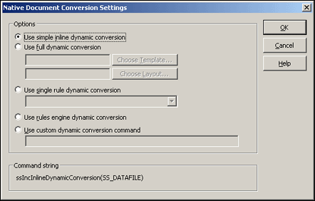
A.24 Native Document Conversion Settings Dialog (Legacy)
When you assign a native document to a contribution region, you can specify a (Dynamic Converter) template or rule that is used to convert the document into a web page. You do so using this dialog.
| Element | Description |
|---|---|
| Use simple inline dynamic conversion | A blank template is used to convert the native document. This template contains minimal conversion settings, and therefore the resulting web page appears similar to the original document (which may or may not be desirable). |
| Use full dynamic conversion | Specifies a Dynamic Converter conversion template and layout page template currently checked into the content server.
Choose Template: Opens a content server window where you can select a conversion template. Choose Layout: Opens a content server window where you can select a Dynamic Converter layout page. For the layout, we recommend using "snippet_layout.txt" because it strips out the opening and closing HTML tags. This allows the converted document to be inserted into another web page, which is necessary for Site Studio. |
| Use single rule dynamic conversion | Specifies a single conversion rule that evaluates and converts the native document. You can select the rule from the menu. |
| Use rules engine dynamic conversion | Specifies that the default rule evaluation be applied to evaluate and convert the native document. |
| Use custom dynamic conversion command | Specifies a custom script that is used to convert the native document.
You can use this option to add your own Idoc Script to the conversion sequence. If you choose this, you can copy the existing conversion syntax from the Command string area (below), paste it into this field, and add your custom script to it. A dynamic conversion does not take place if the conversion command is missing or invalid. |
| Command string | Displays the conversion syntax that is used to convert the native document. |
| OK | Saves your settings and closes the Native Document Conversion Settings dialog. |
| Cancel | Cancels your settings and closes the Native Document Conversion Settings dialog. |
| Help | Opens the online help for this specific dialog. |
Before using this feature, you must create a conversion template or rule in Dynamic Converter.
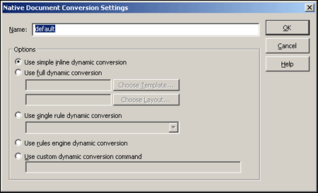
A.25 Native Document Conversion Settings Dialog
When you add a native document to a web page, the conversion definitions can specify a (Dynamic Converter) template or rule that is used to convert the document into a web page. You do so using this dialog.
| Element | Description |
|---|---|
| Name | The name of the conversion for identification. |
| Use simple inline dynamic conversion | A blank template is used to convert the native document. This template contains minimal conversion settings, and therefore the resulting web page appears similar to the original document (which may or may not be desirable). |
| Use full dynamic conversion | Specifies a Dynamic Converter conversion template and layout page currently checked into the content server.
Choose Template: Opens a content server window where you can select a conversion template. Choose Layout: Opens a content server window where you can select a Dynamic Converter layout page. For the layout, we recommend using "snippet_layout.txt" because it strips out the opening and closing HTML tags. This allows the converted document to be inserted into another web page, which is necessary for Site Studio. |
| Use single rule dynamic conversion | Specifies a single conversion rule that evaluates and converts the native document. You can select the rule from the menu. |
| Use rules engine dynamic conversion | Specifies that the default rule evaluation be applied to evaluate and convert the native document. |
| Use custom dynamic conversion command | Specifies a custom script that is used to convert the native document.
You can use this option to add your own Idoc Script to the conversion sequence. If you choose this, you can copy the existing conversion syntax from the Command string area (below), paste it into this field, and add your custom script to it. A dynamic conversion does not take place if the conversion command is missing or invalid. |
| Command string | Displays the conversion syntax that is used to convert the native document. |
| OK | Saves your settings and closes the Native Document Conversion Settings dialog. |
| Cancel | Cancels your settings and closes the Native Document Conversion Settings dialog. |
| Help | Opens the online help for this specific dialog. |
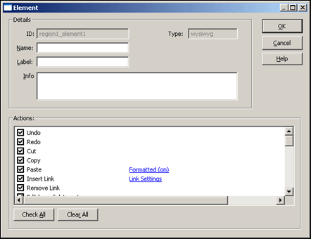
A.26 WYSIWYG Element Dialog
The WYSIWYG element becomes a field in Contributor where users (contributors) add, edit, and delete text, graphics, and more. You can control the contributor's experience using this dialog. This particular element is used in legacy sites.
| Element | Description |
|---|---|
| ID | The identification that Site Studio assigns to the element. |
| Name | The name you assign to the element. It should not contain spaces, or non-ASCII or special characters.
If you reuse the same data file in multiple places, then the name of the region and its elements on each page must be the same. |
| Label | Briefly describes the element. The label displays beside the field in Contributor to let individual contributors know what content should go there. |
| Info | Provides a more detailed description of the element. This description appears as a tooltip when contributors hover their mouse over the Info icon in Contributor. |
| Type | Indicates the type of element you are adding. |
| Actions | Actions determine the available editing options for a contributor:
Undo: Contributors can undo their last edit. Redo: Contributors can redo their last edit. Cut: Contributors can cut text and images. Copy: Contributors can copy text and images. Paste: Contributors can paste text and images.
Insert Link: Contributors can create hyperlinks.
Remove Link: Contributors can remove hyperlinks. Edit hyperlink targets: Contributors can edit the file that is the target of a hyperlink (using the Element menu and right-click menu). Bold: Contributors can make the text bold. Italic: Contributors can make the text italic. Underline: Contributors can underline the text. Remove Formatting: Contributors can remove text formatting. Ordered List: Contributors can add an ordered (numbered) list. Unordered List: Contributors can add an unordered (bulleted) list. Indent: Contributors can indent text and images. Outdent: Contributors can outdent text and images. Left Justify: Contributors can left-align text and images. Center Justify: Contributors can center text and images. Right Justify: Contributors can right-align text and images. Insert Image: Contributors can add/replace images (gif, jpg, and png).
Insert Horizontal Rule: Contributors can add a horizontal rule. Insert Line Break: Contributors can add a line break. Insert Non-Breaking Space: Contributors can add a non-breaking space. |
| Actions (continued) | Change Font Face: Contributors can change the font face.
Change Font Size: Contributors can change the font size. Change Foreground Color: Contributors can change the text color. Change Background Color: Contributors can change the text background color. Spell Checker: Contributors can perform a spell check. Required: Requires information in the field before Contributor closes. Apply CSS Classes: Contributors can use different CSS classes.
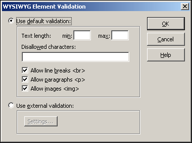
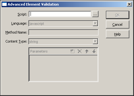
Table Support: Contributors can add and edit tables. Validation: Used to validate the content added in Contributor (allowing you to enforce certain content requirements for contributors).
Edit Object Properties:When selected, contributors can modify the object properties. Custom Configuration:
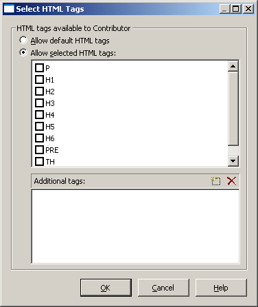
Accessibility Report: When selected, contributors can run an accessibility report on webpages from the WYSIWYG toolbar to see if the pages are compliant with multiple accessibility standards. Please note that this option is meaningful only if Ephox is used as the Contributor editor (which is not the default). Source Mode: Used to allow contributors to select to edit in WYSIWYG or HTML. If unselected, contributors can edit only in WYSIWYG. Expand Editor: Used to allow contributors to view the editing area full-screen. Please note that this option is meaningful only if Ephox is used as the Contributor editor (which is not the default). Apply HTML Tags: Used to determine which tags are available to Contributors who edit in HTML.
Set Element Height: Used to set a fixed height of the element.
Do Not Enclose Text in Editor: Used to define how carriage returns are handled in HTML. If text is enclosed, each time the contributor enters a return, a paragraph is created. If not enclosed, a line break is inserted for each return. Please note that this option is meaningful only if Ephox is used as the Contributor editor (which is not the default). Override Editor CSS: Used to implement a style sheet for the editor window. |
| Check All | Checks all of the actions so that a contributor has all available editing options. |
| Clear All | Clears all of the metadata values so that a contributor has no editing options. |
| OK | Saves your settings and closes the WYSIWYG Element dialog. |
| Cancel | Cancels your settings and closes the WYSIWYG Element dialog. |
| Help | Opens the online help for this specific dialog. |
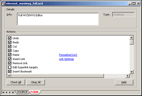
A.27 WYSIWYG Element Definition Dialog
The WYSIWYG element becomes a field in Contributor where users (contributors) add, edit, and delete text, graphics, and more. You can control the contributor's experience using this dialog.
| Element | Description |
|---|---|
| Info | Provides a more detailed description of the element. This description appears as a tooltip when contributors hover their mouse over the Info icon in Contributor. |
| Type | Indicates the type of element you are adding. |
| Actions | Actions determine the available editing options for a contributor:
Undo: Contributors can undo their last edit. Redo: Contributors can redo their last edit. Cut: Contributors can cut text and images. Copy: Contributors can copy text and images. Paste: Contributors can paste text and images.
Insert Link: Contributors can create hyperlinks.
|
| Actions
(continued) |
Remove Link: Contributors can remove hyperlinks.
Edit hyperlink targets: Contributors can edit the file that is the target of a hyperlink (using the Element menu and right-click menu). Insert bookmark: Contributors can insert a bookmarking link. Bold: Contributors can make the text bold. Italic: Contributors can make the text italic. Underline: Contributors can underline the text. Superscript: Contributors can make the text superscript. Subscript: Contributors can make the text subscript. Strikethrough: Contributors can mark the text with a strikethrough bar. Remove Formatting: Contributors can remove text formatting. Ordered List: Contributors can add an ordered (numbered) list. Unordered List: Contributors can add an unordered (bulleted) list. Indent: Contributors can indent (move to the right) text and images. Outdent: Contributors can outdent (move to the left) text and images. Left Justify: Contributors can left-align text and images. Center Justify: Contributors can center text and images. Right Justify: Contributors can right-align text and images. Full Justify: Contributors can fully justify the text and images. Blockquote: Contributors can place and align the text within a blockquote. Insert Image: Contributors can add/replace images (gif, jpg, and png).
Insert Horizontal Rule: Contributors can add a horizontal rule. Insert Line Break: Contributors can add a line break. Insert Symbol: Contributors can add a special character from the symbol map. Edit hyperlink targets: Contributors can edit the file that is the target of a hyperlink (using the Element menu and right-click menu). Change Font Face: Contributors can change the font face. Change Font Size: Contributors can change the font size. Change Foreground Color: Contributors can change the text color. Change Background Color: Contributors can change the text background color. Spell Checker: Contributors can perform a spell check. Required: Requires information in the field before Contributor closes. Apply CSS Classes: Contributors can use different CSS classes.
Table Support: Contributors can add and edit tables. Form support: Contributors can add and edit forms. |
| Actions (continued) | Validation: Used to validate the content added in Contributor (allowing you to enforce certain content requirements for contributors).
Edit Object Properties:When selected, contributors can modify the object properties. Insert Flash: Contributors can insert Flash files.
Custom Configuration: Used to allow configuration scripts to modify the contributor's editing window.
Accessibility Report: When selected, contributors can run an accessibility report on webpages from the WYSIWYG toolbar to see if the pages are compliant with multiple accessibility standards. Please note that this option is meaningful only if Ephox is used as the Contributor editor (which is not the default). Select All: Contributors can select everything within the editor. Print: Contributors can print the content as it appears in the editor. Content is not formatted as it would appear on the web page. Find and Replace: Contributors can perform find and replace functions when editing. Show HTML Elements: Contributors can view where HTML tags are used with the data and how they are used. Source Mode: Used to allow contributors to select to edit in WYSIWYG or HTML. If unselected, contributors can edit only in WYSIWYG. Expand Editor: Used to allow contributors to view the editing area full-screen. Apply HTML Tags: Used to determine which tags are available to Contributors who edit in HTML.
Set Element Height: Used to set a fixed height of the element.
Do Not Enclose Text in Editor: Used to define how carriage returns are handled in HTML. If text is enclosed, each time the contributor enters a return, a paragraph is created. If not enclosed, a line break is inserted for each return. Override Editor CSS: Used to implement a style sheet for the editor window.
|
| Check All | Checks all of the actions so that a contributor has all available editing options. |
| Clear All | Clears all of the metadata values so that a contributor has no editing options. |
| OK | Saves your settings and closes the WYSIWYG Element dialog. |
| Cancel | Cancels your settings and closes the WYSIWYG Element dialog. |
| Help | Opens the online help for this specific dialog. |
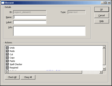
A.28 Plain Text Element Dialog
The Plain Text element becomes a field in Contributor where users perform basic (and somewhat limited) edits, such as cut, copy, and paste. This can be useful when you want to prevent contributors from formatting text (and thereby creating more consistent, or possibly cleaner web pages). This particular element is used in legacy sites.
| Element | Description |
|---|---|
| ID | The identification that Site Studio assigns to the element. |
| Name | The name you assign to the element. This is used for coding purposes and as such should not contain spaces, or non-ASCII or special characters.
If you reuse the same data file in multiple places, then the name of the region and its elements on each page must be the same. |
| Label | Briefly describes the element. The label opens beside the field in Contributor to let individual contributors know what content should go there. |
| Info | Provides a more detailed description of the element. This description appears as a tooltip when contributors hover their mouse over the Info icon in Contributor. |
| Type | Indicates the type of element you are adding. |
| Actions | Actions determine the available editing options for a contributor:
Undo: Contributors can undo their last edit. Redo: Contributors can redo their last edit. Cut: Contributors can cut text. Copy: Contributors can copy text. Paste: Contributors can paste text.
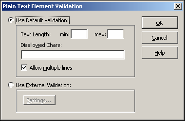
Spell Checker: Contributors can spell check their work. Required: Requires contributors to enter information in the field before Contributor closes. Validation: Used to validate the content added in Contributor (allowing you to enforce certain content requirements for contributors).
Custom Configuration:
Set Element Height: Used to set a fixed height of the element.
|
| Check All | Checks all of the actions so that a contributor has all available editing options. |
| Clear All | Clears all of the metadata values so that a contributor has no editing options. |
| OK | Saves your settings and closes the Plain Text Element dialog. |
| Cancel | Cancels your settings and closes the Plain Text Element dialog. |
| Help | Opens the online help for this specific dialog. |
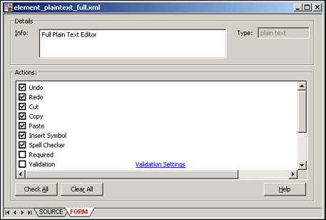
A.29 Plain Text Element Definition Dialog
The Plain Text element becomes a field in Contributor where users perform basic (and somewhat limited) edits, such as cut, copy, and paste. This can be useful when you want to prevent contributors from formatting text (and thereby creating more consistent, or possibly cleaner web pages).
| Element | Description |
|---|---|
| Info | Provides a more detailed description of the element. This description appears as a tooltip when contributors hover their mouse over the Info icon in Contributor. |
| Type | Indicates the type of element you are adding. |
| Actions | Actions determine the available editing options for a contributor:
Undo: Contributors can undo their last edit. Redo: Contributors can redo their last edit. Cut: Contributors can cut text. Copy: Contributors can copy text. Paste: Contributors can paste text. Insert Symbol: Contributors can add a special character from the symbol map. Spell Checker: Contributors can spell check their work. Required: Requires contributors to enter information in the field before Contributor closes. Validation: Used to validate the content added in Contributor (allowing you to enforce certain content requirements for contributors).
Custom Configuration: Used to allow configuration scripts to modify the contributor's editing window.
Select All: Contributors can select everything within the editor. Print: Contributors can print the content as it appears in the editor. Content is not formatted as it would appear on the web page. Find and Replace: Contributors can perform find and replace functions when editing. |
| Actions
(continued) |
Set Element Height: Used to set a fixed height of the element.
Override Editor CSS: Used to implement a style sheet for the editor window.
|
| Check All | Checks all of the actions so that a contributor has all available editing options. |
| Clear All | Clears all of the metadata values so that a contributor has no editing options. |
| OK | Saves your settings and closes the Plain Text Element dialog. |
| Cancel | Cancels your settings and closes the Plain Text Element dialog. |
| Help | Opens the online help for this specific dialog. |
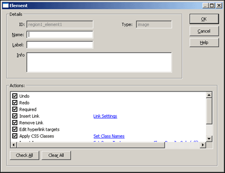
A.30 Image Element Dialog
The Image element becomes a field in Contributor where users can perform basic edits that relate to handling images, such as inserting an image, inserting a link, and applying a CSS class. This can be useful when you want to limit a contributor's capabilities to simply editing images. This particular element is used in legacy sites.
| Element | Description |
|---|---|
| ID | The identification that Site Studio assigns to the element. |
| Name | The name you assign to the element. This is used for coding purposes and as such should not contain spaces, or non-ASCII or special characters.
If you reuse the same data file in multiple places, then the name of the region and its elements on each page must be the same. |
| Label | Briefly describes the element. The label opens beside the field in Contributor to let individual contributors know what content should go there. |
| Info | Provides a more detailed description of the element. This description appears as a tooltip when contributors hover their mouse over the Info icon in Contributor. |
| Type | Indicates the type of element you are adding. |
| Actions | Actions determine the available editing options for a contributor:
Undo: Contributors can undo their last edit. Redo: Contributors can redo their last edit. Required: Requires information in the field before Contributor closes. Insert Link: Contributors can create hyperlinks.
Remove Link: Contributors can remove hyperlinks. Edit hyperlink targets: Contributors can edit the file that is the target of a hyperlink (using the Element menu and right-click menu). Apply CSS Classes: Contributors can use different CSS classes.
Insert Image: Contributors can add/replace images (gif, jpg, and png).
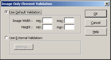
Validation: Used to validate the content added in Contributor (allowing you to enforce certain content requirements for contributors).
Edit Object Properties:When selected, contributors can modify the object properties. Custom Configuration:
Set Element Height: Used to set a fixed height of the element.
|
| Check All | Checks all of the actions so that a contributor has all available editing options. |
| Clear All | Clears all of the metadata values so that a contributor has no editing options. |
| OK | Saves your settings and closes the Image Element dialog. |
| Cancel | Cancels your settings and closes the Image Element dialog. |
| Help | Opens the online help for this specific dialog. |
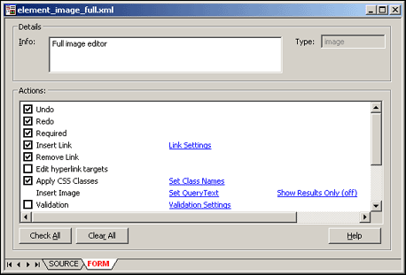
A.31 Image Element Definition Dialog
The Image element becomes a field in Contributor where users can perform basic edits that relate to handling images, such as inserting an image, inserting a link, and applying a CSS class. This can be useful when you want to limit a contributor's capabilities to simply editing images.
| Element | Description |
|---|---|
| Info | Provides a more detailed description of the element. This description appears as a tooltip when contributors hover their mouse over the Info icon in Contributor. |
| Type | Indicates the type of element you are adding. |
| Actions | Actions determine the available editing options for a contributor:
Undo: Contributors can undo their last edit. Redo: Contributors can redo their last edit. Required: Requires information in the field before Contributor closes. Insert Link: Contributors can create hyperlinks.
Remove Link: Contributors can remove hyperlinks. Edit hyperlink targets: Contributors can edit the file that is the target of a hyperlink (using the Element menu and right-click menu). |
| Actions
(continued) |
Apply CSS Classes: Contributors can use different CSS classes.
Insert Image: Contributors can add/replace images (gif, jpg, and png).
Validation: Used to validate the content added in Contributor (allowing you to enforce certain content requirements for contributors).
Edit Object Properties:When selected, contributors can modify the object properties. Custom Configuration: Used to allow configuration scripts to modify the contributor's editing window.
Select All: Contributors can select everything within the editor. Print: Contributors can print the content as it appears in the editor. Content is not formatted as it would appear on the web page. Set Element Height: Used to set a fixed height of the element.
Override Editor CSS: Used to implement a style sheet for the editor window.
|
| Check All | Checks all of the actions so that a contributor has all available editing options. |
| Clear All | Clears all of the metadata values so that a contributor has no editing options. |
| OK | Saves your settings and closes the Image Element dialog. |
| Cancel | Cancels your settings and closes the Image Element dialog. |
| Help | Opens the online help for this specific dialog. |
A.32 Custom Element Dialog
The Custom element becomes a field in Contributor that users (contributors) can use to add content that cannot be added using the other elements (WYSIWYG, Plain Text, and Image). More specifically, the Custom element provides a way to create a custom interface (also called a custom element form) that is used to add various types of content (multimedia files, source code, and so on). This particular element is used in legacy sites.
| Element | Description |
|---|---|
| ID | The identification that Site Studio assigns to the element. |
| Name | The name you assign to the element. This name is used for coding purposes and as such should not contain spaces, or non-ASCII or special characters.
If you reuse the same data file in multiple layout places, then the name of the region and its elements on each page must be the same. |
| Label | Briefly describes the element. The label opens beside the field in Contributor to let individual contributors know what content should go there. |
| Info | More detailed description of the element. This description appears as a tooltip when contributors hover their mouse over the Info icon in Contributor. |
| Type | Indicates the type of element you are adding. |
| Settings | Opens the Custom Element Settings dialog (see Section A.34, "Custom Element Settings Dialog"), where you can specify the Custom element form that is used by contributors. |
| Actions | Set Element Height: Used to set a fixed height of the element.
|
| OK | Saves your settings and closes the Custom Element dialog. |
| Cancel | Cancels your settings and closes the Custom Element dialog. |
| Help | Opens the online help for this specific dialog. |
A.33 Custom Element Definition Dialog
The Custom element becomes a field in Contributor that users (contributors) can use to add content that cannot be added using the other elements (WYSIWYG, Plain Text, and Image). More specifically, the Custom element provides a way to create a custom interface (also called a custom element form) that is used to add various types of content. Custom elements can also be defined to help data-driven web sites publish based on values, as the custom elements can define boolean value, integer values, and other methods of sorting and filtering data for placement on the web page.
| Element | Description |
|---|---|
| Info | More detailed description of the element. This description appears as a tooltip when contributors hover their mouse over the Info icon in Contributor. |
| Type | Indicates the type of element you are adding. |
| Settings | Opens the Custom Element Settings dialog (see Section A.34, "Custom Element Settings Dialog"), where you can specify the Custom element form that is used by contributors. |
| Actions | Set Element Height: Used to set a fixed height of the element.
|
| OK | Saves your settings and closes the Custom Element dialog. |
| Cancel | Cancels your settings and closes the Custom Element dialog. |
| Help | Opens the online help for this specific dialog. |
A.34 Custom Element Settings Dialog
The Custom element becomes a field in Contributor that users (contributors) can use to add content that cannot be added using the other elements (WYSIWYG, Plain Text, and Image). More specifically, the Custom element provides a way to create a custom interface (also called a custom element form) that is used to add various types of content (multimedia files, source code, and so on). You use this dialog to attach the custom element form to the custom element.
| Element | Description |
|---|---|
| Form Url | Specifies the custom element form that is used with the custom element. |
| OK | Saves your settings and closes the Custom Element Settings dialog. |
| Cancel | Cancels your settings and closes the Custom Element Settings dialog. |
| Help | Opens the online help for this specific dialog. |
A.35 Static List Element Dialog
A static list combines the power and flexibility of a fragment with the contribution capabilities of an element in Contributor. A static list can bundle multiple elements in a table-like layout. Contributors can then add, edit, delete, and rearrange rows and columns of information. You can control the static list options that are available to a contributor using this dialog. This particular element is a legacy technique.
| Element | Description |
|---|---|
| ID | The identification that Site Studio assigns to the element. |
| Name | The name you assign to the element. This is used for coding purposes and as such should not contain spaces, or non-ASCII or special characters.
If you reuse the same data file on multiple page templates, then the name of the region and its elements on each page must be the same. |
| Label | Briefly describes the element. The label opens beside the field in Contributor to let individual contributors know what content should go there. |
| Info | Provides a more detailed description of the element. This description appears as a tooltip when contributors hover their mouse over the Info icon in Contributor. |
| Type | Indicates the type of element you are adding. |
| Actions | Actions determine the available editing options for a contributor:
Undo: Contributors can undo their last edit. Redo: Contributors can redo their last edit. Add Item: Contributors can add a row or column to the list. Remove Item: Contributors can remove a row or column from the list. Edit Existing Item: Contributors can edit a row or column in the list. Move Item Up: Contributors can move a row up in the list. Move Item Down: Contributors can move a row down in the list. Insert link: Contributors can create hyperlinks.
Remove link: Contributors can remove hyperlinks. Edit hyperlink targets: Contributors can edit the file that is the target of a hyperlink (using the Element menu and right-click menu). |
| Actions
(continued) |
Insert Image: Contributors can add/replace images (gif, jpg, and png).
Apply CSS Classes: Contributors can apply different classes from a Cascading Style Sheet to text and graphics. If you enable this option, you should probably disable other formatting options (like font face, font size, bold, and italic) to more strictly enforce your CSS classes.
Validation: Used to validate the content added in Contributor (allowing you to enforce certain content requirements for contributors).
Apply HTML Tags: Used to determine which tags are available to Contributors who edit in HTML.
Set Element Height: Used to set a fixed height of the element.
Do Not Enclose Text in Editor: Used to define how carriage returns are handled in HTML. If text is enclosed, each time the contributor enters a return, a paragraph is created. If not enclosed, a line break is inserted for each return. |
| Check All | Checks all of the actions so that a contributor has all available editing options. |
| Clear All | Clears all of the metadata values so that a contributor has no editing options. |
| OK | Saves your settings and closes the Static List Element dialog. |
| Cancel | Cancels your settings and closes the Static List Element dialog. |
| Help | Opens the online help for this specific dialog. |
A.36 Static List Element Definition Dialog
A static list combines the power and flexibility that a fragment would have with the contribution capabilities of an element in Contributor. A static list can bundle multiple elements in a table-like layout. Contributors can then add, edit, delete, and rearrange rows and columns of information. You can control the static list options that are available to a contributor using this dialog.
| Element | Description |
|---|---|
| Info | Provides a more detailed description of the element. This description appears as a tooltip when contributors hover their mouse over the Info icon in Contributor. |
| Type | Indicates the type of element you are adding. |
| Elements | Opens the Element Selection Screen (see Section A.37, "Elements Dialog") |
| Actions | Actions determine the available editing options for a contributor:
Add Item: Contributors can add a row or column to the list. Remove Item: Contributors can remove a row or column from the list. Edit Existing Item: Contributors can edit a row or column in the list. Move Item Up: Contributors can move a row up in the list. Move Item Down: Contributors can move a row down in the list. Validation: Used to validate the content added in Contributor (allowing you to enforce certain content requirements for contributors).
Set Element Height: Used to set a fixed height of the element.
|
| Check All | Checks all of the actions so that a contributor has all available editing options. |
| Clear All | Clears all of the metadata values so that a contributor has no editing options. |
| OK | Saves your settings and closes the Static List Element dialog. |
| Cancel | Cancels your settings and closes the Static List Element dialog. |
| Help | Opens the online help for this specific dialog. |
The actions available in the static list element are for the list as a whole. The specific element definition options for the element definitions referenced within the static list are controlled within each element definition.
A.37 Elements Dialog
The Elements dialog is used to manage the elements associated with a static list. Other elements can be added, re-arranged, modified, or removed from the list.
| Element | Description |
|---|---|
| List | List of named elements and their definitions associated with the region definition. |
| Add | Opens the Add Element dialog (see Section A.43, "Element Dialog"). From there you select an element to add to the list. |
| Remove | Removes the selected element from the list. |
| Edit | Opens the Add Element dialog (see Section A.43, "Element Dialog") to edit the selected element. |
| Move Up | Moves the selected element up the list. |
| Move Down | Moves the selected element down the list. |
| OK | Saves your settings and closes the Element Selection dialog. |
| Cancel | Cancels your settings and closes the Element Selection dialog. |
| Help | Opens the online help for this specific dialog. |
A.38 Static List Element Validation Dialog
When contributors work in the Contributor application, they are generally free to add whatever content they like. As a designer, however, your goal may be to enforce certain standards (for example, limiting the number of rows a contributor can add to a static list). You can enforce this using element validation.
| Element | Description |
|---|---|
| Use default validation | Number Rows
|
| Use external validation | Uses an external validation script that you provide.
Settings: Opens the Advanced Element Validation dialog (see Section A.52, "Advanced Element Validation Dialog"), where you can enter the values from your script. |
| OK | Saves your settings and closes the Static List Element Validation dialog. |
| Cancel | Cancels your settings and closes the Static List Element Validation dialog. |
| Help | Opens the online help for this specific dialog. |
The default validation options in this dialog are derived from a script, ss_default_validation_script.js, that is provided by Site Studio.
A.39 Dynamic List Element Dialog
A dynamic list combines the power and flexibility of a fragment with contribution capabilities. The dynamic list performs a query in the content server, opens the files that match that query, and allows contributors to modify those files, even add new ones. You can control the contribution options that are available in the dynamic list using this dialog. This particular element is used in legacy sites, or in new sites as an old technique.
| Element | Description |
|---|---|
| ID | The identification that Site Studio assigns to the element. |
| Name | The name you assign to the element. This is used for coding purposes and as such should not contain spaces, or non-ASCII or special characters.
If you reuse the same data file in multiple places, then the name of the region and its elements on each page must be the same. |
| Label | Briefly describes the element. The label opens beside the field in Contributor to let individual contributors know what content should go there. |
| Info | A more detailed description that appears as a tooltip when contributors hover their mouse over the Info icon in Contributor. |
| Type | Indicates the type of element you are adding. |
| Actions | Actions determine the available editing options for a contributor:
Go to Next Page: Contributors can view the next set of matches in Contributor, if applicable. Go to Previous Page: Contributors can view the previous set of matches in Contributor, if applicable. Refresh: Contributors can refresh the dynamic list in Contributor. They likely do this after they add an item to the list. Create New Item: Contributors can add items (contributor data files or native documents) to the dynamic list.
Exclude Item: Contributors can remove items from the dynamic list. (The item is removed from all dynamic lists on the web site, but it is not removed from the content server.) Include Item: Contributors can include items in the dynamic list (that were previously excluded). |
| Actions
(continued) |
View Content Information for Item: Contributors can view the Content Information page for an item in the list.
Edit Target Content Item: Contributors can edit the file after they add it to the list. Show Excluded Items: Contributors can view items not included in the Dynamic List and re-apply them to the list. Set Element Height: Used to set a fixed height of the element.
|
| Check All | Checks all of the actions so that a contributor has all available editing options. |
| Clear All | Clears all of the metadata values so that a contributor has no editing options. |
| Parameters | Opens the Fragment Parameter Values dialog (see Section A.65, "Fragment Parameter Values Dialog"), where you can change the appearance and behavior of the dynamic list. |
| OK | Saves your settings and closes the Dynamic List Element dialog. |
| Cancel | Cancels your settings and closes the Dynamic List Element dialog. |
| Help | Opens the online help for this specific dialog. |
When you allow contributors to add items to a list, they ultimately are adding web pages to the web site.
A.40 Dynamic List Element Definition Dialog
A dynamic list combines the power and flexibility that a fragment would have with contribution capabilities. The dynamic list performs a query in the content server, opens the files that match that query, and allows contributors to modify those files, even add new ones. You can control the contribution options that are available in the dynamic list using this dialog. This particular element is used in legacy sites.
| Element | Description |
|---|---|
| Info | A more detailed description that appears as a tooltip when contributors hover their mouse over the Info icon in Contributor. |
| Type | Indicates the type of element you are adding. |
| Settings | Opens the Dynamic List Settings dialog. (see Section A.41, "Dynamic List Settings Dialog") |
| Actions | Actions determine the available editing options for a contributor:
Go to Next Page: Contributors can view the next set of matches in Contributor, if applicable. Go to Previous Page: Contributors can view the previous set of matches in Contributor, if applicable. Refresh: Contributors can refresh the dynamic list in Contributor. They likely do this after they add an item to the list. Create New Item: Contributors can add items (contributor data files or native documents) to the dynamic list.
Exclude Item: Contributors can remove items from the dynamic list. (The item is removed from all dynamic lists on the web site, but it is not removed from the content server.) Include Item: Contributors can include items in the dynamic list (that were previously excluded). View Content Information for Item: Contributors can view the Content Information page for an item in the list. Edit Target Content Item: Contributors can edit the file after they add it to the list. Show Excluded Items: Contributors can view items not included in the Dynamic List and re-apply them to the list. |
| Actions | Set Element Height: Used to set a fixed height of the element.
|
| Check All | Checks all of the actions so that a contributor has all available editing options. |
| Clear All | Clears all of the metadata values so that a contributor has no editing options. |
| OK | Saves your settings and closes the Dynamic List Element dialog. |
| Cancel | Cancels your settings and closes the Dynamic List Element dialog. |
| Help | Opens the online help for this specific dialog. |
When you allow contributors to add items to a list, they ultimately are adding web pages to the web site.
A.41 Dynamic List Settings Dialog
The Dynamic List Settings dialog is used to modify the settings for the dynamic list element definition. These settings would include the sort order and the specific query on the content server.
| Element | Description |
|---|---|
| Query Text | The query on the content server that defines which items display in the dynamic list. |
| Edit | Opens the Edit Query Text dialog (see Section A.22, "Edit Query Text Dialog") to construct a query. |
| Sort Field | Select the field that serves as the sorting field for the returned search results. |
| Sort Order | Select to sort the search results in either ascending or descending order. |
| Number of results per page | Enter the number of search results returned per page. |
| Limit search scope to this website | Check to return only site assets which are associated with the web site. |
| Section to display result items | The target section in the web site where the results display. |
| Edit | Opens the Select Section dialog (see Section A.17, "Select Section Dialog") to select the target section. |
| OK | Saves your settings and closes the Dynamic List Settings dialog. |
| Cancel | Cancels your settings and closes the Dynamic List Settings dialog. |
| Help | Opens the online help for this specific dialog. |
A.42 Region Definition Dialog
The region definition is used to define which elements, by the element definition, are available for use in a selected region template. The region definition is used to organize the set of element definitions available.
| Element | Description |
|---|---|
| Description | The name of the region definition. |
| Elements | Makes select class names available in Contributor. |
| Add | Opens the Add Element dialog (see Section A.43, "Element Dialog") to add an element definition to the region definition. |
| Remove | Specifies a class name to be made available in Contributor.
If you add a class name this way, you still must attach the CSS file containing this class to a page template or fragment. |
| Edit | Opens the Add Element dialog (see Section A.43, "Element Dialog") with the information for the selected element definition available to edit. |
| Move Up | Moves the selected element definition up the list. |
| Move Down | Moves the selected element definition down the list. |
| Modify Metadata | Opens the Enable Modify Metadata dialog (see Section A.15, "Enable Metadata Modification Dialog") to update Metadata fields for the region definition. |
| Switch Content | Opens the Region Content Options dialog (see Section A.20, "Region Content Options Dialog") to select the parameters contributors have to switch region content. |
| Help | Opens the online help for this specific dialog. |
A.43 Element Dialog
The Element dialog is used to add an element definition to a region definition or a static list element definition. In this dialog you can add name-specific information to allow the element definition to maintain its reusability while still giving it a specific identifying name within the region definition or static list.
| Element | Description |
|---|---|
| Name | The name of the element as it appears in the Designer view. |
| Label | The label of the element. The label serves as the name of the editing region in the contributor's editing region. |
| Info | Additional information about the element definition. The information entered here appears to the Contributor as a tooltip when the contributor hovers the mouse over the label. |
| Element Definition ID | Use to select the name of the element definition to use. |
| Embed the element definition inside the region definition | Check the box to embed the element definition in the region definition. This copies the element definition into the region definition, which means that the region definition must be updated when you want to update the element definition. |
| OK | Saves your settings and closes the Element dialog. |
| Cancel | Cancels your settings and closes the Element dialog. |
| Help | Opens the online help for this specific dialog. |
| Search | Opens a window displaying the results of a content server search for element definitions. |
| Edit | Opens a dialog to select the type of element definition to embed. |
The info is what is listed in the hover on the tooltip in Contributor.
A.44 Link Settings Dialog
When you allow contributors to create links, they are able to use a link wizard (the same one that is available in Designer) to create a link to another section, to another site, or to another file. Using this dialog, you can control what types of files (contributor data files and native documents) the contributors can link to and whether they can link to new or existing files.
| Element | Description |
|---|---|
| Create new contributor data file | Allows contributors to create a contributor data file that they can link to. |
| Create new native document | Allows contributors to create a native document that they can link to.
Document Types: Specifies which native documents contributors can create. The Additional Information button opens the Choose Document Types dialog (see Section A.21, "Choose Document Types Dialog"), where you can select the document types that are available to contributors. |
| Choose existing in the content server | Allows contributors to search the content server for an existing contributor data file or native document that they can link to.
Query Text: Specifies the actual query that is performed in the content server to display existing files. The Additional Information button opens the Edit Query Text dialog (see Section A.22, "Edit Query Text Dialog"), which you can use to create, capture, and test the query used to display existing files. Show Results Only: Shows only the search results and not the typical content server environment. (This is useful to prevent contributors from browsing to other content in the content server.) |
| Browse for content locally | Allows contributors to browse for a file on their local file system that they can link to. |
| Remove region content association | This option is disabled when you're specifying link settings for a contributor. It is only applicable when setting contribution region options for a contributor. |
| Default Metadata | Opens the Enable Metadata Modification dialog (see Section A.15, "Enable Metadata Modification Dialog"), where you can specify the metadata that is available and the default metadata that is used when contributors create files. |
| OK | Saves your settings and closes the Link Settings dialog. |
| Cancel | Cancels your settings and closes the Link Settings dialog. |
| Help | Opens the online help for this specific dialog. |
A.45 Select CSS Classes Dialog
When you attach a cascading style sheet (CSS) to a page template, subtemplate, or region template, you can identify certain classes from the style sheet that are available to a contributor to choose from when editing text and graphics in Contributor. This can be useful when you want to enforce well-designed and consistent web pages. You can specify the class names that should be available in this dialog.
| Element | Description |
|---|---|
| Allow all stylesheets | Makes all stylesheets within the scope of the current page available to Contributor, including any stylesheets referenced by fragments. |
| Allow selected stylesheets | Makes only the selected stylesheets available to Contributor. |
| Add ID... | Opens the Select a CSS Stylesheet dialog (see Section A.46, "Select a CSS StyleSheet Dialog") to select stylesheets from the content server. |
| Add Url... | Opens the Choose Fragment Asset dialog (see Section A.47, "Choose Fragment Asset Dialog") to select stylesheets referenced within fragments. |
| Remove | Removes the selected stylesheet from the stylesheets available to Contributor. |
| Allow all classes | Makes all classes from the selected stylesheets available in Contributor. |
| Allow selected classes | Makes select class names from the selected stylesheets available in Contributor. |
| Additional classes | Specifies a class name to be made available in Contributor.
If you add a class name this way, you still must attach the CSS file containing this class to a page template or fragment. |
| Creates a class name. | |
| Deletes the class name that you added (using the previous option). | |
| OK | Saves your settings and closes the Select CSS Classes dialog. |
| Cancel | Cancels your settings and closes the Select CSS Classes dialog. |
| Help | Opens the online help for this specific dialog. |
A.46 Select a CSS StyleSheet Dialog
This dialog is used to select a stylesheet from the content server. Once the stylesheet is selected the styles within the stylesheet will be accessible to Contributor.
| Element | Description |
|---|---|
| Menu | Displays the content ID of the selected stylesheet. |
| Search... | Opens a search results window displaying all CSS files on the content server. From there, select the CSS file. |
| OK | Saves your settings and returns to the Select CSS Classes dialog. |
| Cancel | Cancels your settings and returns to the Select CSS Classes dialog. |
A.47 Choose Fragment Asset Dialog
This dialog is used to select a stylesheet that is loaded with a fragment. Many of these stylesheets are not normally used except with fragments. Because of this, these fragments are loaded by Url rather than Content ID. Once the stylesheet is selected, the styles within the stylesheet will be accessible to Contributor.
| Element | Description |
|---|---|
| Menu | Displays the available stylesheets loaded as fragment assets. |
| OK | Saves your settings and returns to the Select CSS Classes dialog. |
| Cancel | Cancels your settings and returns to the Select CSS Classes dialog. |
A.48 WYSIWYG Element Validation Dialog
When contributors work in the Contributor application, they are generally free to add whatever text, graphics, and other content they like. As a designer, however, your goal may be to enforce consistency, especially formatting consistency, from one web page to another. You may also want to keep the content to a minimum on a particular page. You can enforce such standards with element validation (available in the WYSIWYG Element dialog).
| Element | Description |
|---|---|
| Use default validation | Uses the default validation options provided by Site Studio. Choose from the following:
min: Enforces a minimum amount of text (in characters). max: Enforces a maximum amount of text (in characters). Disallowed characters: Prevents contributors from using the characters that you specify here. Allow line breaks <br>: When checked, contributors can create a line break (soft return), which is usually done by pressing SHIFT + ENTER on the keyboard. Allow paragraphs <p>: When checked, contributors can create a paragraph (hard return), which is usually done by pressing ENTER on the keyboard. Allow images <img>: When checked, contributors can add images. |
| Use external validation | Uses an external validation script that you provide.
Settings: Opens the Advanced Element validation dialog (see Section A.52, "Advanced Element Validation Dialog"), where you can enter the values from your script. |
| OK | Saves your settings and closes the WYSIWYG Element Validation dialog. |
| Cancel | Cancels your settings and closes the WYSIWYG Element Validation dialog. |
| Help | Opens the online help for this specific dialog. |
The default validation options in this dialog are derived from a script, ss_default_validation_script.js, that is provided by Site Studio.
A.49 Plain Text Element Validation Dialog
When contributors work in the Contributor application, they are generally free to add whatever text they like (even with the formatting limitations of a plain text element). As a designer, however, your goal may be to enforce consistency, especially if you must keep content to a minimum on a particular page. You can enforce such standards using element validation (available in the Plain Text Element dialog).
| Element | Description |
|---|---|
| Use default validation | Uses the default validation options provided by Site Studio. Choose from the following:
min: Enforces a minimum amount of text (in characters). max: Enforces a maximum amount of text (in characters). Disallowed characters: Prevents contributors from using the characters that you specify here. Allow multiple lines: When checked, contributors can add lines of text (by pressing ENTER on their keyboard). |
| Use external validation | Uses an external validation script that you provide.
Settings: Opens the Advanced Element Validation dialog (see Section A.52, "Advanced Element Validation Dialog"), where you can enter the values from your script. |
| OK | Saves your settings and closes the Plain Text Element Validation dialog. |
| Cancel | Cancels your settings and closes the Plain Text Element Validation dialog. |
| Help | Opens the online help for this specific dialog. |
The default validation options in this dialog are derived from a script, ss_default_validation_script.js, that is provided by Site Studio.
A.50 Select HTML Tags Dialog
When contributors are capable of editing a web page in the HTML rather than using a WYSIWYG interface, you may want to allow those contributors to edit specified regions using the HTML. As the designer, you can limit the available tags that the contributor can use in editing a region. This is helpful in maintaining a balance between the advanced abilities of some contributors and enforcing standards across a web page.
| Element | Description |
|---|---|
| Allow default HTML tags | Allows the contributor to use the default set of HTML tags. |
| Allow selected HTML tags | Allows the contributor to use only those tags which are selected. |
| Creates an allowed HTML tag. | |
| Deletes the HTML tag that you added (using the previous option). | |
| OK | Saves your settings and closes the Plain Text Element Validation dialog. |
| Cancel | Cancels your settings and closes the Plain Text Element Validation dialog. |
| Help | Opens the online help for this specific dialog. |
A.51 Image Element Validation Dialog
When contributors work in Contributor (in particular, with an image element), they are generally free to add whatever images they like. As a designer, however, your goal may be to enforce consistency, especially images sizes, from one page to another. You can enforce such standards using element validation (available in the Image Element dialog).
| Element | Description |
|---|---|
| Use default validation | Uses the default validation options provided by Site Studio. Choose from the following:
Width:
Height:
|
| Use external validation | Uses an external validation script that you provide.
Settings: Opens the Advanced Element Validation dialog (see Section A.52, "Advanced Element Validation Dialog"), where you can enter the values from your script. |
| OK | Saves your settings and closes the Image Element Validation dialog. |
| Cancel | Cancels your settings and closes the Image Element Validation dialog. |
| Help | Opens the online help for this specific dialog. |
If you enforce a certain image size in pixels, you may want to instruct contributors on how to change the size of the image using the image properties form.
The default validation options in this dialog are derived from a script, ss_default_validation_script.js, that is provided by Site Studio.
A.52 Advanced Element Validation Dialog
When contributors work in Contributor, they are generally free to add whatever text, graphics, and other content they like. As a designer, however, your goal may be to enforce consistency or to limit the amount of content that is contributed to a web page. You can use the default validation options in Designer or come up with your own validation script and attach it to the element using this dialog.
| Element | Description |
|---|---|
| Script | Specifies the custom validation script that you use for the element.
The Additional Information button opens an Oracle Content Server Dialog where you can select your validation script from the content server. |
| Language | Specifies the scripting language used in your validation (JavaScript or VBScript). |
| Method Name | Specifies the method that you use to run the validation. |
| Content Type | Specifies the content type (string, XML, HTML) that is used in the validation. |
| Adds a parameter. | |
| Deletes an existing parameter. | |
| Moves the parameter up in the list. | |
| Moves the parameter down in the list. | |
| OK | Saves your settings and closes the Advanced Element Validation dialog. |
| Cancel | Cancels your settings and closes the Advanced Element Validation dialog. |
| Help | Opens the online help for this specific dialog. |
A.53 New Item Settings Dialog
When you allow contributors to add an item to a dynamic list, they have the ability to add a new or existing contributor data file or native document. You can control exactly what types of files they can add using this dialog (accessible from the Dynamic List Element Definition dialog).
| Element | Description |
|---|---|
| Create new contributor data file | Allows contributors to create a contributor data file and add it to the list. |
| Create new native document | Allows contributors to create a native document and add it to the list.
Document Types: Specifies which native documents contributors can create. The Additional Information button opens the Choose Document Types dialog (see Section A.21, "Choose Document Types Dialog"), where you can select the document types that are available to contributors. |
| Choose existing in the content server | This option is disabled in the context of a dynamic list because the query for the dynamic list already picks up existing files in the content server.
If a contributor wants to add an existing file in the content server that doesn't already appear in the list, then the metadata for that file must be changed to match the metadata used in the list. |
| Browse for content locally | Allows contributors to browse for a file on their local file system and add it to the list. |
| Remove region content association | This option is disabled in the context of a dynamic list. It is only applicable when setting contribution region options for a contributor. |
| Default Metadata | Opens the Enable Metadata Modification dialog (see Section A.15, "Enable Metadata Modification Dialog"), where you can specify the metadata that is available and the default metadata that is assigned to the files added to the list. |
| OK | Saves your settings and closes the New Item Settings dialog. |
| Cancel | Cancels your settings and closes the New Item Settings dialog. |
| Help | Opens the online help for this specific dialog. |
A.54 Assign Content Dialog
Each placeholder on a primary page needs a contributor data file, native document, or subtemplate assigned to it. Each placeholder on a secondary page needs a subtemplate, data file, or native document assigned to it, or it must be designated as replaceable. You perform these tasks in this dialog. The contributor can also assign data files and edit the data files assigned to a placeholder (assuming you allow these actions).
| Element | Description |
|---|---|
| Site Hierarchy | Displays the site hierarchy and indicates which placeholders have content assigned to them.
The folder icon indicates the section has content assigned or is designated as replaceable. The X-folder icon indicates the section is missing content or must be designated as replaceable. Click a section to view and configure the placeholder (or placeholders) on the primary and secondary pages there. |
| Primary | Displays the primary pages in the site hierarchy. |
| Secondary | Displays the secondary pages in the site hierarchy. |
| Show all | Expands the site hierarchy and displays the sections that are missing content or are not designated as replaceable. If you have more than one, you see a navigation control (see below) that you can use to go through each one. |
| Finished | Saves your settings and closes the Assign Content dialog. |
| Help | Opens the online help for this specific dialog. |
You can choose not to assign content to a region and instead have a contributor perform this task.
Placeholder Information Tooltip
When the contribution graphic opens in the Assign Region dialog, you can hover over the contribution graphic for the placeholder and when the region highlighting appears, a placeholder information tooltip (Figure A-70) also opens in a small popup window.
The placeholder information tooltip lists the name of the placeholder mapping, placeholder definition, region definition, and region template that have been assigned in the highlighted contribution region. The Content ID of the page template is also displayed. This information can help in remembering what site assets have been assembled in each placeholder.
A.55 Choose Region Content Dialog
Each region on a primary page needs a contributor data file or native document assigned to it. Each region on a secondary page needs a file assigned to it, or it must be designated as replaceable. You can assign a new or existing contributor data file or native document to a region using this dialog, accessible from the Assign Content Dialog (see Section A.54, "Assign Content Dialog").
| Element | Description |
|---|---|
| Content ID | Displays the Content ID of the file assigned to the region.
(This field and the ones below are initially blank until you assign a file to the region.) |
| Title | Displays the Title of the file assigned to the region. |
| Type | Displays the Type (document type) of the file assigned to the region. |
| Author | Displays the Author of the file assigned to the region. |
| Comments | Displays the Comments of the file assigned to the region. |
| Document Info | Opens the Content Information page for the file assigned to the region. |
| Choose | Use to select a file that you assign to the region. You have four choices:
Existing: Opens the Oracle Content Server dialog where you can select an existing contributor data file or native document and assign it to the region. New: Displays a list of file types that you can create and assign to the region. Local: Opens a window that you use to select a file from your local file system, checked it in, and assign it to the region. None: Removes the existing file assigned to the region. |
| OK | Saves your settings and closes the Choose Region Content dialog. |
| Cancel | Cancels your settings and closes the Choose Region Content dialog. |
| Help | Opens the online help for this specific dialog. |
A.56 Generate Unique Region Content Dialog
Site Studio can automatically generate a unique contributor data file for each region on the same page template throughout the site hierarchy. This is useful when you reuse a page template and want to populate the contribution region on that page wherever it is used on your site. You can specify your own naming convention when you use this feature.
Contributor data files already assigned to a region are not overwritten.
| Element | Description |
|---|---|
| Use auto-generated Content IDs | The Content ID is automatically generated based on your settings in the content server.
This option is disabled if the content server is not set up to auto-generate content IDs. |
| Create Content IDs from the following | The Content ID is automatically generated based on the naming convention that you specify here:
Prepend with: This prefix is used followed by the naming convention specified below:
|
| Define | Defines additional default metadata values for each file by using the Assign Info Form in the content server. |
| Auto-generate title | Automatically generates a title based on the name of the section and the name of the region.
The title, for example, may look similar to this: Contribution Data For Section 'Products', Region 'Region1' |
| Auto-generate comments | Automatically generates a comment based on the name of the section and the name of the region. The comments, for example, may look something like this:
Comments: This is region content for the Site Studio Web Site Section 'Products', Region 'Region1' |
| OK | Saves your settings and closes the Generate Unique Region Content dialog. |
| Cancel | Cancels your settings and closes the Generate Unique Region Content dialog. |
| Help | Opens the online help for this specific dialog. |
A.57 Fragment Editor Dialog
The Fragment Editor comprises a suite of editing options that allow you to edit all parts of a fragment, including its snippets, assets, parameters, and elements. You can open the Fragment Editor from the File menu, and whenever you edit a fragment in the toolbox.
| Element | Description |
|---|---|
| Changes the icon associated with the fragment. The icon displays in the Toolbox after you save the fragment.
Click the button to see the available icons and then select one of them. |
|
| Opens the Properties for Fragment dialog (see Section A.58, "Properties for Fragment Dialog"), where you can change the fragment's name, language, and type. | |
| Assets | Opens the Fragment Assets dialog (see Section A.59, "Fragment Assets Dialog"), where you can add, edit, and delete the assets in a fragment. |
| Elements | Opens the Fragment Elements dialog (see Section A.60, "Fragment Elements Dialog"), where you can add, edit, and delete each element in the fragment.
Elements are only available for static list fragments. As such, this button is disabled if the fragment type is not "staticlist" (see Section A.58, "Properties for Fragment Dialog"). |
| Parameters | Opens the Fragment Parameters dialog (see Section A.61, "Fragment Parameters Dialog"), where you can add, edit, and delete each parameter in the fragment. |
| Add | Opens the Snippet Properties dialog (see Section A.64, "Snippet Properties Dialog"), where you can add a snippet to the fragment. |
| Delete | Deletes the snippet from the fragment. |
| Properties | Opens the Snippet Properties dialog (see Section A.64, "Snippet Properties Dialog"), where you can edit a snippet in the fragment. |
| Name | Location | Include
(Status area) |
Displays the existing snippets in the fragment. |
| Snippet code | Displays the snippet code. You can edit the text in this window. |
| Preview | Opens the Fragment Preview dialog (see Section A.66, "Fragment Preview Dialog"), where you can preview the fragment.
You may be prompted to choose a set of parameter values to preview the fragment. |
| Help | Opens the online help for this specific dialog. |
A.58 Properties for Fragment Dialog
The properties of a fragment include the fragment's name, ID, language, and type. Each time you create a fragment, you're prompted to enter these values. You can also change these values after you create a fragment using this dialog.
| Element | Description |
|---|---|
| Name | Identifies the fragment.
The name of the fragment displays in the Toolbox. It can be a friendly name that includes spaces and special characters, if you like. |
| ID | Identifies the fragment and its individual parts (snippets, assets, parameters, and so on).
You can only change the ID when you first create the fragment. The ID also serves as an XML attribute and as the base name for the classes, files, and directories in the fragment. The ID should be concise, and it should not contain spaces, or non-ASCII or special characters. |
| Language | Identifies the language used by the fragment for server-side scripting.
If your site type is "hcsp/jsp," then the available language is idoc or jsp. If your site type is "asp," then the available language is asp. |
| Type | Identifies the type and intended use of the fragment. This determines the available options for the fragment and its location in the Toolbox. There are four types:
navigation: The fragment is used for site navigation (navigation bar, breadcrumbs, search, and so on). staticlist: The fragment is used to provide advanced contribution capabilities, where contributors can edit individual elements. dynamic list: The fragment is used to provide advanced contribution capabilities, where contributors can modify files that appear in the list. other: The fragment is used for miscellaneous purposes, such as a copyright line, embedded multimedia, or a login script. |
| Library Name | Identifies the library that the fragment is stored in.
Initially, it says "<unsaved>" and appears disabled, until you save the fragment for the first time. |
| OK | Saves your settings and closes the Fragment Properties dialog. |
| Cancel | Cancels your settings and closes the Fragment Properties dialog. |
| Help | Opens the online help for this specific dialog. |
A.59 Fragment Assets Dialog
Assets are files that are referenced by a fragment, usually within a fragment snippet. A graphic, a cascading style sheet (CSS), and a standalone script are all frequently used assets. You can add, edit, and delete assets in this dialog.
| Element | Description |
|---|---|
| Current Assets | Displays existing fragment assets. |
| Add Asset | Adds an asset to the fragment.
You add assets from your file system. Site Studio then checks the file into the content server and packages it with this fragment. |
| Add Folder | Adds a subfolder for the assets, which you can use to better organize the files.
To ensure compatibility on all platforms (specifically UNIX), you should use all lowercase letters in the subfolder. |
| Delete | Deletes the asset from the fragment. |
| Edit | Edits the asset (using a third-party application). There are two options available.
Edit: Opens the asset with the application associated with that file type. Edit With: Opens a dialog where you choose an application to open the file with. |
| OK | Saves your settings and closes the Fragment Assets dialog. |
| Cancel | Cancels your settings and closes the Fragment Assets dialog. |
| Help | Opens the online help for this specific dialog. |
A.60 Fragment Elements Dialog
An element becomes a field in Contributor where users can add and edit content (text and graphics). Elements can also be bundled in a fragment to create a static list. With static lists, contributors can add, edit, delete, and rearrange rows and columns of information. You can add, edit, and delete elements in this dialog.
| Element | Description |
|---|---|
| Opens the WYSIWYG Element dialog (see Section A.26, "WYSIWYG Element Dialog"), where you add the element to the fragment. | |
| Opens the Plain Text Element dialog (see Section A.28, "Plain Text Element Dialog"), where you add the element to the fragment. | |
| Opens the Image Element dialog (see Section A.30, "Image Element Dialog"), where you add the element to the fragment. | |
| Opens the Custom Element dialog (see Section A.32, "Custom Element Dialog"), where you add the element to the fragment. | |
| Edit | Edits the selected element in the fragment. |
| Delete | Deletes the selected element in the fragment. |
| Name | Label | Type | Description | Displays existing elements in the fragment. |
| OK | Saves your settings and closes the Fragment Elements dialog. |
| Cancel | Cancels your settings and closes the Fragment Elements dialog. |
| Help | Opens the online help for this specific dialog. |
| Advanced | Opens a text editor that you use to customize your element even more.
When you edit an element this way, you are not able to return to the graphical user interface in the Fragment Elements dialog because there is no supported interface available. |
A.61 Fragment Parameters Dialog
Parameters are attributes that govern the appearance and behavior of a fragment when it is added to a page template. You create parameters in this dialog and then choose from those parameters when you use the fragment (see Section A.65, "Fragment Parameter Values Dialog").
| Element | Description |
|---|---|
| Parameters: Name | Displays the existing parameters in the fragment. |
| Creates a parameter in the fragment.
The name is used for coding purposes and as such, should not contain spaces, or non-ASCII or special characters. Also, you should not use words that are commonly used for coding purposes, such as "like" (used by Idoc Script as a string comparison operator). |
|
| Deletes the parameter in the fragment. | |
| Moves a parameter up in the list. This changes its location in this dialog and the Fragment Parameter Values dialog (see Section A.65, "Fragment Parameter Values Dialog"). | |
| Moves a parameter down in the list. This changes its location in this dialog and the Fragment Parameter Values dialog (see Section A.65, "Fragment Parameter Values Dialog"). | |
| Type | Defines the function, or purpose, of the parameter. There are several types:
text: Provides a simple text box where you can insert text when using the fragment. (You can create an option list for the text using the Option List: Label | Value) bigtext: Provides a much larger text box (in a popup window) where you can add and edit text when using the fragment. boolean: Provides a True or False value that you can specify when using the fragment. integer: Provides an integer value that you can specify when using the fragment. (This value may not contain decimal points.) float: Provides a value, including decimal points, that you can specify when using the fragment. size: Provides a sizing value, in pixels or percentage, that you can specify when using the fragment. |
| Type (continued) | color: Provides an RGB hexadecimal value (for example, 0xFF0000) and a color picker that you can use to select a color with when using the fragment.
url: Provides a dialog that you can use to browse to a URL and then select it as a value when using the fragment. manageddoc: Opens a content server window that you use to browse to a document in the content server and select it as a value (dDocName), when using the fragment. (Use the Query Text field below to capture the query) managedurl: Opens a content server window that you use to browse to the URL of a document in the content server and then select it as a value, when using the fragment. (Use the Query Text field below to capture the query) managedquery: Opens the Edit Query Text dialog (see Section A.22, "Edit Query Text Dialog"), where you can build a query, when using the fragment. This parameter is most useful for dynamic list fragments. cssstyle: Provides a text box where you can specify a CSS style value when using the fragment. siteid: Provides a dialog (see Section A.16, "Select Site Dialog") that you use to select a web site in the content server, when using the fragment. nodeid: Opens a dialog (see Section A.17, "Select Section Dialog") that you use to select a section in your site hierarchy, when using the fragment. custom: Provides advanced functionality for the fragment parameter. |
| Required | Makes the parameter required.
When using the fragment, you must enter values for each parameter before the Fragment Parameter Values dialog (see Section A.65, "Fragment Parameter Values Dialog") closes. You can make a parameter required and also supply an acceptable default value. |
| Description | Provides a description of the parameter.
The description displays at the bottom of the Fragment Parameter Values dialog when you use the fragment. |
| Default value | Provides a default value for the parameter when you actually use the fragment. |
| Query Text | Specifies the query that is used when you browse for a document using the "manageddoc" or "managedurl" parameter type (above).
If no query is specified, everything is searched in the content server. The Additional Information button opens the Edit Query Text dialog (see Section A.62, "Edit Query Text Dialog"), where you can enter your query, capture it, and test it in the content server. |
| Option List: Label | Value | Displays existing option lists in the fragment.
Option lists are used to specify a list of possible values for a parameter of type "text" (above). The values display as a popup list of options in the Fragment Parameter Values dialog when you use the fragment. |
| Add | Opens the New Option dialog (see Section A.63, "New Option Dialog"), where you can add an option list. |
| Edit | Opens the New Option dialog (see Section A.63, "New Option Dialog"), where you can edit an option list. |
| Delete | Deletes an option list. |
| OK | Saves your settings and closes the Fragment Parameters dialog. |
| Cancel | Cancels your settings and closes the Fragment Parameters dialog. |
| Help | Opens the online help for this specific dialog. |
A.62 Edit Query Text Dialog
When you add a parameter to a fragment that is used to search the content server (for example, parameters of type manageddoc, managedurl, and managedquery), you must specify the query that is performed. You can use this dialog to specify the query, capture the query, and test the query.
| Element | Description |
|---|---|
| [Text field] | Use this text box to specify your query. |
| Capture Query | Opens the Content Query Capture screen in the content server that you use to perform a query and then save (capture) that query. |
| Test Query | Use to test your query in the content server. |
| OK | Saves your settings and closes the Edit Query Text dialog. |
| Cancel | Cancels your settings and closes the Edit Query Text dialog. |
A.63 New Option Dialog
When you create a parameter of type "text" in a fragment (see Section A.61, "Fragment Parameters Dialog"), you can create a list of values in the form of an option list. These values display as a popup list in the Fragment Parameter Values dialog when the fragment is added to a page template. You can create the option list in this dialog.
| Element | Description |
|---|---|
| Label | Displays the name in the option list. |
| Value | Displays the value in the option list (what is added to the page template). |
| OK | Saves your settings and closes the New option dialog. |
| Cancel | Cancels your settings and closes the New option dialog. |
| Help | Opens the online help for this specific dialog. |
A.64 Snippet Properties Dialog
A snippet is the text or code that a fragment adds to a page template (in one of four locations). A fragment must have at least one snippet. You can define the properties of the snippet in this dialog, and then edit the content of the snippet in the Fragment Editor.
| Element | Description |
|---|---|
| Name | The name of the snippet.
(The name may contain spaces and special characters, if you like.) |
| Location | Determines the location where the snippet is added on a page template.
There are four options: drop-point: Inserts the snippet where the cursor is located on the page template. head: Inserts the snippet in the head of the page template (specifically the end of the <HEAD> tag). top-of-body: Inserts the snippet at the beginning of the body in the page template (immediately following the <BODY> tag). bottom-of-body: Inserts the snippet at the end of the body in the page template (immediately preceding the </BODY> tag). |
| Include | Determines the way in which the snippet is added to a page template.
There are three options: simple: Adds the entire snippet to the page template. If parameters are present, their values are added directly to the page, making them a permanent part of the page. The fragment is no longer recognized as a fragment and its parameters cannot be changed. inline: Adds the entire snippet to the page template. As an inline snippet, however, the fragment and its parameters are still recognized as a fragment. You can still move the fragment, delete it, and modify its parameters. reference: Adds a reference to the snippet in the page template (similar to an include file). As a referenced snippet, it is still recognized and managed as a fragment, and you can still edit the fragment in the Fragment Editor and then see the changes on your page template. |
| Design View Code | Creates placeholder text for the fragment snippet when the snippet is viewed in Design view.
The Additional Information button opens a text editor that you use to enter placeholder text. This Element is intended for snippets inserted in the drop-point, top-of-body, and bottom-of-body locations; not the head location. |
| OK | Saves your settings and closes the Snippet Properties dialog. |
| Cancel | Cancels your settings and closes the Snippet Properties dialog. |
| Help | Opens the online help for this specific dialog. |
A.65 Fragment Parameter Values Dialog
Parameters are attributes that govern the appearance and behavior of a fragment when it is added to a page template. You can create parameters in the Fragment Editor (see Section A.61, "Fragment Parameters Dialog") and then choose from those parameters in this dialog, when you're using the fragment.
Parameters are optional, and therefore not all fragments have them.
| Element | Description |
|---|---|
| Property | Lists the available parameters in the fragment.
Each fragment contains different parameters (some contain no parameters at all) and as such, the parameters vary from fragment to fragment. |
| Name | Lists the values for each parameter. |
| Creates a parameter in the fragment.
The name is used for coding purposes and as such, should not contain spaces, or non-ASCII or special characters. Also, you should not use words that are commonly used for coding purposes, such as "like" (used by Idoc Script as a string comparison operator). |
|
| Deletes the parameter in the fragment. | |
| Moves a parameter up in the list. This changes its location in this dialog and the Fragment Parameter Values dialog (see Section A.65, "Fragment Parameter Values Dialog"). | |
| Moves a parameter down in the list. This changes its location in this dialog and the Fragment Parameter Values dialog (see Section A.65, "Fragment Parameter Values Dialog"). | |
| OK | Saves your settings and closes the Fragment Parameter Values dialog. |
| Cancel | Cancels your settings and closes the Fragment Parameter Values dialog.
The fragment is not added to the page template. |
| Help | Opens the online help for this specific dialog. |
You can modify the available parameters, add parameters, and change the default values using the "Fragment Parameters dialog."
A.66 Fragment Preview Dialog
You can preview fragments before adding them to a page template. You can open this dialog by right-clicking a fragment in the Toolbox and then choosing Preview or use the Preview button in the Fragment Editor. You may be prompted to first choose a set of parameter values before you can preview the fragment (see Section A.65, "Fragment Parameter Values Dialog").
| Element | Description |
|---|---|
| Select section to use for preview | Displays the site hierarchy. The section that you select is used to display the fragment in the Fragment Preview area.
You are not able to select a section that is excluded from the site navigation, has no primary page, or contains an external URL as the primary page. |
| Fragment Preview | Previews the fragment using the section that is highlighted in the site hierarchy (above).
You cannot preview static list fragments because they require a contributor data file with content in it to be viewed properly. |
| Change Parameter Values | Opens the Fragment Parameter Values dialog (see Section A.65, "Fragment Parameter Values Dialog"), where you can change the parameter values used in the preview. |
| Finished | Closes the Fragment Preview dialog. |
| Help | Opens the online help for this specific dialog. |
A.67 Save Fragment Dialog
Fragments are stored in fragment libraries. You can save a fragment in the same library as other fragments, or you can save the fragment in its own library. You can also create a library for the fragment in this dialog.
| Element | Description |
|---|---|
| New | Creates a library for the fragment.
The library is created in the content server, and it opens in the Save Fragment dialog the next time you open it. |
| Name | Displays existing fragment libraries in the content server.
Select one of them to store the fragment in that library. |
| OK | Closes the Save Fragment dialog and takes you to the Assign Info form in the content server where you can update the metadata for the fragment library. |
| Cancel | Closes the Save Fragment dialog without saving your fragment. |
| Help | Opens the online help for this specific dialog. |
The Save Fragment dialog only appears the first time you save a fragment. For each subsequent save, you're taken directly to the Assign Info Form for the fragment library in the content server.
A.68 Manage Site Page
Using Manager, you can modify all aspects of your site hierarchy. You can add and remove sections, assign a different page template to a section, change the properties associated with a section, and so on.
| Element | Description |
|---|---|
| (Manage Site) | (Refresh) | "Manage Site" displays when Manager opens in a collapsed state. Click the link to expand it.
"Refresh" displays when Manager is in an expanded state. Click the link to refresh Manager and see your changes. |
| Site Hierarchy | Displays the site hierarchy and is used to modify the site hierarchy.
The tasks performed here require the mouse and at times a right-mouse click. |
| Section | Use to make common site hierarchy changes, like adding a section, removing a section, and changing the properties of a section. |
| Layout | Use to preview a primary page, assign a different primary page (or external URL), and view the content information page for a primary page. |
| Secondary Layout | Use to preview a secondary page, assign a different secondary page, and view the content information page for a secondary page. |
| Custom Properties | Use to view and change the custom properties for a section.
Custom properties are created by the designer and typically apply to this one site or related sites on the content server. |
A.69 Manager Configuration Settings Dialog
The manager configuration settings dialog is used to customize the manager application as viewed from within the Contributor interface.
| Element | Description |
|---|---|
| Visible in Contributor Mode only | Check to make the Manager interface available only when the page is viewed in Contributor mode. |
| Automatically load Manager | Check to automatically load the Manager fully when the page loads. |
| Hierarchy | Select to display the complete hierarchy, only the section the manager component appears in, or none of the hierarchy when the Manager application loads. |
| Add New Section | Check to allow a section to be added. |
| Set UrlDirName | Check to allow the UrlDirName value to be added when a section is created. |
| Set Section ID | Check to allow the Section ID value to be added when a section is created. |
| Remove Section | Check to allow a section to be removed. |
| Move Section | Check to allow a section to be moved. |
| Set the Error Handler Section | Check to allow a section to be marked as the Error Handler. |
| Change the Primary Page Template | Check to allow a Manager to change the page template used for the primary age of the section. |
| Change the Secondary Page Template | Check to allow a Manager to change the page template used for the secondary age of the section. |
| Section ID | Check to display the Section ID field for a section.
disabled: makes the value read-only. |
| Label | Check to display the Label field for a section.
disabled: makes the value read-only. |
| Include in Navigation | Check to display the Include in Navigation field for a section.
disabled: makes the value read-only. |
| Contributor Only | Check to display the Contributor Only field for a section.
disabled: makes the value read-only. |
| UrlDirName | Check to display the UrlDirName field for a section.
disabled: makes the value read-only. |
| UrlPageName | Check to display the UrlPageName field for a section.
disabled: makes the value read-only. |
| MaxAge | Check to display the MaxAge field for a section.
disabled: makes the value read-only. |
| Custom | Check to display the Custom Properties tag on the Manger interface. |
| OK | Closes the Save Fragment dialog and takes you to the Assign Info form in the content server where you can update the metadata for the fragment library. |
| Cancel | Closes the Save Fragment dialog without saving your fragment. |
| Help | Opens the online help for this specific dialog. |
A.70 Placeholder Section Properties Dialog
The Placeholder Section Properties dialog lists the placeholder mappings used within the section that the dialog was opened from.
| Element | Description |
|---|---|
| Name | The name of the placeholder. |
| Data File ID | Specifies the ID of the content (contributor data file or native document) mapped to the named placeholder section property on the page. |
| Region Template or Subtemplate | Specifies the region template or subtemplate assigned to the placeholder. |
| Placeholder Definition ID | Specifies the ID of the placeholder definition assigned to the placeholder. |
| Add | Opens the Edit Placeholder Section Properties dialog (see Section A.71, "Edit Placeholder Section Properties Dialog") to add a mapping to the list. |
| Remove | Removes the selected placeholder definition mapping from the list. |
| Edit | Opens the Placeholder Definition Mapping dialog (see Section A.72, "Placeholder Definition Dialog") with the values of the selected mapping to edit. |
| OK | Saves your settings and closes the Placeholder Section Properties dialog. |
| Cancel | Cancels your settings and closes the Placeholder Section Properties dialog. |
| Help | Opens the online help for this specific dialog. |
A.71 Edit Placeholder Section Properties Dialog
With this dialog, you define the placeholder section properties.
| Element | Description |
|---|---|
| Name | The name of the placeholder. |
| Datafile | The contributor data file or native document for this placeholder. |
| Region Template or Subtemplate | The region template or subtemplate for this placeholder. |
| ID | The placeholder definition for this placeholder. |
| Search | In each instance, opens a content server search results page that opens results appropriate to the field. |
| OK | Saves your settings and closes the Edit Placeholder Definition Mappings dialog. |
| Cancel | Cancels your settings and closes the Edit Placeholder Definition Mappings dialog. |
| Help | Opens the online help for this specific dialog. |
A.72 Placeholder Definition Dialog
The placeholder definition is used to control how the site assets within the placeholder are used and how they work. The placeholder is also used to control the workflow, site reports, and whether the contributor can even edit the data within the placeholder.
| Element | Description |
|---|---|
| Description | The name of the placeholder definition. |
| Contributor edit | Check to allow the contributor to have access to edit the contributor data file within the region. |
| Document info | Check to make the document info menu available on the document info page. |
| Update document info | Check to allow the contributor access to edit the document info. It is not necessary to select Document Info to allow the contributor access to edit. |
| Workflow approve | Check to include workflow approval in the contributor menu. This is only valid when the item is in workflow and the contributor can approve the item in workflow. |
| Workflow reject | Check to include workflow reject in the contributor menu. This is only valid when the item is in workflow and the contributor can reject the item in workflow. |
| Modify metadata | Check to allow the contributor access to edit the metadata. |
| Switch content | Check to allow the contributor access to switch the contributor data file or the native document. |
| Switch region template | Check to allow the contributor access to switch the region template. |
| View Web site usage report | Check to allow the contributor access to view the web site usage report. |
| View content tracker report | Check to allow the contributor access to view the content tracker report. |
| Remove content | Check to allow the contributor access to remove the content (by removing the association with the contributor data file or subtemplate) displayed in the placeholder. |
| Allowed region definitions | The list of region definitions associated with the placeholder definition. The region definitions listed here are the only subtemplates available to use within the placeholder the placeholder definition is mapped to. |
| Associated region templates | The list of all region templates associated with the region definition selected in the "Allowed region definitions" list. The region templates listed here are the only region templates available to use within the placeholder the placeholder definition is mapped to. The region template marked with an asterisk is the default region template for the selected region definition. |
| Allowed subtemplates | The list of all region templates associated with the region definition selected in the "Allowed region definitions" list. The subtemplates listed here are the only subtemplates available to use within the placeholder the placeholder definition is mapped to. |
| Add | Click to add a region definition, region template, or subtemplate to the placeholder definition. |
| Remove | Click to remove a region definition, region template, or subtemplate to the placeholder definition. |
| Make Default | Click to mark a region template as the default template for the selected region definition |
| Help | Opens the online help for this specific dialog. |
A.73 Placeholder Definition Mappings Dialog
This dialog is used to organize and define the placeholders and their definitions when used on primary and secondary pages. Since a placeholder can appear on a page template that is used both as a primary and a secondary page, it can be used to define different rules depending on where the placeholder is used.
| Element | Description |
|---|---|
| Name | The name of the placeholder. |
| Definition ID (Primary) | Specifies the ID of the placeholder definition to use with the placeholder when the page template is used as a primary page. |
| Definition ID (Secondary) | Specifies the ID of the placeholder definition to use with the placeholder when the page template is used as a secondary page. |
| Add | Opens the Placeholder Definition Mapping dialog (see Section A.74, "Define Placeholder Definition Mapping Dialog") to add a mapping to the list. |
| Remove | Removes the selected placeholder from the list. |
| Edit | Opens the Placeholder Definition Mapping dialog (see Section A.74, "Define Placeholder Definition Mapping Dialog") with the values of the selected mapping to edit. |
| OK | Saves your settings and closes the Placeholder Definition Mappings dialog. |
| Cancel | Cancels your settings and closes the Placeholder Definition Mappings dialog. |
| Help | Opens the online help for this specific dialog. |
A.74 Define Placeholder Definition Mapping Dialog
This dialog is used to define which placeholder definitions are used when the placeholder is on a primary page, or on a secondary page.
| Element | Description |
|---|---|
| Name | Enter the name of the placeholder. |
| Definition ID (Primary) | Specifies the ID of the placeholder definition to use with the placeholder when the page template is used as a primary page. |
| Definition ID (Secondary) | Specifies the ID of the placeholder definition to use with the placeholder when the page template is used as a secondary page. |
| Search | Displays the results of a search on the content server for placeholder definitions. |
| OK | Saves your settings and closes the Define Placeholder Definition Mapping dialog. |
| Cancel | Cancels your settings and closes the Define Placeholder Definition Mapping dialog. |
| Help | Opens the online help for this specific dialog. |
A.75 Define Placeholder Dialog
The Define Placeholder dialog is used to select a placeholder name.
| Element | Description |
|---|---|
| Name | Use to select the placeholder by name. |
| Optionally specify the placeholder definition on the template | Marks the placeholder definition within the template, rather than using a mapping to reference the placeholder definition as a site asset. |
| OK | Saves your settings and closes the Define Placeholder dialog. |
| Cancel | Cancels your settings and closes the Define Placeholder dialog. |
| Help | Opens the online help for this specific dialog. |
A.76 Switch Content Wizard
The Switch Content wizard is used to change the content assigned to a placeholder (or assign content if none was assigned yet). The content currently there can be replaced with a contributor data file, a native document, or even a subtemplate.
The Switch Content wizard contains these screens:
-
Section A.76.1, "Switch Content Wizard: Choose Region Content Screen"
-
Section A.76.2, "Switch Content Wizard: Choose Content File Screen"
-
Section A.76.3, "Switch Content Wizard: Check-In Content Screen"
-
Section A.76.4, "Switch Content Wizard: Confirmation Screen"
A.76.1 Switch Content Wizard: Choose Region Content Screen
In the first screen of the Switch Content wizard, you are asked to pick either a file based on an association with a region definition, or a subtemplate.
| Element | Description |
|---|---|
| Select content based upon this Region Definition | Selects an available region definition that the content is associated with. If you want to create a new file or use a local file, the content checked in is associated with this region definition. |
| Select a Subtemplate | Selects a subtemplate that the content is associated with. |
| Cancel | Cancels your settings and closes the Switch Content wizard. |
| Back | Disabled on this screen. |
| Next | Takes you to the next screen in the wizard. |
| Finish | Disabled on this screen. |
| Help | Opens the online help for this specific dialog. |
If you select a subtemplate, the wizard completes. If you select content, then you continue in the wizard.
A.76.2 Switch Content Wizard: Choose Content File Screen
After selecting a region definition, the content you switch to can be either located on the content server already, or you can create a new piece of content, or you can also check in an existing local file to the content server and use that.
| Element | Description |
|---|---|
| New Contributor data file | Select to create and check in a new contributor data file. |
| New native file | Select to create and check in a new native document of the type chosen in the menu. |
| Existing file from server | Select to open a search results window. |
| Existing local file | Select to check in and upload a file to the content server that is located on the local computer. |
| None | Select to remove the current content. |
| Current item | Select to keep the current item. The current item's information is also displayed. |
| Cancel | Cancels your settings and closes the Switch Content wizard. |
| Back | Takes you to the previous screen. |
| Next | Takes you to the next screen in the wizard. |
| Finish | Disabled on this screen. |
| Help | Opens the online help for this specific dialog. |
If you select to have no file associated or to keep the current item, the wizard finishes.
A.76.3 Switch Content Wizard: Check-In Content Screen
In this screen of the Switch Content wizard, you must fill out the form for checking in the content. This screen is no different from the other times you check content in to the server.
After checking in the content to the content server, you click to go to the next screen and then finish the wizard.
A.77 Switch Region Template Dialog
When the placeholder definition allows switching region templates, the context dialog on the contribution graphic includes "Switch Region Template."
| Element | Description |
|---|---|
| Use the default region template | Select to use the region template marked as the default in the placeholder definition. |
| Use this region template | Select to open the menu of all region templates. |
| OK | Select to switch to the selected region template. |
| Cancel | Cancels your changes and closes the dialog. |
| Help | Opens the online help for this dialog. |
When this dialog is opened in Designer, all region templates associated with the web site are available in the menu, and not just those listed in the placeholder definition. When this dialog is opened in Contributor, only those region templates listed in the placeholder definition are available in the menu.
A.78 Insert Dynamic Conversion Dialog
The Insert Dynamic Conversion dialog is used when you insert a dynamic conversion in a region template.
| Element | Description |
|---|---|
| Name | Use to select the specific dynamic conversion to use for converting native documents. |
| OK | Saves your settings and closes the Insert Dynamic Conversion dialog. |
| Cancel | Cancels your settings and closes the Insert Dynamic Conversion dialog. |
| Help | Opens the online help for this specific dialog. |
A.79 Custom Configuration Scripts Dialog
Custom Configuration Scripts are used to modify the customization scripts associated with an element definition.
| Element | Description |
|---|---|
| Custom Configuration Scripts | The name, including path, of the script. |
| Creates a script. The path can be typed in completely, or the search button, which then appears, performs a search on the content server. | |
| Deletes the configuration script. | |
| Moves a script up in the list. The scripts load in order from top to bottom. | |
| Moves a script down in the list. The scripts load in order from top to bottom. | |
| OK | Saves your settings and closes the Custom Configuration Script dialog. |
| Cancel | Cancels your settings and closes the Custom Configuration Script dialog. |
| Help | Opens the online help for this specific dialog. |
A.80 Contribution Element Dialog
The Contribution Element dialog is used to add an element to a region template. If the region template does not have a region definition associated with it, then elements can still be added, however, until the region definition is created, the elements do not function.
| Element | Description |
|---|---|
| Name | The name of the element as it appears in the Designer view. The elements available in the menu are the elements in the region definition. |
| Region Definition ID | The name of the region definition associated with the region template. |
| OK | Saves your settings and closes the Define Placeholder dialog. |
| Cancel | Cancels your settings and closes the Define Placeholder dialog. |
| Help | Opens the online help for this specific dialog. |
| Add Element | Opens the Element dialog (see Section A.43, "Element Dialog") to add an element definition to the region definition associated with the region template. |
A.81 Select Fragment Dialog
The Fragment Toolbox is only available using the mouse. To allow fragment use with other input devices, you use the Select Fragment dialog.
| Element | Description |
|---|---|
| Available Fragments | The list of fragments broken down by type. |
| Insert | Inserts the selected fragment on the template. |
| Edit | Opens the selected fragment in the Fragment Editor dialog (see Section A.57, "Fragment Editor Dialog"). |
| Copy and Edit | Makes a copy of the selected fragment and open the copy in the Properties for Fragment dialog (see Section A.58, "Properties for Fragment Dialog"). After entering new ID information for the copy, the copy of the fragment will then open in the Fragment Editor dialog (see Section A.57, "Fragment Editor Dialog"). |
| Delete | Deletes the selected fragment. |
| Preview | Opens the Fragment Preview dialog (see Section A.66, "Fragment Preview Dialog"), where you can preview the fragment.
You may be prompted to choose a set of parameter values to preview the fragment. |
| Done | Closes the dialog. |
A.82 Site Studio Replicator
Site Studio Replicator is a tool that you use with Site Studio to replicate portions of your site hierarchy from one content server (the source server) to another (the target server). Without Site Studio Replicator, you must replicate the entire site hierarchy. Site Studio Replicator can also be used to override environment properties on your site.
Site Studio Replicator only replicates your site hierarchy; it does not replicate the content on your site (page templates, data files, fragments, and so on).
This section covers the following topics:
A.82.1 Step 1: Select Source Server
This screen is used to select a source server and web site on the server. This is the server where you are replicating your site hierarchy from. You can select a source server by selecting the actual server or a project file created on the source server. Once you select a server, you then select a web site.
| Element | Description |
|---|---|
| Source Content Server | The name of the Oracle Content Server to replicate a web site from. The Additional Information button opens the Server Configuration dialog (see Section A.82.5, "Modifying Server Connections"), a dialog where you enter the Cgi Url of the Oracle Content Server and a name for the Oracle Content Server. |
| Site Label | The name of the web site on the Oracle Content Server. |
| Site ID | he Site ID of the Web Site on the Oracle Content Server. |
| Back | Takes you to the previous screen. |
| Next | Takes you to the next screen in the dialog. |
| Cancel | Cancels your settings and closes the dialog. |
| Help | Opens the online help for this specific dialog screen. |
A.82.2 Step 2: Select Target Server
This screen is used to select a target server. This is the server where you are replicating your site hierarchy to. You can select the server by selecting the actual server or a project file on the target server.
| Element | Description |
|---|---|
| Target Content Server | The name of the Oracle Content Server to replicate a web site to. The Additional Information button opens the Server Configuration dialog (see Section A.82.5, "Modifying Server Connections"), a dialog where you enter the Cgi Url of the Oracle Content Server and a name for the Oracle Content Server. |
| Advanced | Opens the Advanced dialog, which allows you to chose between replicating the hierarchy directly to the target server, or by creating a hierarchy information file to use to manually replicate the web site. |
| Back | Takes you to the previous screen. |
| Next | Takes you to the next screen in the dialog. |
| Cancel | Cancels your settings and closes the dialog. |
| Help | Opens the online help for this specific dialog screen. |
A.82.3 Step 3: Select Items to Replicate
This screen is used to select individual sections, custom properties, and asset categories to replicate. You can also override any environment properties on the site.
The source hierarchy appears in the Site Hierarchy pane on the left, and the merged hierarchy appears in the Preview pane on the right.
| Element | Description |
|---|---|
| Site Hierarchy | Select the entire web site, or sections of the web site to replicate. |
| Preview | The hierarchy of the selected objects to replicate. |
| Advanced | Opens the Advanced dialog (see Section A.82.6, "Advanced Options"). This dialog allows you to determine how much the replication matches the original web site. This includes the switched site asset associations, the environment properties, and how much of the hierarchy is preserved in replication. |
| Back | Takes you to the previous screen. |
| Next | Takes you to the next screen in the dialog. |
| Cancel | Cancels your settings and closes the dialog. |
| Help | Opens the online help for this specific dialog screen. |
A.82.4 Step 4: Perform Replication
The Perform Replication screen is used to display the location and URL of both the source and target servers, the replication type, and the site hierarchies to be replicated.
| Element | Description |
|---|---|
| Preview | Opens a display to show the hierarchy (or the selected portion of the hierarchy) of the replicated, merged web site. |
| Info | Displays an overview of the Source and Target servers, as well as the status of the hierarchy to be replicated. |
| Back | Takes you to the previous screen. |
| Finish | Starts replication with the entered parameters. |
| Cancel | Cancels your settings and closes the dialog. |
| Help | Opens the online help for this specific dialog screen. |
A.82.5 Modifying Server Connections
This dialog is used to add or modify a server as a source or target location. You can change the properties of an existing server, add a server, and delete a server.
| Element | Description |
|---|---|
| Server Name | Enter the name of the Oracle Content Server you will use. |
| CGI URL | Enter the Cgi Url of the Oracle Content Server to use. |
| OK | Stores the Oracle Content Server configuration information, and closes the Server Configuration dialog. |
| Cancel | Cancels your settings and closes the dialog. |
| Help | Opens the online help for this specific dialog screen. |
A.82.6 Advanced Options
This dialog is used to modify what specific relationships of the hierarchy and site asset structure in the source are carried over to the target server.
| Element | Description |
|---|---|
| Options | Select to either replicate only the folders selected on the Select Items to Replicate screen (see Section A.82.3, "Step 3: Select Items to Replicate") or to replicate all folders in the hierarchy. |
| Override Environment Properties | Opens the Override Environment Properties dialog (see Section A.82.7, "Override Environment Properties Dialog"). |
| Preserve the target's switched region associations | Select to preserve the current switched region associations in the site. |
| Preserve the target's switched placeholder definition associations | Select to preserve the current switched placeholder definition associations in the site. |
| Preserve the target's switched region template and subtemplate associations | Select to preserve the current switched region template and subtemplate associations in the site. |
| OK | Stores the options and closes the Advanced Options dialog. |
| Cancel | Cancels your settings and closes the dialog. |
| Help | Opens the online help for this specific dialog screen. |
A.82.7 Override Environment Properties Dialog
When replicating a web site, the properties of the site are replicated as well from one server to the next. In this dialog, you can specify properties that are not replicated and instead remain on the source server. The settings are called environment properties.
The settings as selected here will be effective for the current replication only.
| Element | Description |
|---|---|
| Name | The name of the property.
Check the box beside the name to override the current environment property settings. |
| Type | The type of property. |
| Description | A description of the property. |
| OK | Saves your settings and closes the Override Environment Properties dialog and returns you to the Set Items to Replicate dialog (see Section A.82.3, "Step 3: Select Items to Replicate"). |
| Cancel | Cancels your settings and closes the Override Environment Properties dialog and returns you to the Set Items to Replicate dialog (see Section A.82.3, "Step 3: Select Items to Replicate"). |
| Help | Opens the online help for this specific dialog. |
