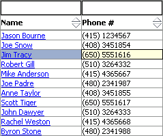
Table component running on Windows Mobile.
Tag name: <amc:table>
The immediate children of a Table component must all be
By default, the table draws both horizontal and vertical grid lines.
The Table component supports sorting columns in ascending or descending
order. On Windows Mobile, sorting is performed by clicking on the header of the column
to be sorted. Repeated clicking will change between ascending and descending sorting. To
sort on Blackberry, move focus to a cell within the column to be sorted and select Sort from
the menu.
There are three requirements to enable sorting: the underlying table
model must support sorting, the "sortProperty" and "sortable"
attributes must be set on the column to enable the sort capability for
that column.
To support sorting, the
To associate a column with a particular property-name to be used for
sorting purposes, use the "sortProperty" attribute on the column.
To enable the UI for sorting a particular column, set the
"sortable" property to
In the following example,
both columns are sortable. Sorting the first column sorts by the
"firstname" property; sorting the second column sorts by the "lastname"
property.
The currently selected row is indicated by changing the background of that row to the color specified
by the
On non-touchscreen Blackberry smartphones, the table implements three different selection modes:
table, row, and cell. By default the table will start out in table mode; however, the starting
selection mode can be specified by setting the
In table mode, the entire table acts as one component for purposes of scrolling. In this mode it
is not possible to interact with the components within the table nor is it possible to directly
navigate through rows and columns.
In row mode, it is possible to navigate through rows and columns directly by using the
trackwheel/trackball. However, it is not possible to interact with components within the table.
For example, in this mode it is not possible to click on a
In cell mode, it is possible to directly interact with components within the table. For example, in this
mode it is possible to click on a
It is possible to change the current row on the table's underlying iterator by using
first/previous/next/last operation bound to components outside the table. When the current row
is changed through such means, the table will scroll to keep the newly selected row visible.
Examples of the "width" attribute: width="700" for 700 pixels, or width="100%" to
fill up the entire width of the container. If no value is defined then the default
will be 100%.
If the sum of column widths is less than the specified table width, the table will
shrink in width to fit exactly around the columns.
The Table is used to display tabular data. It also supports sorting, filtering,
and record navigation.
<amc:column> components. Each visible Column
component creates a separate column in the Table.
For more information see the documentation for
<amc:column>
CollectionModel instance
must implement the following methods:
    public boolean isSortable(String propertyName)
    public void setSortCriteria(List criteria)
    public List getSortCriteria()
true.
For more information see the documentation for
<amc:column>.
<amc:table ...>
  <amc:column sortProperty="firstname" sortable="true" headerText="Firstname">
    ...
  </amc:column>
  <amc:column sortProperty="lastname" sortable="true" headerText="Lastname">
    ...
  </amc:column>
</amc:table>
selectedRowColor attribute. Furthermore, the selected cell within the selected row
is indicated by setting its background to the color specified by the selectedCellColor attribute.
startingSelectionMode attribute
to the desired value. To change from table to row mode and row to cell mode, press the
trackwheel/trackball while focus is on the table. To change from cell to row mode and from
row to table mode, press the Back button.
commandButton that is inside
the currently selected cell. User inputs are handled by the table and are not propagated to
individual contained components. It is helpful to think of the table and row modes as read-only
modes since they make it impossible to directly change the values of the contained components.
commandButton or change the text of an
inputText that is inside the currently selected cell. User inputs are handled by the
component within the selected cell first before being given to the table. For example, if there are two
focusable components within a cell, then scrolling will first move focus from one focusable component to the next
before changing the selected row/column.
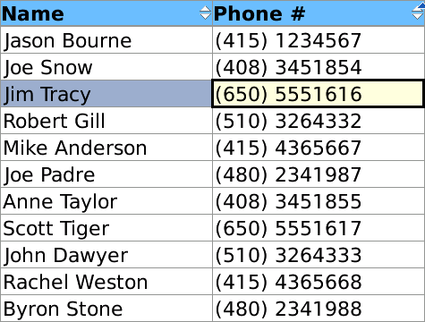
Table component running on Windows Mobile.
<amc:table value="#{myManagedBean.allEmployees}"
          var="emp"
          id="t1">
  <amc:column id="c1" headerText="Name">
    <amc:outputText value="#{emp.ename}" id="ot1"/>
  </amc:column>
  <amc:column id="c2" headerText="Department Number">
    <amc:outputText value="#{emp.deptno}" id="ot2"/>
  </amc:column>
</amc:table>
| Name | Type | Supports EL? | Description |
|---|---|---|---|
| align | String | Yes |
Specifies the horizontal alignment of an element with respect to the surrounding context. Valid values:
Note: On BlackBerry smartphones, if the attribute value is assigned by an EL expression, any changes to the value will not affect the visual appearance of the element once it is rendered. |
| backgroundColor | String | Yes | Sets the color of a background to an RGB value (rgb(255,0,0)) or a hexadecimal number (#ff0000 or #f00). The default value is device-dependent. |
| borderWidth | int | Yes | Sets the width of the borders between cells in pixels. |
| disabled | boolean | Yes | Specifies whether or not the component is disabled. Unlike a read-only component, a disabled component cannot receive focus. |
| emptyText | String | Yes | Specifies the text that is displayed when there are no rows to be shown. |
| focusable | boolean | Yes | Specifies whether or not this component can acquire focus set to it by the user. Unlike disabled, clicking on a focusable component will cause the component to receive focus. |
| foregroundColor | String | Yes | Specifies the color of the foreground of an element. The color value can be an RGB value (rgb(255,0,0)) or a hexadecimal number (#ff0000 or #f00). The default value is device-dependent. |
| height | int | Yes | Specifies the height of the component. Can be entered in pixels or as a percentage of its parent's height. A percentage value should be entered as a number followed by the "%" symbol. A number will be interpreted as a pixel value (as will a number followed by the text "px"). |
| id | String | No |
Specifies the identifier for the component. The identifier must follow the following rules:
|
| rangeChangeListener | oracle.adfnmc.el.MethodExpression | Only EL | Defines a method reference to a range change listener that will be called when a new range is selected. |
| rendered | boolean | Yes | Specifies whether or not the component is rendered. When set to false, no output will be delivered for this component (the component will not in any way be rendered, and cannot be made visible). |
| selectedCellColor | String | Yes | Specifies the background of the selected cell within the selected row in a table. The color value can be an RGB value (rgb(255,0,0)) or a hexadecimal number (#ff0000 or #f00). Default value is #FFFCD8. |
| selectedRowColor | String | Yes | Specifies the background of the selected row in a table. The color value can be an RGB value (rgb(255,0,0)) or a hexadecimal number (#ff0000 or #f00). Default value is #9CACC9. |
| selectionListener | oracle.adfnmc.el.MethodExpression | Only EL | Defines a method reference to a selection listener. |
| sortListener | oracle.adfnmc.el.MethodExpression | Only EL | Defines a method reference to a sort listener. |
| startingSelectionMode | String | Yes |
Specifies the starting selection mode of the table. Valid values:
|
| value | Object | Yes | Specifies the value of the component. |
| var | String | No | Specifies the name of the EL variable used to reference each element of this collection. Once this component has completed rendering, this variable is removed (or reverted back to its previous value). |
| verticalAlign | String | Yes |
Specifies the vertical alignment of a component with respect to the surrounding context. Valid values:
Note: On BlackBerry smartphones, if the attribute value is assigned by an EL expression, any changes to the value will not affect the visual appearance of the element once it is rendered. |
| width | int | Yes | Specifies the width of this component. Can be entered in pixels or as a percentage of its parent's width. A percentage value should be entered as a number followed by the "%" symbol. A number will be interpreted as a pixel value (as will a number followed by the text "px"). |