3 Using the Management Console
This chapter describes the process of working with the Business Transaction Management console; it includes the following sections:
3.1 Getting to Know the Management Console
The Business Transaction Management console displays information about the objects known to the sphere and allows you to access tools for monitoring and managing these objects. The information is presented using different types of views; these include dashboards, charts, maps, graphs, and tables. This section introduces the main areas of the console: the Navigator, the main area, the tabs area, and the main menu.
When you first install Business Transaction Management, the console offers you a set of default views of the objects in the sphere. You can create additional views and save these views to make it easier to access the objects and instruments that interest you. In addition, you can use the custom data explorer to view any object in the system in relationship to any other object.
After you have read through this section, continue reading through the rest of this chapter to learn about the following:
-
controls used in each type of view
-
interpreting default views
-
modifying views
-
creating new views
In addition to using the console, you can also use the Business Transaction Management Command Line Interface (CLI) to issue management commands from the command line or through the use of scripts. You use CLI commands to configure the system, manage DNS aliases, resolve replication issues, register services, manage metadata, control monitoring, apply policies, migrate data, or generate data needed for reporting.
3.1.1 General Console Design
The figure below shows the main areas of the management console.
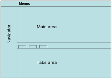
Description of the illustration audi_console_areas.gif
The following sections describe each area in some detail. Here is a brief summary:
-
The Navigator provides a list of views that are available by default. Selecting one of these items displays all objects of this type in the main area.
-
The main area displays the view selected in the navigator. Double clicking any item in the main area opens the tabs area if it is not already opened, and displays detailed information about that item. The main area includes controls at the top that you can use to filter the objects displayed.
-
The menus provide actions that you can perform on the item selected in the main area, or it provides actions unrelated to the selected item, like creating a new object, or performing some administrative action.
-
The tabs area provides additional information about the item selected in the main area.
3.1.2 The Navigator
The navigator is a facilitator that allows you to quickly get to the objects and relationships that interest you. The default navigator sections are the following (they are normally displayed in their expanded form):
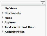
Description of the illustration navigator_abbrev_audi.gif
The navigator includes two kinds of controls:
-
A minimizing control (arrow) in the upper right hand corner. Click this control to collapse the Navigator, which allows more room for the main area.
-
Expansion controls (triangles) to the left of each view name that you can click to expand and view category contents.
Note that each item in the Explorer view contains a numeric value in parenthesis; this indicates the number of such objects known to the sphere. If you were to filter the corresponding main view to show fewer items, the number shown in the Navigator would remain unchanged.
The table below summarizes the contents of the default Navigator categories.
| Category | Description |
|---|---|
| My Views | A list of any views you have modified or created that you have saved. |
| Dashboards | A dashboard is a heterogeneous view comprised of smaller views, typically used to summarize information of interest. It provides a summary view of the state of the system and monitored objects.
By default, the console provides three dashboards: one that summarizes the operational health of the system, and two that provide summary information for the top ten services and transactions. |
| Maps | Graphical views of services and their dependencies, and of containers. |
| Explorer | Tabular views of monitored and non-monitored objects and their relationships. Also includes the custom data explorer, which allows you to view any object in the sphere in relation to other objects. |
| Alerts in the last hour | Tabular views of all alert types: SLA, condition, and system. |
| Administration | Tabular views of system service containers, system services, system policies, monitors, and unassigned endpoints. |
3.1.3 Main Area
For any item selected in the Navigator, except those in the Dashboards and Maps categories, the main area displays a tabular view and, just above the table, a series of controls that you can use to filter the columns and the number of items shown. Here is an example of what is shown in the main view when Containers is selected in the Navigator.
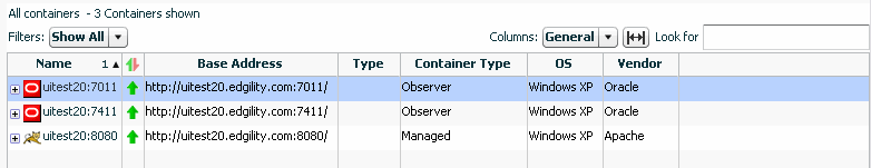
Description of the illustration main_view_example_audi.gif
Use the up/down control in the lower right hand corner of the main area to open and close the tabs area. You can control the size of the main area by moving the slider control bordering the main area and the tabs area.
3.1.4 Menus
Menu items relate directly to the item currently selected in the main area or the tabs area. You might think of the items in the main or tabs area as the nouns and of the menu items as the verbs. Thus, selecting a menu item will result in taking some action that affects the item selected in the main or tabs view.
Although menu items are never hidden, they might be disabled if the operation cannot be applied to the current selection, if the currently selected object is not in an appropriate state, or if the user is not authorized to operate on the target. Look here for additional information about user roles.
3.1.5 Tabs Area
The tabs area is organized into tabbed panels. The tabs shown vary with the item selected in the summary area.
Use the arrow control in the lower right hand corner of the main area to collapse the tabs area. You can expand it again either by double clicking an item in the main area or by clicking the up arrow at the bottom right hand corner of the summary pane.
3.1.6 Object Detail Window
The console provides access to an inspector window or a separate window that includes the tabs area for the selected object. This view is available for any object or area that shows a tear off control (magnifying glass). Clicking the control opens a separate window with additional detail information about the selected item. The information shown varies with the selected object.
3.2 Viewing Data
All data known to the sphere about the services, endpoints, and operations that make up your application are presented using different types of views: graphical views, charts, tabular views, and dashboards. You can view this information using the format that makes it easiest for you to find and interpret data. In addition, you can use a variety of controls to filter and sort the data to highlight selected aspects of application performance.
This section describes the controls and views used to display data. It begins by describing controls that are available for all types of views and continues to describe the characteristics of each type. It covers the following topics:
3.2.1 Viewing Controls
Data is displayed in the console using graphs, tables, charts, and dashboards. This section describes the controls that are available no matter how you view data. Controls specific to a single type of view are described in the section for that type.
For all types of views, you can use controls to filter the information displayed, to add or delete columns in a table or to change time intervals when data is reported; you can also use controls to display additional information or to display information in a separate window.
3.2.1.1 Filtering Controls
You can use filtering controls to filter service maps and tabular data. Business Transaction Management provides two kinds of filters: deep and shallow. Not all views provide both types. The figure below illustrates these controls.
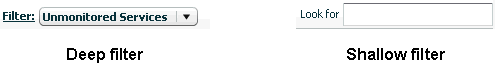
Description of the illustration deep_shallow_filters.gif
Deep filters modify a view by re-fetching data from the sphere according to the constraints you specify using the filter control. Shallow filters simply limit what is currently shown in the console. So, for example if you used a shallow (Look for) filter to show only items that have "Order" in their name, the current view would be refreshed to show you only those items.
You can define deep filters in two ways:
-
Select one of the pre-defined filters from the drop-down list. The choices listed in the drop-down list include those filtering criteria most commonly needed for the object selected in the Navigator.
-
Select the Choose Filter... item from the drop down list to open the Filter tool and specify the desired criteria.
The filter tool allows you to filter objects according to their salient characteristics (attributes); these will differ depending on the object selected in the Navigator: services, containers, policies, devices, consumers, and so on. If the Filter tool does not list an attribute, that means you cannot filter a view based on that attribute.
For more information about the Filter tool, see Section 3.4.3, "Using the Filter Tool."
3.2.1.2 Column Chooser and Sizing Control
Controls for modifying tabular displays (by adding or deleting columns) and for resizing columns are shown just above table views. The figure below shows the column chooser and its drop down list. It also shows the sizing control, which allows you to resize columns so that all columns are visible in the table.
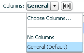
Choose No Columns to display no columns. If you select Choose Columns.... Business Transaction Management displays a tool you can use to add or delete columns.
3.2.1.3 Time Interval Control
The time interval control allows you to specify the interval during which instrument data is fetched and displayed. This control is shown in different locations and has a different effect depending on where it is set. It is displayed either as a clock icon or a drop-down list labeled Time Period.
-
In the column chooser (Instruments tab), the control allows you to specify the intervals over which you want to get instrument data. You can choose this interval to be dynamic, or you can choose fixed periods of 10 minutes, 1 hour, 1 day, or 7 days. If you specify "dynamic," the interval is set by the time interval control shown in the main pane.
-
In the main area, if displayed, the time interval control allows you to specify the intervals for which instrument data is reported. You have the choice of 10 minutes, 1 hour, 1 day, or 7 days.
-
In the Analysis pane, which gives you the finest granularity, you can look at measurements taken in the last fixed period of 10 minutes, 1 hour, 1 day, or 7 days; you can look at measurements taken since a given date and time; or you can look at measurements taken between two specified dates and times.
-
In the Summary pane you can look at measurements taken in the last fixed period of 10 minutes, 1 hour, 1 day, or 7 days; you can also use it to set a time range.
Note that for day and week intervals, the interval is expanded so that you get at least as much data as you ask for. For example, if today is 11:20 a.m. on 12/22/10, and you pick last 1 day, data is returned from 12/21/10 11:00 until now. Similarly, if you pick last week, data is returned from 12/15/10 00:00 till now.
3.2.1.4 Pop-up Links and Inspectors
Some items in tables are underlined to indicate that they are links you can click to open an inspector. For example, in the Operational Health Summary dashboard, the number specifying up containers is such a link.
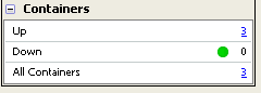
Description of the illustration link_to_container_popup.gif
Click the link to open an inspector window that displays additional information about containers that are currently up.
3.2.2 Viewing Maps
A map is a good way to represent relationships; maps provide a visual representation of how services, endpoints, or operations are related.
-
To view all services and their dependencies, select Maps > Service Map from the navigator.
-
To view containers, select Maps > Container Map from the navigator.
-
To view dependencies between a subset of related services, endpoints, or operations, select the object of interest and click the Dependency tab.
-
To view dependencies between the operations that make up a transaction, select the transaction and click the Summary tab.
The following figure shows a map that presents endpoint dependencies.
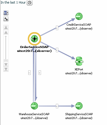
Description of the illustration endpoint_dependency_graph.gif
Because map views focus on relationships, Business Transaction Management attempts to present as clean a picture as possible so as not to obscure these relationships. Additional information is usually available if you move the cursor over the links that connect objects or if you hover over the object itself. In this case, hovering over an endpoint icon displays information about the endpoint's container, service, and core instrument values.
All map views also provide specialized controls that you can use to get additional information or to filter available information. These are described in the following sections.
3.2.2.1 Displaying Tabular Data for a Map
If you click the table icon in any map view, Business Transaction Management displays the corresponding inventory in a table to the left of the map.
The tabular tree view allows you to see one or more layers above or below the objects shown in the graphic. Note the shallow filter at the top of the display; you can use this to further filter the contents of the table.
To close the tabular tree view, click the table icon again.
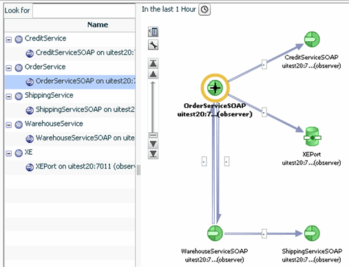
Description of the illustration table_and_graph.gif
3.2.2.2 Filtering and Adjusting the Map View
If you click the wrench icon in any map view, Business Transaction Management offers several controls.
-
The Layout control allows you to choose the direction and type of layout used.
-
The Show Related control allows you to display additional objects that are only indirectly related to the objects whose dependencies are shown. These might be objects that you might want to manually add to the map by registering them.
-
In some maps, this control might also allow you to filter the current view.
3.2.2.3 Scaling a Map View
The scaling icon allows you to expand and shrink the currently displayed map.
Slide the scaling bar up and down to resize the map to the desired size. If scaling does not produce the desired results, you can try using the region control, described next.
3.2.2.4 Focusing on Different Regions of a Map
If a map cannot fit in the current window, Business Transaction Management displays a thumb view control in the lower right hand corner of the map window. You use this control to reposition the map so that you can view all its branches.
To use this control, click on the white rectangle and drag it to position the map as desired. Use the triangle icon in the lower right hand corner to collapse or open the thumb-view control.
3.2.3 Viewing Charts
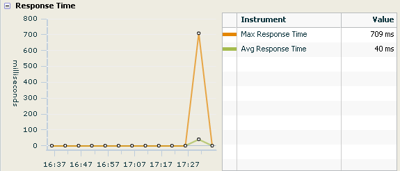
Charts provide a graphic presentation of how instrument values change over time. The following chart displays the response time for a transaction. The chart is accompanied by a table that serves both as a key and as a tabular presentation of the charted data. You can get more information from charts by passing the cursor over the graphed instrument values. As you pass the cursor over the nodes in the chart, Business Transaction Management displays instrument values for the point in time associated with that node.
3.2.4 Viewing Tables
Tables are shown in the main area of the console.
Controls situated above the table allow you to filter the contents of the table, to change the columns shown, or to re-size columns to fit data. You can also sort columns, change column widths, and move columns.
-
To view sorting options for a given column, pass the cursor over the column heading. A pop-up will inform you of your options.
-
To change column widths, place the cursor on the line separating column headings until the resizing icon appears, then drag the icon to change the width of the column.
-
To move columns in different positions, click the column heading and drag to the desired position.
Any changes you make to a table will be lost when you close or refresh your browser. To save a modified view, you must choose View > Save current view from the menu. After naming and saving the view, it will be listed under My Views in the navigator.
3.2.5 Viewing Dashboards
Dashboards are containers that include graphical and tabular elements. They are used to give you a snapshot of some aspect of your system: transaction performance, top ten services, and operational health. You can display dashboards by selecting one from the Dashboards in the Navigator.
3.3 Creating New Views
You can create new temporary or permanent views in the following ways:
-
You can modify existing tables by adding or deleting columns, rearranging columns, and resorting columns.
-
You can create new tables to focus on objects and relationships for which there are no default views.
The views you create are available only for the current session. But you can save a view for future use. Once saved, your custom views are shown in the My Views category of the Navigator.
3.3.1 Modifying Tables
Controls for modifying tabular displays (by adding or deleting columns) and for resizing columns are shown just above table views. The figure below shows the column chooser and its drop-down list. It also shows the sizing control, which allows you to resize columns so that all columns are visible in the table.
Choose No Columns to display no columns. If you select Choose Columns.... Business Transaction Management displays a tool you can use to add or delete columns.
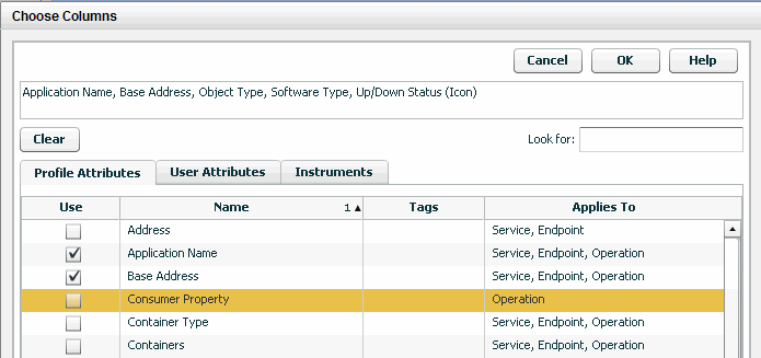
The Choose Columns tool shows the attributes that are currently chosen from any of the three tabs: Profile Attributes, User Attributes, and Instruments.
The top box lists all columns that are currently chosen from any of the three tabs: Profile Attributes, User Attributes, and Instruments.
You can select columns to add or subtract in three tabbed categories. To start, click a tab, and use the Look for filter to narrow the options shown if needed.
-
To add a column click the box in the Use column for the desired attribute or instrument.
-
To remove a column click the checked box in the Use column for the desired attribute or instrument.
User attributes are used only in graphic displays. They dictate whether clients are shown for endpoints or services.
The time control displayed for the Instruments tab applies to all instruments chosen, you can select more than one interval for instruments.
When you are satisfied with your changes, click OK. Look over the resulting view to make sure you have the information you need. You might still want to move or resize columns before saving this as a permanent view.
-
To view sorting options for a given column, pass the cursor over the column heading. A pop-up will inform you of your options.
-
To change column widths, place the cursor on the line separating column headings until the resizing icon appears, then drag the icon to change the width of the column.
-
To move columns in different positions, click the column heading and drag to the desired position.
Any changes you make to a table will be lost when you close or refresh your browser. But you always have the option to save a view you have created.
3.3.2 Using the Custom Data Explorer to Create a View
By default, the console displays objects and relationships thought to be most useful to most users. If the default views do not include the objects or relationships that interest you, use the custom data explorer to display any object known to the system and its relationships to other associated objects. Using this information, you can create your own custom views.
To use the Custom Data Explorer, choose Explorer > Custom Data Explorer from the Navigator.
The custom data explorer uses the main area with which you are already familiar. At the top of the main area, it includes some new controls: Two drop down lists allow you to select an object and one or more associated objects to include in a tree view.
-
The list of possible primary objects is quite long; use the scroll bar to find the object of interest. For a sample view, Transaction is chosen as a primary object.
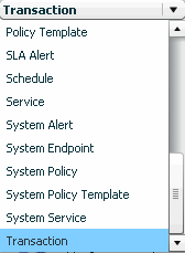
-
The list of possible associated objects, to the right of object list, contains all the objects that the selected object can relate to. For example, the Transaction object can relate to the following:
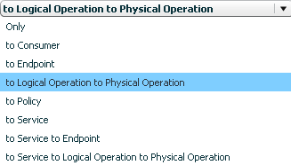
Choosing Only displays no related objects. Choosing a related object displays that object below the primary object in a tree view.
Once you have chosen an item from both lists, the main view will display a tree view with the primary object at the top and one or more subordinate objects underneath. For the sample view, Transactions is chosen as the primary object, and to Logical Operation to Physical Operation is chosen for the associated objects.
You could now use the Column Chooser tool to display attributes and instruments for these primary and associated objects.
When you are done, you can save the view to make it permanent. This process is described in the next section.
3.3.3 Saving a View
To save a view that you have created by modifying an existing view, do the following:
-
With the view in focus, select View > Save current view as from the main menu.
-
If you want this to be a new view, specify its name. This is the name used to reference the view in the My Views category in the Navigator.
-
If this will replace a view by the same name, click the check box Replace the view if it already exists?
-
Click OK.
The view you saved will be displayed in the Navigator in the category My Views. To set the view as a default view, select Set current view as default from the View menu.
3.4 Management Console Reference
This section provides reference information about using controls and tools that are common to many views. It describes the following controls and tools:
3.4.1 Using the Analysis Tab
The Analysis tab displays detailed current performance and usage information for the selected object, either a transaction, service, endpoint, operation, or consumer. Because some types of information are relevant to only certain types of objects, the layout of the Analysis tab can vary from object to object.
The Analysis tab is composed of a number of panes that you display one at a time. Each pane displays a different type of information. The set of available panes changes depending on the object you select (in other words, not all panes are available for every type of object). The panes are described in this section.
3.4.1.1 Performance Pane
When you select a transaction, this pane provides started transactions, completed transactions, condition alerts, average response time, and maximum response time instruments. These instruments are displayed in a Count chart, Count table, Response Time chart, and Response Time table.
When you select a service, endpoint, operation, or consumer, this pane provides traffic, throughput, faults, fault percentage, average response time, and maximum response time instruments. These instruments are displayed in a Messages chart, Messages table, Response Time chart, and Response Time table.
The blue line in the Count chart indicates the number of transactions that started; the green line, the number of transactions that completed; and the red line, the number of condition alerts that occurred during the associated time segment, for example: 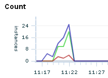
The Count table displays these measurements numerically.
The total height of the bars in the Messages chart indicates the traffic observed during the associated time segment. The green portion of the bar indicates the throughput, and the red portion indicates the fault count, for example: 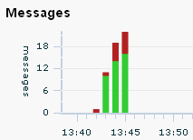
The Messages table displays these measurements numerically, with the addition of the fault percentage measurement. Clicking a hyperlinked value in the table opens the Message Log Search tool and runs a predefined query to return the messages associated with the measurement value. For example, if you want to examine the messages responsible for the Traffic value, click the value: 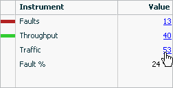
The green line in the Response Time chart indicates the average response time for the associated time segment; the orange line indicates the maximum response time, for example: 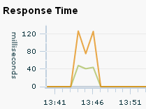
The Response Time table displays these measurements numerically.
3.4.1.2 Transaction Performance
Displays transaction performance measurements associated with the selected consumer. See the description of the Performance pane for details concerning the charts and tables.
3.4.1.3 Service Performance
Displays service performance measurements associated with the selected consumer. See the description of the Performance pane for details concerning the charts and tables.
3.4.1.4 Consumer Usage
Displays throughput, faults, fault percentage, average response time, and maximum response time measurements for the selected object, segmented by consumer. The table lists all consumers of the selected object and the aggregated performance measurements associated with each consumer's use of the object.
3.4.1.5 Transaction Usage
Displays started transactions, completed transactions, average response time, and maximum response time measurements associated with the selected consumer. These measurements are segmented by transaction.
3.4.1.6 Service/Endpoint Usage
Displays throughput, faults, and fault percentage associated with the selected consumer. These measurements are segmented by service and endpoint.
3.4.1.7 Condition Alerts
Lists information about the condition alerts that have been triggered in a given time period: the name of the condition that was met, the endpoint where the condition alert was triggered, and the number of condition alerts triggered.
3.4.1.8 Breakdown by Client Address
Displays throughput, faults, and fault percentage for the selected object, segmented by the client address, which is the machine host name from which the request was sent. The table lists all client addresses that sent requests to the selected object and the aggregated performance measurements associated with each client address's use of the object.
3.4.1.9 Callouts
Lists each operation (qualified by endpoint) to which the selected object made an outbound call. The Operation column identifies the operation that made the outbound call. Aggregated link throughput, link faults, and link average response time is displayed for each type of outbound call.
3.4.1.10 Custom Charting
Lets you set up a customized chart and table similar to the Performance pane, but with instruments of your choosing.
Click Choose Instruments and select the instruments you want displayed in the chart and table. You can select multiple instruments. When you set up a custom chart/table for a transaction, it is available for any selected transaction, likewise for consumers, and for services/endpoints/operations.
3.4.1.11 Custom Breakdown
Lets you set up a custom table of numeric instruments segmented in various ways.
Click Choose Instruments and select the instruments you want displayed in the table. You can select multiple instruments. Click Choose Segments and select how you want to segment the measurements. You can select multiple segments.
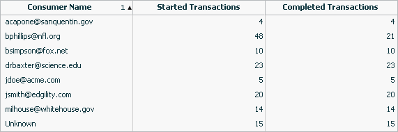
For example, you might set up a table that displays the number of started and completed transactions per consumer, where your instruments are started transactions and completed transactions and your segment is Consumer Name:
3.4.2 Health Summary Dashboards
The Admin Health Summary dashboard enables you to quickly assess the health of your Business Transaction Management system components. The Operational Health Summary dashboard provides that same information plus information about the health of your business components.
To display the Health Summary dashboards
-
Choose Dashboards > Admin Health Summary
-
Choose Dashboards > Operational Health Summary
These dashboards are composed of multiple tables. Each table provides summary information about a particular type of object, such as transactions, services, SLA alerts, and so forth. The rows in each table generally indicate a status that the object can be in, and the numerical value indicates how many instances of the object is in that state. For example, in the following case, 5 services are in a state of failure and 5 are in a state of warning.
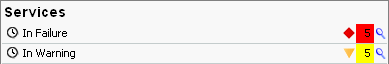
The clock icon at the far left indicates that the numeric value is relative to the Time Period selected at the top of dashboard. Click the magnifying glass next to a value to pop up a list of the individual objects in that state.
3.4.3 Using the Filter Tool
The Filter tool allows you to filter objects according to their salient characteristics, which varies according to the item chosen in the Navigator. Although the basic structure of the Filter tool does not change as the target object changes, the criteria you can select does change depending on whether the filter is used to modify the view of services, containers, policies, consumers, and so on.
In addition to the predefined filters, which are shown in a drop list next to the Filter link, you can also click on the link to open the Filter tool and obtain a richer choice of filtering criteria.
Note: You cannot filter condition alerts, observers, or schedules.
To open the filter tool, click on the Filter link in any view where it is displayed.
Business Transaction Management displays a dialog like the following:
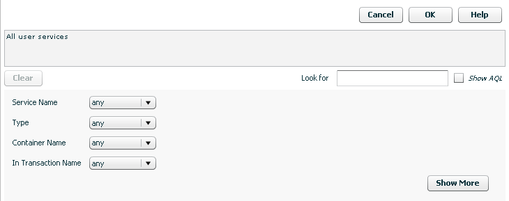
Description of the illustration filter_link.gif
The tool initially presents a short form that allows you to define a filter that references the most common criteria for the object of interest. The domain of objects for which you are creating a filter is displayed in the text box. For example, in the figure above, the text box informs you that you are creating a filter for all user services. To display additional criteria, click the Show More button.
As you select criteria for a query, either from the short form or from the longer form (Show More), Business Transaction Management translates your choices into an AQL expression that it uses to search the database. You can see that AQL query statement in the text box at the top of the tool by clicking the Show AQL check box.
You can use this feature to define AQL expressions that you can pass to CLI commands that use the -filterQuery flag. Simply use the filter tool controls to define your criteria, then copy and paste the AQL expression into the CLI command. Remember to enclose the query in quotation marks if it includes spaces.
When you are done selecting the criteria of interest, click the OK button to use this filter to modify the current view. See Section 3.3.3, "Saving a View" for instructions on saving your view.
3.4.4 Adding a Custom Attribute for Filtering
You can add a custom attribute for any object in the sphere (service, endpoint, container, and so on). This enables you to use the filter tool to find objects that have specific attribute values. For example, you might want to assign priority levels to services and then filter services based on their priority.
Note that unlike default attribute labels, user-defined attribute labels are not automatically translated.
The basic process for adding and using custom attributes for filtering objects is as follows:
-
Add a custom attribute for the object type of interest.
-
Edit an individual object's profile to assign a value to the custom attribute.
-
Use the Filter tool to select only those objects whose custom attributes have the desired value.
3.4.4.1 Adding the Attribute
To add a custom attribute, do the following:
-
Navigate to Admin > Edit Data Model Attributes. The Edit Data Model Attributes tool is displayed.
-
In the Settings area, find the object to which you want to add a custom attribute.
-
Click the add attribute link.
-
Provide the following information. Only the name and type are required.
Name: Specify the name of the attribute.
Type: Select the type of the attribute.
Form Label: This is the name that will be used to identify the attribute in the Profile tab and in the Filter tool. You only need to specify a value if you want the label to be different from the name of the attribute.
Query Label: This is the name that will be used to identify the attribute in the Query text box in the filter tool. You only need to specify a value if you want the label to be different from the name of the attribute.
Value: Click the add value link to provide a suggested value for the attribute. This value is then displayed in the Profile tab for the selected object. (Optional)
Description: Add a description to remind of the use or purpose of this attribute. (Optional)
-
Click Apply
3.4.4.2 Assigning an Attribute Value
To assign values to the custom attribute, do the following:
-
Open the Profile tab for the object to which you have added a custom attribute. The attribute you have added should be shown in the Attributes area of the Profile tab.
-
Select Edit Profile for <Object> from the Modify menu.
-
Specify a value for the custom attribute in the adjoining text box.
-
Click Apply. The value you entered should now be shown in the Profile tab.
3.4.4.3 Filtering Based on a Custom Attribute
To filter objects based on a custom attribute, do the following:
-
From the Filters drop list, select Choose Filter...
-
Expand the attributes link for the object of interest. For example, Service Attributes or Container Attributes.
-
The custom attribute you have created for the object should be listed along with any default attributes defined for the object. If it is not, refresh your browser.
-
Use the drop down list for the custom attribute to specify a search criteria.
-
Click OK. All objects matching the specified criteria will be listed in the main area.
3.4.5 Keyboard Shortcuts
You can use keyboard shortcuts to navigate the Business Transaction Management management console. These shortcuts are supported for Microsoft Internet Explorer 8.
For general information on using shortcuts with Internet Explorer, see the information provided for viewing and exploring web pages at the following site:
http://windows.microsoft.com/en-US/windows-vista
                                        /Internet-Explorer-8-keyboard-shortcuts
This section provides additional detail on how to use keyboard shortcuts in the various areas of the management console.
As noted in Section 3.1.1, "General Console Design," the management console is divided into four sections: the menu bar, the navigator, the main area, and the tabs area. In addition, it is possible to access and use different tools while working with the console. Because these areas are created using different underlying technologies, keyboard shortcuts are not necessarily consistent. Please note the differences and limitations for each area; these are described in the following subsections.
The Tab key is the basic means of navigating through the console. (Tab to go forward; Shift-Tab to go back.) The general tab order is the following: top explorer controls, console menu, log out and refresh controls, console Navigator items, main area controls (filters and column chooser), main area items, tabs area.
Use the following guidelines to work with management console menus:
-
Use tab to move across the menus (shift-tab to move backward).
-
Press Enter to open a menu.
-
Use the up/down arrow keys to move forward/backward through menu items once the menu is open.
-
Use the right arrow key to navigate through layered menus.
-
Press Enter to execute the currently selected menu item.
Use the following guidelines to work with Navigator items:
-
Use the Tab key to reach the Navigator.
-
Use Tab to move forward and Shift-Tab to move backward through the Navigator. without highlighting items.
-
Use the up/down arrows to navigate directly from category to category.
-
Use the right/left arrows to navigate sequentially through categories and views.
-
To expand or collapse a Navigator category, tab to the category and press Enter.
-
To select a Navigator item, tab to the item and press Enter.
To access the main area, move the focus to the last item in the navigator and press the Tab key. This should move the focus to the Filter control in the main area.
To access items in the grid view in the main area, tab until the focus moves through the main area controls (Filters, column chooser ... and highlights the top line of the grid view.) When the top line of the grid view has the focus, use CTRL-down arrow to move the focus to the first item listed in the grid view.
-
To move through items in the grid view in the main area use the up/down arrow key.
-
To expand an item, move the focus to that item and press Shift-CTRL-right arrow. You can then use the up/down arrows to move linearly through grid items.
-
To open the tabs area for an item, place the focus on the item and press Enter.
To work in the tabs area you must display the area and then be able to navigate across tabs and into the content of a specific tab.
To display the tab area you can do one of the following:
-
Place the focus on the item for which you want to display detailed information, and press Enter.
-
Tab to the View menu and select Show/Hide Details Pane. You can then tab through the items shown in the main area to display detailed information about each item.
To access tab contents.
-
In the main area, move the focus to the last item in the grid view using the down arrow key. When you get to the last item, use the Tab key to navigate to the desired tab in the Tabs area.
-
Press Enter to open the tab that is currently in focus.
-
To navigate into the tab's contents, use the Tab key to move the focus across all the tabs to the right of the current tab. After the last one, the focus will shift to the open tab's contents.
-
When the focus moves to the tab contents, use the Tab key to move through elements in the tab. To activate a control or select an item, press the Space bar or press Return.
Caution:
Tabbing beyond the last item in a tab might cause you to lose focus. To be safe, back tab through the tab items (shift-tab) to the main area.You can access tools either from the menu or by using the controls displayed in the main area or in the tabs area. Within the tools:
-
Use the Tab key to move across items in the tool.
-
Press Esc to cancel a tool at any time.
-
Pressing Enter activates the OK or Apply button for the tool. Unless you mean to do that, pressing the Space bar is the means for executing an action within a tool. For example, press the Space bar to toggle check boxes or to execute an action specified by a link or a button,
-
To select items from a drop list, use the up/down arrows.
-
If the tool includes a tab area, use the right/left arrows to move across the tabs.
Caution:
Tabbing beyond the last item in a tool might cause you to lose focus. To be safe, back tab through the tab items (Shift-Tab) to move the focus out of the current tab.