 Determining Whether Users Are in Accessible Layout Mode Using PeopleCode
If you customize PeopleSoft applications, you should ensure that your customizations take advantage of all of the accessibility features that are available in PeopleTools so that your customized applications appear properly in Accessible Layout mode. PeopleTools applies many of the accessibility features automatically at runtime. However, in some cases the accessibility features rely on settings that you apply when creating or customizing applications in PeopleSoft Application Designer. Therefore, you must ensure that any changes or customizations that you make meet accessibility requirements. This chapter discusses how to:
Determine whether users are in Accessible Layout mode using PeopleCode.
Enable users to complete tasks using the keyboard.
Maintain the focus.
Identify images and user interface elements.
Use images consistently.
Enable users to override contrast and color selections.
Provide alternatives to color coding to convey meaning.
Provide links to skip repetitive navigation.
Create HTML that is not generated by PeopleTools.
Test for accessibility.
Note. This chapter assumes that you have a basic understanding
of how to use PeopleSoft Application Designer.
The sections in this chapter list the main Section 508 standards to
which they apply. However, not all Section 508 standards are covered in this
chapter because most accessibility features are provided automatically with
PeopleTools and do not require you to apply any settings when you customize
applications. You can find a complete list of the Section 508 standards at
http://www.section508.gov/.
See Also
PeopleTools 8.52: PeopleSoft Application Designer Developer's Guide
Determining Whether Users Are in Accessible Layout Mode Using PeopleCode
Users activate Accessible Layout mode in their personalizations. PeopleTools provides a PeopleCode function to determine a user's layout mode personalization setting. For example:
&access = GetUserOption("PPTL","ACCESS");
If &access = "A" then
/*  Logic for accessible layout mode user */
Else
/*  Logic for non-accessible layout mode user */
End-if
Enabling Users to Complete Tasks Using the Keyboard
This section explains how to design applications to help satisfy the following Section 508 standards:
1194.21(a) When software is designed to run on a system that has a keyboard, product functions shall be executable from a keyboard where the function itself or the result of performing a function can be discerned textually.
This section discusses how to:
Maintain a logical tab order.
Assign keyboard shortcuts.
 Maintaining a Logical Tab Order
Maintaining a logical tab order on your page is critical because blind and visually impaired users cannot see the groupings or field proximity. In Accessible Layout mode, PeopleTools automatically linearizes pages based on the tab order, so the tab order must be set up correctly in each page definition in PeopleSoft Application Designer.
Tab order is also important for sighted users who use the keyboard to navigate because it can be confusing if the cursor moves to fields in an order that is different from how they appear on the screen.
This section discusses how to:
Order controls logically
Test the tab order
Change the tab order
Ordering Controls Logically
Tab ordering through a page at runtime is strictly defined by page field ordering. When you add a control to a page, PeopleSoft Application Designer automatically inserts it in the order list based on where you position it on the page. You can manipulate the ordering of fields on your page by moving them up or down on the Order tab in the page definition. In doing so, you also change the tab order that users follow as they move through fields on the page.
In general, field tab order should flow from top left to bottom right on a page. The flow should reflect the way that the eye naturally scans information. On a page with multiple scroll levels, the tab order should follow the scroll level order, from Level 0 to Level 1, and so on. In a noncolumnar page, the tab order should go from left to right on each line from top to bottom. For example:
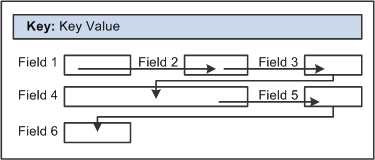
Example flow of a noncolumnar page
In a columnar page, the tab order should go from the top to the bottom of the first column, and then from the top to the bottom of the second column, and so on. For example:
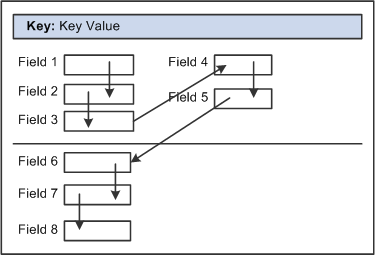
Example flow of a columnar page with two columns
Fields that share the same label should follow consecutively in the tab order from left to right.
After you have placed all of the controls on your page, you should test the tab order. You can do this by viewing the page in the browser and tabbing through the page controls.
Note. The tab order that you establish at design-time may not apply for all browsers.
See "Troubleshooting Browser Limitations" on My Oracle Support.
Changing the Tab Order
The Order tab of the page definition displays attributes about each of the page fields and their field order. The ID column represents the order in which the field was added to the page. If you modify the order of page fields on the page, note that the numbers assigned to each field remain constant. Thus the IDs may not always appear in sequential order. The field ID appears in the Compare report when a database compare is performed to assist you in identifying specific page fields.
Reorder page fields on the Order tab by dragging them in the same view. Changing the order list does not change the physical location of controls on the page. It changes only the logical order or tab order in which controls are processed. When you have added and arranged all of your controls, you may want to print your page definition to see how you might need to reorder your controls.
The Order tab also governs processing rules for scrolls and record or field relationships. Consider which controls are associated with which scroll area or scroll bar and which secondary relationships are important to page processing.
To change the order list:
Open the page definition in PeopleSoft Application Designer.
Select the Order tab.
To move a control to another position in the control order list, select the control that you want to move.
Press the Shift key to select multiple controls.
Drag the selected control to the new position on the Order tab.
The system moves the control to the new location in the list. The ID value remains static. The visual display of the page still looks the same—changing the order list does not move the control on the page, only the logical processing order of the control.
Important! When viewing your page in Test Mode, page fields cannot be accessed, moved, or modified from the Order tab if the page definition contains a sub page. Exit Test Mode to rearrange page fields in the order list.
See Also
PeopleTools 8.52: PeopleSoft Application Designer Developer's Guide, “Creating Page Definitions,” Ordering and Spacing Page Controls
Assigning Keyboard Shortcuts
Use keyboard shortcuts to improve usability for users who use a keyboard rather than a mouse. PeopleSoft applications use two kinds of keyboard shortcuts: hot keys and access keys.
See Understanding Keyboard Shortcuts.
This section discusses how to:
Assign access keys to page tabs.
Assign access keys to grid tabs.
Assigning Access Keys to Page Tabs
To assign access keys to page tabs:
Open the component definition in PeopleSoft Application Designer.
Enter an ampersand (&) in the text of the item label for the page preceding the letter that you want to assign as the access key.
The access key letter is underlined on the page tab at runtime. For example:
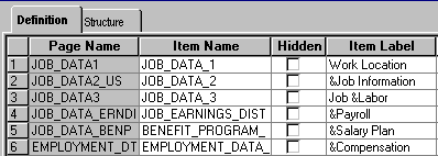
Item labels with ampersands
Note. Make sure that the access key that you assign does not conflict with any other access keys that are assigned in the component.
At runtime, a user can navigate between pages by pressing the Alt key plus the letter that is underlined, followed by the Enter key. For example:
Underlined access keys on tabs
Assigning Access Keys to Grid Tabs
To assign access keys to grid tabs:
Open the grid tab separator properties in PeopleSoft Application Designer.
On the Label tab, enter an ampersand (&) in the label text preceding the letter that you want to assign as the access key.
The access key letter is underlined on the grid tab at runtime.
Note. Make sure that the access key that you assign does not conflict with any other access keys that are assigned on the page.
At runtime, a user can navigate between grid tabs by pressing the Alt key plus the letter that is underlined, followed by the Enter key.
See Also
PeopleTools 8.52: PeopleSoft Application Designer Developer's Guide, “Creating Component Definitions”
PeopleTools 8.52: PeopleSoft Application Designer Developer's Guide, “Using Scroll Areas, Scroll Bars, and Grids,” Using Grids
PeopleTools 8.52: PeopleSoft Application Designer Developer's Guide, “Creating HTML Definitions”
Maintaining the Focus
This section explains how to design applications to help satisfy the following Section 508 standard:
1194.21(c) A well-defined on-screen indication of the current focus shall be provided that moves among interactive interface elements as the input focus changes. The focus shall be programmatically exposed so that assistive technology can track focus and focus changes.
PeopleTools is designed to provide clear feedback on the position of the cursor on-screen and to enable assistive technology to track the cursor focus. When accessibility features are on (in both Standard and Accessible Layout modes), the on-screen focus is indicated by a thick dark outline around the field that is in focus.
To help assistive technology maintain the focus, set up applications to use the Deferred processing mode, which batches field-level events and processes them the next time the user triggers a server trip. Interactive mode processes field level events as they occur, giving users immediate feedback. However, each server trip refreshes the page. This refresh may cause some screen readers to lose focus of the field that the user was on, resulting in the screen readers going back to the top of the page and reading the page from the beginning. Some screen reader users may waste time finding their place again after a screen refresh. Interactive mode might still be appropriate in some situations, such as when one field on a page is dependent on another, but use it judiciously and test it with screen readers.
You can select Deferred mode at the page control, grid, page (include subpage and secondary page), and component levels. For a page control in the component to run in Deferred mode, you must select Deferred mode at each of those levels. Deferred mode is the default processing mode at all levels.
This section discusses how to:
Set Deferred mode at the page control or grid level.
Set Deferred mode at the page level.
Set Deferred mode at the component level.
See Also
PeopleTools 8.52: PeopleSoft Application Designer Developer's Guide, “Designing Pages for Optimal Performance and Accessibility,” Improving Online Performance
Setting Deferred Mode at the Page Control or Grid Level
To set Deferred mode at the page control or grid level:
Open the properties for the control or grid in PeopleSoft Application Designer.
On the Use tab, select the Allow Deferred Processing check box.
See Also
PeopleTools 8.52: PeopleSoft Application Designer Developer's Guide, ”Using Page Controls”
PeopleTools 8.52: PeopleSoft Application Designer Developer's Guide, “Using Scroll Areas, Scroll Bars, and Grids,” Using Grids
Setting Deferred Mode at the Page Level
To set Deferred mode at the page level:
Open the page properties in PeopleSoft Application Designer.
On the Use tab, select Allow Deferred Processing.
See Also
PeopleTools 8.52: PeopleSoft Application Designer Developer's Guide, “Creating Page Definitions,” Producing Pages
Setting Deferred Mode at the Component Level
To set Deferred mode at the component level:
Open the component definition in PeopleSoft Application Designer.
Select the Allow Deferred Processing check box for every page in the component.
Open the component properties.
On the Internet tab, select Deferred for the processing mode.
See Also
PeopleTools 8.52: PeopleSoft Application Designer Developer's Guide, “Creating Component Definitions”
Identifying Images and User Interface Elements
This section explains how to design applications to help satisfy the following Section 508 standards:
1194.21(d) Sufficient information about a user interface element including the identity, operation and state of the element shall be available to assistive technology. When an image represents a program element, the information conveyed by the image must also be available in text.
1194.21(l) When electronic forms are used, the form shall allow people using assistive technology to access the information, field elements, and functionality required for completion and submission of the form, including all directions and cues.
1194.22(a) A text equivalent for every non-text element shall be provided (e.g., via "alt", "longdesc", or in element content).
1194.22(g) Row and column headers shall be identified for data tables.
1194.22(n) When electronic forms are designed to be completed on-line, the form shall allow people using assistive technology to access the information, field elements, and functionality required for completion and submission of the form, including all directions and cues.
Ensure that all user interface elements have descriptive labels. PeopleTools provides the ability to add labels to user interface elements, but it does not automatically insert labels. You must add them manually.
User interface elements include functional images, page controls (such as push buttons and edit boxes), grids, group boxes, and scroll areas. Functional images include image buttons and links and images that convey meaningful information, such as status. Meaningful labels are vital for blind or visually impaired users so that they can understand the meaning of an image through screen readers. Image labels also clarify the meaning of images for sighted users, because the labels appear as mouse-over text in some browsers. Decorative images, such as invisible spacer files or images that do not serve a functional purpose other than to provide visual interest, should have blank labels.
Note. When you assign labels to images in PeopleSoft Application Designer, PeopleTools generates alternate text (<ALT> HTML tags) based on the labels at runtime. These labels are visible to all users as mouse-over text in some browsers, regardless of whether the system administrator makes the accessibility features available to users in PeopleTools Security.
This section discusses how to:
Create meaningful label text.
Assign labels to user interface elements.
Remove labels from decorative images.
Provide text equivalents for charts and graphs.
Assign labels for grid columns and rows.
Assign titles and summaries for grids and scroll areas.
Hide labels.
Using pop-up message windows for important information.
Creating Meaningful Label Text
This section provides general guidelines for creating label text, but this information is not meant to be a complete discussion about text. You should consult other resources, as well.
Follow these general guidelines when you create label text to assign to user interface elements:
Use descriptive text that explains the specific function or purpose of the user interface element.
For example, do not create a link labeled “Click here.” Use a descriptive label, such as “Return to Previous Page.”
Use unique labels for all images and controls on a page.
Many screen readers generate lists of the various controls (such as buttons and links) on a page to make it easier for users to navigate without having to tab through the entire page. If two buttons on a page have the same name, users may not be able to determine which one they need from the list that is generated by the screen reader.
For example, if you create a page to send an email, do not include a “Find” link for the To field and another “Find” link for the CC field. In a screen reader, the list of links displays two “Find” links but no additional information to differentiate between them.
Note. Within grids, the same fields, buttons, and links appear in every row. However, these are not considered duplicates because screen readers typically read the row number with each label (for example, “row 1 Details link,” “row 2 Details link,” and so on).
Avoid using abbreviations in labels.
Screen readers read abbreviations differently. For example, some read Nbr as a word and others read it as individual letters, either of which could confuse users.
Avoid using punctuation and symbols in labels.
Screen readers interpret symbols differently. For example, some read # as number and some read it as pound.
Do not modify formatting styles to add color, bold, or italicized text to labels because screen readers do not recognize formatting changes.
Do not use device-dependent language such as “Click” in link text.
Not all users use a mouse, so the word click can be misleading.
Assigning Labels to User Interface Elements
To assign labels to user interface elements:
Open the properties for the image or page control in PeopleSoft Application Designer.
On the Label tab, select the type of label, and enter or select the label text.
Label types include a message from the Message Catalog, custom label text, or the RFT long or RFT short label if the image or control is associated with a record field. (Not all label types are available for all types of controls.) The Message Catalog is the preferred source of label text because it can be translated. The Message Catalog contains labels for the following types of page elements: folder tabs, scroll left and right buttons, hide and show grid tabs, prompt buttons, expand and collapse grid buttons, group boxes, and scroll areas.
Follow these principles when choosing the type of label:
For buttons and links that perform a function, choose a label that describes the function (for example, Search or Save).
For data entry fields, choose a label that describes what to enter in the field.
If an image displays text, choose a label that is exactly the same as the text in the image.
If an image is not active but conveys information, choose a label that conveys the same information (for example, a description of the status).
If an image is redundant or conveys no information, leave the label blank.
Guidelines for Data Entry Field Labels
To ensure that screen readers read data entry field labels properly, use the following general guidelines when creating field labels:
Avoid repeating group box labels in the field labels within the group box.
When you include fields within a group box, screen readers read the group box label before each field label within the group box.
Avoid adding additional text after the field that explains information about what the user should enter.
Screen readers do not typically read this type of text with the field labels. Instead, a user must specifically command the screen reader to read the entire page or a particular area of the page. As an alternative to including additional text after the field, make the field label more descriptive.
Do not use static text or a second independent field as the label for a data entry field.
Doing so may cause confusion for some blind or visually impaired users because not all screen readers interpret these situations correctly. Always assign the label to the field in the properties for that field.
Do not insert a text field above a column of entry fields to simulate a table and column heading.
Instead, assign a unique label to each field or use a grid, if appropriate.
Size edit boxes, long edit boxes, and drop-down list boxes so that the full contents are visible without horizontal scrolling.
Place labels close to the corresponding fields.
For edited boxes, long edited boxes, and drop-down list boxes, place labels to the left (or above) the field. For check boxes and radio buttons, place labels to the right.
Note. Do not place entry fields between radio buttons. This placement may interfere with how screen readers read the radio buttons.
Guidelines for Push Buttons and Links
If links are close together, include a vertical separator ( | ) between links to help users differentiate between the links on the screen.
See Also
PeopleTools 8.52: PeopleSoft Application Designer Developer's Guide, “Using Page Controls”
PeopleTools 8.52: PeopleSoft Application Designer Developer's Guide, “Creating Field Definitions,” Using Multiple Labels
PeopleTools 8.52: PeopleSoft Application Designer Developer's Guide, “Creating Page Definitions,” Setting Page Field Properties for Controls
Removing Labels from Decorative Images
If images have no information to convey to users and do not serve as navigation, they should not have labels. Images used as spacers, such as invisible GIFs, also should not have labels.
To remove labels from images:
Open the properties for the image in PeopleSoft Application Designer.
On the Label tab, set the Label Text Type field to Static Text.
Delete any characters from the Text field if it is present.
You do not need to enter a space. Leave the Text field blank.
Providing Text Equivalents for Charts and Graphs
Charts and graphs present data as images or client-side image maps with links to navigate to details about the data. Because charts and graphs typically display significant amounts of data, providing alternate text labels for the chart or graph images is usually not enough to make the data accessible to people using screen readers. To make charts and graphs accessible:
Do not use ASCII images to display charts and graphics; use the objects that are provided in PeopleTools.
Do not use color alone to convey information in charts and graphs.
See Providing Alternatives to Color Coding to Convey Meaning.
Provide textual information to describe the content of charts and graphs.
You can insert a static text field to describe the charts and graphs, but also consider displaying the underlying table information of the chart or graph in a grid format in Accessible Layout mode. This method ensures that users in Accessible Layout mode get the same information that the chart or graphic image conveys.
Note. The label that you specify on the Label tab of the Chart Properties dialog box is for information-only and does not appear at runtime. This label appears on the control order list on the Order tab of the page definition and any page definition report that you print.
See Also
PeopleTools 8.52: PeopleSoft Application Designer Developer's Guide, “Using Page Controls,” Using Charts
PeopleTools 8.52: PeopleSoft Application Designer Developer's Guide, “Using Page Controls,” Using Static Text
PeopleTools 8.52: PeopleCode API Reference, “Charting Classes”
Assigning Labels for Grid Columns and Rows
When you create grids, make sure that you include column headings for all visible columns, including columns that contain images and links. In addition, avoid adding grid controls (such as scroll actions). Grid controls that you add are not included automatically within the page area that is skipped by the PeopleTools-generated page anchor.
Column headings and their alignment are derived from the label text that you select on the Label tab in the properties for the page control or page field that you assign to the column. Therefore, you must make sure that the associated page controls or data entry fields have appropriate labels, according to the guidelines in the preceding sections. Also make sure that you select the Show Column Headings (runtime) check box on the Label tab in the Grid Properties dialog box.
If adding column headings will interfere with usability for sighted users, you can hide the grid column titles so that they appear only in Accessible Layout mode by adding PeopleCode that renames the column headings at runtime.
You can also assign row headings, which number the rows at runtime. The row headings option is selected by default. To assign the row headings, select the Show Row Headings (runtime) check box on the Label tab in the Grid Properties dialog box.
See Also
Providing Links to Skip Repetitive Navigation
PeopleTools 8.52: PeopleSoft Application Designer Developer's Guide, “Using Scroll Areas, Scroll Bars, and Grids”
PeopleTools 8.52: PeopleCode Developer's Guide
PeopleTools 8.52: PeopleCode Language Reference
Assigning Titles and Summaries for Grids and Scroll Areas
Include titles and descriptive summaries for all grids and scroll areas. To do this:
Open the properties for the grid or scroll area in PeopleSoft Application Designer.
On the Label tab, select the Display Title check box.
Click the Properties button for the display title to open the Title Properties dialog box.
Enter the Label text that you want to appear in the title:
|
Type |
Select the type of label text to appear in the navigation bar. Message Catalog: Select this option to use a message in the Message Catalog as the title. Static: Select this option to manually enter text as the title. |
|
Text |
Enter the text to appear as the title of the scroll area. This field is enabled when you select Static as the Label Text type. |
|
Message Set/Number |
Enter the message set number and message number of the message in the Message Catalog to appear as the title of the scroll area. This field is enabled when you select Message Catalog as the Label Text type. |
Click OK to return to the Label tab in the properties.
Click the Properties button in the Summary group box to open the Summary Properties dialog box.
Note. The default value of the summary matches the title. However, you should add a more detailed description of the contents of the grid or scroll area to make the summary more useful in Accessible Layout mode.
Clear the Default to Title check box to activate the other Summary options.
Enter static text or enter a message set and number to use text from the Message Catalog.
Click OK twice.
See Also
PeopleTools 8.52: PeopleSoft Application Designer Developer's Guide, “Using Scroll Areas, Scroll Bars, and Grids”
Hiding Labels
In some cases you might want to hide labels so that they do not appear on screen but are still read by screen readers in Accessible Layout mode. For example, a currency field that appears to the right of an amount field may not require a visible label for sighted users. However, blind users often navigate to fields from a list of fields that the screen reader generates, so each field requires a label. In addition, you can hide grid column labels if making them visible will interfere with usability for sighted users. When you hide grid column labels, they still appear in Accessible Layout mode.
To hide labels while still enabling screen readers to access them:
Open the properties for the page control or page field in PeopleSoft Application Designer.
On the Label tab, make sure that a label is selected and change the style to PTTRANSPARENT.
This style is set up to be invisible except for users in Accessible Layout mode.
Note. If you use PTTRANSPARENT for a check box label, make sure that no fields are close to the check box label, even though it is transparent, because it might overlap the field.
Using Pop-Up Message Windows for Important Information
If you use a field or an HTML area to display text that contains important information, such as error messages, use PeopleCode to display the message in a pop-up window in Accessible Layout mode. Screen readers do not typically read display-only field values unless a user specifically commands the screen reader to read the entire page or a particular area of the page.
The following example shows how to create this type of PeopleCode:
If All(&CAL_FINAL_TS) Then
		If GetUserOption("PPTL", "ACCESS") = "A" Then
			MessageBox(%MsgStyle_OK, "", 17000, 407, "");
		End-If;
		&rs0(1).DERIVED_GP.TEXT254.Value = MsgGetText(17000, 407, "");
		&rs0(1),DERIVED_GP.TEXT254.Visible = True;
Else
See Also
PeopleTools 8.52: PeopleCode Developer's Guide
PeopleTools 8.52: PeopleCode Language Reference
Using Images Consistently
This section explains how to design applications to help satisfy the following Section 508 standard:
1194.21(e) When bitmap images are used to identify controls, status indicators, or other programmatic elements, the meaning assigned to those images shall be consistent throughout an application's performance.
Before creating your own images, check the Image Catalog in PeopleSoft Application Designer to see if an existing image is already available. The images are categorized by function and listed alphabetically by image name. Always use images only for the purpose that is specified in the Image Catalog. If you create new images, use them consistently. For example, you should always use the following image for the Search button:
To see a complete list of available images and their purposes, access the Image Catalog by selecting File, Open, Image in PeopleSoft Application Designer.
In addition, if you use images to convey status, make sure that you are using the status indicator images correctly.
See Providing Alternatives to Color Coding to Convey Meaning.
See Also
PeopleTools 8.52: PeopleSoft Application Designer Developer's Guide, “Creating Image Definitions”
Enabling Users to Override Contrast and Color Selections
This section explains how to design applications to help satisfy the following Section 508 standards:
1194.21(g) Applications shall not override user selected contrast and color selections and other individual display attributes.
1194.21 (j) When a product permits a user to adjust color and contrast settings, a variety of color selections capable of producing a range of contrast levels shall be provided.
1194.22(d) Documents shall be organized so they are readable without requiring an associated style sheet.
PeopleTools uses style sheets to apply text and background colors in the applications. System administrators can change colors and contrast settings for all users by modifying the delivered style sheets or by creating multiple style sheets.
In PeopleTools, style sheets are definitions, like record or page definitions, that you create and maintain in PeopleSoft Application Designer. To modify colors in style sheets:
Open the style sheet definition in PeopleSoft Application Designer.
Access the Classes dialog box.
Change font colors on the Font tab and change background colors on the Background tab.
Note. Because application pages must be understandable without requiring an associated style sheet, and because users can override style sheet colors in their browsers, do not use color to convey meaning.
See Providing Alternatives to Color Coding to Convey Meaning.
See Also
PeopleTools 8.52: PeopleSoft Application Designer Developer's Guide, “Creating Style Sheet Definitions”
Providing Alternatives to Color Coding to Convey Meaning
This section explains how to design applications to help satisfy the following Section 508 standards:
1194.21(i) Color coding shall not be used as the only means of conveying information, indicating an action, prompting a response, or distinguishing a visual element.
1194.22(c) Web pages shall be designed so that all information conveyed with color is also available without color, for example from context or markup.
Do not use color as your only way to convey information. Include a redundant clue so that users who are blind or color-blind are aware that a field or process is special or different. For example, do not change the background or text color to red to indicate an error. Another common mistake is to use an icon that changes color based on status but is otherwise the same. Color-blind users cannot distinguish between certain colors, nor can screen readers. In addition, if a user prints a page on a black and white printer, color-dependent items on the page become indistinguishable.
When showing status, you have two options:
Use a display-only text field with the label Status to indicate status.
For example:
Use icons that have different colors and different shapes to represent the different status values.
The following incorrect example shows status icons that are differentiated only by color:
The following correct example shows status icons that have both different colors and different shapes:
Note. When using icons, be sure to assign alternative text labels to the icons.
See Identifying Images and User Interface Elements.
For consistency, use the following icons to indicate status:
|
|
PS_STATUS_OK_ICN: OK, normal, good |
|
|
PS_STATUS_CAUTION_ICN: Warning, caution, at risk |
|
|
PS_STATUS_ERROR_ICN: Error, critical |
|
|
PS_STATUS_CLOSED_ICN: Completed |
|
|
PS_STATUS_CANCELLED_ICN: Cancelled |
|
|
PS_STATUS_UNCHANGED_ICN: No status, status unchanged |
|
|
PS_STATUS_TREND_UP_ICN: Trend up |
|
|
PS_STATUS_TREND_STABLE_ICN: Trend unchanged |
Note. In addition, do not use flickering, moving, blinking, scrolling, or auto-updating objects to indicate status.
Providing Links to Skip Repetitive Navigation
This section explains how to design applications to help satisfy the following Section 508 standard:
1194.22(o) A method shall be provided that permits users to skip repetitive navigation links.
Use page anchors to enable users to jump to other areas of a page. For example, if a page contains a group of navigation links or a series of four or more text buttons in a row, users who navigate using the keyboard might not want to tab through those links or buttons every time they visit the page. You can enable them to skip repetitive page controls by adding a page anchor labeled “Skip Toolbar and Navigation Links” before the repetitive controls. You might also want to provide a way for users to return to the repetitive controls, if they need them, by including another page anchor labeled “Return to Toolbar and Navigation Links” to take them back.
To add these page anchors:
Insert a push button/hyperlink object on the page using PeopleSoft Application Designer.
Locate the new object immediately before the controls to be skipped.
Open the properties for the new object.
On the Type tab, change the type to Hyperlink, add a record and field name, and change the destination to Page Anchor.
Leave the related control blank. You add this information after you create the return object.
On the Label tab, enter a label using the Message Catalog.
On the General tab, enter a page field name and select the Enable as Page Anchor check box.
The page field name is used as a reference later in the PeopleCode.
Add another push button/hyperlink object to the page after the repetitive controls that you want to skip.
Open the properties for the new object.
On the Type tab, change the type to Hyperlink, add a record and field name, change the destination to Page Anchor, and enter the page field name for the first object (the name that you entered on the General tab of the properties for that object) in the Related Control field.
On the Label tab, enter a label using the Message Catalog.
On the General tab, enter a page field name and select the Enable as Page Anchor check box.
Open the properties for the first object again and enter the page field name of the second object in the Related Control field on the Type tab.
Click OK, and then save the page.
Add PeopleCode to hide the page anchors when users are not in accessible mode. For example:
/* Check if accessibility mode is on. If on then show anchors ⇒
else hide the anchorst */
&access = GetUserOption("PPTL", "ACCESS");
If &access = "A" Then
		GetField(HRS_J03_NAV_WRK.HRS_J0360_SKIP).Visible = True;
		GetField(HRS_J03_NAV_WRK.HRS_J0360_RET).Visible = True;
Else
		GetField(HRS_J03_NAV_WRK.HRS_J0360_SKIP).Visible = False;
		GetField(HRS_J03_NAV_WRK.HRS_J0360_RET).Visible = False;
Creating HTML That Is Not Generated by PeopleTools
If a page contains HTML that is not generated by PeopleTools (such as code in HTML areas) or an applet, you must ensure that the code follows the Section 508 accessibility standards. The applicable standards are in Subpart B, “Technical Standards,” Section 1194.21, “Software applications and operating systems,” and Section 1194.22, “Web-based Intranet and Internet Information and Applications.”
See Also
PeopleTools 8.52: PeopleSoft Application Designer Developer's Guide, “Creating HTML Definitions”
Testing for Accessibility
When testing for accessibility, it's important to include a wide variety of users with various disabilities, test various assistive technologies, and include a combination of manual testing (for example, with the keyboard) and automated testing using scripts or browser add-ons to verify compliance of the HTML code. Various web resources and books are available outside of Oracle to help you develop your testing plan.
In addition, the HTML code that is generated for users who enable accessibility features is different from the HTML code that is generated for users who do not enable the accessibility features. Therefore, you must test for accessibility in all of the available accessibility modes:
Test in Accessible Layout mode with various assistive technology, such as screen readers.
If possible, test with users who are familiar with how the assistive technology works.
Test in Standard Layout mode (with accessibility features on) to verify the accessibility features for users with low vision.
Test keyboard navigation with accessibility features turned off.
Many accessibility users do not have vision problems, but they still use the keyboard instead of a mouse due to physical discomfort or disabilities.
Note. Testing for accessibility with the accessibility features turned off does not work for screen readers because most accessibility features are available only in Accessible Layout mode. Although Accessible Layout mode may be more difficult to navigate for sighted users, you must use it to test with screen readers.
To determine the full list of features that you need to test, review the Section 508 accessibility standards.
The following list provides a high-level overview of the accessibility features that you should test after customizing applications in PeopleSoft Application Designer:
Can users complete tasks using only the keyboard?
Is the tab order correct?
Are keyboard shortcuts assigned to page tabs and grid tabs?
Do screen readers track the on-screen focus?
Do pages use the Deferred processing mode?
If pages do not use Deferred processing, is field processing minimized?
Do all functional images and user interface elements have meaningful, unique labels?
Do functional images (static, dynamic, and button) have labels?
Do data entry fields have labels?
Do push buttons and hyperlinks have labels?
Do grid columns have labels?
Do grids and scroll areas have titles?
Do grids have summaries?
Are labels deactivated for decorative images?
Are images used consistently?
Do foreground and background colors provide sufficient contrast?
Do pages provide alternatives to color coding to convey meaning?
Do pages contain links to skip repetitive navigation?
Does HTML that is not generated by PeopleTools (such as code in an HTML area) or an applet meet the Section 508 accessibility standards?