 Pivot Grid Viewer Overview
This chapter provides an overview of Pivot Grid Viewer, discusses how to view a Pivot Grid model using the Pivot Grid Viewer, and provides examples of viewing a Pivot Grid model using the Pivot Grid viewer.
Pivot Grid Viewer Overview
Pivot Grid Viewer is the component that Pagelet Wizard, applications, and so on use to view Pivot Grid models. Pivot Grid Viewer parses the pivot grid attributes (Pivot Grid name, PSQuery runtime prompt values, grid axis information, grid view options, chart type information, and display options) and renders the display on the page. This component enables user to:
View the pivot grid in the browser.
Change the layout of the grid and the chart to view the data differently.
Drill down on the grid and chart to get detailed views of the data.
If the display option is Chart Only, drilldown can be performed by clicking the chart. If the display option is Grid and Chart, drilldown is performed based on the All members that were defined for the axis type columns.
Flip the display of the Pivot Grid chart.
Export the original PSQuery data to Microsoft Excel.
Change the PSQuery runtime prompt values.
Export the slice of data seen in the grid to Microsoft Excel.
Change the chart types to either bar, line, or pie.
Change the chart options—chart axes, chart title, axis labels, and so on—using the User Charting Options dialog box.
Save user preferences in addition to the initial options set for the Pivot Grid View.
You can save the grid and chart layouts based on the filtering and dicing done on the grid and chart. When rendering the Pivot Grid display, these user preferences have a higher priority than the default view options.
This table lists the attributes that can be view options and that can be customized by users:
|
Attribute |
View Option |
User Preference |
|
Pivot Grid core (including axis, values, aggregation functions, and All members). |
No |
No |
|
Pivot Grid display option (including Grid, Chart, or Grid and Chart). |
Yes |
No |
|
Grid Display Options (including Collapsible Data Area, expanded or collapsed Initial Grid View, drag-and-drop operations on the grid, and so on). |
Yes |
No |
|
Grid axis information. |
Yes |
Yes |
|
Grid report filter values. |
No |
Yes |
|
Chart type information. |
Yes |
Yes |
|
Chart axis information. |
Yes |
Yes |
|
Other chart display options, such as legends, chart title, and so on. |
Yes |
Yes |
|
PSQuery runtime prompt values. |
Yes |
Yes |
Note. If the query used in the Pivot Grid model is changed after the Pivot Grid model is created , you need to modify and save the Pivot Grid model to ensure all changes are properly displayed in the Pivot Grid Viewer.
Viewing Pivot Grid Options
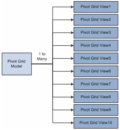
Pivot Grid View Options is the component that facilitates creating new views and updating existing ones for a Pivot Grid model. This component provides a framework to save the Pivot Grid View Name along with all the view options. It enables Pagelet Wizard or applications to pass just the Pivot Grid View Name instead of the whole list of Pivot Grid display preferences as content reference attributes. You can create multiple Pivot Grid View Names and associate them with a single Pivot Grid model.
This diagram shows Pivot Grid view options:
Pivot Grid view options
Note. Whenever a new Pivot Grid model is created, it is always associated with a default view. The default view name is <Pivot Grid Model Name>.View.
Viewing a Pivot Grid Model Using the Pivot Grid ViewerUse the Pivot Grid Viewer page (PTPG_PSPGVIEWER) to view the Pivot Grid model with different display options: Grid and Chart, Grid Only, or Chart Only.
Note. If the display option is Grid Only, Pivot Grid displays the grid without the chart.
To view a Pivot Grid model using Pivot Grid Viewer page:
Select Reporting Tools, Pivot Grid, Pivot Grid Viewer.
The Pivot Grid Viewer page appears with three filter options: Pivot Grid Name, Pivot Grid Data Source Name, and Pivot Grid Data Source Type.
Optionally, enter the filter options and perform the search.
All the available and accessible Pivot Grid models are listed. Invalid Pivot Grid models are not listed for this search.
Note. In PeopleTools 8.52, Pivot Grid supports only PSQuery data source and PSQuery type.
Select a Pivot Grid model for viewing.
On the Pivot Grid Viewer page, view the Pivot Grid model with different options.
The Pivot Grid model appears with the grid, chart, or both based on the display option selected.
This example shows the Pivot Grid Viewer page with the default display of Chart Only:
This example shows the Pivot Grid Viewer page with the default display of Grid Only:
|
Display Chart |
The Pivot Grid model appears with the grid, chart, or both based on the Display Chart option selected. |
|
Set Filters |
Click to open the Datasource Prompts dialog box, where you can change the values for Query prompts. |
|
Export All Data |
Click to export the underlying PSQuery data to Microsoft Excel. |
|
Pivot Grid |
You can change the grid layout at runtime by dragging members to a different axis. |
|
|
Click the Collapse Filter Bar icon to collapse or expand the section that displays the Pivot Grid filter options. |
|
|
Click the Download icon to download the slice of data seen in the pivot grid to Microsoft Excel. |
|
|
Click the Show All Columns icon to display all the grid columns. |
|
|
Click the Help for Drag and Drop icon to display help information for drag-and-drop functionality in the pivot grid. |
|
|
The axis icon is used to drag and drop the axis to row, column or filter. The axis name is displayed next to this icon when it is in filter. The axis member name is displayed next to this icon when in row or column. The axis name/axis member name in the grid is truncated when it is more than 15 characters. If you place the mouse on the axis icon, the axis name or axis member name is fully displayed. |
|
|
The value icon is used to drag and drop the values to row, column, or filter. The value name appears next to this icon when in row or column. The value name doesn't appear next to this icon when it is in filter. The value name in the grid is truncated when it is more than 15 characters. If you place the mouse on the axis icon, the value name is fully displayed. |
|
|
Click the Bar icon to display data in a bar chart. |
|
|
Click the Line icon to display data in a line chart. |
|
|
Click the Pie icon to display data in a pie chart. |
|
Chart Options |
Click to open the User Charting Options dialog box, where you can change the chart layout, chart axis, and filters.
Note. To drill down on the chart, click the chart data points. |
|
View Data |
Click to open the Pivot Grid Chart Data dialog box, where you can view the data that is being plotted. Note. You can change PSQuery runtime prompt values. |
|
Save Layout |
Click to save the current grid and chart layout as a user preference for the default view of the current model. The grid and chart layout, the filter values, and PSQuery prompt values are also saved as preferences. |
Open the Datasource Prompts dialog box by clicking the Set Filters link on the Pivot Grid Viewer page.
Use the Datasource Prompts dialog box to change the values for Query prompts.
This example shows the Datasource Prompts dialog box:
Using the Chart Options
Open the User Charting Options dialog box by clicking the Chart Options button on the Pivot Grid Viewer page.
Use the User Charting Options dialog box to change the chart layout, chart axis, and filters.
This example shows the User Charting Options dialog box when the display option is Grid and Chart:
Note. The X Axis, Y-Axis Series, Overlay Field, and Chart Filters fields in the User Charting Options dialog box are not editable if the display option is Grid and Chart.
This example show the User Charting Options dialog box when the display option is Chart Only:
Open the Pivot Grid Chart Data dialog box by clicking the View Data button on the Pivot Grid Viewer page.
Use the Pivot Grid Chart Data dialog box to view the data that is being plotted.
This example shows the Pivot Grid Chart Data dialog box when the display option is Grid and Chart:
This example shows the Pivot Grid Chart Data dialog box when the display option is Chart Only:
Examples: Viewing a Pivot Grid Model Using Pivot Grid ViewerSuppose that a PSQuery was built on the record PS_QE_BAM_FACT_TBL, which stores the number of product units sold, unit cost, and product sales for a set of regions and products by month, as shown in this table:
|
Region (Key) |
Product (Key) |
Month (Key) |
No. of Units Sold (Units Sold Cube) |
Unit Cost (Unit Cost Cube) |
Product Sales (Product Sales Cube) |
|
QE_BAM_REGION_FLD |
QE_BAM_PRODUCT_FLD |
QE_BAM_MONTH_FLD |
QE_BAM_UNIT_FLD |
QE_BAM_SALES_FLD |
QE_BAM_PRDSALES_FL |
 Viewing a Pivot Grid Model When the Display Option is Grid and Chart
If the display option is Grid and Chart:
The model for this example shows the sales information for various products for different regions across different months.
The axis columns are Region, Product, and Month.
All the axis columns have the All Member enabled.
The Value columns are Unit Cost, Unit Sales, and Product Sales.
Note. If the display option is Grid Only, Pivot Grid displays the grid without the chart.
The initial grid layout has:
Row axis is Region and Product.
Column axis is Unit Sales, Unit Cost, and Product Sales.
Report Filter Field is Month.
The initial chart view has:
X axis is Region field.
Y axis is Unit Sales fields.
Report Filter Field is Month.
This example shows the view of a Pivot Grid model when the display option is Grid and Chart:
Note. You can change the grid layout at runtime by dragging members onto different axes. The chart layout also changes based on the grid layout to preserve synchronization between the grid and the chart. You can change the chart type and the Y axis of the chart.
The Pivot Grid displays detailed data based on the region on which the drilldown is performed. For the chart, the same data appears for the selected Value column. You can select the chart type and change the Y axis by selecting a different Value column to be plotted.
The pivot grid has:
Row axis is Region and Product.
Column axis is Unit Sales, Unit Cost, and Product Sales.
Report Filter Field is Month.
The chart has:
X axis is Region.
Y axis is Unit Sales.
Series field is Product.
This example shows a Pivot Grid model when the display option is Grid and Chart and drilldown was on a region:
Use the User Charting Options dialog box to change the chart type or Y axis.
To add a filter at runtime, place the cursor on the circle for the field in the left side of the grid and drag it to the top part of the grid.
To remove a filter, place the cursor on the circle for the filter listed on the top part of the grid and drag it to back to the lefthand column.
Viewing a Pivot Grid Model When the Display Option is Chart Only
This example of Pivot Grid model was defined using Chart Only. The chart initial view has:
X axis is Region.
Y axis is Unit Sales.
Report filter is Month.
This example shows the initial view of a Pivot Grid model in bar chart format when the display option is Chart Only:
This example shows the initial view of a Pivot Grid model in line chart format when the display option is Chart Only:
This example shows the initial view of a Pivot Grid model in pie chart format when the display option is Chart Only:
Suppose you are drilling down on the chart for the HAWAII region. Click the HAWAII bar (for a bar chart; click the HAWAII slice for a pie chart, or click the line for a line chart) and the drilldown dialog box appears:
Select the Product value for the Drilldown Field field; the chart now has:
X axis is Product.
Y axis is Unit Sales.
Report filter 1 is Month, and that value is 01/01/2004.
Report filter 2 is Region, and that value is EAST_COAST.
In this case, a locator link is automatically added on the right side above the chart for the Region member; if you click the locator link, the previous chart layout is restored.
This example shows a Pivot Grid model when the display option is Chart Only and drilldown was on a Region:
In this example, the data model specifies Chart Only and is set up as follows:
X axis is Region.
Y axis is Unit Sales.
Chart series is Product.
Report filter is Month, and this value is 01/01/2004.
The chart shows each product with a legend:
You can select an overlay field that plots multiple charts based on the Y axis and the overlay field. If the Unit Cost field is selected as the overlay field, then the first chart is plotted with the Region field as the X axis and the Unit Sales field as the Y axis. The second chart is plotted with the Region field as the X axis and the Unit Cost field as the Y axis.
The chart has:
X axis is Region.
Y axis is Unit Sales.
Overlay field is Unit Cost.
This example shows the chart with the Region field as the X axis, the Unit Sales field as the Y axis, and the Unit Cost field as the overlay field:
Note. Whenever you select an overlay field, the chart type is limited to Line chart; however, you are still able to select Bar and Pie charts, but these chart types do not display valid data.