Working with the Worksheet Graph
This chapter covers the following topics:
Graph Styles and Variations
This is an overview of the available graph types. A graph specifies the worksheet series that you specify in the worksheet definition.
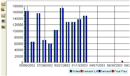
Data Plots
In the line graph, bar chart, data points only, and stacked bar chart:
-
The vertical axis (y-axis) is usually the worksheet series, depending on your worksheet layout. Oracle Demantra displays multiple series in different colors.
-
The horizontal axis (x-axis) is usually time.
This is a typical graph.
Data Plots: Pie Charts
In the default pie chart:
-
There is one pie chart for each column member (y-axis), for example, Orders and Demand
-
The slices of each pie chart show the percentage of each row member (x-axis), for example, time.
This is a default pie chart.
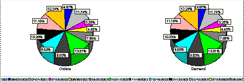
If you want to see the data in a more interesting way, for example, an aggregation level, redefine the worksheet layout to put at least one of the aggregation levels on the x-axis.
This is a default redefined pie chart.
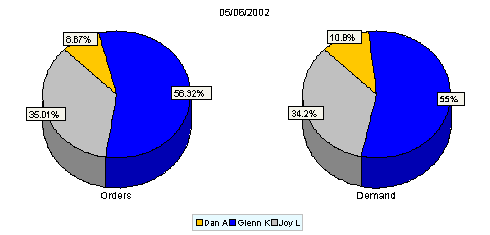
In the alternate pie chart:
-
There is one pie chart for each row member (x-axis), for example, time.
-
The slices of each pie chart show the percentage of each column member (y-axis), for example, Orders and Demand
If you want to see the alternate pie chart, click View > Toggle Pie Chart Display. If you click it again, you see the default pie chart.
The setting does not change either as you navigate in the worksheet or when you open and navigate in the worksheet next time. Oracle Demantra saves your username's last setting.
See also:
-
Defining the View Layout
-
Changing the Graph Style
Changing the Graph Style
To change the style of the graph
Right-click on the graph panel and select the Graph Type menu option. Then, select the radio button of the graph type you want to see--line chart, bar chart, plot chart, pie chart, or stacked bar chart.
In some system configurations, you may see a Graph Type menu on the left side of the graph. If so, click the icon for the graph type that you want to see.
To toggle the pie chart display, click View > Toggle Pie Chart Display. This option switches between these views:
-
One chart per innermost column member (y-axis); the slices are the innermost row members (X-axis).
-
One chart per innermost row member (x-axis); the slices are the innermost column members (Y-axis).