Cost Management Command Center
Cost Management Command Center User Interface
Overview
Oracle Cost Management Command Center is built on top of the Enterprise Command Center Framework. The command center enables costing personnel to view information across all relevant costing processes in the enterprise and makes the data available for analysis and search. You can use the Oracle Cost Management Command Center to quickly search and filter transaction details across organizations and associated entities. You can also use the Available Refinements and other search features to identify hidden trends. The Oracle Cost Management Command Center enables you to review and analyze data using key Performance Indicators (KPIs), performance evaluation metrics, charts, graphs, and tables.
You can use the Oracle Cost Management Command Center to:
-
Identify errors and incomplete transactions that have become bottlenecks for costing period close.
-
Review uncosted inventory, manufacturing, and receiving transactions.
-
Analyze pending inventory, manufacturing, landed cost adjustment, and shipping and receiving transactions.
-
Identify incomplete work orders within Enterprise Asset Management.
The Period Health Check (Discrete) Dashboard enables cost managers to mitigate processing issues that prevent or delay period close activities. This dashboard displays period health check metrics and it categorizes transactions based on time. This dashboard also displays a Top Ten Organizations tag cloud, transaction charts, and transaction results tables.
Note: You can use the Cost Management Command Center only after the installation and common configurations are completed as described in My Oracle Support Knowledge Document 2495053.1, Installing Oracle Enterprise Command Center Framework, Release 12.2. For additional ECC Overview information, see Overview of Oracle Enterprise Command Center Framework, Oracle E-Business Suite User's Guide.
Searching Enterprise Command Center Dashboards
Use the dashboard sidebar to refine (filter) the data on each dashboard. You can also Search using a keyword, value, or a specific record. The type-ahead feature suggests matches for your entry that correspond to the selected data set. When you submit a search, the search term is added to the Selected Refinements list, and the dashboard data is refined to include only records that match the search. You can add multiple refinements and remove any of them at any time. Using Saved Searches, you can create and save your searches and refer to them later. You can also edit and delete saved searches.
Use an asterisk (*) or percent sign (%) to perform a partial keyword or record search that matches any string of zero or more characters. You can also use a question mark (?) to perform a partial search that matches any single character.
Additional Information: For more information about searching for and refining data in enterprise command centers, see Search in Highlights of an Enterprise Command Center, Oracle E-Business Suite User's Guide.
Period Health Check (Discrete) Dashboard
The Period Health Check (Discrete) dashboard enables you to search for and view inventory, receiving, manufacturing, and enterprise asset management transactions that are preventing period close. You can also search for and view transactions that are to be processed, but are not necessary for period close. Using the guided navigation and other search features, you can search on organization, transaction, job, receiving, maintenance, project, and inter-organization transfer data. You can also view period close metrics, charts, and transaction data in results tables. The following is a partial display of the Period Health Check (Discrete) dashboard.
From the Cost Management responsibility, navigate to the Period Health Check (Discrete) dashboard:
(N) Cost Management > Cost Management Command Center > Period Health Check (Discrete)
(N) Cost Management > View Transactions > Cost Management Command Center > Period Health Check (Discrete) (Tab)
Overview (Tab)

The following table describes the Period Health Check (Discrete) dashboard components:
| Component | Description |
|---|---|
| Period Close Backlog (summary bar) | This summary bar displays the following metrics and displays certain metrics in green (good), orange (warning), or red (critical) indicating the importance:
|
| Organizations with Period Close Issues (tag cloud) | The Organizations with Period Close Issues tag cloud displays the organizations that have period close issues. This tag cloud component displays the organizations in relative sizes based on the number of period close issues. |
| Recurring Period Close Issues (chart) | The Recurring Period Close Issues chart displays the number of organizations and number of periods with recurring period close issues. This chart also displays the backlog types in relative sizes by frequency of occurrence. |
| Backlog by Organization (chart) | The Backlog by Organization chart displays the number of backlog transactions by organization and backlog type. You can select dimensions to view and sort this chart by source or backlog type. |
| Backlog by Month (chart) | The Backlog by Month chart displays the number of backlog transactions by transaction month and backlog type. You can select dimensions to view and sort this chart by source or backlog type. |
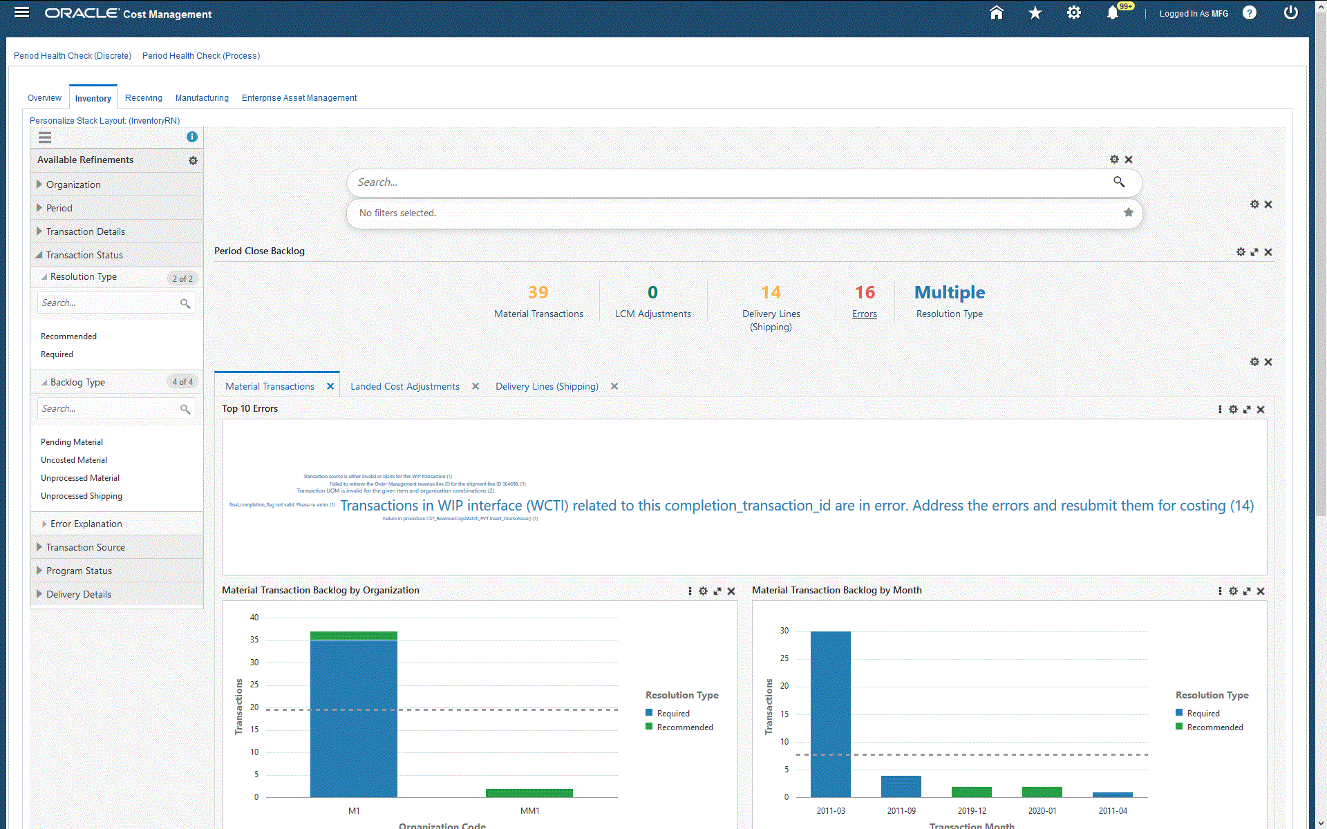
Inventory (Tab)

| Component | Description |
|---|---|
| Period Close Backlog (summary bar) | This summary bar displays the following metrics and displays certain metrics in green (good), orange (warning), or red (critical) indicating the importance:
|
| Material Transactions (tab layout) | The Top 10 Errors tag cloud displays the top ten inventory transaction errors with explanations by frequency of occurrence and the number of occurrences for each error. Click an error to refine and filter all data on the page for the selected error. The Material Transaction Backlog by Organization chart displays the number of material transactions by organization code. You can select dimensions to view and sort this chart. The Material Transaction Backlog by Month chart displays the number of material transactions by month. You can select dimensions to view and sort this chart. The Material Transactions results table displays all attributes pertaining to material transactions. |
| Landed Cost Adjustments (tab layout) | The Top 10 Errors tag cloud displays the top ten landed cost transaction errors with explanations by frequency of occurrence and the number of occurrences for each error. Click an error to refine and filter all data on the page for the selected error. The Landed Cost Adjustment Backlog by Organization chart displays the number of landed cost transactions by organization code. You can select dimensions to view and sort this chart. The Landed Cost Adjustment Backlog by Month chart displays the number of landed cost transactions by transaction month. You can select dimensions to view and sort this chart. The Pending Landed Cost Adjustments results table displays all attributes pertaining to the pending landed cost transactions. |
| Delivery Lines (Shipping) (tab layout) | The Delivery Backlog by Organization chart displays the number of shipping orders by organization code. You can select dimensions to view and sort this chart by resolution type, backlog type, transaction status, or order type. The Delivery Backlog by Month chart displays the number of shipping orders by transaction month. You can select dimensions to view and sort this chart. The Delivery Lines results table displays all attributes pertaining to the delivery transactions. Click the options link to Compare selected records, or Export data sets. |
Receiving (Tab)

| Component | Description |
|---|---|
| Period Close Backlog (summary bar) | This summary bar displays the following metrics and displays certain metrics in green (good), orange (warning), or red (critical) indicating the importance:
|
| Top 10 Errors (tag cloud) | The Top 10 Errors tag cloud displays the top ten receiving transaction errors with explanations by frequency of occurrence and the number of occurrences for each error. Click an error to refine and filter all data on the page for the selected error. |
| Receiving Transaction Backlog by Organization (chart) | The Receiving Transaction Backlog by Organization chart displays the number of transactions by organization code. This chart also displays the number of transaction types. You can select dimensions to view and sort this chart. |
| Receiving Transaction Backlog by Month (chart) | The Receiving Transaction Backlog by Month chart displays the number of transactions by transaction month. This chart also displays the number of transaction types. You can select dimensions to view and sort this chart. |
| Receiving Transactions (results table) | The Receiving Transactions results table displays all attributes pertaining to receiving transactions. Click the options link to Compare selected records, or Export data sets. |
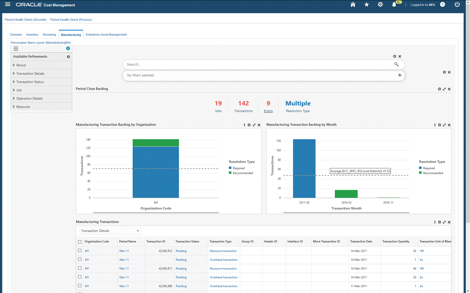
Manufacturing (Tab)

| Component | Description |
|---|---|
| Period Close Backlog (summary bar) | This summary bar displays the following metrics and displays certain metrics in green (good), orange (warning), or red (critical) indicating the importance:
|
| Top 10 Errors (tag cloud) | The Top 10 Errors tag cloud displays the top ten manufacturing transaction errors with explanations by frequency of occurrence and the number of occurrences for each error. Click an error to refine and filter all data on the page for the selected error. |
| Manufacturing Transaction Backlog by Organization (chart) | The Manufacturing Transaction Backlog by Organization chart displays the number of transactions by organization code. This chart also displays the number of transaction types. You can select dimensions to view and sort this chart. |
| Manufacturing Transaction Backlog by Month (chart) | The Manufacturing Transaction Backlog by Month chart displays the number of transactions by transaction month. This chart also displays the number of transaction types. You can select dimensions to view and sort this chart. |
| Manufacturing Transactions (results table) | The Manufacturing Transactions results table displays all attributes pertaining to manufacturing transactions. Click the options link to Compare selected records, or Export data sets. |
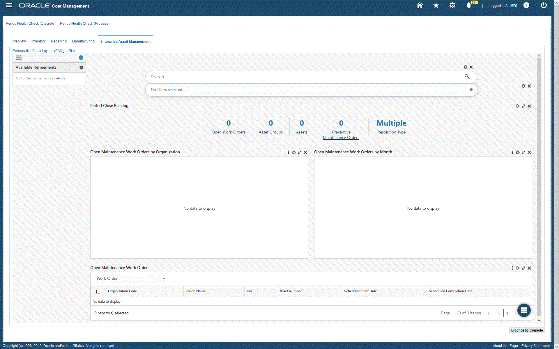
Enterprise Asset Management (Tab)

| Component | Description |
|---|---|
| Period Close Backlog (summary bar) | This summary bar displays the following metrics:
|
| Open Maintenance Work Orders by Organization (chart) | The Open Maintenance Work Orders by Organization chart displays the number of maintenance work orders by organization code. This chart also displays the number of jobs and asset group IDs. |
| Open Maintenance Work Orders by Month (chart) | The Open Maintenance Work Orders by Month chart displays the number of maintenance work orders by scheduled start month. This chart also displays the number of jobs and asset group IDs. |
| Open Maintenance Work Orders (results table) | The Open Maintenance Work Orders results table displays all attributes pertaining to open maintenance work orders. Click the options link to Compare selected records, or Export data sets. |
Margin Analysis Dashboard
The Margin Analysis dashboard enables you to perform multidimensional analysis of gross margins, revenue, and cost of goods sold. Users can also run simulations on margins, and view the potential impacts of these simulations. A simulated margin is calculated by replacing the cost of goods sold of each product in the actual margin analysis data with a simulated cost of goods sold calculated as a product of the simulated cost of the product and its shipped quantity. If a product does not have a new simulated cost, then its COGS remains unchanged. You can use the Margin Analysis dashboard to evaluate:
-
The sales channel, region, or product mix that is the most profitable
-
Costs, sales volumes, and margins
-
Margin trends for the year, quarter, and period
-
Growth in sales, revenue, and margins compared to prior periods
-
Impacts of a cost simulation on margins
The various dimensions in which analysis can be performed include:
-
Overview
-
Product
-
Customer
-
Industry
-
Sales Channel
-
Territory
-
Sales Representative
From the Cost Management responsibility, navigate to the Margin Analysis dashboard:
(N) Cost Management > Cost Management Command Center > Margin Analysis
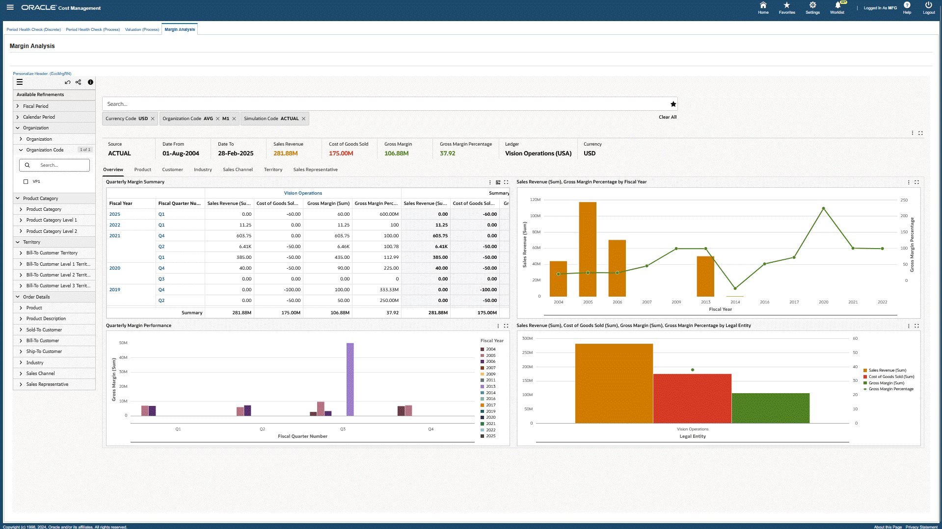
Margin Analysis Dashboard

| Component | Description |
|---|---|
| Margin Analysis (summary bar) | The Margin Analysis summary bar displays the following metrics:
|
| Overview (tab layout) | The Quarterly Margin Summary hierarchical query table displays the total values of Sales Revenue, Cost of Goods Sold, Gross Margin, and Gross Margin Percentage values by Fiscal Year, Fiscal Quarter, and Fiscal Period for selected refinements. The next bar and line chart displays Sales Revenue (Sum), Cost of Goods Sold (Sum), Gross Margin (Sum), Gross Margin Percentage by Fiscal Year, Fiscal Quarter, and Fiscal Period. The Sales Revenue, Cost of Goods Sold, Margin, Margin Percentage chart displays total values of Revenue, COGS, Gross Margin, and Gross Margin Percentage by Fiscal Year, Fiscal Quarter, and Fiscal Period. The Quarterly Margin Performance line chart displays totals for Gross Margin, Sales Revenue, and Cost of Goods Sold by Fiscal Quarter and Fiscal Period. The Sales Revenue, Cost of Goods Sold, Gross Margin, Gross Margin Percentage by Legal Entitychart displays total values of Sales Revenue, COGS, Gross Margin, and Gross Margin Percentage by Legal Entity. |
| Product (tab layout) | The Sales Revenue, Cost of Goods Sold, Gross Margin, Gross Margin Percentage by Product Category chart displays the total values of Sales Revenue, COGS, Gross Margin, and Gross Margin Percentage of Goods Sold by Product Category. The Gross Margin and Gross Margin Percentagechart displays the total values of Sales Revenue, COGS, Gross Margin, Gross Margin Percentage, and Volume (Invoice Quantity) by fiscal quarter, fiscal year, or fiscal period and by Product Category. The Cost vs. Margin bubble chart displays the cost and margin values for products and product codes. You can select dimensions to compare values for Gross Margin, Sales Revenue, Cost of Goods Sold, Invoice Quantity, Average Margin, Average COGS, Average Selling Price, and Gross Margin Percent. You can also refine the chart by clicking on a specific product. This also enables users to visualize how two products compare on cost vs. margin or price irrespective of how much of the product is being sold. Bubble size indicates sales volume. The Cost of Goods Sold pie chart displays cost of goods sold for each product category. You can refine the chart by clicking on a product category to view individual products and values. The Sales Revenue (sum) by Product Category pie chart displays the total values of Sales Revenue, Gross Margin, and Negative Gross Margin by product category. The Product Category Summary hierarchical query table displays Sales Revenue, Cost of Goods Sold, Gross Margin, and Gross Margin Percentage values for selected Product Categories. |
| Customer (tab layout) | The Gross Margin by Sold-To Customer, Product Category chart displays total values for Gross Margin, COGS, by Group, Customer, amd Product Category. The Sales Revenue by Customer chart displays total values for Sales Revenue, COGS, by Sold-To Customer Product, and Product Category. The Top Ten Customers chart displays the total values of Gross Margin, Sales Revenue, Cost of Goods Sold, and Gross Margin Percentage for the top ten customers. Customers include Sold-to Customer, Bill-to Customer, and Ship-to Customer. The Quarterly Margin Performance chart displays the total values of Gross Margin, Sales Revenue, Cost of Goods Sold, and Gross Margin Percentage for Customers. You can refine this chart by clicking on a customer to view values for that customer. |
| Industry (tab layout) | The Gross Margin Performance by Industry chart displays the total values of Gross Margin and Cost of Goods Sold by Customer Industry and by Product Category. You can refine this chart by clicking on Fiscal Year, Fiscal Quarter, and Fiscal Period values. The Sales Revenue by Industry chart displays the total values of Sales Revenue and Cost of Goods Sold by Customer Industry and by Product Category. You can refine this chart by clicking on Fiscal Year, Fiscal Quarter, and Fiscal Period values. |
| Sales Channel (tab layout) | The Gross Margin by Sales Channel chart displays the total values of Gross Margin and COGS by Sales Channel and by Product Category. You can refine this chart by clicking on Fiscal Year, Fiscal Quarter, and Fiscal Period values. The Sales Revenue by Sales Channel chart displays the total values of Sales Revenue and COGS by Sales Channel and by Product Category. You can refine this chart by clicking on Fiscal Year, Fiscal Quarter, and Fiscal Period values. |
| Territory (tab layout) | The Gross Margin Performance by Territory chart displays the total values of Gross Margin and COGS by Territory and Product Category. The Sales Revenue by Territory chart displays the total values of Sales Revenue and COGS by Territory and Product Category. The Quarterly Gross Margin, Margin Percentage Across Territories chart displays the total values of Sales Revenue and COGS for Bill-to Customer Territories. You can refine this chart by clicking on metrics within the chart. The Territory Summary hierarchical query table displays the total values of Sales Revenue, Cost of Goods Sold, Gross Margin, and Gross Margin Percentage for selected customer territories. |
| Sales Representative (tab layout) | The Gross Margin Performance by Sales Representatives chart displays the total values of Gross Margin and Cost of Goods Sold by Sales Representative. You can refine this chart by clicking on Fiscal Year, Fiscal Quarter, and Fiscal Period values. The Sales Revenue by Sales Representative chart displays the total values of Sales Revenue and Cost of Goods Sold by Sales Representative. You can refine this chart by clicking on Fiscal Year, Fiscal Quarter, and Fiscal Period values. |