EBS Custom Components
This appendix covers the following topics:
- EBS Results Grid
- EBS Quick Links
- EBS Global Searchbox
- EBS Multi-view Available Refinements and Selected Refinements
- Summarization Bar Metric Refinement
EBS Results Grid
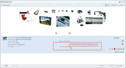
About EBS Results Grid
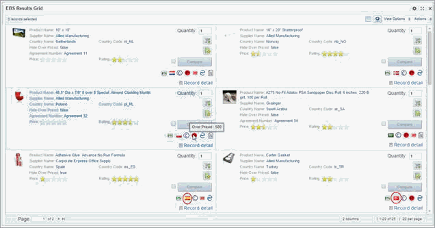
EBS Results grid component provides visual representation of record attributes. It can display single and multi line attribute values effectively.
EBS Results Grid supports a flexible UI design that allows users to toggle between grid and carousel view to check item details and control item image and positioning.
Using the EBS Results Grid
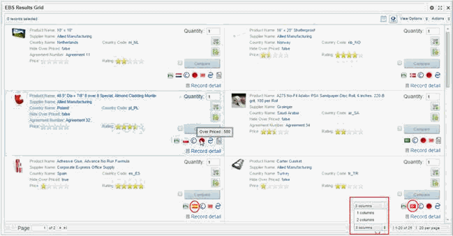
EBS results grid supports two types of views of the content based on how it is configured. The first view is the grid layout with flexibility on how many items to display per row and per column. The second option is to display the items in circular carousel view. Also users can toggle between the grid and carousel view.
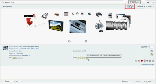
For carousel view, users can move onwards or backwards among the displayed items using the right and left arrows.
For grid view, users can use columns menu to change the number of columns to display.
View option menu enables users to sort the displayed attributes using the sort option based on the data selection view configured to the EBS Results Grid.
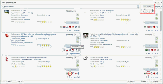
Users are able to add several sorting rules according to the maximum configured in the component.
The sorting rule includes selecting the sorting attribute and the order rule applied on the sorting attribute value: Ascending/Descending.
To change back to the default display, from the View Options menu, select Reset to default.
The displayed attributes in the list template can be links to refine the data, display record details, or navigate to a URL based on each attribute configuration.
Each record can also have a separate link to display the Record Details dialog with the details for that record.
From the Actions menu, you may be able to print and export the results. You may also be able to select records in order to compare them using the Compare dialog.
Users can use add to cart action button upon comparing items.
Users can use the Page pagination on the Grid view to change the displayed EBS results grid pages.
If configured, user can also have:
-
Several buttons to perform EBS actions, such as: Add to cart and Add to favorites in iProcurement
-
Indicator icons
-
Star ratings
Configuration
-
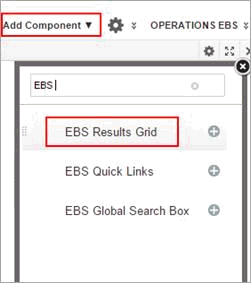
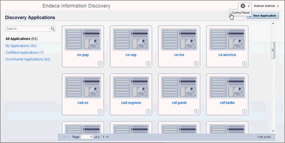
Log in to Oracle Endeca Information Discovery Studio as an Admin user.
The EBS Result Grid is available from the Information Discovery section in the Add Components menu.
-
Click Add the component and Drag and drop the component on the page.
-
When you first add a Results List component to a page it includes five attributes. The identifying attributes from the first base view, plus up to four additional attributes.
The attributes are each displayed in a separate row. The identifying attributes are displayed at the top, and in a slightly larger, bold font.
-
To configure the component, click the options icon.
-
In Data Selection section, Select the relevant base/custom view
-
Navigate to List Template; drag and drop the required attributes to be displayed in the EBS Results Grid per every record. Each row can contain values for up to 3 attributes. To remove an attribute from the template, click its delete icon.
-
Optionally, click Edit to configure the following per required attribute:
-
Enable Display attribute name checkbox
-
Enter Conditional attribute to hide the display name
-
To preserve any line breaks and white space in the attribute value, check the Preserve white space and line breaks checkbox. The box is checked by default.
This option is useful for longer text values that may include some HTML formatting. Except for the white space and line breaks, all HTML code is stripped from the attribute value.
-
Under Truncation, to determine how longer values will be truncated:
To display the value up to a specific number of lines of text, click the Display up to radio button. In the field, type the number of lines to display.
To display the full text of the value, up to the maximum allowed, click the Show full record text radio button.
-
Expand the Display Options sub menu and edit the default text style and alignment.
For a multi-value attribute, whether to display the values in rows or as a single, comma-separated String.
-
If the attribute has formatting options, then use the Value Formatting section to configure the format. For multi-value attributes, the Multi-Value Formatting section allows you to configure the number of values and the delimiter.
-
-
Optionally, Open the drop-down action menu to enable one of the following actions to be taken by the attribute:
-
Refinement Action
-
Hyperlink Action
-
Enable Display action description in tooltip checkbox
-
Edit the Action Description
-
Enable Open link in a new window checkbox
-
Enter the conditional attribute key to open in URL in new window
-
Enter URL name
-
Click Add URL Parameters button
-
Select the required attribute
-
Click Apply
-
Click Save
-
-
Customize Action Buttons Configuration
-
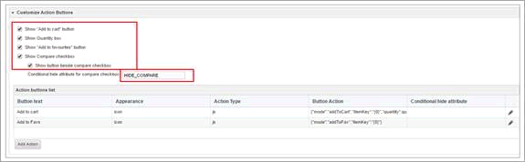
Under the same List Template configuration menu, scroll down to the (Customize Action Button) menu and enable the following:
-
Check Show Add to Cart button if you want the Add to Cart button to be displayed.
-
Check Show the Quantity box if you want the user to see the quantity box.
-
Check Show “Add to Favorites” button if you want the Add to Favorites button to be displayed.
-
Check Show Compare checkbox to allow the end user to compare multiple records.
-
To hide the Compare checkbox conditionally, enter the attribute based on which to hide the checkbox.
-
-
Edit the Add to cart button.
-
Click the update icon for the Add to Cart button.
-
Set the action button properties for the Add to cart button.
-
Enter the action button name in Button Text
-
Select the Appearance option
-
Click Select Image button for choosing the Default image of the action button
-
In case the display option is Icon/Combined
-
-
Select/Browse the action button image
-
Enter conditional hide attribute key
-
Select the action Type taken by the button either to open URL or run JavaScript
-
Enter URL details in Button Action field
-
Click Add Parameter to be passed to URL
-
Enter required attribute key. Click OK.
-
Click Save
-
Click Save to whole component
-
-
Display Options Configuration
-
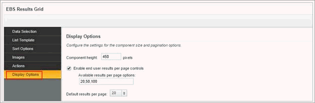
Navigate to Display Options menu
-
Check the Enable end user results per page controls checkbox. The box is checked by default. And allow end users to select the number of records to display per page.
-
In the Available results per page options field, type a comma-separated list of available values for the number of results to display per page.
-
By default, the available options are 10, 20, and 30 records per page.
-
From the Default results per page dropdown list, select the default number of records to display per page.
Grid View Options Configuration
-
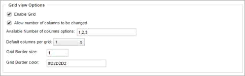
To enable the grid view option, check Enable Grid check box
-
To allow users to select the number of records to change, enable Allow number of columns to be changed checkbox
-
In the Available Number of columns options field, type a comma-separated list of available values for the number of columns to change.
-
From the Default results per page dropdown list, select the default number of records to change.
-
In the Grid Border size field, enter a value for the size of borders separating the grid cells.
-
In the Grid Border color field, specify the color of the grid borders. Alter the default grey color of the grid columns' border by entering new border color code, such as:
-
#FF0000 = Red, or
-
#00FF00 = Green, or
-
#0000FF = Blue
-
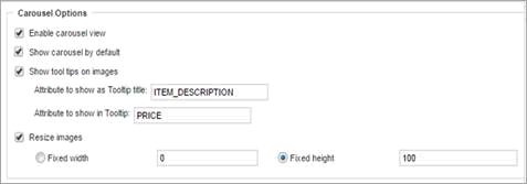
The Carousel Options Configuration
-
To enable the carousel view option, check Enable Carousel view checkbox
-
To enable the carousel as the default view for the component, check Show Carousel by default.
-
To allow the user to see the images tooltip, check Show tool tips on images.
-
In the Attribute to show as Tooltip title field, enter the tooltip title.
-
In the Attribute to show in Tooltip field, enter the tooltip description.
-
Check Resize images to allow end users to resize the images.
-
Select either Fixed width or fixed height for the image size, and specify the appropriate value.
-
Click Save
Configuring the sorting options
Navigate to the (Sort Options) menu.
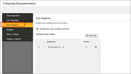
You can configure whether end users can change the sort order for the list.
-
By default, end users can change the sort order, and the Enable end user sorting controls checkbox is checked.
To not allow end users to control the sort order, uncheck the checkbox.
-
To configure the default sort order:
-
To add a new sort rule, click the +Sort rule button.
-
To change the attribute assigned to a sort rule, in the Attribute column, click the drop-down arrow next to the attribute name, then select the new column.
-
You can only sort using attributes that are displayed on the component.
-
To change the sort direction for a sort rule, in the Order column, click the sort direction toggle.
-
To change the order in which to apply the sort rules, drag each sort rule to the appropriate location in the list.
-
To remove a sort rule, click its delete icon.
-
Images Configuration
Navigate to Images menu to configure the image to display next to each record.
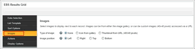
Image sources can be:
| Image Type | Description |
|---|---|
| Icons selected from Studio's image gallery | Studio provides a basic set of icon images. If you use this option, you can assign one of these images to each value of a selected attribute. The icon images provided by Studio include:
This option is typically used when the icons represent a category or other high-level classification of the records. You can also upload your own images to use as icons on the EBS Results Grid. Studio supports the .gif, .jpeg/.jpg, .bmp, and .png file types. When you upload images, they become available to use for any EBS Results Grid component in the same application. |
| Images from a URL that you provide | If you select this option, then you provide the URL for the image. The URL can include a token to represent the value of a selected attribute. This is typically used when most of the records in the system have associated images published to a Web or application server (for example, a unique preview image for products represented by each record). |
-
To not display an image next to each record, under Type of image, click the None radio button. This is the default configuration.
-
To display an icon from a set provided by Studio for each value of a selected attribute:
-
Under Type of image, click the Icon from gallery radio button.
-
To select the attribute to use, click the Select Attribute button. Click the attribute you want to use, and then click Apply.
The attribute selection dialog displays the attributes that can be used for the image selection. The attribute must have fewer than 15 values, and must be displayed on the component.
For a hierarchical attribute, only the top level of values is displayed. On the end user view, records use the image for the top level value.
For example, for a Wine Type attribute, the top level values might be Red, White, and Sparkling. If a record has a Wine Type value of Merlot (Red --> Merlot), that record would use the image selected for the Red value.
-
For each attribute value, to select the image to use, click the Select button.
-
On the Select Image dialog, click the image you want to use.
To never display an image for a value, click the No Image option.
-
To upload your own image, click the Browse button to search for and select the image. After selecting the file, click Upload.
The uploaded image is added to a new My Images category on the Select Image dialog.
If the image is too large, Studio crops it.
-
Click OK.
The list is updated with the selected image.
-
To clear a selected image, and display the default image for that attribute value, click the delete icon.
-
To select a different image for an attribute value, click the edit icon.
-
-
To display images from a URL:
-
Under Type of image, click the Thumbnail from URL radio button.
-
In the field, type the URL for the image file.
-
To add attribute values as parameters in the URL, click Add URL Parameters.
-
On the add parameters dialog, in the attribute list, click the add icon next to each attribute to add. For each attribute you select, the add icon changes to a delete icon.
To not include a selected attribute in the URL parameters to add, click the delete icon.
-
When you are finished selecting attributes, click Apply.
The selected attributes are displayed in a table, with each attribute assigned an ID to use when inserting the attribute into the URL.
The attributes are also inserted as query parameters, where the parameter name is the attribute key, and the parameter value is {IDNumber}, where IDNumber is the ID for that attribute. For example: http://www.acme.com/index.htm?Designation={0}
By default, the value is encoded. To not encode the value, change the format to {{IDNumber}}. For example: {{0}}. you can also use the ID numbers to insert the attribute values manually.
-
To remove a URL parameter from the table, click its delete icon.
If you did not edit the inserted query parameter, then Studio also removes it from the URL.
If you did edit the inserted query parameter, then you must remove the parameter from the URL manually. If you inserted the attribute value manually, then you also must remove it manually.
-
-
Default image to display if selected image is not available:
The default image setting determines the default image to display if Studio can't find the configured image, or, for icons, if you selected the No Image option for a value. You can also use this setting if you want to display the same image for all of the records.
To not display a default image, click the None radio button.
To select a default image, click the other radio button, then click the Change Icon button.
On the Select Image dialog, click the image you want to use, and then click OK.
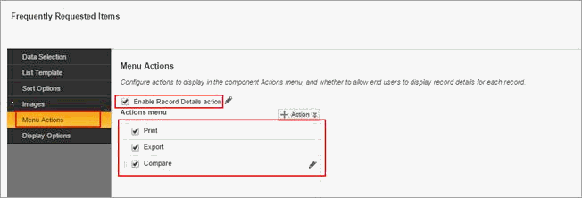
Enabling the Record Details link and Actions menu actions
Users can disable or enable the Record Details link that displays for each record. You can also configure the Actions menu for the component.
On the Actions tab of the Results List edit view, if the Enable Record Details action checkbox is checked, then on the end user view, the Record detail link is displayed next to each record. For the Record Details action, you can configure the title to display on the Record Details dialog.
From the Actions tab, you can also control the available options in the Actions menu. In addition to the Print, Export, and Compare options, you can add Refinement options, to refine by attribute values from selected records.
Indicator Icons Configuration
-
EBS Results Grid portlet support multiple number of indicator icons per each item.
-
Indicator Icons display several item statuses that differ from one Information Discovery application to another, in a graphical UI, such as:
-
(iProcurement application)
-
Over-Priced Items
-
Preferred Suppliers
-
MBE Suppliers
-
-
(HR application)
-
Male candidate
-
Female Candidate
-
-
-
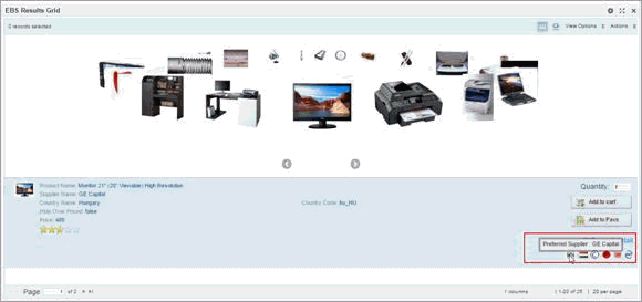
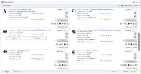
A grid view with multiple indicator icons appears as follows:
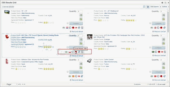
-
A carousel view with multiple indicator icons appears as follows:
-
(N) Add Component > EBS Result List > Configuration Options > List Template > Customize Indicator Icons > Click on (B) Add Indicator Icon button
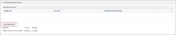
-
Tooltip text
Indicator Icon's tooltip text support both static description and dynamic single attribute value
-
Static Tooltip:
-
Insert required hard description
-
Such as, Preferred Supplier
-
-
Dynamic Tooltip text:
-
We support a single attribute key name
-
Insert the attribute key name between double curly brackets added to the static tooltip text
-
Such as, Preferred Supplier : {SUPPLIER_NAME}
-
-
-
Conditional Hide Attribute
-
Displaying the indicator icons is the default behavior
-
Conditional icons hide per each item is supported
-
ETL a conditional hide attribute into the data domain with (false and true) values per items
-
false: will display the indicator icon
-
true: will hide the indicator icon
-
Insert this attribute in the (F) Conditional hide attribute field
Such as, Hide_Preferred_Supplier
-
-
URL
-
Indicator icon URL support both static and multi dynamic image names
-
Insert icons' images URL name combined with the image name
-
Static Image Name /OA_MEDIA/indicator/PS_16.png
-
/OA_MEDIA/indicator/ : is the Indicator Icons images folder path
-
PS_16.png : is the static image name saved in the above image folder
-
-
Dynamic Image Name /OA_MEDIA/indicator/{Country_Code}.png
-
/OA_MEDIA/indicator/: is the Indicator Icons images folder path
-
/{Country_Code}.png: the image name saved in the folder with the country code attribute key values in the data domain per each item
-
-
Multiple tokenized attributes are supported for the image name URL with special naming conventions. Such as, /OA_MEDIA/indicator/{Country_Code}-{Country_Name}.png
-
All images should be transparent (without white backgrounds)
-
All icon images should maintain a consistent size
-
Recommended thumbnail icon images (24*24) or lower
-
Uploaded Images should all share same (.png), (.jpg) or (.JPG)
-
Uploaded Images names should be without space characters
-
-
Alignment
-
(Left or Right) indicator icons' alignments are supported
-
Right is the default alignment
-
-
Position relative to record details
-
(Above or below) indicator icons' position relative to the (record details) are supported
-
Below is the default position
-
-
Reorder icons on UI
Indicator icons (up or down) reordering on UI is supported
-
Click Save button
Star Rating Configuration
-
EBS Results Grid items support multiple items stars rating.
-
Star Rating provide a quick well known UI stars rating review status, such as: pricing reviews, quality reviews, etc
-
Values of any metric list template attribute can be presented in terms of stars based on its range values
-
Refinable and/or hyperlink stars are supported
-
Stars Rating display on grid view as follows:
-
Stars Rating display on carousel view as follows
-
(N) Add Component > EBS Result List > Configuration Options > List Template
-
Add the required attribute into the list template
-
Click (B) Edit button
-
Display attribute name:
-
Optionally, Enable the display attribute name checkbox to differentiate the stars' attribute name
-
-
Expand (Star Rating Options) menu
-
(Enable star rating) checkbox = Yes
Note: Once the attribute is enabled as a star, the (Display Options) menu for configuring text value attributes is disabled
-
-
-
Tooltip
-
Stars tooltip support a mixed static description and/or multiple dynamic attribute values
-
Such as, Rating = {RATING} of 5 for Product: {PRODUCT_NAME}
-
Static descriptions : Rating =
-
Multiple dynamic attributes : {RATING} , {PRODUCT_NAME}
-
-
Star Rating Factoring
-
-
Star rating support default (0) Minimum & (5) maximum range attribute values
-
Wider value range attributes are supported by stars rating factored (Mimimum) and (Maximum) attribute configuration fields
-
Such as, Price rating attribute minimum range = 450 & maximum range = 26000 ie. Items with prices = 450 will have (0) star while those with prices = 26000 will have (5) stars
-
Star Rating atribute (Actions) menu
-
Stars are supported with 3 different actions: Hyperlink, Refinable, More Detail
-
Hyperlinked Stars's tooltip is inherited from the star rating tooltip
-
-
Alignment
-
Star rating attributes support right, left or centered alignment based on their position in the list template
-
Star rating attributes can be repositioned by drag and drop across the list template
-
Multiple star rating attributes are supported, Such as:
-
Price Rating
-
Item Rating
-
-
EBS Quick Links
About Quick Links
EBS Quick Links component facilitates the quick and easy integration across Oracle Information Discovery applications as well as between Oracle Information Discovery applications and Oracle E-Business Suite forms and OA pages while honouring FND security and filter propagation and mapping .
Using Quick Links
Quick Links allows you to navigate and filter different types of target pages, such as:
-
Endeca page – different application
-
Endeca page – Same application
-
EBS OA page
-
EBS Form
User can select attributes of any data type for defining mapped filters and also can determine whether they will be displayed or hidden when applied on target pages.
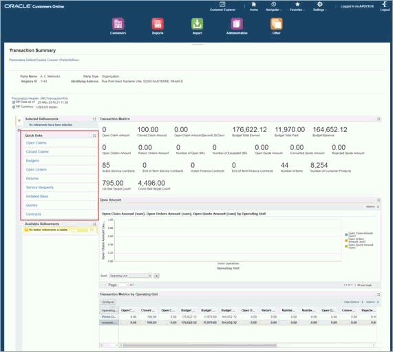
Clicking (Closed Claims) Quick links on Transaction Summary Source Page which is filtered by (A. C. Networks) customer.
Opening (Closed Claims) Endeca target information discovery page of other application filtered by the same hidden customer refinement value.
Configuration
-
Log in to Oracle Endeca Information Discovery Studio as the Admin user.
-
Click Add Component menu to select EBS Quick Links component.
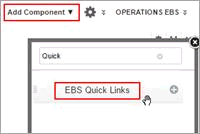
-
Place the EBS Quick Links Component before the Selected Refinements component
-
Rename the component name to Quick Links and click options menu
-
Click Add Link button to enter the details of the new quick link, representing the target page type and its URL as well as specific attributes (filters) required to be applied from the source page to the target one
-
Enter a caption for the quick link that will appear on the page
-
Enter target page URL according to its type, using the following syntax:
-
Endeca page
/endeca/web/ont/ont-open
-
EBS OA page
/OA_HTML/OA.jsp?OAFunc=EA_WORK_REQUEST_CREATE
-
EBS java form
/OA_HTML/callForms.jsp?functionCode=WIP_WIPTXCFM
-
-
In the EBS Security Function field, enter the target page EBS function name.
Note: If the user doesn't have access to this EBS function, This Quick Link will not appear in the Quick Link component based on the FND security check.
-
Select the type of page into which the target page opens, either:
-
Endeca Extension Page
-
Select this option for endeca target page only
-
Where the target endeca page opens and displays its components under the same tab name of the source page
-
-
OA Page
-
Select this option for any type of target pages using /OA_HTML/ url syntax
-
Where the target page whether Endeca, EBS OA page or EBS form will open in new tab under the page tab specific name
-
-
-
For Information Discovery target pages, insert the base dataset view key in the target dataset viewKey field.
Note: In case the target page is (OA Page) only, it is optionally allowed to click the check box that enables the target page to open in a new window.
-
Note that (Propagate Filters) checkbox is enabled by default.
-
Where any target page filters are propagated to the target page through the deeplink.
-
The propagated filter is applied on the target page based on:
-
Enabled Refinement rules on propagated filters (In case of linking to endeca target page of the same application)
-
Filter Mapping (In case of linking to endeca page of other application or Oracle EBS forms or OA pages)
-
-
-
For a target page that is in another application, enable Filter Mapping checkbox
-
Click Add Attribute Mapping button to start mapping the attributes of the source page (ont) to those on the target page (outstanding receivables).
Accordingly, values of any mapped attribute will be applied and filter the target page through its mapped target attribute
-
In the Source Attribute field, enter the key attribute name of the source page.
-
In the Target Attribute field enter the key attribute name of the target page
-
Optionally, enable the Hide Refinement option for the target page.
Recommended for range filter attributes of number or date data type
-
Click Save button
-
Click Save Preferences button
EBS Global Searchbox
About EBS Global Searchbox
EBS Global Searchbox allows an Endeca search box to be embedded in any OA framework page. It facilitates quick search action against the associated data domain.The search action will trigger a redirection to the same page or different destination page.
EBS Global Searchbox allows users to submit keyword searches. Also can configured to provide type-ahead suggestions listing attribute values that match the typed text.
Using EBS Global Searchbox
EBS Global Searchbox can appear in the header of any OA Page in EBS. It includes these features:
-
Visually lightweight Endeca page that only contains a search box and eliminates all other clutter and standard chrome components.
-
Submit button, perform deep link on the default selected data set target page
-
Invoke a target page based on record/value search
-
After completing the search, page navigates to destination page and the data are refined to only include records with the matching search terms or selected attribute value.
To complete a search using EBS Global Searchbox:
-
In the field, type the search terms. As you type the search term, a list of attribute values containing the search terms is displayed.
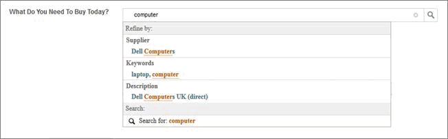
Within the list, the matching values are grouped by attribute, and then within each attribute, displayed based on relevance ranking. If you are searching across data sets, then the attributes are grouped by data set.
-
To do a keyword search for the terms you entered, either:
-
Click the search icon
-
Click the keyword search option displayed on the type-ahead panel
-
Press Enter
-
When you complete the search, the data is refined to only include records with the matching search terms or selected attribute value.
Configuration
The following uptake steps need to be uptake with the same order of implementation for the global search box.
Create New Page
To create a page in your Oracle Endeca Information Discovery Studio application, complete the following steps:
-
Click the Settings icon and select Control Panel.
-
For the application to which you want to add a page, click Action and then select Manage Pages.
-
Enter a name for the new page, the click Add Page
Note: The name of the new page must be the same as the associated FND function name
-
Enter a friendly URL for the page and click Save
Add and configure EBS Global Search Box Component
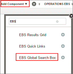
-
In the global search box page, add only EBS Global Search Box Component
Note: Once the component has been added to the page, the page header and footer will be hidden.
-
EBS Global Search Box comes with a layout called EBS Global Search Template Layout. Set this in Oracle Endeca Information Discovery Studio. Click the Settings icon, then click Page Layout and select EBS Global Search Template Layout.
-
Click Configuration.
The Configuration page displays the list of application data sets, plus an entry for All Data.
-
Enable or disable the type-ahead search capability for each data set. If type-ahead is enabled, you can edit the type-ahead option.
To configure the global search box type-ahead search:
-
Click the pencil icon in the Enable Type-Ahead column.
-
In the Minimum characters to trigger suggestions field, set the minimum number of characters that the user must type before type-ahead suggestions are offered.
-
In the Maximum suggestions per attribute field, set the maximum number of type-ahead suggestions to initially display for each attribute.
-
In the Maximum total suggestions per data set field, set the maximum total number of type-ahead suggestions for each data set.
-
In the Type-ahead Attributes list, check each attribute for which you want to enable type-ahead.
-
Click Save.
-
-
To enable keyword search for a search option, check Enable Keyword Search. This checkbox is displayed only for search options associated with a search interface.
-
To select a search option as the default redirect URL for keyword search, select Default Selection.
-
If a keyword search is enabled, then from the Match Mode drop-down list, select a match mode for the search option.
-
In the Target Page field, enter the page to display when the search is executed.
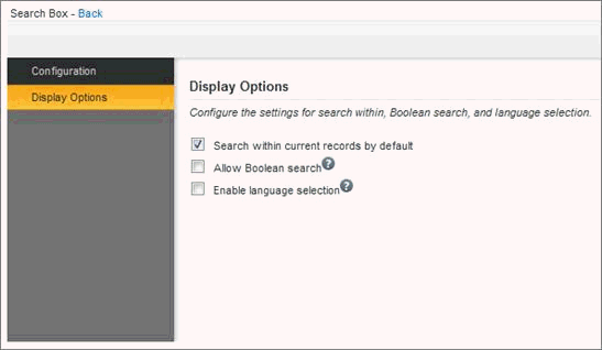
Display Options
To configure global search properties, click Display Options in the left hand navigation.
-
Optionally, enable Boolean search.
-
Optionally, enable language selection.
Create an EBS Function
Create an EBS function to link the Endeca page that contains the global search box with the Oracle E-Business Suite.
To create the EBS Function:
-
Log in as Sysadmin.
-
From the Functional Administrator responsibility, navigate to Core Services and then to Functions.
-
Click Create functions.
-
Enter all required fields. In the HTML Call field enter the URL of the Endeca page that contains the Global Search Box component.
Create an Oracle Application Framework Page
-
Add the EBS Global Search Box in the Oracle Application Framework page and call another Oracle Application Framework page with Oracle E-Business Information Discovery content.
-
Create an Oracle Application Framework page with rich containers for the EBS Global Search Box, which will be called “globalSearch.”
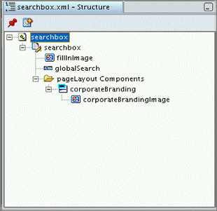
-
Make sure to name the rich container globalSearch.
-
Configure the globalSearch component to redirect to the previously created EBS Function. In this case, the EBS Function is called SEARCH BOX.
-
Set the Height and Width of the component.
-
For a friendlier UI and better performance, a temporary image must be placed before the EBS Global Search Box rich container in its container layout. The temporary image should be named “fillInImage”. The temporary image will be quickly rendered before the EBS Global Search Box is loaded, and will disappear after the EBS Global Search Box is rendered.
-
The URI of the image must be set as “/endeca/html/css/eid-default/images/oracle-default-images/icons/dimmed_search.png”.
-
The height of the search box is static at 26 pixels. The height of the filler image should be the same.
-
The width of the filler image is set according to width of the EBS Global Search Box.
-
The height of the Global Search rich container must be set to zero to hide it until it is completely rendered.
-
-
In the EBS Global Search Box configurations, set the target page to the Oracle Application Framework page that contains “OA_HTML.” Global Search will understand that search result will be redirected to another Oracle Application Framework page.
-
a. The constructed deeplink will be saved in the AppSession as an attribute called constructedDeeplink.
-
b. The target Oracle Application Framework page must get the deeplink from the session and then apply it as a parameter to the Oracle Endeca rich container as directed in the following code sample:
/**
* Layout and page setup logic for a region.
* @param pageContext the current OA page context
* @param webBean the web bean corresponding to the region
*/
public void processRequest(OAPageContext pageContext, OAWebBean webBean)
{
super.processRequest(pageContext, webBean);
String deeplink="deeplink=";

OAApplicationModule am = pageContext.getRootApplicationModule();

OADBTransactionImpl txn = (OADBTransactionImpl) am.getOADBTransaction();

WebAppsContext ctx = (WebAppsContext) txn.getAppsContext();

String constructedDeeplink =ctx.getSessionAttribute("constructedDeeplink",true);

if (!constructedDeeplink.equals("constructedDeeplink")){
deeplink= deeplink+constructedDeeplink ;

OARichContainerBean simpleBean1 =
(OARichContainerBean)webBean.findChildRecursive("endecaContainer");

if (simpleBean1 != null) {
simpleBean1.setParameters(deeplink);
}
/*reset session parameter to make sure no other endeca rich container make use of the deep link*/

ctx.setSessionAttribute("constructedDeeplink","constructedDeeplink");
   }
}
-
EBS Multi-view Available Refinements and Selected Refinements
Out of the box Selected Refinements and Available Refinements components support only one collection (data set).
The two custom components, Multi-view Available Refinements and Multi-view Selected Refinements support mlutiple collection key (data sets)
Users can use these two components if their page contains components read from more than one data set.
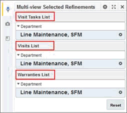
Multi-view Selected Refinements
About Multi-view Selected Refinements
The multi-view Selected Refinements component allows users to view and quickly make adjustments to the current refinement state for all data sets in the application.
The component includes entries for:
-
Multi-view Available Refinements selections
-
Keyword searches
It also includes attribute refinements selected when end users click values displayed on other components
Using Multi-view Selected Refinements
The multi-view Selected Refinements component displays refinements for attributes that belong to all associated data sets.
Configuration
-
Click the Add Component dropdown menu.
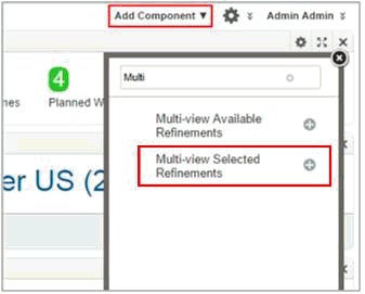
-
Add the Multi-view Selected Refinements component
-
Click Options.
-
On the Data Selection tab, click the check box next to the view to use
-
After selecting the base views, click Keep both sections.
-
Click Continue.
-
Optionally, On the Display Options tab, in the Multi-select collapse/expand threshold field, set the number of attribute values after which the list can be collapsed
-
Click Save and Exit.
Multi-view Available Refinements
About Multi-view Available Refinements
The Multi-view Available Refinements component displays the currently available values or value ranges for selected attribute from more than one data set.
Using Multi-view Available Refinements
The Multi-view Available Refinements component displays available attributes that belong to all associated data sets.
Configuration
-
Click the Add Component dropdown menu.
-
Navigate to the Multi-view Available Refinements component and click Options
-
On the Data Selection tab, to select the views to use for the component, click its check box. The Multi-view Available Refinements component can use more than one data set base view.
-
Click Keep both selections.
-
Click Continue.
-
On the Attribute Selection tab for the first base view, to include or exclude an attribute group on the Multi-view Available Refinements end user view, check or uncheck its checkbox.
By default, for a displayed group, all of the attributes in the group are displayed.
-
Within a group, to not display an attribute on the end user view, uncheck its checkbox.
-
The same configuration for the others base views.
-
Click Save and then click Exit.
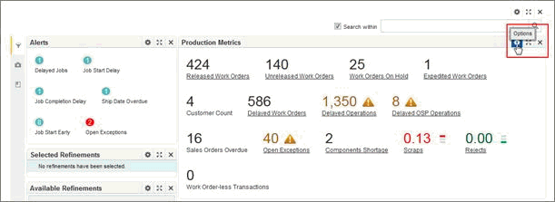
Summarization Bar Metric Refinement
Summarization Bar
The Summarization Bar allows users to quickly view metric or dimension values that summarize aspects of the underlying data.
The Summarization Bar displays one or more summary items. You may be able to display additional information about an item, or use an item to refine the data or navigate to another page or site.
Each summary item contains one of the following types of values:
| Summary Item | Value Description |
|---|---|
| Metric Value | The actual value of a specific metric. For example, an item could display the total sales or average profit. |
| Dimension Value | The dimension value associated with either the top or bottom value of an associated metric value. For example, an item could display the product category that has the highest total sales. |
| Number of flags | The number of flags. Flags are based on the value of a metric for a selected dimension or dimensions. For example, a flag summary item could reflect the number of product categories for which the total number of sales is greater than 500. |
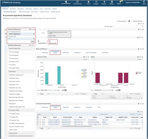
Metric Refinement
However, in order to view the details of crucial figures presented by metrics, extensive manual refinement efforts are performed to drill down to their detailed information as well as redundant result tables and bookmarks are added to represent specific business use case.
Metric Refinement new custom feature supported in Release V8 of information discovery dashboards enables users to directly refine the whole information discovery dashboards with multiple conditions configured per each metric. And allows optional navigation to new destination page.
Using Metric Refinements
Upon clicking the underlined metric refinements, the whole Information Discovery dashboard is filtered by one or many refinement values.
In addition, Users can open specific tabs on the current Information discovery filtered page or a specific tab in another Information discovery page of the same application.
Metric refinements can be configured by multiple metric values that are applied in an (AND) fashion all at once when the metric refinement is clicked. Metric refinements can be of different data types and values:
-
Metric (numeric) refinement values support negative to positive amount ranges.
-
Date/Time refinement values are configured in terms of (negative to positive) n days, where:
-
(0 days) represent studio sysdate
-
(-n days) represent dates before studio sysdate
-
(+n days) represent dates after studio sysdate
-
Configuration
-
Navigate to the application's view manager and create new custom views or update old ones with the metric attribute and its refinements.
-
Navigate to the summarization bar studio component ,through options button, to create a metric refinement in the following fashion:
-
In Select Data tab; Select the view that includes the required metric and its refinements
-
In Select Item Type tab: Select Metric Value
-
Define the metric value and its display options
-
Move to the newly introduced Action menu and select Refinement from the actions drop-down list to start implementing the refinement action.
-
In the Target Page radio button options; Select the target page type where the metric refinement is required to navigate, either to:
-
Current Page (default)
-
Other Page
-
Other page usually refers to any other page in the same application
-
Insert the other target page in the following syntax /pagename such as: /assets
-
-
-
Optionally, insert the required tab details to which the current page will navigate after being refined by the metric refinement.
-
For navigating to specific tab(s) on the current page:
Use the Target Page Tab Details text field to add the required tab information in the following syntax:
FirstTabbedComponentID[TabNumber]::SecondTabbedComponentID[TabNumber]
Such as: nested_tabs_INSTANCE_m4dA[2]::nested_tabs_INSTANCE_yh8V[2]
-
For navigating to specific tab(s) on other page:
Insert other target page tabs details navigation concatenated with the other page name in the following syntax:
/mypagename#FirstTabbedComponentID[TabNumber]::SecondTabbedComponentID[TabNumber]
Such as: /assets#nested_tabs_INSTANCE_9tOH[3]::nested_tabs_INSTANCE_huB8[2]
-
-
In Define Metric Refinements option, click + Metric Refinements button to start adding new refinements values using different operators for metrics filtering current page
-
Click Select attribute button
-
Select the required metric refinement from the attributes available n the metric's data selection view and click Apply button
-
Insert the required value of the selected attribute, in terms of both:
-
Operator type; that applies the selected attribute value in either:
-
(Equal) value refinements
-
Negative refinement, using (Not Equal) operator
-
Range values operators, such as: Between, Less than or Greater than
-
-
Insert the value itself corresponding to the selected refinement in the Attribute Value field.
-
Such as 'Y'
-
-
-
Optionally, Click +Metric Refinement to add extra metric refinements conditions.
-
Optionally configure the conditional formatting of the metric refinement, by moving to the next Conditional Formatting tab
-
Click (Save) button
Translation Note
Multi-national customers running EBS in languages other than English may have to adjust the configuration of metrics that have the refinements feature turned on. This scenario impacts refinements that are based on a language sensitive filter.
Example
The underlying data storage in Information Discovery is language specific. Take the example of JOB_STATUS attribute in Manufacturing. The value of the flag is language sensistive as it is displayed to the end user in their own language. If a metric refinement filter is defined for attribute JOB_STATUS to be equal to 'Released', that filter will be specific to English only. If a user logs with a different language such as Korean then that filter value will not work as the data will store the value in Korean rather than English or code.
To resolve this, once the page is transalated from the base English langague to Korean, in this example, customer will need to update the metric refinement configuration with the corresponding word, as follows:
-
On the Summarization Bar edit view, the Summary Items tab displays the current summary items
-
Edit the configuration of a summary item
-
Click the edit icon on the summary item
-
The Define Item tab is displayed to allow you to change the item configuration.
-
-
Click Actions to configure the action for the displayed value
-
In Define Metric Refinements, update the attribute value with the corresponding word
-
Click Save and Exit
Now when user clicks on the metric refinement, the page will be filtered and the translated value will be displayed in the selected refinement.