5 Getting Started With Designer
As the designer of the site, you spend most of your time using the Site Studio Designer application. It is recommended that you install Site Studio Designer locally on your computer.
In Designer, you build the site hierarchy and create the overall look-and-feel of the site. You make decisions about page layout, site navigation, and the use of fragments and contribution regions (that is, the editable areas of web pages).
This section covers the following topics:
5.1 Installing Designer
For specific information on the system requirements for installing and running Designer, see Section 1.8, "System Requirements."
To install the Site Studio Designer application, perform these tasks:
Note:
You need administrative rights to the computer to install Site Studio Designer. If you want to install Site Studio Designer on a system running Windows Vista or Windows 7 with User Account Control (UAC) turned off, make sure that you install the application as a user with administrator privileges.-
Contact your system administrator for instructions on where to obtain the client software installer for Site Studio Designer.
If you have access to an Oracle Content Server 11gR1 instance, you can find the Site Studio Designer installation on the My Downloads page in the Oracle Content Server web interface (under My Content).
-
After obtaining the client software, run the installer executable.
The installation wizard is launched.
-
Follow the instructions on screen to install the Site Studio Designer software.
5.2 Starting Designer
To start Site Studio Designer, open the Start menu, select Programs, then Oracle Universal Content Management, then select Site Studio 11gR1, and then Site Studio Designer.
The first time the Designer application is launched, it opens an empty site hierarchy and workspace, and it prompts you to create a web site. Thereafter, Designer opens the last web site you worked on. You can prevent Designer from automatically reconnecting to the last site on the Customize dialog (Miscellaneous tab), which is called up by opening the Tools menu and then choosing Customize.
Note:
Site Studio 11gR1 is fully backward compatible. This means that you can use Site Studio Designer 11gR1 to work with sites created in earlier Site Studio releases. It is important to note, though, that these sites continue to work in "legacy" mode; that is, they use the pre-10gR4 architecture and they do not take advantage of the architecture and features introduced in Site Studio 10gR4.5.3 Main Designer Window
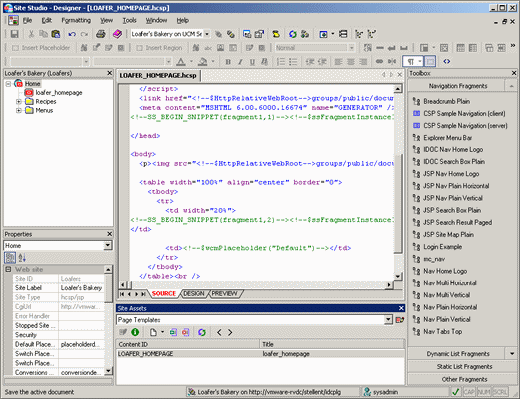
The Designer interface provides an environment where you can set up and manage all aspects of your site, including the site structure, page layout, navigation, and contribution. When you first open Designer, you see the site hierarchy and asset properties on the left, the workspace in the center, the site assets below that, and the toolbox on the right.
Figure 5-1 Main Site Studio Designer Window
Description of "Figure 5-1 Main Site Studio Designer Window"
The main Designer window consists of various elements:
-
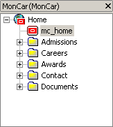
The site hierarchy is used to organize the structure of the site. This includes the home page, the individual sections, and the page templates associated with each section. For more information, see Section 5.4, "Site Hierarchy."
-
The properties pane is used to view and edit a variety of settings for your site, including information about the site hierarchy, site assets, individual HTML and scripting tags, and so on. For more information, see Section 5.5, "Properties Pane."
-
The workspace is used to view and edit site assets such as page templates, region templates, and element definitions. For more information, see Section 5.6, "Workspace."
-
The site assets pane is used to organize files that belong to your site (page templates, data files, CSS files, images, scripts, and so forth). You can use this pane to quickly and easily open, edit, and organize these files. For more information, see Section 5.7, "Site Assets Pane."
-
The toolbox pane is used to create, edit, and manage fragments on your site. For more information, see Section 5.8, "Toolbox," and Chapter 13, "Working With Fragments."
-
The toolbars provide easy access to many features in the Designer application. For more information, see Section 5.10, "Toolbars."
The display and arrangement of these objects is a default. You can rearrange them and customize the interface if you like. For more information, see Chapter 6, "Customizing Designer."
5.4 Site Hierarchy
The site hierarchy shows the fundamental structure of your web site, and it ultimately governs many other aspects of your site (such as how you organize content and how Site Studio controls its presentation). You can show or hide the site hierarchy from the View menu.
After you specify a name and location for a web site in Site Connection Manager (see Section 5.12, "Site Connection Manager"), you are ready to start building the site structure. You do this by creating a home page, then individual sections (like Products, Services, and About Us) in the site hierarchy.
After you add the sections, you are ready to add page templates to each section. Page templates come in two flavors:
-
Primary page: A primary page is the page template that is associated with a section in the site hierarchy. It is the page that you see when you go to that section of the site (much like the default page on a conventional site).
-
Secondary page: A secondary page can also be associated with a section in the site hierarchy. However, its main purpose is to serve as a backdrop for files (contributor data files and native documents) added to the site by a contributor.
Whether you are adding a primary or secondary page to a section, you have three options: create a page template from scratch, reuse an existing page template, or create a page template based on an existing page template. For more information, see Section 12.1, "Working With the Site Hierarchy." You can also use the Manager application to modify the site hierarchy and assign page templates (see Section 5.17, "Site Studio Manager.").
5.5 Properties Pane
The properties pane displays useful information about the currently selected object in the site hierarchy, workspace, site assets pane, or toolbox. You can show or hide the properties pane from the View menu.
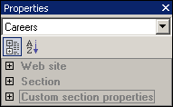
The information displayed in the properties pane is divided into categories, depending on the current object. Figure 5-3 shows the property categories for a node in the site hierarchy called Careers. They are web site, Section, and Custom section properties. Other selected objects have different property categories. You can use the plus and minus symbols to expand or collapse the property categories to show or hide the properties and their values.
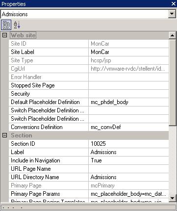
The properties shown differ for each property category. For example, for the site hierarchy, it displays the site ID and label, Cgi URL, home page, default placeholder definition, and so on (Figure 5-4). For page templates, it displays information about the site assets, HTML tags, scripting tags, and fragments on the page. The site asset properties are shown as you work in design view so that you can see what is happening behind the scenes and make precise edits to specific tags.
You can use the properties pane to view and edit various settings on your web site, including the site hierarchy, primary pages and secondary pages, and the contents of site templates (HTML, scripts, fragments, and so forth) while working in design view. The properties pane is extremely useful to edit the contents of site templates (page templates, subtemplates, and region templates), especially when those changes cannot be performed directly in design view. Examples of this include background color, page margins, and table width.
You can use the icons at the top of the properties pane to show all properties in alphabetical order (by name) or categorized into groups of related properties. The values of some properties may be edited. These are shown in black. If a property cannot be edited, it is grayed out.
If you click a different area of a page template, region template, or subtemplate (while in design view), or a separate site asset, a different tag with different attributes displays instead. You can view the attributes of a parent tag by selecting it from the drop-down list at the top of the properties pane.
You can also use the Manager application to modify properties that relate to the site hierarchy. For more information, see Section 5.17, "Site Studio Manager."
5.6 Workspace
The workspace is where you generally do the most work. This is where you edit site templates (page templates, region templates, and subtemplates) and also define and configure other site assets such as region definitions, element definitions, and cascading style sheets.
When you open a site asset in the workspace, its associated file on the content server is checked out. After you are done editing and you save the changes (by clicking the Save icon on the toolbar or pressing Ctrl+S), the file is checked back into the content server.
You cannot open an asset to edit when it is currently opened by another user to edit. In that case, you will be alerted, and the asset will be opened in read-only mode.
The workspace in Designer provides the following features:
5.6.1 Dialogs vs. Tabs
The workspace can display site assets in two ways: as dialogs or as tabs.
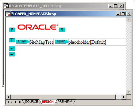
Site assets can display in the workspace as familiar Windows dialogs, with a title bar, minimize and maximize icons, and a close icon (Figure 5-5).
Figure 5-5 Two Assets Displaying As Dialogs
Description of "Figure 5-5 Two Assets Displaying As Dialogs"
You can freely drag and drop dialog windows to any position within the workspace. This may be especially useful if you have a large screen, with lots of "real estate" to work with, so you can arrange the open windows to maximize viewing efficiency. You can also use the Window menu in Designer to change how the windows are arranged in the workspace (cascading, tiled).
If an asset has any unsaved changes, this is indicated by an asterisk (*) next to the asset name in the window title bar. When you close a window that has any unsaved changes, you are first prompted to save or discard these changes.
Site assets may also display in the workspace as tabs covering the entire workspace area (Figure 5-6).
You cannot move the tabs to a different position in the workspace as they already cover the entire workspace. You can use the left and right arrows in the top-right corner of the workspace to cycle between all open asset tabs, and the 'X' icon to close the current tab.
If an asset has any unsaved changes, this is indicated by an asterisk (*) next to the asset name on the tab. When you close a tab that has any unsaved changes, you are first prompted to save or discard these changes.
Switching Between Dialog and Tab Views
You can switch between dialog view and tab view at any time. If you want to see all open assets in tabs rather than dialogs, click the Maximize icon of an asset window (Figure 5-7). Please note that after you maximize one dialog, all assets are displayed in tabs.
If you want to see all assets in dialogs rather than tabs, click the Restore Down icon in the top-right corner of the Designer application window (Figure 5-8), just below the application title bar icons. Please note that after you restore one tab, all assets are displayed in dialogs.
5.6.2 Views
A site asset may be viewed in various ways, depending on the type of asset:
-
Source view displays the code that is in the content file associated with the site asset: HTML, XML, JavaScript, Idoc Script, Site Studio tags, and so on. For more information, see Section 5.6.3, "Source View."
-
Design view displays all objects as they are arranged on a site template, both static (for example, a fixed banner graphic) and dynamic (placeholders and fragments). For more information, see Section 5.6.4, "Design View."
-
Preview provides an actual view of a site template with all assets in place, as it appears to site consumers in a web browser. For more information, see Section 5.6.5, "Preview."
-
Form view provides a dialog in which you can set the properties of a site asset. For more information, see Section 5.6.6, "Form View."
You can use the arrows in the bottom-left corner of the workspace to move between the views of the current site asset. By default, site templates open in design view, while definition assets open in form view. Most other assets (for example, contributor data files and CSS files) open in source view. Native documents open in their associated third-party application.
5.6.3 Source View
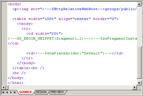
Source view displays the code that is in the content file associated with a site asset: HTML, XML, JavaScript, Idoc Script, Site Studio tags, and so on.
The information in source view appears as color-coded text:
-
Black is used for XML code, HTML tag attributes, and text that appears on the web page.
-
Purple is used for HTML tags.
-
Blue is used for HTML tag attribute values.
-
Green is used for Idoc Script, HTML comments, and code inserted by Site Studio.
You can change many of these settings, including the typeface, indentation levels, and line wrapping. For more information, see Section 6.9, "Formatting the Code in Source View."
Source view offers complete control over the site template. If you do not like the way things look in design view, you can always switch to source view to control the exact behavior of the web page. In fact, you may find yourself starting off in design view (see Section 5.6.4, "Design View") to create the page and then switching to source view to customize the appearance and behavior of the page.
Most of the sections in this guide assume you are working in design view. Source view instructions are included where appropriate.
You can edit the text in source view using common editing keystrokes (for example, Ctrl+C and Ctrl+V to copy and paste), the application toolbars (see Section 5.10, "Toolbars"), and right-click menus (see Section 5.6.7, "Right-Click Menus"). You can, for example, add site assets, images, tables, and line breaks as you work in source view.
5.6.4 Design View
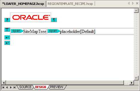
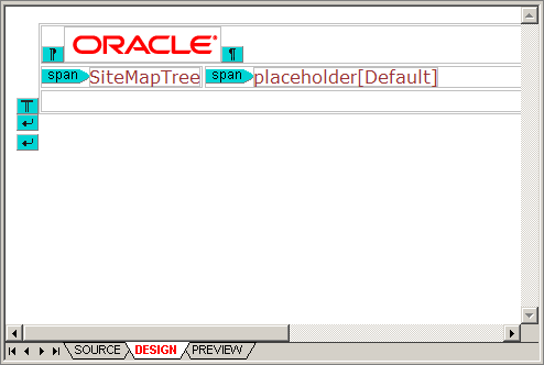
Design view displays all objects as they are arranged on a site template, both static (for example, a fixed banner graphic) and dynamic (for example, placeholders and fragments). Depending on how the template was set up and what positioning methods are used, this view may approximate what the page layout is when viewed in a web browser. You see text, images, colors, hyperlinks, and tables as they appear on the actual web site, but dynamic content (from fragments and scripts) is represented as tags rather than the actual content. This is because most fragments and scripts require server-side scripting and dynamically rendered content. This content can only be seen on the Preview tab (see Section 5.6.5, "Preview").
When you open a site template (page template, region template, or subtemplate) in Designer, it opens in the workspace in design mode, where you can edit the template as needed. The workspace then functions as an editor that offers many common editing features. You can edit the text and objects using common editing keystrokes (for example, Ctrl+C and Ctrl+V to copy and paste), the application toolbars (see Section 5.10, "Toolbars"), and right-click menus (see Section 5.6.7, "Right-Click Menus"). You can, for example, add site assets, images, tables, and line breaks as you work in design view. To select an object, simply click it, so it displays selection handles (Figure 5-12).
For edits that cannot be performed using this interface, you can use the properties pane (see Section 5.5, "Properties Pane"). The properties pane enables you to fine-tune specific areas of a site template, like background color, page margins, and table width. If you cannot make a specific edit here, you can always edit the actual code in source view (see Section 5.6.3, "Source View").
To help you identify where site assets (for example, placeholders and fragments) are located on a site template, Designer inserts asset tags with their names. (You can modify this text for fragments in the Fragment Editor as discussed in Section 13.12.4, "Adding, Editing, and Deleting Fragment Snippets".)
Designer can also highlight the location of HTML tags in design view. To turn this feature on, click the Show/Hide HTML Tags icon (Figure 5-13) in the formatting toolbar. You can click the down arrow next to the icon to show or hide specific HTML tags.
5.6.5 Preview
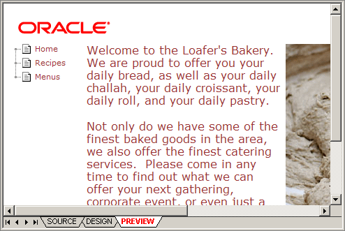
Preview provides an actual view of a web page with all assets in place, as it appears in a web browser for consumers. This is useful for previewing site templates and checking how fragments and placeholders are positioned on a template (which may be hard to see in design mode, especially if the page layout is controlled by CSS).
Note:
Site Studio requires Internet Explorer 7 or higher to provide previewing capabilities.5.6.6 Form View
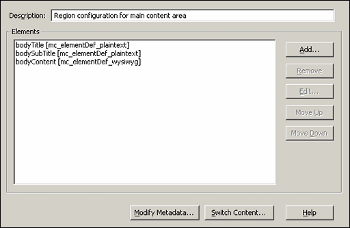
Form view provides a dialog in which you can set the properties of some site assets; for example, element definitions, region definitions, placeholder definitions, and conversion definitions. Figure 5-15 shows an example of a region definition in form view. Most form views have a Help button that you can click to see context-sensitive help information for the current form.
Figure 5-15 Form View (Region Definition)
Description of "Figure 5-15 Form View (Region Definition)"
5.6.7 Right-Click Menus
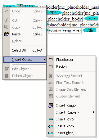
When you are working in the workspace in source view or design view, you can right-click at any time to see a menu of relevant options (Figure 5-16). The available options depend on where you are in the workspace, the type of asset you are working on, and what you are doing. In addition to providing several common editing functions (cut, copy, paste, select all, and the like), the right-click menus also typically allow you to insert assets (appropriate to the specific context), or edit or delete a selected asset.
Figure 5-16 Right-Click Menu in Design View
Description of "Figure 5-16 Right-Click Menu in Design View"
5.7 Site Assets Pane
The site assets pane is used to manage files that are associated with your site. You can use this pane to quickly and easily open, edit, and organize these files. You can show or hide the site assets pane from the View menu.
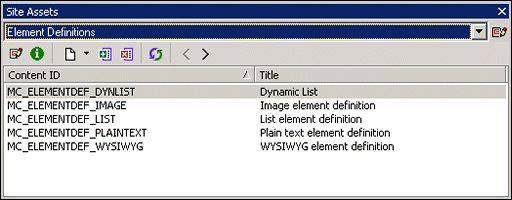
The site asset list shows all types of assets. This list can be modified as desired; the entries can be arranged and grouped in any way you want by clicking the icon next to the menu. This opens the Site Asset Categories dialog (see Section A.14, "Site Asset Categories Dialog"), where you can change the way the items in the site assets pane are ordered and grouped.
The site assets pane has a toolbar that provides easy access to several functions:
| Icon | Definition |
|---|---|
| Opens the Site Asset Categories dialog, where you can customize and even add categories to the site assets pane in Designer. For more information, see Section A.14, "Site Asset Categories Dialog." | |
| Enables you to edit the selected asset. | |
| Opens content information for the selected asset. | |
| Enables you to create assets and copy existing assets. | |
| Adds the selected asset to the site. | |
| Removes the selected asset from the site. | |
| Refreshes the list of items for the current asset category. | |
| Opens the previous asset category in the list of site assets. | |
| Opens the next asset category in the list of site assets. |
The list of asset categories is stored in the project file of a site, so to maintain the same asset list structure in the menu for each web site, you must edit the list for each site.
After you select a site asset type in the menu, all assets of that type are listed. The content ID is the name of each site asset (as given when the asset was created). When a good naming convention is used, the content ID of the asset can tell you at a glance what the asset is used for. You can sort the list of assets by content ID by clicking the column header.
Each site asset, when checked into the content server, has its own content ID and a title used for identification. The title is an additional way to help identify the site assets in the site asset pane. You can sort the list of assets by title by clicking the column header.
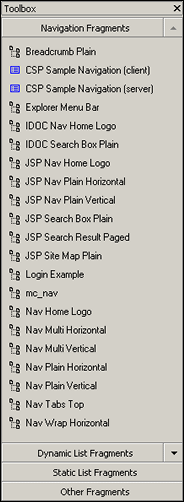
5.8 Toolbox
The toolbox contains fragments that you can add to page templates, region templates, and subtemplates. Fragments are containers for text, graphics, scripts, and anything else that adds functionality to a web page. You can show or hide the toolbox from the View menu.
Site Studio Designer comes with several predefined fragments. There are four categories of fragments: navigation fragments, dynamic list fragments, static list fragments, and other fragments. Each category contains a variety of fragments in multiple scripting languages. You can use any fragment as-is or copy and edit the fragment to suit your needs. You can also create fragments from scratch. For details on the fragments provided with Designer, seeAppendix C, "Sample Fragments."
Adding a fragment to a template is easy. You simply place your cursor in the template where you want the fragment to appear and then click the desired fragment in the toolbox. Many fragments contain additional options (called parameters) that allow you to customize the appearance of the fragment before adding it to the template.
For more information on fragments, see Chapter 13, "Working With Fragments."
5.9 Menu Bar
This section contains the following topics:
5.9.1 File Menu
The File menu has multiple parts. Many of the items here are ones you would expect to find, such as Close, Save, Print, or Exit. However, there are three additional submenus which have many options for working with the structure of the web site, as well as other advanced options.
Many of the items on the File menu are available on the Standard toolbar and Site toolbar. For more information on the Standard toolbar, see Section 5.10.1, "Standard Toolbar." For more information on the Site toolbar, see Section 5.10.2, "Site Toolbar."
The File menu contains the following items:
-
Close: Choose this option to close the active site asset.
-
Save: Choose this option to save the changes made to the active site asset.
-
Print: Choose to print the current site asset. This menu item is available only when the active asset is a template. For more information, see Section 8.2, "Managing Templates as Site Assets."
-
Print Preview: Choose to view the site asset as it will appear on the printed page. This item is active only when the site asset is in source view. For more information, see Section 5.6.3, "Source View."
-
Print Setup: Choose to edit your printer options for this session.
-
Site: This opens a submenu with administration options that affect the entire web site. For more information, see Section 5.9.1.1, "Site Submenu."
-
Fragments: This opens a submenu with options for working with the fragment libraries. For more information, see Section 5.9.1.2, "Fragments Submenu."
-
Definitions: This opens a submenu with options for uploading and downloading definition bundles.
-
Exit: Choose to close Site Studio Designer.
5.9.1.1 Site Submenu
The Site submenu has the following options:
-
Connection Manager: Opens the Site Connection Manager dialog (see Section 5.12, "Site Connection Manager"), where you can create, edit, and delete connections to web sites on the content server.
-
Connect: Establishes a connection with the current web site.
-
Disconnect: Disconnects from the current web site.
-
Refresh Hierarchy and Fragments: Refreshes the entire site, which reloads the site hierarchy and fragments for the web site.
-
Recent Sites: A list of the most recent sites opened in Site Studio Designer.
-
Advanced: This opens an additional submenu of advanced items for working with Site Studio:
-
Edit Site Addresses: Opens the Site Addresses dialog. This allows you to specify one or more domain-based or folder-based addresses that point to your web site. For more information, see Section A.5, "Site Addresses Dialog."
-
Set Default Link Format: Opens the Choose Default Link Format dialog. Here you can specify the default link format, starting with choosing between path-based or ID-based, or if changing the format is available in the link wizard. For more information, see Section A.6, "Choose Default Link Format Dialog," and Section 5.13, "Link Wizard."
-
Define Environment Properties: Opens the Define Environment Properties dialog. This allows you to determine what properties of the web site are maintained during site replication, and what properties are not replicated. For more information, see Section A.7, "Define Environment Properties Dialog."
-
Show Contributor Accessibility Menus: Toggles the menu bar to a style that works better with screen-reading tools.
-
Enable Publish Now: Toggles to include or remove the Publish Now option in the Site Studio Contributor toolbar. For more information, see Section 5.20.2, "Publish Now."
-
Enable Section Level Replication: Toggles the Ready to Publish field in the Section Properties for all sections of the web site.
-
Commit Project Changes: Saves all project changes to the content server.
-
Update Project Info: Updates the project information in Designer from the content server.
-
View Project DOC_INFO: Opens a browser window displaying the DOC_INFO information of the project file.
-
View Web Site Objects Report: Opens a browser window and opens the the Web Site Objects Report. For more information on the Web Site Objects Report, see Section 14.5, "Viewing a Web Site Objects Report."
-
-
View: This opens an additional submenu of items for working with the web site on the Oracle Content Server as well as viewing the web site.
-
Content Server Portal: Opens a browser displaying the Oracle Content Server.
-
Content Server Admin: Opens a browser window displaying the Oracle Content Administration Server.
-
Content Server Applets: Opens a browser window displaying the Administration section on the Oracle Content Server.
-
Content Server Search: Opens a browser window displaying a search page on the Oracle Content Server.
-
Content Tracker Report: Opens a Content Tracker Report for the web site, which shows how many times the assets on the site were accessed. For more information, see Section 14.4, "Content Tracker Report."
-
Site Studio Admin: Opens a browser window displaying the Site Studio Administration page on the Oracle Content Server
-
Site Studio Manage Web Sites: Opens a browser window displaying the Manage Web Sites section in Site Studio Administration on the Oracle Content Server.
-
Site Home Page: Opens a browser window displaying the home page of the current web site
-
Selected Page: Opens the page highlighted in the hierarchy pane in a browser.
-
Source: Opens the active asset in the Source tab. For more information, see Section 8.11.2, "Source View," and Section 9.11.2, "Source View."
-
Design: Opens the active asset in the Design tab. For more information, see Section 8.11.1, "Design View."
-
Preview: Opens the active asset in the Preview tab. For more information, see Section 8.11.3, "Preview."
-
Form: Opens the active asset in the Form tab. For more information, see Section 9.11.1, "Form View."
-
5.9.1.2 Fragments Submenu
The Fragments submenu has items to manage fragment libraries. You can also create a new fragment. For more information on fragments, see Section 13, "Working With Fragments."
-
Select: Opens the Select Fragment Dialog. Here you can select fragments to use with only the keyboard. The Fragment toolbox requires you use the mouse. For more information, see Section A.81, "Select Fragment Dialog."
-
New: Opens the New Fragment dialog. Here you can create a new fragment for the web site, and save it to a library to move to other web sites. For more on creating a fragment, see Section 13.9, "Creating a New Fragment." For more information on the New Fragment dialog, see Section A.58, "Properties for Fragment Dialog."
-
Upload Fragment Library: Opens a dialog to select a stored fragment library on your local computer. For more information, see Section 13.13.4, "Uploading and Downloading Fragment Libraries."
-
Download Fragment Library: Opens a browser window listing the fragment libraries on the content server. Select a library to download to the local computer. For more information, see Section 13.13.4, "Uploading and Downloading Fragment Libraries."
5.9.1.3 Definitions Submenu
The Definitions submenu has items to work with uploading and downloading definition bundles. For more information on definition bundles, seeSection 9.12, "Definition Bundles."
-
Upload Definition Bundle: Opens a dialog to select a stored definition bundle on your local computer. For more information, see Section 9.12.3, "Uploading Bundles."
-
Download: Opens another submenu to download a definition bundle based on the type of definition to download. For more on downloading the different definition bundles, see Section 9.12.2, "Downloading Bundles."
-
Placeholder Definition Bundle...: Opens a browser window listing the placeholder definitions on the content server. Select one to continue downloading the bundle.
-
Region Definition Bundle...: Opens a browser window listing the region definitions on the content server. Select one to continue downloading the bundle.
-
Element Definition Bundle...: Opens a browser window listing the element definitions on the content server. Select one to continue downloading the bundle.
-
5.9.2 Edit Menu
The Edit menu contains items that are used in editing and transforming the text in a document. Many of these functions, such as Undo, Redo, Cut, Copy, Find, and Replace are also used with objects in a document.
Many of the items in this menu are available in the Standard toolbar. For more information, see Section 5.10.1, "Standard Toolbar."
All items in the Edit menu are unavailable (grayed out) when the active document is in Preview mode. For mor einformatino, see Section 5.6.5, "Preview."
The Edit menu has the following items:
-
Undo: Reverses the most recent action, undoing it.
-
Redo: Does the most current action undone by the 'Undo' command.
-
Cut: Cuts the selected text or object and puts it in the clipboard.
-
Copy: Copies the selected text or object and puts it on the clipboard.
-
Paste: Pastes the text or object from the clipboard.
-
Select All: Selects all text and objects if
-
Find: Opens a dialog to find an entered text string.
-
Replace: Opens a dialog to find an entered text string, and replace it with another string.
5.9.3 Formatting Menu
The Formatting menu selection of the menu bar contains items that are similar to other software programs. Functions that have to do with formatting text, such as Bold, Italic, Numbered List, Itemized List, Align Center, and so forth are here.
All items in the Edit menu are unavailable (grayed out) when the active document is in Preview mode. For more information, see Section 5.6.5, "Preview."
All of the items in this menu are available in the Formatting toolbar. For more information, see Section 5.10.3, "Formatting Toolbar."
The Formatting menu has the following items:
-
Bold: Makes the selected text bold.
-
Italic: Makes the selected text italic.
-
Underline: Makes the selected text underlined.
-
Remove Formatting: Removes all bold, italic, and underline formatting in the selected text.
-
Numbered List: Starts a numbered list of items, starting with 1.
-
Bulleted List: Starts a bulleted list of items.
-
Increase Indent: Moves the left-most margin to the right.
-
Decrease Indent: Moves the left-most margin to the left.
-
Align Left: Aligns the text to the left margin.
-
Align Center: Aligns the text to the center of the page.
-
Align Right: Aligns the text to the right margin.
-
Font Size: Opens a menu to select a text size from xx-small to xx-large.
-
Font Face: Opens a menu to select a font to use on the page.
-
Style: Opens a menu to select a font style to use.
-
Text Color: Opens a color picker to select the text color.
-
Background: Opens a color picker to select the background color (also called "highlighting").
5.9.4 View Menu
The items in the View menu are mostly toggles to display windows in the Designer workspace, and toggles to display the workspace toolbars.
The first section of items are used to toggle view (checked) or hide (unchecked) the windows in the workspace. The middle section toggles the workspace toolbars. For more information on the workspace windows, see Section 5.6, "Workspace." For more information on the different toolbars, see Section 5.10, "Toolbars."
The final two sections each have a single item:
-
Log File: Launches the Site Studio Log File Viewer application. For more informatino, see Section 5.11, "Log File."
-
Customize: Opens the Customize dialog to the Commands tab, where you can determine how the menu bar items are organized. For more information, see Section A.1.1, "Customize Dialog: Commands Tab."
5.9.5 Tools Menu
The items in the Tools menu are used to work with the site currently open in Designer. This section also can contain custom menu items created through the Customize item. For more information, see Section A.1.3, "Customize Dialog: Tools Tab."
The Tools menu has the following items:
-
Update Navigation: Regenerates the site navigation structures. This will cause menus generated from these structures to also update on the website.
-
Define Custom Section Properties: Opens the Custom Section Properties dialog, where you can assign custom properties to site sections (in addition to the web site properties such as section ID, label, and default placeholder definition). For more information, see Section A.9, "Custom Section Properties Dialog."
-
Define Placeholder Definition Mappings: Opens the Define Placeholder Definition Mappings dialog, where you provide a mapping from a placeholder name to a placeholder definition. For more information on the Define Placeholder Definition Mappings dialog, see Section A.74, "Define Placeholder Definition Mapping Dialog." For more information on placeholder mappings, see Section 9.8, "Working With Placeholder Definitions."
-
Compare Changes: Opens the Compare Changes Feature. For more information, see Section 12.5.2, "Using the Compare Changes Feature."
-
Create Hyperlink: Opens the Link wizard. For more information, see Section 12.4, "Working With Links."
-
Remove Hyperlink: Removes the selected hyperlink.
-
Show/Hide HTML Tags: Toggles to show the HTML tags in Design View.
-
Highlight Borderless Elements: Toggles to show in Design view a thin outline of the elements with content to be shown fully in the final web page, such as placeholders and fragments.
-
HTML Tidy Source: Applies the HTML Tidy library to the code in Source view. HTMYL Tidy is a library that is used to clean up HTML source code and have it conform to specified .dtd files.
-
Language: Selects a language to operate Designer in.
-
Customize: Opens the Customize dialog to the Tools tab. Here you can add additional custom menu options. For more information, see Section A.1.3, "Customize Dialog: Tools Tab."
5.9.6 Window Menu
The items in the Window menu are similar to those found in other software packages. Here you can select to maximize a window, close it, or select which window among the open workspace windows is the active window.
5.10 Toolbars
Site Studio Designer has several toolbars that provide easy access to many design functions:
You can show or hide any of these toolbars from the View menu. In addition, you can drag and drop the toolbar to any position. If you drag a toolbar to a position outside the toolbar area, it becomes a separate dialog that you can customize by clicking the down arrow in the title bar.
5.10.1 Standard Toolbar
The standard toolbar provides access to several common editing functions such as copying, pasting, and printing.
| Option | Description |
|---|---|
| Saves the open assets. | |
| Cuts the selected text. | |
| Copies the selected text. | |
| Pastes the selected text. | |
| Cancels the operation that was last performed. | |
| Does the operation that was last undone by the 'Undo' command. | |
| Prints the current contents of the active window in the workspace. | |
| Opens the online help of the Designer application. |
5.10.2 Site Toolbar
The site toolbar provides access to several site-related functions such as site connections, content assignment, and navigation.
| Option | Description |
|---|---|
| Lists all defined site connections. | |
| Establishes a connection with the current web site (shown in the list next to this icon). | |
| Breaks the connection with the current web site (shown in the list next to this icon). | |
| Opens the Assign Content dialog (see Section A.54, "Assign Content Dialog"), where you can assign content (contributor data file, native document, or subtemplate) to a contribution region on a page. | |
| Opens the Custom Section Properties dialog (see Section A.9, "Custom Section Properties Dialog"), where you can assign custom properties to site sections (in addition to the web site properties such as section ID, label, and default placeholder definition). | |
| Regenerates the site navigation structures. This will cause menus generated from these structures to also update on the website. | |
| Refreshes the entire site, which reloads the site hierarchy and fragments for the web site. | |
| Opens the Site Connection Manager dialog (see Section 5.12, "Site Connection Manager"), where you can create, edit, and delete connections to web sites on the content server. | |
| Launches a browser with the currently selected section from the site hierarchy window.
Please note that nothing happens if you click this icon with nothing selected in the site hierarchy. |
|
| Compares the current web page with the latest one on the content server, and shows the differences in color-coded text in a new browser window. | |
| Expands all sections in the site hierarchy to show all assigned primary and secondary pages. | |
| Collapses all sections in the site hierarchy to hide all assigned primary and secondary pages. |
5.10.3 Formatting Toolbar
The formatting toolbar provides access to several text formatting functions such as font size and color, text alignment, lists, and the like.
| Option | Description |
|---|---|
| Applies the selected font to the text. | |
| Applies the selected font size to the text. | |
| Applies the selected color to the text. You can use the down arrow next to the icon to select a text color. | |
| Applies the selected background (that is, highlight) color to the text. You can use the down arrow next to the icon to select a background color. | |
| Makes the selected text bold. | |
| Makes the selected text italic. | |
| Makes the selected text underlined. | |
| Removes all formatting from the selected text. | |
| Inserts a numbered (ordered) list. | |
| Inserts a bulleted (unordered) list | |
| Increases the indentation level of the selected text by one level. | |
| Reduces the indentation level of the selected text by one level. | |
| Left-aligns the selected text. | |
| Centers the selected text. | |
| Right-aligns the selected text. | |
| Launches the Link wizard (see Section A.18, "Link Wizard"), which enables you to create a hyperlink for the selected text, or edit an existing hyperlink. | |
| Removes an existing hyperlink from the selected text. | |
| Shows or hides HTML tags in the workspace. You can use the down arrow next to the icon to show or hide specific HTML tags. | |
| Shows or hides borders around elements that normally do not have borders. | |
| Cleans up and reformats the HTML source code, making sure that it complies with the chosen DOCTYPE. |
5.10.4 HTML Toolbar
The HTML toolbar provides access to several HTML-related functions such as CSS classes, images, and horizontal lines.
| Option | Description |
|---|---|
| Applies the selected HTML style to the text. | |
| Inserts an image on the web page at the current cursor position. You are prompted to select an image from the content server. | |
Inserts a horizontal line (<hr>). |
|
Inserts a line break (<br>). |
|
Inserts a non-breaking space ( ). |
5.10.5 Table Toolbar
The table toolbar provides access to several table-related functions such as adding a table, adding rows and columns, merging and splitting cells, and the like.
| Option | Description |
|---|---|
| Inserts a table on the web page at the current cursor position. Click the down arrow next to the icon to choose from a list of predefined tables. | |
| Deletes the current table. | |
| Inserts a row to the table above the row the cursor is in. | |
| Adds a column to the table to the left of the column the cursor is in. | |
| Splits the table cell where your cursor is located into columns or rows. You are prompted to choose whether the cells should split into columns (that is, vertically) or rows (that is, horizontally). | |
| Merges the table cell where your cursor is located with the cell to the left. | |
| Merges the table cell where your cursor is located with the cell above it. | |
| Merges the table cell where your cursor is located with the cell to the right. | |
| Merges the table cell where your cursor is located with the cell below it. |
5.10.6 Contribution Toolbar
The contribution toolbar provides access to several contribution functions such as adding a region and various types of elements. This toolbar is primary used for legacy sites (that is, sites created in Site Studio Designer releases before 10gR4).
| Option | Description |
|---|---|
| Inserts a legacy contribution region on the web page at the current cursor position. | |
| Inserts a legacy WYSIWYG element on the web page at the current cursor position. | |
| Inserts a legacy plain-text element on the web page at the current cursor position. | |
| Inserts a legacy image element on the web page at the current cursor position. | |
| Opens the properties dialog for the selected element, where you can edit its properties. | |
| Removes the selected item from the web page. |
5.10.7 Placeholder Toolbar
The placeholder toolbar provides access to several placeholder-related functions such as adding a placeholder and various types of elements to templates.
| Option | Description |
|---|---|
| Inserts a placeholder on the web page at the current cursor position. | |
| Inserts an element on the web page at the current cursor position. | |
| Inserts a dynamic conversion on the web page at the current cursor position. | |
| Opens a dialog where you can assign an element. | |
| Removes the selected item from the web page. |
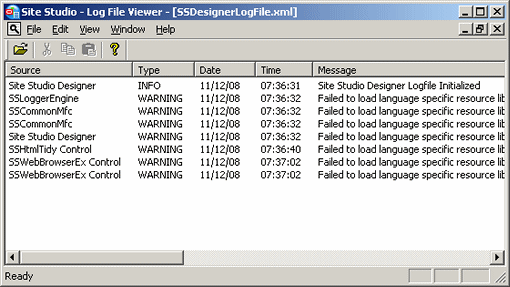
5.11 Log File
The log file shows status, warning, and error messages that are generated while you are using the Designer application. This may be useful for troubleshooting purposes. You can see the log file at any time by opening the View menu and then choosing Log File.
The log shows the source of the messages, their type, date, and time, and the actual message texts. You can click any message for a more detailed view. In addition, you can save the current log to a text file by clicking File, and then Save.
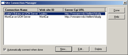
5.12 Site Connection Manager
The Site Connection Manager is used to control the connections to Site Studio web sites on the content server. You can add, edit, and delete site connections. When you connect to a web site, you essentially connect to its project file on the content server. This project file holds all relevant information that enables you to work with the site in Designer. For example, it contains references to all files that comprise the web site and their relationships.
You can open the Site Connection Manager in two ways:
-
By opening the File menu, selecting Site, and then Connection Manager.
-
By clicking the Site Connection Manager icon on the site toolbar (Figure 5-27).
When you create a site connection, you specify the Cgi URL address of the content server that stores the web site, the site identifier, and a connection name. Site Studio Designer then creates a project file for the web site and checks it into the content server with the default metadata for new project files (see Section 7.3.1, "Specifying the Metadata That is Assigned to a Project File"). When you have created a site connection, you can quickly open your site in Designer using the menu on the site toolbar (Figure 5-29) or by selecting File, then Site, and then Recent Sites.
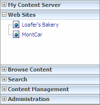
web sites also appear in the "Web Sites" menu on the content server (Figure 5-30).
For more information on working with site connections, see Section 7.1, "Site Connections," and Section A.2, "Site Connection Manager Dialog."
5.13 Link Wizard
The Link wizard is used to add a hyperlink to text or other page element in page templates, region templates, or subtemplates. You can link to a variety of targets, including web site sections, contributor data files, native documents, and URLs. You can link to items on the current web site, but also to items on other Site Studio sites on the content server, or to external web sites. Contributors use this same wizard to create hyperlinks in the Contributor application. You, as the site designer, control the options available to them when you set up an element definition (under 'Link Settings'). For example, you decide what kinds of content can be linked to: a new contributor data file or native document, an existing file on the content server, and/or an existing file on your local computer. You may also limit the file formats of native documents that can be linked to (for example, only Microsoft Word documents).
In Designer, with a template open in design view and some text or other page element selected, you open the wizard by clicking the Create Hyperlink icon on the formatting toolbar (Figure 5-31).
The Link wizard consists of multiple steps, depending on the choices you make during the process.
Note:
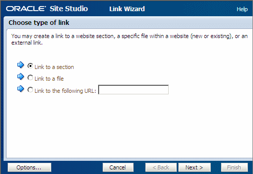
You can step through the wizard faster by clicking the blue arrow to the left of the option you want to use. This automatically selects the option and moves the wizard to the next step.The first step is to specify the type of hyperlink to create:
You can click Options to specify whether the link target should open in a new browser window. After you select the desired link type, the wizard proceeds and presents some additional screens depending on the choices you make.
If you choose to link to a section, you are asked to specify the site section that the hyperlink points to. You can link to a section on the current web site or a different Site Studio site on the content server. You select the target section from the site hierarchy.
In addition, you may be asked to select the URL format (path-based or ID-based), depending on whether this was enabled in the wizard (see Section 12.4.8, "Choosing a Default Link Format"). For more information, see "URL Formats".
The final step is to confirm the link before it is actually created (or modified).
If you choose to link to a file, you are first asked to select the type of file that the hyperlink points to. The site designer decides which file type(s) you can link to:
-
New contributor data file: If you choose to link to a new contributor data file, you are prompted to check the new data file into the content server (using the standard content check-in form). Enter the appropriate content information (metadata) to check the item into the content server. Much of the information is automatically provided. If a field name is marked red, then the field is required (that is, the item cannot be checked in if the field is empty). Please note that the new contributor data file is empty until a site contributor edits it in the Contributor editor.
You are also prompted to specify the web site section in which you want the hyperlinked data file to appear. For more information, see "Target Sections".
In addition, you may be asked to select the URL format (path-based or ID-based), depending on whether this was enabled in the wizard (see Section 12.4.8, "Choosing a Default Link Format"). For more information, see "URL Formats".
The final step is to confirm the link before it is actually created (or modified).
-
New native file: If you choose to link to a new native document, you first must select the file format (for example, Microsoft Word). You, as the site designer, decide what file formats are allowed for new native documents.
Next, you are prompted to check the new native document into the content server (using the standard content check-in form). Enter the appropriate content information (metadata) to check the item into the content server. Much of the information is automatically provided. If a field name is marked red, then the field is required (that is, the item cannot be checked in if the field is empty). Please note that the new native document is empty until a site contributor edits it in its associated third-party application.
You are also prompted to specify the web site section in which you want the hyperlinked native document to appear. For more information, see "Target Sections".
In addition, you may be asked to select the URL format (path-based or ID-based), depending on whether this was enabled in the wizard (see Section 12.4.8, "Choosing a Default Link Format"). For more information, see "URL Formats".
The final step is to confirm the link before it is actually created (or modified).
-
Existing file from server: If you choose to link to an existing file on the content server, you are taken to the standard search results page on the content server, showing all content files that are available for you to choose. You, as the site designer, decide what criteria are used for the search query. Click the Select button next to the content item you want to link to.
You are also prompted to specify the web site section in which you want the hyperlinked file to appear. For more information, see "Target Sections".
In addition, you may be asked to select the URL format (path-based or ID-based), depending on whether this was enabled in the wizard (see Section 12.4.8, "Choosing a Default Link Format"). For more information, see "URL Formats".
The final step is to confirm the link before it is actually created (or modified).
-
Existing local file: If you choose to link to an existing local file (that is, on your own computer), you are prompted to check the file into the content server (using the standard content check-in form). Much of the information is automatically provided. If a field name is marked red, then the field is required (that is, the item cannot be checked in if the field is empty). Click the Browse button next to the Primary File field to navigate to the file on your computer and select it. Also, make sure to specify a title.
You are also prompted to specify the web site section in which you want the hyperlinked file to appear. For more information, see "Target Sections".
In addition, you may be asked to select the URL format (path-based or ID-based), depending on whether this was enabled in the wizard (see Section 12.4.8, "Choosing a Default Link Format"). For more information, see "URL Formats".
The final step is to confirm the link before it is actually created (or modified).
-
Current item: Choose this option if you want to continue to link to the selected content file, but you want to change the hyperlink properties (for example, its target section on the site).
If you choose to link to a URL (web address), you can specify that URL in the field next to this option. You cannot proceed in the wizard until you provide a URL. This is often an external URL, such as a web site on the Internet, but may also useful to link to a file on the content server that is not used for contribution, such as a PDF file, media file, or zip file.
The final step is to confirm the link before it is actually created (or modified).
One of the wizard steps enables you to specify the web site section in which you want the selected data file to appear (the "target section"). This enables you to control where a particular file appears on the web site regardless of where it is actually stored on the site. For example, if you have a product description stored in the "Products" section of the site, you can create a link to it from the "Support" section and then specify that the document actually appears in the "Support" section when the hyperlink is clicked. You can choose from the following options:
-
Use default Web site section metadata: If you choose this option, the hyperlinked content file opens in the web site section as currently specified in the Web Site Section metadata field for the content file. If contributors are allowed to select the URL format of links, they must use an ID-based URL format.
-
Choose a Web site section: If you choose this option, the hyperlinked content file opens in the web site section of your choice (in effect overriding the default target section of the content file). The section may be in the current web site or another Site Studio site on the content server.
-
Link to the Content Item's URL: If you choose this option, the file displays exactly as it is stored on the content server rather than within the framework of the web site. This is useful for linking to native documents such as PDF files.
You may be prompted to choose the URL format of the link, depending on whether contributors are allowed to make this decision. (You can set this option in Designer by selecting File, then Site, then Advanced, and then Set Default Link Format.) The following URL formats are available:
-
Path Based URL: The link contains a path to the target location. You have two choices for this type of link:
-
Absolute Path: Generates a full path; for example
<!--$ssServerRelativeSiteRoot-->products/index.htm(where"<!--$ssServerRelativeSiteRoot-->"gets replaced with the path to the root of the web site). -
Relative Path: Generates a relative path instead of a full path; for example
../products/index.htm.
Please note that this option is not available if you chose to use the default web site section for the content file as the target section.
-
-
ID Based URL: The link contains the coded identity of the target location rather than the path-based name. You have three choices for this type of link:
-
Client Side Script Format: Uses client-side JavaScript to construct a link to the target location; for example,
javascript:nodelink('10024');. -
Server Side Script Format: Uses server-side Idoc Script to construct a link to the target location; for example,
<!--$wcmUrl('nodelink','10024')-->. -
URL Token Format: Uses a redirect on the server to construct a link to the target location; for example,
ssNODELINK/10024.
-
5.14 Switch Content Wizard
The Switch Content wizard is used to change the content assigned to a contribution region on a web page (or assign content if none was assigned yet). Contributors use this same wizard to assign or switch content in the Contributor application. You, as the site designer, control the options available to them when you set up a region definition. For example, you decide what kinds of content can be assigned: a new contributor data file or native document, an existing file on the content server, and/or an existing file on your local computer. You may also limit the file formats of native documents that can be assigned (for example, only Microsoft Word documents). In addition, you may allow the association of content with a contribution region to be removed altogether.
In Designer, you open the Switch Content wizard from a web page that opens in the Assign Content dialog (see Section A.54, "Assign Content Dialog"), which, in turn, is launched by right-clicking an assigned primary or secondary page of a section in the site hierarchy and choosing Assign Content. The page is essentially displayed in contribution mode, and you can right-click the menu in a contribution graphic to switch the content of the associated placeholder (or assign it if no content has yet been assigned).
The Switch Content wizard consists of multiple steps, depending on the properties of the current contribution region and the choices you make during the process.
Note:
You can step through the wizard faster by clicking the blue arrow to the left of the option you want to use. This automatically selects the option and moves the wizard to the next step.Selecting a Region Definition or Subtemplate
Depending on how contribution region was set up, you may first be prompted to select the region definition or subtemplate that the region content should be based on.
If you select a region definition, you associate the contribution region directly with a contributor data file or native document (to be selected later in the wizard). Its contents open in the contribution region in accordance with the selected region definition and its associated region template. You, as the site designer, control what region definitions are available for the contribution region (in the placeholder definition).
If you select a subtemplate, you associate the contribution region with a subtemplate that defines what the region looks like and typically divides it into smaller contribution regions (each of which needs separate content assigned to it). You, as the site designer, control what subtemplates are available for the contribution region (in the placeholder definition).
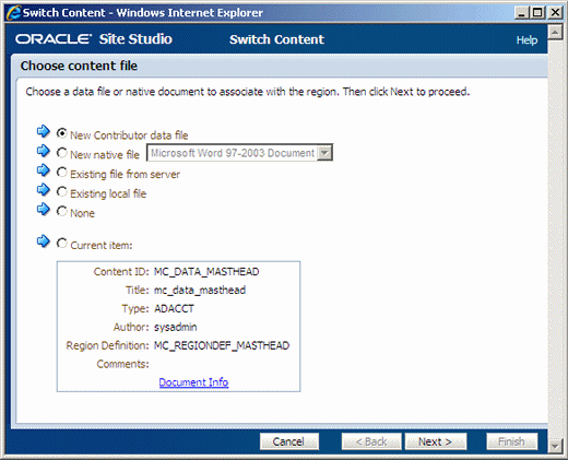
Depending on your wizard choices, you may be prompted to select the type of content file that is associated with the contribution region. The available content file types depend on what was made available in the region definition. Select an option:
-
To use a new contributor data file, select New Contributor data file. You are taken to a content check-in form, where you can provide the metadata for the contributor data file and check the file into the content server. The file is empty until you (or another contributor) edits it in the Contributor editor.
-
To use a new native document, select New native file and choose the file format. (The available file formats are set in the region definition.) You are taken to a content check-in form, where you can provide the metadata for the native document and check the file into the content server. All required metadata fields are marked red. The file is empty until you (or another contributor) edits it in its native application.
-
To use an existing file on the content server, select Existing file from server. You are taken to a search results page, which lists all items on the content server that you can choose from. (The criteria for the search query are set in the region definition.) Select the file you want to use by clicking its associated Select button.
-
To use an existing file on your computer, select Existing local file. You are taken to a content check-in form, where you can provide the metadata for the file and check the file into the content server. All required metadata fields are marked red. Use the Browse button next to the Primary File field to navigate to the file on your computer to use and select it.
-
To remove the existing association of a content file with the contribution region, select None. This means that the contribution region no longer has a content file assigned to it.
5.15 Fragment Editor
The fragment editor is used to create and edit fragments. To edit a fragment, simply right-click the fragment in the toolbox (see Section 5.8, "Toolbox") and choose Edit or Copy and Edit (for read-only fragments). This opens the fragment in the fragment editor. (You may first see a fragment properties dialog, where you must provide some information before you can edit the fragment.) To create a fragment, select File. then select Fragments, and then New.
The fragment editor may display as a dialog or a tab. For more information, see Section 5.6.1, "Dialogs vs. Tabs."
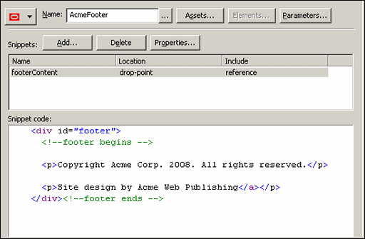
Fragments can exist in many forms, from a simple copyright statement to a complex series of scripting functions. You can turn just about any piece of code into a fragment. The Fragment Editor helps you manage this code and the individual parts that comprise a fragment, including the following:
-
Properties: The properties of a fragment are its identifying characteristics such as its name, type, and scripting language.
-
Snippets: Snippets are the individual pieces of code (which could simply be text) that comprise a fragment. This code can be created and edited in source view or design view in the Fragment Editor (similar to source and design view of a site template). You must know the correct scripting syntax if your fragment contains scripting code.
-
Assets: Assets are files that are referenced from within a fragment. A graphic, cascading style sheet, or JavaScript file are all commonly used assets. After you add an asset to a fragment, it becomes part of that fragment.
-
Elements: Elements can be added to a fragment that is used to generate a static list. When elements are used this way, contributors can edit the list, add rows, delete rows, and more.
-
Parameters: Parameters are the attributes that govern the appearance and behavior of a fragment. You can specify your own set of parameters when you create a fragment and then choose from those parameters when you add the fragment to a page template.
For more information on the fragment editor, see Section 13.12, "Using the Fragment Editor."
5.16 Contributor Data Files and Native Documents
Contributor data files and native documents are used to store content submitted to the site by a contributor. Both files can be assigned directly to a contribution region on a primary page or added as the target of a hyperlink or dynamic list, where they appear on a secondary page.
The two files are different, however, in how you open and edit them:
-
Contributor data file: A contributor data file is an XML file generated by Site Studio and intended to be opened and edited using the Contributor application. The file is immediately updated and added to the web page.
-
Native document: A native document is a third-party file that is viewed and edited using the application originally used to create it (for example, Microsoft Word is used for Word documents). When the file is closed, it is converted into a web page (using Dynamic Converter) and then made available to the web page.
To use these files on your site, you must create an editable area (a 'contribution region') on a page template and then assign the data file or native document to the placeholder. If you are using data files, you also must add one or more elements to each region definition. Each element appears as a field in Contributor where a user can add and edit content. You, as the site designer, control the editing options available to the contributor within each element (in its element definition).
After you have set up the contribution region, you assign one of these files to the region using the Assign Content dialog (see Section A.54, "Assign Content Dialog"). This is available at any time by clicking the Assign Content icon (Figure 5-35).
When you first open the Assign Content dialog, you see the site hierarchy on the left and the fully rendered page template with one or more contribution regions on the right. Each contribution region has its own contribution graphic, which shows the name of the contribution region, a Status/Edit icon, and a Menu icon (Figure 5-36).
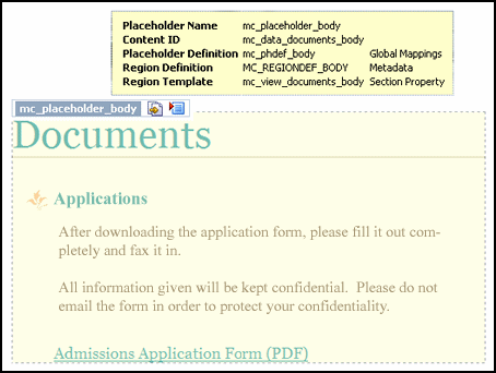
If you hover your mouse cursor over a contribution graphic, its associated contribution region is marked in a yellow box. This is the content that can be edited using the selected contribution graphic. In addition, a tooltip appears that provides useful site design information for the contribution region (such as the associated placeholder name and definition, the content ID of the associated content file, and the associated region definition and template) (Figure 5-37).
Figure 5-37 Contribution Region Marked on Web Page With Tooltip
Description of "Figure 5-37 Contribution Region Marked on Web Page With Tooltip"
If not all contribution regions on a page in a site section have content assigned to them, the folder icon of that section in the site hierarchy shows a red 'x' (Figure 5-38).
You can specify a new data file or native document or reuse an existing one for each region. You should specify a new file if you want new and unique content to display on that page on the web site and reuse an existing file if you want the same content to display on multiple pages on the web site (similar to the decision that goes into reusing other site assets, such as page templates).
Note:
Contributor data files and native documents are stored in the content server like any other content item. As such, you can choose different metadata or security for each file and consequently, limit what a contributor sees based on his or her login credentials.Allowing Contributors to Create Files
In addition to assigning contributor data files or native documents to a region, you can allow contributors to create their own data files and native documents on the web site.
This adds a whole new dimension to your site, allowing the site to grow without your having to create sections and page templates every time a piece of content is created. To do this, you must allow contributors to add files to the site (an allowed action in an element definition) and then set up areas on the site where those files can appear (a replaceable region on a secondary page).
5.17 Site Studio Manager
When a web site has been created and deployed using Site Studio Designer, the site management responsibilities can be handed over to users who manage the site. They do this using Site Studio Manager, which is a web-based application.
To use Manager, you browse to a web page that has the manager feature enabled (see Chapter 16, "Setting Up Manager"). Depending on how it is implemented, Manager may display at all times or it may only display in contribution mode. You can open Manager from each page or from a designated section of the site.
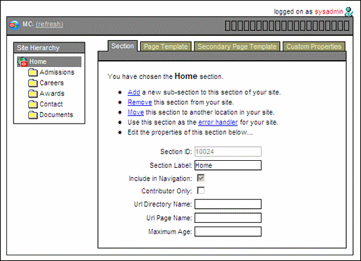
In Manager, you can modify the site hierarchy, change the page template associated with a section, modify the properties of a section, and so on. The manager of the site may choose to work exclusively in Manager or both Manager and Contributor to effectively manage the site.
When you add Manager and Contributor to your site, you must consider how the two applications are used and how they might be used together by managers and contributors. You should educate them regarding their roles and responsibilities.
For more information on using Manager, see the Oracle WebCenter Content Administrator and Manager's Guide for Site Studio.
5.18 Site Studio Contributor
After a web site has been created and deployed in Site Studio Designer, it can be handed over to the users who add and update content on the site. These users are called contributors, and they update the site using the Contributor application.
The designer of the site can also use Contributor, and may frequently do so to test the site contribution, to populate the site with sample pages, or to fix pages that have become broken.
To start Contributor, you visit a web page that contains an editable contribution region (which was set up in Designer) and then change the page view to contribution mode (you may be prompted to log onto the web site). You can then click any contribution graphic on the page and start editing that page in Contributor.
The following topics provide a brief introduction to Contributor:
5.18.1 Launching Contributor
To open the Contributor application, browse to the web page containing a contribution region and enable contribution mode using a combination of keystrokes on the keyboard (the default is Ctrl+Shift+F5). You are then prompted to enter your login credentials.
You can tell that you are in contribution mode by a thin Contribution Mode banner along the top of the screen. You also see one or more contribution graphics (Figure 5-40) on the page, one for each placeholder.
Each contribution graphic marks an editable area on the web page that can be opened and edited with Contributor or a third-party application (if a native document is used). The name of the placeholder is listed first, followed by the Edit icon then the menu icon. To edit, click the Edit icon or click the Menu icon and choose Edit.
Please note the following:
-
The number of contribution graphics may vary, depending on the number of editable areas on a page and the contributor's login credentials (if the designer set up different security for each file on the site).
-
Different icons may appear within the contribution graphic, meaning different things. If content has not been assigned to the placeholder, then the graphic has a small green '+' symbol (Figure 5-41).
If the contributor has access to switch the region content, then the graphic displays a small yellow arrow (Figure 5-42).
If the content is in workflow, this is represented by a green gear icon on the left side of the contribution graphic (Figure 5-43).
-
For information on how to change the default keystroke combination (Ctrl + Shift + F5), see the Oracle WebCenter Content Administrator and Manager's Guide for Site Studio.
-
To know which web pages contain contribution regions and of those, which ones should be edited, the designer must notify the contributor, perhaps by forwarding the URL of the web page or using Workflow.
5.18.2 Contributor Editor
After you choose to edit a contribution region on a web page, the Contributor editor launches in a browser popup window (Figure 5-44), and you can start editing the content in the current contribution region. Please note that this browser popup window may be suppressed by popup-blocking software, so you must configure that software to allow pop-ups on your site. Also, when the Contributor editor opens, the web browser displaying the original web page becomes temporarily unavailable. You can return to the web browser when you close the Contributor editor.
The Contributor interface is very similar to the interface of a word processing program. You can add, remove, and edit text, images, hyperlinks, and more. There is even a list option that enables you to manage simple or complex lists. The appearance and behavior of Contributor varies depending on how each contribution region and element is set up in Designer. As the designer of the site, you can set up and modify contribution regions so that the Contributor interface is plain and simple or advanced and powerful.
The main editor window contains various elements:
-
Page header: includes the name of the contribution region being edited.
-
Data file: shows the content ID of the data file associated with the editable contribution region on the content server.
-
Elements tab: provides the editing environment for all elements in the contribution region. Please note that all elements in the associated data file are shown, even if only some of them are actually displayed in the contribution region being edited. (The other information may be used elsewhere on the web site, so editing that information may affect other pages on the site.)
-
Metadata tab: shows the content information (metadata) for the data file associated with the editable contribution region (only if the site designer opted to make the metadata available for the contribution region).
-
Contribution toolbar: provides a set of functions that apply to the contribution region as a whole. You can save or preview the data changes, refresh the current view, open a usage report for the data file, and view the changes made to the web page.
-
Editing areas: one for each element in the contributor data file associated with the contribution region on the web page. These editing areas are where you type in your text and format your document.
-
Element toolbars: provide editing functionality relevant to the type of content you are editing. The site designer controls what editing options are available for each element type.
5.18.3 Contributor and Workflows
In addition to contributing content to the site, a contributor may also be responsible for reviewing and approving content. This could also be the sole responsibility of a reviewer in your organization. The process of reviewing and approving content is called workflow.
You create a workflow in Site Studio using the existing workflow functionality in the content server. If you are familiar with this, you should be able to quickly adopt the workflow process on your site. Workflow can be enabled for the content assigned to a contribution region on a web page. When a contributor adds a new data file or native document to that web page, the content automatically enters a workflow (preventing the page from going "live" without going through an approval process).
To participate in a workflow, reviewers click a link in a workflow e-mail message that takes them to the web page that must be reviewed (the page is in contribution mode). They can open the menu in the contribution graphic that has the workflow icon (Figure 5-45) and choose Approve Document, Reject Document, or Edit.
If the reviewer chooses Approve Document, the next reviewer in the workflow is notified with a similar e-mail message. If the reviewer is the last reviewer in the workflow, clicking Approve Document makes the content appear on the actual, "live," web site.
If the reviewer chooses Reject Document, the Oracle Content Server rejection page opens, where the review must supply details on why it was rejected. Additionally, an e-mail is sent to the previous reviewer in the workflow. Clicking Edit opens Contributor so that the content can be edited. For more information, see Section 15.3, "Workflow Experience for Contributors," and the Oracle WebCenter Content User's Guide for Site Studio Contributor.
The complete workflow process depends on how you set up workflow on the content server. For more information, see Chapter 15, "Using Workflows," and the Oracle Content Server documentation.
5.19 Site Studio Administration Page in Oracle Content Server
The Site Studio Administration page is created when you install the Site Studio component on the content server, and it is accessible from the Oracle Content Server Administration page.
You use this page to perform several administrative tasks for all of your web sites (some of which you can also do in Designer). Using the Site Studio Administration page, you can view information about your web sites, start and stop web sites, replicate web sites, upgrade web sites, and much more.
This page has the following options:
-
Manage Web Site: Opens the Manage Web Sites page, where you can view each site, update navigation, view a site report, stop and start the site, and reload a site.
-
Manage Web Site Addresses: Opens the Manage Web Site Addresses page, where you can add domain addresses that point to your web site.
-
Manage Fragment Libraries: Opens the Manage Fragment Libraries page, where you can deploy fragment libraries, configure JSP support, and compress the Contributor code.
-
Set Default Project Document Information: Opens the Set Project Default Document Information page , where you can specify the default metadata that is assigned to project files (created in Designer).
-
Manage Site Replication: Opens the Manage Site Replication page, where you can replicate your site from one content server to another.
-
Backup and Restore: Opens the Backup and Restore page , where you can create a backup of your web site and restore from a backup of your web site.
-
Site Studio Publisher: Opens the Site Studio Publisher page, where you can manage the scheduled publication of a Site Studio web site to a static web site. For more information, see the Oracle WebCenter Content User's Guide for Site Studio Publisher.
-
General Component Information: Opens the General Component Information page, where you can view useful information about your site, including the version, Site Studio-specific metadata, directory paths, and so on. Additionally, you can enable or disable the Contributor console from this page.
For more information on each of these options, see the Oracle WebCenter Content Administrator and Manager's Guide for Site Studio.
In addition to going through the Oracle Content Server user interface, you can also conveniently open the Site Studio Administration page by clicking the down arrow next to the View Pages icon on the site toolbar in Designer and choosing Site Studio Admin (Figure 5-46). This opens the Site Studio Administration page on the content server hosting the site that you are currently connected to in Designer.
Figure 5-46 Site Studio Admin Option in View Menu
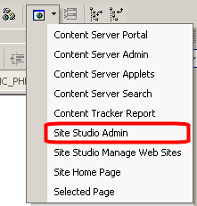
Description of "Figure 5-46 Site Studio Admin Option in View Menu"
5.20 Site Studio Publisher
Site Studio Publisher is a component installed on the Oracle Content Server (just as the Site Studio component is installed) that is used to crawl a Site Studio web site and transfer it from an Oracle Content Server environment to a pure web server environment that is not running an Oracle Content Server instance. This process is referred to as publishing.
Site Studio Publisher creates a static snapshot of a dynamic site by traversing all the links in a web site (visiting all of the linked pages) and downloading a copy of each page and all of the resources (images, flash movies, and so on) on each page. Your entire web site, including the content of queries, layout pages, fragments, contributor data files, and native documents, are then copied and published to the new server.
This section contains the following topics:
5.20.1 Site Studio Publisher in Oracle Content Server
Site Studio Publisher is run from the Oracle Content Server. Once installed, you can create any tasks you need to crawl any sites created with Site Studio. It is not necessary that Publisher is located on the content server storing the web site that you want to publish.
The main Publisher interface is a type of dashboard, listing all of the publishing tasks, their status including when they are scheduled to run and most recently ran, and an actions menu to modify individual tasks, or even run them immediately ("on demand.")
This window contains the information on available publishing tasks:
-
The top of the screen lists the status of Publisher, if it is running or paused.
-
Pause Publishing suspends all tasks from running according to schedule. If Publisher is paused, then the button becomes Resume Publishing.
-
Add New Task is used to add a new publishing task.
-
Refresh redisplays all task statuses.
-
Description is the name you have given the task.
-
Priority shows if the task runs at a high or a normal priority.
-
Status displays if the task is Waiting, Pending, Running, Finished, or Expired.
-
Next Run is the scheduled date and time the task will run.
-
Last Run is the date and time of the completion or failure of the most recent task.
-
Progress displays the current progress of the task.
-
Click Actions to open a menu and select one of the following actions for the task:
-
Edit opens a screen to edit the task parameters.
-
Run puts the task in the queue to run according to the schedule set for the task.
-
Stop appears when a task is running. Select to stop a task.
-
Delete deletes the task.
-
View Info opens a screen to view the information about previous times the task has run. This will not appear on tasks that have never run.
-
View Logs opens the screen to view the log file for the task.
-
See the Oracle WebCenter Content User's Guide for Site Studio Publisher for more information on using Publisher.
5.20.2 Publish Now
Publishing is the term used to describe Site Studio Publisher crawling a web site and creating a static web site to a pure web server environment. Depending on the size of the web site, publishing may take quite a while, and this is why the full site is often published only periodically. In these cases, some time may pass before a changed web page is reflected on the "live" site.
You may not want to wait until the next publication cycle for a changed web page to appear on the site, especially if you corrected errors on a page. To accommodate for this, Site Studio Publisher has a Publish Now feature, which enables it to search for files on the content server that are marked for immediate publication and then publish only those files. This is a much quicker process, since it does not involve deploying the entire site, but only a limited number of files.
The Publish Now selection is in the Site Studio Contributor toolbar. When a contributor changes a page and wants it published quickly, they click the Publish Now selection in the Contributor toolbar. For more information on Publish Now in Site Studio Contributor, see the Oracle WebCenter Content User's Guide for Site Studio Contributor.
Contributor can be controlled regarding whether or not the Publish Now feature is available, by setting the feature in Designer. This is easily handled in the menu bar, first selecting File, then Site, then Advanced, and finally Enable Publish Now (for more information, see Section 5.9.1.1, "Site Submenu"). If Enable Publish Now is checked, it is enabled, and contributors working on the web site can mark the individual pages with Publish Now.
