A script enabled browser is required for this page to function properly.
Skip to main content
STA User Interface Guide, v1.0.2
E28380-03
Table of Contents Previous Next Index


Table Displays : Pivot Tables

Pivot Tables

STA provides real-time advanced data manipulation through pivot tables. Pivot tables appear on Analysis screens, and they show data that is aggregated into different categories, or “layers”. Layers can be nested within one another along the table column and row edges. By adding and removing layers and nesting layers in different ways, you can break down the table data into different aggregations without the need to open multiple windows or export data to a spreadsheet.

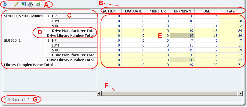
For example, you can use pivot tables to look at the health of drives, not just by library location, but also by drive type, firmware level, and many other attributes. The following table, from the Drives – Analysis screen, shows the number of occurrences of each drive health indicator (ACTION, MONITOR, etc.), aggregated by drive manufacturer, library, and library complex.

Note – A pivot table layer represents a resource attribute, such as drive health or media type. Pivot tables can display two to seven attributes, total. Two is the minimum because there must be one for each edge.

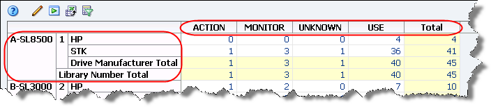
The aggregate counts in each pivot table cell are active links. These links provide access to additional details about the items included in the count. See “Aggregate Count Links” for details.

By aggregating data, pivot tables allow you to see data patterns that might not be obvious in a regular List View table. The format of a pivot table is dynamic in that you can change the way the data is organized simply by dragging and dropping—”pivoting”—the layers from one area to another. Moving a layer within the same edge (shifting layers within the row edge, for example) changes the nesting order. Moving a layer to the opposite edge (moving a layer from row to column edge, for example) adds the layer there.

See “Pivot Table Layout Tasks” for details on how you can modify their display.

Pivot Table Layout

A

Pivot Table Toolbar

Provides direct access to the most frequently used commands. See “Pivot Table Toolbar” for descriptions of each icon.

B

Column layer headings

Arranged along the top edge of the table. Layers are nested from top to bottom within the heading area. Individual heading cells identify the different values for the layer attribute.

C

Row layer headings

Arranged along the left edge of the table. Layers are nested from left to right within the heading area. Individual heading cells identify the different values for the layer attribute.

D

Layer subtotal

Subtotals are automatically provided for each row and column layer. Subtotal cells are highlighted in light yellow.

E

Data area

Area where the data cells are displayed. The data values are aggregate counts and are all active links. Aggregate cells are white.

F

Horizontal scrollbar

Appears only if the table is too large to display in the screen area. Allows you to scroll through the entire table display.

G

Table status line

Indicates how many rows or cells are selected.

Applied Filter
(not shown)

Appears only if the data in the table has been filtered. Indicates the filter criteria that have been applied. See “Filtering Overview” for details.

Note – Filter descriptions longer than 250 characters are truncated. You can hover the cursor over the text to display a tooltip containing the full description.


Table of Contents Previous Next Index Link to documentation
Copyright © 2012 Oracle and/or its affiliates. All rights reserved.