11 Adding Extensions to the Layout Editor
This chapter describes how to extend the layout editor functionality using custom plug-ins to integrate content generated by other applications into BI Publisher reports. The custom content can be viewed in the interactive viewer.
This chapter includes the following sections:
11.1 Using Layout Editor Plug-in Extensions
BI Publisher supports adding JavaScript plug-in extensions to the layout editor to add custom components to your reports. The custom components are included in your report when you view the report in interactive mode. During design time, when you add the plug-in to the layout editor, the icon that you define for it displays in the layout editor's Insert menu. You can then drag and drop the custom component to the report layout as you do any other component in the layout editor.
Use this functionality to insert static components to your reports, such as text, images, and video or data-driven components.
This feature also supports defining custom properties for your plug-in to enable report designers to add properties specific to the component plug-in you create.
11.2 Implementing Plug-ins
To implement a plug-in:
-
Code the JavaScript plug-in using the guidelines described in Section 11.3, "Coding the Custom Plug-in."
-
Place the JavaScript (.js) file in the following location
<BI Publisher repository>\Admin\Plugins. -
Reload the Layout Editor. Your plug-in icon appears in the layout editor Insert menu.
11.3 Coding the Custom Plug-in
This section provides the specification of the plug-in structure and describes the APIs provided for use with the plug-in. It contains the following topics:
11.3.1 Plug-in Structure
The plug-in module file is a simple JavaScript file. Call a single function with the plug-in definition object to enable the plug-in.
The plug-in definition JavaScript object has the following fields:
- id
-
The
idis an identification string. Oracle recommends using the reverse domain name to avoid any naming conflicts, for example: "com.example.helloworld". - component
-
The following fields comprise the
componentobject:- name
-
The name of the component. Example: "Hello World"
- icon
-
The icon is the image that displays in the layout editor Insert menu to represent the plug-in. This field takes a URL that points to the icon image. Example: "http://www.example.com/img/smile.gif"
- tooltip
-
The tooltip message to display for the icon image. Example: "Hello World Plugin".
- events
-
(Optional) Array of the click event definition object.
- id
-
(string) The event identification, for example: "filter" or "showselection".
- source
-
A true|false flag, when set to true, the click action against the component triggers the filtering of the other components.
- target
-
A true|false flag, when set to true, this plugin component receives the click event.
- cssClass
-
(Optional) Component CSS class selector to identify the plug-in components.
- render
-
The render function renders the plug-in contents. The render function passes the following parameters:
- context
-
Object which contains following information:
- id
-
The
idis an assigned instantiated component ID string. The system assures this ID is unique in the same template. Oracle recommends using this ID as a prefix or suffix to the HTML element that the plug-in code generates. This practice prevents ID conflicts. - reportLocale
-
The locale assigned to the template.
- containerElem
-
The container HTML element. The contents must be set to this element
- rows
-
The data rows array, each item contains another array for the columns.
- fields
-
The assigned xml path.
- props
-
Current properties. See Section 11.4, "Property Support."
11.3.2 JavaScript APIs That Can Be Used in Custom Plug-ins
The following JavaScript APIs are available to use in custom plug-ins:
-
Captures clicked (selected) field information to send to the system.
-
Returns the pixel value from the length string value. The system uses 96 dots per inch (dpi), which is the same as most browsers.
11.3.2.1 handleClickEvent Method
This method captures the clicked (or selected) field information to send to the system.
- Signature
-
xdo.api.handleClickEvent(info)
This method takes the following parameter:
- info
-
Clicked field information object.
The structure of the object is:
Object Structure
{
  id: [component id],
  [
    {
      field: [xpath to the element],
      value: [filter value]
    },
    {
      field: [xpath to the element],
      value: [filter value]
    },
  ]
11.3.2.2 getPixelValue Method
This method returns the pixel value from the length string value. The system uses 96 dpi, which is the same as most browsers.
- Signature
-
xdo.api.getPixelValue(lengthString)
The method takes one parameter:
- lengthString
-
A string value that specifies the length. Supported units are "px", "pt", "in", and "cm".
11.4 Property Support
To add custom properties, a properties field is available. Array of property definition object can be set to this field. Construct the property definition object from the following values.
- Key
-
A string value that specifies the property key. This value must be unique.
- label
-
A string value that specifies the label displayed for this property in the layout editor's Properties pane.
- type
-
A string value that specifies the property type. The layout editor uses this value to open the appropriate editor to edit the property. The following values are supported for type:
-
string - creates a text entry box to enter string data.
-
number - creates a text entry box to enter numeric data.
-
bool - creates a True/False (boolean) choice option.
-
length - creates text entry box to enter length data and select units in px, in, cm, or pt.
-
color - displays a color-chooser for color selection.
-
font - displays the list of supported fonts for selection.
-
fontsize - displays the font size selector.
-
lov - creates a list of values. See options for creating the name-value pairs.
-
- value
-
The initial value of the property. The value must follow the format of the type specified.
- options
-
This parameter is valid only when the property type is "lov". The options parameter contains label-value pairs to define the list of values.
-
label - the label for each list item
-
value - the value for the label
-
11.5 Samples
Following are plug-in examples:
11.5.1 Example of Static Plug-in: Company Logo
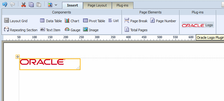
This example demonstrates how to implement the simplest type of plug-in. This plug-in adds an icon to the layout editor toolbar that when selected will insert a company logo into the layout at the insertion point. The JavasSript file for this plug-in defines everything in a single object.
-
Write the JavaScript for the plug-in.
The plug-in definition for this example is:
{ id: "com.oracle.xdo.logo", component: { name: "Logo", icon: "http://localhost:7001/xmlpserver/logo_icon.gif", tooltip: "Oracle Logo Plugin" }, render: function(context, containerElem, rows, fields, props) { containerElem.innerHTML = '<img src="http://localhost:7001/xmlpserver/oracle.gif" />'; } } -
Save the file with the ".js" extension and place it under the
<REPOSITORY ROOT>/Admin/Pluginsdirectory. -
Reload the layout editor application. The logo plug-in displays in the ribbon.
Click the "Oracle" icon or drag and drop the item to insert the logo into your layout. This is shown in Figure 11-1.
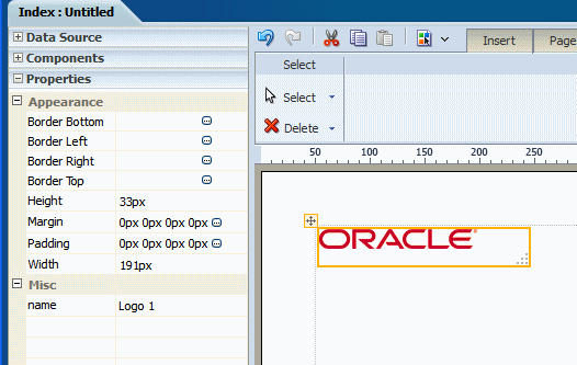
With the inserted plug-in component selected, click the Properties pane to view or edit the default properties, as shown in Figure 11-2.
11.5.2 Example Plug-in to Insert YouTube Video
This example creates a plug-in to enable users to embed YouTube videos in a BI Publisher report. When viewed as interactive output, the user can view the YouTube video using the embedded controls.
1. Define the id and component functions of the plug-in.
YouTube provides simple HTML code in each of its video pages to facilitate third-party embedding. This code is revealed when you click the "Share" button and then the "Embed" button shown on the YouTube video page. An example of this code is:
<iframe width="425" height="349" src="http://www.youtube.com/embed/TK7KYaCEGZU" frameborder="0" allowfullscreen></iframe>
When embedding the video, the iframe requires a width, height, and video identifier (called in this example "videoid"). Define these as properties in your plug-in. Although width and height already have default values, you can define them here to override the defaults. Because the base URL for YouTube videos is constant, defining the videoid as a property should produce the expected results. To give report designers more control, you can add additional properties such as "allowfullscreen" as a boolean property or "privacy-enhanced" boolean property.
Following is the sample code for the property definitions:
{
   id: "com.oracle.xdo.youtube",
   component: {
     name: "Youtube Video",
     cssClass: "youtube",
     icon: "http://hostname.com/youtube_32x32.png",
     tooltip: "Insert Youtube Video"
   },
   properties: [
                {key: "width", label:"Width", type:"length", value:"450px"},
                {key: "height", label:"Height", type:"length", value:"370px"},
                {key: "videoid", label:"Video ID", type:"string", value:"TK7KYaCEGZU"}
               ]
   .......
}
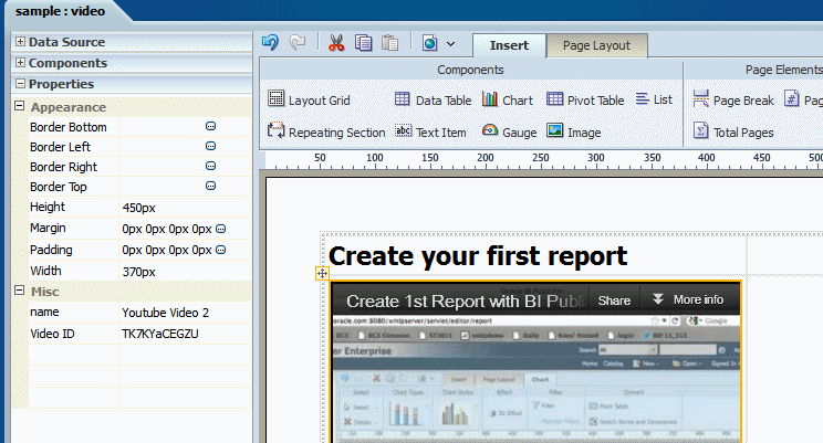
Figure 11-3 shows how the properties appear in the Properties pane of the layout editor.
In the render function, retrieve the property values using the property key; call the getPixelValue system function to get the pixel value for width and height; and create html code for embedding the YouTube video.
YouTube videos use swf (Flash) for playback. Embedded Flash video players interrupt the click event required to play or pause the video. YouTube provides the workaround for this. Add &wmode=transparent after the embedding src attribute.
The code for the render function is as follows:
 render: function(context, containerElem, rows, fields, props) {
     var videoid = props["videoid"];
     var width = props["width"];
     var height = props["height"];

     var widthPx = xdo.api.getPixelValue(width);
     var heightPx = xdo.api.getPixelValue(height);

     var iframe = '<iframe id="'+context.id+'_iframe" style="z-index: -1" src="http://www.youtube.com/embed/'+videoid+'?wmode=transparent" width="'+(widthPx)+'" height="'+(heightPx)+'"> </iframe>';
     xdo.dom.DOMElement.set(containerElem, iframe);
   }
If you are embedding a flash component from another source that does not provide a similar workaround, then you must implement one yourself. You can either modify the flash component to propagate a click event to HTML or create extra "clickable" space around the flash component so that the user can click the space to select the component.
The complete code sample for the YouTube plug-in is:
{
   id: "com.oracle.xdo.youtube",
   component: {
     name: "Youtube Video",
     cssClass: "youtube",
     icon: "http://hostname.com/youtube_32x32.png",
     tooltip: "Insert Youtube Video"
   },
   properties: [
                {key: "width", label:"Width", type:"length", value:"450px"},
                {key: "height", label:"Height", type:"length", value:"370px"},
                {key: "videoid", label:"Video ID", type:"string", value:"TK7KYaCEGZU"}
               ],
   render: function(context, containerElem, rows, fields, props) {
     var videoid = props["videoid"];

     var width = props["width"];
     var height = props["height"];
     var widthPx = xdo.api.getPixelValue(width);
     var heightPx = xdo.api.getPixelValue(height);

     var iframe = '<iframe id="'+context.id+'_iframe" style="z-index: -1" src="http://www.youtube.com/embed/'+videoid+'?wmode=transparent" width="'+(widthPx)+'" height="'+(heightPx)+'"> </iframe>';
     xdo.dom.DOMElement.set(containerElem, iframe);
   }
}
11.6 Creating a Data Field Plug-in
You can define a plug-in to have a data field that is defined in the data model. To do this, specify field information in the fields component of the plug-in structure. Specify the label and the measure.
{
  id: "com.oracle.xdo...",
  component: {
    name: "Field Test"
  }
  fields:
  [
    {name: "labelField", caption: "Drop Label Field Here", fieldType:"label", dataType:"string"},
    {name: "dataField", caption: "Drop Data Field Here", fieldType:"measure", dataType: "number", formula: "summation"}
  ],
}
For each field define the following:
-
name
-
caption - text that the layout editor displays to the user for the field. For example: "Drop Label Field Here".
-
fieldType - valid values for fieldType are "label" and "measure". The layout editor displays the caption (such as "Drop Label Field Here") defined for the field. The layout editor user can drag and drop the data field from the data source tree structure to the plug-in component.
-
dataType - the following data types are supported:
-
string (text string, default)
-
number (number, including integer and float)
-
data (XML date format)
The data type of the element that you drag and drop from the data model structure in the layout editor must match the dataType defined here.
-
-
formula - when the fieldType is "measure" supports aggregating values by specifying the function name. The following function names are supported:
-
count
-
count-distinct
-
summation
-
average
-
maximum
-
minimum
-
At runtime, calculated data is stored in the rows variable of the render function. The rows variable is an array type and each rows element has another array for keeping column information. The following render function implementation displays data in HTML:
 render: function(context, containerElem, rows, fields, props) {
   // setup column
   var html = '<table>';
   for (var i=0, rowCount=rows.length; i<rowCount; i++)
   {
     html += "<tr>";
     var col = rows[i];
     for (var j=0, colCount=col.length; j<colCount; j++)
     {
       html += "<td>";
       html += col[j];
       html += "</td>";
     }
     html += "</tr>";
   }
  html += '</table>';
  containerElem.innerHTML = html;
 }
Users can define a field label string by using the layout editor's property editor. This information can then be accessed by the fields variable in the render function arguments, as well as information defined in the plug-in definition.
-
field - the field path
-
fieldFormula - the field formula; must be null if this field is fieldType="label"
-
fieldType - the field type: "label" or "measure"
-
dataType - the data type: "string", "number", or "data"
-
label - the user-specified label string


