25 Using ADF Gauge Components
This chapter describes how to use an ADF gauge component to display data and provides the options for gauge customization.
This chapter includes the following sections:
For information about the data binding of gauges, see the "Creating Databound Gauges" section in the Oracle Fusion Middleware Fusion Developer's Guide for Oracle Application Development Framework.
25.1 Introduction to the Gauge Component
Gauges identify problems in data. A gauge usually plots one data point with an indication of whether that point falls in an acceptable or an unacceptable range. Frequently, you display multiple gauges in a single gauge set. The gauges in a set usually appear in a grid-like format with a configurable layout.
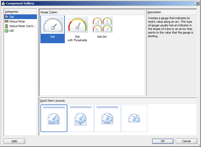
A Component Gallery displays available gauge categories, types, and descriptions to provide visual assistance when creating gauges and using a quick-start layout. Figure 25-1 shows the Component Gallery for gauges.
When a gauge component is inserted into a JSF page using the Component Gallery, a set of child tags that support customization of the gauge is automatically inserted. Example 25-1 shows the code inserted in the JSF page for a dial gauge with the quick-start layout selected in the Component Gallery in Figure 25-1.
Example 25-1 Gauge Sample Code
<dvt:gauge id="gauge1" gaugeType="DIAL">
  <dvt:gaugeBackground>
    <dvt:specialEffects/>
  </dvt:gaugeBackground>
  <dvt:gaugeFrame/>
  <dvt:indicator/>
  <dvt:indicatorBase/>
  <dvt:gaugePlotArea/>
  <dvt:tickLabel/>
  <dvt:tickMark/>
  <dvt:topLabel/>
  <dvt:bottomLabel/>
  <dvt:metricLabel position="LP_WITH_BOTTOM_LABEL"/>
</dvt:gauge>
Gauges are displayed in a default size of 200 X 200 pixels. You can customize the size of a gauge or specify dynamic resizing to fit an area across different browser window sizes. When gauges are displayed in a horizontally or vertically restricted area, for example in a web page sidebar, the gauge is displayed in a small image size. Although fully featured, the smaller image is a simplified display.
By default, gauges will be displayed using the HTML5 image format when using the Skyros skin. New applications default to this skin. Alternatively, gauges can be displayed using Flash or a Portable Network Graphics (PNG) output format. For more information about gauge image formats, see Section 25.3.5, "What You May Need to Know About Gauge Image Formats."
HTML5, Flash, and PNG image formats for gauges support bi-directional locales. Support includes text strings containing bi-directional characters, label positions, legend display, and gauge set display.
25.1.1 Types of Gauges
The following types of gauges are supported by the gauge component:
-
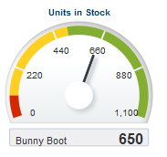
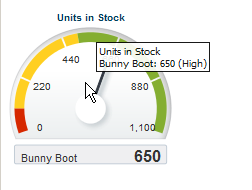
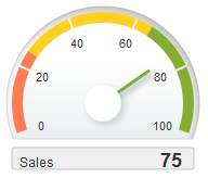
Dial: Indicates its metric along a 220 degree arc. This is the default gauge type. Figure 25-2 shows a dial gauge indicating the stock level for a beginner's ski boot is within an acceptable range.
-
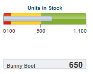
Status Meter: Indicates the progress of a task or the level of some measurement along a rectangular bar. An inner rectangle shows the current level of a measurement against the ranges marked on an outer rectangle. Figure 25-3 shows the Bunny Boot stock level using a status meter gauge.
-
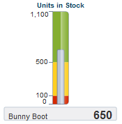
Status Meter (vertical): Indicates the progress of a task or the level of some measurement along a vertical rectangular bar. Figure 25-4 shows the Bunny Boot stock level using a vertical status meter gauge.
-
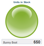
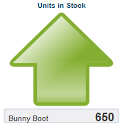
LED (light-emitting diode): Graphically depicts a measurement, such as a key performance indicator (KPI). Several styles of graphics are available for LED gauges, such as arrows that indicate good (up arrow), fair (left- or right-pointing arrow), or poor (down arrow). Figure 25-5 shows the Bunny Boot stock level using a LED bulb indicator.
Figure 25-6 shows the same stock level using a LED arrow.
For dial and status meter gauges, a tooltip of contextual information automatically displays when a users moves a mouse over the plot area, indicator, or threshold region. Figure 25-7 shows the indicator tooltip for a dial gauge.
25.1.2 Gauge Terminology
Gauge terms identify the many aspects of a gauge and gauge set that you can customize. The gauge component includes approximately 20 child tags that provide options for this customization.
The parts of a gauge that can be customized are:
-
Overall gauge customization: Each item in this group is represented by a gauge child tag:
-
Gauge Background: Controls border color and fill color for the background of a gauge.
-
Gauge Set Background: Controls border color and fill color for the background of a gauge set.
-
Gauge Frame: Refers to the frame behind the dial gauge.
-
Plot Area: Represents the area inside the gauge itself.
-
Indicator: Points to the value that is plotted in a dial gauge. It is typically in the form of a line or an arrow.
-
Indicator Bar: The inner rectangle in a status meter gauge.
-
Indicator Base: The circular base of a line or needle style indicator in a dial gauge.
-
Threshold Set: Specifies the threshold sections for the metrics of a gauge. You can create an infinite number of thresholds for a gauge.
-
-
Data values: These include the metric (which is the actual value that the gauge is plotting), minimum value, maximum value, and threshold values. Section 25.2, "Understanding Data Requirements for Gauges" describes these values.
-
Labels: The gauge supports the following elements with a separate child tag for each item:
-
Bottom Label: Refers to an optional label that appears below or inside the gauge. By default displays the label for the data row.
-
Lower Label Frame: Controls the colors for the background and border of the frame that contains the bottom label. The metric label can also appear inside the lower label frame, to the right of the bottom label.
-
Metric Label: Shows the value of the metric that the gauge is plotting in text.
-
Tick Marks: Refers to the markings along the value axis of the gauge. These can identify regular intervals, from minimum value to maximum value, and can also indicate threshold values. Tick marks can specify major increments that may include labels or minor increments.
-
Tick Labels: Displays text that is displayed to identify major tick marks on a gauge.
-
Top Label: Refers to the label that appears at the top or inside of a gauge. By default, a title separator is used with a label above the gauge. By default, displays the label for the data column.
-
Upper Label Frame: Refers to the background and border of the frame that encloses the top label. You can specify border color and fill color for this frame. Turn off the default title separator when using this frame.
-
-
Legend: The gauge supports the gauge legend area, text, and title elements with a separate child tag for each item.
-
Shape Attributes Set: The gauge supports interactivity properties for its child elements. For example, the
alttext of a gauge plot area can be displayed as a tooltip when the user moves the mouse over that area at runtime. For more information, see Section 25.5.3, "How to Add Interactivity to Gauges."
25.2 Understanding Data Requirements for Gauges
You can provide the following kinds of data values for a gauge:
-
Metric: The value that the gauge is to plot. This value can be specified as static data in the Gauge Data attributes category in the Property Inspector. It can also be specified through data controls or through the
tabularDataattribute of thedvt:gaugetag. This is the only required data for a gauge. The number of metric values supplied affects whether a single gauge is displayed or a series of gauges are displayed in a gauge set. -
Minimum and maximum: Optional values that identify the lowest and highest points on the gauge value axis. These values can be provided as dynamic data from a data collection. They can also be specified as static data in the Gauge Data attributes category in the Property Inspector for the
dvt:gaugetag. For more information, see Section 25.4.4, "How to Add Thresholds to Gauges." -
Threshold: Optional values that can be provided as dynamic data from a data collection to identify ranges of acceptability on the value axis of the gauge. You can also specify these values as static data using gauge threshold tags in the Property Inspector. For more information, see Section 25.4.4, "How to Add Thresholds to Gauges."
The only required data element is the metric value. All other data values are optional.
25.3 Creating a Gauge
You can use any of the following ways to supply data to a gauge component:
-
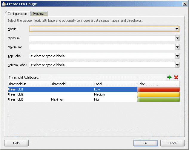
ADF Data Controls: You declaratively create a databound gauge by dragging and dropping a data collection from the ADF Data Controls panel. Figure 25-8 shows the Create Gauge dialog where you configure the metric value, and optionally the minimum and maximum and threshold values for a gauge you are creating.
For more information, see the ”Creating Databound Gauges" section in the Oracle Fusion Middleware Fusion Developer's Guide for Oracle Application Development Framework.
-
Tabular data: You can provide CSV (comma-separated value) data to a gauge through the
tabularDataattribute of thedvt:gaugetag.
25.3.1 How to Add a Gauge to a Page
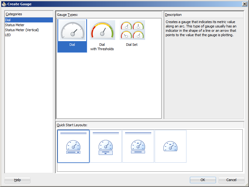
When you are designing your page using simple UI-first development, you use the Component Palette to add a gauge to a JSF page. When you drag and drop a gauge component onto the page, a Create Gauge dialog displays available categories of gauge types, with descriptions, to provide visual assistance when creating gauges. You can also specify a quick-start layout of the gauge's title and legend. Figure 25-9 shows the Create Gauge dialog with the dial gauge type selected.
Once you complete the dialog, and the gauge is added to your page, you can use the Property Inspector to specify data values and configure additional display attributes for the gauge.
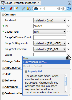
In the Property Inspector you can use the dropdown menu for each attribute field to display a property description and options such as displaying an EL Expression Builder or other specialized dialogs. Figure 25-10 shows the dropdown menu for a gauge component value attribute.
Note:
If your application uses the Fusion technology stack, then you can use data controls to create a gauge and the binding will be done for you. For more information, see the "Creating Databound Gauges" section in the Oracle Fusion Middleware Fusion Developer's Guide for Oracle Application Development Framework
-
In the ADF Data Visualizations page of the Component Palette, from the Gauge panel, drag and drop a Gauge onto the page to open the Create Gauge dialog in the Component Palette.
Use the dialog to select the gauge category and type, and the quick start layout for display of gauge title, legend, and labels. For help with the dialog, press F1 or click Help.
-
In the Property Inspector, view the attributes for the gauge or gauge set. Use the help button to display the complete tag documentation for the
gaugecomponent. -
Expand the Common section. Use this section to set the following attributes:
-
GaugeType: If you wish to change the category of gauge type, use the dropdown list to select any of the following valid values: DIAL, LED, STATUSMETER, or VERTICALSTATUSMETER.
-
GaugeSetColumnCount, GaugeSetAlignment, and GaugeSetDirection: Use one or more of these attributes to determine the layout of gauges in a gauge set. For more information, see Section 25.4.2, "How to Determine the Layout of Gauges in a Gauge Set."
-
-
Expand the Gauge Data section. Specify data values for the gauge by setting the value in these fields:
-
Value: For a single gauge, specify the data model, which can be an attribute from a data control or an instance of
DataModel, using an EL Expression. Alternatively, set a metric value as either aJava.lang.Numberobject or aString. -
TabularData: For a gauge set, specify a tabular data set as a
Java.util.Listobject. For more information, see Section 25.3.3, "How to Create a Gauge Using Tabular Data." -
MinValue and MaxValue: Optionally, set the lowest and greatest values on the gauge axis. These values are set automatically if not specified.
-
-
Expand the Appearance section. Specify display attributes by setting the value in these fields:
-
LedStyle: If you wish to change the shape of the LED gauge, use the dropdown list to select any of the following valid values: LS_DOT, LS_ARROW, LS_RECTANGLE, or LS_TRIANGLE. You can also use the LS_CUSTOM value if you wish to specify a custom image.
-
ThresholdDialStyle: If you wish to change the default style (TDS_SEGMENTS) of thresholds in dial gauges, use the dropdown list to select any of the following valid values: TDS_PIE_FILL, TDS_RING_FILL.
-
AngleExtent: Use to specify the range of degrees that sweeps through angles other than the standard 220-degree arc in a dial gauge.
-
CustomShapesPath: Use to specify the path to the custom shape definition file. For more information, see Section 25.6, "Using Custom Shapes in Gauges."
-
ShortDesc: Enter a description of the gauge. This description is accessed by screen reader users.
-
AnimationOnDisplay, AnimationOnDataChange, AnimationDuration (Animation sub-section): Use one or more of these attributes to set animation effects for the gauge. For more information, see Section 25.5.4, "How to Animate Gauges."
-
The gauge will display on the client in the HTML5 image format if the client supports it and your application uses the default Skyros skin. For more information about gauge image formats, see Section 25.3.5, "What You May Need to Know About Gauge Image Formats."
25.3.2 Creating a Gauge Using Tabular Data
The process of creating a gauge from tabular data includes the following steps:
-
Storing the data in a method in the gauge's managed bean.
-
Creating a gauge that uses the data stored in the managed bean.
25.3.2.1 Storing Tabular Data for a Gauge in a Managed Bean
The tabularData attribute of a gauge component lets you specify a list of metric values that the gauge uses to create a grid and to populate itself. You can provide only the metric value through the tabularData attribute. Therefore, you must specify any desired thresholds and minimum or maximum values through the Property Inspector.
A gauge component displays rows and columns of gauges. The text that you specify as column labels appears in the top label of the gauges. The text that you specify as row labels appears in the bottom label of the gauges.
25.3.2.2 Structure of the List of Tabular Data
The list that contains the tabular data consists of a three-member Object array for each data value to be passed to the gauge. The members of each array must be organized as follows:
-
The first member (index 0) is the column label, in the grid, of the data value. This is generally a
String. -
The second member (index 1) is the row label, in the grid, of the data value. This is generally a
String. -
The third member (index 2) is the data value, which is usually
Double.
Figure 25-11 has five columns: Quota, Sales, Margin, Costs, and Units. The example has three rows: London, Paris, and New York. This data produces a gauge set with five gauges in each row and lets you compare values such as sales across the three cities.
Example 25-2 shows code that creates the list of tabular data required for the gauge that compares annual results for three cities.
Example 25-2 Code to Create a List of Tabular Data for a Gauge
public List getGaugeData()
{
    ArrayList list = new ArrayList();
    String[] rowLabels  = new String[] {"London", "Paris", "New York"};
    String[] colLabels  = new String[] {"Quota", "Sales", "Margin", "Costs", "Units"};
    double [] [] values = new double[][]{
        {20, 90, 135},
        {50, 20, 80},
        {130, 140, 150},
        {70, 80, 90},
        {110, 120, 130}
        };
    for (int c = 0; c < colLabels.length; c++)
    {
     for (int r = 0; r < rowLabels.length; r++)
       {
        list.add (new Object [] {colLabels[c], rowLabels[r],
            new Double (values [c][r])});
       }
    }
    return list;
}
25.3.3 How to Create a Gauge Using Tabular Data
Use the tabularData attribute of the gauge tag to reference the tabular data that is stored in a managed bean.
To create a gauge that uses tabular data from a managed bean:
-
In the ADF Data Visualizations page of the Component Palette, Gauge panel, drag and drop a Gauge onto the page.
-
In the Component Gallery, select the category, type, and quick-start layout style for the gauge that you are creating.
-
In the Gauge Data category of the Property Inspector, from the
tabularDataattribute dropdown menu, choose Expression Builder. -
In the Expression Builder dialog, use the search box to locate the managed bean.
-
Expand the managed bean node and select the method that creates the list of tabular data.
-
Click OK.
The Expression is created.
For example, if the name of the managed bean is
sampleGaugeand the name of the method that creates the list of tabular data isgetGaugeData, the Expression Builder generates the code#{sampleGauge.gaugeData}as the value for thetabularDataattribute of thedvt:gaugetag.
25.3.4 What Happens When You Create a Gauge Using Tabular Data
When you create a gauge tag that is powered by data obtained from a list referenced in the tabularData attribute, the following results occur:
-
A gauge is generated with a setting in its
tabularDataattribute. The settings for all other attributes for this gauge are provided by default. -
You have the option of changing the setting of the
gaugeTypeattribute in the Property Inspector toDIAL,LED,STATUSMETER, orVERTICALSTATUSMETER.
25.3.5 What You May Need to Know About Gauge Image Formats
Gauges support the following image formats: HTML5, Flash, and PNG. The image format used depends upon the application's settings and the client's environment. By default, gauges will be displayed using the HTML5 image format when using the Skyros skin. New applications default to this skin.
If your application uses a custom skin, you can configure your application to use the HTML5 format by adding the following parameter to the application's web.xml file: oracle.adf.view.rich.dvt.DEFAULT_IMAGE_FORMAT. For more information about the web.xml parameter, see Section A.2.3.24, "Graph and Gauge Image Format." For information about skinning and styles, see Chapter 20, "Customizing the Appearance Using Styles and Skins."
If the specified image format isn't available on the client, the application will default to an available format. For example, if the client does not support HTML5, the application will use:
-
Flash, if the Flash Player is available.
You can disable the use of Flash content across the entire application by setting a
flash-player-usagecontext parameter inadf-config.xml. For more information, see Section A.4.3, "Configuring Flash as Component Output Format." -
Portable Network Graphics (PNG) output format. A PNG output format is also used when printing gauges. Although static rendering is fully supported when using a PNG output format, certain interactive features are not available including:
-
Animation
-
Context menus
-
Popup support
-
Interactivity
-
25.4 Customizing Gauge Type, Layout, and Appearance
Gauge components can be customized in the following ways:
-
Change the gauge type
-
Specify the layout of gauges in a gauge set
-
Change a gauge size and style
-
Add thresholds
-
Format numbers and text
-
Specify an N-degree dial gauge
-
Customize gauge labels
-
Customize indicators and tick marks
-
Specifying transparency in gauges
25.4.1 How to Change the Type of the Gauge
You can change the type of a gauge using the gaugeType attribute of the dvt:gauge tag. The gauge type is reflected in the visual editor default gauge.
To change the type of a gauge:
-
In the Structure window, right-click the dvt:gauge node and choose Go to Properties.
-
In the Property Inspector, choose a gauge type from the GaugeType attribute dropdown list. Valid values are
DIAL,LED,STATUSMETER, orVERTICALSTATUSMETER.
25.4.2 How to Determine the Layout of Gauges in a Gauge Set
A single gauge can display one row of data bound to a gauge component. A gauge set displays a gauge for each row in multiple rows of data in a data collection.
You can specify the location of gauges within a gauge set by specifying values for attributes in the dvt:gauge tag.
To specify the layout of gauges in a gauge set:
-
In the Structure window, right-click the dvt:gauge node and choose Go to Properties.
-
In the Property Inspector, select the Common attributes category.
-
To determine the number of columns of gauges that will appear in a gauge set, specify a value for the
gaugeSetColumnCountattribute.A setting of zero causes all gauges to appear in a single row. Any positive integer determines the exact number of columns in which the gauges are displayed. By default, the layout is determined automatically.
-
To determine the placement of gauges in columns, specify a value for the
gaugeSetDirectionattribute.If you select GSD_ACROSS, then the default layout of the gauges is used and the gauges appear from left to right, then top to bottom. If you select GSD_DOWN, the layout of the gauges is from top to bottom, then left to right.
-
To control the alignment of gauges within a gauge set, specify a value for the
gaugeSetAlignmentattribute.This attribute defaults to the setting GSA_NONE, which divides the available space equally among the gauges in the gauge set. Other options use the available space and optimal gauge size to allow for alignment towards the left or right and the top or bottom within the gauge set. You can also select GSA_CENTER to center the gauges within the gauge set.
25.4.3 Changing Gauge Size and Style
Gauges are displayed in a default size of 200 X 200 pixels. You can customize the size of a gauge or specify dynamic resizing to fit an area across different browser window sizes. When gauges are displayed in a horizontally or vertically restricted area, for example in a web page sidebar, the gauge is displayed in a small image size. Although fully featured, the smaller image is a simplified display.
You can customize the width and height of a gauge, and you can allow for dynamic resizing of a gauge based on changes to the size of its container. These two aspects of a gauge are interrelated in that they share the use of the gauge inlineStyle attribute.
You can also apply CSS styles such as active, focus, hover, link, and visited to use for a gauge.
25.4.3.1 Specifying the Size of a Gauge at Initial Display
You can specify the initial size of a gauge by setting values for attributes of the dvt:gauge tag. If you do not also provide for dynamic resizing of the gauge, then the initial size becomes the only display size for the gauge.
To specify the size of a gauge at its initial display:
-
In the Structure window, right-click the dvt:gauge node and choose Go to Properties.
-
In the Style attributes category of the Property Inspector, enter a value for the
InlineStyleattribute of thedvt:gaugetag. For example:inlineStyle="width:200px;height:200px"
25.4.3.2 Providing Dynamic Resizing of a Gauge
You can enter a value for the DynamicResize attribute to allow for a gauge to resize when its container in a JSF page changes in size. The value that you specify for this capability is also useful for creating a gauge component that fills an area across different browser window sizes.
To allow dynamic resizing of a gauge:
-
In the Structure window, right-click the dvt:gauge node and choose Go to Properties.
-
In the Behavior attributes category of the Property Inspector for the
DynamicResizeattribute, select the value DYNAMIC_SIZE. -
In the
InlineStyleattribute, enter a fixed number of pixels or a relative percent for both width and height.For example, to create a gauge that fills 50% of its container's width and has a height of 200 pixels, use the following setting for the
inlineStyleattribute:"width:50%;height:200px;".Best Practice Tip:
To specify a width of 100%, set the
styleClassattribute toAFStretchWidth.
25.4.3.3 Using a Custom Style Class for a Gauge
You have the option of specifying a custom style class for use with a gauge. However, you must specify width and height in the inlineStyle attribute.
To specify a custom style class for a gauge:
-
In the Structure window, right-click the dvt:gauge node and choose Go to Properties.
-
In the Style attributes category of the Property Inspector, for the
StyleClassattribute, enter the CSS style class to use for this gauge. -
In the
InlineStyleattribute, enter a fixed number of pixels or a relative percent for both width and height.For example, to create a gauge that fills 50% of its container's width and has a height of 200 pixels, use the following setting for the
inlineStyleattribute:"width:50%;height:200px;".
25.4.4 How to Add Thresholds to Gauges
Thresholds are data values in a gauge that highlight a particular range of values. Thresholds must be values between the minimum and the maximum value for a gauge. The range identified by a threshold is filled with a color that is different from the color of other ranges.
The data collection for a gauge can provide dynamic values for thresholds when the gauge is databound. After the gauge is created, you can also insert a dvt:thresholdSet tag and individual dvt:threshold tags to create static thresholds. If threshold values are supplied in both the data collection and in threshold tags, then the gauge honors the values in the threshold tags.
25.4.4.1 Adding Static Thresholds to Gauges
You can create an indefinite number of thresholds in a gauge. Each threshold is represented by a single dvt:threshold tag. One dvt:thresholdSet tag must wrap all the threshold tags.
To add static thresholds to a gauge:
-
In the Structure window, right-click the gauge node and choose Insert inside dvt:gauge > ADF Data Visualization > Threshold Set.
You do not need to specify values for attributes on the
dvt:thresholdSettag. -
Right-click the dvt:thresholdSet node and choose Insert inside dvt:thresholdSet > threshold.
-
In the Property Inspector, enter values for the attributes that you want to customize for this threshold.
You have the option of entering a specific fill color and border color for the section of the gauge related to the threshold. You can also identify the maximum value for the threshold and any text that you want to display in the legend to identify the threshold.
Note:
For the final threshold, the maximum value of the gauge is used as the threshold maximum value regardless of any entry you make in the threshold tag for the final threshold.
-
Repeat Step 2 and Step 3 to create each threshold in the gauge from the lowest minimum value to the highest maximum value.
You have the option of adding any number of thresholds to gauges. However, arrow and triangle LED gauges support thresholds only for the three directions to which they point.
25.4.5 How to Format Numeric Values in Gauges
For gauges, the dvt:metricLabel and dvt:tickLabel tags may require numeric formatting.
25.4.5.1 Formatting the Numeric Value in a Gauge Metric or Tick Label
The metric label tag has a numberType attribute that lets you specify whether you want to display the value itself or a percentage that the value represents. In some cases, this might be sufficient numeric formatting.
You can also use the af:convertNumber tag to specify formatting for numeric values in the metric label. For example, the af:convertNumber tag lets you format data values as currency or display positive or negative signs.
To format numbers in a gauge metric or tick label:
-
In the Structure window, right-click the dvt:metricLabel or dvt:tickLabel node and choose Go to Properties.
-
In the Property Inspector, if you want to display the metric value as a percentage rather than as a value, then set the NumberType attribute of the
dvt:metricLabeltag to NT_PERCENT. -
If you want to specify additional formatting for the number in the metric or tick label, do the following:
-
In the Structure window, right-click the dvt:metricLabel or dvt:tickLabel node and choose Insert inside dvt:<type>Label > Convert Number.
-
In the Property Inspector, specify values in the attributes of the
af:convertNumbertag to produce additional formatting.
-
Note:
When the numberType attribute of metric or tick labels is set to percent (NT_PERCENT), a child af:convertNumber tag, if used, will be automatically set to percent for its type attribute. When af:convertNumber is forced to percent, gauge clears the pattern attribute. This means that patterns are ignored when a gauge forces percent formatting.
25.4.6 What Happens When You Format the Numbers in a Gauge Metric Label
When you add a number formatting to a metric label, XML code is generated. Example 25-3 shows a sample of the XML code that is generated.
25.4.7 What You May Need to Know About Automatic Scaling and Precision
In order to achieve a compact and clean display, gauges automatically determine the scale and precision of the values being displayed in metric labels and tick labels. For example, a value of 40,000 will be formatted as 40K, and 0.230546 will be displayed with 2 decimal points as 0.23.
Automatic formatting still occurs when af:convertNumber is specified. Gauge tags that support af:convertNumber child tags have scaling and autoPrecision attributes that can be used to control the gauge's automatic number formatting. By default, these attribute values are set to scaling="auto" and autoPrecision="on". Fraction digit settings specified in af:convertNumber, such as minFractionDigits, maxFractionDigits, or pattern, are ignored unless autoPrecision is set to off.
25.4.8 How to Format Text in Gauges
You can format text in any of the following gauge tags that represent titles and labels in a gauge:
-
dvt:bottomLabel -
dvt:gaugeMetricLabel -
dvt:gaugeLegendText -
dvt:gaugeLegendTitle -
dvt:tickLabel -
dvt:topLabel
The procedure for formatting text in gauge labels and titles is similar except that you insert the appropriate child tag that represents the gauge label or title. For example, you can use a dvt:gaugeFont child tag to a dvt:metricLabel tag to specify gauge metric label font size, color, and if the text should be bold or italic.
To format text in a gauge metric label:
-
In the Structure window, right-click the metricLabel node and choose Insert inside dvt:metricLabel > Font.
-
In the Property Inspector, specify values in the attributes of the
dvt:gaugeFonttag to produce the desired formatting.
When you format text in a gauge metric label using the gaugeFont tag, XML code is generated. Example 25-4 shows a sample of the XML code that is generated.
25.4.9 How to Specify an N-Degree Dial
You can specify a gauge that sweeps through angles other than the standard 220-degree arc in a dial gauge. Set the angleExtent attribute to specify the range of degrees in the gauge.
For example, to create a 270 degree dial gauge, set the angleExtent attribute as follows: <dvt:gauge angleExtent="270"/>.
25.4.10 How to Customize Gauge Labels
You can control the positioning of gauge labels. You can also control the colors and borders of the gauge label frames.
25.4.10.1 Controlling the Position of Gauge Labels
You can specify whether you want labels to appear outside or inside a gauge by using the position attribute of the appropriate label tag. The following label tags are available as child tags of dvt:gauge:
-
dvt:bottomLabel -
dvt:metricLabel -
dvt:topLabel
The procedure for controlling the position of metric and top labels is similar.
To specify the position of the bottom label:
-
In the Structure window, right-click the dvt:bottomLabel node and choose Go to Properties.
-
In the Property Inspector, for the
positionattribute, select the desired location of the label. -
In the
textattribute, enter the text that you want the label to display.
Use a similar procedure to customize the position of the top and metric labels.
25.4.10.2 Customizing the Colors and Borders of Gauge Labels
You can control the fill color and border color of the frames for the top label and the bottom label. The dvt:upperLabelFrame and dvt:lowerLabelFrame gauge child tags serve as frames for these labels.
To customize the color and border of the upper label frame:
-
In the Structure window, right-click the gauge node and choose Insert inside dvt:gauge > ADF Data Visualization > Upper Label Frame.
-
In the Property Inspector, select the desired colors for the
borderColorattribute and thefillColorattribute.
Use a similar procedure to customize the color and border of the bottom label frame using the dvt:bottomLabel tag as a child of the gauge node.
25.4.11 How to Customize Indicators and Tick Marks
There are a variety of options available for customizing the indicators of gauges and the location and labeling of tick marks.
25.4.11.1 Controlling the Appearance of Gauge Indicators
The following gauge child tags are available to customize the indicator of a gauge:
-
dvt:indicator: Specifies the visual properties of the dial gauge indicator needle or the status meter bar. Includes the following attributes:-
borderColor: Specifies the color of the border of the indicator. -
fillColor: Specifies the color of the fill for the indicator. -
type: Identifies the kind of indicator: a line indicator, a fill indicator, or a needle indicator. -
useThresholdFillColor: Determines whether the color of the threshold area in which the indicator falls should override the specified color of the indicator.
-
-
dvt:indicatorBar: Contains the fill properties of the inner rectangle (bar) of a status meter gauge. -
dvt:indicatorBase: Contains the fill properties of the circular base of a line and needle style indicator of a dial gauge.
To customize the appearance of gauge indicators:
-
In the Structure window, right-click the dvt:indicator node and choose Go to Properties.
-
In the Property Inspector, specify values for the desired attributes.
-
If you want to customize the fill attributes of the inner bar on a status meter gauge, in the Structure window, right-click the dvt:gauge node and choose Insert inside dvt:gauge > ADF Data Visualization > Indicator Bar.
-
In the Property Inspector, specify values for the desired attributes.
-
If you want to customize the circular base of a line style indicator on a dial gauge, in the Structure window, right-click the dvt:indicatorBase node and choose Go to Properties.
-
In the Property Inspector, specify values for the desired attributes.
25.4.11.2 Specifying Tick Marks and Labels
The following gauge child tags are available to customize tick marks and tick labels for a gauge:
-
dvt:tickMark: Specifies the display, spacing, and color of major and minor tick marks. Only major tick marks can include value labels. Includes the following attributes:-
majorIncrementandminorIncrement: Sets the distance between two major tick marks and two minor tick marks, respectively. If the value is less than zero for either attribute, the tick marks are not displayed. -
majorTickColorandminorTickColor: Sets the hexidecimal color of major tick marks and minor tick marks, respectively. -
content: Specifies where tick marks occur within a gauge set. Valid values are any combination separated by spaces or commas including:-
TC_INCREMENTS: Display tick marks in increments. -
TC_MAJOR_TICK: Display tick marks for minimum, maximum, and incremental values. -
TC_MIN_MAX: Display tick marks for minimum and maximum values. -
TC_METRIC: Display tick marks for actual metric values. -
TC_NONE: Display no tick marks. -
TC_THRESHOLD: Display tick marks for threshold values.
-
-
-
dvt:tickLabel: Identifies major tick marks that will have labels, the location of the labels (interior or exterior of the gauge), and the format for numbers displayed in the tick labels.
To customize the tick marks and tick labels of a gauge:
-
In the Structure window, right-click the dvt:tickMark node and choose Go to Properties.
-
In the Property Inspector, specify values for the desired attributes.
-
In the Structure window, right-click the dvt:tickLabel node and choose Go to Properties.
-
In the Property Inspector, specify values for the desired attributes.
25.4.11.3 Creating Exterior Tick Labels
By default, the dial gauge displays interior tick labels to provide a cleaner look when the gauge is contained entirely within the gauge frame. Because the tick labels lie within the plot area, the length of the tick labels must be limited to fit in this space. You can customize your gauge to use exterior labels.
To create interior tick labels on a gauge:
-
In the Structure window, right-click the dvt:tickLabel node and choose Go to Properties.
-
In the Property Inspector, select TLP_EXTERIOR for the
Positionattribute.
25.4.12 Specifying Transparency for Parts of a Gauge
You can specify that various parts of a gauge show transparent colors by setting the borderColor and fillColor attributes on the gauge child tags related to these parts of the gauge. These color properties accept a 6 or 8 RGB hexidecimal value. When an 8-digit value is used, the first two digits represent transparency. For example, you can set transparency by using a value of 00FFFFFF.
Any gauge child tag that supports borderColor or fillColor attributes can be set to transparency. The following list are examples of parts of the gauge that support transparency:
-
Gauge background: Use the
dvt:gaugeBackgroundtag. -
Gauge gauge frame: Use the
dvt:gaugeFrametag. -
Gauge plot area: Use the
dvt:gaugePlotAreatag. -
Gauge legend area: Use the
dvt:gaugeLegendAreatag.
25.5 Adding Gauge Special Effects and Animation
These gauge features are used less frequently than the common gauge features. These special features include applying gradient effects to parts of a gauge, adding interactivity to gauges, animating gauges, and taking advantage of the gauge support for active data.
25.5.1 How to Use Gradient Special Effects in a Gauge
A gradient is a special effect in which an object changes color gradually. Each color in a gradient is represented by a stop. The first stop is stop 0, the second is stop 1, and so on. You must specify the number of stops in the special effects for a subcomponent of a gauge that supports special effects.
You can define gradient special effects for the following subcomponents of a gauge:
-
Gauge background: Uses the
dvt:gaugeBackgroundtag. -
Gauge set background: Uses the
dvt:gaugeSetBackgroundtag. -
Gauge plot area: Uses the
dvt:gaugePlotAreatag. -
Gauge frame:
Uses the dvt:gaugeFrametag. -
Gauge legend area: Uses the
dvt:gaugeLegendAreatag. -
Lower label frame: Uses the
dvt:lowerLabelFrametag. -
Upper label frame: Uses the
dvt:upperLabelFrametag. -
Indicator: Uses the
dvt:indicatortag. -
Indicator bar: Uses the
dvt:indicatorBartag. -
Indicator base: Uses the
dvt:indicatorBasetag. -
Threshold: Uses the
dvt:thresholdtag.
The approach that you use to define gradient special effects is identical for each part of the gauge that supports these effects.
25.5.1.1 Adding Gradient Special Effects to a Gauge
For each subcomponent of a gauge to which you want to add special effects, you must insert a dvt:specialEffects tag as a child tag of the subcomponent if the tag does not already exist. For example, if you want to add a gradient to the indicator of a gauge, then you would create one dvt:specialEffects tag that is a child of the dvt:indicator tag. You must also set the dvt:specialEffects tag fillType property to FT_GRADIENT.
Then, optionally if you want to control the rate of change for the fill color of the subcomponent, you would add as many dvt:gradientStopStyle tags as you need to control the color and rate of change for the fill color of the component. These dvt:gradientStopStyle tags then must be entered as child tags of the single dvt:specialEffects tag.
To add a gradient special effect to a gauge indicator:
-
In the Structure window, right-click the dvt:indicator node and choose Insert inside dvt:indicator > Special Effects.
-
Use the Property Inspector to enter values for the attributes of the
dvt:specialEffectstag:-
For
fillTypeattribute, selectFT_GRADIENT. -
For
gradientDirectionattribute, select the direction of change that you want to use for the gradient fill. -
For the
numStopsattribute, enter the number of stops to use for the gradient.
-
-
Optionally, in the Structure window, right-click the special effects node and choose Insert within dvt:specialEffects > dvt:gradientStopStyle if you want to control the color and rate of change for each gradient stop.
-
Use the Property Inspector to enter values for the attributes of the
dvt:gradientStopStyletag:-
For the
stopIndexattribute, enter a zero-based integer as an index within thedvt:gradientStopStyletags that are included within thedvt:specialEffectstag. -
For the
gradientStopColorattribute, enter the color that you want to use at this specific point along the gradient. -
For the
gradientStopPositionattribute, enter the proportional distance along a gradient for the identified stop color. The gradient is scaled from 0 to 100. If 0 or 100 is not specified, default positions are used for those points.
-
-
Repeat Step 3 and Step 4 for each gradient stop that you want to specify.
25.5.2 What Happens When You Add a Gradient Special Effect to a Gauge
When you add a gradient fill to the background of a gauge and specify two stops, XML code is generated. Example 25-5 shows the XML code that is generated.
Example 25-5 XML Code Generated for Adding a Gradient to the Background of a Gauge
<dvt:gauge >
  <dvt:gaugeBackground borderColor="#848284">
    <dvt:specialEffects fillType="FT_GRADIENT" gradientDirection="GD_RADIAL">
      <dvt:gradientStopStyle stopIndex="0" gradientStopPosition="60"
           gradientStopColor="FFFFCC"/>
      <dvt:gradientStopStyle stopIndex="1" gradientStopPosition="90"
           gradientStopColor="FFFF99"/>
    </dvt:specialEffects>
  </dvt:gaugeBackground>
</dvt:gauge>
25.5.3 How to Add Interactivity to Gauges
You can specify interactivity properties on subcomponents of a gauge using one or more dvt:shapeAttributes tags wrapped in a dvt:shapeAttributesSet tag. The interactivity provides a connection between a specific subcomponent and an HTML attribute or a JavaScript event. Each dvt:shapeAttributes tag must contain a subcomponent and at least one attribute in order to be functional.
For example, Example 25-6 shows the code for a dial gauge where the tooltip of the indicator changes from "Indicator" to "Indicator is Clicked" when the user clicks the indicator, and the tooltip for the gauge metric label displays "Metric Label" when the user mouses over that label at runtime.
Example 25-6 Sample Code for Gauge shapeAttributes Tag
<dvt:gauge >
      <dvt:shapeAttributesSet>
         <dvt:shapeAttributes component="GAUGE_INDICATOR" alt="Indicator" onClick="document.title="onClick";"/>
         <dvt:shapeAttributes component="GAUGE_METRICLABEL" alt="Metric Label" onMouseMove="document.title="onMouseMove";"/>
      </dvt:shapeAttributesSet>
</dvt:gauge>
You can also use a backing bean method to return the value of the attribute. Example 25-7 shows sample code for referencing a backing bean and Example 25-8 shows the backing bean sample code.
Example 25-7 Gauge shapeAttributes Tag Referencing a Backing Bean
<dvt:gauge >
      <dvt:shapeAttributesSet>
         <dvt:shapeAttributes component="GAUGE_INDICATOR" alt="#{sampleGauge.alt}" onClick="#{sampleGauge.onClick}"/>
          <dvt:shapeAttributes component="GAUGE_METRICLABEL" alt="#{sampleGauge.alt}" onMouseMove="#{sampleGauge.onMouseMove}"/>
      </dvt:shapeAttributesSet>
</dvt:gauge>
Example 25-8 Sample Backing Bean Code
public String alt(oracle.dss.dataView.ComponentHandle handle) {
     return handle.getName(); }
     public String onClick(oracle.dss.dataView.ComponentHandle handle) {
     return ("document.title=\"onClick\";"); }
     public String onMouseMove(oracle.dss.dataView.ComponentHandle handle) {
     return ("document.title=\"onMouseMove\";"); }
The following gauge subcomponents support the dvt:shapeAttributes tag:
-
GAUGE_BOTTOMLABEL- the label below the gauge -
GAUGE_INDICATOR- the indicator in the gauge -
GAUGE_LEGENDAREA- the legend area of the gauge -
GAUGE_LEGENDTEXT- the text label of the legend area -
GAUGE_METRICLABEL- the label showing the metric value -
GAUGE_TOPLABEL- the label above the gauge -
GAUGE_PLOTAREA- the area inside the gauge -
GAUGE_THRESHOLD- the threshold area of the gauge
25.5.4 How to Animate Gauges
You can animate gauges (not gauge sets) to show changes in data, for example, a dial gauge indicator can change color when a data value increases or decreases. Figure 25-12 shows a dial gauge with the dial indicator animated to display the data change at each threshold level.
The attributes for setting animation effects on gauges are:
-
animationOnDisplay: Use to specify the type of initial rendering effect to apply. Valid values are:-
NONE(default): Do not show any initial rendering effect. -
AUTO: Apply an initial rendering effect automatically chosen based on graph or gauge type.
-
-
animationOnDataChange: Use to specify the type of data change animation to apply. Valid values are:-
NONE: Apply no data change animation effects. -
AUTO(default): Apply Active Data Service (ADS) data change animation events. For more information about ADS, see Section 25.5.5, "How to Animate Gauges with Active Data." -
ON:Apply partial page refresh (PPR) data change animation events. Use this setting to configure the application to poll the data source for changes at prescribed intervals.
-
25.5.5 How to Animate Gauges with Active Data
Animation effects using Active Data Service (ADS) can be added to dial and status meter gauge types. ADS allows you to bind ADF Faces components to an active data source using the ADF model layer. To allow this, you must configure the components and the bindings so that the components can display the data as it is updated in the data source.
In order to use the Active Data Service, you must:
-
Have a data source that publishes events when data is changed
-
Create business services that react to those events and the associated data controls to represent those services
For more information about ADS and configuring your application, see the "Using the Active Data Service" chapter in the Oracle Fusion Middleware Fusion Developer's Guide for Oracle Application Development Framework.
25.5.5.1 Configuring Gauge Components to Display Active Data
You configure a databound gauge to display active data by setting a value on the binding element in the corresponding page definition file.
To configure a gauge to display active data:
-
In the Structure window, right-click the dvt:gauge node, and choose Go to Page Definition.
-
In the Property Inspector, expand the Advanced section and select Push for the
ChangeEventPolicyattribute.
25.5.5.2 Adding Animation to Gauges
After configuring the gauge component to display active data, set animation effects using the attributes defined in Section 25.5.4, "How to Animate Gauges."
25.6 Using Custom Shapes in Gauges
You can directly specify the graphics for a gauge to create custom gauge shapes. The customShapesPath attribute is set to point to the vector graphics file that is processed into graphics used for output. JDeveloper also provides a set of custom shape styles accessible by using the customShapesPath attribute.
25.6.1 How to Create a Custom Shapes Graphic File
Due to the requirements for rotating and resizing a gauge's components, such as the plot area or tick marks, a vector graphics file is required when creating a custom shapes graphic file. Scalable Vector Graphics (SVG) is the supported file format for creating custom shapes for gauges.
After designing the gauge and exporting it to an SVG file, a designer can add information to identify, scale, and position the gauge shapes and components, and to specify other metadata used in processing.
In the SVG file, gauge components are identified using an ID. For example, an SVG file with <polygon id="indicator"/> would be interpreted as using a polygon shape for the indicator component. To specify multiple shapes to create the desired visual for a component, the ID can be modified as in id="indicator_0", id="indicator_1", and id="indicator_2".
Table 25-1 shows the gauge component IDs and their descriptions.
Table 25-1 Gauge Component IDs for Custom Shapes
| ID | Description |
|---|---|
|
|
Points to the value represented by the gauge. If not specified, the gauge will use the indicator specified in the application. For the dial gauge, the For the status meter gauge, the indicator should be specified with its full extent, and the gauge will be cropped to point to the metric value. |
|
|
For a dial gauge, refers to the object that appears at the base of the |
|
|
Refers to the optional component that adds visual distinction to the |
|
|
Refers to the frame that contains the |
|
|
For the dial gauge, refers to the circular area within which the indicator moves. For the status meter gauge, refers to the area that contains the indicator. For the LED gauge, refers to the area that contains any graphics that will not be filled with the LED fill color. When a |
|
|
Used to define increments on the gauge. When a set of tick marks is specified with no |
|
|
Refers to the frame that contains the |
Table 25-2 shows the metadata IDs and the descriptions used for internal calculations, not rendered in the gauge.
Table 25-2 Metadata IDs for Custom Shapes
| ID | Description |
|---|---|
|
|
Specifies the box containing the minimum and maximum extent of the indicator bar. If not specified, the bounding box is taken to be the entire indicator as specified in the input file. |
|
|
Specifies the center of rotation for the indicator that rotates around in a dial gauge. The center of the shape with this ID is considered to be the indicator center. If not specified, it is assumed to be the center of the bottom edge of the plot area for an 180-degree dial gauge, and the center of the plot area for an N-degree dial gauge. |
|
|
Specifies the area of the LED gauge that should be filled with the appropriate threshold color. If not specified, then the entire |
|
|
For complex |
|
|
Specified the bounding box for the |
|
|
Defines the area that will be filled with the threshold colors. For a dial gauge, specifies the For a status meter gauge, specifies the |
|
|
Defines the path in which to draw tick marks. This is necessary for the gauge to calculate where tick marks should be drawn on a custom plot area, and the gauge will be unable to change the |
|
|
For complex |
Example 25-9 shows a sample SVG file used to specify custom shapes for the components of a gauge.
Example 25-9 Sample SVG File Used for Gauge Custom Shapes
<?xml version="1.0" encoding="UTF-8" standalone="no"?>
<svg xmlns:svg="http://www.w3.org/2000/svg"
   xmlns="http://www.w3.org/2000/svg"
   version="1.0">

    <rect width="264.72726" height="179.18887" rx="8.2879562"
       ry="10.368411" x="152.76225" y="202.13995"
       style="fill:#c83737;fill-opacity:1;stroke:none"
       id="gaugeFrame"/>
    <rect width="263.09058" height="42.581127" rx="3.0565372"
       ry="3.414634" x="155.11697" y="392.35468"
       fill="#c83737"
       id="lowerLabelFrame" />
    <rect width="241.79999" height="120.13961"
       x="164.2415" y="215.94714"
       style="fill:#ffeeaa"
       id="plotAreaBounds"/>
    <rect width="74.516975" height="44.101883"
       rx="2.6630435" ry="3.5365853"
       x="247.883" y="325.4415"
       style="fill:#ffd5d5;fill-opacity:1;stroke:none"
       id="indicatorBase"/>
    <rect width="6.0830183" height="98.849045" rx="2.6630435"
       ry="2.2987804" x="282.86035" y="237.23772"
       style="fill:#00aa00;fill-opacity:1;stroke:none"
       id="indicator"/>
</svg>
25.6.2 How to Use a Custom Shapes File
After creating the SVG file to be used to specify the custom shapes for your gauge, set the customShapesPath attribute to point to the file.
To specify a custom shapes file:
-
In the Structure window, right-click the dvt:gauge node and choose Go to Properties.
-
In the Appearance attributes category of the Property Inspector, for the
CustomShapesPathattribute, enter the path to the custom shapes file. For example,customShapesPath="/path/customShapesFile.svg".
25.6.3 What You May Need to Know About Supported SVG Features
The custom shapes available to you support the following SVG features:
-
Transformations
-
Paths
-
Basic shapes
-
Fill and stroke painting
-
Linear and radial gradients
SVG features that are not supported by custom shapes in JDeveloper include:
-
Unit Identifiers: All coordinates and lengths should be specified without the unit identifiers, and are assumed to be in pixels. The parser does not support unit identifiers, because the size of certain units can vary based on the display used. For example, an inch may correspond to different numbers of pixels on different displays. The only exceptions to this are gradient coordinates, which can be specified as percentages.
-
Text: All text on the gauge is considered data, and should be specified through the tags or data binding.
-
Specifying Paint: The supported options are
none, 6-digit hexadecimal, and a<uri>reference to a gradient. -
Fill Properties: The
fill-ruleattribute is not supported. -
Stroke Properties: The
stroke-linecap,stroke-linejoin,stroke-miterlimit,stroke-disarray, andstroke-opacityattributes are not supported. -
Linear Gradients and Radial Gradients: The
gradientUnits,gradientTransform,spreadMethod, andxlink:hrefare not supported. Additionally, ther,fx, andfyattributes on the radial gradient are not supported. -
Elliptical Arc Out-of-Range Parameters: If
rx,ry, andx-axis-rotare too small such that there is no solution, the ellipse should be scaled uniformly until there is exactly one solution. The SVG parser will not support this. -
General Error Conditions: The SVG input is expected to be well formed and without errors. The SVG parser will not perform any error checking or error recovery for incorrectly formed files, and it will stop parsing when it encounters an error in the file.
25.6.4 How to Set Custom Shapes Styles
In addition to the ability to specify custom shapes for gauges, there are a set of prebuilt custom shapes styles for use with the gauge components. The available styles are:
-
Rounded rectangle
-
Full circle
-
Beveled circle
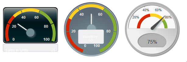
Figure 25-13 shows a dial gauge displayed with each of the custom shapes styles applied.
To apply a custom shapes style to a gauge:
-
In the Structure window, right-click the dvt:gauge node and choose Go to Properties.
-
In the Appearance attributes category of the Property Inspector, select the custom shapes style from the
CustomShapesPathattribute dropdown list.
