23 Introduction to ADF Data Visualization Components
This chapter highlights the common characteristics and focus of the ADF Data Visualization components, which are an expressive set of interactive ADF Faces components. The remaining chapters in this part of the guide provide detailed information about how to create and customize each component.
This chapter includes the following sections:
-
Section 23.1, "Introduction to ADF Data Visualization Components"
-
Section 23.2, "Defining the ADF Data Visualization Components"
-
Section 23.3, "Providing Data for ADF Data Visualization Components"
23.1 Introduction to ADF Data Visualization Components
The ADF Data Visualization components provide significant graphical and tabular capabilities for displaying and analyzing data. These components provide the following common features:
-
They are full ADF Faces components that support the use of ADF data controls.
-
They provide for declarative design time creation using the Data Controls Panel, the JSF Visual Editor, Property Inspector, and Component Palette.
-
Each component offers live data preview during design. This feature is especially useful to let you see the effect of your design as it progresses without having to compile and run a page.
For information about the data binding of ADF Data Visualization Components, see the "Creating Databound ADF Data Visualization Components" chapter in the Oracle Fusion Middleware Fusion Developer's Guide for Oracle Application Development Framework.
23.2 Defining the ADF Data Visualization Components
The ADF Data Visualization components include the following: graph, gauge, pivot table, geographic map, Gantt chart, hierarchy viewer, treemap, and sunburst.
23.2.1 Graph
The graph component gives you the capability of producing more than 50 types of graphs, including a variety of bar graphs, pie graphs, line graphs, scatter graphs, and stock graphs. This component lets you evaluate multiple data points on multiple axes in many ways. For example, a number of graphs assist you in the comparison of results from one group against the results from another group.
The following kinds of graphs can be produced by the graph component:
-
Area graph: Creates a graph in which data is represented as a filled-in area. Use area graphs to show trends over time, such as sales for the last 12 months. Area graphs require at least two groups of data along an axis. The axis is often labeled with increments of time such as months.
-
Bar graph: Creates a graph in which data is represented as a series of vertical bars. Use to examine trends over time or to compare items at the same time, such as sales for different product divisions in several regions.
-
Bar (horizontal) graph: Creates a graph that displays bars horizontally along the Y-axis. Use to provide an orientation that allows you to show trends or compare values.
-
Bubble graph: Creates a graph in which data is represented by the location and size of round data markers (bubbles). Use to show correlations among three types of values, especially when you have a number of data items and you want to see the general relationships. For example, use a bubble graph to plot salaries (X-axis), years of experience (Y-axis), and productivity (size of bubble) for your work force. Such a graph allows you to examine productivity relative to salary and experience.
-
Combination graph: Creates a graph that uses different types of data markers (bars, lines, or areas) to display different kinds of data items. Use to compare bars and lines, bars and areas, lines and areas, or all three.
-
Funnel graph: Creates a graph that is a visual representation of data related to steps in a process. The steps appear as vertical slices across a horizontal cylinder. As the actual value for a given step or slice approaches the quota for that slice, the slice fills. Typically a funnel graph requires actual values and target values against a stage value, which might be time. For example, use this component to watch a process (such as a sales pipeline) move towards a target across the stage of the quarters of a fiscal year.
-
Line graph: Creates a graph in which data is represented as a line, as a series of data points, or as data points that are connected by a line. Line graphs require data for at least two points for each member in a group. For example, a line graph over months requires at least two months. Typically a line of a specific color is associated with each group of data such as Americas, Europe, and Asia. Use to compare items over the same time.
-
Pareto graph: Creates a graph in which data is represented by bars and a percentage line that indicates the cumulative percentage of bars. Each set of bars identifies different sources of defects, such as the cause of a traffic accident. The bars are arranged by value, from the largest number to the lowest number of incidents. A Pareto graph is always a dual-Y graph in which the first Y-axis corresponds to values that the bars represent and the second Y-axis runs from 0 to 100% and corresponds to the cumulative percentage values. Use the Pareto graph to identify and compare the sources of defects.
-
Pie graph: Creates a graph in which one group of data is represented as sections of a circle causing the circle to look like a sliced pie. Use to show the relationship of parts to a whole such as how much revenue comes from each product line.
-
Radar graph: Creates a graph that appears as a circular line graph. Use to show patterns that occur in cycles, such as monthly sales for the last three years.
-
Scatter/polar graph: Creates a graph in which data is represented by the location of data markers. Use to show correlation between two different kinds of data values such as sales and costs for top products. Scatter graphs are especially useful when you want to see general relationships among a number of items.
-
Sparkchart: Creates a simple, condensed graph that displays trends or variations, often in the column of a table or inline with text. Sparkcharts are simple in design, with limited features and formatting options, showing as much data as possible.
-
Stock graph: Creates a graph in which data shows the high, low, and closing prices of a stock. Each stock marker displays three separate values.
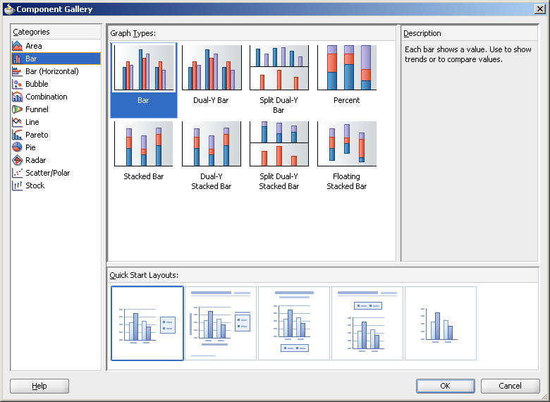
In JDeveloper, you can create and data bind a graph by dragging a data control from the Data Controls Panel. A Component Gallery displays available graph categories, types, and descriptions to provide visual assistance when designing graphs and defining a quick layout. Figure 23-1 shows the Component Gallery that displays when creating a graph from a data control.
For information about the data binding of graphs, see the "Creating Databound Graphs" section in the Oracle Fusion Middleware Fusion Developer's Guide for Oracle Application Development Framework.
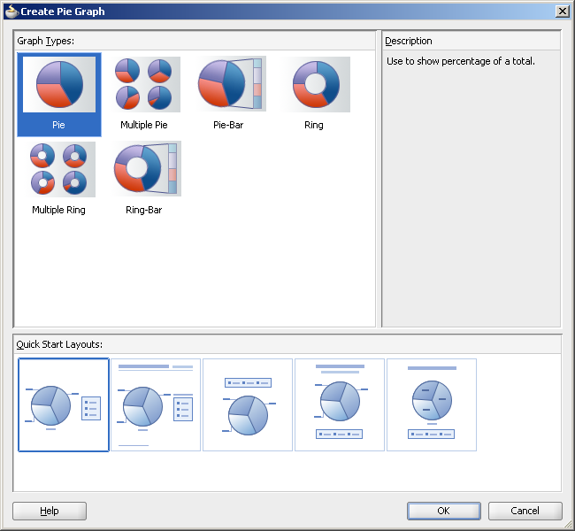
You can also create a graph on your page by dragging a graph component from the Component Palette. This approach allows you the option of designing the graph user interface before binding the component to data. Figure 23-2 shows the Component Gallery that displays when creating a pie graph from the Component Palette.
Note:
The sparkchart component can only be inserted from the Component Palette and bound to data afterwards.
All graphs support HTML5, Flash, SVG, and PNG rendering. Graph components support interactivity on initial display and data change including the use of zooming and scrolling, the use of an adjustable time selector window to highlight specific sections on a time axis, the use of line and legend highlighting and fading to filter the display of data points, and the use of dynamic reference lines and areas.
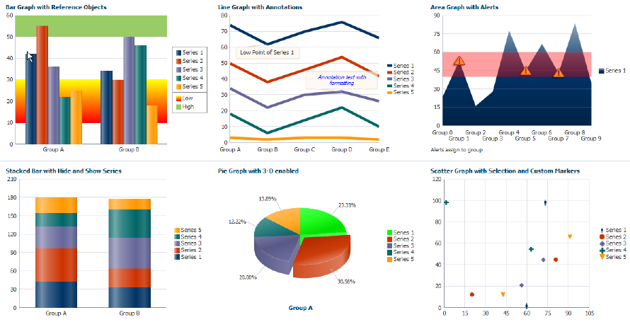
Figure 23-3 show an application dashboard that illustrates some of the available graph types.
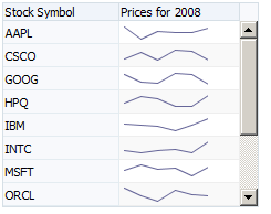
Figure 23-4 shows a line sparkchart displaying stock prices in a table column.
23.2.2 Gauge
The gauge component renders graphical representations of data. Unlike the graph, a gauge focuses on a single data point and examines that point relative to minimum, maximum, and threshold indicators to identify problem areas.
One gauge component can create a single gauge or a set of gauges depending on the data provided.
The following kinds of gauges can be produced by this component:
-
Dial gauge: Creates a gauge that indicates its metric value along an 180-degree arc. This type of gauge usually has an indicator in the shape of a line or an arrow that points to the value that the gauge is plotting.
-
Status meter gauge: Creates a gauge that indicates the progress of a task or the level of some measurement along a horizontal rectangular bar. An inner rectangle shows the current level of a measurement against the ranges marked on an outer rectangle.
-
Status meter gauge (vertical): Creates a gauge that indicates the progress of a task of the level of some measurement along a vertical rectangular bar.
-
LED (lighted electronic display) gauge: Creates a gauge that depicts graphically a measurement, such as key performance indicator (KPI). Several styles of graphics are available for LED gauges such as arrows that indicate good (up arrow), fair (left- or right-pointing arrow), or poor (down arrow).
You can specify any number of thresholds for a gauge. However, some LED gauges (such as those with arrow or triangle indicators) support a limited number of thresholds because there are a limited number of meaningful directions for them to point. For arrow or triangle indicators, the threshold limit is three.
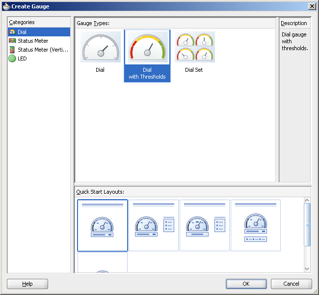
In JDeveloper, a Component Gallery displays available gauges categories, types, and descriptions to provide visual assistance when designing gauges and defining a quick layout. Figure 23-5 shows the Component Gallery for gauges.
All gauge components can use HTML5, Flash, SVG, and PNG rendering.
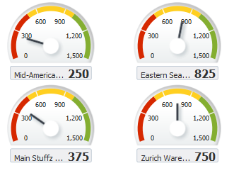
Figure 23-6 shows a set of dial gauges set with thresholds to display warehouse stock levels.
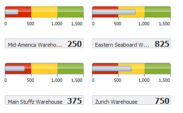
Figure 23-7 shows a set of status meter gauges set with thresholds.
23.2.3 Pivot Table
The pivot table produces a grid that supports multiple layers of data labels on rows or columns. An optional pivot filter bar can be associated with the pivot table to filter data not displayed in the row or column edge. When bound to an appropriate data control such as a row set, the component also supports the option of generating subtotals and totals for grid data, and drill operations at runtime. In JDeveloper, a Create Pivot Table wizard provides declarative support for databinding and configuring the pivot table. For more information, see the "Creating Databound Pivot Tables" section in the Oracle Fusion Middleware Fusion Developer's Guide for Oracle Application Development Framework.
Pivot tables let you swap data labels from one edge (row or column) or pivot filter bar (page edge) to another edge to obtain different views of your data. For example, a pivot table might initially display total sales data for products within regions on the row edge, broken out by years on the column edge. If you swap region and year at runtime, then you end up with total sales data for products within years, broken out by region.
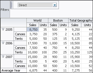
Pivot tables support horizontal and vertical scrolling, header and cell formatting, and drag-and-drop pivoting. Pivot tables also support ascending and descending group sorting of rows at runtime. Figure 23-8 shows an example pivot table with a pivot filter bar.
23.2.4 Geographic Map
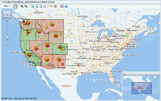
The geographic map provides the functionality of Oracle Spatial within the ADF framework. This component represents business data on a map and lets you superimpose multiple layers of information on a single map. This component supports the simultaneous display of a color theme, a graph theme (bar or pie graph), and point themes. You can create any number of each type of theme and you can use the map toolbar to select the desired themes at runtime.
As an example of a geographic map, consider a base map of the United States with a color theme that provides varying color intensity to indicate the popularity of a product within each state, a pie chart theme that shows the stock levels of warehouses, and a point theme that identifies the exact location of each warehouse. When all three themes are superimposed on the United States map, you can easily evaluate whether there is sufficient inventory to support the popularity level of a product in specific locations. Figure 23-9 shows a geographic map with color theme, pie graph theme, and point theme.
23.2.5 Gantt Chart
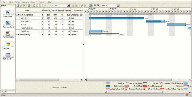
The Gantt chart is a type of horizontal bar graph (with time on the horizontal axis) that is used in planning and tracking projects to show resources or tasks in a time frame with a distinct beginning and end.
A Gantt chart consists of two ADF Faces tree tables combined with a splitter. The left-hand table contains a list of tasks or resources while the right-hand table consists of a single column in which progress is graphed over time.
There are three types of gantt components:
-
Project Gantt: Creates a Gantt chart that shows tasks vertically, and the duration of the task is represented as a bar on a horizontal timeline.
-
Resource utilization Gantt: Creates a Gantt chart that shows graphically whether resources are over or under allocated. It shows resources vertically while showing their allocation and, optionally, capacity on the horizontal time axis.
-
Scheduling Gantt: Creates a Gantt chart that shows resource management and is based on manual scheduling boards. It shows resources vertically with corresponding activities on the horizontal time axis.
Figure 23-10 shows a project Gantt view of staff resources and schedules.
23.2.6 Timeline
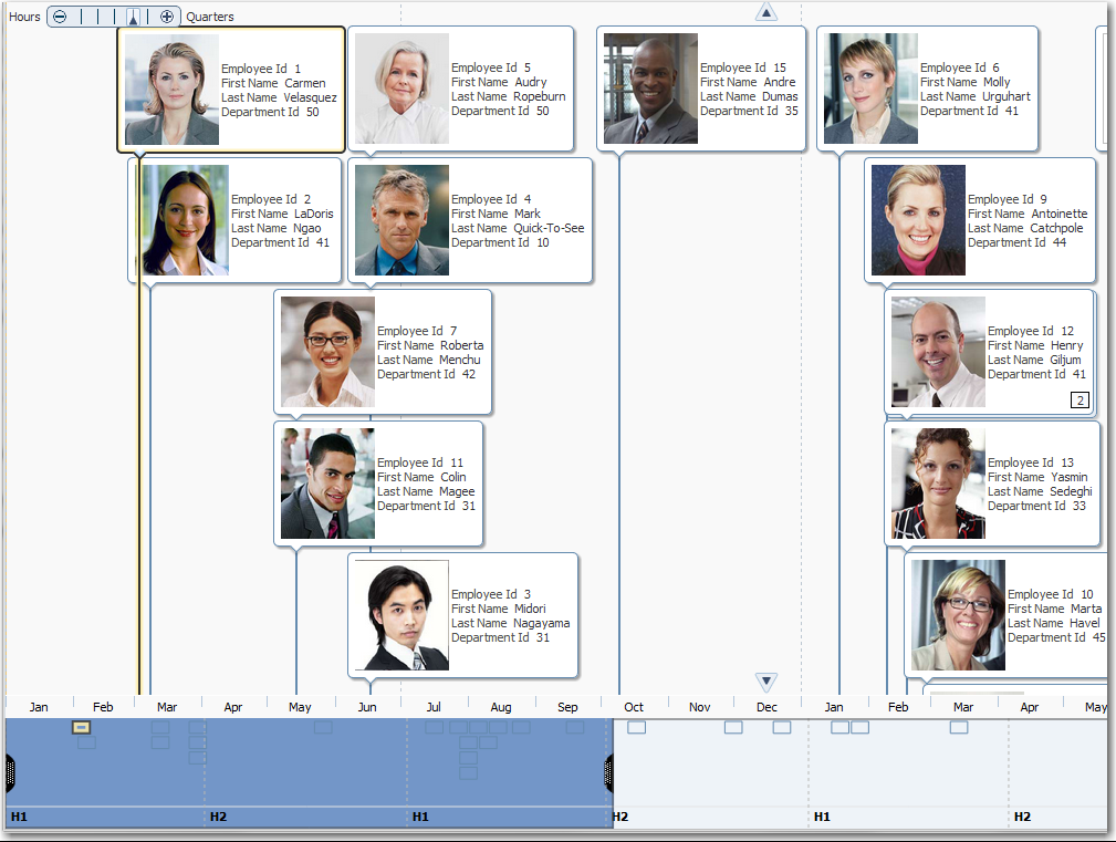
The timeline component is an interactive data visualization tool that allows users to view events in chronological order and easily navigate forwards and backwards within a defined time range. Events are represented as timeline items using simple ADF components to display information such as text and images, or supply actions such a links. A dual timeline can be configured to display two series of events to allow a side-by-side comparison of related information.
A timeline is composed of the display of events as timeline items along a time axis, a movable overview window that corresponds to the period of viewable time in the timeline, and an overview time axis that displays the total time increment for the timeline. A horizontal zoom control is available to change the viewable time range. Timeline items corresponding to events display associated information or actions and are connected to the date of the event in the time axis. Timelines items are represented by a marker in the overview panel. No more that two series of events are supported by the timeline component.
Figure 23-11 shows a timeline displaying the chronological order of the hire dates of employees in the Summit DVT example. In this example, timeline items representing each event display information about the employee using an image and text with labels. When selection is configured, the timeline item, line feeler, and the event marker in the overview panel are highlighted.
23.2.7 Hierarchy Viewer
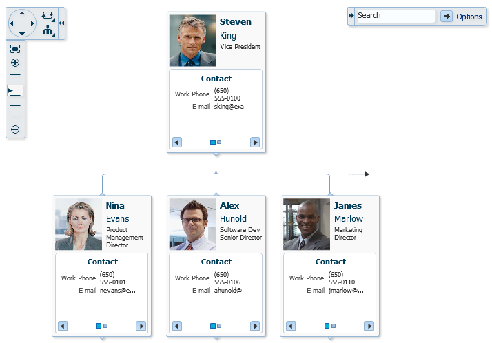
The hierarchy viewer component displays hierarchical data as a set of linked nodes in a diagram. The nodes and links correspond to the elements and relationships to the data. The component supports pan and zoom operations, expanding and collapsing of the nodes, rendering of simple ADF Faces components within the nodes, and search of the hierarchy viewer data. A common use of the hierarchy viewer is to display an organization chart, as shown in Figure 23-12.
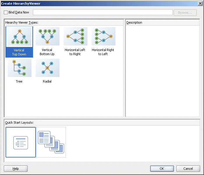
In JDeveloper, a Component Gallery displays available hierarchy viewer types and descriptions to provide visual assistance when designing the component and defining a quick layout. Figure 23-13 shows the Component Gallery for the hierarchy viewer.
23.2.8 Treemap and Sunburst
The treemap and sunburst components display quantitative hierarchical data across two dimensions, represented visually by size and color. For example, you can use a treemap or sunburst to display quarterly regional sales and to identify sales trends, using the size of the node to indicate each region's sales volume and the node's color to indicate whether that region's sales increased or decreased over the quarter.
Treemaps and sunbursts use a shape called a node to reference the data in the hierarchy. Treemaps display nodes as a set of nested rectangles. Each branch of the tree is given a rectangle, which is then tiled with smaller rectangles representing sub-branches.
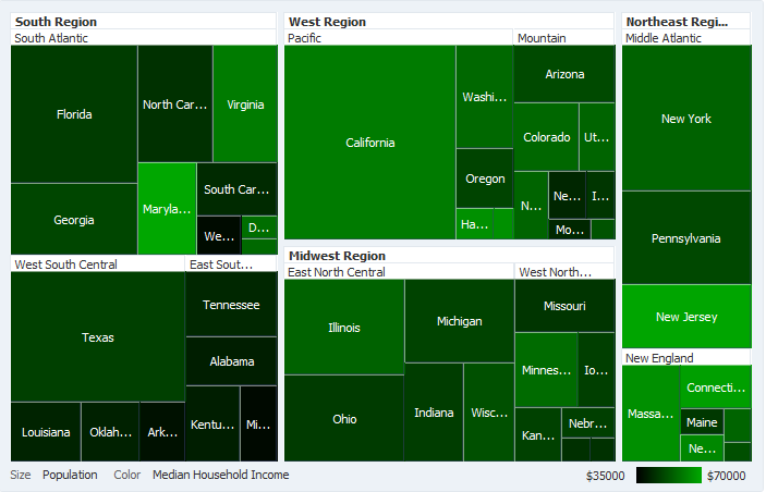
Figure 23-14 shows a treemap displaying United States census data grouped by regions, with the color attribute used to indicate median income levels. States with larger populations display in larger-sized nodes than states with smaller populations.
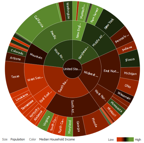
Sunbursts display the nodes in a radial rather than a rectangular layout, with the top of the hierarchy at the center and deeper levels farther away from the center. Figure 23-15 shows the same census data displayed in a sunburst.
Treemaps and sunbursts can display thousands of data points in a relatively small spatial area. These components are a good choice for identifying trends for large hierarchical data sets, where the proportional size of the nodes represents their importance compared to the whole. Color can also be used to represent an additional dimension of information
Use treemaps if you are primarily interested in displaying two metrics of data using size and color at a single layer of the hierarchy. Use sunbursts instead if you want to display the metrics for all levels in the hierarchy. Drilling can be enabled to allow the end user to traverse the hierarchy and focus in on key parts of the data.
For additional information about treemaps and sunbursts and how to use them in your application, see Chapter 30, "Using ADF Treemap and Sunburst Components."
23.3 Providing Data for ADF Data Visualization Components
All data visualization components can be bound to row set data collections in an ADF data control. For information and examples of data binding these components to data controls, see the "Creating Databound ADF Data Visualization Components" chapter in the Oracle Fusion Middleware Fusion Developer's Guide for Oracle Application Development Framework.
Graphs and gauges have a tabularData method that lets you provide CSV (Comma Separated Value) data from a method that is stored in a managed bean.
The Gantt chart component supports the use of a basic tree data control when you want to provide data not only for tasks and resources but also for subtasks and subresources.
23.4 Downloading Custom Fonts for Flash Images
Graph and gauge components provide text rotation, high fidelity display, and embedded fonts using Flash image types. The Flash engine is a prebuilt Shockwave Flash (SWF) file containing precompiled ActionScript code used to display a graph or gauge by using an XML definition of a chart. The Flash engine is downloaded and instantiated by a Flash Player embedded in the client browser at runtime.
Embedded fonts are used for display and printing purposes, they are not installed on the client, and they cannot be edited. They are used by the Flash Player, in memory, and are cleared when the player terminates. Although embedded fonts require a roundtrip to the server to download the font SWF file, they provide a consistent look across all clients, support text rotation, and minimize distortion or anti-aliasing.
Oracle provides one font, Albany WT, for use in Flash images when necessary. This font does not provide any non-plain variations such as Bold or Italic. The Albany WT font is used instead of the default font to support certain animations not supported by Flash with device fonts, if the application does not specify and provide its own embedded font to use instead.
Specific fonts and their respective SWF files can be added to your application as embedded fonts to be passed to the Flash engine. The engine will defer-load any font specified in the list until that font is required by any text or labels in a graph or gauge definition. Example 23-1 defines the Georgia font with a Bold and Italic combination.
package
{
  import.flash.display.Sprite;
  import.flash.text.Font;
public class fGeorgiaBoldItalic extends Srite
        (
  [Embed (source="c:\\WINDOWS\\Fonts\\GEORGIABI.TTF",
    fontName="Georgia Bold Italic",
    fontWeight="Bold",
    fontStyle="Italic".
    mimType="application/x-font-truetype")]
  private statis car font1:Class;
  public function fGeorgiaBoldItalic() {
    Font registerFont(font1);
}
  }
}
You can set graph and gauge font attributes as follows:
-
fontEmbedding: Defines whether or not the embedded fonts are used. Some performance may be gained by setting the attribute tonone. -
fontMap: Contains the actual map of the fonts that should be used for embedding. The map contains the name of a font and a URL where the custom font SWF file can be found.
