From the edit view of the Chart component, power users can create one or more charts to include on the component. For each chart, the power user selects the chart style, and provides an Analytics statement to generate the chart data.
On the edit view, each tab represents a chart.
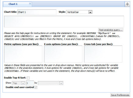
To add a chart to the Chart component, click the + button.
To remove a chart from the component, click the delete button at the top right corner of the chart tab.
On the chart tab, to configure a chart:
-
In the
Chart title field, enter the title for the
chart.
For end users, the title is displayed at the top of the chart. If the component contains multiple charts, it is displayed in the chart drop-down list.
In the edit view, the title also is used as the chart tab label.
- From the Style drop-down list, select the type of chart.
-
In the text area, enter the Analytics statement on which the chart
will be based. For example:
RETURN YearlyAverages AS SELECT
    AVG(Product_MSRPDollars) AS AvgMSRP,
    AVG(Product_Avg_National_Sales_PriceDollars) AS AvgNationalSalesPrice,
    AVG(Unit_Sale_PriceDollars) AS AvgSalesPrice
GROUP
Note that you can only configure labels for metrics, using the AS functionality in the Analytics statement. The labels must be NCName-compliant (no spaces or special characters).
To create a parametric chart, where end users can use drop-down lists to change the chart display, you replace the actual attributes with the following placeholder values:- {METRIC} is replaced at runtime by a user-specified value from the Metrics Options list. If you use the {METRIC} token, you must use it for both the field to be returned and the "AS" alias for that field.
- {XAXIS} is replaced at runtime by a user-specified value from the X Axis Options list.
- {CROSSTAB} is replaced at runtime by a user-specified value from the Cross tab list
For example:RETURN MyChart AS SELECT AVG({METRIC}) GROUP BY {XAXIS} -
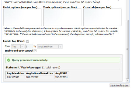
To test the validity of the statement, click the
Test analytics query button.
If the statement is not valid, then an error message is displayed.
If the statement is valid, then a "success" message is displayed, as well as the metric values from the statement.
-
For a parametric chart, in the
Metric Options,
X Axis Options, and
Cross tab fields, enter the lists of values.
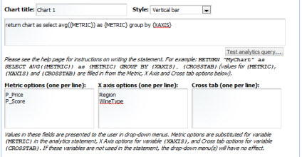
These values are used to as the available options in the drop-down lists used by end users to control the chart display. Cross tabs are grouped aggregations such as cross-tabulated totals over one or more attributes.
-
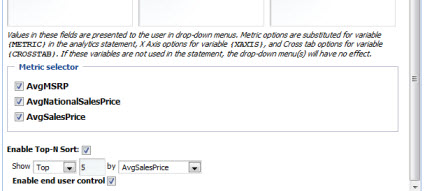
To only display the top or bottom "n" values on the chart:
-
Check the
Enable Top-N Sort checkbox.
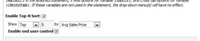
- From the Show drop-down list, to only display the top values, select Top. To only display the bottom values, select Bottom.
-
In the field, enter the number of values to display.
The default is 10.
- From the by drop-down list, select the metric to use to sort the displayed values.
- To allow end users to toggle between the top and bottom values, check the Enable end user control check box.
-
Check the
Enable Top-N Sort checkbox.
-
To save the new or updated Analytics statement, click
Save Preferences.
The Metric selector section is displayed, listing all of the metrics from the current Analytics statement.
-
By default, the chart displays all of the metrics. From the
Metric selector section, to remove a metric
from the display, uncheck its checkbox.
For example, your Analytics statement may include a metric to control the display order of the chart elements. However, you may not want the chart to display this value.
- If you have made any other changes, then to save those changes, click Save Preferences.
- To exit the edit view, click Return to Full Page.
