The power user can set the following preferences for the Chart component.
The power user can add a fixed
Analytics statement to the
Chart component, or configure a parametric
Analytics statement that allows end users to see drop-down lists across the top
of the chart.
Note: Unlike most components, the
Chart component includes online help. This help,
which mostly provides tips on working with Analytics statements, can be
accessed from the same menu that contains the
Preferences option. For more detailed
information on the Endeca Analytics language, see the
Endeca Analytics Guide.
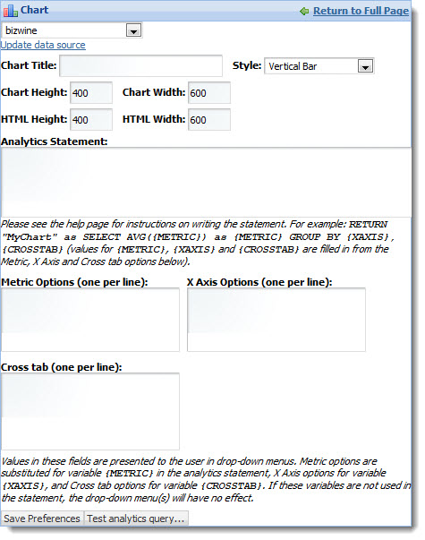
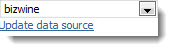
- Data source controls:
Select from the available data sources in the drop-down list, and then click
Update data source to bind your selection to the
component.
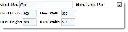
- Chart appearance:
Provide the chart title, select a style of chart, and define the height and
width of the chart. Examples of the available chart styles appear below.
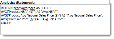
- Analytics Statement:
Type your Analytics statement here. Note that labels can be configured for
metrics only, using the AS functionality in an Analytics statement.
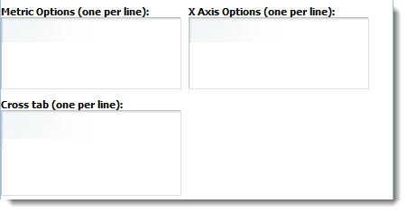
- Metric Options,
X Axis Options, and
Cross tab: For parametric Analytics charts,
provide options for the drop-down lists your end users will access. Cross tabs
are grouped aggregations such as cross-tabulated totals over one or more
dimensions.
- Test analytics query:
Test and debug your Analytics statement before saving and applying it.