End users use the Guided Navigation component to refine the displayed data.
Displaying the available attribute values
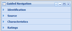
The Guided Navigation component displays the attribute groups that end users can use to filter the data.
Each group may be expanded or collapsed by default, and the values for each attribute may be displayed or hidden by default.
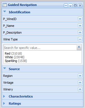
To show or hide the list of attributes for a group, click the group name.
To display or hide the available values for an attribute, click the attribute name, or use the + and - buttons for the attribute.
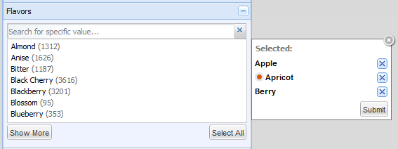
If the number of values is too large, then a Show More button is displayed:
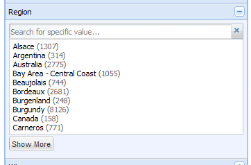
To display the remaining values, up to the configured total maximum, click the button.
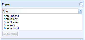
To search for a specific value for an attribute, begin typing the value in the attribute search box. As you type, the matching values are displayed.
Selecting a single, non-hierarchical attribute value
For attributes that are not hierarchical, and do not allow multiple selections, the list of values is displayed.
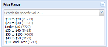
- The data is filtered to only display records with that value.
- The selected value is added to the Breadcrumbs component.
- The attribute is removed from the Guided Navigation component.
Selecting hierarchical attribute values
For a hierarchical attribute, only Guided Navigation component initially displays the top level of the hierarchy.
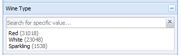
- The data is filtered to only display records with that value.
- The selected value is added to the Breadcrumbs component.
- On the Guided Navigation component, the child values for the selected value are displayed, with the parent value displayed above the list.
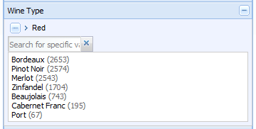
To return to the top level of the hierarchy, click the ... button.
When you click a child attribute value, the selected value is added to the existing breadcrumb for that attribute. If there is another level of child values, those values are displayed on the Guided Navigation component.
When you click a value that does not have any children, the attribute is removed from the Guided Navigation component.
Selecting a negative refinement for an attribute value
Attributes also can be configured to allow negative refinement. Negative refinement means that the data is refined to only include records that do NOT have the selected attribute value.
If an attribute allows negative refinement, then when you move the mouse over the value, the negative refinement icon displays to the right of the value.
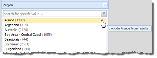
To refine the data to only include records that have that value, click the value.
To refine the data to only include records that do NOT have that value, click the negative refinement icon. When you do a negative refinement, then the negative refinement icon is displayed next to the breadcrumb.
Selecting multiple values for an attribute
If users can select multiple values for an attribute, then when you select a value, it is added to a list of values to add. If you select a negative refinement for a value, then the negative refinement icon is displayed in front of the value.
- Depending on the attribute
configuration, the data is filtered to include records that either:
- Have any one or more of the selected values
- Have all of the selected values
- The selected values are added to the Breadcrumbs component.
- The selected values are removed from the Guided Navigation component.
End users can still select the other remaining values. If the user selects all of the values, then the attribute is removed from the Guided Navigation component.
Effect of filtering on the available attribute values
When you filter by a selected attribute value, it affects the available values for other attributes.
For example, a wine data set includes attribute for both the price range and the region. If you filter the list to only show wines with a price range of $30-40 dollars, then any region that does not have any wines in that price range is removed from the list of available region values.
The Guided Navigation component also is affected by filtering performed from other components. For example, when end users perform a search, the available attribute values on the Guided Navigation component are restricted to those associated with the matching records from the search.
