Screen Shot(s)
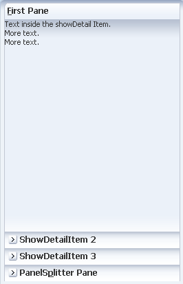
A panelAccordion component with 4 showDetailItem children.
| Oracle Fusion Middleware Tag Reference for Oracle ADF Faces 11g Release 2 (11.1.2.3.0) E17491-05 |
UIComponent class: oracle.adf.view.rich.component.rich.layout.RichPanelAccordion
Component type: oracle.adf.RichPanelAccordion
Unsupported agents: pda
The panelAccordion control can be used to display a set of contents belonging to showDetailItem components. Each disclosed showDetailItem is shown as expanded and its contents are displayed; if the showDetailItem is not disclosed, only the title bar is displayed. Typically you would put one or more showDetailItem components inside of the panelAccordion but you may also alternatively place a facetRef, group, iterator, or switcher inside of the panelAccordion as long as these wrappers provide showDetailItem components as a result of their execution.
The following is an example of panelAccordion.
<af:panelAccordion id="pa1">
  <af:showDetailItem text="ADF Faces Components" id="sdi1">
    <af:panelHeader text="ADF Faces Components First Child" id="ph1"/>
    <af:panelHeader text="ADF Faces Components Second Child" id="ph2"/>
  </af:showDetailItem>
  <af:showDetailItem text="Architecture" disabled="true" id="sdi2">
    <af:panelHeader text="Architecture First Child" id="ph3"/>
    <af:panelHeader text="Architecture Second Child" id="ph4"/>
  </af:showDetailItem>
  <af:showDetailItem text="Release" id="sdi3">
    <af:panelHeader text="Release First Child" id="ph5"/>
    <af:panelHeader text="Release Second Child" id="ph6"/>
  </af:showDetailItem>
</af:panelAccordion>
| Type | Phases | Description |
|---|---|---|
| org.apache.myfaces.trinidad.event.AttributeChangeEvent | Invoke Application, Apply Request Values |
Event delivered to describe an attribute change. Attribute change events are not delivered for any programmatic change to a property. They are only delivered when a renderer changes a property without the application's specific request. An example of an attribute change event might include the width of a column that supported client-side resizing. |
| Name | Type | Supports EL? | Description |
|---|---|---|---|
| attributeChangeListener | javax.el.MethodExpression | Only EL | a method reference to an attribute change listener. Attribute change events are not delivered for any programmatic change to a property. They are only delivered when a renderer changes a property without the application's specific request. An example of an attribute change events might include the width of a column that supported client-side resizing. |
| binding | oracle.adf.view.rich.component.rich.layout.RichPanelAccordion | Only EL | an EL reference that will store the component instance on a bean. This can be used to give programmatic access to a component from a backing bean, or to move creation of the component to a backing bean. |
| clientComponent | boolean | Yes | whether a client-side component will be generated. A component may be generated whether or not this flag is set, but if client Javascript requires the component object, this must be set to true to guarantee the component's presence. Client component objects that are generated today by default may not be present in the future; setting this flag is the only way to guarantee a component's presence, and clients cannot rely on implicit behavior. However, there is a performance cost to setting this flag, so clients should avoid turning on client components unless absolutely necessary. |
| customizationId | String | Yes | This attribute is deprecated. The 'id' attribute should be used when applying persistent customizations. This attribute will be removed in the next release. |
| dimensionsFrom | String | Yes | Valid Values: auto, children, parent determines how the component will handle geometry management. This specifies where the dimensions of the decorativeBox come from:
If the oracle.adf.view.rich.geometry.DEFAULT_DIMENSIONS context-param is set to "auto" in the project's web.xml, the default value for this attribute will be "auto". Otherwise, the default value will be "parent". |
| discloseMany | boolean | Yes | whether more than one detail item may be disclosed at a time. Use "false" (the default) to keep a maximum of one detail item disclosed at all times. Use "true" to make it possible for multiple detail items to be disclosed. |
| discloseNone | boolean | Yes | whether a minimum of one detail item must be disclosed at a time. Use "false" (the default) to keep a minimum of one detail item disclosed at all times. Use "true" to make it possible for zero detail items to be disclosed. |
| id | String | No | the identifier for the component. The identifier must follow a subset of the syntax allowed in HTML:
|
| inlineStyle | String | Yes | the CSS styles to use for this component. This is intended for basic style changes. The inlineStyle is a set of CSS styles that are applied to the root DOM element of the component. Be aware that because of browser CSS precedence rules, CSS rendered on a DOM element takes precedence over external stylesheets like the skin file. Therefore skins will not be able to override what you set on this attribute. If the inlineStyle's CSS properties do not affect the DOM element you want affected, then you will have to create a skin and use the skinning keys which are meant to target particular DOM elements, like ::label or ::icon-style. |
| partialTriggers | String[] | Yes | the IDs of the components that should trigger a partial update. This component will listen on the trigger components. If one of the trigger components receives an event that will cause it to update in some way, this component will request to be updated too. Identifiers are relative to the source component (this component), and must account for NamingContainers. If your component is already inside of a naming container, you can use a single colon to start the search from the root of the page, or multiple colons to move up through the NamingContainers - "::" will pop out of the component's naming container (or itself if the component is a naming container) and begin the search from there, ":::" will pop out of two naming containers (including itself if the component is a naming container) and begin the search from there, etc. |
| rendered | boolean | Yes | whether the component is rendered. When set to false, no output will be delivered for this component (the component will not in any way be rendered, and cannot be made visible on the client). If you want to change a component's rendered attribute from false to true using PPR, set the partialTrigger attribute of its parent component so the parent refreshes and in turn will render this component. |
| reorder | String | Yes | Valid Values: enable, disable Sets if reordering of the panel accordion's items should be allowed. After a reorder, an event is sent to the server. If all the children components of the panel accordion are <c>RichShowDetailItem</c> components, the display indexes will be updated to reflect the new order. The accordion will update as many items as needed to ensure they appear in the proper order. This means that if there are five items all with the default index of -1, and the first is moved to position 3, the items now first, second and third (where the third is the old first) will have their display indexes updated to 0, 1 and 2 respectively. The updating of display indexes in flattened components is not supported at this time. |
| shortDesc | String | Yes | the short description of the component. This text is commonly used by user agents to display tooltip help text, in which case the behavior for the tooltip is controlled by the user agent, e.g. Firefox 2 truncates long tooltips. For form components, the shortDesc is displayed in a note window. For components that support the helpTopicId attribute it is recommended that helpTopicId is used as it is more flexible and is more accessibility-compliant. |
| styleClass | String | Yes | a CSS style class to use for this component. The style class can be defined in your jspx page or in a skinning CSS file, for example, or you can use one of our public style classes, like 'AFInstructionText'. |
| unsecure | java.util.Set | Yes | A whitespace separated list of attributes whose values ordinarily can be set only on the server, but need to be settable on the client. Currently, this is supported only for the "disabled" attribute. Note that when you are able to set a property on the client, you will be allowed to by using the the .setProperty('attribute', newValue) method, but not the .setXXXAttribute(newValue) method. For example, if you have unsecure="disabled", then on the client you can use the method .setProperty('disabled', false), while the method .setDisabled(false) will not work and will provide a javascript error that setDisabled is not a function. |
| visible | boolean | Yes | the visibility of the component. If it is "false", the component will be hidden on the client. Unlike "rendered", this does not affect the lifecycle on the server - the component may have its bindings executed, etc. - and the visibility of the component can be toggled on and off on the client, or toggled with PPR. When "rendered" is false, the component will not in any way be rendered, and cannot be made visible on the client. In most cases, use the "rendered" property instead of the "visible" property. Not supported on the following renderkits: org.apache.myfaces.trinidad.core |