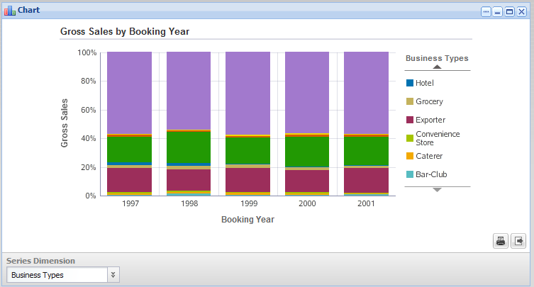
Here is an example of a stacked percentage bar chart.
Like the other stacked bar example, this chart also shows the total gross sales for each year, divided by business type.
However, with the stacked percentage bar, instead of comparing the total values, users compare the relative percentages for each business type across the years. They could then see, for example, that the percentage of sales from grocery stores remained fairly constant, while the percentage from wine stores changed significantly.
The configuration for this chart is:
| Chart type (Subtype) | Bar (Stacked Percentage Vertical) |
| Series metric (aggregation) | Gross Sales (sum) |
| Group dimension | Booking Year |
| Series dimension | Business Types |
| Sorting | Group dimension A to Z |
