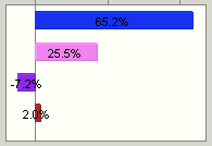
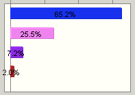
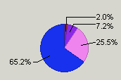
Depending on the basic chart type (assumption, forecast, trend, overlay, or sensitivity), you can choose from among several chart display types, such as column, line, area, bar, or pie.
 To change the chart display type:
Display the Chart Type tab of the Chart Preferences dialog. The Chart Type group is displayed in the middle of the Chart Type page.
If more than one series is displayed in the list box at the top of the tab, select one to work with. The settings on the tab apply to the selected series.
To change the chart display type, open the Type drop-down list and select a display type. Depending on the basic chart and series types, you can choose from among these display types (not including scatter charts):
Table 6. Chart Types
While you have a series selected, consider adjusting the chart color (Setting Chart Colors) and marker line settings (Showing the Mean and Other Marker Lines) too.
When settings for the current series are complete, follow steps 2 through 3 to customize settings for any other series in the chart.


