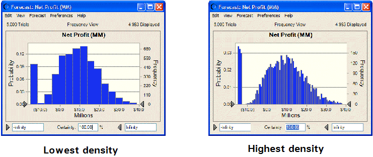
You can show more or less detail (such as data points and columns) in a chart by changing the number of bins used to group similar values. The level of detail or resolution is called the density of the chart. Higher densities more accurately reflect the actual distribution of data and lower densities highlight the overall shape and trend of data.
 To change the chart density:
Choose a density level from the Density drop-down list. For example, the following figure shows the lowest and highest density settings for a column chart:
To show a space between each column, or "bin," check Show Column Gaps.
Even if you uncheck Show Column Gaps, gaps will always be displayed in a discrete distribution.