The Graphic Gauges component provides a way of visually summarizing information in a familiar way. A gauge is similar to a bar in a spotlighted chart where another color (or image for gauges) is displayed based on performance. For instructions on how to spotlight a chart, see “Spotlighting Charts” in the Hyperion Interactive Reporting – Object Model and Dashboard Development Services Developer's Guide, Volume 5: Dashboard Studio.
A gauge is a set of images positioned on top of each other. By default, all images are invisible and contain an associated rule to indicate which image is to be made visible. For example, when conditions are excellent the image that conveys excellence is made visible and all other images remain invisible. Conversely, when conditions are very bad the image that conveys the need to take remedial steps is made visible and all other images remain invisible.
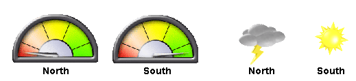
In this example, two gauge styles are used. However, both display equivalent information, that is, the business rule defines North is performing at the worst level, while South is performing at the peak.
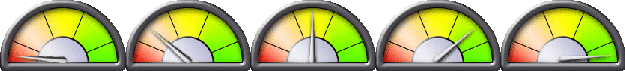
Five images are used for the four visible gauges, North, South, East, and West. Each image represents five ranges of performance defined by the business rule. Only one image is visible in each gauge at any time, and that image represents the measured performance.
If the dial images are used, the image changes so that the pointer cycles through colors: red, orange, yellow, pale green, and bright green.
If the weather images are used, the image cycles through weather types: thunder storm, rain, mostly cloudy, light cloud, and sunshine.

When using the Graphic Gauges component, use the predefined gauge styles or create a gauge style using any image.