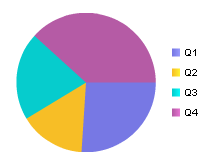
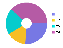
| Pie | (Live) Pie Chart in 2–D format: (Live) Pie Chart in donut format: | (Live) Pie charts display data as shares or “slices” to a whole in a pie-shaped graphic. These types of charts are useful for relative comparisons within the same data series, for example if you need to compare advertising costs of different brands. (Live) Pie charts can be displayed in a standard pie format, or in donut format. Charts can be “exploded” such that slices are moved away from the center of the chart. |
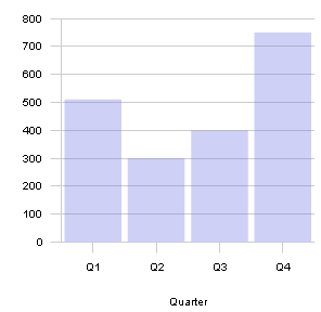
| Bar | (Live) Bar Chart | (Live) Bar charts displays data values within the same category by bar length. This type of chart is useful for comparing data series within a category. |
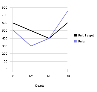
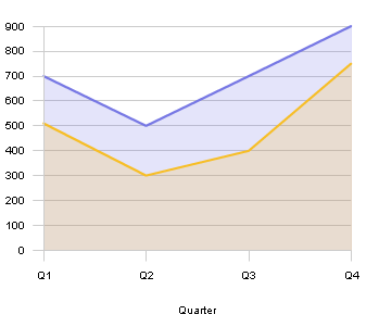
| Line | (Live) Line Chart in line format: (Live) Line Chart in area format: | (Live) Line charts displays items or a series in one or more categories at equal intervals. They are effective for comparing highs and lows in a continuum. Values are depicted by the height of a point determined in the y-axis, and categories are represented on the x-axis. (Live) Line charts are also effective in showing numeric increases or decreases within the same category. The (Live) Line chart can be displayed in the traditional or area format. |
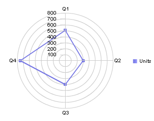
| Radar | | (Live) Radar charts display data values in relation to a center point. This chart is effective for demonstrating variances between multiple components associated with a single value. A point nearer to the center on an axis shows a low value, and a point closer to the edge show a higher value. Each data point is displayed as a marker, and you can plot data along multiple axes. |
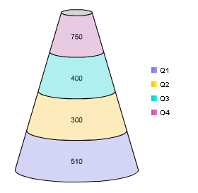
| Block | (Live) Block Chart in cone format: (Live) Block in Pyramid format | (Live) Block charts consists of a cone shape or pyramid shaped chart. Like (Live) Bar charts, (Live) Block charts are useful for comparing values using a common scale, where the values need to be rendered hierarchically. (Live) Block charts are best used with a small data set since they taper at the end. |
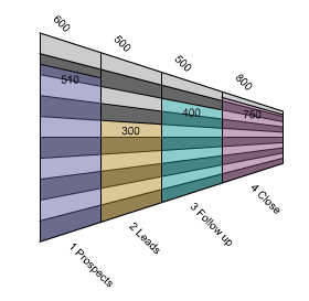
| Funnel | | (Live) Funnel charts illustrate discreet components within a larger context. The height of the bar represents how close the actual value (Fact) is to a target values. For example, if the target value is 100, and the actual value is 50, the bar is drawn half way. (Live) Funnel charts are traditionally used to demonstrate phases in the sales pipeline (for example, prospects, qualified leads, tested customer requirements, proposals sent and negotiations to close). |