Use the (Live( Line Chart Properties dialog box to define specific properties associated with a (Live) Line Chart or Area Chart.
Table 201. (Live) Line Chart General Properties
| General Properties | Description |
|---|---|
| Type | Select the format for the (Live) Line Chart. Available options include:
|
| Effect | Select either a 2–D, or gradient effect. A 2–D effect refers to the perspective of the rendered chart. A gradient defines the direction of the blend pattern from one color to another, and simulates depths of color from light to dark. Available options are:
|
| Marker Style | Select the style of a marker. A marker depicts a data point in a cell. Valid options are:
|
| Show Title | Enables the display of the chart title. |
| Show Legend | Enables the display of the chart legend. |
| Target Range | (Live) Line charts can include a colored band around the target line to indicate the absolute or percentage distance from the target markers. A unique color can also be associated with the area above or below the specified band. From left to right, the first color box corresponds to the upper range, the second color box corresponds to the middle range, and the third color box corresponds to the lower range. By default the upper and lower ranges have a transparent color. To select an alternate color for a range, double click the box and select a color from the palette. This option is not available for a (Live) Line Chart in area chart format. |
| (% or Absolute Deviation) | For the target range above, select one of the following options:
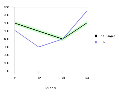 |
Table 202. (Live) Line Chart Category Axis Properties
| Category Axis Properties | Description |
|---|---|
| Title | Enables the display of the category axis title. |
| Show Labels | Enables the display of category axis labels. |
Table 203. (Live) Line Chart Fact Axis Properties
| Fact Axis Property | Description |
|---|---|
| Title | Enables the display of the fact axis title. |
| Show Labels | Enables the display of fact labels. |
| Auto | Enable to calculate the lower and upper values scale of the data set automatically. The scale is recalculated automatically when the data set is refreshed. To specify a minimum and maximum scale manually, disable this field. |
| Min: | Enter the minimum data value on the values scale. This option is disabled if Auto is enabled. |
| Max: | Enter the maximum data value on the value scale. This option is disabled if Auto is enabled. |