11g Release 7 (11.1.7)
Part Number E20388-06
Home
Contents
Book
List
Contact
Us
|
Oracle® Fusion Applications CRM Extensibility Guide 11g Release 7 (11.1.7) Part Number E20388-06 |
Home |
Contents |
Book List |
Contact Us |
 Previous |
 Next |
This chapter contains the following:
Customizing Oracle Fusion CRM Using Page Composer : Overview
Customizing Oracle Fusion CRM Pages Using Page Composer: Explained
Customizing Simplified Pages Using Page Composer : Points to Consider
Personalizing Dashboards, Transactional Pages, and Landing Pages Using Page Composer : Overview
Customizing UI Components with Direct Selection Support Using Page Composer : Overview
How to customize standard desktop pages, as well as dashboards
How to customize simplified pages
How to use Direct Selection mode to make user interface changes
Important
Page Composer supports two editing modes: Design View and Source View. In Oracle Fusion CRM, customizations can be done only in Design View mode. The only exception is the Partner Relationship Management's Partner Portal UI Shell customization, which is done in Source View mode.
Note
Page Composer does not support the customization of custom object pages and custom fields. You can customize extended pages and fields only with the Application Composer.
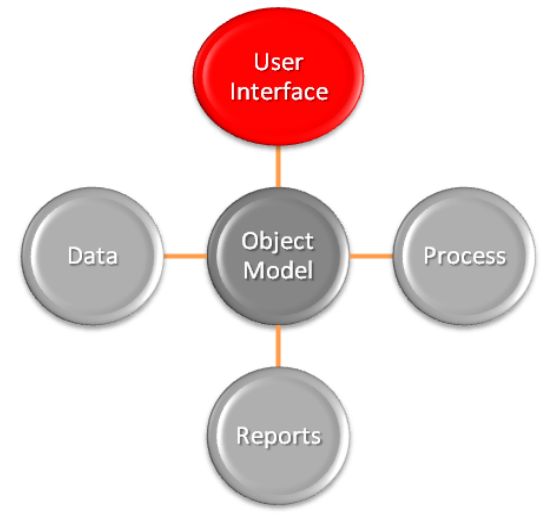
The following figure shows how Page Composer affects only the UI layer.
Page Composer supports two editing modes: Design View and Source View. In Design View mode, you can edit by direct manipulation of the target components and their properties. In the Source View mode, you can edit from the programmatic code of the target component. In Oracle Fusion CRM, Page Composer is launched in Design View mode by default. Customizations can be done only in Design View mode. The only exception is the Partner Relationship Management's Partner Portal UI Shell customization, which is done in Source View mode.
The Page Composer Design View mode has two selection submodes:
Design mode is launched by default when opening a page with Page Composer. You can also select this mode by clicking the Design tab on the top left corner of a page in Page Composer mode.
Direct Selection mode is activated when you click the Select tab that is next to the Design tab.
The following figure shows a Page Composer-enabled dashboard in Design View mode and Design Selection mode.
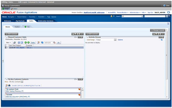
The Direct Selection mode is mainly used to select and edit UI components, such as form fields and table columns. In Direct Selection mode, the enabled UI components become apparent when you move the cursor over the component. Enabled UI components get in focus on mouseover and are highlighted by a light blue border for editing. When you click the highlighted component, the border changes to dark blue and an Edit window appears.
The window allows you to select whether to edit the selected component or the parent component. Examples of parent components include tables that hold columns and forms that hold fields.
Note
In Oracle Fusion CRM, the Direct Selection mode is available when you customize pages through the Administration link, but not when you personalize them from the Personalization link.
Access Page Composer from the Administration global menu. Access to the Administration menu is controlled through the Administration Link View Duty. The following table lists examples of duty and job roles that must be assigned to you so that you can access the Page Composer editor.
|
Application |
Duty Role |
Job Role |
|---|---|---|
|
CDH |
Master Data Management Application Administrator |
Master Data Management Application Administrator |
|
Sales Catalog |
Sales Catalog Administrator Duty |
Sales Catalog Administrator |
|
Sales |
Sales Administrator Duty |
Sales Administrator |
|
PRM |
Channel Administrator Duty |
Channel Administrator |
|
PRM |
Channel Partner Portal Administrator Duty |
Channel Partner Portal Administrator |
For additional details on these security privileges, contact your security administrator.
Page Composer also supports sandboxes. The sandbox provides temporary storage for your customization changes until you are ready to commit them to the back end. Before working with sandboxes, review the guidelines and recommendations on using sandboxes, available in related help topics.
Use the following steps to open Page Composer:
Navigate to the Page Composer-enabled page.
Before making changes using Page Composer, confirm that you are working in the correct sandbox. If not, create a sandbox before making your changes.
Select the Administration global menu.
In the Customize <page name> Pages dialog box, select the MDS layer that you want to customize.
Click OK.
Click Customize <page name>.
Select Customize Work Areas for dashboard customization.
Page Composer opens.
Customize the page.
When you are done, click Close to leave the Page Composer editor.
In Oracle Fusion CRM, you can use the following customization options:
Transactional, landing, and dashboard page customizations. Only administrators can do these customizations.
Partner Portal UI shell and branding customizations. Only Partner Portal administrators can do these customizations.
User-level page personalization for limited personalization tasks, such as hiding or adding content. Personalization changes are only visible to the user who is doing them.
Additionally, you can do Page Composer customizations in any of the following MDS customization layers:
Site: Your customizations are visible to all site users.
Job Role: Your customizations are visible to users who have the selected job role.
External or Internal: Depending on your selection, your customizations are visible to either external or internal users. External users could be your partners or anonymous users. Internal users could be your employees.
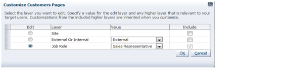
When Page Composer opens, the Customize <page name> Pages dialog box opens, where you can select the MDS layer to customize. The layer that is selected in the Edit column is the layer that you want to edit. The layers that are selected in the Include column inherit any changes you make to the layer you edit.
By default, changes made at higher levels (Site) are propagated to lower level layers (External or Internal and Job Role), unless you uncheck these layers in the Include column.
The following figure shows selecting the MDS layer for customization.
Note
The Fusion Welcome dashboard does not support job role or External or Internal layer changes. All customizations to this dashboard are applied at the site level.
Design and Direct Selection modes support different sets of customization tasks (although in some instances a task can be performed in either mode). The Design mode is intended for overall UI composition customizations, such as adding content, changing the dashboard layout, and changing region properties. The Direct Selection mode is intended for customizations at the component rather than the region level, mainly for fields, forms, tables, and tree nodes customizations.
Tip
It might be necessary to toggle between Direct Selection and Design mode to navigate between pages when performing Direct Selection customizations, since you can only navigate in Design mode.
All Oracle Fusion CRM dashboard pages support the design mode of the Page Composer-enabled regions. External facing landing and transactional pages that are expected to need customizations also support the design mode for the following Page Composer-enabled regions:
Partner Snapshot
Edit Partner Profile
Edit Partner Public Profile
Edit Personal Profile
Partner Landing
Partner Registration Landing
Partner Registration: Partner Information
Partner Registration: Review and Accept Terms
Partner Registration Information
In general, use Direct Selection mode to do the following customizations:
Fields, such as input text fields, output fields, and list of values fields:
Show or hide component
Make read-only
Make required
Edit label
UI Containers (forms, tables and trees):
Show or hide child components, for example, fields in the form
Reorder child components, for example, reorder fields in a form
Note
UI components can be protected from updates to preserve the product business logic, for example, a field is read-only or not based on a security privilege already defined in the application. If protected from updates, the UI components are dimmed and cannot be customized in Page Composer.
The following table lists the customization tasks available through Page Composer and the modes in which they are supported.
|
Customization Task |
Design View - Standard Mode |
Design View - Direct Selection Mode |
|---|---|---|
|
Change local area layout. For example, change a two-column layout to three-column layout (eight layouts are available). |
Yes |
No |
|
Add, rename, remove dashboard tabs (except for Home tab). |
Yes |
No |
|
Expand, collapse dashboard Regional pane (or move the splitter location). |
Yes |
No |
|
Add and remove panel boxes to or from the dashboard local area. |
Yes |
No |
|
Add predefined content to dashboard panel boxes (Business Intelligence reports, CRM portlets, and common components such as Calendar). |
Yes |
No |
|
Edit dashboard panel box properties: show, hide box, reorder child regions, display options, and style. |
Yes |
No |
|
Add and remove ADF Components to or from dashboards (for example, regions, hyperlinks, images, text boxes, movable boxes, and Web pages) and edit their properties. |
Yes |
No |
|
Customize saved searches (create and edit). |
Yes |
No |
|
Hide or show field. |
No |
Yes |
|
Change field label. |
No |
Yes |
|
Make field required or not. |
No |
Yes |
|
Make field read-only or updateable. |
No |
Yes |
|
Reorder fields in a form. |
No |
Yes |
|
Reorder table columns. |
Yes |
Yes |
|
Hide or show table columns. |
Yes (end users can optionally display columns at run time) |
Yes (end users cannot display columns at run time) |
|
Set table column width with the mouse. |
Yes |
No |
|
Set table column width and minimum width in percent or pixels. |
No |
Yes |
|
Enable, disable column sorting. |
No |
Yes |
Also known as the Oracle Fusion CRM Home page, the Welcome dashboard is the application suite's default starting page. It is composed of a collection of tabs that are visible based on the roles assigned to users. The Welcome dashboard provides a collection of high-level data summaries meant for quick monitoring and navigation to key business objects. You can customize this page.
To customize the Welcome dashboard:
Navigate to the dashboard.
Click the Administration global menu.
Select Customize Workarea Pages....
The Welcome dashboard consists of a local area only. The supported customization tasks, which you do in Design mode, are:
Change the local area layout.
Add or remove panel boxes.
Add seeded content to dashboard panel boxes.
Edit dashboard panel box properties: show or hide a box, reorder child regions, change display options and style.
Add, edit, and remove ADF components to or from dashboards, such as regions, hyperlinks, images, text boxes, movable boxes, and Web pages.
Note
The Welcome dashboard does not support role-based or External or Internal interface customization. All customizations are site-wide.
After you select a customization layer, if available, you can click:
Design to navigate around and get to the components you want to customize. You cannot make any customizations in this mode.
Select to select a component on the page and open its properties.
Each component has its own set of properties, which may include some of the properties in this table.
|
Property |
Description |
|---|---|
|
Description |
Text used by screen readers, for information in addition to what is provided in the Short Desc property. |
|
Label |
Display text for the component, for example the field prompt or the single prompt for a group of check boxes |
|
Read only |
Whether users can edit the component, for example if a check box can be selected or not |
|
Rendered |
Whether the component is visible or hidden to users on the page |
|
Required |
Whether users must enter something for the component before saving the page |
|
Short Desc |
Text that appears when users hover or focus on the component, for example hover over a field label or click in the text box |
|
Show Required |
Whether an asterisk is displayed to indicate that the component is required |
When you access component properties on a workstation page using Page Composer, more properties are available.
As needed later, you can click your name in the global area and select Manage Customizations. Click Promote for the desired component and select the label to revert to.
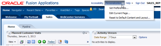
The following figure shows the Page Composer - Personalization menu.
Personalization tasks are available only in Design Edit mode, and they include:
Change the local area layout. For example, change a two-column layout to a three-column layout. In all, eight layouts are available for selection.
Add, rename, or remove subtabs.
Restriction
You cannot rename or remove predefined tabs or home tabs.
Expand or collapse the dashboard regional pane. You can do this by moving the page splitter location.
Add or remove panel boxes from the dashboard local area.
Add Resource Library content to the dashboard panel.
Edit the dashboard panel box properties: show or hide a box, reorder child regions, or change the display and style options.
Add, remove, and edit dashboard ADF components: regions, hyperlinks, images, text boxes, movable boxes, and Web pages.
The Page Composer Design View mode has two selection submodes:
The Direct Selection mode is mainly used to select and edit UI components, such as form fields and table columns. In Direct Selection mode, the enabled UI components become apparent when you move the cursor over the component. Enabled UI components get in focus on mouseover and are highlighted by a light blue border for editing. When you click the highlighted component, the border changes to dark blue and an Edit window appears.
The following table lists:
User interface components that support Direct Selection mode
Customization properties of the components
|
ADF Component Name |
Type |
Selectable |
Rendered Attribute |
Read-Only Attribute |
Required Attribute |
Label Attribute |
Minimum Width |
Maximum Width |
Sortable |
Header Text |
Reorder Children |
|---|---|---|---|---|---|---|---|---|---|---|---|
|
af:activeOutputText |
Field |
Yes |
Yes |
NA |
NA |
NA |
NA |
NA |
NA |
NA |
NA |
|
af:inputComboboxListOfValues |
Field |
Yes |
Yes |
Yes |
Yes |
Yes |
NA |
NA |
NA |
NA |
NA |
|
af:inputDate |
Field |
Yes |
Yes |
Yes |
Yes |
Yes |
NA |
NA |
NA |
NA |
NA |
|
af:inputFile |
Field |
Yes |
Yes |
Yes |
Yes |
Yes |
NA |
NA |
NA |
NA |
NA |
|
af:inputListOfValues |
Field |
Yes |
Yes |
Yes |
Yes |
Yes |
NA |
NA |
NA |
NA |
NA |
|
af:inputNumberSlider |
Field |
Yes |
Yes |
Yes |
Yes |
Yes |
NA |
NA |
NA |
NA |
NA |
|
af:inputNumberSpinbox |
Field |
Yes |
Yes |
Yes |
Yes |
Yes |
NA |
NA |
NA |
NA |
NA |
|
af:inputRangeSlider |
Field |
Yes |
Yes |
Yes |
Yes |
Yes |
NA |
NA |
NA |
NA |
NA |
|
af:inputText |
Field |
Yes |
Yes |
Yes |
Yes |
Yes |
NA |
NA |
NA |
NA |
NA |
|
af:outputFormatted |
Field |
Yes |
Yes |
NA |
NA |
NA |
NA |
NA |
NA |
NA |
NA |
|
af:outputText |
Field |
Yes |
Yes |
NA |
NA |
NA |
NA |
NA |
NA |
NA |
Yes |
|
af:panelLabelAndMessage |
Field |
Yes |
Yes |
NA |
NA |
Yes |
NA |
NA |
NA |
NA |
NA |
|
af:panelFormLayout |
Container |
Yes |
No |
NA |
NA |
NA |
NA |
NA |
NA |
NA |
Yes |
|
af:richTextEditor |
Field |
Yes |
Yes |
Yes |
Yes |
Yes |
NA |
NA |
NA |
NA |
NA |
|
af:selectBooleanCheckbox |
Field |
Yes |
Yes |
Yes |
Yes |
Yes |
NA |
NA |
NA |
NA |
NA |
|
af:selectBooleanRadio |
Field |
Yes |
Yes |
Yes |
Yes |
Yes |
NA |
NA |
NA |
NA |
NA |
|
af:selectManyCheckbox |
Field |
Yes |
Yes |
Yes |
Yes |
Yes |
NA |
NA |
NA |
NA |
NA |
|
af:selectManyChoice |
Field |
Yes |
Yes |
Yes |
Yes |
Yes |
NA |
NA |
NA |
NA |
NA |
|
af:selectManyListbox |
Field |
Yes |
Yes |
Yes |
Yes |
Yes |
NA |
NA |
NA |
NA |
NA |
|
af:selectManyShuttle |
Field |
Yes |
Yes |
Yes |
Yes |
Yes |
NA |
NA |
NA |
NA |
NA |
|
af:selectOneChoice |
Field |
Yes |
Yes |
Yes |
Yes |
Yes |
NA |
NA |
NA |
NA |
NA |
|
af:selectOneListbox |
Field |
Yes |
Yes |
Yes |
Yes |
Yes |
NA |
NA |
NA |
NA |
NA |
|
af:selectOneRadio |
Field |
Yes |
Yes |
Yes |
Yes |
Yes |
NA |
NA |
NA |
NA |
NA |
|
af:selectOrderShuttle |
Field |
Yes |
Yes |
Yes |
Yes |
Yes |
NA |
NA |
NA |
NA |
NA |
|
af:Column |
Container |
Yes |
Yes |
NA |
Yes |
NA |
Yes |
Yes |
Yes |
Yes |
NA |
|
af:panelHeader |
Container |
|
Yes |
NA |
NA |
NA |
|
|
|
|
NA |
|
af:showDetailHeader |
Container |
|
Yes |
NA |
NA |
NA |
|
|
|
|
NA |
|
af:table |
Container |
Yes |
No |
NA |
NA |
NA |
NA |
NA |
NA |
NA |
Yes |
|
fnd:applications table |
Container |
|
No |
NA |
NA |
NA |
|
|
|
|
NA |
|
af:panelTabbed |
Container |
|
No |
NA |
NA |
NA |
|
|
|
|
Yes |