| Oracle® Fusion Middleware User's Guide for Oracle Business Activity Monitoring 11g Release 1 (11.1.1.7) Part Number E10230-09 |
|
|
PDF · Mobi · ePub |
| Oracle® Fusion Middleware User's Guide for Oracle Business Activity Monitoring 11g Release 1 (11.1.1.7) Part Number E10230-09 |
|
|
PDF · Mobi · ePub |
This chapter describes how to create and use each of the views in Oracle Business Activity Monitoring (Oracle BAM) Active Studio, including list views and charts views, and how to add organization and functionality to reports and groups of views, or use rows and columns to display a multi-dimensional view of the values.
This chapter contains the following topics:
This section provides information about creating and using the Streaming List, Updating List, Ordered Updating List, Collapsed List, and Action List. It contains the following topics:
Oracle BAM Active Studio provides several types of list views that can accommodate your requirements.
Streaming List displays rows of data that insert new rows at the top of the list when active data arrives. Only insert operations are supported for displaying active data without reprompting the report. Do not use the Streaming List view if your active data includes update or delete operations.
Updating List displays rows of data that update in place when active data is received. New records are inserted at the top of the list. Only update operations are supported for displaying active data without reprompting the report. Do not use the Updating List if your active data includes insert or delete operations; they are not displayed.
Updating Ordered List displays updated records inserted into a sorted list. The top records are highlighted in up to four colors. You must apply a sort to view the color highlighting. This list supports active data for insert, update, and delete operations on the data object without reprompting the report.
Collapsed List displays rows of data that are grouped by a field and lets you display a summary field.
Action List is modeled on the Updating Ordered List and includes row selection checkboxes or radio buttons so that you can perform an action on selected rows of data.
This procedure describes the common steps for creating all types of list views in a report. Individual differences between the list types are noted in the procedure.
To create list views:
In a report that you are creating or editing, click the frame of the view to display the selection handles.
If you are creating a report, select the view in the template.
If you are editing an existing view, you might be required to click Change view type.
If you need another view to define, insert a view.
A group of view type icons opens.
Select a list view icon.
The View Editor opens.
Select a data object in the Data Objects field, and click Next.
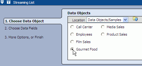
Select the fields to include in the list.

If the data object contains 10 or fewer fields, the fields are automatically selected in the Data Fields list. If it has more than 10, you must manually select fields.
In most views you can click select none to clear all of the checkboxes.

The link switches to select all so that you can select all of the fields again.
When creating a Collapsed List you must select a field to summarize and choose a Summarize function from the list on the right.
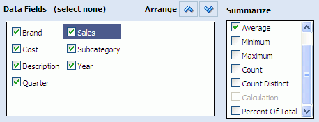
The collapsed list is grouped by the summarized field. See Section 4.1.5, "Adding Summaries to a Collapsed List" and Section 4.2.4, "Grouping Data" for more information.
List views can contain calculated fields containing graphics and color. For information about configuring those types of fields see Section 5.4.1, "Using HTML in Calculations."
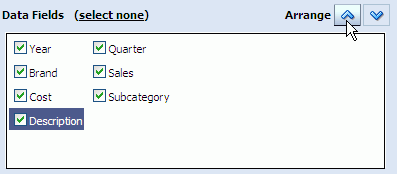
Select each field and use the arrow keys to arrange the fields in the order you want to present them (left to right) in the list, then click Next.
You can select an option in the last step to add data modifiers or formatting properties.
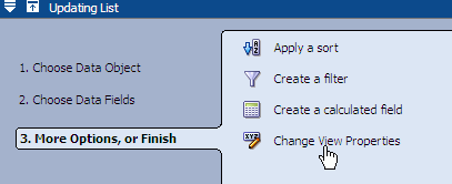
Click Change View Properties to continue formatting the view.
Click Finish, Apply, or OK to display the view with your current selections.
Although they have differences when displayed, list views have some formatting characteristics in common.

In addition to the general properties common to all views (see Section 6.2, "Configuring General Formatting Properties"), the properties in Table 4-1 are also available for the list views.
Table 4-1 General Properties for List Views
| Property | Description |
|---|---|
|
Show When List Empty |
When there is no data to display in a list the text entered in the field is shown instead. |
|
Hide Headings |
Hides the column headers in the list. |
|
Click here to edit the window features used when clicking on a link in the List |
You can configure the properties of a separate browser window that opens when a user clicks a hyperlink in a list view. |
|
Selected Fields |
Determines which columns are displayed in the list. Not all of the fields you selected in the data object must be displayed in the view. |
Adjusting Column Width
If you encounter a situation where the values in a column are wider than the column width, you can change the width of the column in the Text and Align properties tab. See Section 6.5, "Configuring Text Alignment" for more information.
By default all of the columns have variable size in the report, but if you fix the widths you have greater control over what the user sees. If you fix a width for one column only, space is taken for the existing columns. If you fix the width for all of the columns, a scroll bar appears at the bottom of the view to help the user navigate the width of the view.
Data in the Updating Ordered List, Collapsed List, and Action List views can be configured to be sorted by any field.
You can also sort an Updating Ordered List, Collapsed List, and Action List while viewing it by clicking on the column header of the field you want to sort. You will see either an up arrow or down arrow next to the column header to indicate whether this field is sorted in ascending order or descending order.
Streaming List and Updating List data cannot be sorted because active data is added to the top of the list.
To sort a List view:
Click Data in the View Editor. To open the View Editor, double-click the view you are editing, or click Edit view in the View Tasks/Options list.
Click the Sort tab.
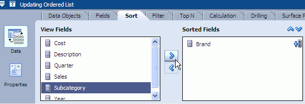
Click a field in the View Fields list. You can click several fields to move multiple fields at the same time.
Click the right arrow (>) to move the field to the Sorted Fields list.
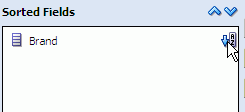
You can change the sort order by clicking the Sort Order icon next to the field name.
To define the priority of multiple sorted fields:
Click a field in the Sorted Fields list.
Click the Up arrow to move the field higher in the list, and click the Down arrow to move the field lower in the list.

You can add summaries to a Collapsed List view. You apply a summary function, such as Sum, Average, Min, Max, or Count to a value field. You can also apply the Count function to non-numeric fields.
See Section 5.6, "Applying Summary Functions to Groups" for definitions of the summary functions.
To add summaries:
Click the Data button in the View Editor. To open the View Editor, double-click the view you are editing, or click Edit view in the View Tasks/Options list.
Click the Fields tab.
Select a value field and select a summary function checkbox.
Click Apply or OK to update the view.
This section details the procedures for using an Action List view. It contains the following topics:
By default the Action List displays a column of checkboxes on the left side so that you can select rows of data. You can display a column of radio buttons making it possible to select only one row of data.
To display a column of radio buttons:
Select the Action List view and click Edit view in the View Tasks/Options list.
The View Editor opens.
Click Properties and select the Actions tab.
Select Single select (radio buttons).
Click Apply or OK.
The column of checkboxes is changed to radio buttons.
You can edit data in any column in an Action List.
Note:
Active data is disabled in Action Lists that have editable columns, to ensure that the list does not change while the user is entering data into the editable column.
To make columns editable:
Select the Action List view and click Edit view in the View Tasks/Options list.
The View Editor opens.
Click Properties and select the Editable Fields tab.
Select the fields to be made editable in the Selected Fields list.
Click Apply or OK.
The columns selected become editable and a Submit button appears in the bottom left corner of the view.
When editing fields you must click the Submit button to commit the changes to the data object.
To do something with the selected data in an Action List you must create Action Buttons. Action Buttons can appear in any report, but a lot of the actions you can define for Action Buttons only apply to the Action List view. See Chapter 9, "Using Action Buttons" for more information about creating Action Buttons.
When you have a very large number of records in a list view, a set of page control buttons appears in the top right corner of the view.
When the buttons are displayed in a list view it indicates that there are pages of data in the list that cannot be viewed simply by using the scrolling control on the right side of the view. To view additional records you must select a page control button (the numbered buttons) to see that set of records.
When a list consists of a very large set of records, not all of the available record set (numbered) buttons can be seen on the view. In this case use the page button scrolling controls to scroll to the desired record set button.
This section provides information about the Chart views. It contains the following topics:
Section 4.2.3, "Configuring Chart View General Formatting Properties"
Section 4.2.8, "Creating Statistical Process Control Charts"
Chart view types include bar, line, area, combo, pie, statistical, and stacked bar charts. Most charts are available in 2D and 3D styles.
Bar Chart shows vertical columns to represent summarized values. Bar charts are available in 2D and 3D.
Line Chart shows a graphed line of values or compared values. Line charts are available in 2D and 3D.
Area Chart view shows a graphed line of values with the area filled in for visual comparison. The Area Chart is available in 2D and 3D.
Combo Chart shows a combination of values as bars, lines, and area charts in the same view. The Combo Chart is available in 2D and 3D.
Pie Chart displays values in segments of a circle. The Pie Chart is available in 2D and 3D.
Stacked Bar Chart provides a bar chart with sets of values as stacked columns instead of side by side. The Stacked Bar Chart is available in 2D and 3D.
The Statistical Process Control Charts (R Chart, S Chart, and P Chart) are attribute control charts showing the fraction or percent of nonconforming data out of a given population. Attribute control charts are useful when items are compared with some standard and then are classified as to whether they meet the standard or not.
Although they have differences when displayed, the chart views have formatting characteristics in common. This procedure describes the shared steps. Individual differences between the list types are noted in the procedure.
To create chart views:
In a report that you are creating or editing, click the frame of the view to display the selection handles.
If you are creating a report, select the view in the template.
If you are editing an existing view, you can click Change view type.
If you need another view to define, insert a view.
A group of view type icons opens.
Select one of the chart view icons
The View Editor opens.
Select a data object, and click Next.

Select one or more fields to group data by.

See Section 4.2.4, "Grouping Data" for more details about grouping.
If you choose to group by a field of type datetime, some additional configuration is required. See Section 4.2.5, "Configuring Time Groups."
See Section 4.2.8, "Creating Statistical Process Control Charts" for information about selecting fields for the S Chart, P Chart, and R Chart.
Click one or more Chart Values to chart.
For each Chart Values field selected, select a summary function in the Summary Functions list. See Section 5.6, "Applying Summary Functions to Groups" for more information.
Click Next.
The list of additional options is displayed.
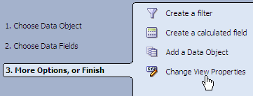
You can select options to add filters, calculations, or additional data objects.
For more information about creating charts with more than one data object see Section 4.2.7, "Creating Charts With Multiple Data Objects."
Click Change View Properties to continue formatting the view. Formatting options include General, Axis, Data Labels, Shading, Text & Align, Value Format, Themes, Font, Active Data, Patterns, and Target.
See Chapter 6, "Formatting Views" for more information about using each tab in the View Editor to configure the view.
Click Finish, Apply, or OK to display the view.
Although they have differences when displayed, chart views have formatting characteristics in common.
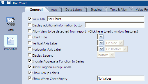
In addition to the general properties common to all views (see Section 6.2, "Configuring General Formatting Properties"), the properties in Table 4-2 are also available.
Table 4-2 General Properties for Chart Views
| Property | Description |
|---|---|
|
Show When Chart Empty |
When there is no data to display in a chart the text entered in the field is shown. |
|
Chart Title |
Displays a chart title in addition to the view title. You can enter a custom chart title or choose a field from the list. |
|
Vertical Axis Label |
Displays a label along the vertical axis of the chart (available for all charts except Pie Charts). You can enter a custom label or choose a field from the list. Select On Side or At End from the second list to determine the orientation of the label. |
|
Horizontal Axis Label |
Displays a label along the horizontal axis of the chart (available for all charts except Pie Charts). You can enter a custom label or choose a field from the list. Select On Bottom or At End from the second list to determine the orientation of the label. |
|
Display Legend |
Displays a legend of the colors and patterns used in the chart. |
|
Include Aggregate Function In Series |
Displays the aggregate function in the series. |
|
Allow Diagonal Group Labels |
When space is limited, enables group labels to be displayed diagonally (available for all charts except Pie Charts). |
|
Show Group Labels |
Displays group labels (available for all charts except Pie Charts). |
|
Suppress Empty Groups |
When no data is available for a particular group, no pie slice is displayed (available in Pie Charts only). |
|
Explode All Slices |
Displays pie slices in exploded view when the view is opened (available in Pie Charts only). |
Data is organized in groups in the Chart views, and also the Collapsed List view.
For example, using the /Samples/Product Sales data object Figure 4-1 a bar chart displays data grouped by the Company field.
If the numeric fields needed to group by are in the Chart Values list, select Include Value Fields to display in the Group By list.
When you group by week, quarter, or year, week is based on a Sunday through Saturday week, and year is based on a January through December year with Q1 starting January 1.
If you choose to group by a field of type datetime, some additional configuration is required. See Section 4.2.5, "Configuring Time Groups."
You can create a chart where the grouping (x axis) is based on datetime field values.
Note:
Note that time groups are used to arrange the data in the chart based on a datetime field, while Active Now filters are used to concentrate on a particular time slice in a data object. These options can be used in the same chart.
See Section 5.1.1, "Using Active Now" for information about filtering on datetime values.
For an example of how time groups and Active Now can be used in the same view, see Section 5.1.1.4, "Using Active Now and Time Groups in the Same Chart."
This feature is available in the Bar Chart, Line Chart, Area Chart, Combo Chart, Pie Chart, and Stacked Bar Chart views (2D and 3D).
This feature is also available in Crosstab views (see Section 4.5, "Creating and Using Crosstab Views"). The only difference in functionality between Chart views and Crosstab views is that the Crosstab views do not have the option of creating a continuous time series, because there is no x-axis.
To configure time groups:
In a report that you are creating or editing, select a field of type datetime in the Group By list in the Fields tab. The Time Groups options appear on the right side of the tab as shown in Figure 4-2.
Select the Continuous time series checkbox to display groups for time intervals where no data is available. The continuous time series feature is not available in Crosstab views.
There may be time gaps where the data did not have entries. The Continuous time series feature adds groups to the result whose values are zero, so that when the results are shown on the graph, the x axis represents a smooth time series.
Continuous time series only works if you have chosen a single datetime field to group by. Continuous time series does not work if any additional groupings are selected.
Select either Use time series or Use time groups.
Use time series displays the data from the first datetime point available to the last in a sequence.
Use time groups displays data grouped into a set of time intervals. For example, if you select Month from the time unit list, all data from January from all years where data is available is grouped in one data point on the chart.
Select a time unit from the list.
If you selected Use time groups, the groups are described in the following list.
Year displays groups for all of the years where data is available. You can specify a quantity of 1, 2, 5, or 10 years to include in each group.
Quarter displays four groups representing the quarters of a year (January-March, April-June, July-September, and October-December). You can specify a quantity of 1 quarter to include in each group.
Month can display up to twelve groups representing the months of the year. You can specify a quantity of 1, 2, 3, 4, 6, or 12 months to include in each group.
Week can display up to 52 groups representing the weeks in a year. You can specify a quantity of 1, 2, 4, 13, 26, or 52 weeks to include in each group.
Day of Year displays groups representing the 365 possible days in a year. You can specify a quantity of 1 day of the year to include in each group.
Day of Month displays 31 groups representing the possible days of a month. You can specify a quantity of 1 day of the month to include in each group.
Day of Week displays seven groups representing the days of the week. You can specify a quantity of 1 day of the week to include in each group.
Hour can display up to 24 groups representing the hours of a day. You can specify a quantity of 1, 2, 3, 4, 6, 8, 12, or 24 hours to include in each group.
Minute can display up to 60 groups representing the minutes in an hour. You can specify a quantity of 1, 2, 3, 4, 5, 6, 10, 12, 15, 20, 30, and 60 minutes to include in each group.
Second can display up to 60 groups representing the seconds in a minute. You can specify a quantity of 1, 2, 3, 4, 5, 6, 10, 12, 15, 20, 30, and 60 seconds to include in each group.
Enter a quantity of the time unit to group by. For example, entering a 2 next to the Month time unit displays the groups in two month increments (January and February are grouped as one data point on the chart).
Click Apply or OK.
Chart targets enable you to configure a target line on a chart view. This makes it easy to see when a target is reached by a process you are tracking.
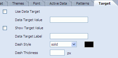
Use the following properties to configure the target:
Use Data Target enables the target line to appear on the graph.
Data Target Value is the value at which the target should appear on the graph. This should be a positive integer value.
Show Target Value displays the target value on the target line.
Data Target Label appears in a pop up text box when the mouse moves over the target line.
Dash Style is the line style for the target line. You can use a solid or broken line. There are several dotted and dashed line styles available.
Dash Thickness requires a positive integer to specify the thickness of the target line in pixels.
You can use more than one data object in all of the Chart views. For example stacked bar charts are created with two or more data objects. This section contains the following topics:
To add a second data object to a Chart view, choose from the following:
While creating the view, select Add a Data Object in the More Options, or Finish screen of the wizard.
Select Manage Data Objects from the View Tasks/Options list. In the Manage Data Objects dialog box click Add and select a data object to add to the chart.
When a chart contains more than one data object the Edit view option does not appear in the View Tasks/Options list.
To edit a Chart view containing multiple data objects:
Select Manage Data Objects from the View Tasks/Options list.
The Manage Data Objects dialog box opens.
Select a data object and click Edit.
The View Editor opens.
The Statistical Process Control (SPC) charts demonstrate how consistently your process is performing, and whether you should, or should not, attempt to adjust it. Whether you track revenues, billing errors, or the dimensions of manufactured components, the SPC charts can help you measure, understand and control the variables that affect your business processes.
The S Chart and R Chart are designed to be used primarily with variable data, which are usually measurements such as the length of an object, the time it takes to complete a process, or the number of objects produced in each period. Upper and lower limits are used to determine whether the process is in control.
R Charts are used when you can collect measurements in groups (subgroups) of between two and ten observations. Each subgroup represents a snapshot of the process at a given point in time. The charts' x-axes are time based, so that the charts show a history of the process. For this reason, you must have data that is time-ordered; that is, entered in the sequence from which it was generated. For subgroup sizes greater than ten, use S Charts.
P Charts are used for results of pass/fail tests, such as percent of work orders completed within budgeted cost. In this case, a work order is either completed within budget or not (pass/fail). P Charts have the advantage of taking into account the sample size (the number of work orders completed) and accounting for the high level of random fluctuations when the sample size is small (very few work orders completed).
The SPC charts are created a bit differently from the other charts described in this section. The following sections explains how the data object should be organized and how to select fields for the charts.
Note:
By definition, S Charts plot standard deviation values on X-BAR, however, in previous versions of Oracle BAM, S charts plotted average/mean values on X-BAR. In 11.1.1.2.0 version of Oracle BAM and going forward, S Charts plot standard deviation values on X-BAR.
S Chart reports created earlier than 11.1.1.2.0 version will continue to show average values instead of standard deviation values. You must recreate the S chart to display standard deviation values on X-bar.
The data object you design for the SPC charts has two columns. One column indicates which sample group each measurement belongs to, in our example this is a group number but it could also be a time stamp. The second column contains the measurements. Figure 4-3 is an example of how the SPC data object might look.
When you are creating the S Chart, R Chart, and P Chart, the field selection is different from that of other charts.
There are two selections you must make. Select the field in the Index group that contains the data on which sample group the measurements belong to. Also select the field in the SPC Chart Measures group that contains the measurements.
In the P Chart, you also create a pass filter in the Etc. field. The pass filter determines which measurements are acceptable cases (passes). Enter an expression that determines the pass criteria for the filter. In the example shown in Figure 4-4 the filter passes those measurements in the measurement field that are greater than 2.
Note:
Curly brackets {} are required for field names with spaces, for example
{Sales Number} > 1000
When viewing a Pie Chart, you can double-click a segment of the pie to separate it from the others. Click it again to move it back into place.
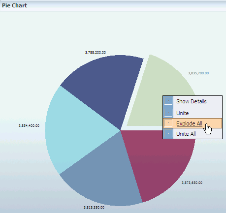
You can also right-click and select Explode to move a segment away from the pie. Then right-click and select Unite to return it to its place.
You can use the right-click menu to Explode All and Unite All.
This section provides information about creating and using the Columnar view in a tiled report. It contains the following topics:
For information about creating, formatting, and using the columnar report see the following topics:
The Columnar view is a text report view that includes grouping, summaries, headers, footers, and text formatting. Columnar views can be tiled views in a single page or continuous Columnar reports.
Notes:
The Columnar view only supports active updates.
If you create a columnar report with an image in the header, and upgrade to a more recent version of Oracle Business Activity Monitoring without backing up and restoring the images into the upgraded Oracle Business Activity Monitoring directory, the columnar report displays a red X where the image was inserted. If the image is replaced in the directory, then the columnar report displays the image instead of the red X symbol.
To add a columnar view:
In a report that you are creating or editing, click the frame of the view to display the selection handles.
If you are creating a report, select the view in the template.
If you are editing an existing view, you can click Change view type.
If you need another view to define, insert a view.
A group of view type icons opens.
Select a list view icon.
The View Editor opens.
Follow the remaining steps in Section 3.3, "Creating Columnar Reports", from the step "Select a data object."
You can apply a summary function to a Columnar view, such as Sum, Average, Min, Max, or Count to a value field. You can also apply the Count function to non-numeric fields.
To add summaries:
Open the View Editor by double-clicking the view you are editing, or click Edit view in the View Tasks/Options list.
Click the Data button in the View Editor.
Select the Summary tab.
Select a value field in the Values column and select a summary function checkbox in the Summary Functions column. See Section 5.6, "Applying Summary Functions to Groups" for more information.
Click Apply or OK to update the view.
In addition to the general properties common to all views (see Section 6.2, "Configuring General Formatting Properties"), the properties in Table 4-3 are also available for configuring the columnar view.

Table 4-3 General Properties for the Columnar View
| Property | Description |
|---|---|
|
Selected Fields |
Indicates columns that are displayed in the list. |
|
Report Title |
Displays a report title in addition to the view title. |
|
Design Borders |
Displays the outlines surrounding the header, footer, and detail areas in the columnar view when creating and formatting. Design borders are not displayed when you view the report. |
When you have a very large number of records in a Columnar view, A set of paging buttons appear in the top right corner of the view.
The buttons indicate that there are pages of data in the list that cannot be viewed simply by using the scrolling control on the right side of the view. To View additional records you must select a page button (the numbered buttons) to see that set of records.
When a Columnar view consists of a very large set of records, not all of the available page buttons can be seen on the view. In this case you must use the page button scrolling controls to scroll to the correct page button.
This section provides information about the Arrow, Market Arrow, Range Gauge, and Dial Gauge views. It contains the following topics:
The following KPI views are available in Oracle BAM Active Studio.
Arrow is a positive or negative number key performance indicator accompanied by an associated description.
Market Arrow is a positive or negative number key performance indicator with no extra fields for text descriptions within the view.
Range Gauge indicates the current value in a range display designed for the values.
Dial Gauge indicates the current value in a numeric marked gauge.
KPI view types include arrows and gauges. Although they have differences when displayed, they have many configuration settings in common. This procedure describes the shared steps in creating KPI views.
To create KPI views:
In a report that you are creating or editing, select the frame of the view to display the selection handles.
If you are creating a report, select the view in the template.
If you are editing an existing view, you might be required to click Change view type.
If you need another view to define, insert a view.
A group of view type icons is displayed.
Select a KPI view:
The View Editor opens.
Select a data object, and click Next.

Because KPIs display only one value at a time, KPIs require that you choose from the following options:
a timestamp field and a numeric field in the data object
a data object containing a single row that is updated with KPI data
a filter reducing the output data to a single field
Select a field from each list where you want to display data
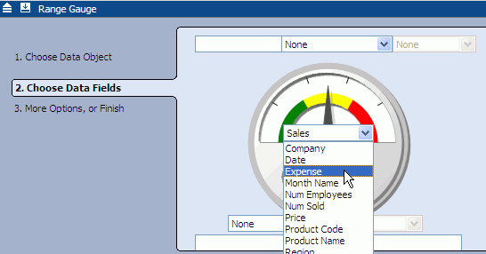
You are not required to choose a field for every list. The field shown in the middle of the arrow or gauge is the indicator field. You must specify a value for this field.
Note:
The Arrow indicator field requires data that represents the change in information. For example, a number moving from 100 to 80 does not display a down arrow. Instead, a field with -20 is necessary for the indicator field to display a down arrow.
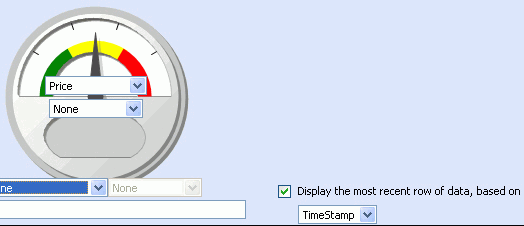
To display only the most recent row of data on a non-aggregated numeric value, select Display the most recent row of data, based on.
This feature is enabled when there is a TimeStamp type column in the data object. The column name appears in the drop-down list. Currently, only one TimeStamp type column is allowed per data object.
To use this feature a non-aggregated numeric value must be displayed in the gauge itself.
Click Next to continue.
You can click a link in the More Options, or Finish step to add filters or calculations.
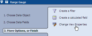
Click Change View Properties to continue formatting the view. Formatting options include General, Gauge Styles, Shading, Text & Align, Value Format, and Font.
Click Finish, Apply, or OK to display the view.
In addition to the general properties common to all views (see Section 6.2, "Configuring General Formatting Properties"), the properties in Table 4-4 are also available.
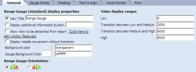
Table 4-4 General Properties for KPI Views
| Property | Description |
|---|---|
|
Background Color |
Displays a background color outside the arrow or gauge in the view. Click the current color swatch and select a color from the palette, or enter the hexadecimal number of the color in the field. |
|
Display needle movement without transition |
Transitions are not used to indicate movement of the Gauge needle. The needle jumps from one position to another. (Gauge views only) |
|
Gauge Background Color |
Displays a background color inside the gauge (Gauge views only). Click the current color swatch and select a color from the palette, or enter the hexadecimal number of the color in the field. |
|
Range Gauge Orientation |
Indicates whether to display the range colors from green to red, or red to green when reading the gauge left to right. The order you choose should relate to the meaning represented by large numbers in the view. Select whether to display the range colors with green on the left and red on the right or red on the left and green on the right. (Range Gauge only). |
|
Value display ranges |
Indicates the ranges for Low, Medium, and High on the gauge (Gauge views only). Range Gauge value display ranges: Low: Enter the minimum value to display in the gauge. This can be a nonzero value. If the value being measured is lower than this minimum, the gauge arrow changes to yellow instead of black. Transition between Low and Medium: Enter a value at which the needle leaves the Low range and enters the Medium range of values. Transition between Medium and High: Enter a value at which the needle leaves the Medium range and enters the High range of values. High: Enter the maximum value to display in the gauge. If the value being measured is higher than this maximum, the gauge arrow changes to yellow instead of black. Dial Gauge value display ranges: Minimum Value: Enter the minimum value to display on the gauge. This can be a nonzero value. If the value being measured is lower than this minimum, the gauge arrow is yellow instead of black. Maximum Value: Enter the maximum value to display in the gauge. If the value being measured is higher than this maximum, the gauge arrow is yellow instead of black. Increment: Enter an increment amount to display as lines in the dial. The Maximum Value must be divisible by the number entered here. Auto Increment: Automatically calculates the increments. |
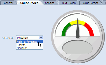
The Range Gauge and Dial Gauge views offer a few different styles to choose from: Medallion, Horizon, and High Performance.
To change the appearance of a gauge view, open the View Editor and select Properties. Then select the Gauge Styles tab and choose a style from the drop down list.
This section provides information about creating and using the Crosstab, Summary Crosstab, and Matrix views. It contains the following topics:
The three crosstab views are formats that combine rows and columns to display a multi-dimensional view of values. Summary functions that you can add to crosstabs include sum, average, count, minimum (min) or maximum (max). The crosstab view displays best in reports containing a single view.
Crosstab is a format that combines rows and columns to display a multi-dimensional view of values. A Crosstab is summarized vertically and horizontally for columns and rows.
Summary Crosstab is a format that combines rows and columns to display a multi-dimensional view of values. A Summary Crosstab is summarized horizontally in rows.
Matrix is a format that combines rows and columns to display a multi-dimensional view of values. A Matrix is an exploded view of all the data available.
Although they have differences when displayed, the crosstab views have many configuration settings in common. This section describes the steps to create crosstab views.
To create crosstab views:
In a report that you are creating or editing, click the frame of the view to display the selection handles.
If you are creating a report, select the view in the template.
If you are editing an existing view, you might be required to click Change view type.
If you need another view to define, insert a view.
A group of view type icons is displayed.
Select a Crosstab view type.
The View Editor opens.
Select a data object, and click Next.
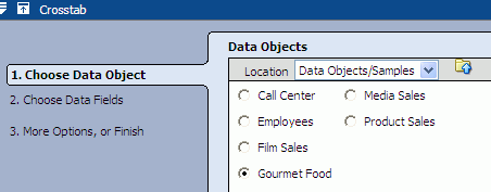
Select at least one field in the Rows list, Columns list, and Values list, and click Next.
You can move a field from one list to another by clicking and dragging it from one list to another list as shown in the graphic.
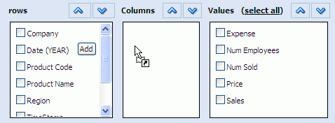
If you choose a date or time value to chart, you can configure time groups on that field. See "Configuring Time Groups" for more information. The only difference in time groups functionality between Chart views and Crosstab views is that the Crosstab views do not have the option of creating a continuous time series, because there is no x-axis.
The Summary Crosstab view has no Columns list because all of the data is summarized in rows.
You can select a link to add filters or calculations.
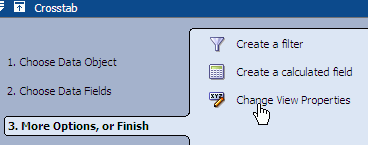
Click Change View Properties or Formatting Properties to continue formatting the view. Formatting options include General, Shading, Text & Align, Font, Value Format, Cond Format, Themes, Active Data, and Driving.
Click Finish, Apply, or OK to display the view.
In addition to the general properties common to all views (see "Configuring General Formatting Properties") the properties in Table 4-5 are also available for the Matrix view and Summary Crosstab View.
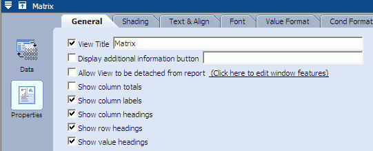
Table 4-5 General Properties for Crosstab Views
| Property | Description |
|---|---|
|
Show column totals |
Displays the totals of the values in the columns (Matrix and Summary Crosstab views) |
|
Show column labels |
Displays the labels for each column (Matrix view only) |
|
Show column headings |
Displays the headings for each column (Matrix view only) |
|
Show row headings |
Displays the row headings (Matrix view only) |
|
Show value headings |
Displays the value headings (Matrix view only) |
You can configure summaries in the Crosstab and Summary Crosstab views. You apply a summary function, such as Sum, Average, Min, Max, or Count to a value field. You can also apply the Count function to non-numeric fields.
To configure summaries:
Click the Data button in the View Editor. To open the View Editor, double-click the view you are editing, or click Edit view in the View Tasks/Options list.
Click the Summary tab.
Select a value field in the Values column and select a Summary Function. Only one summary function can be selected.
Click Apply or OK to update the view.
Use the Conditional Format tab in the View Editor to configure conditional formatting in the Matrix view.

Apply To
Select the field to apply the formatting to. You can apply formatting to multiple fields.
Condition
Select a conditional expression from the drop down list, and enter a value in the field. When the value in the selected field matches the expression the formatting is applied.
This section contains the following topics:
A Crosstab is a format that combines rows and columns to display a multi-dimensional view of values. A Crosstab is summarized vertically and horizontally for columns and rows. You can filter, drill down, roll up, and pivot using the headers in a Crosstab.
Note:
Printing and e-mailing are not fully implemented for Crosstab views.
You can filter column and row headings in a Crosstab.
To filter values in a column or row heading:
In the Crosstab view, click the down arrow next to the heading label.
A list of values for the heading is displayed with checkboxes next to each value.
Deselect the checkboxes of values to hide from the display.
You can change the aggregate function applied to the Crosstab.
To change the aggregate function applied to the values:
In the Crosstab view, click the current aggregate function in the upper left corner, such as Sales (avg).
A list of functions for the heading is displayed.
Select the aggregate function to apply.
The values update and display.
You can change the order of rows (or columns) by dragging a row (or column) above or below (to the left or right) another row (column heading).
You can pivot data by dragging a column heading to become a row heading in the Crosstab view.
To pivot the view of data:
Click and drag a heading from a location as a column heading to a row heading.
A red line is displayed on the current row headings to indicate where to display it.
Release the mouse button to drop the heading in the other location.
The data displayed in the Crosstab reflects the updated combination of row and column headings.
This section contains the following topics:
A Summary Crosstab is a format that combines rows and columns to display a multi-dimensional view of values. A Summary Crosstab is summarized horizontally in rows. You can filter, change the aggregate function, drill down, roll up, and sort using the headers in a Summary Crosstab.
You can filter column and row headings in a Summary Crosstab.
To filter values in a column heading:
In the Summary Crosstab view, click the down arrow next to the heading label.
A list of values for the heading is displayed with checkboxes next to each value.
Deselect the checkboxes of values to hide from the display.
You can change the aggregate function applied to the Summary Crosstab.
To change the aggregate function applied to the values:
In the Summary Crosstab view, click the current aggregate function in the upper left corner, such as Sales (sum).
A list of functions for the heading is displayed.
Select the aggregate function to apply.
The values update and display.
You can roll up or drill down in headings.
To roll up or drill down for a heading:
Click the plus sign (+) to drill down and display the values using the details of the heading.
Click the minus sign (-) to roll up values into a whole number for the heading.
This section provides information about creating and using the Excel spreadsheet view. It contains the following topics:
The Excel spreadsheet view displays columns containing rows of data in a Microsoft Excel spreadsheet. This view enables you to save the content externally (outside of the Oracle BAM applications) in a Microsoft Excel spreadsheet.
The Excel view requires that Microsoft Excel version XP, 2003, or 2007 is installed on the client computer.
This section describes the steps to create Excel views.
In a report that you are creating or editing, click the frame of the view to display the selection handles.
If you are creating a report, select the view in the template.
If you are editing an existing view, you might be required to click Change view type.
If you need another view to define, insert a view.
A group of view type icons is displayed.
Select the Excel view type.
A dialog box opens for you to accept a CAB file (oraclebam.cab) that contains an ActiveX control. The ActiveX control enables Microsoft Excel to run inside of Oracle BAM Active Studio.
Click Install to accept the CAB file.
The View Editor opens.
Select a data object. The data object is the source of data for the report.
Click Next.
Select the field checkboxes you want to include in the spreadsheet.
Click select none to clear all of the checkboxes. The link switches to select all so that you can select all fields again.
If the data object contains 10 or fewer fields, the fields are automatically selected in the Data Fields list. If it has more than 10, you must manually select fields.
Click Next.
The list of additional options is displayed.
You can click a link to add data modifiers or formatting properties.
Click Change View Properties to continue working with the view. Other options include data transfer and applying macros to run before or after each data update. Formatting options include General, Shading, Text & Align, and Font.
Click Finish, Apply, or OK to display the view.
In addition to the general properties common to all views (see "Configuring General Formatting Properties") the properties in Table 4-6 are available for the Excel view.
Table 4-6 General Properties for Excel Views
| Property | Description |
|---|---|
|
Hide Excel Toolbar While Viewing |
Hides the Microsoft Excel toolbar while the report is in view mode (except Save and Help commands). Enable this property when you do not want report users to execute Excel commands within the view. |
|
Save in Excel 97-2003 format |
Gives you the option of saving the Excel view in Microsoft Excel 97 or Microsoft Excel 2003 format if you installed Microsoft Excel 2007. This option is only enabled if Microsoft Excel 2007 is installed on the machine. If you have Microsoft Excel 2007, and you do not select this option, the view will be saved in Microsoft Excel 2007 format. Therefore, if a user later tries to open the report with Microsoft Excel 97 (XP) or Microsoft Excel 2003, it will fail. If you have Microsoft Excel 97 or Microsoft Excel 2003, the checkbox will be pre-selected and disabled (because the only option is to save the view in Microsoft Excel 97-2003 format). |
When viewing or editing an Excel spreadsheet in Oracle BAM Active Studio, you can use the Microsoft Excel toolbars and menu options available in the Oracle BAM dashboard. However, you cannot use the New and Save toolbar buttons from inside Oracle BAM Active Studio.
Notes:
Applying sorting to an entire column includes the header. In most cases, you want the header cell to remain as the header cell. When you sort a column, select only the cells to be sorted.
Data that is blank displays as (Null) in an Excel view, although filters on blank strings return the rows containing the blanks as expected. For data objects intended to display in an Excel view, the data designer might prefer to substitute the blank or null values in the data object with other representative values for clarity.
You can save the Excel spreadsheet outside of Oracle BAM Active Studio.
To save the Excel spreadsheet outside of Oracle BAM Active Studio:
On the Excel toolbar, click File>Save As.
The Save As dialog box opens.
Type a file name for the Excel spreadsheet, select a location, and click Save.
Oracle BAM Active Studio automatically creates named ranges for each column in the Excel spreadsheet view.
To view the named ranges and their definitions:
On the Excel menu bar, select Insert > Name > Define.
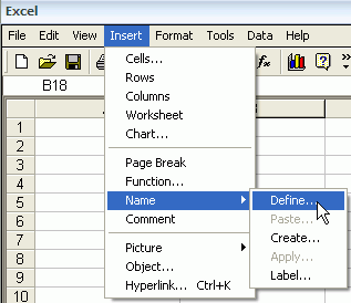
The Define Name dialog box opens. The named range for the entire data set that is specified on the Data Transfer tab in the View Editor is only listed in this dialog box when viewing active data.
Follow these rules and tips when using Excel views.
Be sure that Excel is not running when you use macros in the Excel view. This means checking that the application is not running, and that no Excel processes are running. Use your operating system's task manager to check whether the Excel process is running.
Also be sure that you are using only versions of Excel supported with this version of Business Activity Monitoring.
Using macros in Excel views is still a Preview-only feature.
For best performance in Excel views where data is very large and very active, the following settings are recommended:
In the Oracle BAM Active Studio Report Properties dialog box, on the Advanced tab, increase the active data interval to 3-5 seconds.
In the Excel menu bar, select Tools>Options. On the Calculation tab, select Manual. The default setting is Automatic.
Avoid applying macros to run before and after data.
This section provides information about creating and using the Action Form View. It contains the following topics:
The Action Form view lets you create an HTML form in a report that can submit information to a data object.
The designer of an action form view first decides what the inputs of the form are, and what action is taken. Use an HTML editor to create HTML for the form incorporating all of the necessary inputs. The HTML must be self-contained, but it can use CSS. The HTML must also be valid XML meaning that all tags must be closed and all attributes must have an assignment.
Action Form templates contain the HTML needed to create an Action Form view in Oracle BAM Active Studio. Before creating the Action Form view, you must first create an HTML form and define an Action Form template in Oracle BAM Architect.
To create an Action Form template:
Create an HTML form.
See Example 4-1, "Example HTML Form for Action Form Template" for a sample form. Note that any inputs that ought to map to data objects and parameters must contain an attribute rtsenabledID that is set to a unique value in the form.
Open Oracle BAM Architect and select Data Objects from the Oracle BAM Architect function list.
Select the Action Form Templates data object located in the Data Objects/System/Views folder.
Click Contents.
Click Edit Contents.
Click Add.
Enter a Name for the template. This name is displayed in the View Editor for the Action Form in Oracle BAM Active Studio.
Specify the ID; the system requires it.
Enter a brief Description.
Enter html in the Type field. Only the html type is supported.
Cut and paste your HTML from your HTML editor into the FormInput field.
Click Save.
Example 4-1 Example HTML Form for Action Form Template
<html>
<head>
<title>Email Form</title> <meta http-equiv="Content-Type" content="text/html;
charset=iso-8859-1"/>
<link href="styles/CUSTCOOLBLUEv.css" rel="stylesheet" type="text/css"/>
</head>
<body>
<table>
<tr>
 <td>To:</td>
 <td><div align="left" rtsEnabledID="ToRecipient"></div></td>
</tr>

<tr>
 <td>CC:</td>
 <td><div align="left" rtsEnabledID="CcRecipient"></div></td>
</tr>

<tr>
 <td>BCC:</td>
 <td><input type="text" name="text223222" size="49" rtsEnabledID="OtherRecipient"/></td>
</tr>

<tr>
 <td>Subject</td>
 <td><input type="text" name="text22322" size="49" rtsEnabledID="Subject"/></td>
</tr>

<tr>
 <td>Message</td>
 <td><textarea rtsEnabledID="Message" name="textarea" cols="51" rows="6"
wrap="virtual"></textarea></td>
</tr>
</table>
<!--input name="button2222" type="button" value="Send" /-->
</body>
</html>
To create the Action Form view:
In a report that you are creating or editing, click the frame of the view to display the selection handles.
If you are creating a report, select the view in the template.
If you are editing an existing view, you might be required to click Change view type.
If you need another view to define, insert a view.
A group of view type icons is displayed.
Select the Action Form view type.
The View Editor opens.
Choose an action form template from the Choose Action Form Type options, and click Next.

The template options displayed in this step are HTML forms that were loaded in the Action Form Template data object. See "Creating Action Form Templates" for more information.
Configure the Map Inputs options, and click Next.
In the Map Inputs section, select the data type (in the right-hand list) that each input expects from the source.
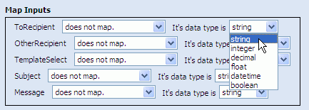
Next, select from what source each input should expect the data (in the left hand list. The options are:
maps to the parameter: Enables you to select a parameter previously configured in the current report.
Select a parameter from the list on the right side to select the parameter (as shown in Figure 4-5).
Enter a character in the Delimiter field if the input receives multiple values.
maps to the Data Object: Enables you to select a data object field from which the input receives values.
When this option is selected the Choose Data Object dialog box opens. Select a data object and click OK.
Then, select a field from the list provided (see Figure 4-6).
To filter the values in this field, click Add Filter, and complete a filter expression. SeeSection 5.1, "Filtering Data" for information about filter expressions.
Figure 4-5 Using maps to the parameter Option

Figure 4-6 Using maps to Data Object Option

Configure Input Associations and click Next.
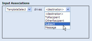
Associations enable automatic input field population in your form when a selection is made in another input field. Associations are typically used to populate other fields in the form when selecting an option from a list. (Creating associations requires putting data into a data object in Oracle BAM Architect to which to associate the input fields.)
Click Finish, Apply, or OK to display the view.
Create an Action Button so you can submit the data in the action form to a data object. See Chapter 9 for more information about Action Buttons.
This section provides information about creating and using the External Content view. It contains the following topics:
The External Content view is for displaying URLs, files, or static images in a report. The External Content view includes only the General tab in Formatting Properties. No other formatting tabs are included.
Notes:
If users navigate to another page with the External Content view set to refresh, the original URL is displayed again when it refreshes. If the content is static and does not require refreshing, select No for the Refresh this content automatically setting.
Because the External Content view displays referenced image files, if you delete the image file from the specified location, a red X is displayed when the report is viewed. The red X indicates that the image cannot be found. Replace the image in the specified location to view it again.
Some Web sites contain Java script which causes them to load into the top frame of the Web browser, taking over the entire browser window. Oracle BAM cannot control this behavior, so these URLs should not be used in external content views.
External content views display either a Web page external to Oracle BAM Active Studio or an image. Images must be in either JPG or GIF format.
To create external content views:
In a report that you are creating or editing, click the frame of the view to display the selection handles.
If you are creating a report, select the view in the template.
If you are editing an existing view, you might be required to click Change view type.
If you need another view to define, insert a view.
A group of view type icons is displayed.
Click the External Content view type.
The View Editor opens.
Enter the Web Page URL for the page you want displayed in this view.
To refresh the content automatically, click Yes, and specify how often to refresh the display. Enter a number and select a measurement of time from the list.
Click Apply or OK to display the view.
This section provides information about creating and using the Surface Prompts, Container, Row Group, Column Group, Tab Group, and Dashboard views. It contains the following topics:
The utility views allow you to add organization and functionality to reports and groups of views.
Surface prompts let report users interact with the report content by selecting from a list of items to display. The Surface Prompt view provides a space on the report for displaying the surface prompts.
The Container, Row Group, and Column Group views allow you to create views within views.
You can split a view into two or more frames using a Container view; however (unlike views within a Row Group or Column Group) views that are created inside a Container are not contained in the Container. They are not bound by the Container borders, so resizing the container does not resize the internal views, and deleting a container does not delete the internal views.
The Container view acts as a visual divider for the dashboard rather than a containment system for them. It is useful when you want to use one continuous splash graphic behind a group of graphs.
You can split a view into two or more frames using a Row Group or Column Group view. These views also contain additional controls for the group of views they contain.
The Tab Group view is used to arrange reports within reports. Tab Group views consist of a multipage collection of reports.
The Dashboard view is used to arrange reports within reports. Dashboard views can consist of a collection of Tab Group reports or a single report of any type.
In addition to the general properties common to all views (see "Configuring General Formatting Properties"), you have the following configuration options:
Go Button Text enables you to change the text displayed on the Go button.
Note:
Surface prompt views depend upon prompt filters created in other views for content. If there are no prompt filters defined in other views, nothing is displayed in the Surface Prompts view.
Custom System DateTime Text enables you to customize the text for the System DateTime prompt. The text you choose to enter there, such as Now or Current Time, will appear in fields where you specify the System DateTime as the time. Filters and prompts are two areas where you would see this effect.
To create a Surface Prompt view:
In a report that you are creating or editing, click the frame of the view to display the selection handles.
If you are creating a report, select the view in the template.
If you are editing an existing view, you might be required to click Change view type.
If you need another view to define, insert a view.
A group of view type icons is displayed.
Select the Surface Prompt view.
Click Edit view in the View Tasks/Options list.
Select the Surface Prompts tab and select which prompts to display on the report.
Prompts configured for each of the views appear in this list. Use the list next to each prompt to show or hide it. Prompt configuration is explained in Chapter 8, "Using Prompts and Parameters."
Formatting options include General, Shading, Text & Align, and Font.
Click Apply or OK to display the view.
In addition to the general properties common to all views (see "Configuring General Formatting Properties") Go Button Text enables you to change the text on the Go button.
To create a Container view:
In a report that you are creating or editing, click the frame of the view to display the selection handles.
If you are creating a report, select the view in the template.
If you are editing an existing view, you might be required to click Change view type.
If you need another view to define, insert a view.
A group of view type icons is displayed.
Select the Container view type.
Each frame displays a selection of view types.
Select a view for each frame.
The Row Group and Column Group views are used to align objects in the dashboard, and they provide additional formatting options as a group such as a list of summary totals.
To create Row Group and Column Group views:
In a report that you are creating or editing, click the frame of the view to display the selection handles.
If you are creating a report, select the view in the template.
If you are editing an existing view, you might be required to click Change view type.
If you need another view to define, insert a view.
A group of view type icons is displayed.
Select a group view type.
Row Group
Column Group
Each frame displays a selection of view types.
Select a view for each frame.
Tab Group views are dependent upon reports that have been created previously and are ready to be placed in a multiple page format.
The Tab Group view can also contain prompt and parameter mappings from the Tab Group configuration to the reports contained within it.
To create a Tab Group view:
In a report that you are creating or editing, click the frame of the view to display the selection handles.
If you are creating a report, select the view in the template.
If you are editing an existing view, you might be required to click Change view type.
If you need another view to define, insert a view.
A group of view type icons appears.
Select the Tab Group view type.
The View Editor opens.
Click New to add tabs to the Tab Contents list.

The Tab Editor dialog box opens.
Enter a name for the tab label in the Name (Label Text) field.

To display the row count on the tab label, select the Display Row Count from a Data Object on Tab Label checkbox, and click Define to select the data object.
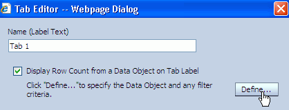
The Tab Modifier Editor dialog box opens. Select a data object and click OK. If desired you can also add a filter to filter the rows in the data object selected in the top section of the dialog.
Indicate the type of content the tab will contain.
Select Report to display a previously created Oracle BAM report in the tab. Then click Browse to locate the report.
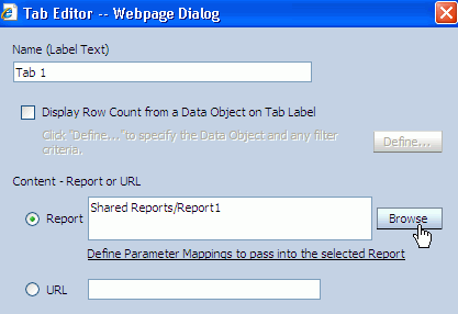
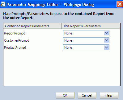
At this point you can define any prompt or parameter values required by the report by clicking Define Parameter Mappings to pass into the selected Report.
Figure 4-7 Parameter Mappings Editor Dialog Box
Note:
To map parameters from the Tab Group to the contained report, you must have already configured parameters (to which to pass the values) in the report containing the Tab Group view.
Select URL to enter a URL for external content, or a URL shortcut for a previously created Oracle BAM report.
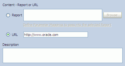
This URL can be an external URL or a shortcut to an Oracle BAM report.
Optionally, enter text to describe the tab in the Description field.
Click OK.
Add more tabs as needed, and click Finish to display the view.
When you add another report to the Tab Group, you can either give the name of the report, or you can provide a copy-shortcut URL of the report. See "Copying Report URLs" for more information.
Dashboard views are dependent upon reports that have been created previously and are ready to be placed in a multiple page format. The benefit of using a dashboard to display reports is the option of displaying a toolbar at the top of the report.
The Dashboard view can also contain prompt and parameter mappings from the Dashboard configuration to the reports contained within it.
To create a Dashboard view:
In a report that you are creating or editing, click the frame of the view to display the selection handles.
If you are creating a report, select the view in the template.
If you are editing an existing view, you might be required to click Change view type.
If you need another view to define, insert a view.
A group of view type icons is displayed.
Select the Dashboard view type.
The View Editor opens.
Select the contents to place in the Dashboard view.
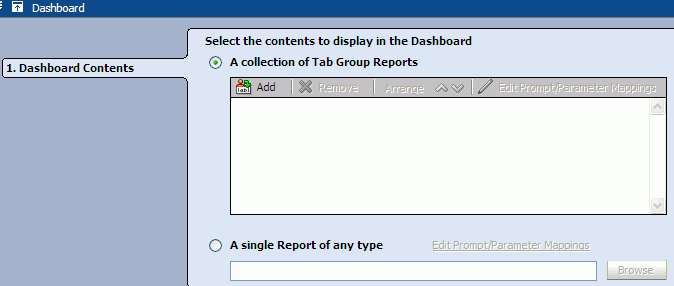
A collection of Tab Group Reports: You can choose a Tab Group report that was created previously.
Click Add, and the Select a Report dialog opens to help you locate the tabbed report to display in the dashboard.

Note that you can edit the prompt and parameter mappings in the selected tab group by clicking Edit Prompt/Parameter Mappings. The Parameter Mappings Editor dialog box opens to configure the mappings (see Figure 4-7).

A single Report of any type: You can choose a single report of any type that was created previously.

Click Browse, and the Select a Report dialog opens to help you locate the report to display in the dashboard.
Note that you can edit the prompt and parameter mappings in the selected report by clicking Edit Prompt/Parameter Mappings. The Parameter Mappings Editor dialog box opens to configure the mappings (see Figure 4-7).
Click Finish.
Click Change View Properties or Formatting Properties to continue working with the view. Other options include toolbar buttons you can add to the Dashboard view. Formatting options include Toolbar, General, Shading, Text & Align, and Font. See "Configuring the Dashboard Toolbar".
Click OK or Apply to display the view.
The Dashboard view has a configurable toolbar. The Toolbar tab in the View Editor enables you to control the contents of the toolbar in the Dashboard view.
This toolbar could contain the following buttons:
Email enables the end-user to email the report to someone.
Print enables the end-user to print the report.
Edit Dashboard opens an Oracle BAM Active Studio window with the current dashboard report in edit mode.
Edit Tab Group opens an Oracle BAM Active Studio window with the current tabbed report from the dashboard in edit mode. This only applies to dashboard reports that contain a tabbed report.
Edit Contents opens an Oracle BAM Active Studio window with the current report from the dashboard edit mode.
Display toolbar
Enabling this property displays the toolbar within the Dashboard view.
Available Controls
A list of the controls available for inclusion in the Dashboard toolbar.
Selected Controls
A list of the controls that have been selected to display in the Dashboard toolbar. Controls can be moved from one list to the other using the arrow buttons. The order of appearance (left to right) is controlled with the up and down arrows located on the right side of the Selected Controls list.
Display Options
Icon and Text Label displays both an icon and a text label for each control on the toolbar.
Icon Only displays only an icon for each control on the toolbar.
Text Only displays only a text label for each control on the toolbar.