Here is an example of a scatter chart.
The chart shows the gross sales and number of cases sold for each business type and varietal.
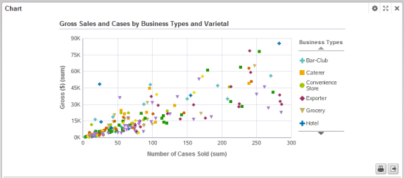
The configuration for this chart is:
| Chart Setting | Value |
|---|---|
| Chart type (subtype) | Scatter/Bubble (Scatter) |
| X axis metric (aggregation) | Number of Cases Sold (sum) |
| Y axis metric (aggregation) | Gross $ (sum) |
| Dimension (color) | Business Types |
| Dimension (detail) | Varietals |
| Sorting | The data points are not sorted, but the legend displays the color dimension values in alphabetical order. |
