For a Tabbed Component Container component, you can add and remove tabs, and determine whether to display a border around the container.
To configure a Tabbed Component Container:
-
On the component edit view, to add a new tab to the component:
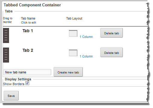
- In the New tab name field, type the name of the new tab.
- Click Create new tab.
-
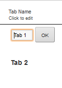
To rename a tab:
-
Click the tab name.
The tab name becomes an editable field.
-
Click the tab name.
-
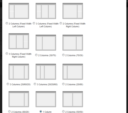
To change the layout of a tab:
-
Click the layout name.
The list of available layouts is displayed, with the current layout selected.
-
Click the layout name.
-
Under
Display Settings, to hide the regular
component border around the
Tabbed Component Container, uncheck the
Show Borders checkbox.
If Show Borders is unchecked, then the Tabbed Component Container title bar and border do not display. The buttons are replaced by links. The change applies both to the end user and edit views.
After configuring the Tabbed Component Container, you can drag other components onto each tab and configure them as usual.
