Here is an example of a bubble chart.
The chart shows the gross sales and number of cases sold for each business type and varietal. The bubble size reflects the number of cases produced.
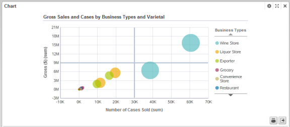
The configuration for this chart is:
| Chart Setting | Value |
|---|---|
| Chart type (subtype) | Scatter/Bubble (Bubble) |
| X axis metric (aggregation) | Number of Cases Sold (sum) |
| Y axis metric (aggregation) | Gross $ (sum) |
| Size metric (aggregation) | Cases Produced (sum) |
| Dimension (color) | Business Types |
| Dimension (detail) | Varietals |
| Sorting | Size metric descending |
