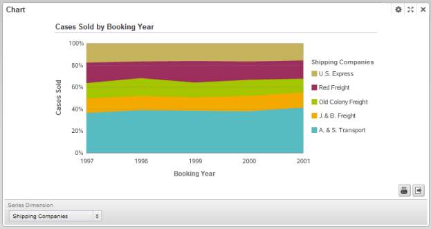
Here is an example of a percentage stacked area chart.
Like the other stacked area example, this chart also shows the number of cases sold for each year, divided by shipping company.
However, with the percentage stacked area, instead of comparing the total values, users compare the relative percentages for each shipping company across the years.
The configuration for this chart is:
| Chart Setting | Value |
|---|---|
| Chart type (Subtype) | Area (Percentage Stacked) |
| Series metric (aggregation) | Cases Sold (sum) |
| Group dimension | Booking Year |
| Series dimension | Shipping Companies |
| Sorting | Group dimension A to Z |
