Data Visualization components, available from the Information Discovery section of the Add Component dialog, provide more detailed or alternate views of the data.
Alerts
Displays messages to users to highlight values for those records. For example, alerts can be used to flag attribute values that fall outside of a specific range.

- Whether users can use an alert to refine the data
- The EQL query for each alert
- The text of the alert messages
Chart
- Bar charts
- Line charts
- Area charts
- Pie charts
- Scatter charts
- Bubble charts
Users may be able to select different metric or dimensions in order to change the chart display.
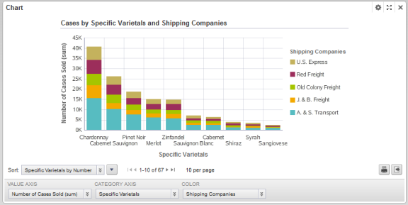
- The chart type
- The dimensions and metrics to display on the chart
- The chart style, including options for displaying the chart legend and axes
- Whether end users can change the chart metrics and dimensions
Map
Displays one or more sets of geographic locations.
Users can search for locations, and display details for a specific location.
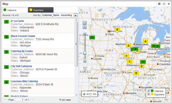
- The available search options
- The lists of locations,
including:
- EQL queries to generate the lists
- Sorting and pagination options
- The attributes to include in the location details
Metrics Bar
Provides a quick view of metrics that summarize various aspects of the data. Users can display additional messages related to the metric value.
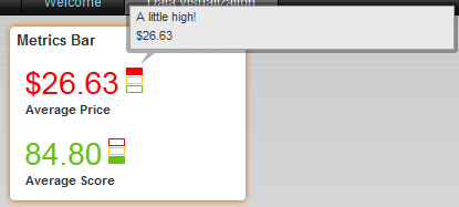
- The EQL queries to generate the metrics
- The format for each metric value
- Rules for displaying the metric value based on the current value
Pivot Table
Generates a table that allows users to perform comparisons and identify trends across several cross sections of data.
Users can export the data to a spreadsheet, and may be permitted to change the table layout.
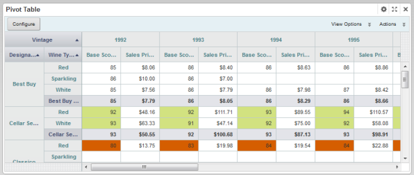
- The metrics and dimensions to display
- Highlighting for specific metric values
- Available actions
- Other display options such as the table height and the column width
Tag Cloud
Displays the distribution of text values for an attribute in the current data. Values that occur more frequently or are more relevant are in larger and bolder type.

When the values are displayed by frequency, the component may instead show the number of matches for each value.

Users may be able to use the values to refine the data.
- The attribute to use
- The number of values to display
- Whether to display values based on frequency or relevancy
- When displaying by frequency, whether to display the number of matches
- Whether users can use the values to refine the data
