Configuring Toolbars
To configure toolbars, use the Toolbar Definition (EOTL_TOOLBAR) component.
This section discusses how to:
Define general toolbar attributes.
Configure toolbar buttons.
Configure component-specific toolbar content.
Specify the default cursor position for pages.
View the toolbar at runtime.
Pages Used to Configure Toolbars
|
Page Name |
Definition Name |
Navigation |
Usage |
|---|---|---|---|
|
Toolbar Definition - Description |
EOTL_TOOLBAR_DEFN |
|
Define general toolbar attributes. |
|
Toolbar Definition - Button |
EOTL_TOOLBAR_BTNS |
|
Configure toolbar buttons. |
|
Toolbar Definition - Content |
EOTL_TOOLBAR_DISP |
Enterprise Components |
Configure component-specific toolbar content. |
|
Toolbar Definition - Focus Fields |
EOTL_TOOLBAR_FFLD |
|
Specify the default cursor position for pages. |
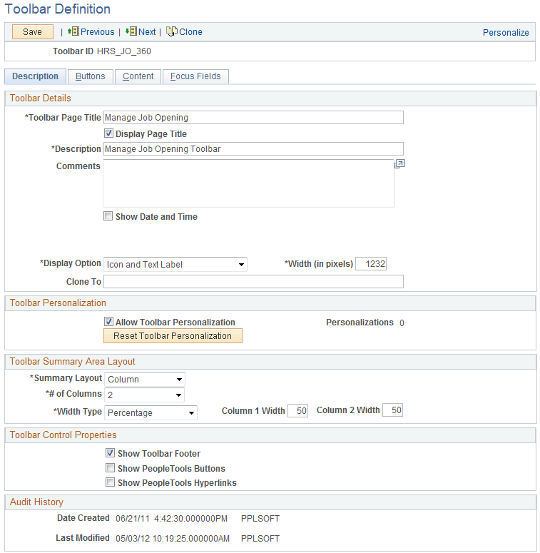
Toolbar Definition - Description Page
Use the Toolbar Definition - Description page (EOTL_TOOLBAR_DEFN) to define general toolbar attributes.
Image: Toolbar Definition - Description page
This example illustrates the fields and controls on the Toolbar Definition - Description page. You can find definitions for the fields and controls later on this page.
| Toolbar ID |
Displays the toolbar's unique identifier. This ID is referenced in PeopleCode to manipulate toolbar properties. |
Toolbar Details
Toolbar Personalizations
Toolbar Summary Area Layout
Toolbar Control Properties
Select to have the toolbar footer, PeopleTools buttons, and PeopleTools links displayed. It is suggested that you disable the PeopleTools buttons and links from being displayed because it may cause confusion to users if the button used for the same function appears twice on a page. When using a new toolbar, it is recommended that you disable the PeopleTools generated folder tabs from the component property settings.
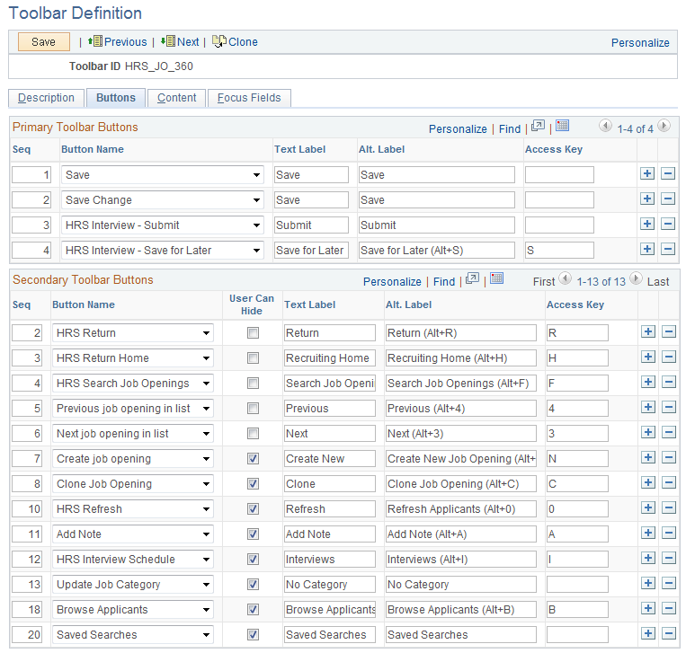
Toolbar Definition - Button Page
Use the Toolbar Definition - Button page (EOTL_TOOLBAR_BTNS) to configure toolbar buttons.
Image: Toolbar Button Definition - Buttons page
This example illustrates the fields and controls on the Toolbar Button Definition - Buttons page. You can find definitions for the fields and controls later on this page.
Toolbar Definition - Content Page
Use the Toolbar Definition - Content page (EOTL_TOOLBAR_DISP) to configure component-specific toolbar content.
Image: Toolbar Definition - Content page
This example illustrates the fields and controls on the Toolbar Definition - Content page. You can find definitions for the fields and controls later on this page.
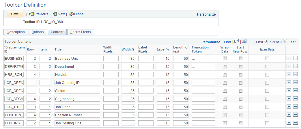
- Display Item ID
-
Enter the ID of the data to appear on the toolbar. The ID and the data that it references come from an array that component PeopleCode populates.
- Row
-
Enter the toolbar row in which the content appears. Row 1 appears under the button bar. If you define display items for additional rows, those rows appear in order under row 1.
- Item
-
Enter the position of the item in the row. Enter 1 for the item that appears in the leftmost position in the row, 2 for the next label to the right, and so forth.
- Title
-
Enter a label for the item.
- Width Pixels, Width %, Label Pixels and Label %
-
Enter the width of the display item label and data in pixels or as a percentage of the total toolbar width. If the latter, be sure that the total percentage for all fields on the same row does not exceed 100%. It is recommended that you indicate widths in percentage because the toolbar layout is adjusted automatically. The general guideline is 20% for the display item label, and 30% for the display item data. If pixel is used (for advanced HTML usage), the total width of all display columns on the same row should not equal or exceed the width of the toolbar as defined.
- Length of text
-
Enter the maximum number of characters of data (not label text) that can appear in this row. The text is truncated with the specified truncation token if it exceeds the length of text value, and is wrapped if it is too long for the width that you specify.
- Truncation Token
-
Enter the characters that indicate truncated data. This appears when the data is longer than the value that you entered in the Length of text field.
- Wrap Data
-
Select to wrap data if its length exceeds what is specified for the text length.
- Start New Row
-
Select if the display item should start on the next new row.
- Span Data
-
Select to let the display item span across horizontally to use the other column to display its long item value. This option is enabled only when Start New Row field is selected.
Toolbar Definition - Focus Fields Page
Use the Toolbar Definition - Focus Fields page (EOTL_TOOLBAR_FFLD) to specify the default cursor position for pages.
Image: Toolbar Definition - Focus Fields page
This example illustrates the fields and controls on the Toolbar Focus Fields Definition page. You can find definitions for the fields and controls later on this page.
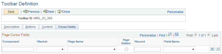
For pages that uses the toolbar, you can specify the field in which the cursor always appears when the page is rendered. The toolbar doesn't set the cursor position for any page that either doesn't have a focus field defined in the toolbar definition or its focus field doesn't exist on the page, for example, the button is hidden, or is removed from the page after the toolbar definition.
Viewing the Toolbar at Runtime
Access any PeopleSoft page that uses the toolbar.
Image: Toolbar used on the Manage Job Opening page (HRS_JO_360)
This example illustrates the toolbar used on the Manage Job Opening page (HRS_JO_360).
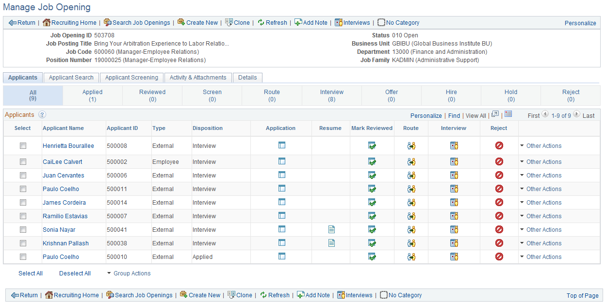
Confirm that the toolbar buttons, content, and other controls work and are displayed as intended.
At runtime, you can find out which toolbar that a page is using (for debugging purposes). To do so, right click on the toolbar area of the page to view the HTML source code, and look for keywords TOOLBAR ID If the page uses the toolbar, a comment appears in the source code that indicate the actual toolbar being used, for example:
<!-- TOOLBAR ID: [HRS_JO_360] -->