A scatter chart is useful for emphasizing scientific or statistical similarities rather than differences in your analysis. Scatter charts illustrate the relationship between pairs of numerical or quantitative values, which are combined into individual data points along the horizontal (y axis) and a vertical (x axis) axis. Data points are plotted in uneven intervals.
A scatter chart represents non-aggregated sources, that is, it retrieves data from the underlying Table/Reports section and does not reflect rolled up values (all other chart types retrieve their data from an aggregated source, and there is a one-to one correspondence between Charts and Pivots). For this reason, the Pivot This Chart feature is not available for a scatter chart.
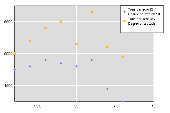
To demonstrate how a scatter chart plots data, see the following two figures. If two data series consisting of tons per acre by degree of latitude are shown in an Excel worksheet, the data is displayed as:

If the two data series a rendered in chart, the data is shown as:

Scatter charts can only contain a pair of fact or numeric values which are placed in the Y Axis and X Axis in the data layout. If you add only one fact item to the data layout, no scatter chart is rendered. In addition, label values cannot be added to the Y Axis or X Axis of the data layout.
The zoom feature is available from the View menu when you need to zoom in a selected are of the plotted scatter chart.
The following feature limitations apply to scatter charts:
Data functions are not available to scatter charts because this type of chart relies on non-aggregated data.
The sort feature cannot be used for scatter chart items.
The Pivot To Chart feature is not available.
Drilling cannot be performed on a scatter chart.
The focus feature cannot be used on scatter chart items.
The Hide feature hides the whole data series in a scatter chart, and an individual item cannot be hidden.
 To create a scatter chart:
In the Section pane, select the Chart in which to generate the scatter chart.
Drag a fact value from Elements to the Y Axis of the data layout.
A pair of fact values must be added to the data layout to create a scatter chart. Multiple pairs of facts can be added. If only one fact value is added to the data layout, no chart is rendered.
Drag a fact value from Elements to the X Axis of the data layout.
 To show grid lines on the scatter chart, click the plot area of the chart and select Show X Axis Grid Lines or Show Y Axis Grid lines.
 To zoom in on data value, click and hold your mouse button and drag to draw a selection rectangle around the data values that you want to zoom in
You can also select View, then Zoom, and then Zoom In.
Once the view is zoomed out, you can pan areas to the left, top, right, and bottom of the chart.
If the view is zoomed out to the maximum, no shortcut menu is available.