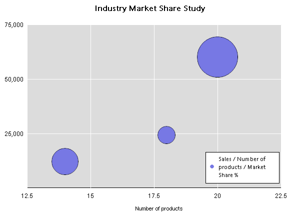
Bubble charts are typically used to show three dimensions of data in a two dimensional chart. This type of chart often lends itself to the display of financial data because specific values can be visually represented in your chart by different bubble sizes. It is similar to scatter chart allowing you to plot data as a collection of bubbles. Bubble charts plot three values:
a value set on the x-axis
a value set on the y-axis
a value that defines the size or width dimension of a bubble in proportion to the amount of data
For example, the worksheet in the following picture contains values for three types of facts: number of products, dollar value of sales, and percentage size of market share.

In the following bubble chart, the size of the bubble corresponds to the values in the third column of the sample data (Market share %):

Multiple data values can be plotted in the bubble chart.
Bubbles with zero size can rendered using some small bubble size to prevent them from disappearing. Also there is an option can be provided to hide zero-size values if necessary.
Bubbles with negative values can also be displayed. These type of values are derived from their real absolute value, and the real negative value is depicted in the data label (although based on the positive value). You can optionally select not to show negative values.
The zoom feature is available from the View menu when you need to zoom in a selected are of the plotted bubble chart.
The following feature limitations apply to bubble charts:
Data functions are not available to bubble charts because this type of chart relies on non-aggregated data.
The sort feature cannot be used for bubble chart items.
The Pivot To Chart feature is not available.
Drilling cannot be performed on a bubble chart.
The focus feature cannot be used on bubble chart items.
The Hide feature hides the whole data series in a bubble chart, and an individual item cannot be hidden.
 To show grid lines on the scatter chart, click the plot area of the chart and select Show X Axis Grid Lines or Show Y Axis Grid lines.
 To zoom in on data value, click and hold your mouse button and drag to draw a selection rectangle around the data values that you want to zoom in
Once zoomed in, the text: “Partial View” is displayed in the upper left of the chart.
Once the view is zoomed out, you can pan areas to the left, top, right, and bottom of the chart.
If the view is zoomed out to the maximum, no shortcut menu is available.