Gauges and (Live) Charts enable you to transform the Interactive Reporting data set into Adobe Flash based graphics. They are snapshots of real time data graphically embedded in the Dashboard section. When you need to present compact data driven visuals, use these objects to develop the solution.
Interactive Reporting offers four types of gauges, six types of (Live) Charts, and a Slider control.
Available gauges are:
Speedometer
Thermometer
Bullet
Traffic Light
Available (Live) Charts are:
(Live) Bar Chart (in cluster, stack or 100% formats)
(Live) Block Chart (in pyramid or cone formats)
(Live) Funnel Chart
(Live) Line Chart (in line or area formats)
(Live) Pie Chart (in pie or donut formats)
(Live) Radar Chart
The XML template drives the overall appearance of gauges and (Live) Charts. The template provides a consistent look, and each object inherits the properties specifically defined for it by the template. It is provided in the installed version of Interactive Reporting. Many properties of each object can be changed without editing the template directly. For example you can select a gauge theme, choose the type of a (Live) Chart (cluster, stack or 100% stack for a (Live) Bar chart), or define which labels and values are rendered.
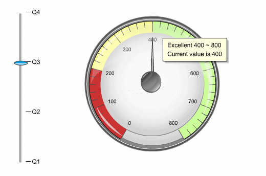
Below is an example of a Speedometer gauge (right) which has been associated with a Slider (left).
Note: | Adobe Flash must already be installed before you can display the gauges and (Live) Charts in Interactive Reporting. See the epm_install_start_here.pdf for more information. |