The Chart component supports several types of charts, and can include options for users to select the specific data to display.
The supported chart types are:
| Chart Type | Description |
|---|---|
| Pie chart | A pie chart shows a single series metric
aggregated across a group dimension.
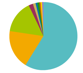 For example, a pie chart could show the number of transactions for each region. Pie charts are good for doing a quick assessment of how each value contributes to the whole. The values are displayed as a pie wedge for each group dimension value. The size of the wedge reflects the relative size of the metric value. |
| Bar chart (basic) | Basic bar charts show one or more series
metric values aggregated across a single group dimension.
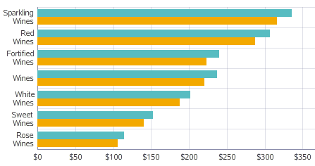
For example, a bar chart could show both the total sales and projected sales for each region. Bar charts are good for more precise comparisons of one or more values. On a basic bar chart, for each group dimension value, the series metric values are displayed as a cluster of bars. Each series metric value may be subdivided using a series dimension value. For example, the chart could show the total sales and projected sales per region for each product line. If there is a series dimension, then for each group dimension value, the chart displays a separate bar for each combination of series metric and series dimension. |
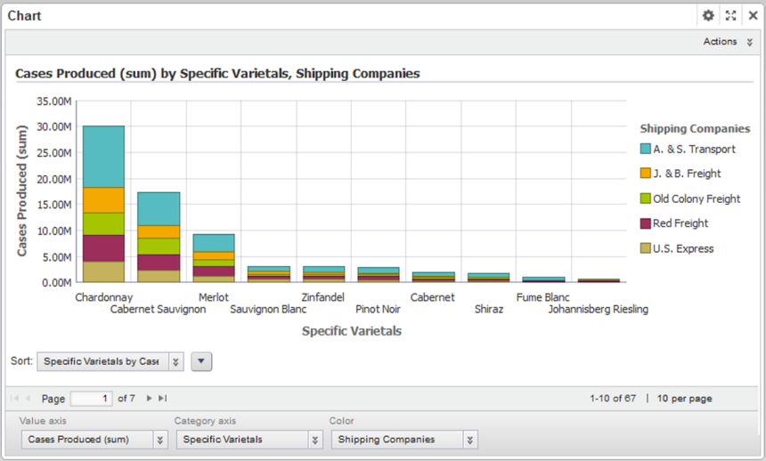
| Bar chart (stacked) | Like basic bar charts, stacked bar charts
also show one or more series metric values aggregated across a single group
dimension.
However, instead of displaying a cluster of bars for each metric, the chart creates sections within a single bar. 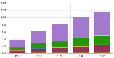
The stacked bar chart is useful if it is important to see the total value for the series metric. |
| Line chart | Line charts show one or more series metric
values aggregated across a single group dimension.
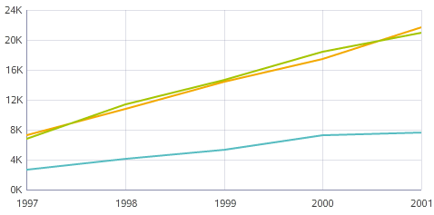
For example, a line chart could show the change in total sales and the change in sales margins over several years. Line charts are usually designed to show changes or trends. For each group dimension value, the series metric value is a data point on the line. Each metric is plotted on a separate line. Each series metric value may be subdivided using series dimensions. For example, the chart could show the change in total sales per year for each region. Each combination of series metric and series dimension displays as a separate line on the chart. |
| Area chart | Area charts are similar to line charts, but
display a shaded area instead of a single line.
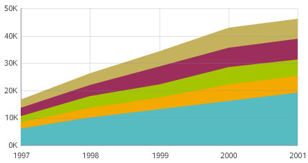
For each group dimension value, the series metric value is a data point along the top of the shaded area. Multiple metrics are represented by multiple stacked shaded areas. Each series metric value may be subdivided further using a series dimension. |
| Bar-Line chart | Bar-Line charts show two or more series
metric values aggregated across a single group dimension.
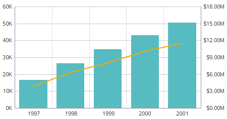
The values for some metrics are displayed as bars, and the values for others as lines. In the single-axis version of the chart, both the bars and lines are plotted against the left vertical axis. If the lines and bars have different scales, then you can use the dual-axis version, where the bars are plotted against the left vertical axis and the lines against the right vertical axis. |
| Scatter chart | Scatter charts display data points, with
each point representing a dimension value.
The color dimension determines the number of colors, and the detail dimension controls the number of points in each color. Each color also uses a different shape. The location of each data point corresponds to the values of the X-axis and Y-axis metrics. 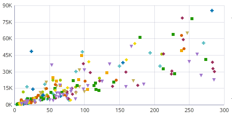 Scatter charts allow you to show correlations between metrics. Hovering the mouse over a data point displays the complete set of dimension and metric values for that point. |
| Bubble chart | Bubble charts are similar to scatter charts,
but display data points as bubbles, with each bubble representing a dimension
value. The color dimension controls the number of colors, and the detail
dimension controls the number of bubbles in each color.
The location of each bubble corresponds to the values of the X-axis and Y-axis metrics. The size of each bubble indicates the relative value of a third metric. 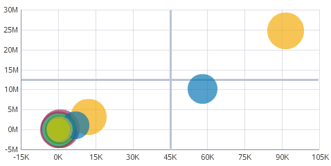 Bubble charts allow you to show correlations among multiple metrics. Hovering the mouse over a bubble displays the complete set of dimension and metric values for that bubble. |
