Data visualization components provide more detailed or alternate views of the data.
Chart
- Bar charts
- Line charts
- Area charts
- Pie charts
- Scatter charts
- Bubble charts
Users may be able to select different metric or dimensions in order to change the chart display. They can also save the currently displayed chart as an image.
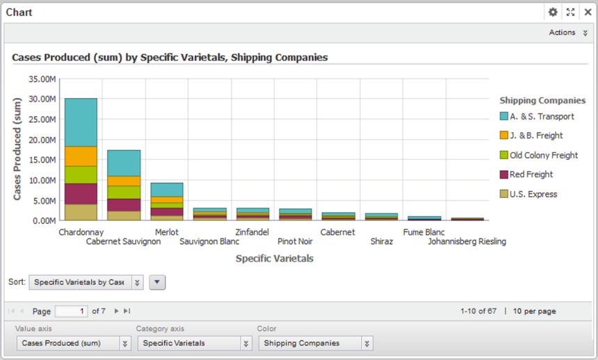
- The chart type
- The dimensions and metrics to display on the chart
- The chart style, including options for displaying the chart legend and axes
- Whether end users can change the chart metrics and dimensions
Map
Displays one or more map layers. Each layer represents a set of geographic locations.
Users can search for locations, and display details for a specific location.
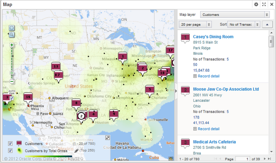
- The lists of locations,
including:
- The geocode attribute representing the location
- Display options for the map layer points
- Sorting and pagination options
- The attributes to include in the location details
- The available search options
Pivot Table
Generates a table that allows users to perform comparisons and identify trends across several cross sections of data.
Users can export the data to a spreadsheet, and may be permitted to change the table layout.
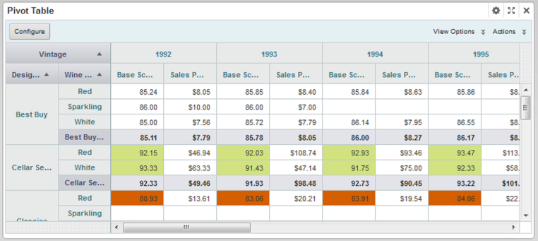
- The metrics and dimensions to display
- Highlighting for specific metric values
- Available actions
- Other display options such as the table height and the column width
Summarization Bar
Display a set of summary items that contain summary values from the data. A summary value can be a metric (such as average sales), a dimension value associated with the lowest or highest value of a metric (such as the region with the highest sales), or a number of flags. Flags indicate dimension values for which associated metric values have passed a specified threshold.
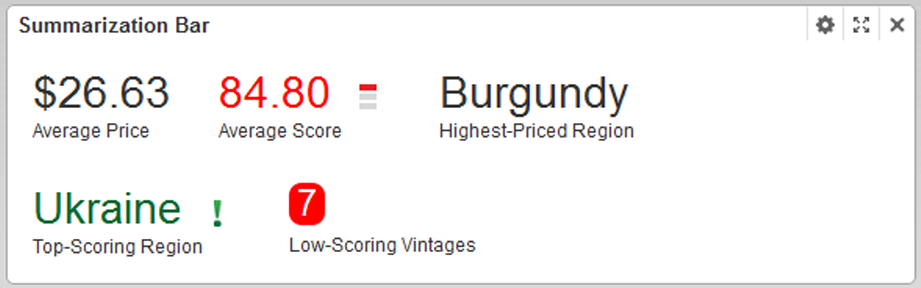
- The metric and dimension values to display
- Conditional formatting to highlight the summary item for specific ranges of metric values
- The text size for the summary item title and value
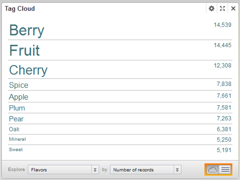
Tag Cloud
Displays a distribution of terms based on the value of an associated metric. The font size reflects the metric value. The higher the metric value, the larger the font.
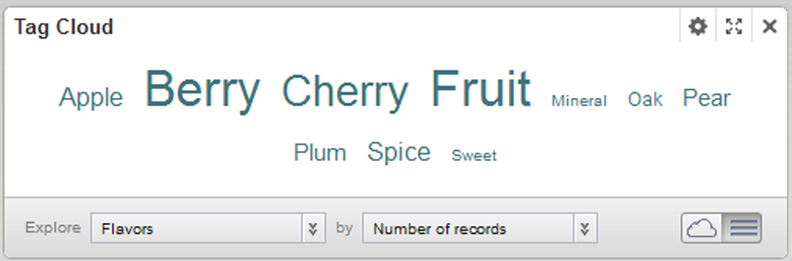
The component can display in cloud view, with the terms in alphabetical order, or in list view, with the terms ordered by the metric value.
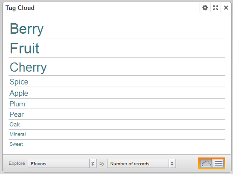
For both formats, the Tag Cloud can display the associated metric value:
Users can refine by the displayed terms.
- The available dimensions (Tag Cloud terms) and metrics (values used to organize the terms)
- Whether to display the metric value next to each Tag Cloud term
- The number of terms to display
- The default display format (cloud of list)
- The range of text sizes for the displayed terms
