For each axis on a Bar, Line/Area, Bar-Line, or Scatter/Bubble chart, you can configure how the axis displays. This includes whether to display lines, gridlines, titles, and labels. For a Pie chart, there is no axis configuration.
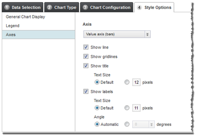
On the Style Options tab, to configure the display of each axis:
-
Click the
Axes section heading.
-
For each axis, the settings are:

Setting Description Show line If this checkbox is checked for an axis, then the chart displays a line for that axis. Show gridlines If this checkbox is checked for an axis, then the chart displays gridlines for the axis. Show title If this checkbox is checked for an axis, then the chart displays a title for the axis. If you are displaying the axis title, then use the Text size setting to determine the size of the axis title text.
Show labels If this checkbox is checked for an axis, then labels are displayed on the axis. For the category axis, the labels are the group dimension values. For the value axes, the labels are interval values based on the scale needed for the displayed series metric values.
If you are displaying the axis labels, then:
- Use the Text size setting to determine the size of the label text.
- Use the
Angle setting to determine the
angle of the label text.
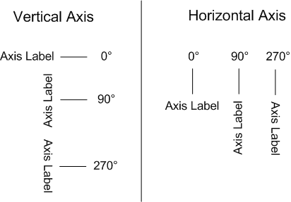
If you do not have Studio automatically determine the angle, then the available values are 0, 90, and 270.
The angles work as follows: