On the Chart Type tab, you select the type of chart you want to create.
When you select a chart type, you may be prompted to also select the specific chart subtype within the selected type.
On the Chart Type tab, to select the chart type and subtype:
-
Under
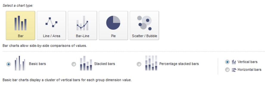
Select a chart type, click the image
representing the type of chart you want to create.
- Bar
- Line/Area
- Bar-Line
- Pie
- Scatter/Bubble
-
If you selected the
Bar chart type:
-
Click the radio button to select the chart subtype:
Chart Subtype Description Basic bars Displays each combination of series metric and series dimension values as a separate bar. The bars are clustered for each group dimension value.
Stacked bars Displays a single bar for each group dimension value. Each bar contains a section for each combination of series metric and series dimension values.
Percentage stacked bars Displays a single bar for each group dimension value. The bars are all the same height. Each bar contains a section for each combination of series metric and series dimension values.
The size of each bar section reflects the percentage of the total series metric value for that combination of series metric and series dimension.
You would use this if you are more interested in the relative values than the exact values.
- Click the radio button to indicate whether to create vertical bars or horizontal bars.
-
Click the radio button to select the chart subtype:
-
If you selected the
Line/Area chart type, click the radio button
to select the chart subtype:
Chart Subtype Description Basic lines Displays a separate line for each combination of series metric and series dimension values. Each line has a data point for each group dimension value. If there are missing data points, then the line may have breaks or may be missing.
Stacked area Displays a shaded area showing the total of the series metric values for each group dimension value. The shaded area is divided into sections for each combination of series metric and series dimension values.
Percentage stacked area Displays a shaded area. The height of the shaded area is uniform. For each group dimension value, the shaded area is divided into sections to show the percentage of the total series metric value for each combination of series metric and series dimension value.
-
If you selected the
Bar-Line chart type, click the radio button to
indicate whether to create a single axis or dual axis chart.
For a dual axis chart, the bars are plotted against the primary (left) value axis, and the lines are plotted against the secondary (right) value axis. Dual-axis charts are used to compare trends between metrics that have a different scale. For example, the gross sales may be in the millions of dollars, but the number of sales may only be in the thousands.
- If you selected the Pie chart type, there are no subtypes.
-
If you selected the
Scatter/Bubble chart type, click the radio
button to select the chart subtype:
Chart Subtype Description Scatter Displays a separate scatter point for each combination of color dimension and detail dimension values. Each color also uses a different shape. The scatter point locations reflect the associated X-axis and Y-axis metric values.
Bubble Displays a separate bubble for each combination of color dimension and detail dimension values. The bubble locations reflect the associated X-axis and Y-axis metric values.
The bubbles can also be different sizes to reflect the relative value of a third bubble size metric.
