Setting the Chart Type

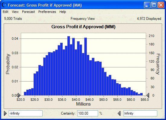
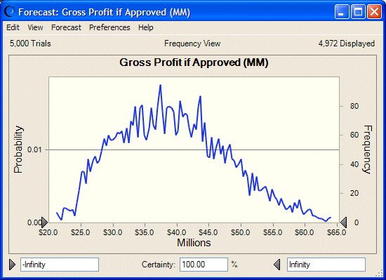
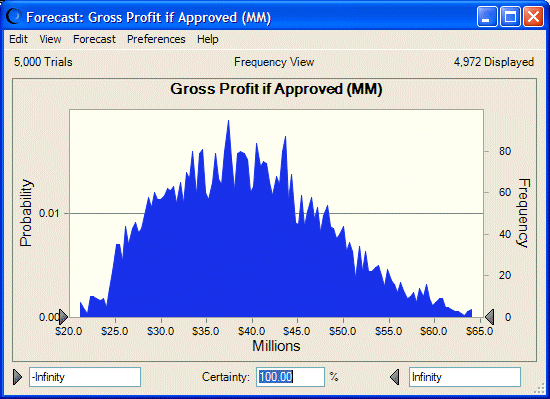
Depending on the basic chart type (assumption, forecast, trend, overlay, or sensitivity), you can select from among several chart display types, such as column, line, area, bar, or pie.

  To change the chart display type:

  1. Select the Chart Type tab of the Chart Preferences dialog.

    If more than one series is displayed in the list box at the top of the tab, the settings on the tab apply to the selected series.

  2. To change the chart display type, open the Type drop-down list and select a display type. Depending on the basic chart and series types, you can select from among these display types (not including scatter charts):

    Table 7. Chart Types  

    Example

    Type

    Description

    Column Chart

    Column

    Displays data as vertical columns that correspond to the group intervals (chart bins) of the data. The column chart is the default chart type for generated data in assumption, forecast, and overlay charts.

    Line Chart

    Line

    Shows data as an outline of the peaks and valleys.

    Area Chart

    Area

    Shows data as darkened peaks and valleys.

    Directional Bar Chart

    Bar (directional)

    Shows sensitivity data as horizontal bars to the right and left of the 0 line showing magnitude and direction of sensitivity

    Magnitude Bar Chart

    Bar (magnitude)

    Shows sensitivity data as horizontal bars to the right of the 0 line showing magnitude of sensitivity but not direction

    Pie Chart

    Pie

    Shows sensitivity data as a circle divided into proportional “slices” showing the magnitude of sensitivity

  3. Optional: Consider adjusting the chart color (Setting Chart Colors) and marker line settings (Showing the Mean and Other Marker Lines) too.

  4. When settings for the current series are complete, follow steps 2 through 3 to customize settings for any other series in the chart.

  5. When all settings are complete, click OK.