Changing the Chart Density
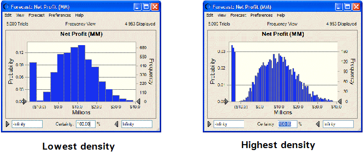
You can show more or less detail in a chart by changing the number of bins (intervals) used to group similar values. The level of detail is called the chart density. Higher densities more accurately reflect the actual distribution of data; lower densities highlight the data trend.
 To change the chart density:
Display the General tab of the Chart Preferences dialog.
Select a density level from the Density drop-down list.
To show a space between each column (bin) select Show Column Gaps.
Gaps will always be displayed in a discrete distribution.
Change another setting or click OK.