
| Tag Name: | <af:panelDashboard> |
| Java Class: | oracle.adf.view.rich.component.rich.layout.RichPanelDashboard |
| Component Type: | oracle.adf.RichPanelDashboard |
panelDashboard features:
<af:panelDashboard id="theDashboard"
binding="#{demoDashboard.theDashboard}"
columns="3" rowHeight="175px"
dropListener="#{demoDashboard.handleReorder}">
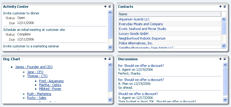
<af:panelBox id="box1" text="Box 1">
<af:componentDragSource/>
<af:outputText value="Here is some content" id="ot1"/>
</af:panelBox>
<af:panelBox id="box2" text="Box 2">
<af:componentDragSource/>
<af:outputText value="Here is some content" id="ot2"/>
</af:panelBox>
<af:panelBox id="box3" text="Box 3">
<af:componentDragSource/>
<af:outputText value="Here is some content" id="ot3"/>
</af:panelBox>
<af:panelBox id="box4" text="Box 4">
<af:componentDragSource/>
<af:outputText value="Here is some content" id="ot4"/>
</af:panelBox>
</af:panelDashboard>
|
|
|
| Type | Phases | Description |
|---|---|---|
| org.apache.myfaces.trinidad.event.AttributeChangeEvent | Invoke Application, Apply Request Values |
Event delivered to describe an attribute change. Attribute change events are not delivered for any programmatic change to a property. They are only delivered when a renderer changes a property without the application's specific request. An example of an attribute change event might include the width of a column that supported client-side resizing. |
| Name | Type | Supports EL? | Description |
|---|---|---|---|
| attributeChangeListener | javax.el.MethodExpression | Only EL | a method reference to an attribute change listener. Attribute change events are not delivered for any programmatic change to a property. They are only delivered when a renderer changes a property without the application's specific request. An example of an attribute change events might include the width of a column that supported client-side resizing. |
| binding | oracle.adf.view.rich.component.rich.layout.RichPanelDashboard | Only EL | an EL reference that will store the component instance on a bean. This can be used to give programmatic access to a component from a backing bean, or to move creation of the component to a backing bean. |
| clientComponent | boolean | Yes | Default Value: false whether a client-side component will be generated. A component may be generated whether or not this flag is set, but if client Javascript requires the component object, this must be set to true to guarantee the component's presence. Client component objects that are generated today by default may not be present in the future; setting this flag is the only way to guarantee a component's presence, and clients cannot rely on implicit behavior. However, there is a performance cost to setting this flag, so clients should avoid turning on client components unless absolutely necessary. |
| columns | int | Yes | Default Value: 3 the number of columns the width of the dashboard will be divided into |
| customizationId | String | Yes | This attribute is deprecated. This attribute will be removed in the next release. Use the 'id' attribute instead. This attribute is deprecated. The 'id' attribute should be used when applying persistent customizations. This attribute will be removed in the next release. |
| dimensionsFrom | String | Yes | Valid Values: auto, children, parent Default Value: parent determines how the component will handle geometry management. This specifies where the dimensions of the decorativeBox come from:
If the oracle.adf.view.rich.geometry.DEFAULT_DIMENSIONS context-param is set to "auto" in the project's web.xml, the default value for this attribute will be "auto". Otherwise, the default value will be "parent". |
| dropListener | javax.el.MethodExpression | Only EL | A method reference to a callback with the signature oracle.adf.view.rich.dnd.DnDAction method(oracle.adf.view.rich.event.DropEvent dropEvent) called when a drop occurs on the component. Since the panelDashboard will automatically adjust the positions of its children in the browser, this method should return DnDAction.NONE if your handler is successful in adjusting the position of the reordered children since this will cause the panelDashboard to be left as is. If you return DnDAction.MOVE, the panelDashboard will be redrawn. You may wish to use org.apache.myfaces.trinidad.change.ReorderChildrenComponentChange and ChangeManager().addComponentChange() if you wish to preserve a new ordering of the children. Ideally, you should use an MDS ChangeManager to persist the change longer than the user's session so that the use does not have to repeatedly make the same reorder gesture every time your application is used. The dropEvent.getDropSiteIndex() method will give you the location that the user desires the dragged component to end up at. Use dropEvent.getTransferable().getData(DataFlavor.UICOMPONENT_FLAVOR) to get the dragged component. |
| id | String | No | the identifier for the component. Every component may be named by a component identifier that must conform to the following rules:
|
| inlineStyle | String | Yes | the CSS styles to use for this component. This is intended for basic style changes. The inlineStyle is a set of CSS styles that are applied to the root DOM element of the component. Be aware that because of browser CSS precedence rules, CSS rendered on a DOM element takes precedence over external stylesheets like the skin file. Therefore skins will not be able to override what you set on this attribute. If the inlineStyle's CSS properties do not affect the DOM element you want affected, then you will have to create a skin and use the skinning keys which are meant to target particular DOM elements, like ::label or ::icon-style. |
| partialTriggers | String[] | Yes | the IDs of the components that should trigger a partial update. This component will listen on the trigger components. If one of the trigger components receives an event that will cause it to update in some way, this component will request to be updated too. Identifiers are relative to the source component (this component), and must account for NamingContainers. If your component is already inside of a naming container, you can use a single colon to start the search from the root of the page, or multiple colons to move up through the NamingContainers - "::" will pop out of the component's naming container (or itself if the component is a naming container) and begin the search from there, ":::" will pop out of two naming containers (including itself if the component is a naming container) and begin the search from there, etc. |
| rendered | boolean | Yes | Default Value: true whether the component is rendered. When set to false, no output will be delivered for this component (the component will not in any way be rendered, and cannot be made visible on the client). If you want to change a component's rendered attribute from false to true using PPR, set the partialTrigger attribute of its parent component so the parent refreshes and in turn will render this component. |
| rowHeight | String | Yes | Default Value: 100px the height of the rows of the grid layout as a CSS length. If dimensionsFrom resolves to "children", percent units are not allowed and the default value is used instead. |
| shortDesc | String | Yes | the short description of the component. The shortDesc text may be used in two different ways, depending on the component.
For components with images, the shortDesc is often used to render an HTML alt attribute for the image. Please see the accessibility guidelines section for correct alt text usage of the shortDesc attribute. shortDesc is also commonly used to render an HTML title attribute, which is used by user agents to display tooltip help text. In this case the behavior for the tooltip is controlled by the user agent, e.g. Firefox 2 truncates long tooltips. For form components, the shortDesc is displayed in a note window. For components that support the helpTopicId attribute and are not using the shortDesc as image alt text, it is recommended that helpTopicId is used instead of shortDesc as it is more flexible and provides more accessible descriptive text than the use of the title attribute. |
| styleClass | String | Yes | a CSS style class to use for this component. The style class can be defined in your jspx page or in a skinning CSS file, for example, or you can use one of our public style classes, like 'AFInstructionText'. |
| unsecure | java.util.Set | Yes | A whitespace separated list of attributes whose values ordinarily can be set only on the server, but need to be settable on the client. Currently, this is supported only for the "disabled" attribute. Note that when you are able to set a property on the client, you will be allowed to by using the the .setProperty('attribute', newValue) method, but not the .setXXXAttribute(newValue) method. For example, if you have unsecure="disabled", then on the client you can use the method .setProperty('disabled', false), while the method .setDisabled(false) will not work and will provide a javascript error that setDisabled is not a function. |
| visible | boolean | Yes | Default Value: true the visibility of the component. If it is "false", the component will be hidden on the client. Unlike "rendered", this does not affect the lifecycle on the server - the component may have its bindings executed, etc. - and the visibility of the component can be toggled on and off on the client, or toggled with PPR. When "rendered" is false, the component will not in any way be rendered, and cannot be made visible on the client. In most cases, use the "rendered" property instead of the "visible" property. Not supported on the following renderkits: org.apache.myfaces.trinidad.core |