Big Data Discovery provides several types of charts to use to visualize data and the distribution of data values.
Box Plot
A Box Plot provides a capsule summary of values for a metric for each value of another attribute. For example, you can show a summary of the values for Number Ordered against each value of Product Category.
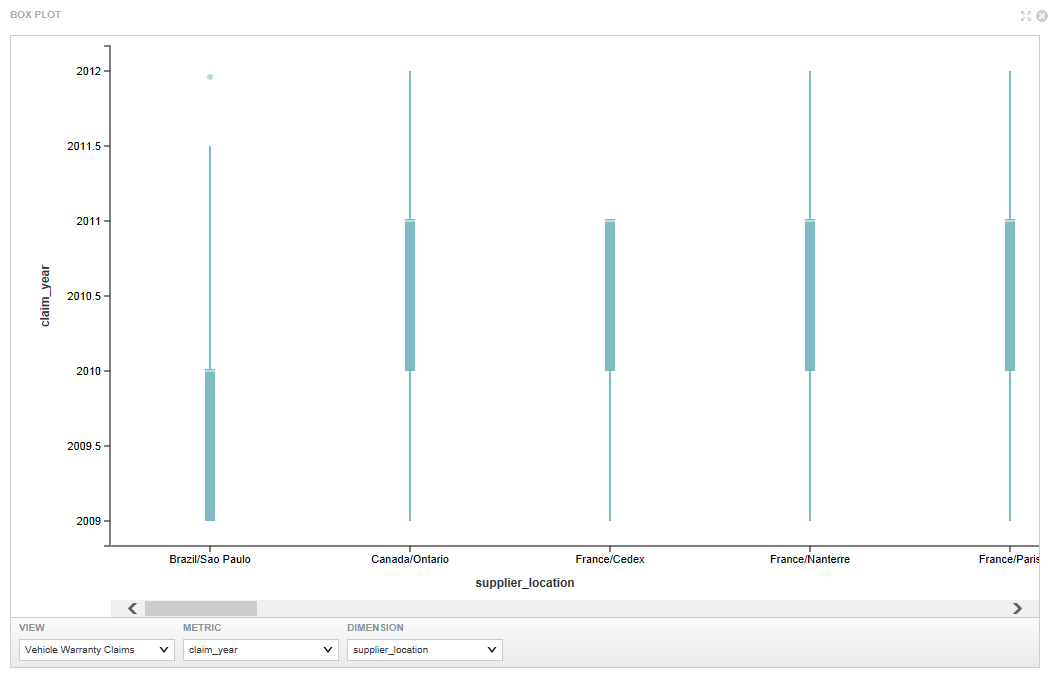
- The view to use
- The metric to plot on the Y axis
- The dimension to plot on the X axis
Chart component
- Bar charts
- Line charts
- Area charts
- Pie charts
- Scatter charts (including binning as an option to scatter charts)
- Bubble charts
Users may be able to select different metric or dimensions in order to change the chart display. They can also save the currently displayed chart as an image.
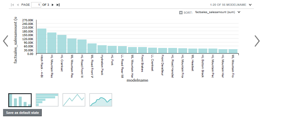
- The chart type
- The dimensions and metrics to display on the chart
- The chart style, including options for displaying the chart legend and axes
- Whether end users can change the chart metrics and dimensions
Histogram Plot
A Histogram Plot is a basic visualization for showing the distribution of values for a single metric. The values are grouped into bins, each representing a range of values. Users can then see the number of values within each range.
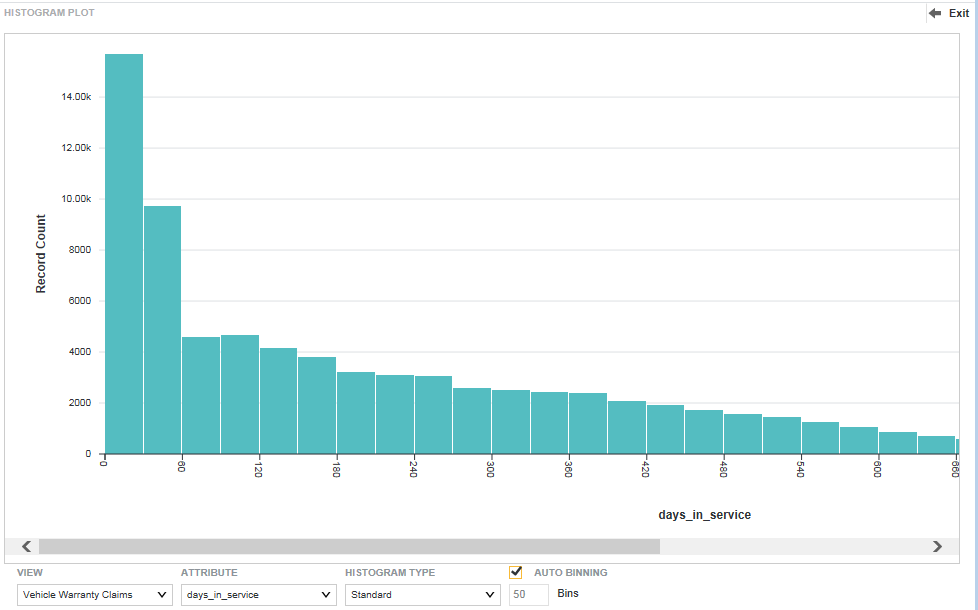
- The view to use for the chart data
- The metric to plot on the X axis
- The type of histogram to display
- The number of bins to display on the X axis
Parallel Coordinates Plot
The Parallel Coordinates Plot plots the values of multiple metrics for each value of a single dimension.
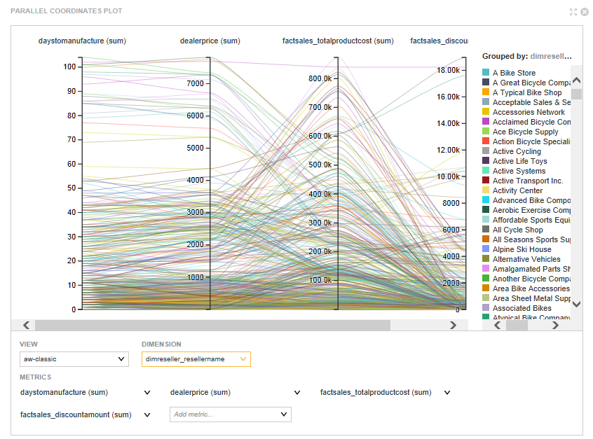
- The view to use for the chart data
- The metrics to display on the chart. For each metric, you also select the aggregation method to use.
- The dimension to use
