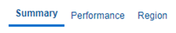
This chapter explains the reports available under each tab in the Corporate Performance Dashboard.
The following tabs are present in the Corporate Performance Dashboard:
· Corporate Performance Summary
· Lines of Business Performance
The following screenshots display the essential nature of the available reports as per each tab:
Figure 260: Corporate Performance Dashboard Tabs
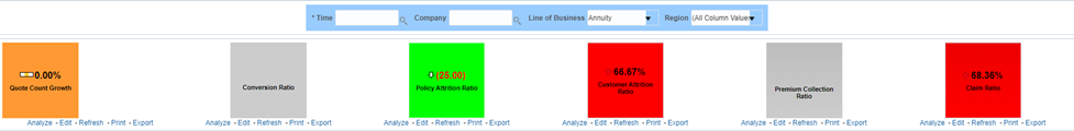
The Corporate Performance Summary tab includes information at the corporate level. The information contained in the reports generated summarizes how the entire organization is performing. The filters for this tab include:
· Time
· Company
Line of BusinessesThe various reports available under this tab is discussed in the following sections.
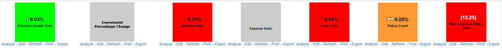
This report shows snapshots of key performance indicators represented through flash boxes for the current period.
Figure 261: Key Performance Indicators Flash
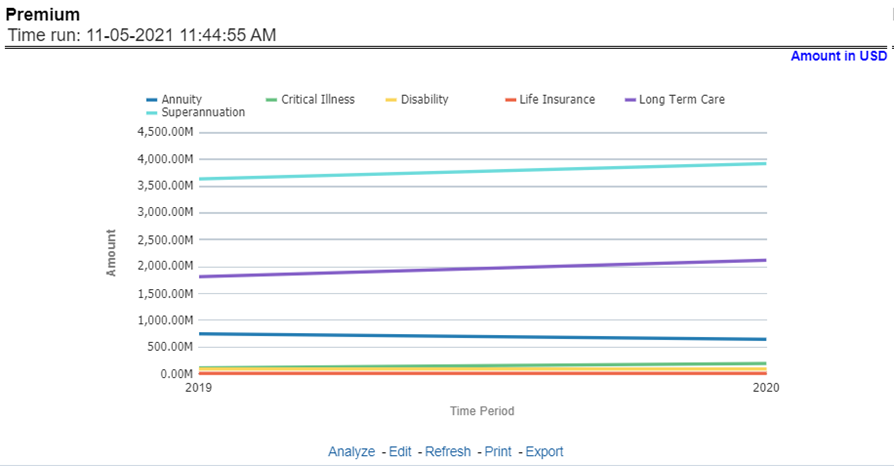
This report shows premium revenue across all lines of businesses and underlying products through a time series. This report can be viewed over various periods, entities, and regions Line of Businesses selected from page-level prompts.
Figure 262: Premium
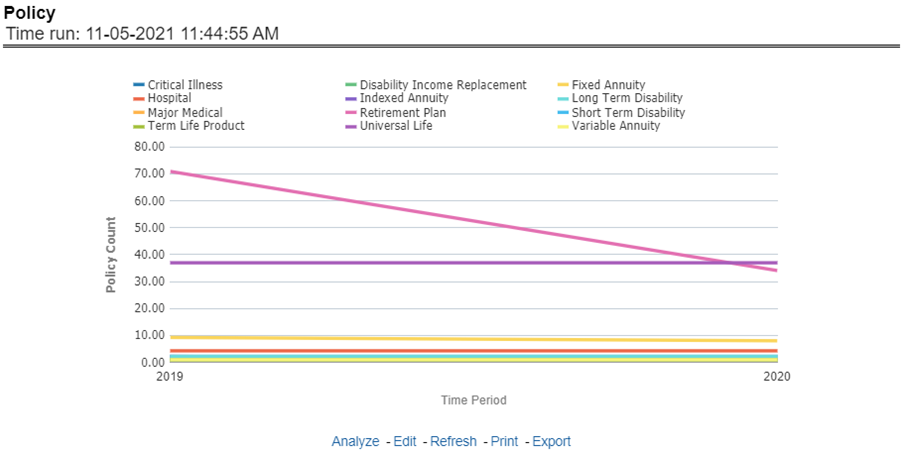
This report shows policy-related expenses across all lines of businesses and underlying products through a time series. This report can be viewed over various periods, entities, and regions selected from page-level prompts.
Figure 263: Policy
This report shows investment revenue across all lines of businesses and underlying products through a time-series graph. This report can be viewed over various periods, entities, and regions Line of Businesses selected from page-level prompts.
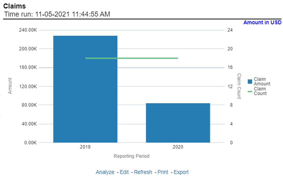
This report shows expense towards claim payments across all lines of businesses and underlying products through a time series. This report can be viewed over various periods, entities, and region Line of Businesses selected from page-level prompts.
Figure 264: Claims
This report shows policy-related expenses across all lines of businesses and underlying products through a time series. This report can be viewed over various periods, entities, and regions Line of Businesses selected from page-level prompts.
Figure 265: Expenses
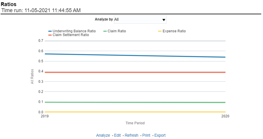
This report shows key business indicator ratios across all lines of businesses and underlying products through a time series. The key ratio indicator report contains various report level filters such as Claim Ratio, Expense Ratio, Claim Settlement Ratio, and Underwriting Balance Ratio, and can be viewed by individual ratio or all ratios together. This report can be analyzed over various periods, entities, and regions Line of Businesses selected from page-level prompts.
Figure 266: Ratios
All reports on this tab focus on the policy performance perspective. The reports represent business performance through a policy performance perspective. The filters of this tab include:
· Time
· Company
· RegionLine of Business
· Product
The various reports available under this tab are discussed in the following sections.
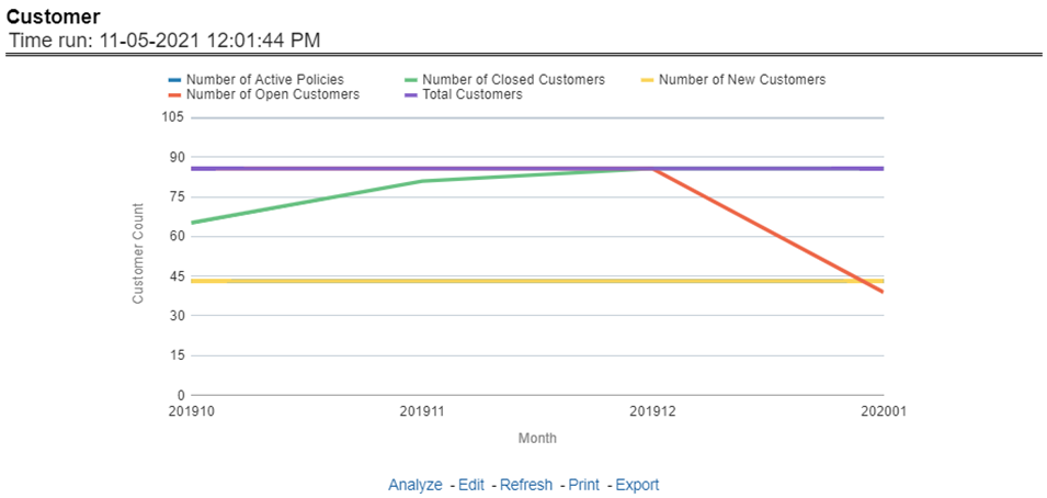
This trend report provides enterprise-wide performance with customer and policy information overtime a period. Various performance metrics-based measures, for example, the Number of New Customers, Number of Closed Customers, and so on for the reporting period selected, are compared with the previous periods and displayed. It shows enterprise performance through customers and policies. This report can be viewed and tracked through control areas like Time, Company, and Region, Line of Business, and Product.
Figure 267: Customer
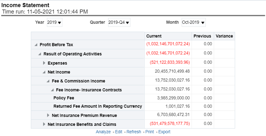
At an enterprise level, performance through various financial indicators can be tracked through an Income Statement. This helps to understand the company's financial position at a given point in time. This report can be analyzed over various periods, entities, and Region, LOB, and Products selected from page-level prompts. The values are in a table.
Figure 268: Income Statement
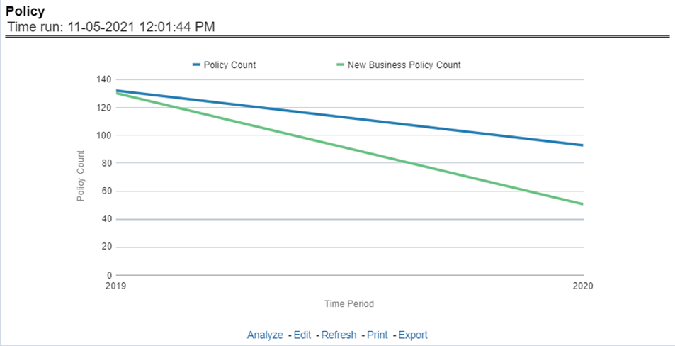
This report shows counts of policies and count of new business policies for all lines of businesses and underlying products through a time series. This report can be analyzed over various periods, entities, and regions, LOB, and products selected from page-level prompts.
Figure 269: Policy
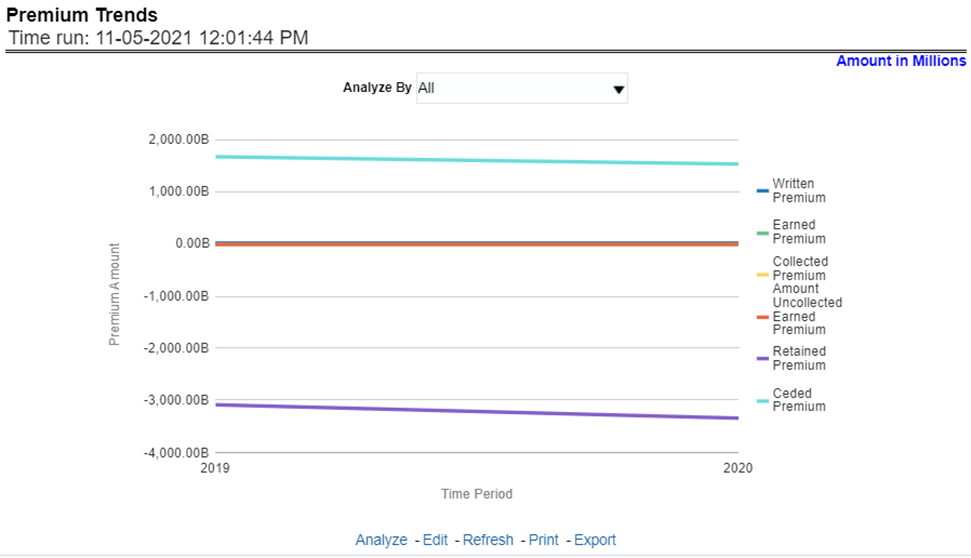
This report shows a trend in revenue through different types of premium, for example, Written Premium, Earned Premium, and Ceded Premium, at an enterprise level, for all lines of businesses and underlying products through a time series. The Premium Trends report contains the following report level filters:
· Written Premium
· Earned Premium
· Collected Premium
· Uncollected Earned Premium
· Retained Premium
· Ceded Premium
This report can be viewed by individual premium type or all types together through a line graph. This report can be analyzed over various periods, entities, lob, product, and region selected from page-level prompts.
Figure 270: Premium Trends
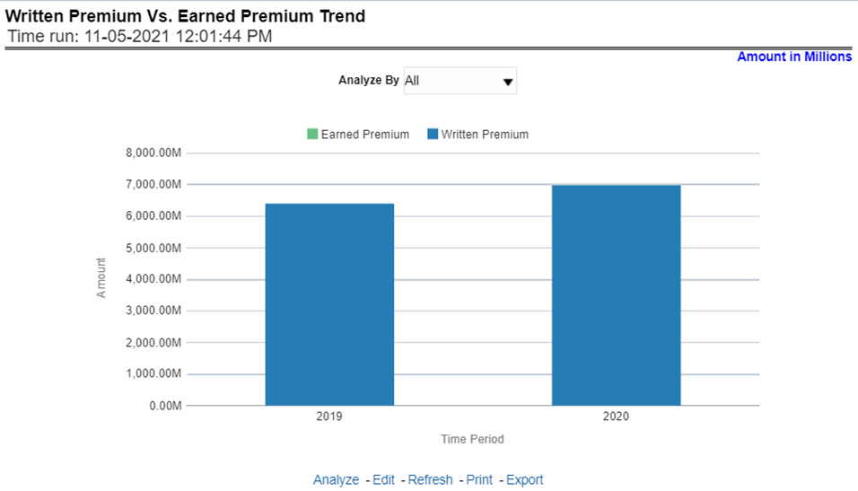
This report shows the trend in revenue and a comparison between Written Premium and Earned Premium, at an enterprise level, for all lines of businesses and underlying products through a time series. This Trend can further be viewed and analyzed through filters like Lines of business and Products for more granularities, through a stacked bar graph. This report can be analyzed over various periods, entities, and Region, lob, and products selected from page-level prompts.
Figure 271: Written Premium vs. Earned Premium Trend
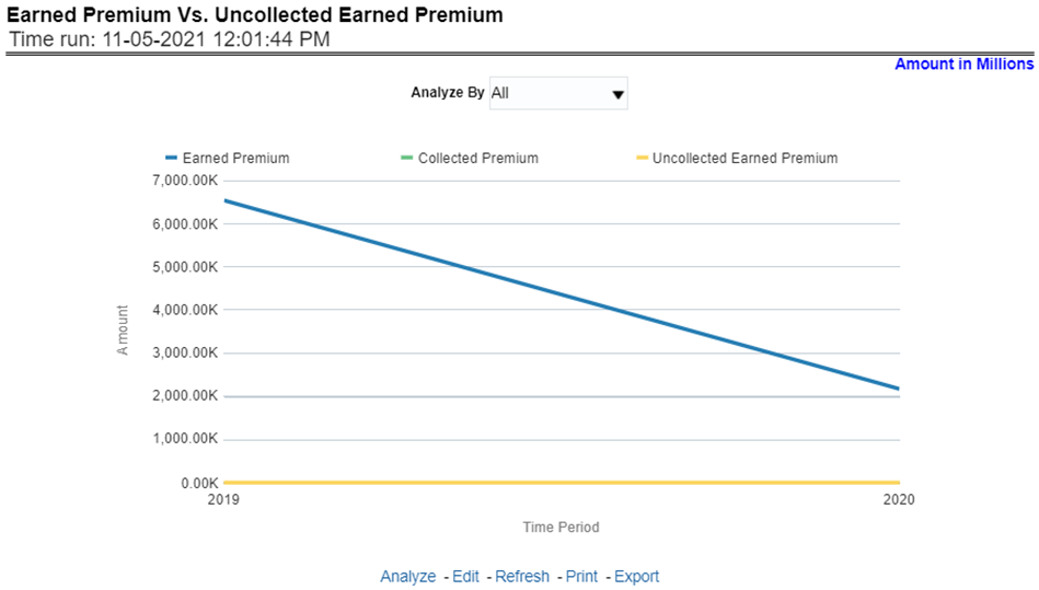
This report shows a trend in the actual collection of earned premium through a comparison between earned premium, collected premium, and uncollected earned premium. This report shows at an enterprise level, for all lines of businesses and underlying products through a time series. This Trend can further be viewed and analyzed through filters like Lines of business and Products for more granularities. The values are in a stacked bar graph. This report can be analyzed over various periods, entities, and regions selected from page-level prompts.
Figure 272: Earned Premium versus Uncollected Earned Premium
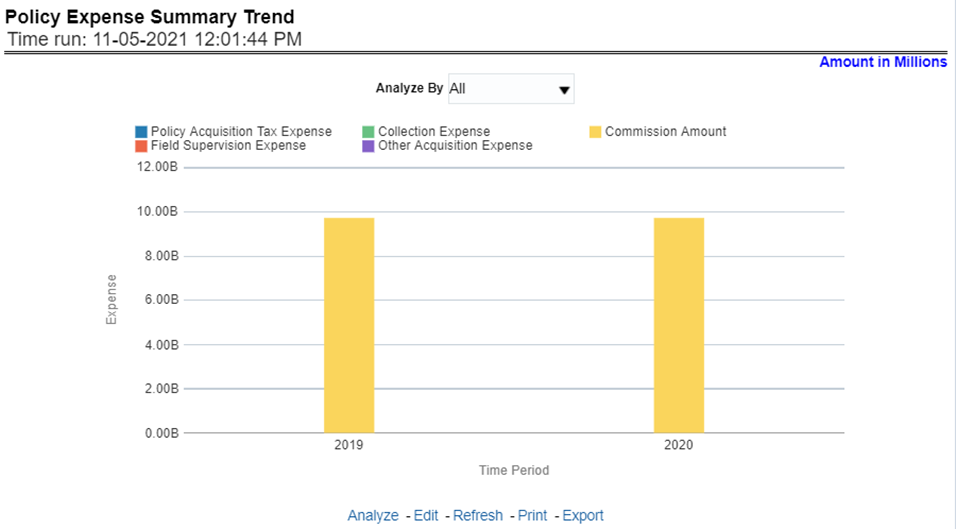
This report shows policy-related expenses under different expense heads at an enterprise level, for all lines of businesses and underlying products through a time series. This Trend can further be viewed and analyzed through report level filters like Lines of business and Products for more granularities. The values are in a clustered bar graph. This report can be analyzed over various periods, entities, and regions selected from page-level prompts.
Figure 273: Policy Expense Summary Trend
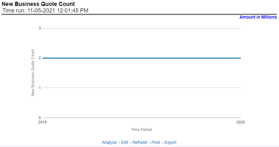
This report shows the number of quotes generated for new business, at an enterprise level, for all lines of businesses and underlying products through a time series. This report can be analyzed over various periods, entities, lob, product, and regions selected from page-level prompts.
Figure 274: New Business Quote Count
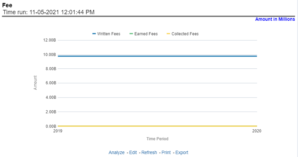
This report shows fee income generated, earned, collected, and refunded, at an enterprise level, for all lines of businesses and underlying products through a time series. This report can be analyzed over various periods, entities, Lob, Product, and regions selected from page-level prompts.
Figure 275: Fee
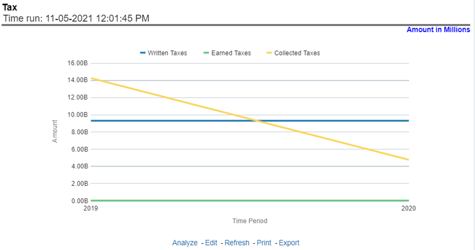
This report shows the premium tax trend for tax generated, earned, and collected, at an enterprise level, for all lines of businesses and underlying products through a time series. This report can be analyzed over various periods, entities, Lob, Product, and Regions selected from page-level prompts.
Figure 276: Tax
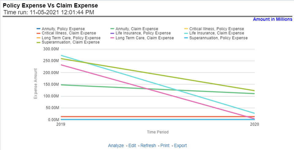
This trend report shows a comparison between policy expenses and claim expenses, at an enterprise level, for all lines of businesses and underlying products through a time series. This report can be analyzed over various periods, entities, Lob, Product, and regions selected from page-level prompts.
Figure 277: Policy Expense versus. Claim Expense
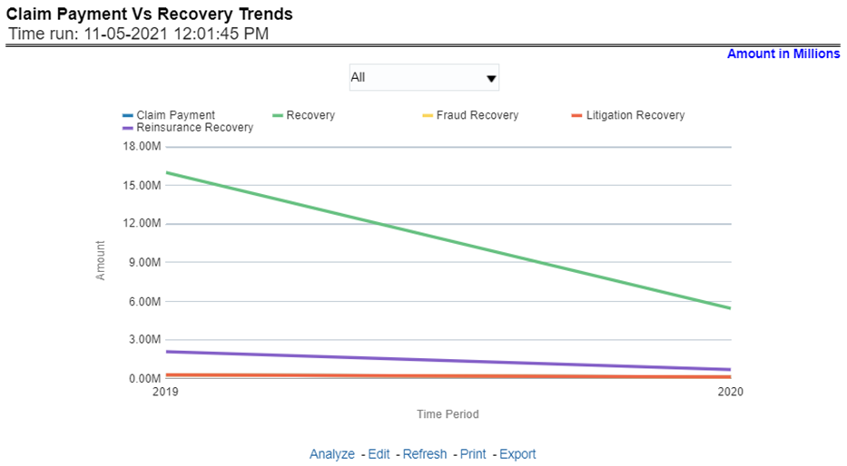
This report shows a comparison between claim payments and recoveries made as well as the trend in various types of recoveries at an enterprise level, for all lines of businesses and underlying products through a time series. This Trend can further be viewed and analyzed through the following report level filters for more granularities:
· Claim Payments
· All recovery Payments
· Fraud Recovery
· Litigation Recovery
· Reinsurance Recovery
The values are in a line graph. This report can also be analyzed over various periods, entities, Lob, Product, and regions selected from page-level prompts
Figure 278: Claim Payment versus Recovery Trends
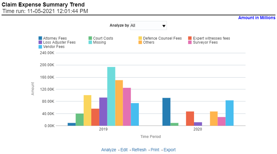
This report shows a trend and comparison between various types of claim expenses at an enterprise level, for all lines of businesses and underlying products through a time series. This Trend can further be viewed and analyzed through the report level filters, Lines of business and products, for more granularities. The values are in a clustered bar graph. This report can also be analyzed over various periods, entities, Lob, Product, and regions selected from page-level prompts.
Figure 279: Claim Expense Summary Trend
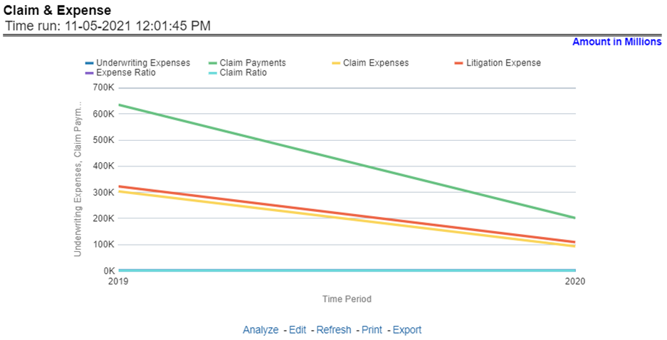
This report shows a trend and comparison between underwriting expense and various types of claim expenses along with actual claim payments, claim ratio, expense ratio, and litigation expenses at an enterprise level, for all lines of businesses and underlying products through a time series. The values are in a line graph. This report can also be analyzed over various periods, entities, and regions selected from page-level prompts.
Figure 280: Claim and Expense
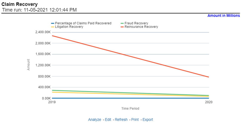
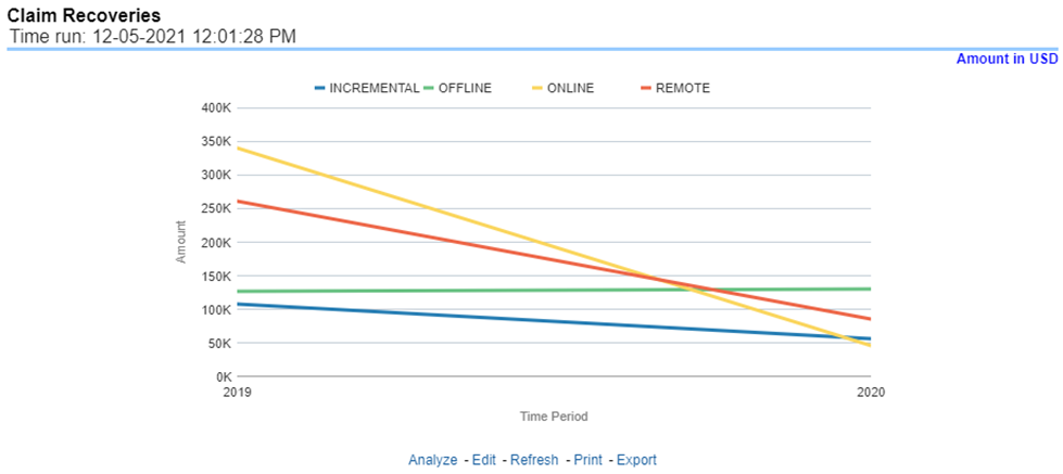
This report shows a trend in various types of recoveries as well as the extent of recoveries against paid losses, at an enterprise level, for all lines of businesses and underlying products through a time series. The values are in a line graph. This report can also be analyzed over various periods, entities, lob, products, and regions selected from page-level prompts.
Figure 281: Claim Recovery
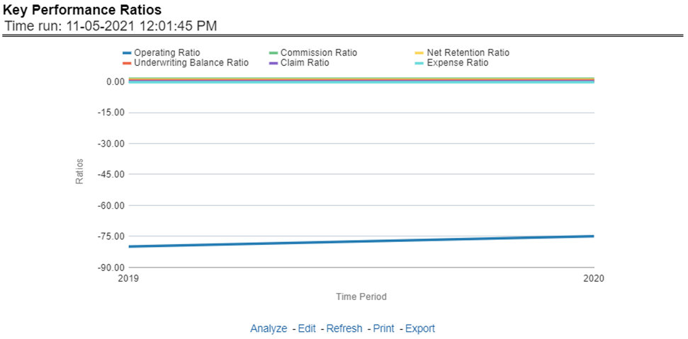
This report shows the trend in various key performance metrics, that is, operating ratio, commission ratio, net retention ratio, claim ratio, and so on for all lines of businesses and underlying products over a selected period. Values are in a line graph. This report can also be analyzed over various periods, entities, lob, products, and regions selected from page-level prompts.
Figure 282: Key Performance Ratios
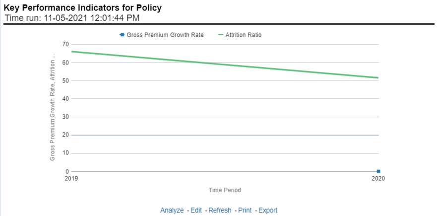
This report shows the trend in two key policy performance indicators that is the gross premium growth rate and attrition ratio, for all lines of businesses and underlying products through a time series. The values are in a line graph. This report can also be analyzed over various periods, entities, lob, products, and regions selected from page-level prompts.
Figure 283: Key Performance Indicators for Policy
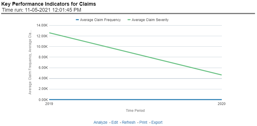
This report shows a trend in two key claim performance indicators, average values of claim frequency and claim severity, for all lines of businesses, and underlying products through a time series. The values are in a line graph. This report can also be analyzed over various periods, entities, lob, products, and regions selected from page-level prompts.
Figure 284: Key Performance Indicators for Claims
The Lines of business overview tab includes reports that focus on an overview of Key Performance Indicators for Lines of businesses. The filters for this tab allow the report results to be focused on selected lines of business for comparison and targeted analysis.
Following are the filters available for this tab:
· Time
· Company
· Lines of business
· Region
The various reports available under this tab are discussed in the following sections.
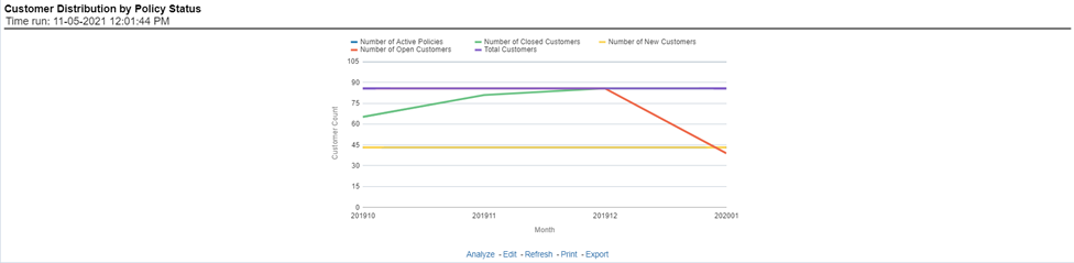
This report provides customer and policy information through time series. Various performance metrics-based measures, for example, the Number of New Customers, Number of Closed Customers, and so on for the reporting period selected, are displayed on a year-on-year basis. This report can be analyzed over various periods, entities, regions, and lines of business selected from page-level prompts.
Figure 285: Customer Distribution by Policy Status
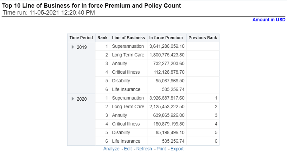
This report provides ranking for the Top 10 lines of businesses in terms of in-force written premium and policy count with previous period ranking.
Figure 286: Top 10 Lines of Business for In-force Premium and Policy Count
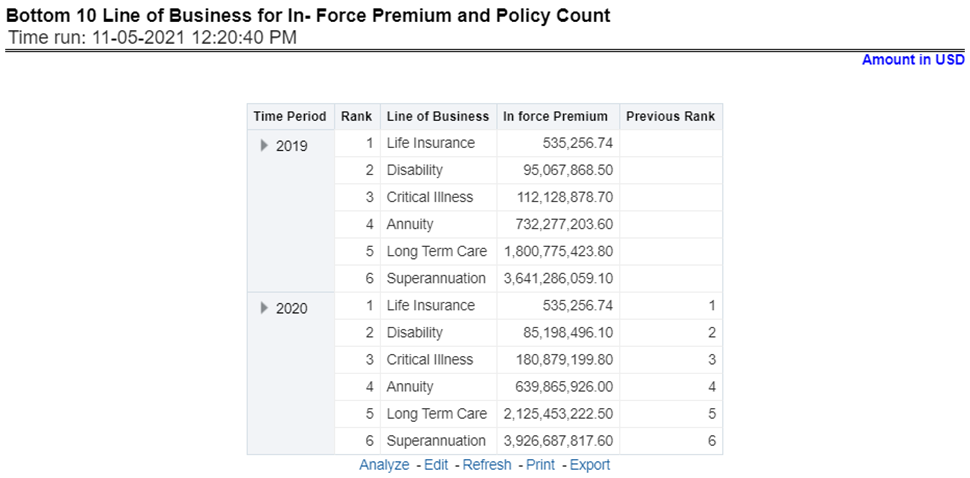
This report provides ranking for the Bottom 10 lines of businesses in terms of in-force, written premium, and policy count with previous period ranking.
Figure 287: Bottom 10 Lines of Business for In-force Premium and Policy Count
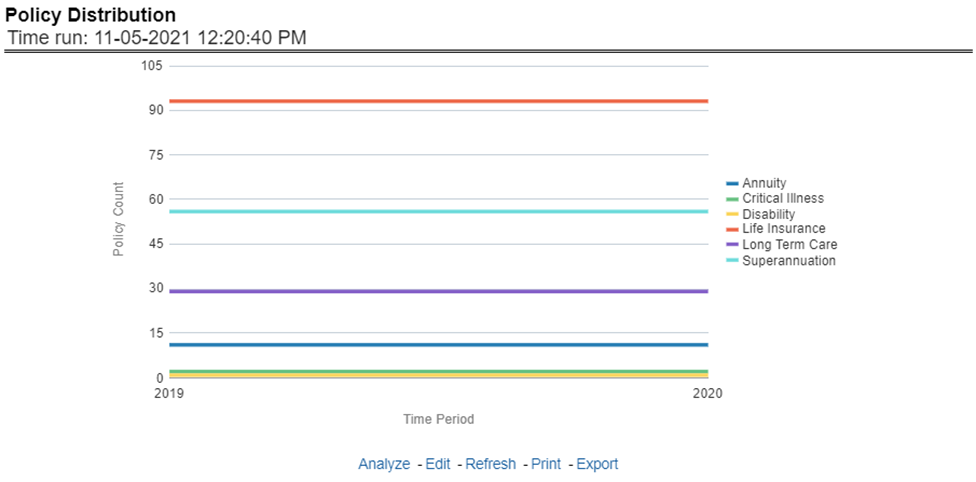
This report provides a policy count of all active policies through a time series.
Figure 288: Policy Distribution
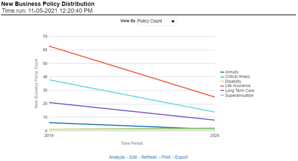
This report provides Policy Count or Written Premium for all new business policies, as selected from the report level view option, during the reporting period across Lines of business through time series.
Figure 289: New Business Policy Distribution
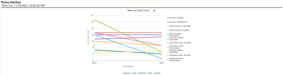
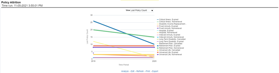
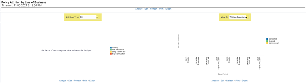
The objective of the report is to show Attrition Policy Count (Lost) and Attrition Written Premium (lost business across Lines of businesses over a period. The Attrition Policy count and attrition written premium values can be filtered and analyzed through report level filters on various attrition types, for example, Cancellation, nonrenewal, and expiration.
Figure 290: Policy Attrition
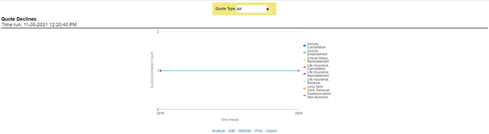
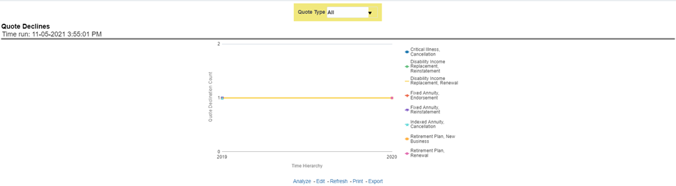
The objective of the report is to show the count of quote declines across lines of businesses. This report displays declines by various quote types through a time series. The report can be analyzed by all declined quotes as well as by various quote types, that is, New Business Quotes, Endorsement Quotes, Renewal Quotes, Reinstatement Quotes, and Cancellation Quotes.
Figure 291: Quote Declines
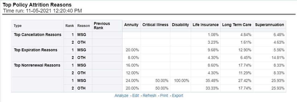
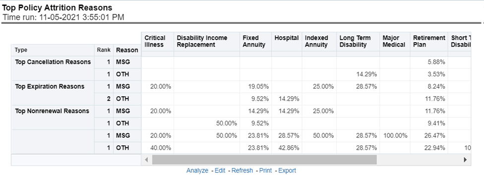
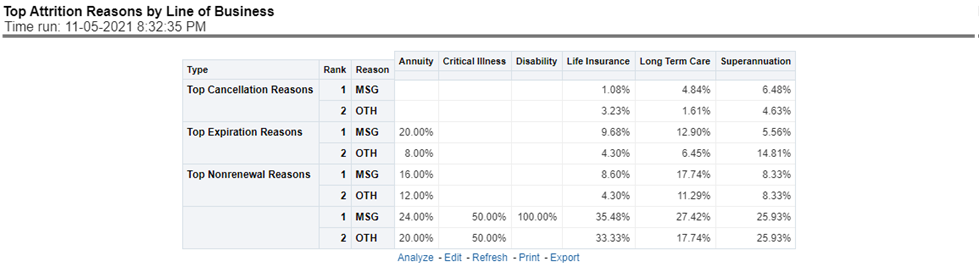
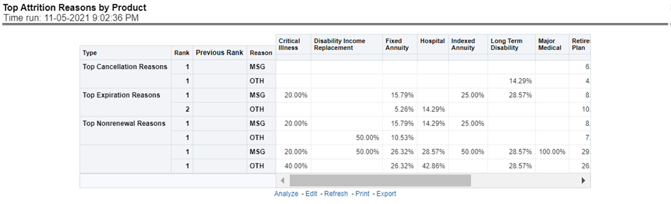
The objective of the report is to show the top three attrition reasons for each attrition type, that is, Cancellation, Nonrenewal, and Expiration in terms of percentage contribution to total attrition across Lines of businesses. These are reported for all lines of businesses in which the insurer writes business.
Figure 292: Top Policy Attrition Reasons
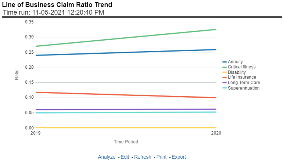
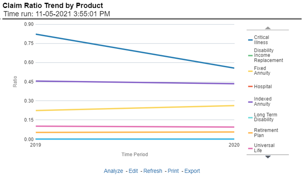
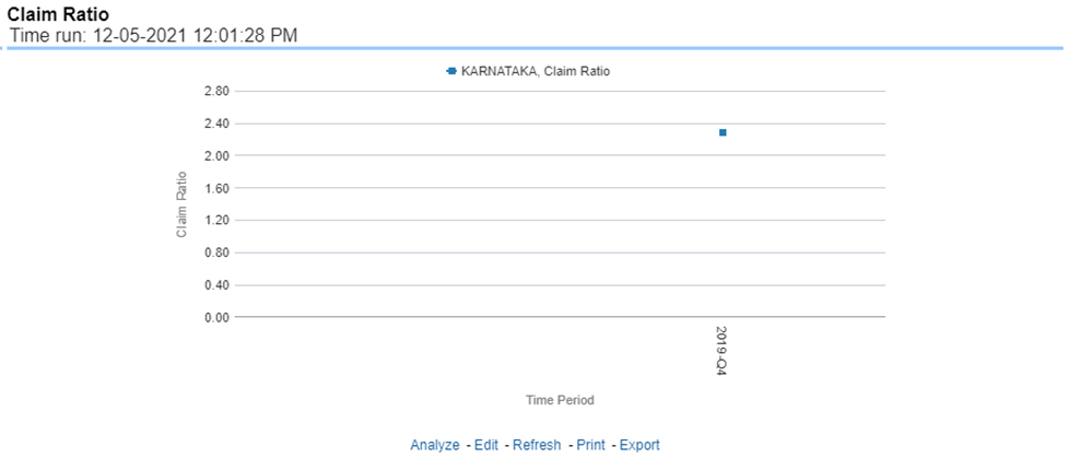
This Report shows the Claim Ratio Trend across all or selected lines of businesses through a time series trend graph.
Figure 293: Lines of Business Claim Ratio Trend
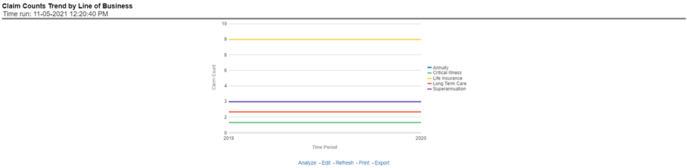
This report displays the count of claims through a time series for all of the selected lines of businesses.
Figure 294: Claim Counts Trend by Lines of Business
The Lines of business performance tab includes reports that focus on the Performance of each Line of business. The filters for this tab allow the report results to be focused on selected lines of business for comparison and targeted analysis. The filters include:
· Time
· Company
· Lines of business
· Region
The various reports available under this tab are discussed in the following sections.
This tabular report provides a snapshot of financial profitability by all or specific lines of business selected for the period. The financial performance window displays net income through premium, expenses through claims, and benefits paid with overall profitability. This report also shows the previous period figures along with a variance between the current and the previous period.
Figure 295: Line of Business Profit and Loss

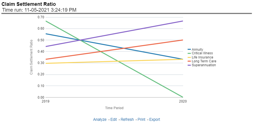
This Report shows the claim settlement ratio for all selected lines of business for all or selected regions through a time series line graph. The purpose of this report is to analyze efficiency in claim settlement. The report can be viewed over various periods selected from the page level prompt.
Figure 296: Claim Settlement Ratio
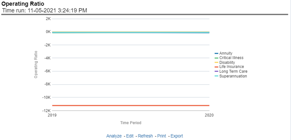
This report shows the operating ratio for all or selected lines of business through a time series. This report can be viewed over various periods, entities, Lobs, and regions selected from page-level prompts.
Figure 297: Operating Ratio
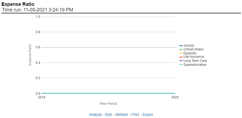
This report shows the expense ratio for all or selected lines of business through a time series. This report can be viewed over various periods, entities, lobs, and regions selected from page-level prompts.
Figure 298: Expense Ratio
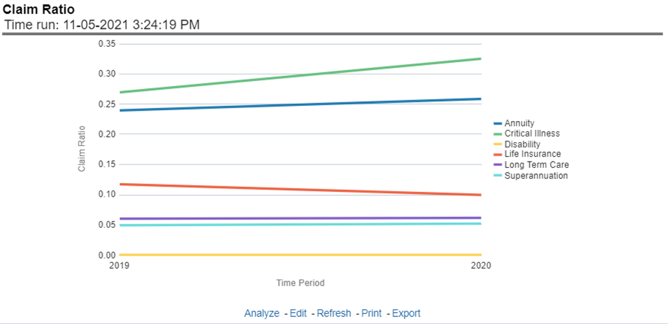
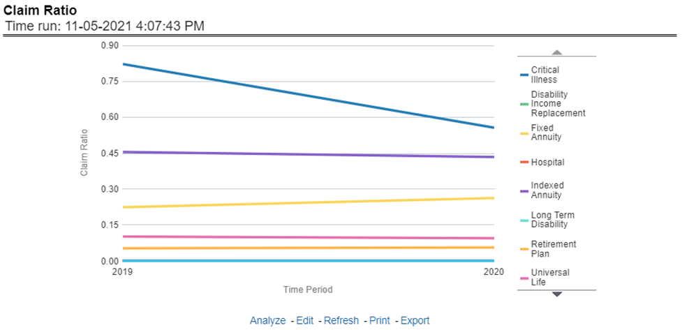
This Report shows the claim ratio for all selected lines of business for all or selected regions through a time series line graph. The purpose of this report is to analyze claims profitability and efficiency. The report can be viewed over various periods selected from the page level prompt.
Figure 299: Claim Ratio
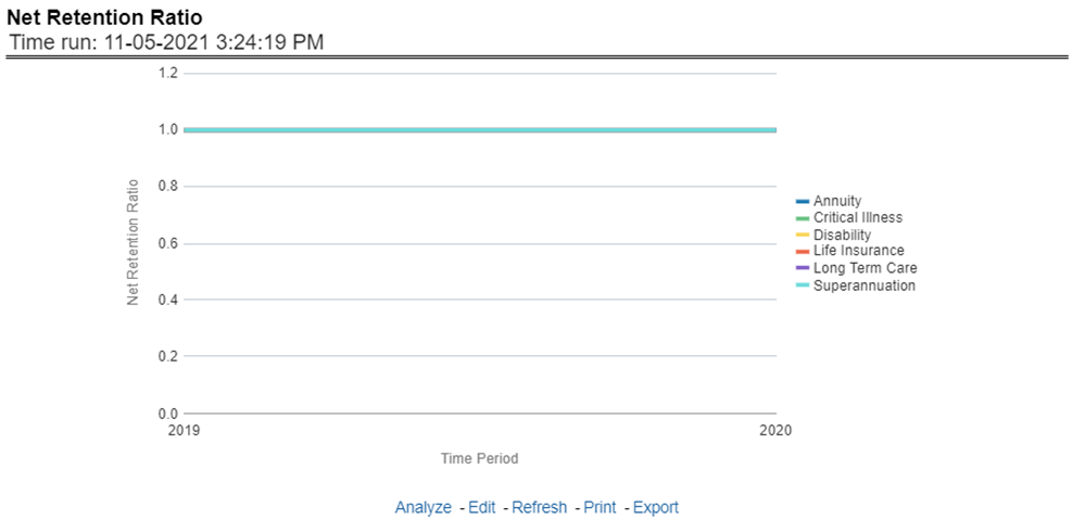
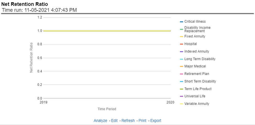
This report shows the net retention ratio for all or selected lines of business through a time series. This report can be viewed over various periods, entities, Lobs, and regions selected from page-level prompts.
Figure 300: Net Retention Ratio
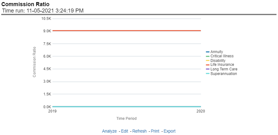
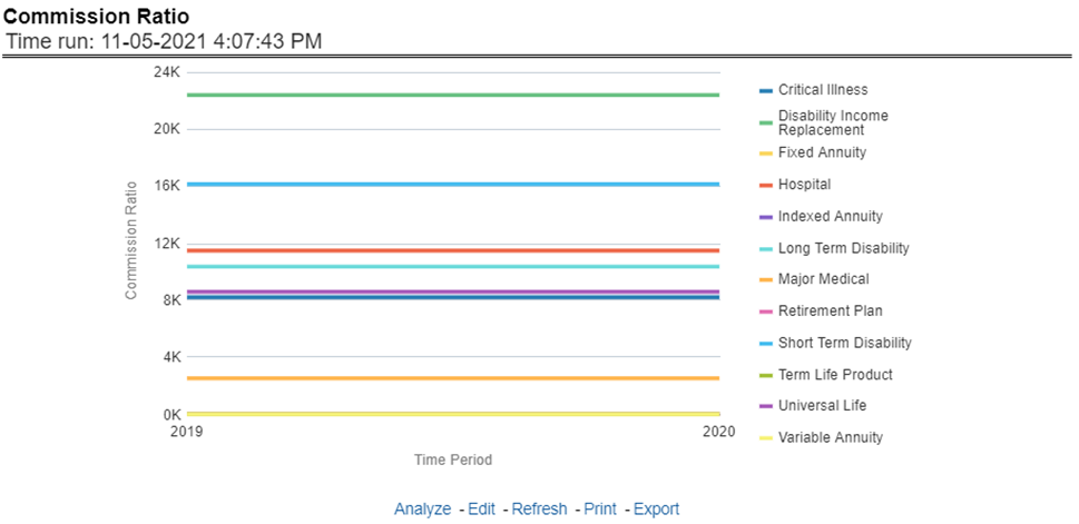
This report shows the commission ratio for all or selected lines of business through a time series. This report can be viewed over various periods, entities, Lobs, and regions selected from page-level prompts.
Figure 301: Commission Ratio
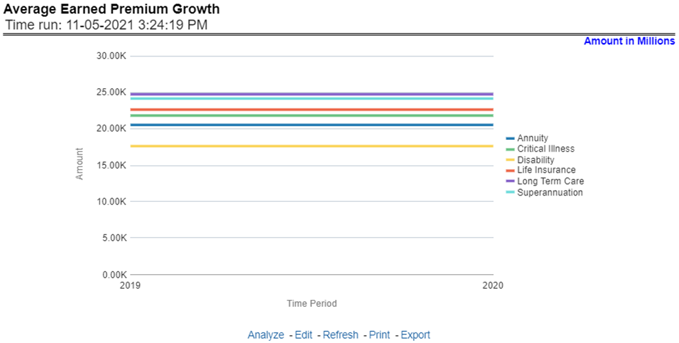
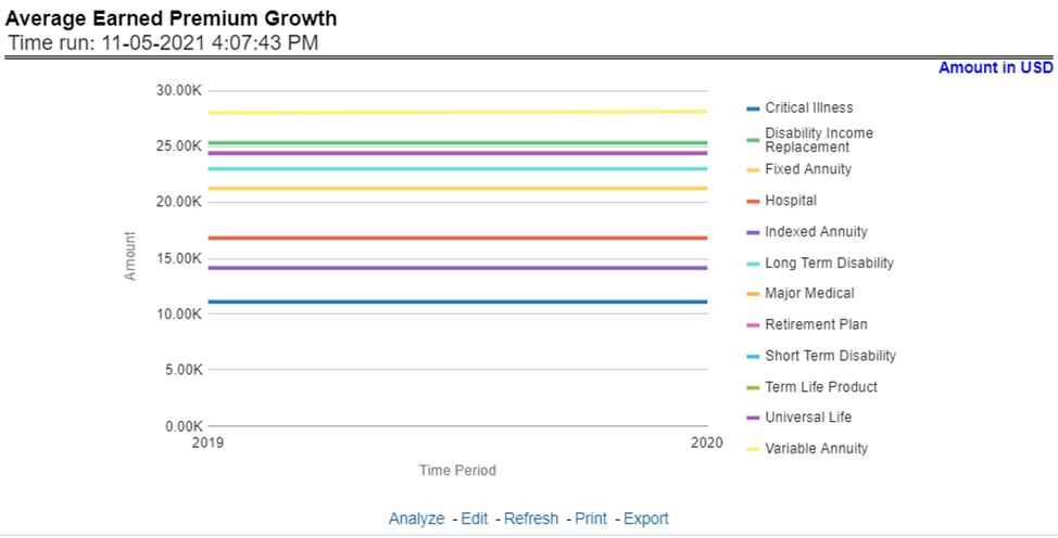
This report shows the growth in average earned premium for all or selected lines of business through a time series. This report can be viewed over various periods, entities, Lobs, and regions selected from page-level prompts.
Figure 302: Average Earned Premium Growth
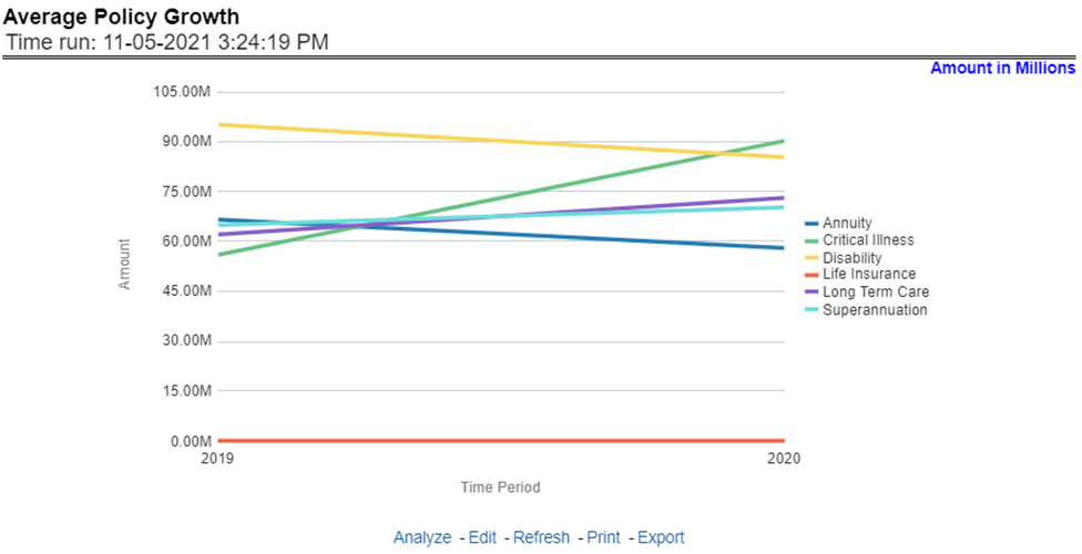
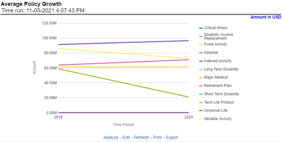
This report shows growth in policy premium for all or selected lines of business through a time series. This report can be viewed over various periods, entities, and regions selected from page-level prompts.
Figure 303: Average Policy Growth
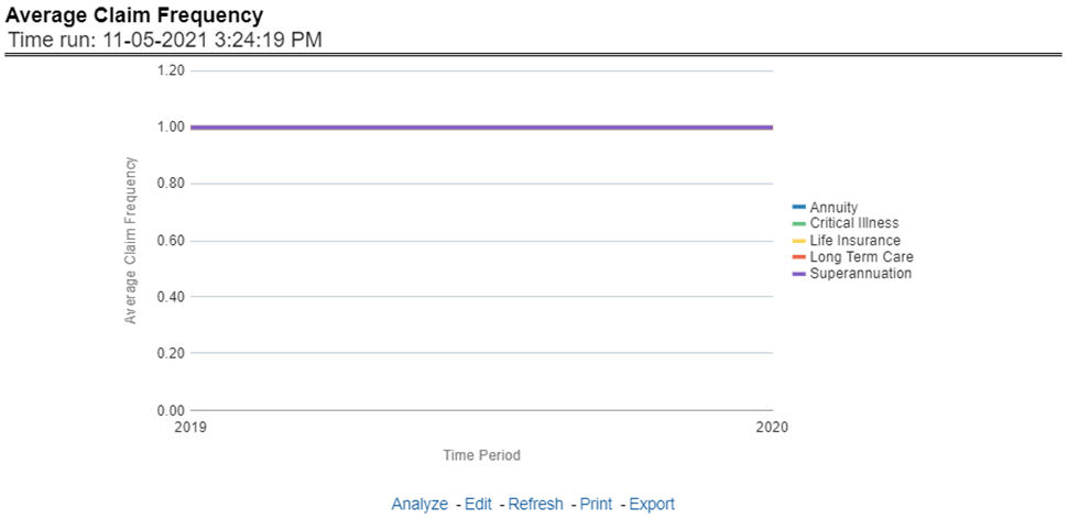
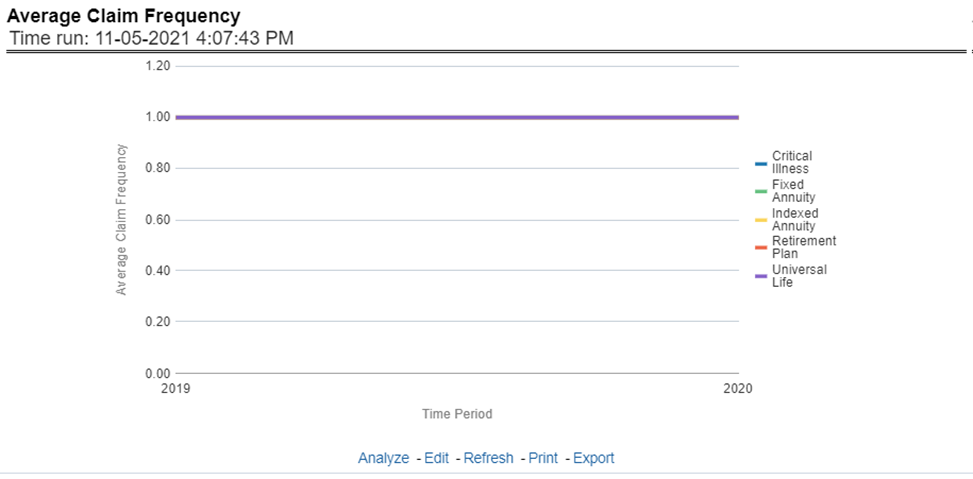
This report shows the average number or frequency of reported claims for all or selected lines of business through a time series. This report can be viewed over various periods, entities, lobs, and regions selected from page-level prompts.
Figure 304: Average Claim Frequency
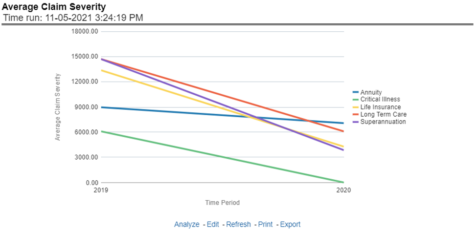
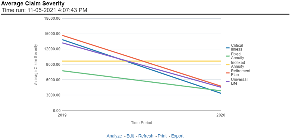
This report shows the average size or severity of reported claims for all or selected lines of business through a time series. This report can be viewed over various periods, entities, lobs, and regions selected from page-level prompts.
Figure 305: Average Claim Severity
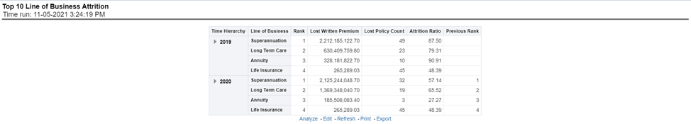
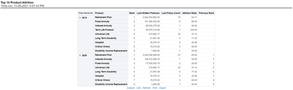
This report ranks the top ten lines of business in terms of various key attrition measures like loss policy count, lost written premium, and corresponding attrition ratio.
Figure 306: Top 10 Lines of Business Attrition
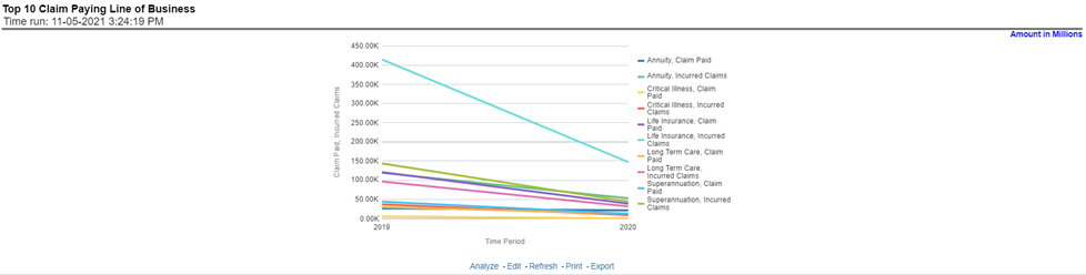
This report ranks the top ten lines of business in terms of claim payments, Claims paid, and incurred.
Figure 307: Top 10 Claim Paying Lines of Business
The Product tab includes reports that focus on the overview of Performances for Products. The filters for this tab allow the report results to be focused on selected products for comparison and targeted analysis. The filters include:
· Time
· Company
· Lines of business
· Products
· Region
The various reports available under this tab are discussed in the following sections.
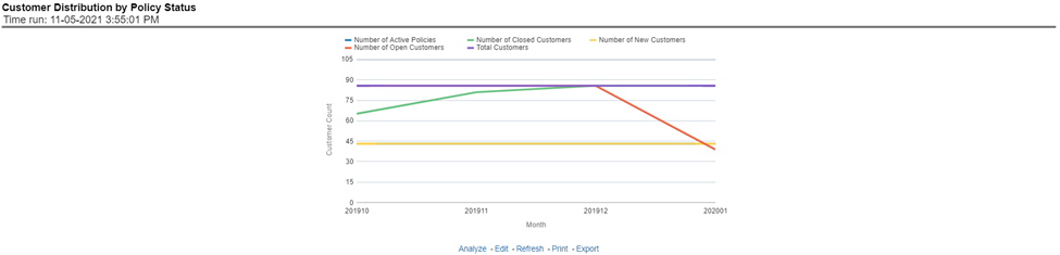
This report provides customer and policy information through time series. Various performance metrics-based measures, for example, the Number of New Customers, the Number of Closed Customers, and so on for the reporting period selected, are displayed on a year-on-year basis. This report can be analyzed over various periods, entities, regions, products, and lines of business selected from page-level prompts.
Figure 308: Customer Distribution by Policy Status
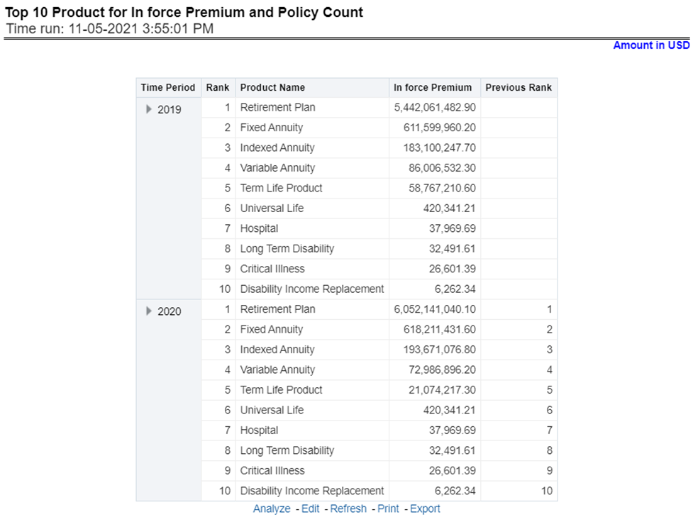
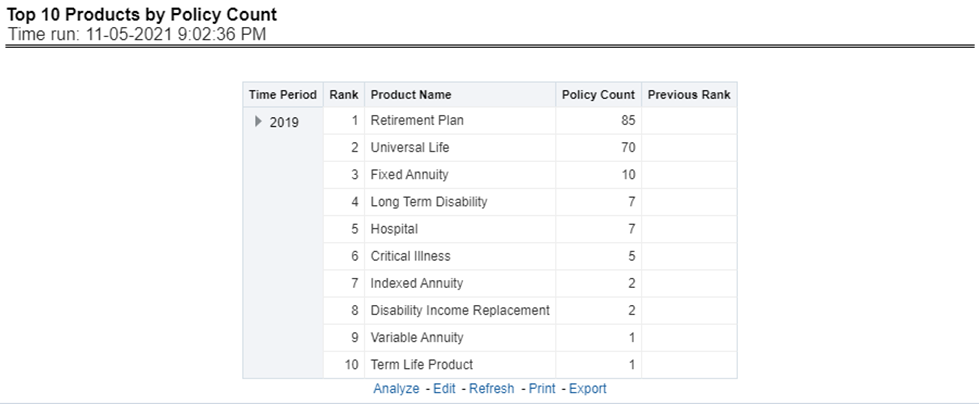
This report provides ranking for Top 10 products in terms of in-force written premium and policy count with previous period ranking.
Figure 309: Top 10 Products for In-force Premium and Policy Count
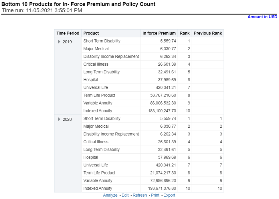
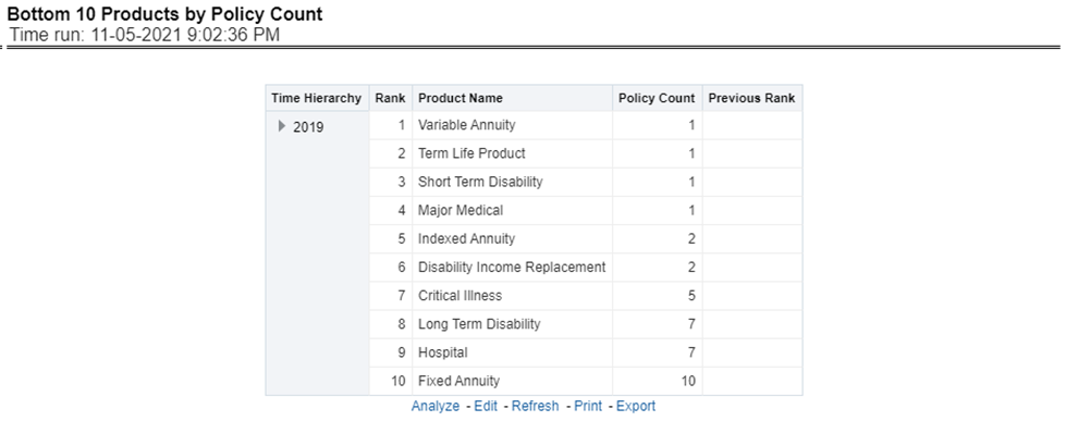
This report provides ranking for the Bottom 10 products in terms of in-force written premium and policy count with previous period ranking.
Figure 310: Bottom 10 Products for In-force Premium and Policy Count
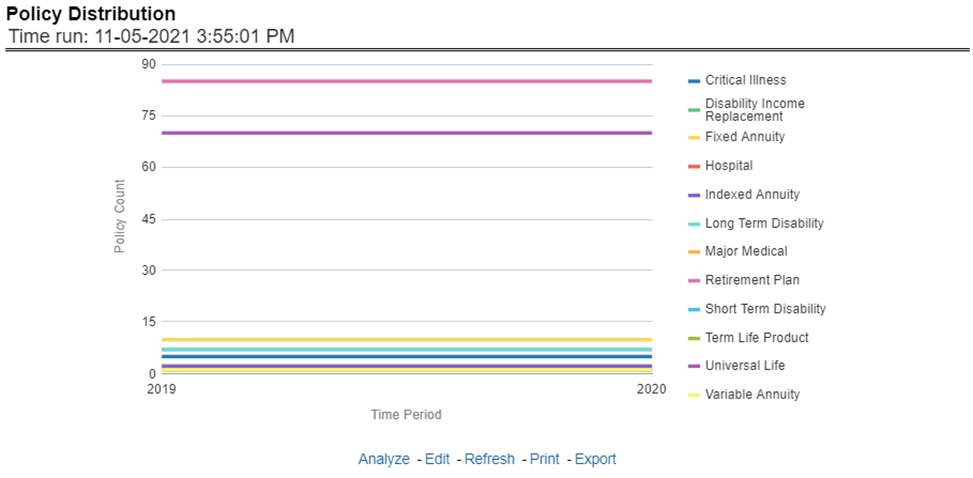
This report provides a policy count of all active policies through a time series.
Figure 311: Policy Distribution
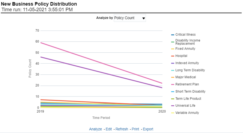
This report provides Policy Count or Written Premium for all new business policies (as selected from the report level view option) during the reporting period across products through time series.
Figure 312: New Business Policy Distribution
The objective of the report is to show the Attrition Policy Count and Attrition Written Premium across products over a period. The Attrition Policy count (lost) and attrition written premium (lost business) values can be filtered and analyzed through report level filters on various attrition types, that is, Cancellation, nonrenewal, and expiration.
Figure 313: Policy Attrition
The objective of the report is to show the count of quote declines across products. This report displays declines by various quote types; through a time series. The report can be analyzed by all declined quotes as well as by various quote types:
· New Business Quotes
· Endorsement Quotes
· Renewal Quotes
· Reinstatement Quotes
· Cancellation Quotes
Figure 314: Quote Declines
The objective of the report is to show the top three attrition reasons for each attrition type, that is, Cancellation, Non-renewal, and Expiration in terms of percentage contribution to total attrition products. These are reported for all products and lines of businesses in which the insurer writes business.
Figure 315: Top Policy Attrition Reasons
This Report shows the Claim Ratio Trend across all or selected lines of businesses and Products through a time series trend graph.
Figure 316: Claim Ratio Trend by Product
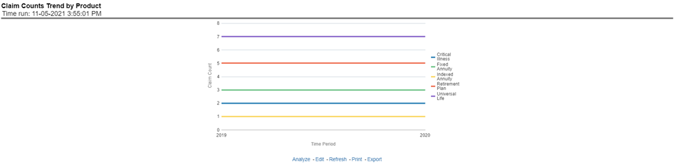
This report displays the count of claims through a time series for all products and lines of businesses selected.
Figure 317: Claim Counts Trend by Product
The Product performance tab includes reports that focus on the Performance of each product under each Line of business. The filters for this tab allow the report results to be focused on selected products for comparison and targeted analysis. The filters include:
· Time
· Company
· Lines of business
· Products
· Region
The various reports available under this tab are discussed in the following sections.
This tabular report provides a view of financial profitability by all or a specific product for or specific lines of business selected for the period. The financial performance window displays net income through premium, expenses through claims, and benefits paid with overall profitability. This report also shows the previous period figures along with a variance between the current and the previous period.
Figure 318: Product Profit and Loss

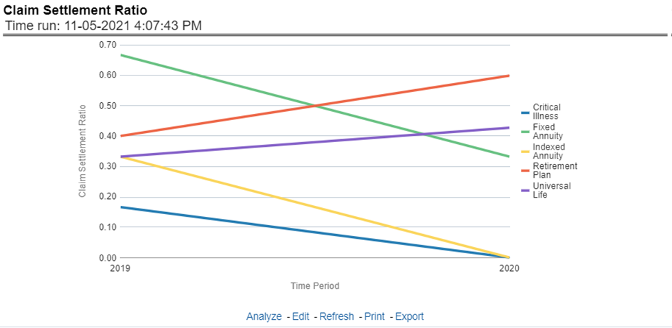
This Report shows the claim settlement ratio for all selected lines of business and Products for all or selected regions through a time series line graph. The purpose of this report is to analyze efficiency in claim settlement. The report can be viewed over various periods selected from the page level prompt.
Figure 319: Claim Settlement Ratio
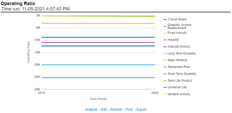
This report shows the operating ratio for all or a specific product for or specific lines of business through a time series. This report can be viewed over various periods, entities, and regions selected from page-level prompts.
Figure 320: Operating Ratio
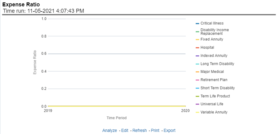
This report shows the expense ratio for all or a specific product for or specific lines of business through a time series. This report can be viewed over various periods, entities, and regions selected from page-level prompts.
Figure 321: Expense Ratio
This Report shows the claim ratio for all or a specific product selected for lines of business for all or selected regions through a time series line graph. The purpose of this report is to analyze claims profitability and efficiency at the product level. The report can be viewed over various periods selected from the page level prompt.
Figure 322: Claim Ratio
This report shows the net retention ratio for all or a specific product for or specific lines of business through a time series. This report can be viewed over various periods, entities, and regions selected from page-level prompts.
Figure 323: Net Retention Ratio
This report shows the commission ratio for all or a specific product for or specific lines of business through a time series. This report can be viewed over various periods, entities, and regions selected from page-level prompts.
Figure 324: Commission Ratio
This report shows growth in average earned premium for all or a specific product for or specific lines of business through a time series. This report can be viewed over various periods, entities, and regions selected from page-level prompts.
Figure 325: Average Earned Premium Growth
This report shows growth in policy premium for all or a specific product for or specific lines of business through a time series. This report can be viewed over various periods, entities, and regions selected from page-level prompts.
Figure 326: Average Policy Growth
This report shows the average number or frequency of reported claims for all or a specific product for or specific lines of business through a time series. This report can be viewed over various periods, entities, and regions selected from page-level prompts.
Figure 327: Average Claim Frequency
This report shows the average size or severity of reported claims for all or a specific product for or specific lines of business through a time series. This report can be viewed over various periods, entities, and regions selected from page-level prompts.
Figure 328: Average Claim Severity
This report ranks the top ten products in terms of various key attrition measures like loss policy count, lost written premium, and corresponding attrition ratio.
Figure 329: Top 10 Product Attrition
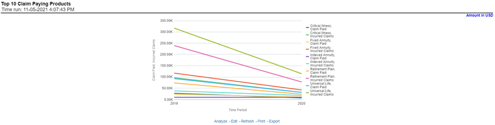
This report ranks the top ten products in terms of claim payments, Claims Paid, and Incurred.
Figure 330: Top 10 Claim Paying Products
This chapter explains the report available under each tab in the Policy Performance Dashboard.
The following tabs are present in the policy performance dashboard:
· Summary
· Product
· Region
· Producer
The following screenshots display the essential nature of the available reports as per each tab:
Figure 331: Policy Performance Tabs

The Summary tab includes information for lines of businesses at the corporate level. The information contained in the reports generated summarizes how the entire organization is performing for all the lines of businesses. Following are the filters available for this tab.
· Time
· Company
· Lines of business
· Region
The various reports available under this tab are detailed in the following sections.
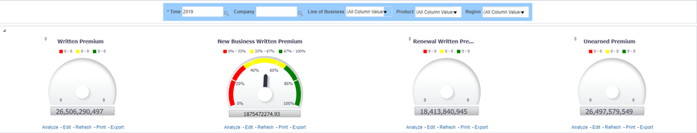
This report shows snapshots of key performance indicators represented through flash boxes for the current period.
Figure 332: Key Policy Performance Indicators Flash

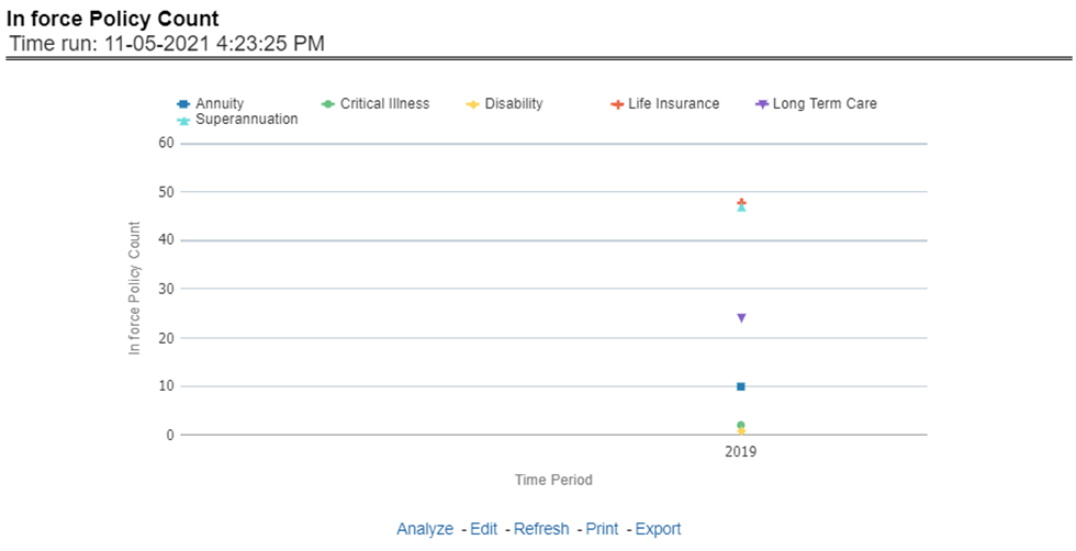
This report shows active in-force policy counts across all lines of businesses and underlying products through a time series. This report can be viewed over various periods, company, region, and lines of business selected from page-level prompts.
Figure 333: In force Policy Count
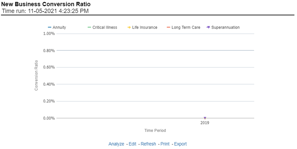
This report shows new business quote to conversion ratio performance across lines of business through a time series. This report can be viewed over various periods, company, region, and lines of business selected from page-level prompts.
Figure 334: New Business Conversion Ratio
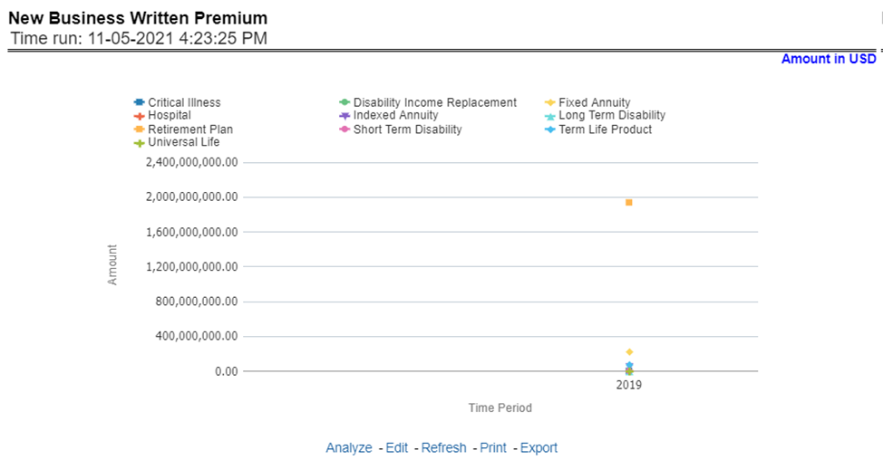
This report shows new business performance in terms of written premium across all lines of business and underlying products through a time series. This report can be viewed over various periods, company, region, and lines of business selected from page-level prompts.
Figure 335: New Business Written Premium
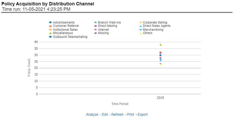
This report shows policy performance in terms of new business acquisition through different distribution channels through a time series. This report can be viewed over various periods, company, region, and lines of business selected from page-level prompts.
Figure 336: Policy Acquisition by Distribution Channel
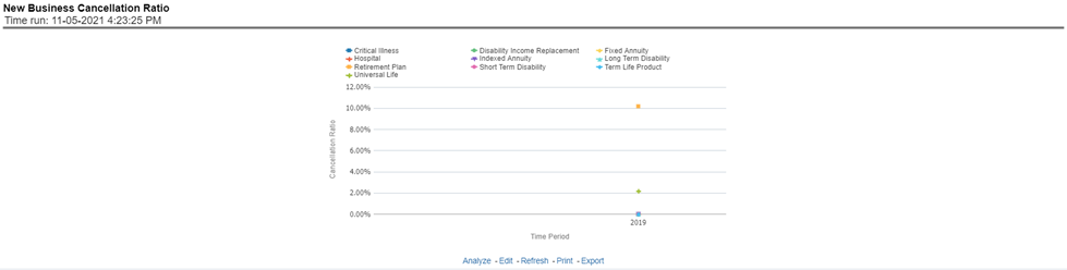
This report shows policy performance in terms of loss of new business through cancellation over a time series. This report can be viewed over various periods, company, geography, and lines of business selected from page-level prompts.
Figure 337: New Business Cancellation Ratio
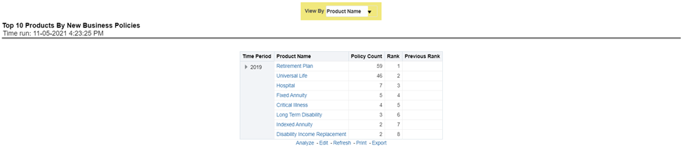
This report shows policy performance by ranking top selling ten products acquiring new business policies. This report shows policy counts and can be analyzed by report level filters, product name, and product category. This report can be viewed over various periods, company, region, and lines of business selected from page-level prompts.
Figure 338: Top 10 Products by New Business Policies
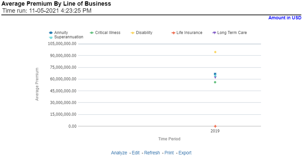
This report shows policy performance in terms of the average premium generated by lines of business through a time series. This report can be viewed over various periods, company, region, and lines of business selected from page-level prompts.
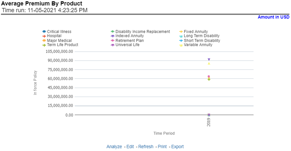
Figure 339: Average Premium by Lines of Business
This report shows policy performance in terms of the average premium generated by-products through a time series. This report can be viewed over various periods, company, region, and lines of business selected from page-level prompts.
Figure 340: Average Premium by Product
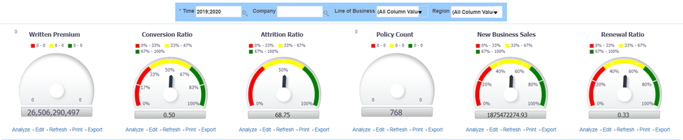
The Key Fact tab includes Key Performance Indicator Reports for lines of businesses at the group level. The filters for this tab allow the report results to be focused on selected combinations for comparison and targeted analysis. The filters include:
· Time
· Company
· Lines of business
· Region
The various reports available under this tab are detailed in the following sections.
This report shows snapshots of current key performance areas against a target.
Figure 341: Key Policy Performance Indicators
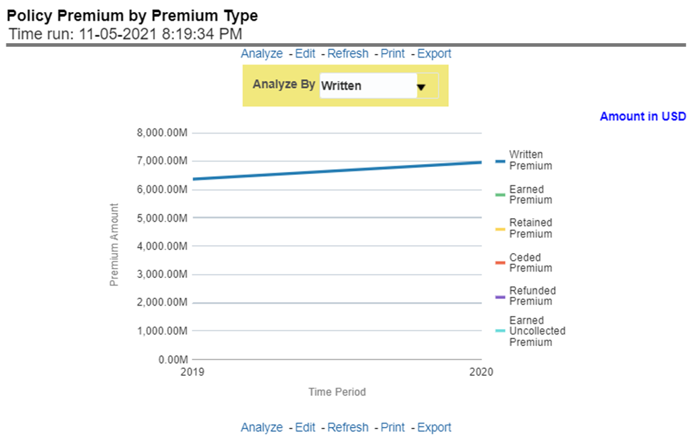
This report shows business revenue in terms of premium generated through different premium types over a time series. Various types of premium options such as written, earned, ceded, retained, earned uncollected, and refunded are available as report-level filters. This report can be viewed over various periods, company, region, and lines of business selected from page-level prompts.
Figure 342: Policy Premium by Premium Type
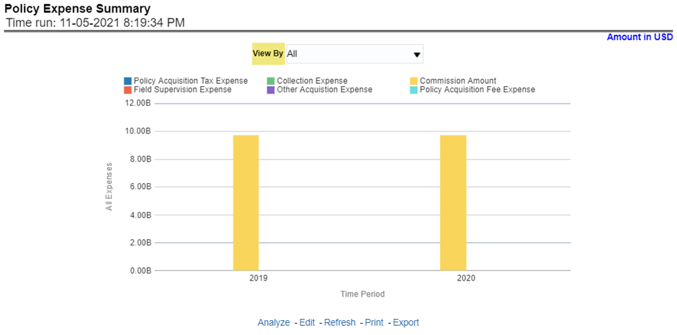
This report shows different policy-related expenses incurred over the period like acquisition exp, collection exp, and so on. The report can be analyzed by report level filters for different expense types. This report can be viewed over various periods, company, region, and lines of business selected from page-level prompts.
Figure 343: Policy Expense Summary
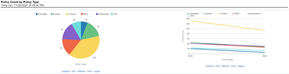
This report shows the count of policies through different policy types, that is, active in-force, reissue, rewritten, canceled, and non-renewed policies through a time series. This report can be viewed over various periods, company, region, and lines of business selected from page-level prompts. The pie chart shows policy count by current in-time values whereas the line graph represents the values through a time series.
Figure 344: Policy Count by Policy Type
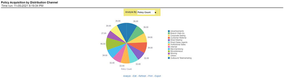
This report shows the percentage of policies acquired through different sales and distribution channels maintained by the company and can be analyzed by report level filters, policy count, and premium amount. This report can be viewed over various periods, company, region, and lines of business selected from page-level prompts.
Figure 345: Policy Acquisition by Distribution Channel
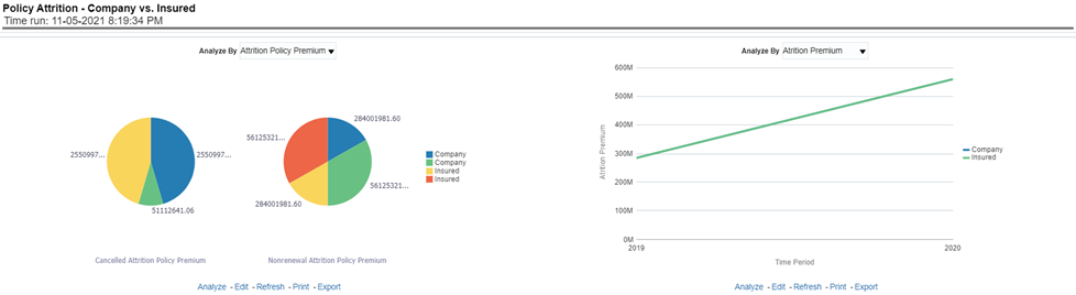
This report shows a loss of business through policy attrition through a time series. Attrition analysis can be done by percentage between company initiated and insured initiated attrition through the attrition types such as cancellation, non-renewal, and expiry, as well as attrition policy premium amount and attrition policy count. This report can be viewed over various periods, company, region, and lines of business selected from page-level prompts. The pie chart shows policy count by current in-time values whereas the line graph represents the values through a time series.
Figure 346: Policy Attrition - Company versus Insured
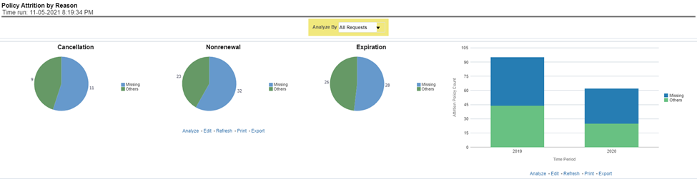
This report shows policy attrition occurred due to various attrition reasons. Attrition reason analysis can be done by percentage between company initiated and insured initiated attrition through the attrition types such as cancellation, non-renewal, and expiry as well by attrition reasons which can be selected from report level filter. This report can be viewed over various periods, company, region, and lines of business selected from page-level prompts. The pie chart shows policy count by current in-time values whereas the line graph represents the values through a time series.
Figure 347: Policy Attrition by Reason
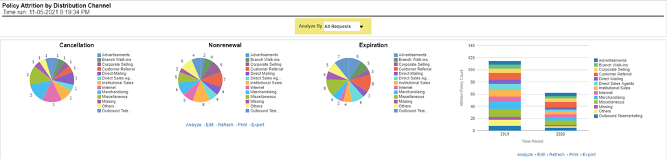
This report shows policy attrition by various distribution channels. Attrition analysis can be done by percentage between company initiated and insured initiated attrition through the attrition types such as cancellation, non-renewal, and expiry as well by distribution channels. This report can be viewed over various periods, company, region, and lines of business selected from page-level prompts. The pie chart shows policy count by current in-time values whereas the line graph represents the values through a time series.
Figure 348: Policy Attrition By Distribution Channel
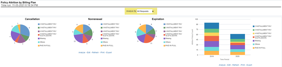
This report shows policy attrition by various distribution channels. Attrition analysis can be done by percentage between company initiated and insured initiated attrition through the attrition types such as cancellation, non-renewal, and expiry as well by billing plan type. This report can be viewed over various periods, company, region, and lines of business selected from page-level prompts. The pie chart shows policy count by current in-time values whereas the line graph represents the values through a time series.
Figure 349: Policy Attrition By Billing Plan
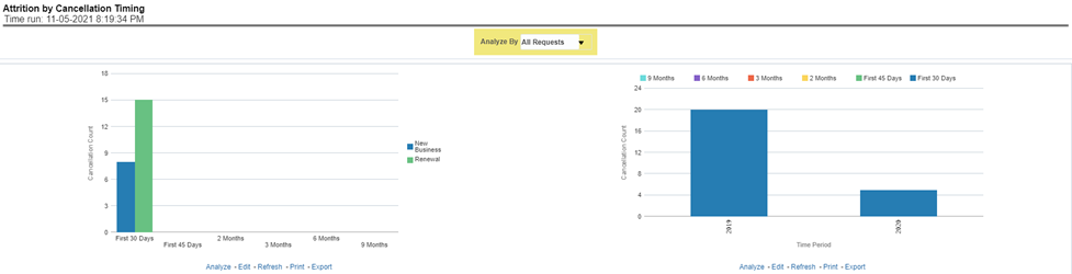
This report shows policy attrition by cancellation timings. Attrition analysis can be done by percentage between company initiated and insured initiated attrition through the attrition types such as cancellation, non-renewal, and expiry as well by cancellation/lapses attrition periods, for example, "First 30 days" and "First 45 days". This report can be viewed over various periods, company, region, and lines of business selected from page-level prompts. The pie chart shows policy count by current in-time values whereas the line graph represents the values through a time series.
Figure 350: Attrition by Cancellation Timing
The Lines of business tab includes reports that focus on the Key Performance Indicators for each Line of business. The filters for this tab allow the report results to be focused on selected lines of business for comparison and targeted analysis. The filters include:
· Time
· Company
· Region
· Lines of business
The various reports available under this tab are detailed in the following sections.
This report shows snapshots of current key performance areas against the target.
Figure 351: Key Lines of Business Performance Indicators Flash
This report ranks the top ten lines of business in terms of written premium and their previous ranking. This report can be viewed over various periods, company, Region, and lines of business selected from page-level prompts.
Figure 352: Top 10 Lines of Business by Written Premium
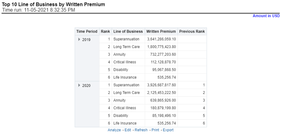
This report ranks the lowest-performing bottom ten lines of business in terms of written premium and their previous ranking. This report can be viewed over various periods, company, Region, and lines of business selected from page-level prompts.
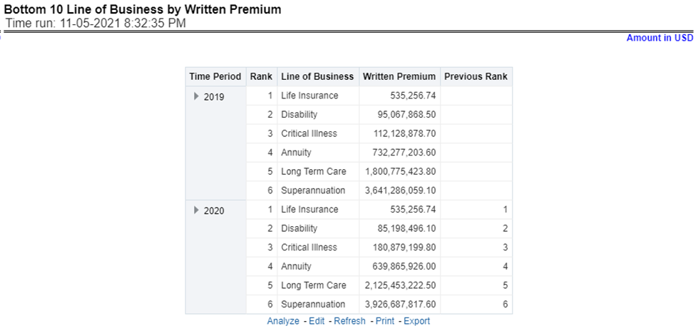
Figure 353: Bottom 10 Lines of Business by Written Premium
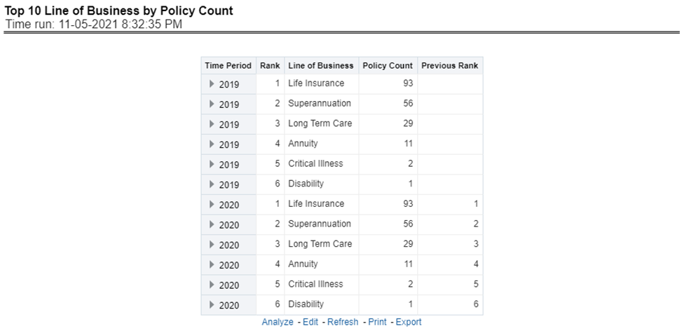
This report ranks the best performing top ten lines of business in terms of policy counts and their previous ranking. This report can be viewed over various periods, company, Region, and lines of business selected from page-level prompts.
Figure 354: Top 10 Lines of Business by Policy Count
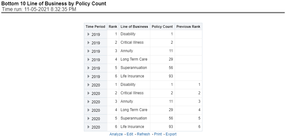
This report ranks the lowest-performing bottom ten lines of business in terms of policy counts and their previous ranking. This report can be viewed over various periods, company, Region, and lines of business selected from page-level prompts.
Figure 355: Bottom 10 Lines of Business by Policy Count
This report ranks best performing top ten lines of business in terms of earned premium and their previous ranking. This report can be viewed over various periods, company, Region, and lines of business selected from page-level prompts.
Figure 356: Top 10 Lines of Business by Earned Premium
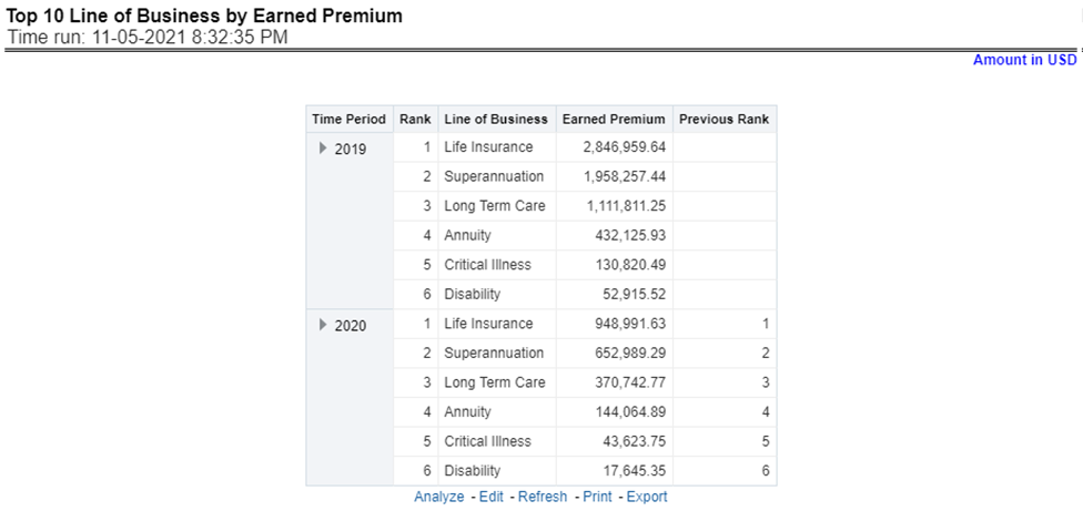
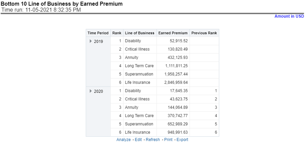
This report ranks the lowest-performing bottom ten lines of business in terms of earned premium and their previous ranking. This report can be viewed over various periods, company, Region, and lines of business selected from page-level prompts.
Figure 357: Bottom 10 Lines of Business by Earned Premium
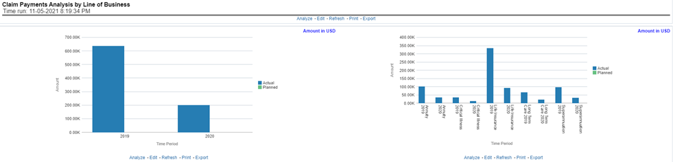
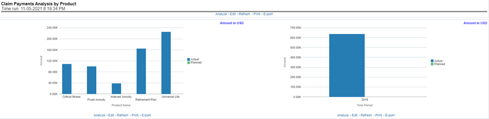
This report shows claim payments by lines of business through a comparison between actual and planned values. This report can be viewed over various periods, company, region, and lines of business selected from page-level prompts. The pie chart shows policy count by current in-time values whereas the line graph represents the values through a time series.
Figure 358: Claim Payment Analysis by Lines of Business
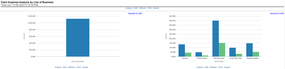
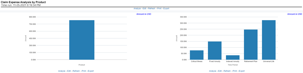
This report shows claim expenses by lines of business through a comparison between actual and planned values. This report can be viewed over various periods, company, Region, and lines of business selected from page-level prompts. The pie chart shows policy count by current in-time values whereas the line graph represents the values through a time series.
Figure 359: Claim Expense Analysis by Lines of Business
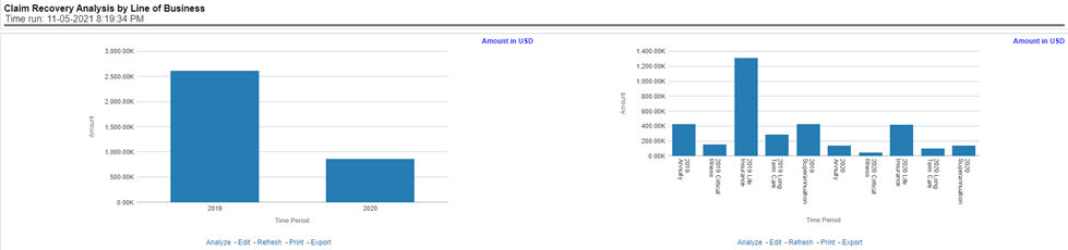
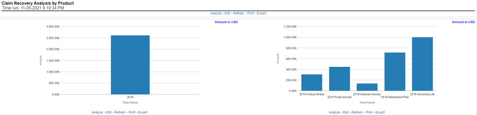
This report shows claim recovery by lines of business through a comparison between actual and planned values. This report can be viewed over various periods, company, region, and lines of business selected from page-level prompts. The pie chart shows policy count by current in-time values whereas the line graph represents the values through a time series.
Figure 360: Claim Recovery Analysis by Lines of Business
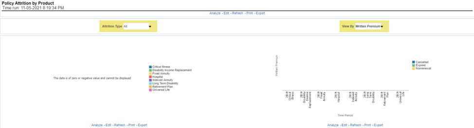
This report shows policy attritions by lines of business. This report can be viewed for current performance by different attrition types such as cancellation, expiry, and non-renewals. This report can also be analyzed both in terms of lost policy counts and lost written premium. This report can be viewed over various periods, company, region, and lines of business selected from page-level prompts. The pie chart shows policy counts by current in-time values wherein the line graph represents the values through a time series.
Figure 361: Policy Attrition by Line of Business
This report analyzes policy attrition reasons and ranks them by each attrition reason and by lines of business.
Figure 362: Top Attrition Reasons by Lines of Business
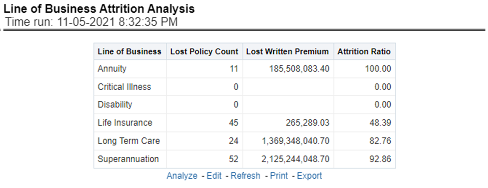
This report analyzes policy attrition reasons by lines of business and shows attritions through the three key parameters such as lost policy count, lost premium count, and attrition ratio.
Figure 363: Attrition Analysis by Lines of Business
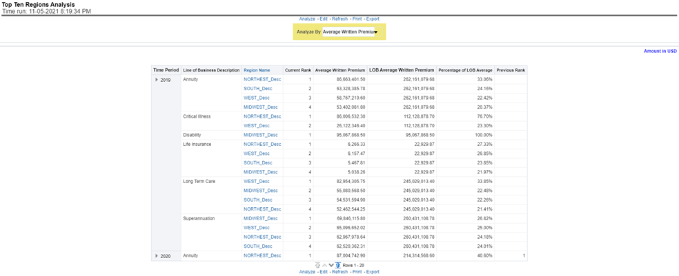
This report analyzes policy business at a regional level and displays top-performing Lines of business and regions. The lines of business and region-wise ranking can be further analyzed through the following performance indicators:
· Written Premium
· Average Written Premium
· Conversion Ratio
· Policy Count
· Quote Count
· Attrition Ratio
· Claim Ratio
· Claim Payments
· Claim Count
Figure 364: Top Ten Regions Analysis
The Product tab includes reports that focus on the Key Performance Indicators for each Product. The filters for this tab allow the report results to be focused on selected products for comparison and targeted analysis. The filters include:
· Time
· Company
· Lines of business
· Product
· Region
The various reports available under this tab are detailed in the following sections.
This report shows snapshots of current key performance areas against the target.
Figure 365: Key Product Performance Indicators Flash
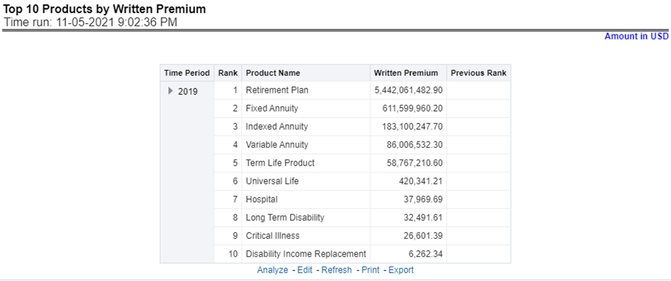
This report ranks the top ten products in terms of written premium and their previous ranking. This report can be viewed over various periods, company, region products, and lines of business selected from page-level prompts.
Figure 366: Top 10 Products by Written Premium
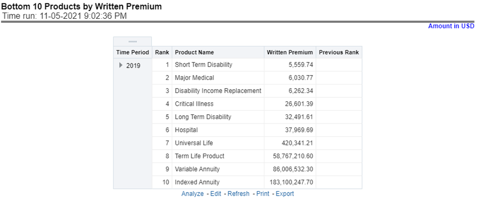
This report ranks the lowest-performing bottom ten products in terms of written premium and their previous ranking. This report can be viewed over various periods, company, Region, product, and lines of business selected from page-level prompts.
Figure 367: Bottom 10 Products by Written Premium
This report ranks the best performing top ten products in terms of policy counts and their previous ranking. This report can be viewed over various periods, company, Region, product, and lines of business selected from page-level prompts.
Figure 368: Top 10 Products by Policy Count
This report ranks the lowest-performing bottom ten products in terms of policy counts and their previous ranking. This report can be viewed over various periods, company, Region, products, and lines of business selected from page-level prompts.
Figure 369: Bottom 10 Products by Policy Count
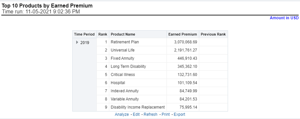
This report ranks the best performing top ten products in terms of earned premium and their previous ranking. This report can be viewed over various periods, company, Region, products, and lines of business selected from page-level prompts.
Figure 370: Top 10 Products by Earned Premium
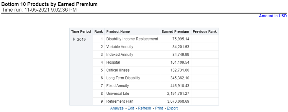
This report ranks the lowest-performing bottom ten products in terms of earned premium and their previous ranking. This report can be viewed over various periods, company, Region, products, and lines of business selected from page-level prompts.
Figure 371: Bottom 10 Products by Earned Premium
This report shows claim payments by-products through a comparison between actual and planned values. This report can be viewed over various periods, company, Region, product, and lines of business selected from page-level prompts. The pie chart shows policy count by current in-time values whereas the line graph represents the values through a time series.
Figure 372: Claim Payment Analysis by Product
This report shows the claim expenses incurred for products through a comparison between actual and planned values. This report can be viewed over various periods, company, Region, products, and lines of business selected from page-level prompts. The pie chart shows policy count by current in-time values whereas the line graph represents the values through a time series.
Figure 373: Claim Expense Analysis by Product
This report shows claim recoveries by-products through a comparison between actual and planned values. This report can be viewed over various periods, company, Region, product, and lines of business selected from page-level prompts. The pie chart shows policy count by current in-time values whereas the line graph represents the values through a time series.
Figure 374: Claim Recovery Analysis by Products
This report shows policy attritions by Products. This report can be viewed for current performance by different attrition types like cancellation, expiry, and non-renewals. This report can also be analyzed both in terms of lost policy counts and lost written premium. This report can be viewed over various periods, company, Region, Product, and lines of business selected from page-level prompts. The pie chart shows policy counts by current in-time values wherein the line graph represents the values through a time series.
Figure 375: Policy Attrition by Product
This report analyzes policy attrition reasons and ranks them by each attrition reason and by lines of business.
Figure 376: Top Attrition Reasons by Product
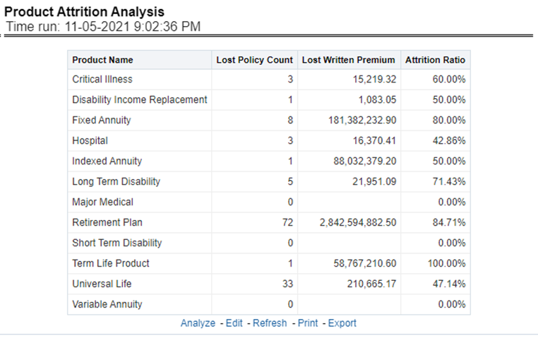
This report analyzes policy attrition reasons by-products and shows attritions through the three key parameters lost policy count, lost premium count, and attrition ratio.
Figure 377: Product Attrition Analysis
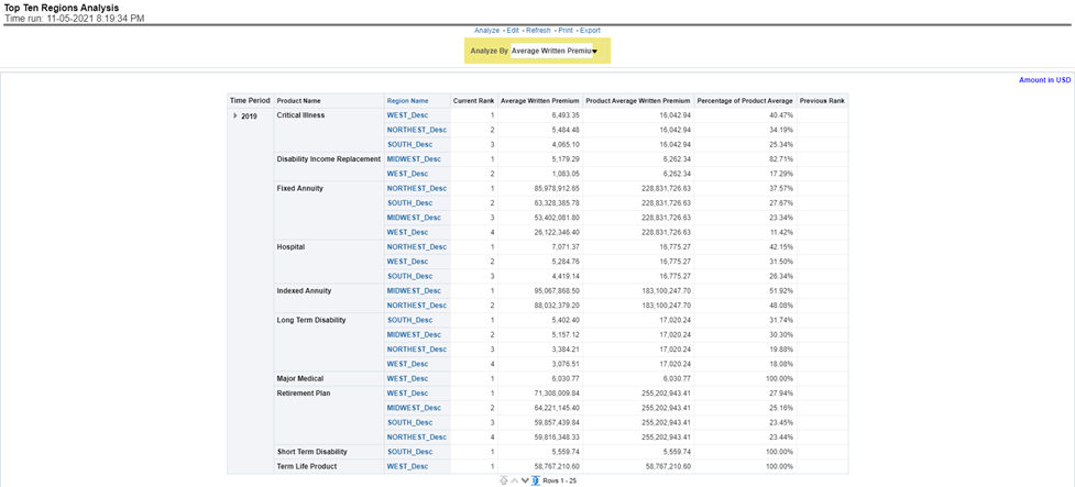
This report analyzes policy business at a regional level and displays top-performing Products and regions. The product and region wise ranking can be further analyzed through the following performance indicators:
· Written Premium
· Average Written Premium
· Conversion Ratio
· Policy Count
· Quote Count
· Attrition Ratio
· Claim Ratio
· Claim Payments
· Claim Counts
Figure 378: Top Ten Regions Analysis
The Region tab includes reports represented in tabular and map format that summarizes results for geographical regions. The filters for this tab allow the report results to be focused on selected combinations for geographical comparison. The filters include:
· Time
· Company
· Lines of business
· Product
· Region
The various reports available for this tab are discussed in the following sections.
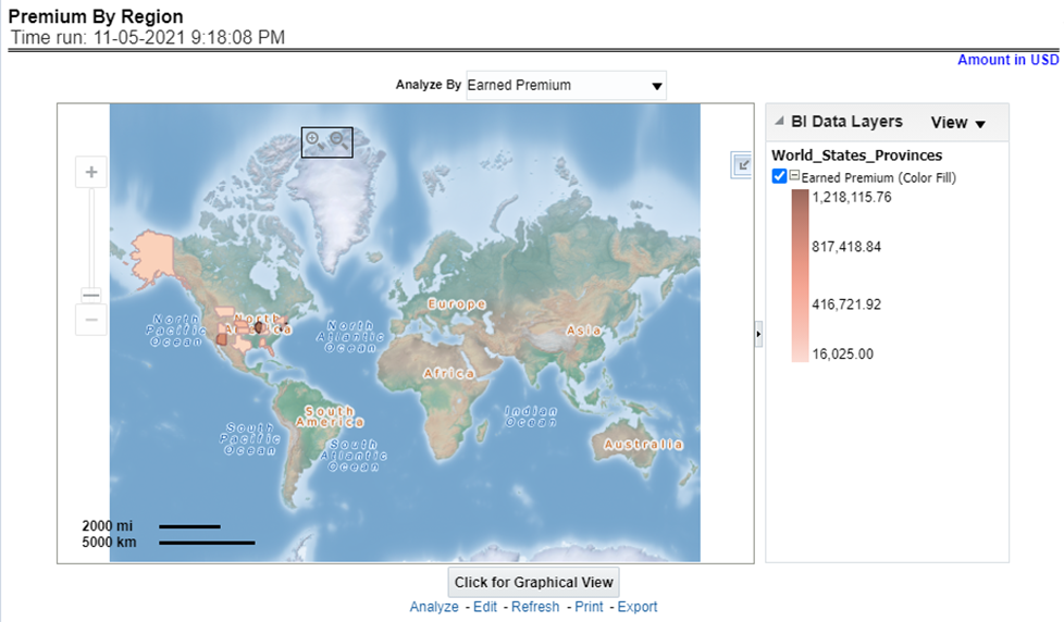
This report shows different types of premium revenue by various geographical regions. This report can be viewed over various periods, company, Region, product, and lines of business selected from the page-level prompts. This report shows premium income through the following premiums.
· Written premium
· Earned premium
· Ceded premium
· Retained premium
· Refund premium
· Uncollected earned premiums
Drill Down: The report Premium By Region can be further analyzed by regions, period, and premium types, for example, written premium, earned premium, ceded premium, retained premium, refund premium, and uncollected Earned Premium. Click any premium type to view the report in the drill-down mode.
Figure 379: Premium by Region
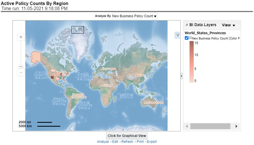
This report shows the count of policies written by different policy types, that is, total policy count, new business policy count, and renewal policy count. This report can be viewed over various periods, company, Region, product, and lines of business selected from the page-level prompts.
Drill Down: The report can be further analyzed by regions, period, and policy counts of different policy statuses, for example, policy count, new business policy count, and renewal policy count. Click any policy status to view the report in the drill-down mode.
Figure 380: Active Policy Counts By Region
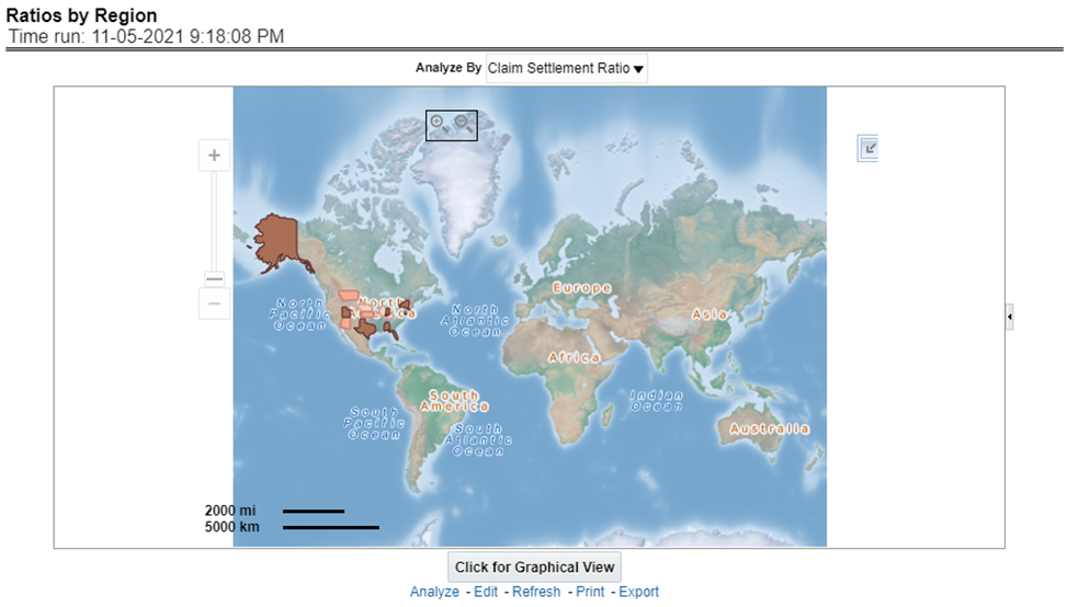
This report shows key indicator ratios like expense ratio, claim ratio, and claim settlement ratio by different regions. This report can be viewed over various periods, company, Region, product, and lines of business selected from page-level prompts.
Drill Down: The report can be further analyzed by regions, period, and ratios like new business attrition ratio, and renewal business attrition ratio. Click any ratio to view the report in the drill-down mode.
Figure 381: Ratios by Region
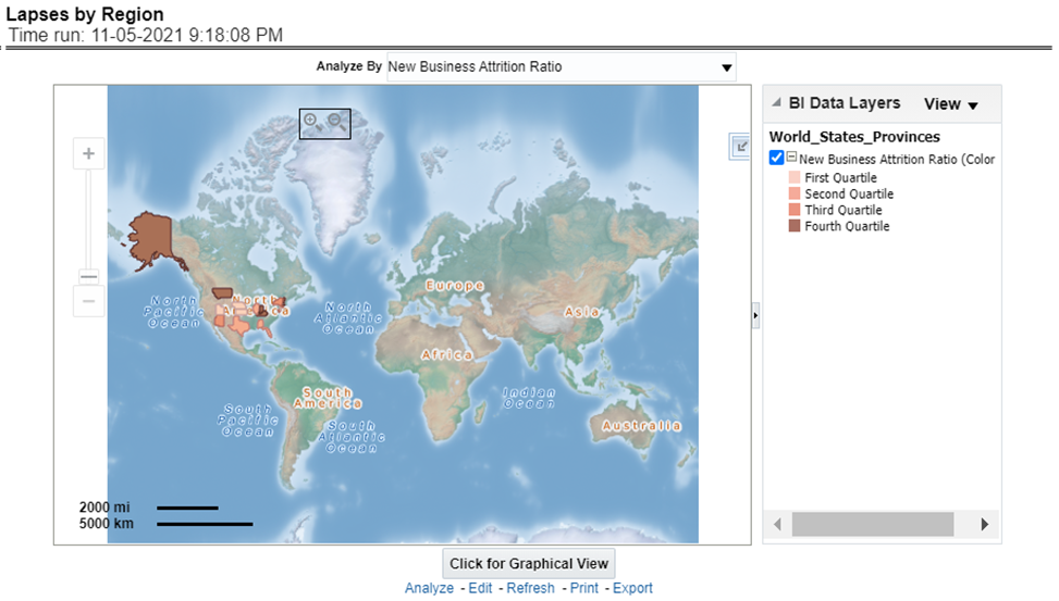
This report shows, lapses and attritions by region represented by new and renewal business attrition ratios as well as written premium lost for new and renewal business attrition policies. This report can be viewed over various periods, company, line of business, and product as selected from page-level prompt.
Figure 382: Lapses by Region
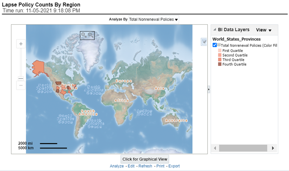
This report shows a count of policies in lapsed status. This can be viewed by cancelled policy counts, total expired policies, non-renewed policies as available at the report level filter. This report can be viewed over different periods, companies, lines of business, and products as selected from page-level prompt.
Figure 383: Lapse Policy Counts for Region
This report illustrates the count of claims by claims in a different status, for example, claims reported, claims settled, and claims in litigation. This report can be viewed over various periods, company, Region, product, and lines of business selected from page-level prompts.
Drill Down: The report can be further analyzed by regions, period, claim status, and counts, for example, Number of Claims Reported, Number of Claims Settled, and Litigation Claims. Click any claim status to view the report in the drill-down mode.
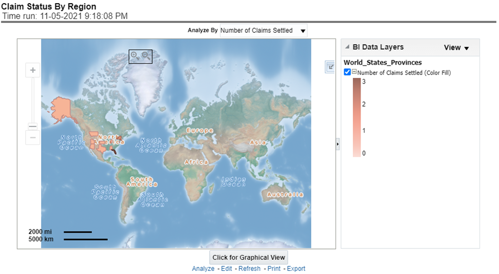
Figure 384: Claim Status By Region
This report illustrates the claim payment like loss payments, catastrophic claim payments, and litigation claim payments through the geographical map and a drill through time series. This report can be viewed over various periods, company, Region, product, and lines of business selected from page-level prompts.
Drill Down: The report can be further analyzed by regions, period, and claims, for example, Number of loss payments, catastrophic claim payments, and litigation claim payments. Click any claim payment to view the report in the drill-down mode.
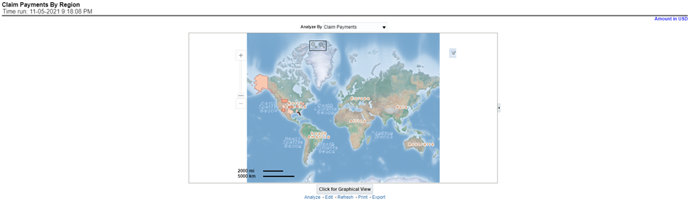
Figure 385: Claim Payments by Region
This report consists of three further reports, which show
the ranking for the top ten best performing and
bottom ten least performing producers.
This report also shows the region-wise ranking by the number of customers through a map and tabular forms.
Drill Down: This report can be further analyzed by clicking each region where top or bottom 10 producers are ranked for each region and their performance measurement for each ranked producer through the following performance key indicators:
· Policy Count
· Written Premium
· Bind (Conversion)Ratio
· Attrition Ratio
· Claim Count
Figure 386: Producer Ranking By Region
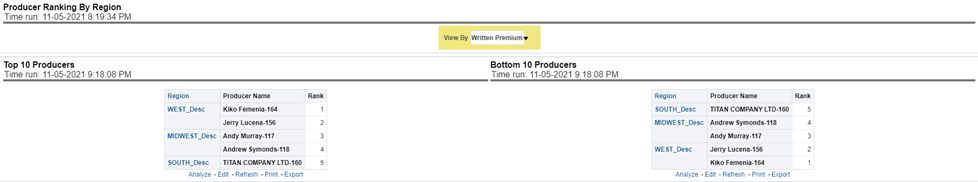
This report lists out top-performing producers by region with their previous ranks. The ranking is based on and displayed as per key indicator chosen under the Producer Ranking By Region menu.
Figure 387: 10 Ten Producers

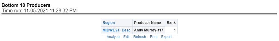
This report lists out the bottom ten least performing producers by region with their previous ranks. The ranking is based on and displayed as per key indicators chosen under the Producer Ranking By Region menu.
Figure 388: Bottom 10 Producers

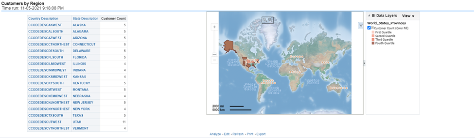
This report shows the number of customers by region and countries including states.
Figure 389: Customers by Region
This chapter explains the report available under each tab in the Claim Performance Dashboard.
The following tabs are present in the Claim Performance Dashboard.
· Summary
· Product
The following screenshots display the essential nature of the available reports as per each tab:
Figure 390: Claim Performance Tabs

The Summary tab includes information at the corporate level. The information contained in the reports generated summarizes how the entire organization is performing. The filters for this tab include:
· Time
· Company
· Catastrophe
· Region
The various reports available for this tab are discussed in the following sections.
This report shows snapshots of key performance indicators represented through flash boxes for the current period.
Figure 391: Key Claim Performance Indicators Flash

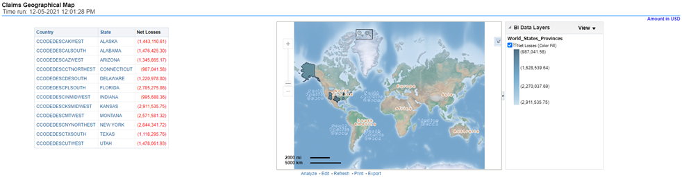
This is a geographic heat map that illustrates the count of claim occurrences over geographic regions with areas of similar amounts colored similarly. The Location of the claim provides the basis for geographical mapping.
Figure 392: Claim Geographical Map
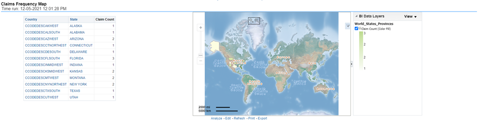
This heat map report displays a number of average claim counts, as claim frequency by region. This report can be generated for various periods, companies, regions as available in the page level prompt.
Figure 393: Claim Frequency Map
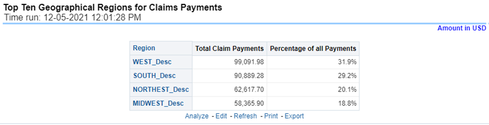
This is a table that ranks the geographical regions with the highest monetary amount total claim payments for a given reporting period. The percentage of all payments represents the amount of all claim payments generated during the same reporting period in comparison to those only for the given region.
Figure 394: Top Ten Geographical Regions for Claim Payments
This is a table that ranks the geographical regions with the highest claim counts for a given reporting period. The percentage of all occurrences represents the amount of all claim counts generated during the same reporting period in comparison to those only for the given region.
Figure 395: Top Ten Geographical Regions for Claims Reported

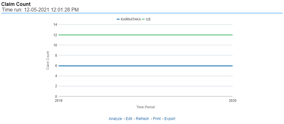
This report is a time-series line graph that illustrates the count of claims added to the system over a time series and represented as a line for each Line of business.
Figure 396: Claim Count
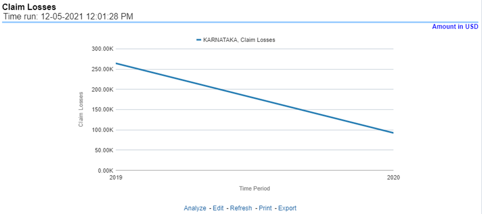
This represents the incurred claims, the total amount of paid claims associated with a reporting period over a time series. This report is a time-series line graph generated for the enterprise as a whole and illustrates each Line of business with its own line.
Figure 397: Claim Losses
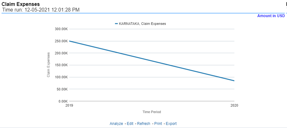
This report is a line graph that illustrates the monetary amount of claim expenses, payments made for services, and other non-claim-related costs, issued over a time series.
Figure 398: Claim Expenses
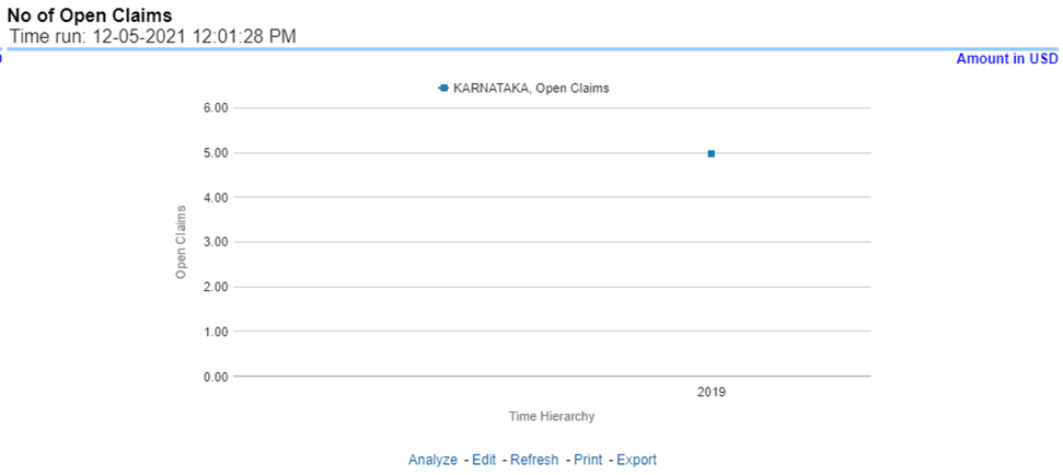
This report is a time-series line graph generated on the count of open claims. This report can be analyzed by various periods, companies, catastrophes, and regions as selected from the page level prompt.
Figure 399: Number of Open Claims
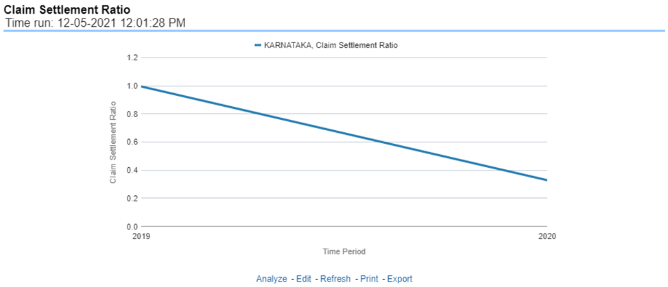
This report is a time-series line graph generated as the percentage of settled claims against total claims received. This report can be analyzed by various periods, companies, catastrophes, and regions as selected from the page level prompt.
Figure 400: Claim Settlement Ratio
This report is a time-series line graph generated as the percentage of claims payments against premium income. This report can be analyzed by various periods, companies, catastrophes, and regions as selected from the page level prompt.
Figure 401: Claim Ratio
This is a time-series line graph that displays the monetary amount of claim recovery payments received by a company at the point in time of the reporting period and over a time series. This report can be analyzed by various periods, companies, catastrophes, and regions as selected from the page level prompt.
Figure 402: Claim Recoveries
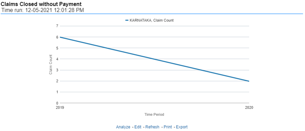
This report is a time-series line graph that illustrates the count of claims that were closed during the reporting period without any payments generated for the claim.
Expenses may have been paid for these claims. This report can be analyzed by various periods, companies, catastrophes, and regions as selected from the page level prompt.
Figure 403: Claims Closed without Payment
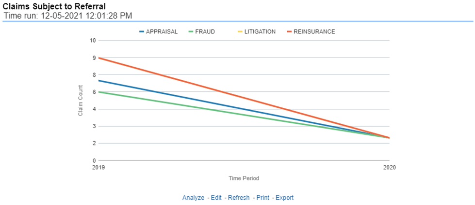
This report is a time-series line graph that illustrates the count of claims that were referred for further actions, appraisal, or recovery during the reporting period. This report can be analyzed by various periods, companies, catastrophes, and regions as selected from the page level prompt.
Figure 404: Claims Subject to Referral
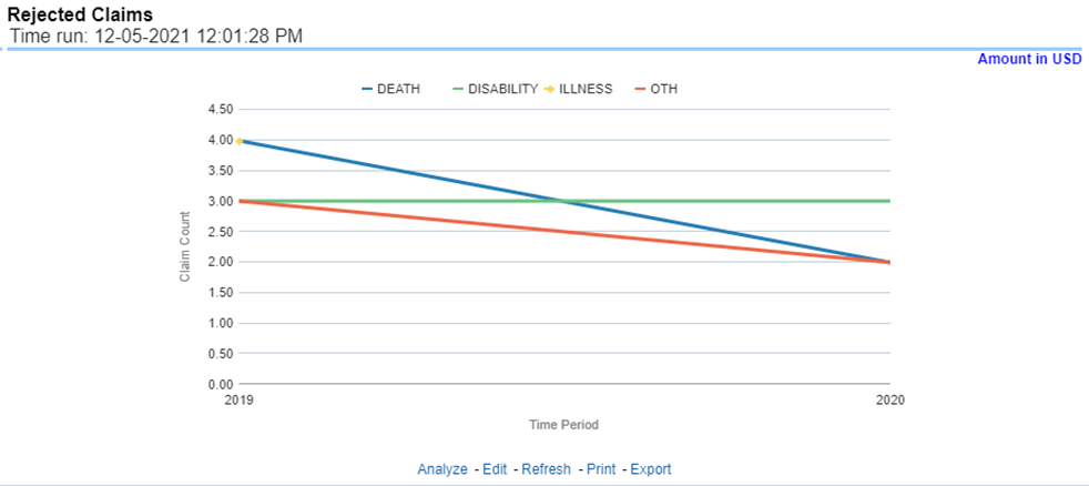
This report is a time-series line graph that illustrates the count of claims that were rejected during the reporting period without any payments generated for the claim. Expenses may have been paid for these claims. This report can be analyzed by various periods, companies, catastrophes, and regions as selected from the page level prompt.
Figure 405: Rejected Claims
The Claim Handling tab includes information at the corporate level and focuses on the manner and quality by which the handling of a claim is measured. The filters for this tab include:
· Time
· Company
· Region
The various reports available for this tab are discussed in the following sections.
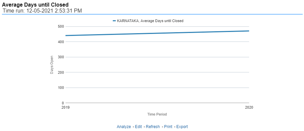
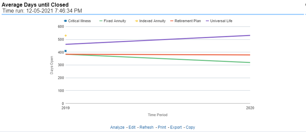
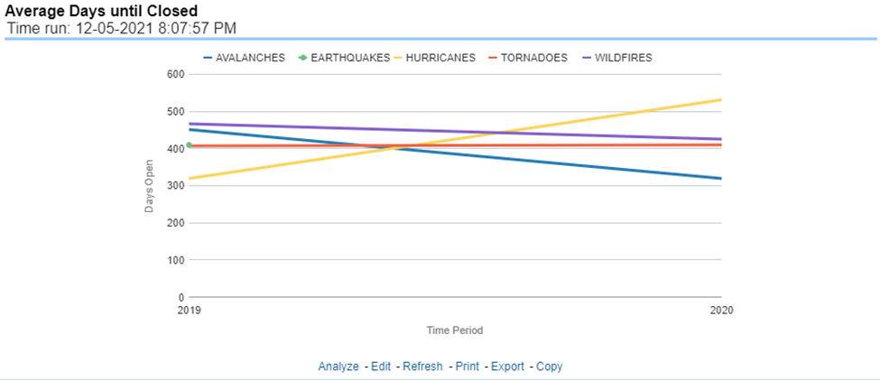
This report is a time-series line graph that illustrates the average number of days between the day a claim is opened in the system and the date that the status of the same claim is changed to "Closed". This average is shown over a time series for each insurance company. This report can be analyzed by various periods, companies, catastrophes, and regions as selected from the page level prompt.
Figure 406: Average Days until Closed
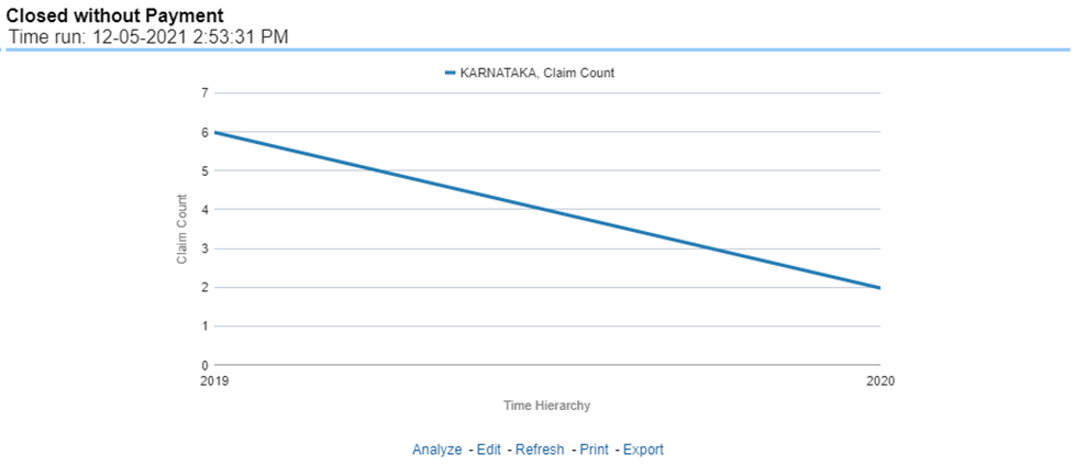
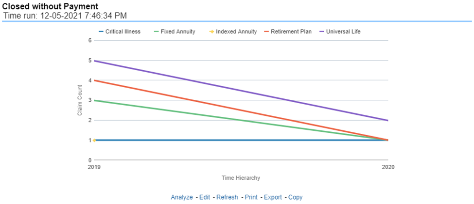
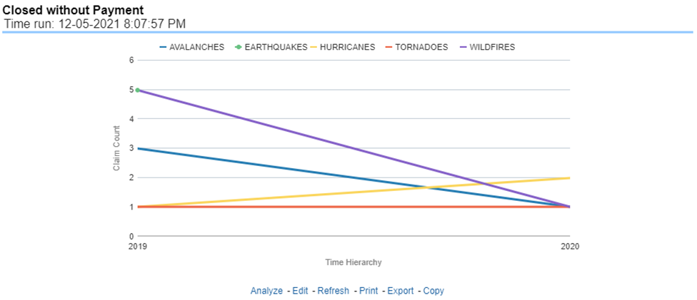
This report is a line graph that illustrates the count of claims that were closed during the reporting period without any loss payments generated for the claim. This report can be analyzed by various periods, companies, catastrophes, and regions as selected from the page level prompt.
Expenses may have been paid for these claims. Each Insurance Company is represented by its own line.
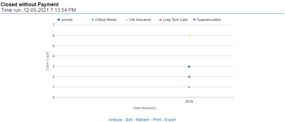
Figure 407: Closed Without Payment
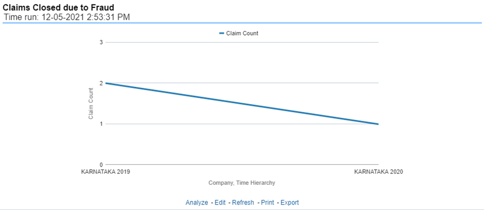
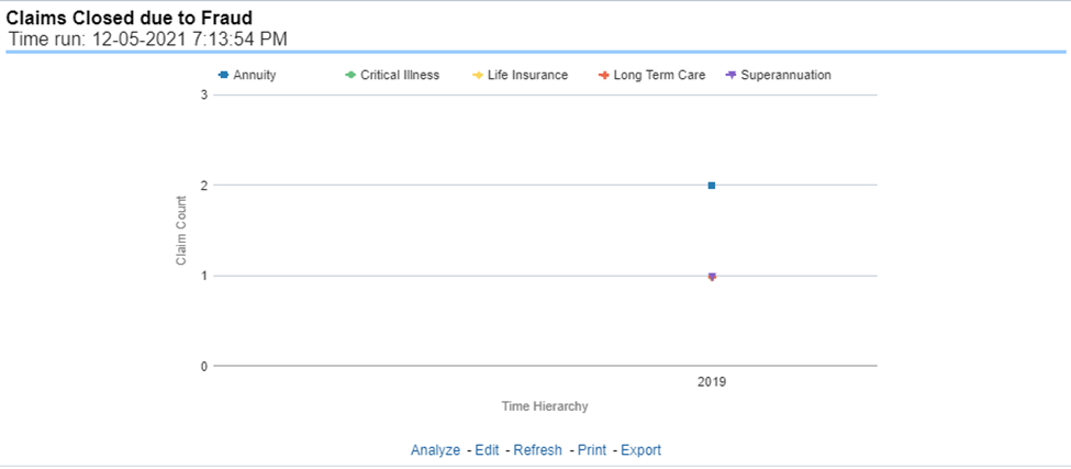
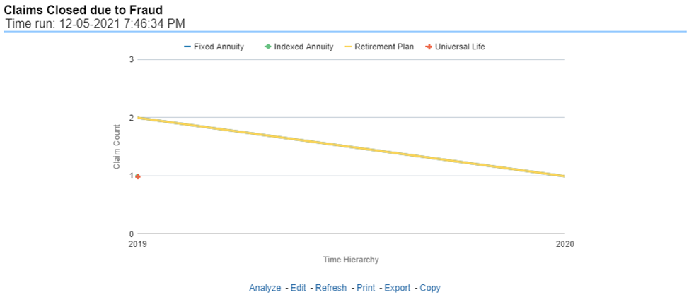
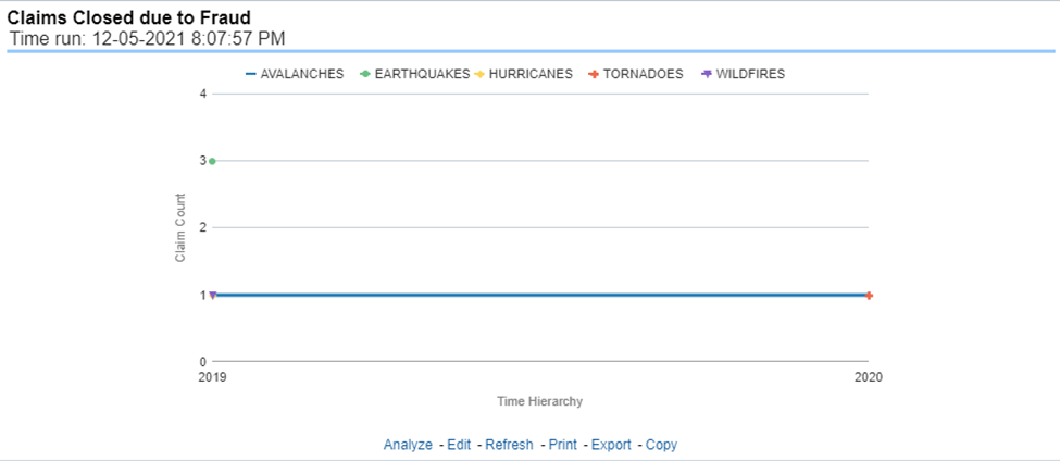
This report is a line graph that illustrates the count of claims that, after an investigation, were deemed to be fraudulent. In this report, the count is exhibited over a time series with each insurance company represented by its own line. This report can be analyzed by various periods, companies, catastrophes, and regions as selected from the page level prompt.
Figure 408: Claims Closed Due to Fraud
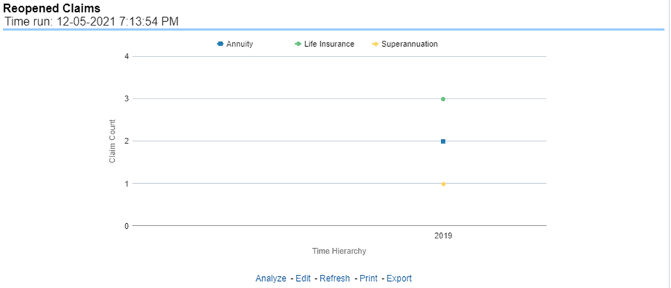
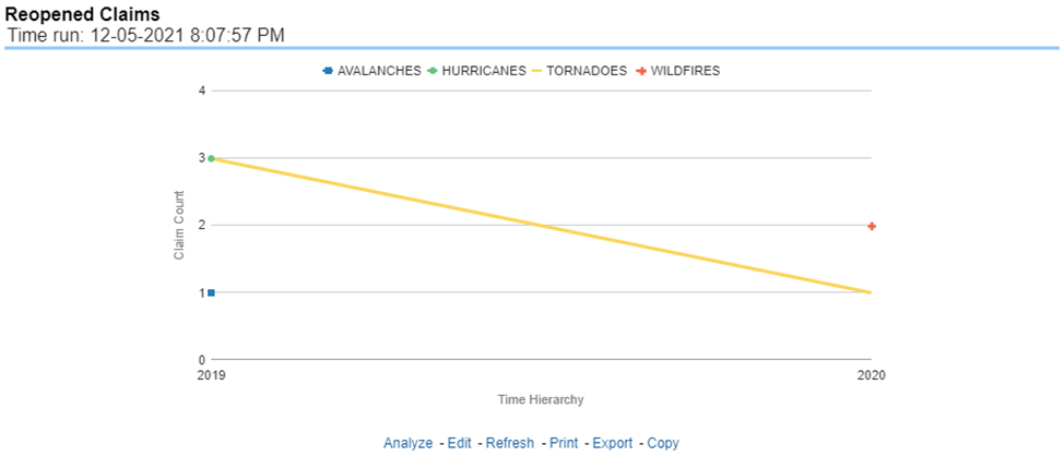
This report is a line graph that illustrates the count of claims that were changed back to an "Opened" status after it was previously closed. This report shows affected claims during the reporting periods over a time series with each insurance company represented with its own line. This report can be analyzed by various periods, companies, catastrophes, and regions as selected from the page level prompt.
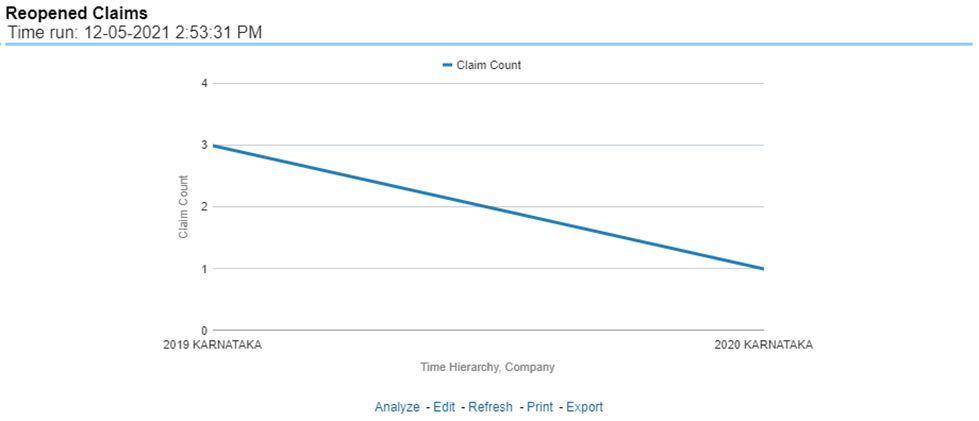
Figure 409: Reopened Claims
This report is a line graph that displays the count of claims that resulted in a judicial litigation case being initiated. This shows the count of claims per Line of business where this process occurred over time. This report can be analyzed by various periods, companies, catastrophes, and regions as selected from the page level prompt.
Figure 410: Litigation Claims

The Lines of business tab includes reports that focus on the Key Performance Indicators for each Line of business. The filters for this tab allow the report results to be focused on selected combinations for comparison and targeted analysis.
· Time
· Company
· Lines of business
· Region
The various reports available under this tab are detailed in the following sections.
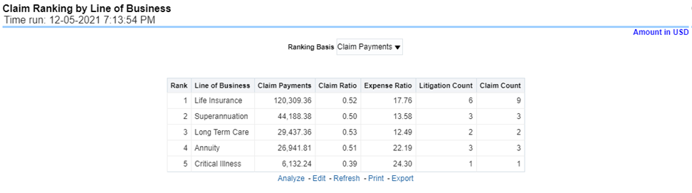
This is a tabular report that lists the Lines of Business in the order of greatest value to least value based on the Ranking Grade Basis selected, these include Key Performance Indicators for Claim Performance eg; Claim Payments, Claim Counts, and Litigation Counts. This report can be analyzed by various periods, company, line of business, and regions as selected from the page level prompt.
Figure 411: Claim Ranking by Line of Business
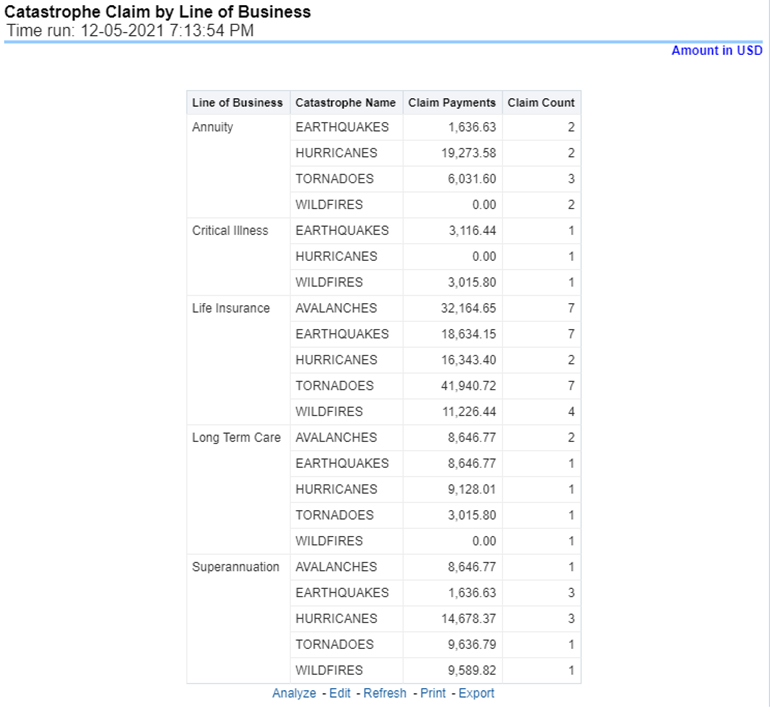
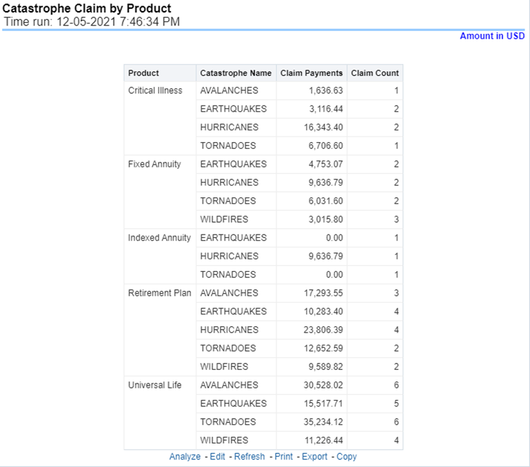
This is a tabular report that provides a summary of the effects of a Catastrophe on the Claims Performance for the Lines of business. The total Claim Payments and Claim Count are presented for each Line of business for each Catastrophic Event.
Figure 412: Catastrophe Claim by Lines of Business
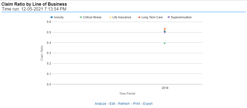
This report is a time-series line graph generated as the percentage of claims payments against premium income for each line of business. This report can be analyzed by various periods, company, line of business, and regions as selected from the page level prompt.
Figure 413: Claim Ratio by Line of Busines
This report is a time-series line graph generated for the amount claims payments for each line of business. This report can be analyzed by various periods, company, line of business, and regions as selected from the page level prompt.
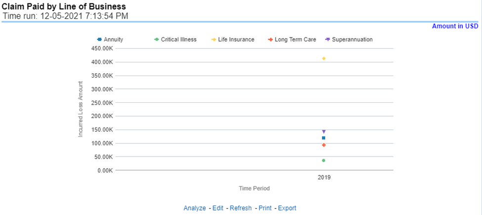
Figure 414: Claim Paid by Line of Business
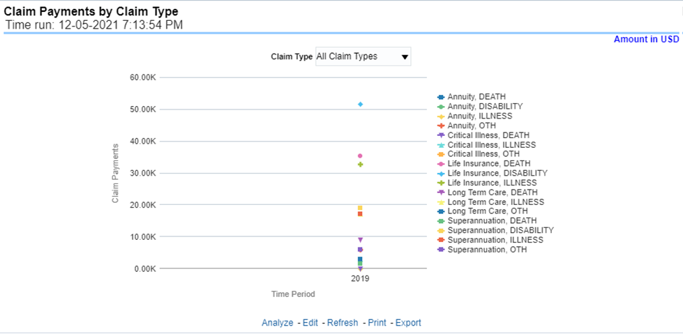
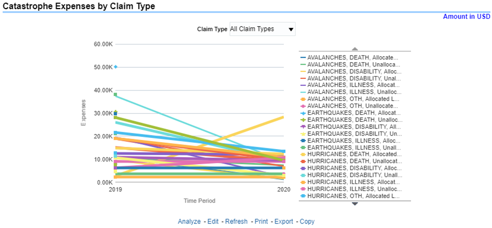
This report is a time-series line graph generated by total or specific claims types like death, dismemberment, and so on for each line of business. The report has two report level drop-down values like “All Claim Types” and “Specific Claim Types”. The second drop-down menu list is displayed upon selection of “Specific Claim Types”, where an individual time series can e generated by selecting each claim type. This report can be analyzed by various periods, company, line of business, and regions as selected from the page level prompt.
Figure 415: Claim Payments by Claim Type
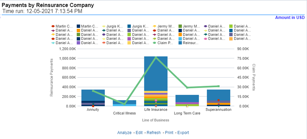
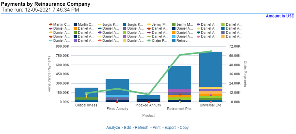
This report is a stacked Bar/Line graph that illustrates the relationship between the amount of payments made by the insurer and those that were received from the reinsurer for claim payments. Each stack of the bar represents each reinsurance company that the insurance company has an agreement with.
Figure 416: Payments by Reinsurance Company
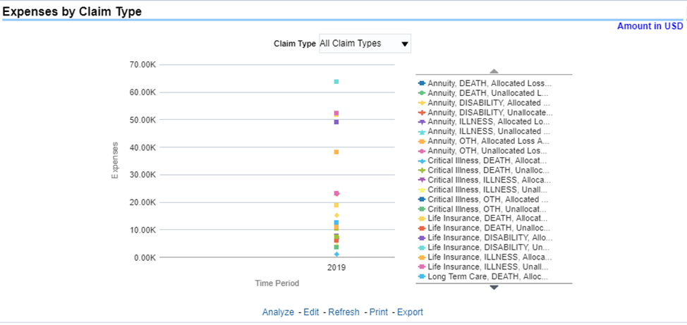
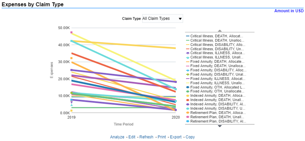
This report is a time-series line graph generated for claim expenses by total or specific claims types like death, dismemberment, and so on for each line of business. The report has two report level drop-down values like “All Claim Types” and “Specific Claim Types”. The second drop-down menu list is displayed upon selection of “Specific Claim Types”, where an individual time series can e generated by selecting each claim type. This report can be analyzed by various periods, company, line of business, and regions as selected from the page level prompt.
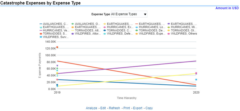
Figure 417: Expenses by Claim Type
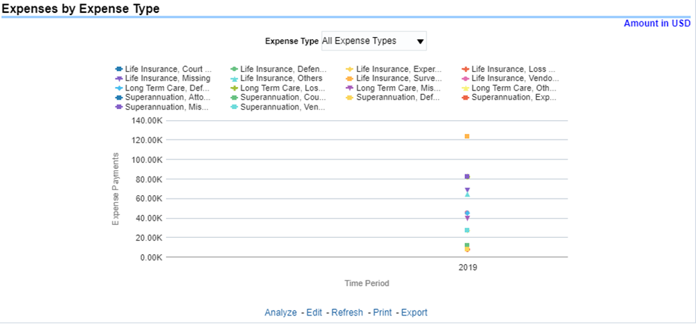
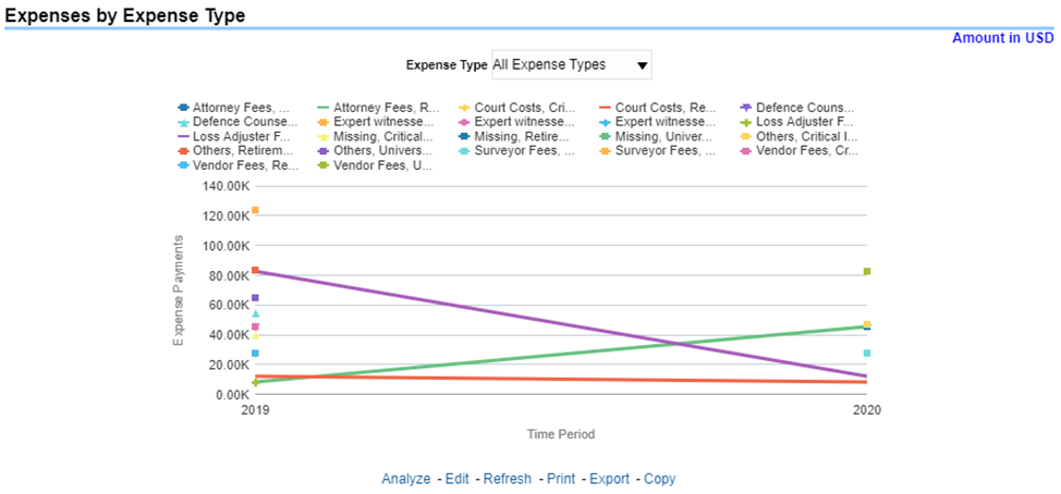
This report is a line graph that illustrates the monetary payment totals generated for Expenses on claims based on the categorization of the expense. Each expense amount is categorized by the Lines of business and type of Expense. Additional Details can be reviewed by selecting a specific Expense Type from the Expense Type selection field.
Figure 418: Expenses by Expense Type
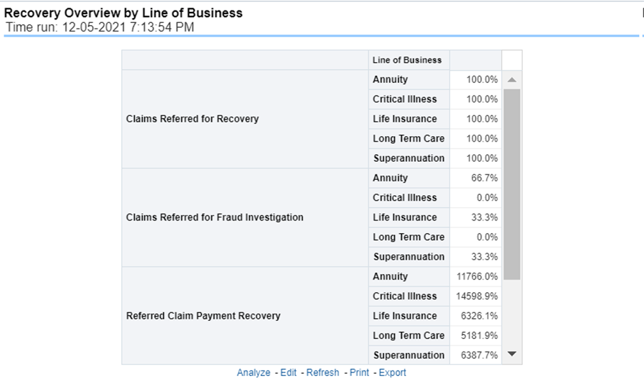
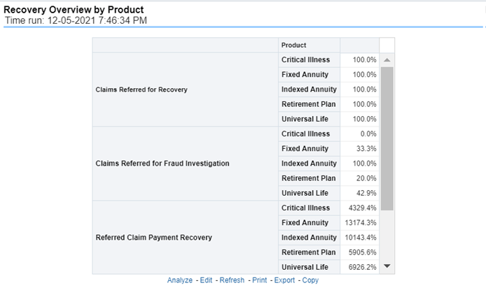
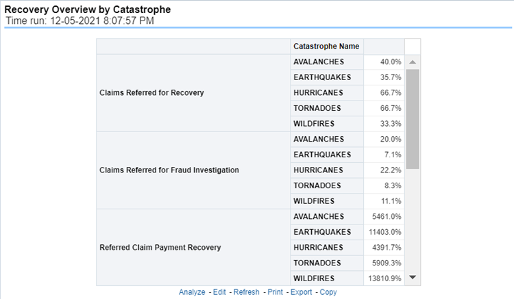
This report is a tabular representation illustrating the performance of Recovery Referral for each Line of business and the performance of those efforts.
Figure 419: Recovery Overview by Lines of Business
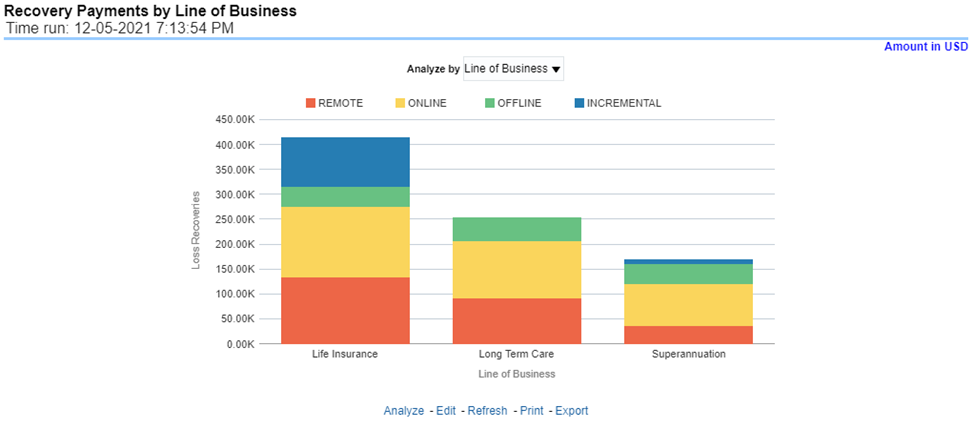
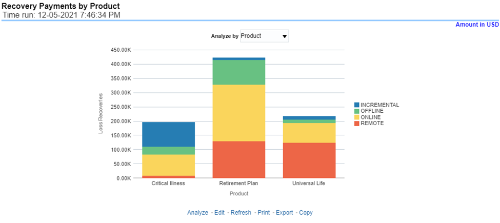
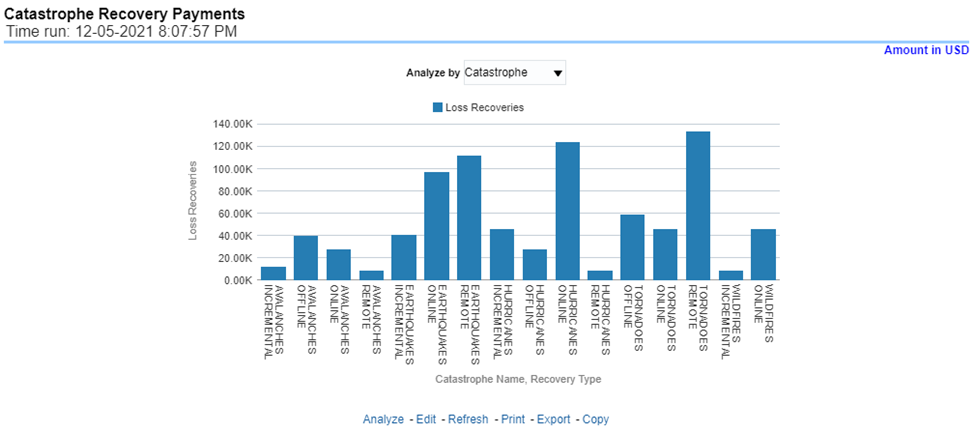
This report is a stacked bar graph that illustrates the total monetary amount of Recovery Payments, payments received by an insurer that reimburse it for claims it paid, received during a reporting period. This report has a report level drop-down menu based on Line of Business and Coverage Type.
Figure 420: Recovery Payments by Lines of Business
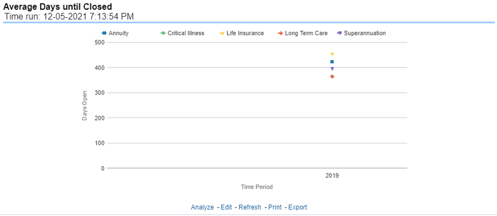
This report is a line graph that illustrates the average number of days between the day a claim is opened in the system and the date that the status of the same claim is changed to "Closed". This average is shown over a time series for each Line of business.
Figure 421: Average Days until Closed
This report is a line graph that illustrates the count of claims that were closed during the reporting period without any loss payments generated for the claim.
Expenses may have been paid for these claims. Each Line of business is represented by its own line.
Figure 422: Claims Closed without Payment
This report is a line graph that illustrates the count of claims that, after an investigation, were deemed to be fraudulent. In this report, the count is exhibited over a time series with each Line of business represented by its own line.
Figure 423: Claims Closed Due to Fraud
This report is a line graph that illustrates the count of claims that were changed back to an "Opened" status after it was previously closed. This report shows affected claims during the reporting periods over a time series with each Line of business represented with its own line.
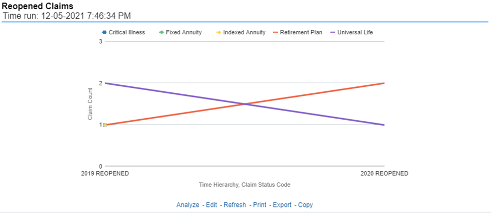
Figure 424: Reopened Claims
This report is a line graph that represents the count of claims where a judicial litigation case was initiated for the claim during the reporting period. This report illustrates the count of the affected claims for over a time series with each Line of business being represented by its own line.
Figure 425: Litigation Claims

The Product tab includes reports that focus on the Key Performance Indicators for each Product. The filters for this tab allow the report results to be focused on selected combinations for comparison and targeted analysis. The filters include:
· Time
· Company
· Product
· Region
The various reports available under this tab are detailed in the following sections.
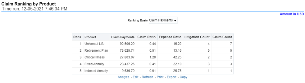
This is a tabular report that lists the products in the order of greatest value to least value based on the Ranking Grade Basis selected, these include Key Performance Indicators for Claim Performance eg; Claim Payments, claim ratio, expense ratio, Claim Counts and Litigation Counts. This report can be analyzed by various periods, companies, products, and regions as selected from the page level prompt.
Figure 426: Claim Ranking by Product
This is a tabular report that provides a summary of the effects of a Catastrophe on the Claims Performance for the Product. The total Claim Payments and Claim Count are presented for each Product for each Catastrophic Event.
Figure 427: Catastrophe Claim by Product
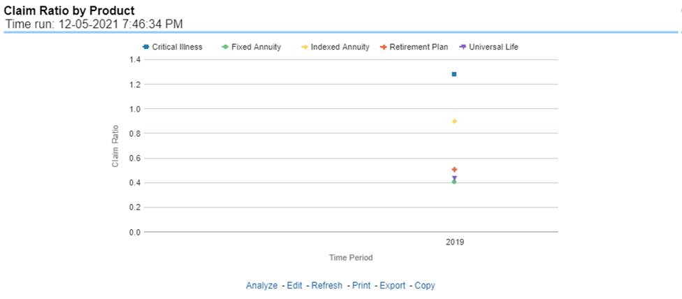
This report is a time-series line graph generated as the percentage of claims payments against premium income for each product. This report can be analyzed by various periods, company, product, and regions as selected from the page level prompt.
Figure 428: Claim Ratio by Product
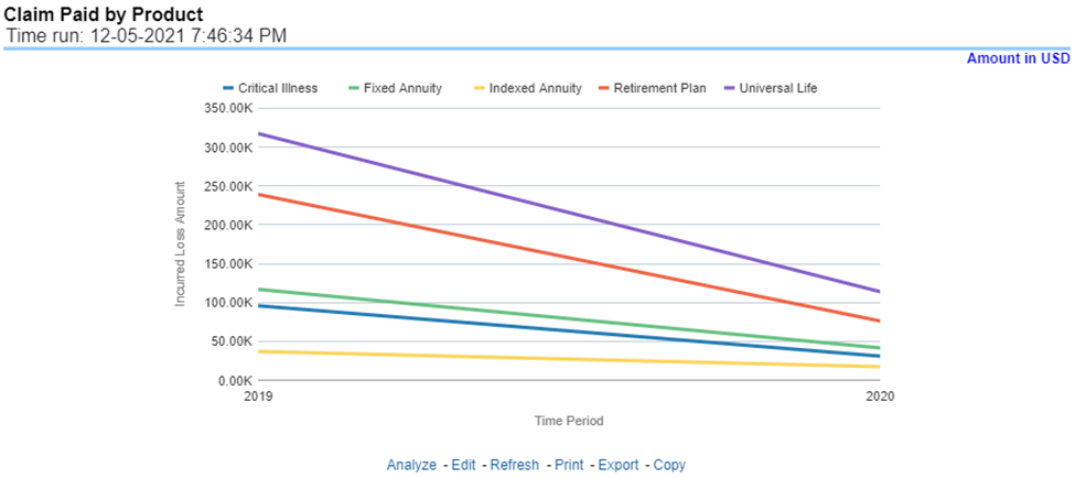
This report is a time-series line graph generated for the amount claims payments for each product. This report can be analyzed by various periods, companies, products, and regions as selected from the page level prompt.
Figure 429: Claim Paid by Product
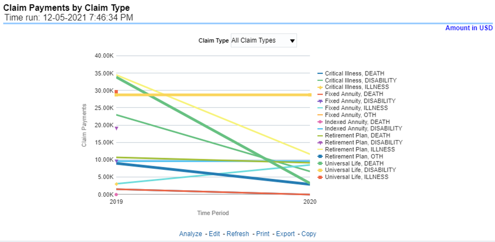
This report is a time-series line graph generated by total or specific claims types like death, dismemberment, and so on for each product. The report has two report level drop-down values like “All Claim Types” and “Specific Claim Types”. The second drop-down menu list is displayed upon selection of “Specific Claim Types”, where an individual time series can e generated by selecting each claim type. This report can be analyzed by various periods, companies, products, and regions as selected from the page level prompt.
Figure 430: Claim Payments by Claim Type
This report is a stacked Bar/Line graph that illustrates the relationship between the amount of payments made by the insurer and those that were received from the reinsurer for claim payments. Each stack of the bar represents each reinsurance company that the insurance company has an agreement with.
Figure 431: Payments by Reinsurance Company
This report is a time-series line graph generated for claim expenses by total or specific claims types like death, dismemberment, and so on for each line of business. The report has two report level drop-down values like “All Claim Types” and “Specific Claim Types”. The second drop-down menu list is displayed upon selection of “Specific Claim Types”, where an individual time series can e generated by selecting each claim type. This report can be analyzed by various periods, company, product, and regions as selected from the page level prompt.
Figure 432: Expenses by Claim Type
This report is a line graph that illustrates the monetary payment totals generated for Expenses on claims based on the categorization of the expense. Each Expense amount is categorized by the Product and type of Expense. Additional Details can be reviewed by selecting a specific Expense Type from the Expense Type selection field.
Figure 433: Expenses by Expense Type
This report is a tabular representation illustrating the performance of Recovery Referral for each Product and the performance of those efforts.
Figure 434: Recovery Overview by Product
This report is a stacked bar graph that illustrates the total monetary amount of Recovery Payments, payments received by an insurer that reimburse it for claims it paid, received during a reporting period. This report has a report level drop-down menu based on Product and Coverage Type.
Figure 435: Recovery Payments by Product
This report is a line graph that illustrates the average number of days between the day a claim is opened in the system and the date that the status of the same claim is changed to "Closed". This average is shown over a time series for each Product.
Figure 436: Average Days until Closed
This report is a time-series line graph that illustrates the count of claims that were closed during the reporting period without any claim payments generated for the claim.
Expenses may have been paid for these claims. Each Product is represented by its own line.
Figure 437: Claims Closed without Payment
This report is a time-series line graph that illustrates the count of claims that, after an investigation, were deemed to be fraudulent. In this report, the count is exhibited over a time series with each Product represented by its own line. This report can be analyzed by various periods, company, product, and regions as selected from the page level prompt.
Figure 438: Claims Closed Due to Fraud
This report is a line graph that illustrates the count of claims that were changed back to an "Opened" status after it was previously closed. This report shows affected claims during the reporting periods over a time series with each Product represented with its own line. This report can be analyzed by various periods, companies, products, and regions as selected from the page level prompt.
Figure 439: Reopened Claims
This report is a line graph that represents the count of claims where a judicial litigation case was initiated for the claim during the reporting period. This report illustrates the count of the affected claims for over a time series with each Product being represented by its own line. This report can be analyzed by various periods, company, product, and regions as selected from the page level prompt.
Figure 440: Litigation Claims

The Catastrophe tab includes reports that focus on the Key Performance Indicators for declared Catastrophe. The filters for this tab allow the report results to be focused on selected combinations for comparison and targeted analysis. The filters include:
· Time
· Company
· Catastrophe
· Region
The various reports available under this tab are detailed in the following sections.
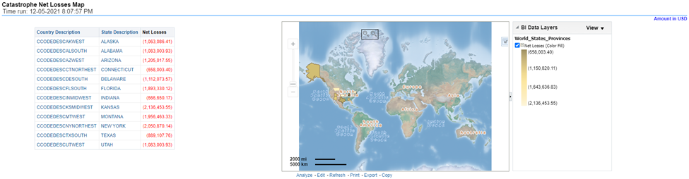
This report is a Geographic Heat Map that illustrates the monetary amount of Net Losses, that is, Paid Losses exclusive of Expenses, for Catastrophe Claims over geographic regions with areas of similar amounts colored similarly. The Location of Loss provides the basis for geographical mapping.
Figure 441: Catastrophe Net Losses Map
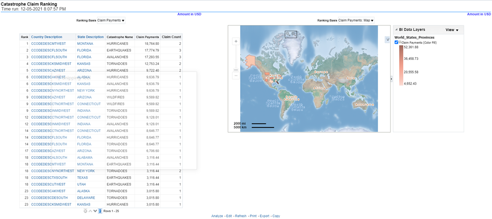
An assessment and ranking of catastrophe losses can be measured by various performance measures like net losses, claim payments, and through the number of claims across regions and catastrophes. This report contains both tabular and geographical map that lists the catastrophe in the order of greatest value to the least value based on the grade basis selected.
Figure 442: Catastrophe Claim Ranking
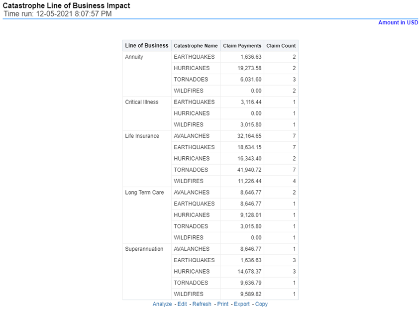
This is a tabular report that provides a summary of the effects of a catastrophe on the claim performance for the lines of business. The total claim payments and claim count are presented for each Line of business for each catastrophic event.
Figure 443: Catastrophe Lines of Business Impact
This is a tabular report that provides a summary of the effects of a catastrophe on the claim performance of the product. The total claim payments and claim count are presented for each Line of business for each catastrophic event.
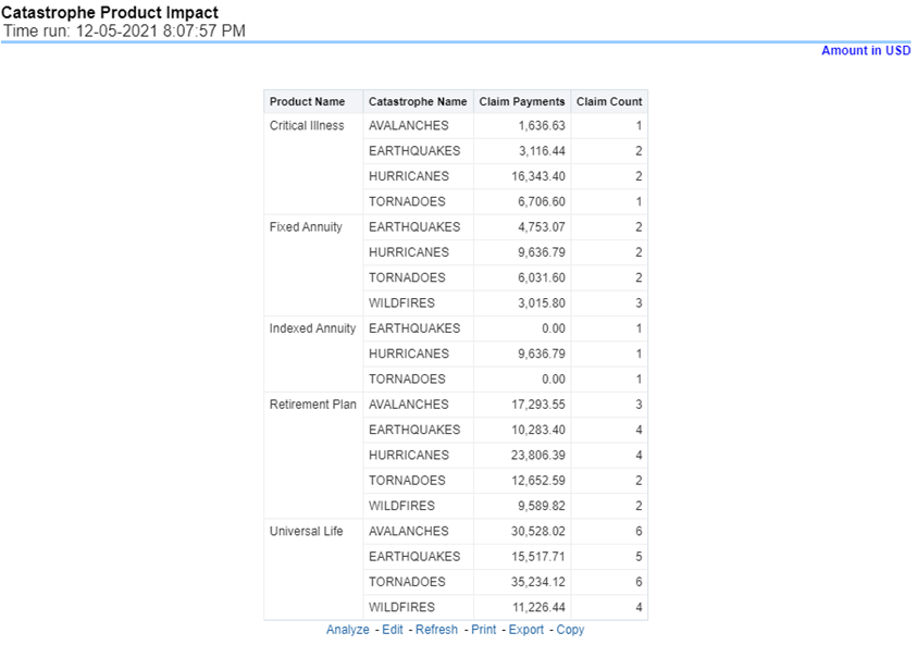
Figure 444: Catastrophe Product Impact
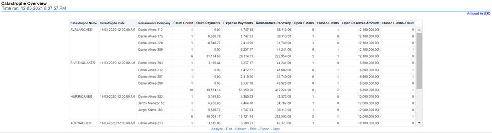
This is a tabular report that summarizes the key performance factors for Claims performance for each Catastrophe. This report lists down impacts by each catastrophe in terms of reinsurance companies involved, count of claims, claim payments, expense amount, reinsurance recovery amount by each reinsurer, no of claims open, number of claims closed, no of claims closed marked as fraudulent claims, and so on. This report can be analyzed by all or any selected catastrophe, by regions impacted by the catastrophe.
Figure 445: Catastrophe Overview
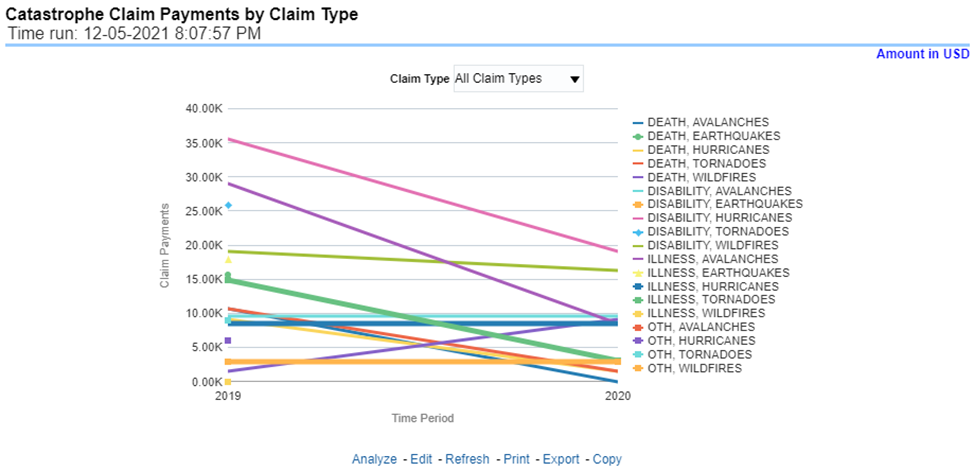
This report is a time-series line graph generated by total or specific claims types like death, dismemberment, and so on for each product. The report has two report level drop-down values like “All Claim Types” and “Specific Claim Types”. The second drop-down menu list is displayed upon selection of “Specific Claim Types”, where an individual time series can e generated by selecting each claim type. This report can be analyzed by various periods, company, catastrophe name, and regions as selected from the page level prompt.
Figure 446: Catastrophe Claim Payments by Claim Type
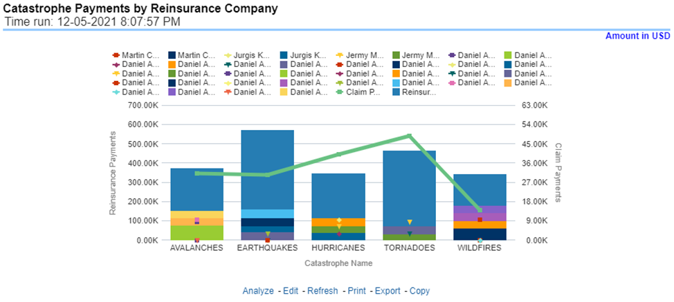
This report is a stacked Bar/Line graph that illustrates the relationship between the amount of payments made by the insurer and those that were received from the reinsurer for claim payments. Each stack of the bar represents each reinsurance company that the insurance company has an agreement with.
Figure 447: Catastrophe Payments by Reinsurance Company
This report is a time-series line graph generated for claim expenses by total or specific claims types like death, dismemberment, and so on for each line of business. The report has two report level drop-down values like “All Claim Types” and “Specific Claim Types”. The second drop-down menu list is displayed upon selection of “Specific Claim Types”, where an individual time series can e generated by selecting each claim type. This report can be analyzed by various periods, company, catastrophe, and regions as selected from the page level prompt.
Figure 448: Catastrophe Expenses by Claim Type
This report is a line graph that illustrates the monetary payment totals generated for expenses on claims based on the categorization of the expense. Each expense amount is categorized by the catastrophe and type of expense. Additional details can be reviewed by a specific expense type from the expense type selection field.
Figure 449: Catastrophe Expenses by Expense Type
This report is a tabular representation illustrating the performance of Recovery Referral for each Catastrophe and the performance of those efforts.
Figure 450: Recovery Overview by Catastrophe
This report is a line graph that illustrates the total monetary amount of Recovery Payments, payments received by an insurer that reimburses it for losses it paid, received for Catastrophe Claims during a reporting period and shown over a period for each Catastrophe. Each Catastrophe is represented by its own line.
Figure 451: Catastrophe Recovery Payments
This report is a line graph that illustrates the average number of days between the day a catastrophe claim is opened in the system and the date that the status of the same claim is changed to "Closed". This average is shown over a time series for each catastrophe.
Figure 452: Average Days until Closed
This report displays the count of catastrophe claims that were closed without any payments for losses being issued to claimants. The graph shows the average count of days for these claims per catastrophe over time.
Figure 453: Closed Without Payment
This report is a line graph that displays the count of catastrophe claims that were closed after an investigation determined that fraudulent activity occurred and no losses were paid to the claimant due to the fraud activity. The graph shows the count of these claims per catastrophe over time.
Figure 454: Claims Closed Due to Fraud
This report displays the count of catastrophe claims that were initially closed and then opened again for further processing. This shows the count of claims per catastrophe where this process occurred over time.
Figure 455: Reopened Claims
This report is a line graph that displays the count of catastrophe claims that resulted in a judicial litigation case being initiated. This shows the count of claims per catastrophe where this process occurred over time.
Figure 456: Litigation Claims

This chapter explains the report available under each tab in the Producer Performance Dashboard.
The following tabs are present in the Producer Performance Dashboard:
· Producer Performance Summary
· Performance
· Overview
The following screenshots display the essential nature of the available reports as per each tab:
Figure 457: Corporate Performance Dashboard Tabs
The Summary tab includes information for producer analysis at the corporate level. The information contained in the reports generated summarizes how the performance of producer are compared and are impacting the overall business. Following are the filters available for this tab.
· Time
· Company
· Lines of business
· Region
The various reports available under this tab are detailed in the following sections.
This report shows snapshots of key performance indicators represented through flash boxes for the current period. The growth/decline is shown with respect to previous months' values.
Figure 458: Key Performance Indicators Flash
This map-based report shows the distribution of producers in different regions, areas.
Figure 459: Producer Distribution
This is a map and tabular report. The map plots the count of agents or agencies with active appointments to write new business. The agent or agency address is the basis for the location. The Tabular report shows details of active appointments by periods, country, state, count of current active, percentage of active against total appointments, with previous period count and previous active appointments during the select report analysis period.
Figure 460: Active Producer Appointments
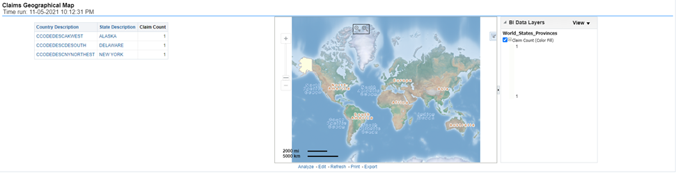
This is a geographic heat map that illustrates the count of claim occurrences over geographic regions with areas of similar amounts colored similarly. The Location of the claim provides the basis for geographical mapping.
Figure 461: Claims Geographical Map
This is a tabular rank-based report which lists out the top 10 performing producers with their Average Claim Settlement Ratio against the number of claims reported for the policies written by these producers and the number of claims rejected which were written by these producers.
Figure 462: Top 10 Producers by Claim Settlement

This is a tabular rank-based report which lists out the top 10 performing producers with their conversion efficiency represented through conversion or Hit Ratio.
Figure 463: Top 10 Producers by Conversion Ratio

This is a tabular rank-based report which lists out the top 10 performing producers with their business and customer retention efficiency represented through retention ratio.
Figure 464: Top 10 Producers by Customer Retention Ratio

This is a tabular rank-based report which lists out the top 10 performing producers based on the amount of premium business brought by them.
This is a tabular rank-based report which lists out the top 10 producers based on the expenses rendered.
This report shows the percentage of policies acquired through different agents and agencies for the company and can be analyzed by report level filters, policy count, and written premium amount. This report can be viewed over various periods, company, region, and lines of business selected from page-level prompts.
Figure 465: Policy Acquisition by Distribution Channel
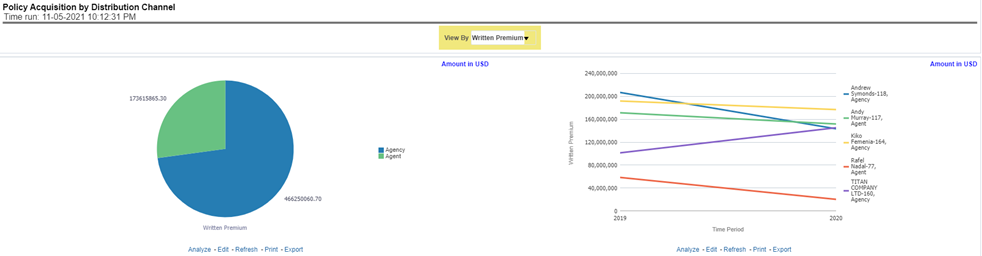
The Producer performance tab includes reports that focus on the performance of each producer and producer collectively. The filters for this tab allow the report results to be focused on selected producers for comparison and targeted analysis. The filters include:
· Time
· Company
· Lines of business
· Products
· Producer
· Region
The various reports available under this tab are discussed in the following sections.
This map-based report shows new business policies written by producers in different areas.
Figure 466: Producer New Business Map
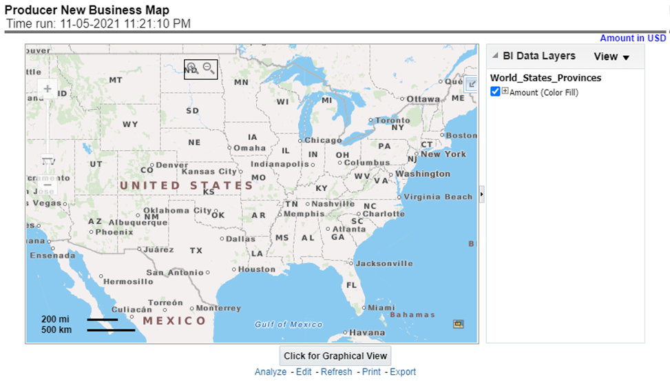
This map-based report shows a number of producers distributed in different areas.
Figure 467: Producer Distribution
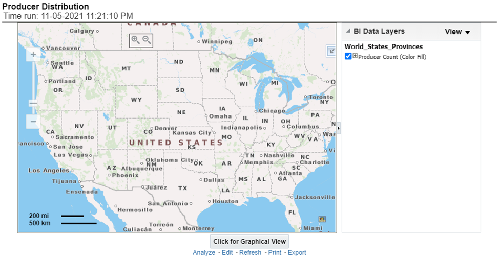
This tabular report shows details of active appointments by periods, country, state, count of current active, percentage of active against total appointments, with previous period count and previous active appointments during select report analysis time period.
Figure 468: Active Producer Appointments
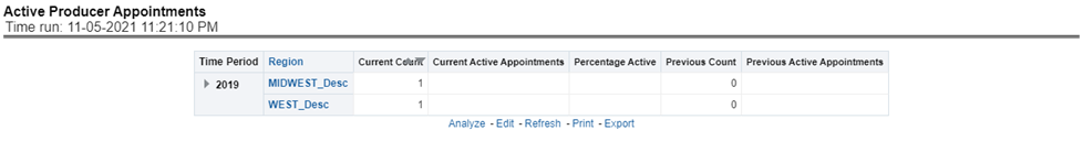
This tabular report provides a summary of Key Performance Metrics for the agents and agencies and averages the results for each of the respective classifications. This provides the basis for comparison when looking at individual producer performances.
Figure 469: Producer Performance Analysis
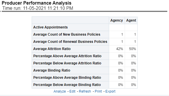
This line graph illustrates the count of agents or agencies over time that have not written a new business policy within either 30, 60, or 90 days since the reporting period start date. These producers have current appointments but are not currently placing new policies with the organization.
Figure 470: Inactive Producers Summary
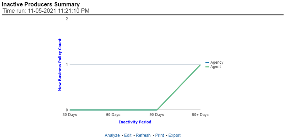
This time-series report shows types of premium generation and claims for selected or all producers.
The report records written and earned premium by producers vis-à-vis claim payments. This report helps to see profitability for the businesses generated by the producers for the company.
Figure 471: Premium and Claim
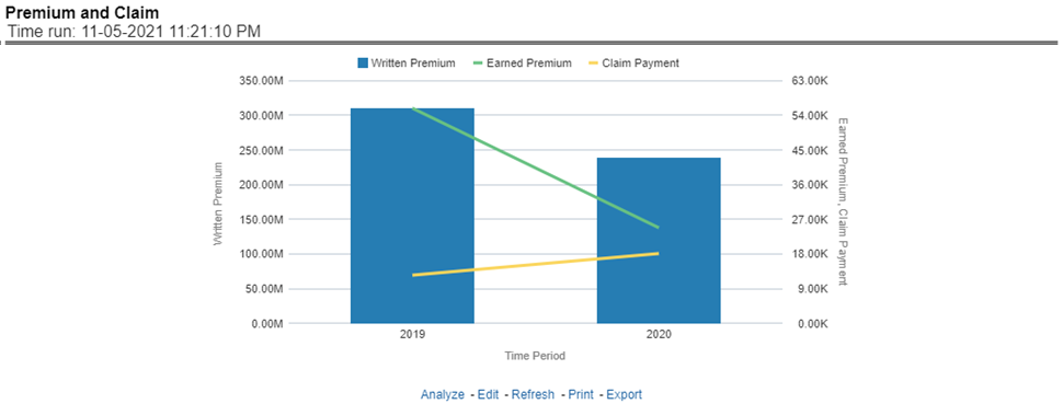
This tabular report shows new business written premium generated by all or selected producers in comparison with previous period written premium and percentage growth and decline in business contributed by the producers.
Figure 472: New Business
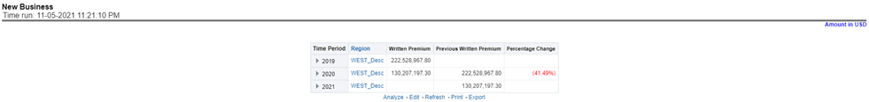
This report lists out top-performing producers by region with their previous ranks. These reports can be displayed based on producer types like agencies and agents selected at the report group level drop-down menu. This report can be viewed by key indicators like written premium, conversion/bind ratio, attrition ratio, claim counts, etc selected at the report level drop-down menu.
Figure 473: Top Ten Producers
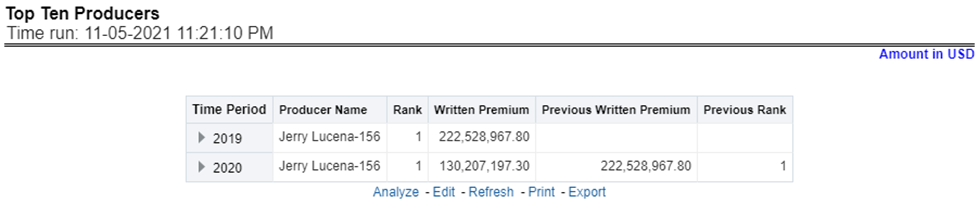
This report lists out least performing producers by region with their previous ranks. These reports can be displayed based on producer types like agencies and agents selected at the report group level drop-down menu. This report can be viewed by key indicators like written premium, conversion/bind ratio, attrition ratio, claim counts, etc selected at the report level drop-down menu.
Figure 474: Bottom Ten Producers
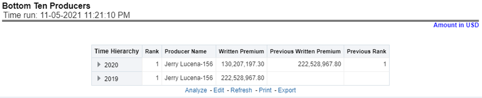
This chart lists the producing agents and agencies with the 10 highest New Business Quote Count for the reporting period. This chart also lists the agencies' prior quote count for reference. The Rank of 1 is for the highest quote count of the top 10, the Rank of 10 is for the lowest quote count for the count of the top 10.
Figure 475: Top 10 Producing Agency New Business Quote Count

This tabular report illustrates the performance in key performance areas. The results are populated based on the values selected in the agency and producing agent filters. This allows multiple columns to present for multiple view selections. The report also shows the performances against key parameters for agents reporting to producing agencies. These key performance indicators are eg, performance rank, number of new business policies, renewal policies, binding/conversion ratios, average quote acceptance days, claims, attrition, premium, and so on.
Figure 476: Individual Producer Performance Analysis
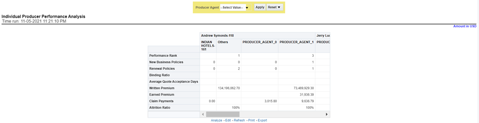
The Region tab under the producer dashboard includes reports represented in tabular and map format that summarizes results for geographical regions. The filters for this tab allow the report results to be focused on selected combinations for geographical comparison. The filters include:
· Time
· Company
· Lines of business
· Product
· Producer
· Region
· Analyze by Producer Type- Agent, Agency
The various reports available for this tab are discussed in the following sections.
This map report shows different types of premium revenue generated by producers in various geographical regions. This report can be viewed over various combinations selected from the page-level prompts. This report can be analyzed by agents and agencies. This report shows different types of premium phases as given below,
· Written premium
· Earned premium
· Ceded premium
· Retained premium
· Refund premium
· Uncollected earned premiums
Drill Down: The report Premium By Region can be further analyzed by regions, period, and premium types, for example, written premium, earned premium, ceded premium, retained premium, refund premium, and uncollected Earned Premium. Click any premium type to view the report in the drill-down mode.
Figure 477: Producer Premium by Region
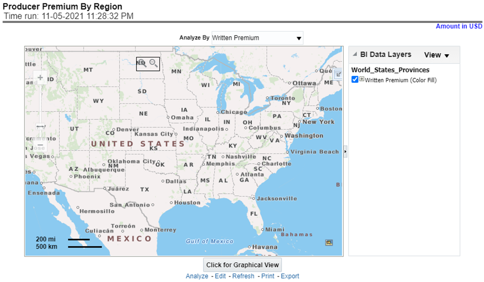
This report shows a count of policies written by different policy types, that is, total policy count, new business policy count, and renewal policy count by producers. This report can be viewed over various periods, company, Region, product, and lines of business selected from the page-level prompts. This report can be analyzed by agents and agencies.
Drill Down: The report can be further analyzed by regions, period, and policy counts of different policy statuses, for example, policy count, new business policy count, and renewal policy count. Click any policy status to view the report in the drill-down mode.
Figure 478: Producer Active Policy Counts by Region
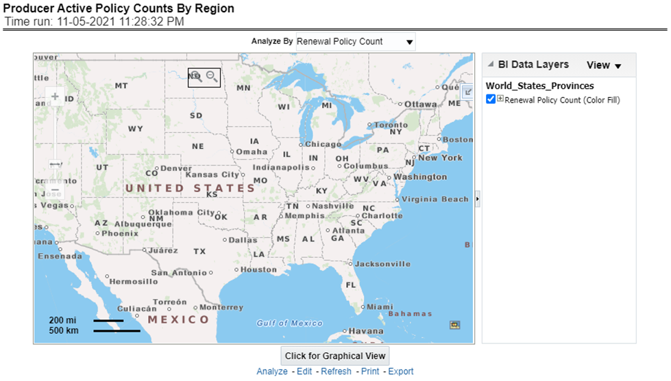
This report shows key indicator ratios like expense ratio, claim ratio and claim settlement ratio, premium collection ratio in different regions for the business generated by producers. This report can be viewed over various periods, company, Region, product, and lines of business selected from page-level prompts. This report can be analyzed by agents and agencies.
Drill Down: The report can be further analyzed by regions, period, and ratios like new business attrition ratio, and renewal business attrition ratio. Click any ratio to view the report in the drill-down mode.
Figure 479: Producer Ratios by Region
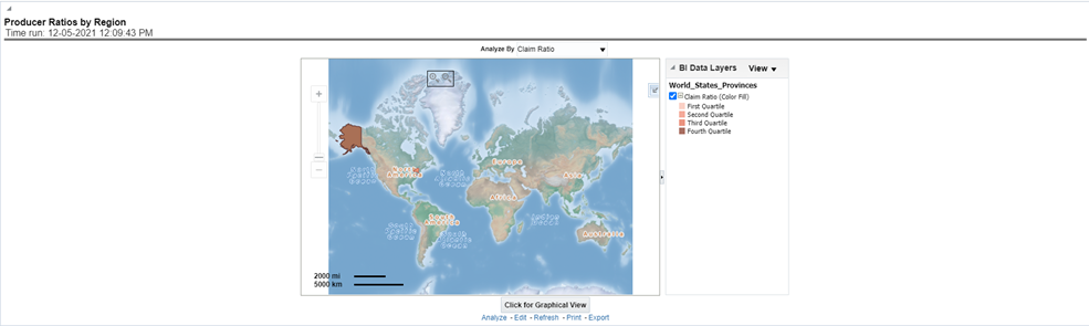
This report shows lapses and attritions by region for the business generated by producers, in terms of new and renewal business attrition ratios as well as written premium lost for new and renewal business attrition policies. This report can be viewed over various periods, company, line of business, and product as selected from page-level prompt. This report can be analyzed by agents and agencies.
Figure 480: Producer Attrition (Lapses) by Region

This report shows a count of policies generated by producers in lapsed status. This can be viewed by cancelled policy counts, total expired policies, non-renewed policies as available at the report level filter. This report can be viewed over different periods, companies, lines of business, and products as selected from page-level prompt. This report can be analyzed by agent and agencies.
Figure 481: Producer Attrition (Lapse) Policy Counts by Region
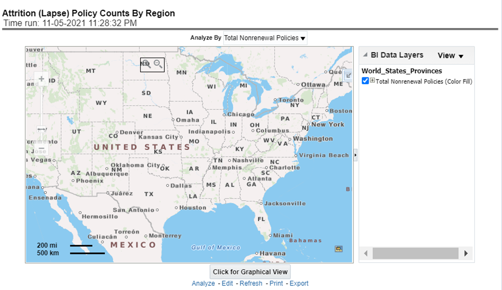
This report illustrates the count of claims by claims in a different status for the policies written by producers, for example, claims reported, claims settled, and claims in litigation. This report can be viewed over various periods, company, Region, product, and lines of business selected from page-level prompts. This report can be analyzed by agents and agencies.
Drill Down: The report can be further analyzed by regions, period, claim status, and counts, for example, Number of Claims Reported, Number of Claims Settled, and Litigation Claims. Click any claim status to view the report in the drill-down mode.
Figure 482: Claim Status by Region
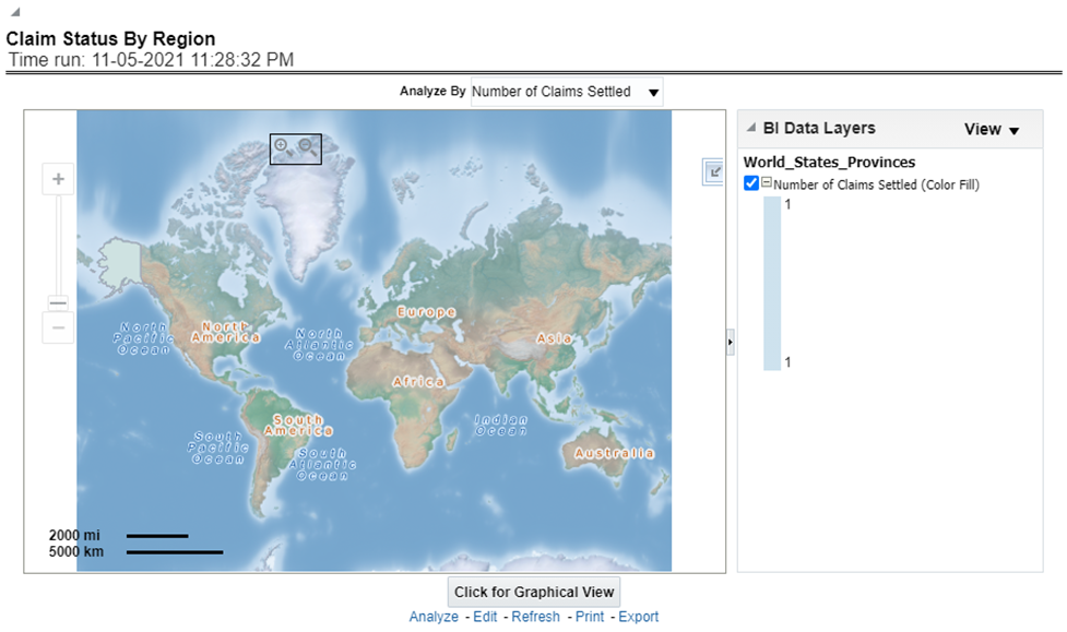
This report illustrates the claim payment like claim payments, catastrophic claim payments, and litigation claim payments through the geographical map and a drill through time series. This report can be viewed over various periods, company, Region, product, and lines of business selected from page-level prompts. This report can be analyzed by agents and agencies.
Drill Down: The report can be further analyzed by regions, period, and claims, for example, Number of loss payments, catastrophic claim payments, and litigation claim payments. Click any claim payment to view the report in the drill-down mode.
Figure 483: Claim Payments by Region
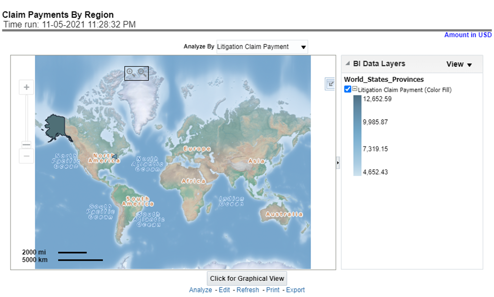
This report consists of three further reports, which show
the ranking for the top ten best performing and
bottom ten least performing producers.
This report also shows the region-wise ranking by a number of customers through the map and tabular forms.
This report can be analyzed by agents and agencies.
This report can be further analyzed by clicking each region where top or bottom 10 producers are ranked for each region and their performance measurement for each ranked producer through the following performance key indicators:
· Policy Count
· Written Premium
· Bind (Conversion)Ratio
· Attrition Ratio
· Claim Count
Figure 484: Producer Raking by Region

This report lists out top-performing producers by region with their previous ranks. The ranking is based on and displayed as per key indicator chosen under the Producer Ranking By Region menu.
Figure 485: Top 10 Producers

This report lists out the bottom ten least performing producers by region with their previous ranks. The ranking is based on and displayed as per key indicators chosen under the Producer Ranking By Region menu.
Figure 486: Bottom 10 Producers