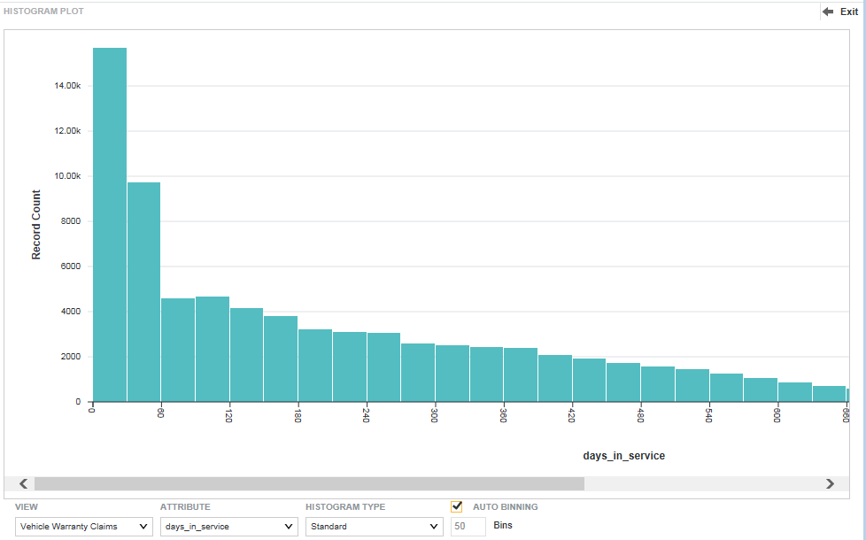
A Histogram Plot is a basic visualization for showing the distribution of values for a single metric.
On the Histogram Plot, the X-axis contains bars with binned data reflecting ranges of attribute values. For example, the first bin might reflect values between 0 and 30, the second bin values between 30 and 60, and so on. The Y-axis shows the number of records with values that fall within each range of values.
To display the range of values for a selected bin, hover the mouse over the bar for that binned range.