For some charts, you can refine the data by selecting a displayed dimension value or by selecting multiple dimension values with the marquee selection tool.
Hovering over values in a chart displays a highlight and tooltip with the exact dimension and metric values for a section. Use this information to preview data in detail before further refining the chart.
To refine the chart data:
-
To refine to a range of values:
-
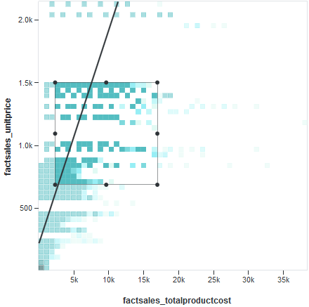
Click and drag to select an area of the chart that contains
multiple values (the marquee selection). For example:
Optionally, click and drag the selected area to move it. -
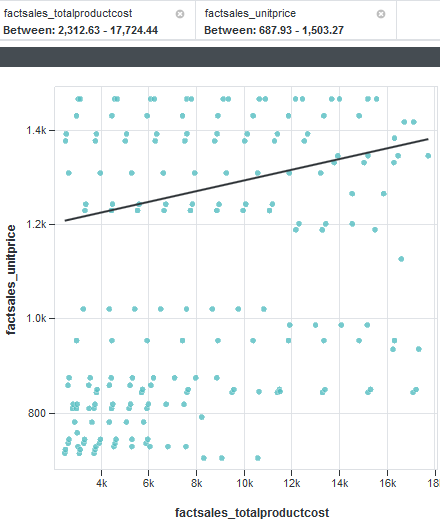
Click the selected area to refine the chart and see a detailed
visualization. For example:
-
Click and drag to select an area of the chart that contains
multiple values (the marquee selection). For example:
-
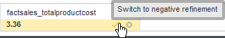
To negate a selected refinement, mouse over it in the
Selected Refinements panel and click the
Switch to negative / positive refinement icon.
For example: