Explore provides you with an out-of-the-box guided analytics experience. It configures the canvas with the right visualizations to explain the data based on your goals. This allows you to get a summary of the data and explore data quality.
![]()
Explore provides an attribute-focused visual summary of the data, summarizing value distributions, data quality gaps, and relationships.
Explore presents visualizations that give you the most insight into the data set: visualizations are most suitable for each specific attribute's data type and value distribution.
Visualizations are automatically composed, to save you time and effort at this early stage in the process. When you have a better understanding of the data set, you can compose your own visualizations on data that you have identified as worthy of further analysis.
You can think of the Explore area as a guided tour of new data sets, freeing you from the need to manually enter a series of common R commands and trying to extract initial meaning from the results, to better understand what's inside the data set.
- What fields are in my data? Do I understand what they are? Explore shows these fields as a series of visualizations.
- How are values distributed? Explore uses descriptive statistics (mean, median, mode, quintiles) and visuals (histograms, box plots).
- How dirty/messy is the data? Are there missing values or outliers? Explore uses the bar underneath each attribute, showing you at a glance whether any inconsistencies exist.
- What relationships exist between fields? Explore uses numeric correlations and visuals.
As an outcome, you understand the data sets you've been exploring.
Some examples of Explore visualizations are shown below:
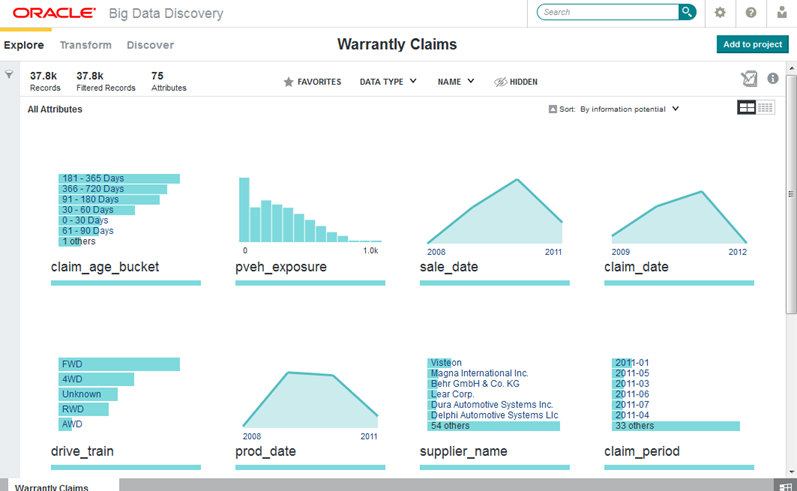
This image shows Explore for a data set with 37.8K records. The attributes are sorted in descending order by information potential.
