")
Overview
This documentation focuses on activity guides in Fluid applications. An activity guide divides action items into a series of tasks or steps. It enables users to see exactly where they are in a process as they progress towards completion. Activity guides track the status of your tasks or steps.
Activity guides use the PeopleTools activity guide framework. An activity guide can be guided or non-guided, sequential or non-sequential. Activity guides are also optimized or non-optimized. The activity guide shows users which tasks to complete and sometimes in which order. The user is presented with a series of tasks to complete a milestone. However, sometimes the user can complete the tasks in whichever order they choose, or as events dictate. An activity guide can also support multiple users and can be used across components. An example is an onboarding process for a new hire that can include multiple users, and numerous tasks or steps that involve HR, Finance, Purchasing, Legal, etc.
Activity guide templates provide a mechanism for defining the properties, security, action items, contextual data, and other options for activity guides as a onetime activity. Then, individual activity guide instances can be generated from these reusable templates.
Activity Guide Terminology
The following terms are used to differentiate the types of activity guides that can be created, and the types of processes these activity guides support:
Optimized - Optimized activity guides support only activity guide optimized fluid components as well as classic components. This allows an optimized activity guide to control the use and display of the left panel.
Non-optimized activity guides – Not recommended, support any fluid components as well as classic components. Instead of presenting the steps or tasks in the left panel, a non-optimized activity guide presents a vertical dropdown list in the fluid banner (or header).
Activity guide optimized fluid components – An activity guide-optimized fluid component adheres to the guidelines for all fluid components as well as the additional guidelines for optimized activity guide types. One of the main guidelines for considering a fluid component as optimized for activity guides is that it does not make use of the left panel.
Sequential - In a sequential activity guide, steps or tasks are numbered and must be completed in a specified order. With non-sequential activity guides, tasks are not numbered and can be completed in any order unless dependencies are defined.
Guided - Guided activity guides include Next, Previous, and Submit (Submit can be relabeled) for navigation in the “guided mode” fluid banner. Non-guided activity guides do not include any navigation buttons; in addition, non-guided activity guides display the standard fluid banner.
Guided mode banner – Different from the standard fluid banner. It displays Next and Previous navigation buttons and some features are moved from the banner into the Actions List.
Single unit of work (SUOW) - Certain activity guide types can be defined as a single unit of work spanning multiple components in the same system. No data is committed until a submit is performed at the final step; if the user exits the activity guide before the submit, all changes are lost. All SUOW activity guides are sequential; moreover, data dependencies can be configured between steps using input/output parameters.
Single component - Certain activity guide types can be defined as single component, which allows different pages from the same component to be displayed as separate steps or tasks within the activity guide. A Save button can be configured to perform a save at any step or task.
Activity Guide Template Types
When an activity guide template is defined, you select one of the process types for the template and its instances. The following table summarizes the features available with each activity guide type.
| Activity Guide Template Type | Uses |
|---|---|
| Horizontal optimized guided sequential | Presents the numbered steps horizontally. Uses the guided mode banner to present navigation buttons. Allows only one level of steps. Use for simple sequential procedures. Can be used for Single Unit of Work or Single Component. |
| Vertical optimized guided sequential | Presents the numbered steps vertically in the left panel. Uses the guided mode banner to present navigation buttons. Allows for steps and substeps. Use for complex sequential procedures. Can be used for Single Unit of Work or Single Component. |
| Vertical optimized guided non-sequential | Presents unnumbered tasks vertically in the left panel. Uses the guided mode banner to present navigation buttons. Allows for tasks and task groupings. Use when users can complete the tasks in which ever order they choose or as events dictate. Cannot be used for Single Unit of Work but can be used for Single Component. |
| Vertical optimized non-guided non-sequential | Presents unnumbered tasks vertically in the left panel. Displays the standard fluid banner without navigation buttons. Allows for tasks and task groupings. Cannot be used for Single Unit of Work or Single Component. |
| Vertical non-optimized guided sequential | Presents the numbered steps vertically in a drop-down list in the guide mode banner. Uses the guided mode banner to present navigation buttons. Allows for steps and substeps. Cannot be used for Single Unit of Work or Single Component. |
| Vertical non-optimized guided non-sequential | Presents unnumbered tasks vertically in a drop-down list in the guided mode banner. Uses the guided mode banner to present navigation buttons. Allows for tasks and task groupings. Cannot be used for Single Unit of Work or Single Component. |
| Vertical non-optimized non-guided non-sequential | Presents unnumbered steps vertically in a drop-down list in the fluid banner. Displays the standard fluid banner without navigation buttons. Allows for tasks and task groupings. Cannot be used for Single Unit of Work or Single Component. |
The following table differentiates between single unit of work and single component activity guides.
| Single Unit of Work | Single Component |
|---|---|
| Each step is a separate component. | Each step or task is a page from the same component. |
| Supported only in optimized guided sequential activity guide types. | Supported in optimized guided sequential or non-sequential activity guide types. |
| Although optimized activity guide types also support classic components, classic components are not supported in SUOW activity guides. | Although optimized activity guide types also support classic components, classic components are not supported in single component activity guides. |
| Does not support components from multiple PeopleSoft applications—that is, all the components have to be defined on the same local PeopleSoft application in which the activity guide is defined. | NA |
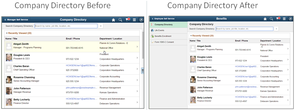
Optimizing Components for Activity Guides
Fluid pages that have no page title, contain application headers, footers or left panels must be optimized for activity guides to provide the best user experience. Detect whether the component is running inside of an activity guide. If so, optimize the component.
Optimizing includes:
- Providing a page title
- Removing any application header that spans the width of the banner and have it span the width of the page only
- Removing any footer and place buttons in the body of the page. Do not place buttons on the same line as any other content unless responsiveness is dealt with by the application developer
- Designing an alternative when a component has its own Next and Previous buttons
There are two design patterns for the application header:
- Scrollable in content area – background is white and the application header scrolls away
- Fixed in content area– background is grey and the application header does not scroll away
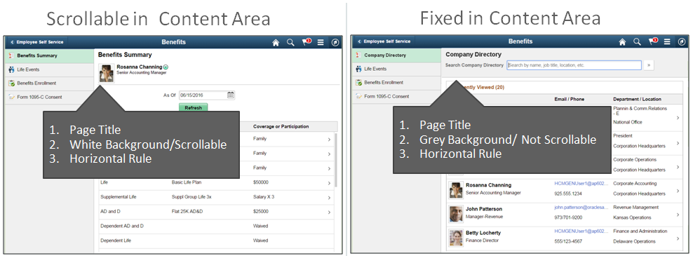
The following is an example of scrollable in content area design pattern before and after optimization:
The next example is of a fixed in content area design pattern before and after optimization:
Guidelines:
- Scrollable in content area
- This is the recommended default design pattern
- It is same recommendation we make for Small Form Factor:
- Application header content scrolls away (is not fixed on the page)
- It has a white background (grey background indicates fixed, not scrollable)
- Application header is separated from content area by a horizontal bar
- Fixed in content area
- To be used infrequently, only when content must not scroll away. Search in Company Directory is a good example of this.
- There will be a blank white space between the left panel and the application header in the content area when using AG/Nav Collection Collapsible Mode setting:
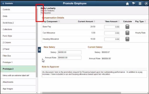
Figure 5: Example of blank white space between left panel and app header - Recommendation: Do not allow a left panel that is configured as collapsible.
Saving Data in Activity Guides
How data is saved in an activity guide can vary based on the activity guide type.
Saving Data in a Guided Sequential Activity Guide (not a SUOW)
The most commonly used activity guides are conventional activity guides where you put components in and save to a database at each step. Guided sequential activity guides (except for SUOW) automatically perform an auto-save. Auto-save sets a flag at each step so that no matter how you navigate away from a step, the current step’s data would be saved first.
In a sequential activity guide a user completes the step that they are on first, reaching a complete status, and then the Next button will allow them to move forward. The step is marked as complete unless there is an issue and then a message or error is presented. One example of a message would be for a step requiring an approval. Users can still move to next step however the previous step will not be marked complete until approval is given.
Saving Data in a Guided Non-Sequential Activity Guide
For non-sequential activity guides, the onus for saving falls on the component itself. A user enters data and saves their changes. The transaction is put on a step, the user has to save it. There may be a Save button for that component, a Save button on the page, or push button on page that performs a do save to initiate something. The component that you’re putting in an activity guide has an inherent function in it already.
It’s not an automatic save off the Next button in non-sequential. However these activity guides can be configured to automatically perform an auto-save. You can introduce auto-save functionality for the Next and Previous buttons for guided non-sequential activity guides.
Saving Data in a Single Unit of Work Activity Guide (SUOW)
You cannot have a Save button on each task or step in a SUOW. SUOW only performs validation on transition steps and then saves during the Submit. Applications are required not to perform any save or do save now. If you present a Save Tools button, it will automatically be hidden in SUOW.
SUOW does not use the database like a normal activity guide would. The application has to be written that has data that requires information from the previous step. SUOW uses activity guide context variables to pass information across because information has not been saved to a database. Application has to be specifically written for a SUOW activity guide. If you have save operations within your application you have to turn those off. To support SUOW you must make changes if you require data from a previous step. Use a Submit button on the final step and when a user clicks it data added and modified by the user is submitted and then committed to the database. This also sets the activity guide instance status to complete and then saves the instance.
Saving Data in a Non-Guided Activity Guide
There are three techniques to present some type of save functionality to a user: the PeopleTools Save button, an application-created Save button, and rendering a custom Save button to invoke the transaction page’s Save button to save the current task.
Most Used: Guided Processes
Guided activity guides include both vertical and horizontal, sequential and non-sequential. These optimized activity guides will be used most often.
Guided Mode Banner
Guided processes use a guided mode banner to present navigation buttons: Exit, Previous, Next, and Action List. Notifications is optional. It does not show: Home, Search, or NavBar.
The modified banner helps users stay on task with the activity guide. Users most likely will not navigate away from the activity guide. The banner is owned by the activity guide rather than the application.

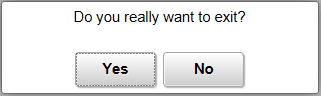
Exit Button
If the Exit button in upper left hand side of banner is clicked, and the user navigates out of the guided process, a warning should be provided to allow the user to cancel the operation.
Activity Guide Title
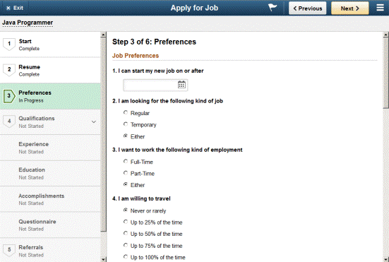
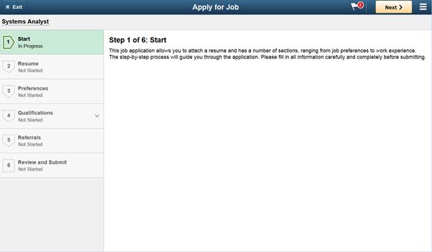
The activity guide title appears centered in the banner. Apply for Job is the title in the guided mode banner above.
Navigation Buttons
Guided processes use Next/Previous buttons to advance through the steps or tasks.
The button sequence is as follows. Button positions cannot be modified.
- First Step: Exit, Previous (hidden), Next
- Subsequent Steps: Exit, Previous, Next
- Final Step: Exit, Previous, Next (hidden), Submit or Complete

The Previous button is hidden by default on the first step when there is no previous step to navigate to. On subsequent steps clicking the Previous button navigates a user back to the previous step or substep.
Clicking the Next button navigates a user to the next step, substep or task. If any required information is missing on the current step, a message appears, and the user must provide the missing information before continuing to the next step or task. The Next button is hidden on the final step.
A component that is included in an activity guide may have its own page level Next/Previous buttons. Two sets of Next/Previous buttons will be confusing to the user.
Guidelines:
- Never have two sets of Next/Previous buttons
- Detect if running in an activity guide:
- If a component contains Next/Previous buttons, design an alternative for use in an activity guide using one of the following methods:
- Clearly label the component Next/Previous buttons to indicate what they apply to, for example “Next Employee”, “Previous Employee”
- Suppress the component Next/Previous buttons where it makes sense
- If a component contains Next/Previous buttons, design an alternative for use in an activity guide using one of the following methods:
When all mandatory or required steps have been completed, a Submit (Finish or Complete) button may appear on the final step. A user clicks this button to submit or finish something. There is an option on the final step to provide a label that states Submit, Finish or Complete.

Once a Submit (Finish or Complete) button is clicked a message should display warning the user if insufficient information has been provided. If all information is there it is recommended that the user be transferred to a confirmation page.
Actions List in Guided Sequential Process
The Actions List menu with activity guides shows (in order): custom activity guide items, and custom application items. It does not show the Tools elements: Sign Out, My Preferences, Search or NavBar. The Actions List menu is modified so that the user does not navigate away from the guided process unintentionally.
When setting up an activity guide some custom buttons can be configured and put in to the Actions List. These custom buttons would allow the user to intentionally navigate away from the guided process. In a guided sequential activity guide we recommend any of the following custom buttons in the Actions List: “Save”, “Save as Draft”, or “Continue Later”.
- “Save” and “Save as Draft” buttons should not be presented to the user at the same time. Selecting one of these options saves an in-progress application without moving to a new page or exiting the application. With “Save” or “Save as Draft” a user is not going to see anything happen. They are saving something at the component level that’s assigned to the step or task.
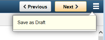
Figure 10: Example of guided process Actions List menu with “Save as Draft” custom button - “Continue Later” custom button exits out and returns the user to wherever they started the activity guide (same as Exit button).
Actions List in Single Unit of Work (SUOW) Activity Guide
In an Actions List for a guided sequential SUOW activity guide there is only a “Home” menu item which is delivered out of the box. This will take the user back to their homepage. It is an exception to what is usually found in the Actions List for guided processes. It provides a way for the user to navigate away from the guided process without using the Exit button. A warning message should display if a user clicks on the “Home” menu item.
There could also be a “Help” menu item if it’s configured. But there is no “Save” or “Save as Draft” custom buttons in Actions List for a SUOW activity guide.
Sub banner
The sub banner provides a visual context for the activity guide. It is linked to the activity guide title shown in the Tools banner. The activity guide sub banner can contain additional attributes of the transaction to provide contextual information such as name, ID, location and so on. The context information is text only with the exception of graphics.
You can display up to three rows of data and include graphics such as a photo. Related Actions are not available in the Tools activity guide sub banner. The designer decides what information to show to the user when setting up the activity guide.


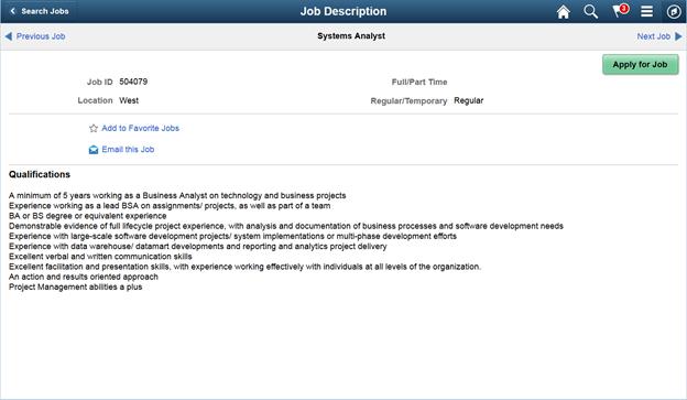
Entering an Activity Guide Using a Launch Page
Users may enter an activity guide through a number of different ways. Using a launch page is one way to enter an activity guide. A launch page provides a place for the user to initiate the activity guide. The Job Description page in this next example is a launch page. The page is designed by the application and is not part of the activity guide framework. The activity guide gets launched by the “Apply for Job” button in example below.
See the Navigation Standard for more options on navigating to an activity guide.
Entering an Activity Guide Using a Questionnaire
Use a questionnaire to enter an activity guide when there are questions to be answered. There are two types of questionnaires that can be used to enter an activity guide:
- Questionnaire provided by the activity guide tool.
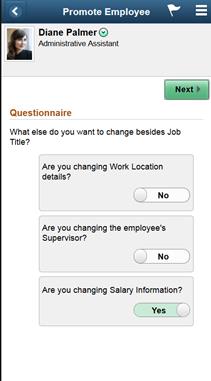
It is recommended that you leverage this questionnaire for activity guides. This questionnaire is provided as part of the activity guide framework. There are particular restrictions on when you can use it. You would need to have a predefined set of steps already in place. It’s going to launch a single activity guide and drives which selected tasks or steps are turned on or off. These tasks or steps will then become either visible or not visible in the activity guide based on the answers to the questions. Questions within the questionnaire need to be presented as simple “Yes” or “No”.
In the example below, the user is getting a questionnaire that is related to a particular activity guide template.
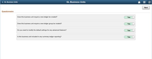
Figure 14: Example of entering an activity guide through a questionnaire provided by the activity guide tool - Questionnaire supplied by the application.
The application controls this questionnaire and determines the amount of complexity it will have. The application questionnaire is typically used when you have to figure out which activity guide template to go to and which activity guide to start. You use it because you have logic that needs to be executed to determine which type of activity guide to activate. This questionnaire initiates which activity guide the user is going to launch. This is outside the activity guide definition.
Returning to an Activity Guide
Guidelines:
- Some activity guides may not have a way for the user to return it. These are activity guides that the user cannot save. If the user abandons it or completes it then it is gone.
- Also in some instances there would be no reason to return to an activity guide. Some activity guides are one-time only events and there is no reason to go back in. For example with promoting an employee, the user submits it and then they’re done with it. They don’t go back to it.
- However there are other types of activity guides that you design where the user could return to it. The user has perhaps stopped the process midstream. It may be a longer or more complex process. The user may need more information or they could be waiting for an approval. The user then want to go back in. This type of activity guide would require a save on each step.
Recommendation:
- It is recommended that if a user returns to a saved, but un-submitted guided sequential process, they should be returned to the last visited step to continue where they left off in the process. If a user saves and then returns to an unfinished job application for example, the activity guide should automatically take the user back to where they left off in the process since it’s a sequential activity guide.
- It is recommend that if the user returns to a submitted activity guide process, display a summary page instead of the guided process, to allow the user to review their data.
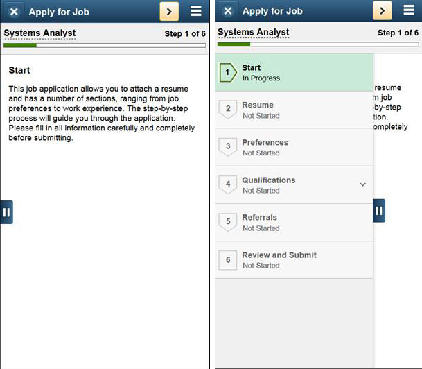
Vertical Guided Sequential Activity Guide
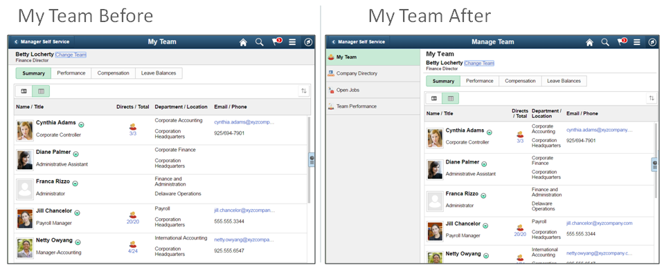
Guided sequential activity guides show the user which tasks to complete and in which order. A vertical guided sequential activity guide would be used most often. It is intended for use with activity guide optimized fluid components. The numbered steps are presented vertically in the left panel.
Use this activity guide when:
- you have complex sequential procedures
- you want to move step-by-step sequentially through the process
- you have both steps and substeps
In the main panel there is the activity guide step number and name - for example, Step 1 of 7: Start. This corresponds to the active step on the activity guide left panel.
Step Statuses
In a vertical guided sequential activity guide step statuses are:
- “Not Started”
- “In Progress”
- “Complete”
Note: when the user is on given step it is shaded green, the arrow points to the right, and the status indicates “In Progress”. When the user moves to the next step, the status changes to “Complete”, the arrow changes to point down and the shade is no longer green.
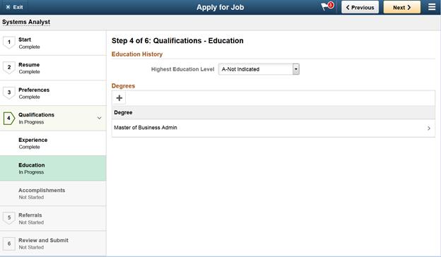
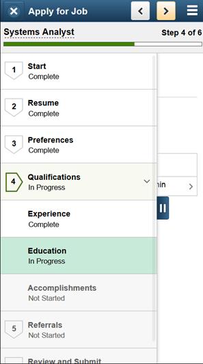
Substeps
Guidelines:
Substeps are available for vertical activity guides only. Substeps group tasks together in a sub-process beneath a parent step and can never be more than one level down. The user can expand or collapse the substeps. A parent step is not marked as complete until all substeps are complete.
For substeps, the page title includes both the step and substep name, separated by a hyphen. For example as shown below, Step 4 of 6: Qualifications – Education indicates that the step title is Qualifications and the substep title is Education.
Recommendation:
When a designer has logical groupings of tasks and a lot of steps one way to streamline the process is to use substeps under a parent step.
Final Step
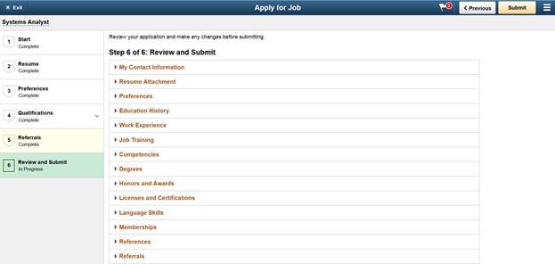
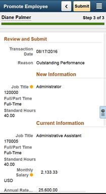
A final Review and Submit step provides a summary of all the information that has been gathered throughout the activity guide.
Recommendation:
As a designer consider using Review and Submit as the last step of the activity guide when you have a large number of steps or you have collected a large amount of data. Where appropriate for the process and when you have the ability to access the data, present a Summary page to the user for review. This allows a user the chance to review a summarization of what’s been done through the process in a single place prior to submitting.
We recommend a functional review of data on the final step where multiple sections could correspond to a given step or substep (not a step review where the sections on the review page each correspond to a step or substep name). Show the review by functionality.
In the example below there are a lot of sections to review so it makes sense for the Review and Submit page to have a collection of collapsible group boxes and a user can expand the sections they want to review.
Also in cases where it makes sense to have a review page on the final step, as a designer consider providing possible ways to edit information:
- Inline editing on the review page of final step in the case of a single component for example
- Use links to guide the user back to prior steps where they can make the edit
- Edit on the page in a grid
- Use a pop up modal window where the user can make an edit
- Instruct the user to use the navigation to go back to a prior step and edit
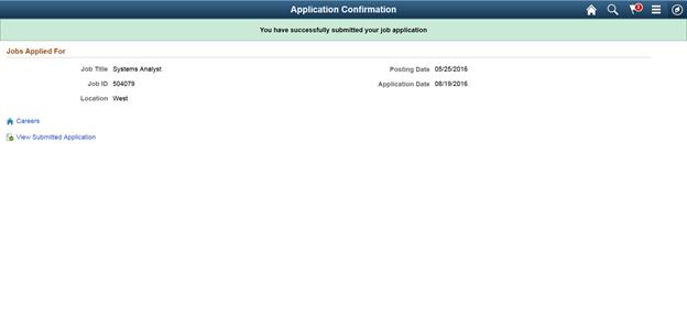
Confirmation Page
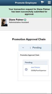
Once a user has completed the final step and submitted, consider transferring the user out of the activity guide to a confirmation page. Confirmation pages are not included as part of the activity guide framework. A designer will need to create the confirmation page and transfer the user to it. The confirmation message design on the page should be the fixed inline (not using the dynamic auto-dismiss confirmation message).
Recommendation:
A designer should consider using a confirmation page after ending the activity guide to show that the process has completed successfully. This should be used for processes with infrequent users and for times when it is important to provide the user with feedback and confirmation that the process completed successfully.
The confirmation page does not have a back button (back button turned off) because the user should not be allowed to go back into the completed activity guide. The user has just finished submitting and is done with the process. The confirmation page summarizes at a very high level the details of what’s just been done. The confirmation page may include transaction numbers for reference. It may be important for the user to be able to print out the confirmation page. Also note that navigation links can be provided on the confirmation page to help guide the user to their next page.
Refer to the Message Standard for more information on confirmation pages and messages.
Responsive Design - Vertical Guided Sequential Process
The following example shows the first step of a guided sequential process on a small form factor device. Note on a small form factor (or when in portrait mode on a larger device, or when a user narrows the width of a browser window used to access the activity guide) the banner has a different presentation. Users only see the image X, <, and > instead of the text on the Exit, Previous and Next buttons. The page title and step numbering is rendered slightly different on small form factor too.
A designer can also decide on the style of panel behavior: fixed, collapsible or overlay. The panels have a primary and secondary mode. This is configurable. The default is fixed. In the first image below, the step list is hidden. In the second image you see the left panel overlay.
 The left panel tab is used on a small form factor device (or when in portrait mode on a larger device, or when a user narrows the width of a browser window used to access the activity guide) for vertical processes. Tap this to show or hide the list of steps.
The following example shows Step 4 of the activity guide on a small form factor device. In the first image, the step list is hidden. In the second image you see the left panel overlay.

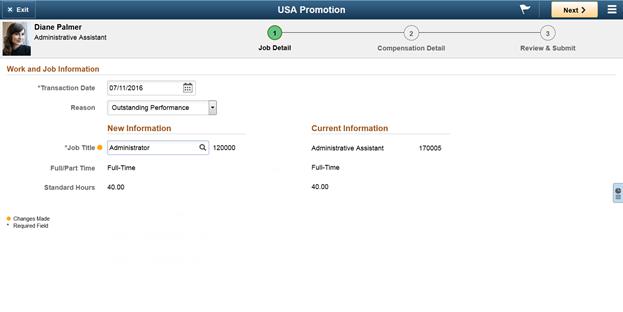
Horizontal Guided Sequential Activity Guide
A horizontal guided process moves from left to right and shows users which tasks to complete and in which order. It can be useful for any simple transaction.
Use this activity guide when:
- you have a simple sequential procedure, for example a self-service transaction
- you have a short procedure with three to five steps, where all steps can be shown at the same time
If more than five steps are required, or when there are too many steps to fit the horizontal space consider using a vertical guided process. Horizontal guided processes cannot contain substeps. Use a vertical guided process if you need substeps.
Step numbers and labels appear in the sub banner and do not wrap. Text should be kept short and provide a clear description of step content. Labels that are too long reduce the number of steps which can be displayed horizontally, causing overflow. The guided process built-in paging mechanism automatically calculates the maximum number of steps to display before overflow occurs. Overflow is not recommended as the user cannot see all main steps displayed at once. Try to avoid if possible and consider using a vertical guided process instead.
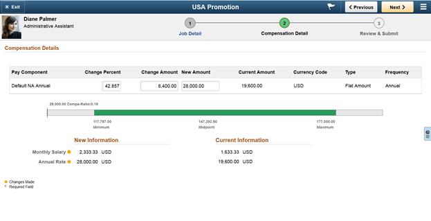
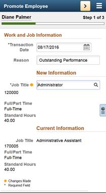
The next example shows the first step in a horizontal guided sequential process. All steps are visible and the Next button shows in the guided mode banner.
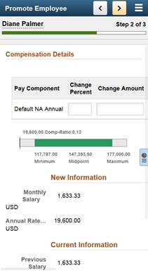
This next example shows the second step in a horizontal guided process. Both the Previous and Next buttons show in the guided mode banner.
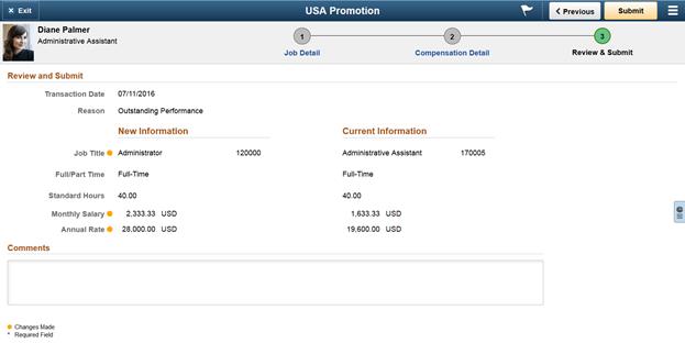
The next example shows the final step in a horizontal guided process. Both the Previous and Submit buttons show in the guided mode banner.
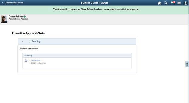
The next example shows a confirmation page that the transaction has been submitted for approval.
Responsive Design – Horizontal Guided Sequential Process
An example of a horizontal guided activity guide as rendered on small form factor is shown below. Note on a small form factor (or when in portrait mode on a larger device, or when a user narrows the width of a browser window used to access the activity guide) the banner has a different presentation.
Note: There is no overlay list of steps on the small form factor for the horizontal guided process.
Step 2 and Step 3 of a horizontal sequential activity guide on small form factor are shown in next example.
The next example shows a confirmation page that the transaction has been submitted for approval on small form factor.
Vertical Guided Non-Sequential Activity Guides
In a guided non-sequential activity guide process the user can tap ahead on the left panel to advance anywhere in the process.
Use this activity guide when:
- you have a complex process
- you have more than four tasks
- you have multiple users
- you do not need to complete the tasks in a particular order
Task Statuses
In a vertical guided non-sequential activity guide task statuses are:
- A light gray circle icon appears in front of status “Not Started”
- A green circle icon appears in front of status “Visited”
- A green circle with a check icon appears in front of status “Complete”
- A red asterisk displays to the left of each required step. If a step is not required, the status can be changed from “Not Started” to “Visited” as shown in example below.
- A possible Locked (View Dependency task)
- A possible Pending Approval task
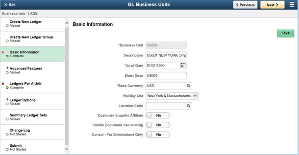
In the left hand panel, the task that the user is on will be shaded green. The main content panel shows the page title. “Basic Information” is the page title in example below.
Task groupings
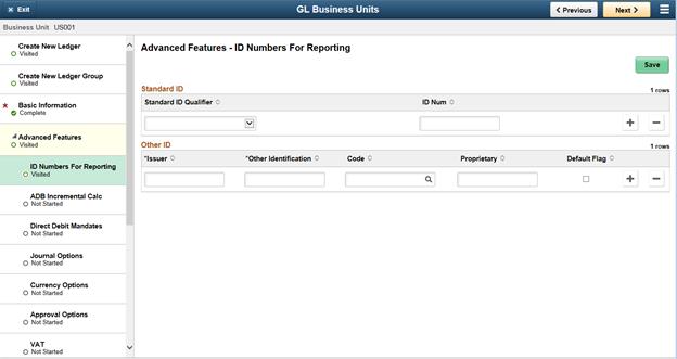
The next example shows a task grouping called Advanced Features. The overall grouping would not be “Complete” until all subtasks or tasks within that folder are complete.
For tasks within a folder or grouping, the page title includes both the task grouping name and the task within the folder name, separated by a hyphen. For example, Advanced Features – ID Numbers For Reporting indicates that the task grouping is Advanced Features and the task within the folder is ID Numbers For Reporting.
Guidelines:
Consider creating a task grouping:
- if you have a lot of tasks use groupings for similar tasks such that it makes sense to collapse them to reduce the vertical scrolling
- if you have several tasks and they all must be finished together in order to mark the task grouping as complete
- If there is a dependency and you need to complete the group of tasks before you can go on and complete a further task
Actions List in a Guided Non-Sequential Activity Guide
The next example shows the Actions List in a guided non-sequential activity guide. This Actions List menu includes:
- Mark Complete
- Mark All Complete
- Return to Questionnaire
- Home
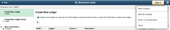
Figure 30: Example of Actions List menu items in a guided non-sequential activity guide - “Mark Complete” in a non-sequential activity guide is a way for a user to manually mark the tasks as complete. It changes the status of the task on the left. “Mark Complete” would typically be seen in an Actions List for non-sequential activity guide.
- If there is for example a read-only page where the user is just looking at the information then “Mark Complete” in the Actions List would be helpful and can be used to acknowledge that the task is complete.
- When a user clicks “Mark Complete” they should get a message confirming that they do want to mark this action complete.
- “Mark All Compete” is a way to manually mark all tasks as complete. “Mark All Complete” changes the status of all tasks on the left. When a user clicks “Mark All Complete” they should get a message confirming that they do want to mark all tasks complete.
- “Return to Questionnaire” will delete the current activity guide instance and return a user to a questionnaire.
- “Home” is delivered out of box in the Actions List.
Used Less Often: Non-Guided and Non-Optimized
The following activity guides will not be used very often.
Non-Guided Activity Guides
Non-guided means there is no guided mode banner with Exit, Previous and Next buttons. You will get the normal header bar.
Use this activity guide when:
- the Next and Previous does not make sense for your list of tasks and you want it to look like another transaction
- you want to create a quick and easy two-panel layout without going into Application Designer
- you want a collection of navigational links in left hand panel and want to maintain their status. Content is displayed in the main content area.
- you want to allow for saving when you move around
This activity guide is a lot like a Navigation Collection but you can configure saving and maintain status. Refer to the Navigation Collection Page Standard for more details if you don’t need saving and statuses.
Non-Optimized Activity Guides
Non-optimized activity guides list the steps or tasks in a dropdown from the middle of the banner (or guided mode banner) versus the left hand panel. Non-optimized support both sequential & non-sequential processes. They support any component type in up to a two-level hierarchy with summary and detail steps.
Use this activity guide when:
- you want to minimize the amount of changes that you need to make for the application to run inside of an activity guide
- you do not want to go through the optimization process which potentially requires customization and changes to the components and pages
This is a non-standard activity guide rendering and could be confusing to users. We recommend using optimized activity guides in a standard activity guide format.