")
Overview
This documentation provides standards and guidance related to the use of banners and footers on Fluid Self-Service transactions.
Banners
All fluid components should use the following standards to maintain a common look and feel.
The banner of a fluid component can be divided into the following three areas:
This section describes the use of icons in the following parts of a fluid application:
- Back Button
- Page Title (also referred to as the Banner Title)
- Icons
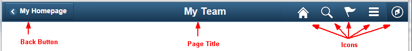
The following sections describe the function and guidelines for each of these areas.
Note: The guidelines in this section apply to all form factors unless specifically described otherwise in the Small Form Factor section.
Back Button
On the main page of a Fluid transaction, a Back button should always appear in the left side of the banner.
The Back button should always allow users to return to the place from which they entered the current page. Note that the only page that should not have a Back button is a homepage (since there is no place to go back to). The Back button label should always be based on the page name to which the user will be returned (that is, not the word “Back”). Note that in a small form factor device, the button appears as a left facing arrow without text.
Keep page titles short so they will fit on the Back button. The Back button style will truncate long page titles when rendering the label.
If the transaction is editable and edits have been made, the Save alert will fire when the Back arrow is tapped.
See the Buttons Standards for more details about the Back button.
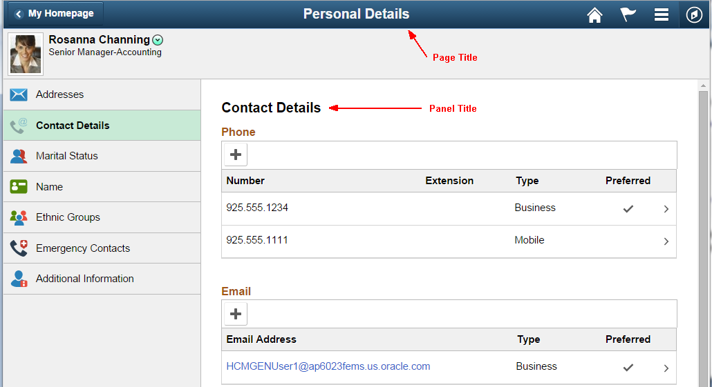
Page Title
The page title should briefly identify the current page to the user. Choose a concise page title so that it can be displayed in its entirety even on a small form factor. Be aware that long page titles increase the possibility of overlap with other banner elements (for example, icons) and may require that the title be truncated.
The page title comes by default from the App Designer page name but can be overridden in PeopleCode.
Note: In a two- or three-panel layout, the right (main content area) panel should have a title that reflects the category selected from the left panel. This title is properly referred to as a Panel Title to avoid confusion with the page title that appears in the banner. See the Panel Layout standard for more details about panel titles.
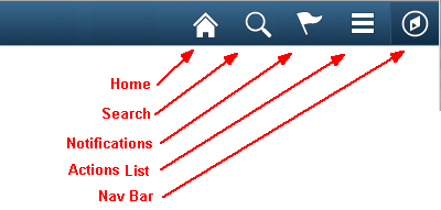
Icons in Banner (Banner Actions)
The following icons are available and should be used for Fluid components:
The above options are enabled in App Designer. Designers of Fluid pages should generally enable the options shown below in the Header Toolbar Actions section of the Fluid tab in the Component Properties definition.
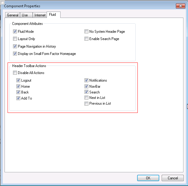
The Next in List and Previous in List options should also be enabled if the component has a component search (that is, when there is the possibility of a set of search results through which the user can navigate).
Note that the Add To and Logout actions will appear under the Component Actions icon.
Do not use the Add To option for any component where it does not make sense. For example, if the user should not directly access the component, as would be the case for a Guided Self Service transaction or to a component that is in the middle of a process, the Add To option should not be enabled.
Note that while it is technically possible to add custom application buttons to the right portion of the banner, developers should not do so: instead add actions to the Actions List.
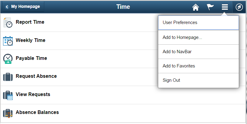
Application Actions Added to Actions List in Banner
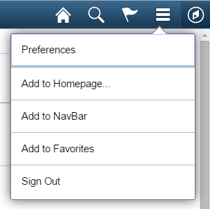
Application-specific action items can be added to the Actions List (also referred to as the Hamburger icon) that appears in the banner. They will always appear at the top of the list. They should be placed there if they are general action items that users would logically expect to see under a Menu or Settings area; User Preferences is an example of such an item:
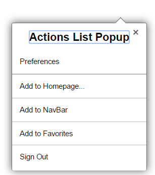
Note that it is important to ensure that such slide-out menu windows display a header with an appropriate title in Accessibility mode. Figure 4 (1 of 2) shows the Actions List slide-out menu modal window in non-Accessibility mode, while Figure 4 (2 of 2) shows it as it should appear in Accessibility mode. The following is an example PeopleCode snippet to achieve the header/title in accessibility mode:
Local string &sMenuTitle = EscapeHTML(MsgGetText(124, 524, "Message Not Found: Action Menu")); /* Text=Actions List Popup*/
PTLAYOUT.HEADER_ACTIONGROUP.SetGroupletMOptions("sStyle@ps_popup-menu ps_menutype-act;sTitle@" | &sMenuTitle | ";bAutoClose@1;bMask@1;sMaskStyle@ps_masktrans;bVertical@1;bHeader@0;");
Small Form Factor Banner
This guidance applies specifically to the Back button in a small form factor device.
Back Button
To save room on the banner, the Back button will always display a left-facing arrow rather than a page name if the banner width is less than 680 pixels. Similarly, the Notifications icon and Actions List icon will be the only visible icons in the banner when the banner width is 580 pixels or less (as would be the case for most smartphones in portrait orientation). See the following Responsive Design topic for more information about how icons are displayed or hidden based on various breakpoints in the banner width.
Responsive Design
This section discusses how developers can minimize or avoid collisions of items in the banner.
| Concept | Description | Examples |
|---|---|---|
| Actions List Overflow | To try to avoid collisions between the page title and banner icons, move icon actions from the banner into the Actions List based on the rendering area (size of the window). At the most compressed width, only the Notifications icon (if activated for that component) and the Actions List icon will be visible. If necessary, the Back button will change from displaying a text label to displaying just the left-facing arrow. If further compression is necessary, the title will be truncated and ellipses will appear when there is not enough space to show the entire title. | Avoid
collisions between title and icons.
 Here the Home and Search icons are automatically removed from the banner. Their actions can be accessed from the Actions List icon.  This is how the Home, Search, and Nav Bar actions become available under the Actions List icon when their icons are hidden: 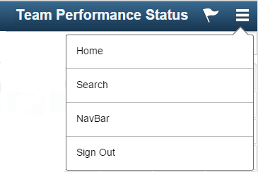 Here the Back button label is still visible:  Here, the Back button has changed to display only a left-facing arrow (no text label):  Here, the title was truncated:  |
| Thresholds for Moving Each Icon into the Actions List | Here are the breakpoints (based on banner width) for moving icons into the Actions List menu: The icons will fall over into the Actions List starting with the first icon on the left. Adjustments will be made to the width of the other banner elements, Page Title and Back Button label/appearance. Below 900 pixels: Remove Custom buttons from banner. Below 800 pixels: Hide the Home icon, set max width on Back button, set max width of Page Title in banner. Below 680 pixels: Hide Search icon, change max width of Page Title, hide text in the Back button, and enlarge icons. 580 pixels: Hide the Navbar icon and change size of Page Title. Note: The system always displays the Actions List and Notifications icons. | This is an
example of a banner with more than 800 pixels and all
elements included:
 This example shows that the Back button loses its label text below 680 pixels. The Home and Search icons are also hidden:  Below 580 pixels, only the Alerts and Actions List icons will appear; all other icon actions were moved into the menu under the Actions List icon.  |
Footers
Important! Only use footers for small form factor devices. Do not use a footer in any other size form factor.
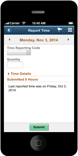
Small Form Factor Footer
Action Button
Use footers in the small form factor to display page-level buttons.
This example shows a footer with a page-level button in small form factor device.
See the Buttons standard for more information about the button styles and guidelines to be used in footers.
Responsive Design
Footers are used in the small form factor to display page-level buttons. These page-level buttons should be displayed differently on larger form factors, where the use of a footer is not allowed.
See the Responsive Design section in the Buttons standard for more information on how buttons appear in the small form factor and in larger form factors.