")
Overview
This documentation describes the UI guidelines to use for group boxes in NUI-based applications. It covers the usage of group boxes on tablets, smartphones, laptops, and desktops.
This example shows the Absence Details, Requestor Comments, and Approval Chain group boxes:

Common Guidelines for Group Boxes
The guidelines in this section apply to all form factors: small, medium, large, and extra large.
Group Box Size
Size the group box such that horizontal page scrolling does not occur. In general, a group box should contain at least two fields.
Group Box Title
A group box should always have a title. Use an appropriate title for clarity and do not use same title more than once on the same page.
Collapsible Group Boxes
Use collapsible sections when possible so that users can access more data on the small-form factor.
If a collapsible section is needed for information that should be generally available, then it should be expanded by default. For information typically not viewed, such a section should be collapsed by default and users should be able to expand it when needed.
In certain cases, you may want to provide a user preference to render the section expanded or collapsed by default; evaluate and design accordingly.
For example, country-specific data is not needed by all users all the time. By default, therefore, the group boxes representing countries are set to be collapsed. Users can easily expand the section.
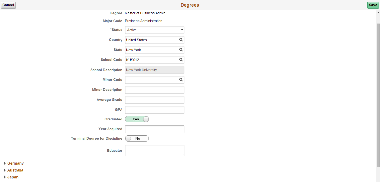
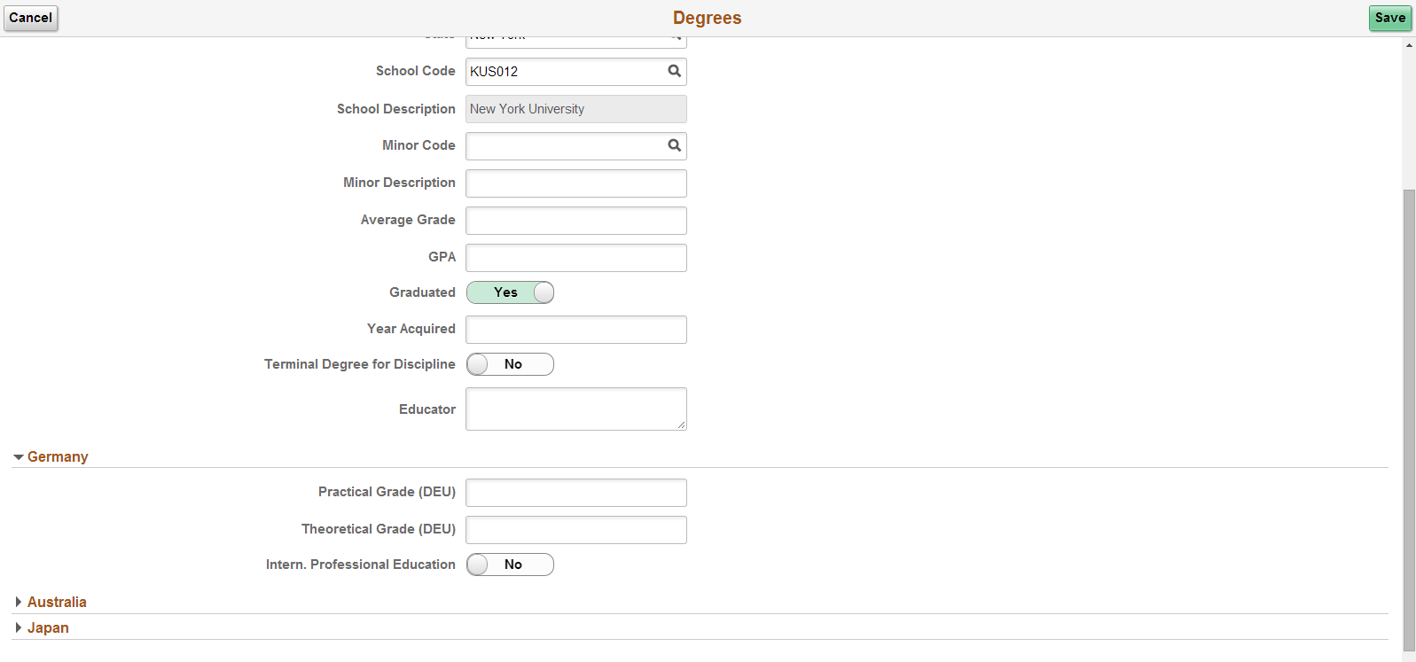
The following example shows a collapsible group box that is expanded by default:
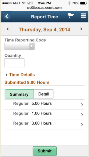
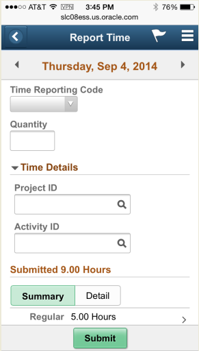
The following example shows collapsible sections on a small-form factor. In the Report Time page shown, the Time Details seldom change, so a collapsible group box is used to make them viewable only when user needs them. The expanded Time Details section is shown on the right:
Multiple Group Boxes on a Page
Group boxes can be placed one after the other (stacked), nested, or placed side by side.
Design side-by-side group boxes so that once users access the page on the small-form factor, the group box on the right moves below the one on the left.
Nested Group Boxes on a Page
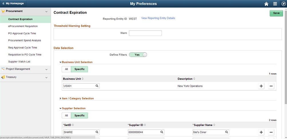
Use the standard group box style for all group boxes. Indent the inner group boxes from the left and right and keep the nested group box proportional to the other elements on the page. The following example displays nested group boxes. The Business Unit Selection, Item/Category Selection, and Supplier Selection group boxes are nested within the Data Selection group box.
Apply the psc_pagepadding-content style to the content of the group box. For nested group boxes, the inner group-box heading will be smaller but will not be smaller than H3.
Check the Page Layout Standards for details about indentation requirements.
Group Box Border
In general, pages look clean and less cluttered when group boxes without borders are used. However, sometimes it may not be as readable as it would be if a border were used. Consider the contents of the page to decide whether group box border should be turned on or off.
If the group box on the page contains simple elements, then the group boxes should be displayed without borders (see examples in Figure 1, 3, and 4). If the page has group boxes containing complex grids and structures, then the group boxes could be displayed with borders. The borders should be displayed only if it helps readability by clearly demarking the contents.
Use the style psc_border-content to show border when needed.
Figure 6 above is an example of using group boxes with a border (the Threshold Warning Setting and Data Selection group boxes).
Responsive Design for Group Boxes
Group boxes can be placed one after the other, nested, or placed side by side. However, these should follow the responsive design pattern. Design the side-by-side group boxes such that once users access the page on the small-form factor, the group box on the right moves below the one on the left.
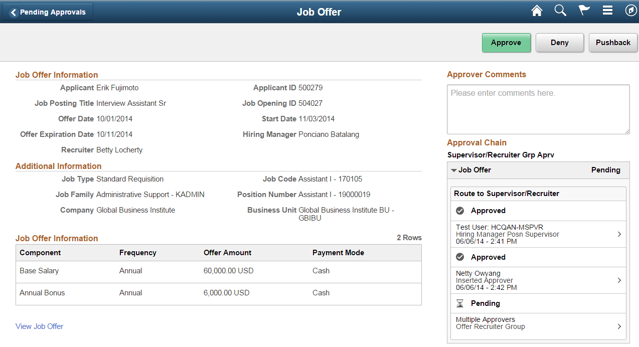
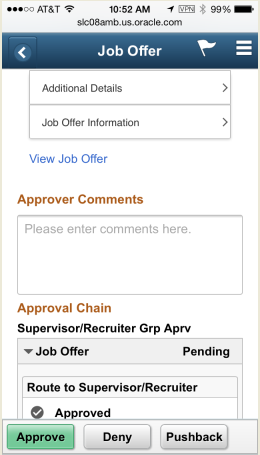
The following example shows Approver Comments and Approval Chain placed side by side to the group boxes on the left (Job Offer Information and Additional Information) on a medium/large/extra-large form factor.
For side-by-side group boxes, make sure that the field tabbing is logical and correct. By default, the tab order is based on the order in which the fields render, which may make the cursor move from left to right fields even if they belong to different group boxes.
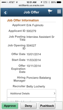
In the small form factor example that follows, the Approver Comments and Approval Chain group boxes appear below the group boxes that were on the left in the previous example:
Accordion Group Boxes on a Page
In certain cases, instead of using stacked group boxes on a page, you may use accordions, as described below.
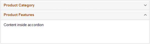
Accordian group boxes can display content that is grouped into categories. The category label is placed in an expandable section, and the category expands vertically. The remaining page content does not change when a category is expanded. Instead, it is moved up or down as the accordion expands.
The primary reason to use an accordion layout is to compress a large number of options into a limited space. By default, the first section in an accordion is expanded. Only one category can be open at a time. When a second category is expanded, the category that was open will be collapsed. The user scrolls up and down to see the categories and the expanded category contents:
Use the accordion layout when:
- The number of category options is large.
- The space to display the categories and their contents is constrained.
- The list of items can be logically grouped into smaller, roughly equal-sized chunks.
Avoid using an accordion layout when expanding a section will cause a lot of scrolling.
Evaluate using Related Field Groups for radio buttons so that these are read correctly in accessibility mode. When using Related Field Groups, the screen reader reads aloud radio button label and value together in accessible mode for sight impaired users.